HAL Id: tel-02339047
https://tel.archives-ouvertes.fr/tel-02339047v2
Submitted on 13 Nov 2019HAL is a multi-disciplinary open access archive for the deposit and dissemination of sci-entific research documents, whether they are pub-lished or not. The documents may come from teaching and research institutions in France or abroad, or from public or private research centers.
L’archive ouverte pluridisciplinaire HAL, est destinée au dépôt et à la diffusion de documents scientifiques de niveau recherche, publiés ou non, émanant des établissements d’enseignement et de recherche français ou étrangers, des laboratoires publics ou privés.
Haolin Ren
To cite this version:
Haolin Ren. Visualizing media with interactive multiplex networks. Numerical Analysis [cs.NA]. Université de Bordeaux, 2019. English. �NNT : 2019BORD0036�. �tel-02339047v2�
Doctorat Université de Bordeaux
THÈSE
pour obtenir le grade de docteur délivré par
Université de Bordeaux
Spécialité doctorale “Informatique”
présentée et soutenue publiquement par
Haolin Ren
le 14 mars 2019Visualizing media with interactive multiplex
networks
Directeur de thèse : Guy Melançon Co-encadrant de thèse : Marie-Luce Viaud
Jury
Mme Florence Sedes, Professeur, Université Paul Sabatier Rapporteur
M. Gilles Venturini, Professeur, Université de Tours Rapporteur
M. Jean Carrive, DR., Institut national audiovisuel Président
M. Gayo Diallo, Université de Bordeaux Examinateur
M. Benjamin Renoust, Université de Osaka, JP Examinateur
Université de Bordeaux
réseaux multiplexes interactifs
Les flux d’information suivent aujourd’hui des chemins complexes: la propagation des informations, impliquant éditeurs on-line, chaînes d’information en continu et réseaux sociaux, emprunte alors des chemins croisés, susceptibles d’agir sur le contenu et sa perception. Ce projet de thèse étudie l’adaptation des mesures de graphes classiques aux graphes multiplexes en relation avec le domaine étudié, propose de construire des visualisations à partir de plusieurs représentations graphiques des réseaux, et de les combiner (visualisations multi-vues synchronisées, représentations hybrides, etc.). L’accent est mis sur les modes d’interaction permettant de prendre en compte l’aspect multiplexe (multicouche) des réseaux. Ces représentations et manipulations interactives s’appuient aussi sur le calcul d’indicateurs propres aux réseaux multiplexes.
Ce travail est basé sur deux jeux de données principaux: l’un est une archive de 12 ans de l’émission japonaise publique quotidienne NHK News 7, de 2001 à 2013. L’autre recense les participants aux émissions de télévision/radio françaises entre 2010 et 2015. Deux systèmes de visualisation s’appuiyant sur une interface Web ont été développés pour analyser des réseaux multiplexes, que nous appelons «Visual Cloud» et «Laputa».
Dans le Visual Cloud, nous définissons formellement une notion de similitude entre les concepts et les groupes de concepts que nous nommons possibilité de co-occurrence (CP ). Conformément à cette définition, nous proposons un algorithme de classification hiérarchique. Nous regroupons les couches dans le réseau multiplexe de documents, et intégrons cette hiérarchie dans un nuage de mots interactif. Nous améliorons les algorithmes traditionnels de disposition de mise en forme de nuages de mots de sorte à préserver les contraintes sur la hiérarchie de concepts.
Le système Laputa est destiné à l’analyse complexe de réseaux temporels denses et multidimensionnels. Pour ce faire, il associe un graphe à une segmentation. La segmentation par communauté, par attribut, ou encore par tranche temporelle, forme des vues de ce graphe. Afin d’associer ces vues avec le tout global, nous utilisons des
diagrammes de Sankey pour révéler l’évolution des communautés (diagrammes que nous avons augmentés avec un zoom sémantique).
Cette thèse nous permet ainsi de parcourir trois aspects (3V) des plus intéressants de la donnée et du BigData appliqués aux archives multimédia: Le Volume de nos données dans l’immensité des archives, nous atteignons des ordres de grandeurs qui ne sont pas praticables pour la visualisation et l’exploitation des liens. LaVélocité à cause de la nature temporelle de nos données (par définition). LaVariété qui est un corollaire de la richesse des données multimédia et de tout ce que l’on peut souhaiter vouloir y investiguer. Ce que l’on peut retenir de cette thèse c’est que la traduction de ces trois défis a pris dans tous les cas une réponse sous la forme d’une analyse de réseaux multiplexes. Nous retrouvons toujours ces structures au cœur de notre travail, que ce soit de manière plus discrète dans les critères pour filtrer les arêtes par l’algorithme Simmelian backbone, que ce soit par la superposition de tranches temporelles, ou bien que ce soit beaucoup plus directement dans la combinaison d’indices sémantiques visuels et textuels pour laquelle nous extrayons les hiérarchies permettant notre visualisation.
Mots Clés: Réseau Multiplexe, Graphe Dynamique, Graphe Temporel, Détection de Communauté, Visualisation, Big Data, Analyse Visuelle
Laboratoire:
Laboratoire Bordelais de Recherche en Informatique (UMR 5800) 351, cours de la Libération, 33405 Talence cedex, France
multiplex networks
Nowadays, information follows complex paths: information propagation involving on-line editors, 24-hour news providers and social medias following entangled paths acting on information content and perception. This thesis studies the adaptation of classical graph measurements to multiplex graphs, to build visualizations from several graphical representations of the networks, and to combine them (synchronized multi-view visualizations, hybrid representations, etc.). Emphasis is placed on the modes of interaction allowing to take in hand the multiplex nature (multilayer) of the networks. These representations and interactive manipulations are also based on the calculation of indicators specific to multiplex networks.
The work is based on two main datasets: one is a 12-year archive of the Japanese public daily broadcast NHK News 7, from 2001 to 2013. Another lists the participants in the French TV/radio shows between 2010 and 2015.
Two visualization systems based on a Web interface have been developed for multiplex network analysis, which we call "Visual Cloud" and "Laputa". In the Visual Cloud, we formally define a notion of similarity between concepts and groups of concepts that we call co-occurrence possibility (CP). According to this definition, we propose a hierarchical classification algorithm. We aggregate the layers in a multiplex network of documents, and integrate that hierarchy into an interactive word cloud. Here we improve the traditional word cloud layout algorithms so as to preserve the constraints on the concept hierarchy. The Laputa system is intended for the complex analysis of dense and multidimensional temporal networks. To do this, it associates a graph with a segmentation. The segmentation by communities, by attributes, or by time slices, forms views of this graph. In order to associate these views with the global whole, we use Sankey diagrams to reveal the evolution of the communities (diagrams that we have increased with a semantic zoom).
This thesis allows us to browse three aspects of the most interesting aspects of the data miming and BigData applied to multimedia archives: The Volume since our archives are immense and reach orders of magnitude that are usually not practicable for the visualization; Velocity, because of the temporal nature of our data (by definition). The Variety that is a corollary of the richness of multimedia data and of all that one may wish to want to investigate. What we can retain from this thesis is that we met each of these three challenges by taking an answer in the form of a multiplex network analysis. These structures are always at the heart of our work, whether in the criteria for filtering edges using the Simmelian backbone algorithm, or in the superposition of time slices in the complex networks, or much more directly in the combinations of visual and textual semantic indices for which we extract hierarchies allowing our visualization.
Keywords: Multiplex Network, Dynamic Graph, Temporal Graph, Community
Detection, Visualization, Big Data, Interaction, Visual Analytics
Laboratory:
Laboratoire Bordelais de Recherche en Informatique (UMR 5800) 351, cours de la Libération, 33405 Talence cedex, France
1 Introduction 1
1.1 Video documents content . . . 1
1.2 French medias as a social ecosystem . . . 2
1.3 Overview of main contributions . . . 3
1.3.1 Visually exploration of network over time . . . 4
1.3.2 A framework to interactively analyze the labeled Videos . . . . 5
1.3.3 Research and propose some algorithms . . . 5
2 State of Art 7 2.1 About clustering . . . 7
2.2 Detecting communities in dynamic networks . . . 8
2.3 Visualizing evolving communities . . . 9
3 Capturing data heterogeneity through Visual Clouds 11 3.1 Introduction . . . 11
3.2 Data preprocessing . . . 12
3.3 Multiplex abstraction . . . 13
3.3.1 Layer interaction network and edge entanglement . . . 13
3.3.2 Concept and group similarity . . . 15
3.3.3 Layer hierarchization . . . 16
3.4 Visualization of heterogeneous clouds . . . 21
3.4.1 Visual cloud generation . . . 22
3.4.2 Interactions . . . 27
3.4.3 Query system and implementation . . . 28
3.5 Evaluation and use cases . . . 30
3.5.1 Usage scenario, Abe and the North Korea: . . . 30
3.5.2 Evaluation of the hierarchical word cloud . . . 31
3.6 Conclusion and perspectives . . . 34
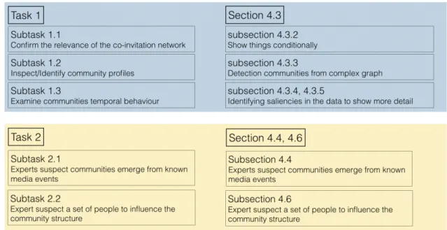
4 Visually tracking dynamic communities using Laputa’s multiple co-ordinated views 37 4.1 Domain questions and tasks specifications . . . 38
4.1.1 Task 1 - Communities, are you there? . . . 39
4.1.2 Task 2 - Communities versus media events . . . 40
4.2 Data model . . . 41
4.3 Statistics, visual encodings, and interaction . . . 43
4.3.1 Overviewing the data, communities at large . . . 43
4.3.2 Conditionally showing elements . . . 44
4.3.3 Detecting communities from complex graph . . . 49
4.3.4 Studying a community/an individual . . . 54
4.3.5 Identifying saliencies in the data to show more detail . . . 56
4.4 Visually tracking communities’ evolution . . . 60
4.4.1 Animation . . . 62
4.4.2 Multiple views . . . 63
4.4.3 Sankey graph . . . 68
4.5 Algorithmic considerations . . . 73
4.5.1 Comparing Simmelian backbone results . . . 73
4.5.2 Dynamic graph grouping algorithms . . . 77
4.6 Use cases . . . 78
4.6.1 General idea about French TV/Radio participant network . . . 78
4.6.2 Sport and football . . . 78
4.6.3 Party members in TV programs during 2017 France election . . 83
5 Reducing link complexity with the Simmelian backbone 85 5.1 Edge strength and edge redundancy . . . 86
5.2 Studying the behavior induced by parameters m and n . . . . 87
5.3 Different types of value to quantify Simmelian relationship . . . 88
5.4 Different parameters of the same network . . . 89
5.5 Is the Simmelian method beneficial for the detection of communities . . 93
6 Conclusion 99
Introduction
T
his thesis was funded by ANRT through a collaboration involving INA (Institut National Audiovisuel, Paris, FR) and LaBRI (Laboratoire Bordelais de Recherche en Informatique, UMR CNRS 5800, Talence, FR).INA is a public institution archiving audiovisual productions, producing and pub-lishing audiovisual and multimedia content for all audiences. INA is also a training and research center that aims to develop and transmit knowledge in the audiovisual, media and digital fields. The thesis took place as part of activities of INA Recherche
& Innovation Recherche & Innovation is a research team led by Marie-Luce Viaud
focusing on information retrieval and visualization interfaces.
This work was also accomplished in co-supervision by Benjamin Renoust from Osaka University (formerly at NII in Tokyo), in particular the part focusing on video document visualization.
This section briefly summarizes the work and results of the main research during the doctoral period. The manuscript is organized into two main parts, one focusing on the visualization of video documents content, the other looking at how dynamic network analysis can support the understanding of media as a social ecosystem.
1.1
Video documents content
The size of digital news archives makes it necessary for media studies to rely on automatic processing for quantitative analysis, not limited to their textual content. Visual analytics of multimedia data proposes then to extract high-level representations and support high-end analysis of multimedia concepts (not limited to text). Advances in computer vision now allows the extraction of visual semantic concepts, which can be used in turn to index video documents in an archive [32]. Querying and
retrieving relevant information still remains a difficult task, one with a relatively high cognitive cost for users, especially considering semantic ambiguity. This has stimulated information visualization to support the strategies adopted by users to find their way in the information space formed by results. In particular, tag clouds can give an overview of this semantic space and support exploratory tasks [66].
With news videos, the heterogeneous combination of both textual and visual con-cepts presents an interesting challenge. Modeling query results as multiplex document networks – each semantic concept being associated to a layer [54] – can turn this heterogeneity as an advantage. [53] had shown how a Layer Interaction Network (hereafter LIN ) derived from the original multilayer network enables the design of
advanced interaction and coordination, and thus eases exploration.
1.2
French medias as a social ecosystem
The social and political life of a community is partly shaped by the voice of different actors and groups of actors is echoed in the media. In the context of INA’s OTMedia project1, different measures and visualizations supporting the analysis of medias
visibility were developed (newspapers, radio, TV and even social medias).
We have investigated radio and TV programs broadcasted between 2011 and 2015, and have more particularly looked at co-invitation patterns hoping to locate different communities of actors. By doing so, we hoped to answer simple questions such as “Are there groups of person being co-invited often with one another?” “Can we provide an overview of all co-invitations, groups and how they evolve in time?”, etc. Because co-invitations spread over a five year period, the notion of a community had to be tackled in a manner consistent with the fact that people come and go between groups.
The data we use naturally comes as a network of people being connected as they are co-invited on TV or radio shows. The avenue we borrow to provide answers to the previous questions is to “visualize” the data and provide insight on its “structure” and display graphical patterns that the human eye is extremely well trained to detect [75] [76]. The structure of data is intimately linked to the notion of a “group”: a set of elements showing relative homogeneity [68, 62]. Now, the data we use is modeled as a graph where nodes correspond to people and links correspond to co-invitation to a same TV or radio show. For graphs, homogeneity is generally referred to as modularity and most often measured in terms of internal connectivity versus external connectivity. A popular modularity measure was introduced by Newman [46].
Dynamic graphs – those where nodes and edges vary in time – raise quite a number of issues. Properly defining the notion of a group or community in a dynamic graph is difficult as shows the lack of consensus in the literature [57]. Their visualization is another difficult and interesting problem [11]. The challenge indeed is to be able to display changes through a graphical representations capable of supporting the user’s mental map [4].
As if the challenge was not hard enough, our aim is to help users track changes in the community structure of a network – which often are termed dynamic communities [57]. This notion however hides an implicit assumption, that communities remains relatively stable over time. This “stability” assumption simply does not hold in the context of our work, as we shall see.
We study the French medias, and look more particularly at how people (politicians, actors, sportsmen, commentators, etc.) get co-invited on the same radio or TV shows over the 2010 – 2016 period. Being able to track and understand patterns potentially sheds light on editorial policies and potential biases induced from repeated co-invitations on given topics.
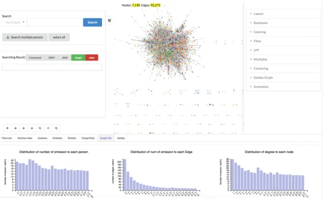
Our contribution is a fully equipped exploratory dashboard allowing users to select and track groups of people over time in the “co-invitation network”. Communities, either suggested using standard algorithms or deliberately selected by users, can then be examined from different angles, and through different signals reflecting the level of “activity”, “stability” or “renewal” rate of a group.
1.3
Overview of main contributions
In this thesis we focus on data modeling, visualization and analysis approaches toward a better understanding of complex network and time evolving network. Information visualization is the primary focus of our investigations. The four main contributions are as follows:
Temporarily and heterogeneity in graph communities from media archives
• Heterogeneity within the document context. Documents have many properties such as channels, broadcasts, type of broadcast etc.
• Heterogeneity within the document itself: mining the keywords, computer vision cues, face detection.
• heterogeneity through multiplex networks • heterogeneity through bipartism
The first contribution of our design study is a formal description using Brehmer et
al.’s approach [14] of the tasks we need to support. Each task corresponds to a domain
question and a set of operations conducted on the relevant data. Based on these task descriptions, our second contribution is the design of a visual analytics dashboard shown in Fig. 4.5, consisting in:
• A dual community detection approach based on two complementary perspectives: first on the overall link structure with time-independent groups confronted to time-interval induced groups;
• A set of statistics turned into indicators of time-dependent community cohesion; • A system combining and synchronizing several representations of communities,
together with dedicated interactions.
Our dashboard uses Bobo Nick’s [48] Simmelian backbone filtering approach to downsize the data and provide a fluid navigation of our data. The curves of time-dependent statistics can be used to filter data according to time. The iterative design of the dashboard was guided by close consultation with two expert users. Our last contribution is two use cases that showcase how the dashboard supports the analysis work-flow.
1.3.1
Visually exploration of network over time
We design and produce a visual framework to represent temporal graphs, to detect communities and to show their evolution over time.
This work is done in the French audiovisual institute and the constraints are strong because the framework produced should handle real data, is tested and used by real expert users, to produce real studies at real scale. Then, the framework should contain several modules to ensure it use in real environment:
- a module to build a temporal graphs from tabular data or given graph models - a module to observe and evaluate the temporal distribution of the data
- a visual framework to visualize the graph and its evolutions over time and allows users to manipulate the data.
1.3.2
A framework to interactively analyze the labeled Videos
We build a multi-layered visual cloud for semantic concepts visualization. This visual cloud has four features:
- Hierarchical placement. After modifying the traditional tag cloud location calculation algorithm, our visual cloud implements a mix of tags and snippets, and the placement of each concept is hierarchically distributed.
- Network behind. Concepts of visual cloud are from interaction network, so the connection between concepts is preserved and users can interact to understand the connections between concepts.
- Multiple interaction. A time line is designed to filter the time varying visual cloud. Click, mouse hover, double click etc. several interactive mode is designed in our application for user explore the data.
- Heat-map highlight. A heap-map is creatively designed in our visual cloud for highlight the interest region of concepts, helps user quickly have an overview of all concepts.
1.3.3
Research and propose some algorithms
In this thesis, we studied the cluster algorithm and proposed our own methods for better understand the graph.
- A hierarchical cluster for complex graph.
- Several indexes for analyzing the communities’ evolution over time.
- In-depth study of the Simmelian backbone algorithm and dynamic graph cluster-ing algorithm.
State of Art
2.1
About clustering
There are two different clustering method: Clustering via inter-document similarity. The best-known and earliest research on document clustering for search user interface is the Scatter/Gather project [50], documents are clustered into topically-coherent groups, and presenting descriptive textual summaries to the user. The usability study showed that the use of Scatter/Gather on a large text collection successfully conveyed some of the content and structure of the corpus. Usability study results suggest that user dislike organizations that show inconsistent levels of description [21].
Clustering according to the shared common term. Monothetic clustering algorithms [13] build clusters around dominant phrases, which give rise to more understandable labels. An analysis of the queries for which clusters were selected suggested that they are helpful primarily for moving documents that are low in the standard search rankings up higher. This happened on those occasions in which the query was ambiguous and the primary sense was not shown near the top of the search results, or when the query was specified very generally [31].
A primary problem with clusters is that their contents can be difficult to understand. The study by Kleiboemer et al. [35] found that for non-expert users the results of clustering were difficult to use, and that graphical depictions were much harder to use than textual representations, because documents’ contents are difficult to discern without actually reading some text. The human perceptual system is highly attuned to images, and visual representations can communicate some kinds of information more rapidly and effectively than text [65].
A notable successful use of visual cues in search interfaces is color highlighting of query terms in documents, and bolding of query terms in document summaries in retrieval results [41].
2.2
Detecting communities in dynamic networks
A common definition to describe dynamic networks is to consider a finite sequence of graphs G0, G1, . . . , Gk where the node and edge sets of graphs Gt = (Vt, Et) vary intime, and where each graph Gt is associated with a timestamp (or time interval). It is
usual to refer to each of the graphs Gt as beginstatic, where Gt represents the state of
the network at timestamp t.
There roughly are three approaches to address community detection in dynamic networks. They are:
• A first approach is to aggregate all graphs Gt into a single graph and apply
community detection methods for static graphs. Typically, edges if the resulting graphs can be weighted according to how frequently nodes get connected through time [6] [69].
• Another set of approaches is to compute communities for each of the graph Gt.
– Communities can then be reconciled [20] [39], simultaneously optimizing
the quality of the community structure at t + 1 and the maximization of the likeliness with communities at t.
– Alternatively, communities for Gt+1 can be computed using communities
for Gt as a starting point [67] [19], focusing on changes that occurred from
Gt to Gt+1. Changes are dealt with in different manners depending on their
types (community growth or contraction, community merge, split, birth, death and even resurgence; see [18]). A foreseen advantage of this approach is to compute communities for Gt+1 in less time, assuming snapshots Gt
and Gt+1 are topologically close to each other.
As for the latter optimization approaches one has to be cautious and take into consideration the number of snapshots Gt, and the complexity of the networks at hand
– that is, the implicit assumption on link persistence may not be at work. This is an important aspect in our work as our data is highly dynamic and links are far from being persistent. Also, these methods most of the time being non-deterministic they
tend to produce unstable results [58]. Hence it appears that providing users with means to inspect community structures in a sense is mandatory.
2.3
Visualizing evolving communities
Animating graphical representations is a traditional approach to indeed represent dynamic network [24] [11]. The complexity of the network, and consequently the readability of the representation may however call for alternative approaches [56]. Small multiples [25] consists in juxtaposing similar representations of varying but comparable datasets and effectively support the detection of changes in dynamic networks. This approach applies to dynamic networks but is subject to an obvious scalability issue [4]. Scalability can be improved by grouping timestamps into hierarchy that can be developed on demand as in [7].
Of particular importance here is the visualization of group structure in dynamic graphs [71].
Interactive Sankey diagrams [55] have proved to be quite useful in visually displaying evolving community structures [70]. As we shall see, Sankey diagrams can be enriched with interactions, and usefully synchronized with node-link views to support the visual inspection of evolving communities.
Capturing data heterogeneity
through Visual Clouds
3.1
Introduction
R
ecent advances in Computer Science have brought quantitative capabilities for news analysis on a large scale, to the benefit of media studies and sociology. Beyond topic detection and tracking from the text data, the analysis of video content itself matters, due to the impact images to the viewers [9].Visual analytics of multimedia data proposes then to extract high-level representa-tions and support high-end analysis of multimedia concepts (not limited to text). The analysis part of multimedia analytics often requires semantic annotations describing a multimedia document or at least a part of it. Semantic concepts required for analysis are often extracted from textual annotations, when available [38]. Advance in computer vision now allows the extraction of visual semantic concepts, which can be used in turn to index video documents in an archive [32]. Querying and retrieving relevant information still remains a difficult task, one with a relatively high cognitive cost for users, especially considering semantic ambiguity. While relevance ranking (such as page ranking [16, 8]) is a powerful approach to extract a set of interesting pages, studies have shown that users usually focus on the first few pages of results.
Semantic ambiguity remains challenging the information retrieval workflow, from extraction down to restitution to users [45, 37]. This has stimulated information visualization to support the strategies adopted by users to find their way in the information space formed by results. This has stimulated the study of strategies adopted by users to find their way into the information space [42] and information visualization soon responded to tackle this task [2, 78]. In particular, tag clouds can
give an overview of this semantic space and support exploratory tasks [66]. The visual inspection of results and even snippets for the first few most relevant results cannot allow users to build a proper mental map of this space. We want to address this problem by giving access to the semantic coverage of results of a user query through proper visual representation and interaction, in a form of a multimedia analytics system delivering a visual map of the query results.
Multiplex networks are heterogeneous and complex data structures: they present interacting entities across multiple layers of interactions. One successful strategy to visualize these complex structures is to exploit an additional network: This layer interaction network describes how layers overlap and may be used to investigate the original network. When the layers correspond to semantic units in documents, the new network shows some sense of semantic hierarchy reflecting the semantic context formed by the documents. We first propose an algorithm to extract hierarchical clusters of layers in a multiplex network of documents, and then to embed this hierarchy in an interactive word cloud.
3.2
Data preprocessing
With news videos, we also challenged by another issue is raised by the heterogeneity of multimedia information, in which we must visually represent. The challenge is then to visually represent both textual and visual semantic concepts combined. Modeling query results as multiplex document networks – each semantic concept being associated to a layer [54] – can turn this heterogeneity as an advantage and derive a Layer Interaction Network (hereafter LIN ), which offers advance interaction and coordination [53].
To this end, we propose to model query results in a multiplex network [34] since it aims at capturing multiple types of relationships [17]. as one could observe in the real world phenomenon (e.g. friend, colleague, family or sports club for social relationships ). Each layer can be associated to a semantic concept shared between different documents when modeling a document network [54]. These multiplex networks of documents often show a high number of layers (as opposed to traditional multilayer networks that often consider largely below a dozen). The number of layers can been turned into an advantage by using them to form a second network, the Layer Interaction Network (hereafter LIN ), which offers interesting opportunity in terms of interaction and coordination [53].
Detangler [53] used it to coordinate exploration in association with a flattened multiplex network (corresponding to the more traditional document network). Users
have then evaluated the LIN to be similar to a tag cloud, while additionally giving a sense of the semantic contextual hierarchy [53].
Our data consists in a 12-year archive of daily Japanese public broadcast NHK News 7 [52], from 2001 until 2013. Each program is 30mn long with synchronized closed captions, about 6 months of 24/7 viewing in total. A program is composed of different news segments. As provided by Ide [33], we obtain the segments using a sliding window of topic distribution (Fig. 3.1, top). The extracted topics being very noisy, we further extract textual semantic information, for each segment, with a keyword extractor trained for news documents (including named entities) [26]. The Japanese keywords are translated to English with Bing Translator1.
We use the face detection and tracking proposed in [52] (Fig. 3.1). Faces instances are detected in each frame [73], then regrouped with point tracking [63] creating
face-tracks, sampled with k-faces [47], and represented using the average of its 128-dim
OpenFace embedding vectors [3]. Face-tracks are clustered using GreedyRSC [40]. About 3,000 clusters are manually annotated, resulting in over 15,000 face-tracks of 139 public figures. We index each video segment with date-time of broadcast, keywords, and face-tracks. A query can be placed upon these criteria, returning a subset of news segments, including their associated semantic concepts, i.e. keywords and detected faces.
3.3
Multiplex abstraction
This section introduce our hierarchical clustering method. Subsection 3.3.1 introduce how we applied previous work, subsection 3.3.2 discuss a notion of similarity between concepts and groups of concepts, subsection 3.3.3 details our algorithm steps.
3.3.1
Layer interaction network and edge entanglement
Our input are the search results, which news segments associated with their bag of features (i.e. semantic concepts). “Graph of topics” [60] (or LIN [54]) are used to group results of a web search query. As pointed out, “a graph of topics provides a
contextualization of snippets” [60], and enables us to measure group cohesion through
multiplex entanglement [54].
Let S be the set of results returned by a query (see Fig. 3.1 (a)). Each segment in the results s ∈ S is indexed by a set of concepts t ∈ T . We first consider a graph
Fig. 3.1 (Top) Indexing each video segment: closed captions-based segmentation, face tracking, and keyword extraction. (Bottom) Abstraction of the search results; (a) indexed video segments; (b) the multiplex network of results; (c) the associated LIN.
.
G= (V, E) connecting segments to concepts. Two segments s, s′ may share concepts
t, t′, . . . We build a graph where nodes correspond to segments s, s′ ∈ V and edges
e = (s, s′) ∈ E are created if s and s′ share at least one concept, e is labeled by the concepts (t, t′, . . .) shared by s and s′ (see Fig. 3.1(b)). This graph corresponds to a multiplex graph [54] G′ = (V, E′) in which E′ =S
t∈T Et , i.e. each concept t forms a
layer.
This formalism allows us to derive the LIN [54] GT (T, F ), together with
entangle-ment measures. The nodes of GT are thus concepts t ∈ T , connected by an edge
f ∈ F if they overlap in G′ (hence index at least two distinct segments). An edge f is weighted by ntt′ the size of |Et∩ Et′| which is the number of edges in G labeled by
both t and t′. Following the same definition, ntt = |Et| is the number of edges of G
labeled by a concept t. Fig. 3.1(c) is a toy example of a LIN.
From there, Renoust et al. [54] compute an entanglement index γt for each concept:
γt.λ =Pt′∈T ntt′
nt γ
′
t . It measures how much concept t is entangled with other concepts
Fig. 3.2 Seraching results are built into interaction network
other concepts that brings results close one another. The more the concepts interact together, the more the group of results will be cohesive, and the more γt∀t ∈ T values
will be similar. This is captured by theentanglement homogeneity[54] H which is then defined as the cosine similarity H = <1T,γ>
|1T||γ| ∈ [0, 1] .
3.3.2
Concept and group similarity
We now extend the work of Renoust et al. [54] by introducing a notion of similarity between concepts and groups of concepts: the Co-occurrence Possibility (CP). In GT,
concepts are connected when they co-occur through at least two distinct segments. The CP quantifies this association such as the higher the CP, the closer two concepts can be considered.
CP of two connected concepts t and t′ in GT is defined as follows:
CP (t, t′) = ntt′
nt′t′
· ntt′
ntt
∈ [0, 1] (3.1)
With ntt and ntt′ the number of (co)occurrences of the concept layers t,t′ in the
multiplex network. The higher the value of CP, the closer the two corresponding concepts will be. CP is maximized ( CP (t, t′) = 1 ) if and only if two concepts always appear together within results.
When t and t′ are disconnected in GT, we define a dissimilarity as follows:
CP (t, t′) = −ntt+ nt′t′
With |E| the number of connected pairs of nodes in the multiplex network. The CP value is then negative, with minimal value CP (t, t′) = −1 when the two concepts t and
t′ cover all the links between segments but never co-occur together, hence representing two separated topics.
Following the same idea, the CP between a concept t and a group of concepts S is formulated as: X t∈S CP (t, S) = X t′∈S CP (t, t′) , t ̸= t′ (3.3)
Finally, the CP between two groups of concepts S and S′ ( S ̸= S′) of concepts is then defined as:
CP (S, S′) = X
t∈S
CP (t, S′) (3.4)
We may verify that CP (S, S′) = CP (S′, S). This formulation of similarity could
be seen as analogous to forces of a force directed layout algorithm[49]. Similar concepts should tend to “attract” each other, while dissimilar concepts will “repulse” one another, placing them far apart: high negative avoid unconnected concepts to be assigned to the same group.
3.3.3
Layer hierarchization
In Detangler [53], the LIN captures the semantic context with “a sense of hierarchy”. However, the network drawn “as is” tends to quickly become a furball as the number of concepts increases. Hierarchical relationships can provide a meaningful navigational mechanism by organizing information into a small number of hierarchical clusters [80]. To extract this hierarchy, our strategy is to identify concept and segment subsets with optimal cohesion (entanglement). Since it is an NP-hard combinatorial optimization problem, Renoust et al. [54] did not offer any solution. Keeping in mind that we have a subgraph of segments corresponding to each (group of) concept(s), we propose a heuristic solution to maximize cohesion in groups of segments.
This algorithm aims at building trees of concepts from the LIN GT. Each concept
starts labeled with its own group ltand we aggregate concepts from the topology of GT
such as two concepts will be connected if they are linked by an edge in GT. Orientation
of links are decided from max(γt, γt′) (rooting on the most entangled concepts). The
parent-children links. The second step associates all parent-children nodes to their closest concepts (or group of concepts). The last step iteratively assembles groups of concepts.
Fig. 3.3 Step 1: constructing the first trees by pair association.
Step 1: Generate “parent-children” pairs for all concepts. In this step
(Fig. 3.3(a)), each concept t1 , that is not a parent already, will be associated to a
concept t2 in its neighborhood t2 ∈ NGT(t1) such as CP (t1, t2) is maximal. All the
pairs form now C groups, each node will then be labeled with its parent’s group lp.
Algorithm 1 Generate “parent-children” pairs for all concepts procedure Initialization
for t in T do
assign to t a unique label lt
procedure Step 1 for t in T do
if t is notparent then
t2 ← n \ maxn∈N (t)(CP (t, n))
if t2 is not parent then
x ← parent \ maxx∈{t,t2}(γx)
Fig. 3.4 Step 2: moving nodes to optimize group assignation (highlighted in red).
Step 2: Link children to their closest concept or group of concepts. We
need now to associate concepts to the group in which they can maximize entanglement. We now compare the group c ∈ C in which a concept t maximize CP (t, c) to the neighboring child concepts t2 that also maximizes CP (t, t2) . A pair of nodes may
maximize together entanglement in comparison of those of a group, so we create in this case a new parent node. In other words, this avoids too coarse aggregations often induced by very occurring concepts, such as queried criteria. We continue updating associations until no change occur anymore. Results are illustrated by in Fig. 3.3(b).
Step 3: Regroup all groups in a forest. After the second step, all concepts
are now part of a parent-children association that took into account group CP (with positive and negative weights). We now compute the hierarchy between group, by simply comparing CP of groups together. Similarly, we will associate neighboring groups depending on their CP, starting with the pair of neighboring group displaying the highest CP in the graph (Fig. 3.3(c)) (and if there is a connection between them). We may obtain multiple hierarchical trees and the most obvious case is when the LIN
Algorithm 2 Link children to their closest concept or group procedure Step 2
C = {C1, C2, · · · , Ck} (groups formed from step 1)
repeat
changed ← F alse
for t in nodes \ t is not parent do c \ maxc∈C(CP (a, c))
t2\ maxt2∈N (t)(CP (t, t2)), t2 is not parent
if CP (t, c) > CP (t, t2) then
if lt̸= lc then
lt← lc
changed ← T rue else
x ←parent, x ∈ {a, b} \ maxa,b(λa, λb)
lx′, new label
ly ← lx ← l′x
changed ← T rue until ¬changed
Algorithm 3 Regroup all groups in a forest procedure Step 3
repeat
cx, cy \ maxci,cj∈C(CP (ci, cj))
u ← maxk∈{x,y}(γP arent(ck))
v ← mink∈{x,y}(γP arent(ck))
lcv ← lcu
P arent(cv) ← P arent(cu)
until |C| = 1 or maxCi,Cj∈C(CP (Ci, Cj)) <= 0
is not always only one connected component. We stop when there are only negative distances (i.e. ∀i, j CP (ci, cj) ≤ 0 ) or only q groups ( q = 1 or user specified).
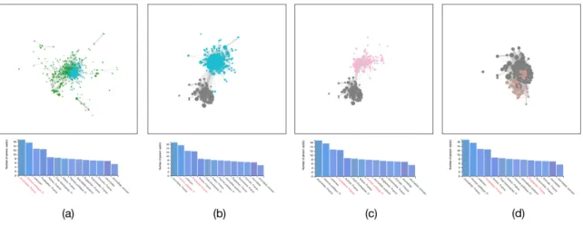
The overall structure of our cluster algorithm is very similar to the method intro-duced by Blondel et al. [13]. Their work proposes a simple method to extract the community structure of large networks. The complexity of our grouping algorithm is in O(E) where E is number of edges.
This bottom up hierarchical cluster method has three features:
Dendrogram. In the first and the second step, the node with a relatively large
weight is always used as the parent. In the third step, when two different groups are merged, the parent with the larger weight is also selected as the root of the new group. Each root(parent) node is the node with the highest weight in the group. The existence
Fig. 3.5 Step 3:aggregating groups to construct the final hierarchy.
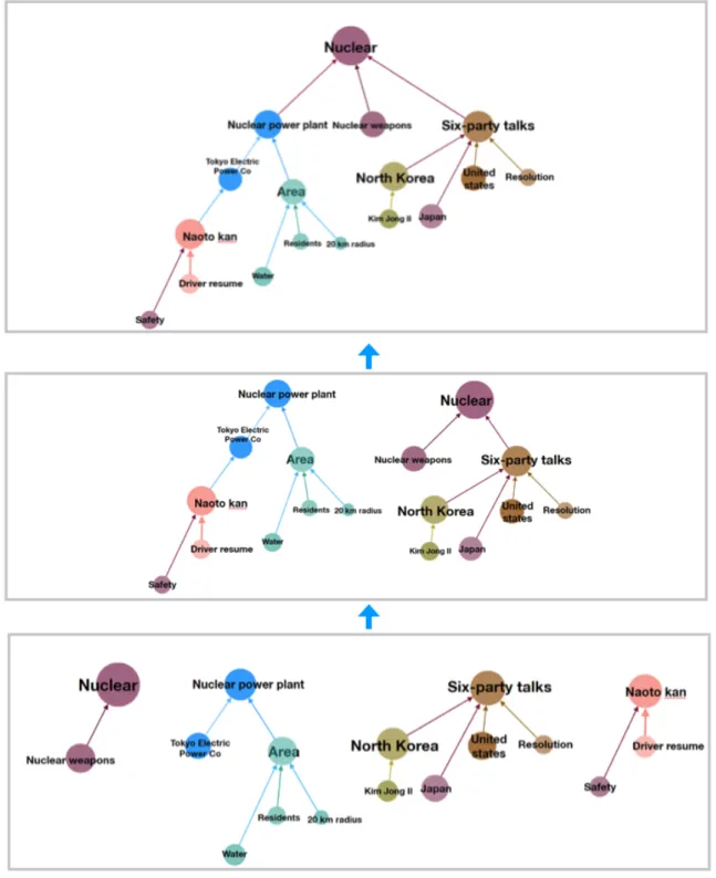
of the parent(root) node can clearly show the hierarchical relationship between the concepts, which allows the user to understand the search results more systematically. As 3.6 shows, the hierarchical cluster results from query "ABE".
Fig. 3.6 Concepts are clustered into dendrogram.
Get the best number of groups. Repeat the third step until the CP value
between all the different groups is less than zero, and the number of groups is the optimal number. As 3.7 shows the adjcency matrix is supported in our framework, it can also be used to test the quality of group results.
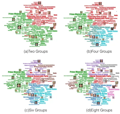
Get the required groups number. When get a lot of parent-child like groups through the first and second steps. In the third step, the two groups that are most closely connected are merged. In the process of merging, if the number of groups set by the user is q, when the number of groups reaches q, the merging process ends, and the number of groups that the user wants is obtained. If the number q set by the user is less than the optimal number of groups obtained by the algorithm, in the third step, if the CP value between any two groups is less than zero, but the number of groups is still greater than the number required by the user, the merging process will continue. Perform the merge of the two groups with the largest CP value, even if the CP value between the two groups is less than zero. Through this forced merger, the amount required by the user is finally obtained. As 3.8 shows, different colors represent different communities, and users can divide the same graph into any number of required groups. Of course, the number of groups is less than or equal to the number of nodes.
3.4
Visualization of heterogeneous clouds
Many attempts to display overview or grouping information have focused on automati-cally extracting the most common general themes that occur within the collection. In document clustering, similarity is typically computed using associations and common-alities among features, where features are usually words and phrases [8]. The greatest
Fig. 3.7 The adjcency matrix display the grouping results
advantage of clustering is that it is fully automatable and can be applied to any text collection without manual [9].
Queries on our news search engine return a set of video segments, but since the activities of public figures can span over long periods of time and diverse topics, we need to provide contextualization on-the-fly.
3.4.1
Visual cloud generation
To best support users, the visual cloud should be compact, aesthetic and expressly map the thematic grouping resulting from the hierarchical structure extracted. Inspired by usual tag cloud, it should also integrate images seamlessly. We start by embedding the hierarchical relationships.
Pack Layout initialization: The Pack Layout algorithm [74] uses enclosed
Fig. 3.8 User could group the tags into specific numbers, The different colored tags in each figure represent different groups.
algorithms). The size of each leaf node reveals a quantitative dimension associated to data points and the enclosing circles show the approximate cumulative size of each subset. Circle packing does not use space efficiently, however it can indicate relative positions of nodes following their hierarchical relationship. Each concept is assigned to the center of the enclosing circle it is represented by (Fig. 3.9(b,c)). Pack Layout creates a leaf-node per node in the tree, instead, we assign parent nodes to the center position of the higher order circles. This results in a more even distribution of position in the plan, giving a relative position for each concept guided by the hierarchy (Fig. 3.9, left).
Visual cloud layout: Wordle algorithm [72] is arguably the fastest tag cloud
algorithm. Words initial position can not be strictly specified, and size depends on words relative frequency. Words are introduced one by one to some random position close to the center of the canvas and iteratively placed in the order of frequency. A word is then displaced if it intersects with any previously positioned words. This displacement
Fig. 3.9 Visual cloud layout: (a)LIN (b) extracted hierarchy (c) Pack Layout embedding (with spirals) (d) visual cloud (e) with heatmap.
Fig. 3.10 Dendrogram is used to build pack layout, the location of the tag in the tag cloud depends on the location of the tags in the pack layout.
is made following an increasing Archimedean spiral until no more intersection is found. We use this to our advantage by constraining the spirals with the Pack Layout’s circles (center and separation distance), see Fig. 3.10. We extended the algorithm to take into account any rectangle shape. As a result, concepts are placed in the proximity of their previously calculated position, relatively reflecting their hierarchical structure (Fig. 3.11).
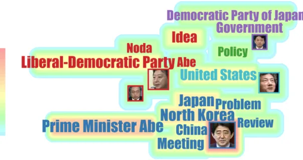
Regions of Interest: To highlight regions of interest, we offer multiple visual
encoding. Textual concepts and image borders are colored upon the group to which they belong.
The number of groups can be interactively set, since it corresponds to a different cut of the hierarchy, it simply updates colors, while keeping the layout stable. The size of a concept encodes its frequency on the edges of the multiplex network. Because frequency is only one aspect of the significance of a concept in its group, we introduce a
Fig. 3.11 Since the position occupied by the tags is a rectangle and the character image is also a rectangle, we use the character image instead of the tags in the process of calculating the layout, so that the tags and the image can appear at the same time, and the hierarchical placement is kept. (a) displays the normal tagcloud, we use the person’s name instand of their profile photo, (b) displays the profile photo and the name at the same time, (c) displays only profile photo
Fig. 3.12 A canvas made heat-map is used to show the importance of concepts.
new highlighting that displays how concepts mix with others: an optional background heatmap displays the entanglement index of concepts (Fig. 3.12) and contrasts enough
with the categorical scale. Higher entanglement indices assigned to warm color attract user attention. A max blending function as the heat value diffuses from the outer box of concepts maintains text readability.
Fig. 3.13 There are two layers behind the tags cloud: a network and a heat-map.
Users can place advanced queries on the three criteria of time-frame, face and keywords (Fig. 3.14 (a)). Above the list of results and the visual cloud (Fig. 3.14 (d, c)), the system shows a brushable time bar chart that positions the query results in time (the timeline background is tuned to our usage scenario to show periods of interest in color). Similar to traditional search engines, a list of results is presented (Fig. 3.14 (d)). It is ordered by time, titled by date/time/segment. A snippet composed of the first lines of captions can be expanded. Clicking on a result launches a video player at the segment position.
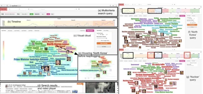
Fig. 3.14 Left. Interface overview, search query over Abe during Koizumi terms (a) - very active during the end of Koizumi3 (b), mention of ‘North Korea’ stands out (c). Hovering over ‘North Korea’ shows that it strongly relates to ‘abduction’ (e). Right. Comparison of the queries on North Korea (f), and Nuclear (g): two periods coincide (in black) Koizumi1 and Abe1 but we can notice two major differences (in red). Koizumi3 period did not associate much North Korea and Nuclear, and Kan period associate Nuclear with Accident. Demonstration video available at https://youtu.be/VfGwa6T94t8. Fig. 3.15 An optional list of concepts view could be displayed. Concepts are ordered by its entanglement index, the bar after each concept represent their degree in the graph, their color is the color of their heat in heat-map which is based on their entanglement index.
3.4.2
Interactions
Filter the concepts Filtering results is achieved by clicking a concept or brushing
timeline. The curve of the number of snippets on the timeline help user to make chocie. After selecting a certain period of time, the interaction network will be re-computed, showing the tag clouds in that time period, and the size of the tags will be dynamically adjusted, so that users can understand the changes of concepts more deeply. however,
leapfrog interaction [53] by double-clicking a concept or the timeline brush will result
in a new query corresponding to this filter, recomputing a new visual cloud for a finer grain analysis. This corresponds to Search tasks often formulated by Shneiderman’s mantra “Overview first, zoom and filter, then details-on-demand” [64].
Fig. 3.16 Select different time interval from timeline, the concepts only appear in that period will be displayed, the concepts’ size would be changed.
Mouse over interaction Extracting a hierarchy from the LIN implies that we
loose its topology but the neighborhood of a concept is key to exploration. It is restored through hovering interaction: all concepts are dimmed except for those neighboring the concept in the LIN with timeline highlighting (Fig. 3.14(c,e)). When the heatmap is active, new heat values are computed on-the-fly which map the local entanglement indices of concepts in the multiplex subgraph induced by the concept hovered (similar to [53], Fig. 3.14(e)).
3.4.3
Query system and implementation
The three important elements for labeled TV news videos are: "when", "who", "what". In our interface, user could search TV news by time (when), person’s name (who) and keywords (what). Also the boolean query is supported for advanced search. User could use multiple query operators and quotation marks for boolean search. As figure 3.18 shows the example of boolean query a ∨ (b ∧ c).
Fig. 3.17 Mouseover interaction. (a) Mouse move over the tag ’dandidacy’, only connected tags displayed, the other tags become pale. (b)When heatmap is displayed, the new heatmap will be redrawn based on the entanglement index of the subgraph of the mouseover tag.
Fig. 3.18 User could search by inputing time period and person’s name and keywords, figure shows a boolean query example.
User could select time period by simply drag the brush of time-line, also, user could modify the boolean query by simply clicking the options. Those feature make easier for user to select the desired time clip and results.
Implementation and complexity: The system is implemented in HTML5 with
the popular semanticUI [61] and D3 [23] libraries. Database indexing and access
is implemented in python. The hierarchy algorithm complexity is bounded by the computation of entanglement which requires an Eigen decomposition of a matrix of dimension the number of concepts.The construction of the LIN and nt,t′ are made
while constructing the multiplex network of results. Both depend on the number of results |V | and number of concepts |T |, O(1
2(|V | ∗ (|V | − 1) + |T | ∗ (|T | − 1)). The
computation of the hierarchy is a greedy optimization similar to Louvain [13] estimated in O(|T |log|T |). No complexity is discussed for the Pack-Layout algorithm [74] but runs in milliseconds for a thousand circles. The number of circles depends on |T |, which is at best a few hundreds. The word cloud generation is based on Davies’ heavily optimized implementation (see www.jasondavies.com/wordcloud/about/, which is bounded by computation of bounding boxes and collisions (not impacted by our modifications). Including the Pack-Layout initialization, the word cloud generation can be considered instantaneous. The heat-map generation is done in one pass through each concept,
with a static Canvas implementation faster and more memory efficient than DOM population of SVG elements.
3.5
Evaluation and use cases
We have made use studies to evaluate our cluster algorithm and the visual cloud. We invited students to use our framework, and made a comparision to other cluster methods and tags clouds.
3.5.1
Usage scenario, Abe and the North Korea:
In a previous study, the authors investigated appearances of Japanese Prime Ministers on NHK[52]. One interesting conclusion was the growth in screen appearances of Abe during Prime Minister Koizumi’s ruling, before becoming himself Prime Minister in the following elections. Our system allows to refine this study by placing a complex query to search all news segments during Koizumi mentioning Abe by name or face (Fig.3.14). A demonstration video is available at https://youtu.be/VfGwa6T94t8.
The timeline (which is augmented with Prime Minister’s rulings on the background) confirms the growing mention of Abe. This is no surprise knowing that Abe was chief cabinet secretary during Koizumi’s third term. The visual cloud proposes 5 groups: about elections, about Yasukuni Shrine, about the newspaper Asahi Shimbun, about Japan/Korea/China, and about North Korea. But turning on the heatmap, the most prominent word becomes North Korea by far. Indeed, Abe was chief negotiator on issues related to abductions of Japanese citizens by North Korea, managing to free 5 of them. Leapfrogging on the keyword “North Korea” (Fig.3.14(e)) makes a new search of Abe associated with North Korea during Koizumi terms. Browsing the timeline among the three terms highlights different subtopics at each terms. We may mention a meeting during Koizumi’s first term, associated with the three faces of Koizumi, Kim Jong Il, and Abe; mentions of sanctions, missile launch and draft resolutions during Koizumi’s third term.
Now a new search on the keyword North Korea highlights that it is most active during first Koizumi ruling and especially during first Abe ruling (Fig.3.14, left). North Korea related abductions was excessively reported on the media and Abe’s administration has put pressure on NHK to “pay attention” [43]. A last search on the keyword nuclear gives 3 spikes in the timeline (Fig.3.14, right). Two of the spikes coincide with North Korea previously described (Fig. 3.14). One big difference comes
with Koizumi’s third term, when no mention of nuclear issue is made. The last in 2011 after the Great East Japan Earthquake about the nuclear powerplant accident.
Validation of the hierarchical algorithm: We offer a heuristic that optimizes
entanglement homogeneity H in networks formed by association of results and concepts that captures cohesion of a group of documents[54]. To the best of our knowledge no other work attempt create a hierarchy of concepts to maximize cohesion between documents related to concepts on one hand, while preserving the relationships in the
LIN on the other hand. However, we can still compare H with that of groups of
documents corresponding from concept clusters induced by a Louvain segmentation [13] on the LIN, and with random segmentation to serve us as a baseline. The random segmentation only agglomerates nodes randomly from the network’s topology until reaching a given number of clusters. Based on 8 queries of 50/100/150/200 concepts, we randomized 10 generations of k clusters (k reused from the Louvain segmentation [13] to equally compare between the three types of segmentation). We then average H for each group, across queries and segmentation. Results in Table 3.1 confirms that our segmentation results in more cohesive subgroups.
Table 3.1 Comparing H among groups of results of varying sizes
Group Size Random Louvain Multiplex All sizes 0.43874 0.53359 0.59600 50 concepts 0.58213 0.66137 0.68647 100 concepts 0.38544 0.46707 0.55022 150 concepts 0.38665 0.52803 0.60585 200 concepts 0.40075 0.47792 0.54149
3.5.2
Evaluation of the hierarchical word cloud
To evaluate the output of visual cloud, we conducted a user study. We compared the output of our algorithm with three other word cloud algorithms that focus on the preservation of semantic relationships. The first,“Inflate-and-Push” (IP), is a semantic preserving word cloud based on multi-dimensional scaling [10]. The second is the
“context preserving word cloud” (CP) [22]. The last, “Star-forest” (SF) is the closest
to our spirit [10, 12]. We used for the three of them a 4:3 image ratio with cosine similarity for relationship between words and term frequency for word ranking. The implementation used is proposed by the university of Arizona2. Incidentally, Louvain
segmentation [13] is also the way the groups of words are chosen in this implementation.
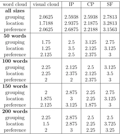
Table 3.2 Comparison of cluster results word cloud visual cloud IP CP SF
all sizes grouping 2.0625 2.5938 2.5938 2.7813 location 1.7188 2.9375 2.1875 3.2813 preference 2.0625 2.6875 2.2188 3.1563 50 words grouping 1.75 2.5 3.125 2.75 location 1.25 3.5 2.125 3.125 preference 2.125 2.5 2.375 3 100 words grouping 2.25 2.125 2.5 3.125 location 2.25 2.375 2.125 3.5 preference 2 2 2.375 3 150 words grouping 2 2.875 2.25 2.75 location 1.875 3 2.25 3.125 preference 2.125 3.125 1.875 3 200 words grouping 2.25 2.875 2.5 2.5 location 1.5 2.875 2.25 3.725 preference 2 3 2.25 3.25
In total we evaluated 32 queries among 8 different users, each query with 4 different representations. We generated 8 different search queries that may contain ambiguous results: swift, apple, jaguar, serendipity, ring, network, orange and uncertainty and gathered about 250 snippets for each query. The evaluation was conducted with the help of college students, each student had 4 queries (each of varying size from 50 to 200 words) with the four different word cloud representation to evaluate on a query. The presentation of the word clouds have been shuffled to avoid ordering effect, and the overall interview took about one hour each (including informal interview after).
We ask them to rank the 4 word clouds by three criteria:
• meaningfulness of the color grouping (do words in a group really belong to a group?);
• meaningfulness of the positioning (do close words well relate to each other?); • preferred word-cloud (including aesthetics).
We average the ranking among all queries on each criteria and results are shown in Table 3.2. The meaningfulness of our grouping and the meaningfulness of our words
positioning have received the best results. Although overall users were preferring our word cloud over others, two users clearly did not so. The grouping appeared to be quite disturbing and too aggressive for them, as they would like to see appearing more ontological grouping rather than topical. A user also noticed too many non-meaningful words such as “likes” or “related”. This suggests that we need to improve our pre-processing as part of our future work.
We also broke the results according to group size in Table 3.2 (8 experiments per group of 50). It is interesting to note that our algorithm performs particularly well for location meaningfulness of the words, especially for the large groups. This is a comment confirmed while we interviewed users, as our grouping technique was helpful in breaking down large numbers of words. Note that we were slightly outperformed by CP for location and IP for grouping meaningfulness for 100-word queries, and by CP as well for 150 words as users’ preferred word cloud. CP tends to better separate its clusters for the queries at 100 words than it did with other queries (often mixing words of different clusters). As for the users preference, CP produced the less compact layout of words by allowing blank spaces, which especially pleased some of our users.
3.5.3
Usefulness of the representation
We conducted an informal study to get feedback on the usefulness of our system. After each experiment described previously, we interviewed preference on with/without heat map on word tags in relation to size. Users almost always preferred the our word cloud generated with heat-map.
Interviewing our users on their experience, they tend to emphasize on the usefulness of the hierarchical layout, and their usage meant often turning on and off the heat-map representation. The heat-map appears as an optional feature to them. It was also noted that it sometimes disturbs the reading of text. However, users also reported that they were able to understand the thematic from the word cloud faster by using the heat-map feature. When a large number of words was presented, they reported to also better spot important words.
We further let users do 10 search queries each and collected feedback of their user experience in comparison with a regular search engine results:
• Most users have used our topic map to help search for results when not the result they were hoping for was not clearly found within the first two pages of search results.
• When users are not familiar with the area they are searching in, they prefer using our interface. For example some users preferred using our interface to search about celebrities, places, news.
• All users are interested in the interactive re-ranking of results and would like it implemented in search engines.
• Word cloud with highlight is obviously more readable than their own experience of common tag cloud. However, with complex query like with statement, they would prefer sentences rather than terms to understand the search result. The feedback is very important. It highlights that users have many different behaviors and intentions when searching the web. This is well captured by Brehmer et
al.’s typology [15] (in their Fig. 1), in the searching task: search location and search
target can be known or unknown. This corresponds to four different behaviors: lookup,
locate, browse and explore. Although we designed this system for exploration tasks, we
have not thought of differentiating those cases before conducting our experiment, it clearly impacts the usefulness of ours system.
A one-cent guess from this informal feedback we collected is that search engines are often used for lookup tasks (with location and target both known). In this case the word cloud representation is certainly less useful. While fully making sense for
exploration tasks, usefulness of our representation then rises when browsing, but less
for locating tasks. Indeed, in locating tasks, users expect the target to fall under the first few search results. However, in real cases, there is a delicate balance between both location and browsing cases: users do not always have full certainty of the target to find, or its location.
3.6
Conclusion and perspectives
Although tag clouds do not offer much room for visual encoding except for layout, size, and color, users have positively welcomed the heatmap. It helps to correct the information overload when too many concepts are displayed, by bringing initial focus on the highlighted concepts. However, it reduces the perception of group differences. Future work will explore the design space offered by joining heatmaps and visual clouds, especially for interaction (used here to reintroduce theLIN topology). We also improve traditional tag clouds with thumbnails as a supplementary information, bringing new information in form of visual cues. We only use faces this time but we plan to use other
cues, such as objects or logos. We compared here word occurrence and tracking time in terms of a rougher segment occurrence, but the comparison of these heterogenous measurements remains open.
The design of our multimedia system completely falls into the search task as described by Brehmeret al.’s typology [15] (in their Fig. 1) consisting of two parameters:
search location and search target, either being known or unknown. Each situation maps
to a subtasks: lookup, locate, browse and explore. Usual search engines are often used for lookup tasks (with location and target both known). Video broadcasters such as Youtube link videos together to supportbrowsing tasks (when the location is known but not the target). Locating tasks consists in knowing the target but not the location, made successful by keyword search. The visual cloud supportsexploration and browsing tasks, our keyword search is too strict to provide proper lookup task support. It should be improved, together with video linking, to better support lookup and locate (beyond time location with the timeline).
One last important future work concerns comparison tasks. We currently refine in-formation through visual cloud hovering, timeline browsing, and leapfrogging. However, beyond side-by-side comparison of two queries tabs, we do not have explored other means of comparison. This need quickly rises as we would like to compare periods of time.
Finally, we have presented a system designed for exploration of the NHK News 7 archive with a visual cloud, that improves from tag clouds in several ways. It takes roots in a multiplex network formulation, and uses group entanglement of search result to build a hierarchy with stable grouping, that results in a very fast and interactive drawing. The cloud is coordinated with search query, results, and timeline to allow further browsing, exploration, and query refinement. We illustrated our system with the case of Abe Shinzo and North Korea, studied the ability of our hierarchy to optimize group entanglement, and presented implementation and complexity.
Visually tracking dynamic
communities using Laputa’s
multiple coordinated views
T
his chapter reports on our work developed in close link with media researchers and media experts at INA and Sciences Po (Paris). It is driven by a high-level question: are potential bias induced from patterns in the way people get invited on TV and radio news events (when, on what occasion(s), in what context(s), with whom)? This question then induces more specific interrogations related to media exposure: are there co-invitation patterns? Do communities form in the media and how does the community structure relate to media visibility?In order to detect and visualize community structure in the context of the French audiovisual news media landscape, we investigated data covering the French media over the 2011 - 2017 period. Assuming there are communities in this evolving ecosystem, how can they be characterized? How do they behave over time? Do known phenomena (related to social/political events or persons) act as underlying drivers of communities? The analysis and visualization of communities in dynamic networks has received much attention these recent years [44] [11] [57]. Being able to find groups in data indeed is a central task in most taxonomies [1] [59], as it fundamentally relates to understanding structure and capturing insight in data.
Timestamped and even streamed data is now abundantly produced. While theory might be uncomfortable when defining what a community is in a time varying network, users usually have a quite clear idea about what types of groups they expect to discover and “see”, or on the contrary what groups they expect not to see.