Characterization of monitoring alarms in a
community hospital intensive care unit
by Sarah Hensley
S.B., Massachusetts Institute of Technology (2017)
Submitted to the
Department of Electrical Engineering and Computer Science
in Partial Fulfillment of the Requirements for the degree of
Masters of Engineering in Electrical Engineering and Computer Science
at the
Massachusetts Institute of Technology
June 2018
c
○ 2018 Sarah Hensley. All rights reserved.
The author hereby grants to M.I.T. permission to reproduce and to
distribute publicly paper and electronic copies of this thesis document
in whole and in part in any medium now known or hereafter created.
Author:
Department of Electrical Engineering and Computer Science May 25, 2018
Certified by:
Thomas Heldt, W.M. Keck Career Development Professor in Biomedical Engineering May 25, 2018
Accepted by:
Characterization of monitoring alarms in a community
hospital intensive care unit
by
Sarah Hensley
Submitted to the
Department of Electrical Engineering and Computer Science on May 25, 2018, in partial fulfillment of the
requirements for the degree of
Masters of Engineering in Electrical Engineering and Computer Science
Abstract
Because the vast majority of monitoring alarms in the adult intensive care unit (ICU) do not require intervention, care providers are slow to respond to all alarms, endan-gering patients. We collect, characterize, and analyze alarms, alarm annotations provided by clinical staff while responding to alarms, and physiological data from a community hospital ICU. In order to suggest opportunities for suppressing irrele-vant alarms, we examine monitoring device coverage across patients and analyze the alarms observed by device, priority, and type. On average, we observe 196.3 alarms per patient-day, for a total of 23,057 alarms. From these, the electrocardiogram and pulse plethysmogram produce 86.1% of all alarms. The lowest priority alarms rep-resent 81.1% of all alarms, while the highest priority alarms compose just 5.5% of the total. While the rate of annotations is low, also just 5.5% of possible alarms, it is comparable to the rate of care provider interactions with alarms, as measured by alarm silencing, at 9.6%. Using these annotations, we find – surprisingly – that the annotated nuisance threshold-violation alarms tend to have higher excursions than actionable and advisory alarms, offering a statistic for separation. When focusing on threshold-crossing alarms, we find that 22.5% of Heart Rate Low alarms may actually indicate device error. Among ST segment alarms, 44.4% occur simultaneously with at least one other ST segment alarm, producing redundant alarms. Addressing these issues represent strategies for reducing excessive alarms in this community hospital cohort of ICU patients.
Thesis Supervisor: Thomas Heldt
Acknowledgments
I would like to thank my advisor Professor Thomas Heldt, whose guidance and support was invaluable. I would also like to thank Minoru Matsushima and Daisuke Horiguchi for all their help in data collection and interpretation. This work was made possible by Nihon Kohden Corporation, from support of this research and the efforts by staff of Nihon Kohden Innovation Center to develop and deploy the data collection system at Winchester Hospital.
Contents
1 Introduction 15
1.1 Motivation for Reducing Alarm Rates . . . 15
1.1.1 High nuisance alarm rates . . . 15
1.1.2 Dangers of high alarm rates . . . 16
1.2 Motivations for Specific Alarms . . . 17
1.2.1 Threshold alarms . . . 17
1.2.2 Heart rate and oxygen saturation alarms . . . 18
1.3 Aims . . . 19
2 Background 21 2.1 Previous Observational Alarm-audit Studies . . . 21
2.1.1 Studies of community hospitals . . . 22
2.2 Previous Algorithms . . . 24
2.2.1 Alarm thresholds . . . 24
2.2.2 Alarm delays . . . 25
2.2.3 Median filter as a low-pass . . . 25
2.2.4 Other algorithms . . . 26
2.2.5 Comparisons . . . 26
2.3 Conclusions . . . 27
3 Data Collection 29 3.1 Hospital Setup . . . 29
3.3 Data Details . . . 32
3.4 Data Quality Metrics . . . 33
3.5 Conclusions . . . 34
4 Data Statistics 37 4.1 Data Coverage . . . 37
4.2 Alarm Statistics and Alarm Rates . . . 40
4.2.1 Alarm priorities and types . . . 40
4.2.2 Alarms by device . . . 41
4.2.3 Alarms by active signals . . . 42
4.3 Threshold Alarms . . . 42
4.3.1 ST alarms . . . 44
4.4 Conclusions . . . 45
5 Threshold Alarm Analysis 47 5.1 Signal Thresholds . . . 47
5.2 Separating High and Low Alarms . . . 49
5.3 Duration, Excursion, and Exposure . . . 49
5.3.1 SpO2 low . . . 49
5.3.2 Heart rate high . . . 51
5.3.3 Heart rate low . . . 52
5.3.4 ST segment high . . . 54
5.3.5 ST segment low . . . 54
5.4 Conclusions . . . 55
6 Alarm Annotations 57 6.1 Annotation Statistics . . . 57
6.2 Annotated Threshold Alarms . . . 59
6.3 Alarm Silencing . . . 60
7 Conclusions and Future Work 63 7.1 Conclusions . . . 63 7.2 Future Work . . . 64
List of Figures
3-1 Central station display screen . . . 30
3-2 Bedside monitor display screen . . . 30
3-3 Data collection system . . . 32
3-4 Example trend data . . . 33
4-1 Trend data coverage by patient . . . 39
4-2 Alarm breakdown by priority and device . . . 42
4-3 Alarm breakdown by priority and message . . . 43
4-4 Alarm numbers normalized by data coverage . . . 44
5-1 SpO2 Low duration, excursion, exposure . . . 51
5-2 HR High duration, excursion, exposure . . . 52
5-3 HR Low duration, excursion, exposure . . . 53
5-4 HR Low without errors duration, excursion, exposure . . . 53
5-5 ST Segment High duration, excursion, exposure . . . 54
5-6 ST Segment Low duration, excursion, exposure . . . 55
List of Tables
4.1 Trend data collected. . . 38
4.2 Breakdown of alarms by priority and type. . . 41
4.3 Threshold alarms by priority and percentage of total alarms. . . 43
4.4 Breakdown of ST alarms by lead. . . 44
5.1 ST segment time at typical threshold settings. . . 48
5.2 SpO2 and HR threshold settings. . . 48
5.3 Number of threshold alarms. . . 50
6.1 SpO2 and HR threshold settings. . . 60
Chapter 1
Introduction
The vast majority of alarms from bedside monitoring systems in the adult intensive care unit (ICU) do not require intervention from care providers. As a result, care providers are slow to respond or ignore alarms altogether, endangering patients with time-sensitive need for intervention. To prevent this, it is important to understand which types of alarms are excessively irrelevant. This thesis characterizes alarms from the ICU of a local community hospital. Most monitor alarm studies have been conducted at academic hospitals, so collecting alarms from a community hospital offers insights that may be more representative of most hospitals. Unlike previous studies, we developed a system for care providers to annotate alarms by actions taken. With this, we look to reducing the number of irrelevant alarms by efficiently targeting the alarms that sound most frequently.
1.1
Motivation for Reducing Alarm Rates
1.1.1
High nuisance alarm rates
Alarms in the ICU can be categorized as one of four types. These are actionable, in which the alarm directly causes a care provider to change care given to the patient; advisory, in which the alarm is considered useful to the care providers but does not lead to immediate action; nuisance, in which the alarm either does not accurately
reflect the patient’s status or the information given is useless; and induced, in which the care provider’s action triggers an alarm when administering care to the patient.
The proportion of nuisance alarms in the adult ICU is much greater than the proportion of actionable and advisory alarms. An oft-cited paper from 1994 by Law-less observes a pediatric ICU. Over the course of 928 patient-care hours, there were 2,176 alarms. However, only 119 (5.5%) were actionable or advisory alarms [20]. In contrast, 1,481 (68%) were nuisance alarms and 576 (26.5%) were induced alarms. This clear demonstration of the excess of nuisance alarms has caused research on alarm rates to proliferate.
Chambrin et al. conducted a study of five adult ICUs, observing 131 patients over 1,971 patient-care hours. The authors recorded 3,188 alarms, of which 25.8% were actionable [4]. Siebig et al. observed an adult ICU with 38 patients over 515 patient-care hours. Of 3,682 alarms, 610 (16.6%) were actionable and 1,289 (35%) alarms were advisory. Another 1,713 (46.5%) alarms were nuisance alarms [34]. Paine et al. conducted a systematic review of the literature on alarm frequency and char-acteristics. The review found that, across ten different observational studies set in adult ICUs, between less than 1% and 26% of alarms in adult ICUs were actionable [28]. While there is variability between studies due to different methods in annotating alarms as actionable, every study indicates that actionable alarms are overwhelmed by non-actionable alarms in adult ICUs.
1.1.2
Dangers of high alarm rates
The low proportion of actionable alarms is not simply frustrating; it is dangerous. The large number of alarms can cause alarm fatigue in care providers. Alarm fatigue slows response time to all alarms, including those that represent a real change in patient health [28]. It can also cause care providers to ignore or turn off certain alarms altogether [37]. Finally, it can distract care providers from real, time-sensitive issues [6].
Because of the problems caused by alarm fatigue, “alarm hazards” – including the high rate of non-actionable alarms – are recognized as a major danger. The ECRI
Institute is a non-profit institution that advises over 5,000 health care organizations on medical research and technology. In every year between 2010 and 2017, the ECRI Institute has ranked alarm hazards in the top five health technology hazards of the year, with three years as the number one hazard [13–19, 23]. These “alarm hazards” are a direct result of the high rate of false and nuisance alarms; the sheer number of alarms causes care providers to be distracted from real and time-sensitive issues, to become slow to respond or to ignore alarms, and to disconnect alarms to prevent them from sounding [15]. One study notes that a four-year period in Manufacturer and User Facility Device Experience database had 566 patient deaths related to issues stemming from alarm monitoring systems [6].
1.2
Motivations for Specific Alarms
With these issues, the need to develop algorithms to suppress non-actionable alarms is clear. To do this efficiently, the algorithms must focus on suppressing the types that give the highest rate of non-actionable alarms.
1.2.1
Threshold alarms
Threshold alarms sound when a trend signal, such as heart rate (HR), oxygen satura-tion (SpO2), or arterial blood pressure (ABP), goes above or below certain thresholds. For example, a HR Low alarm would sound if a patient’s HR fell below a pre-specified limit, such as 60 beats per minute (bpm).
Siebig et al. note that the overwhelming majority of alarms observed in the ICU – 68.2% – are threshold alarms [34]. With the knowledge that most alarms are not actionable, this implies that reducing the number of threshold alarms is an effective strategy for reducing the number of nuisance alarms.
In a study of alarms during cardiac surgery, Schmid et al. noted that 6,386 alarms sounded. Of these, 6,119 (96%) were threshold alarms, and only 1,735 (28%) of those threshold alarms were actionable [33].
1.2.2
Heart rate and oxygen saturation alarms
More specifically than threshold alarms, the threshold alarms caused by HR and SpO2 signals cause a disproportionately large number of nuisance alarms. When Siebig et al. found that 68.2% of ICU alarms were threshold alarms, they also specifically noted that the SpO2 alarm was the second-greatest source of alarms, representing 29.5% of cases [34], after systolic arterial blood pressure.
Tsien and Fackler conducted a study in a pediatric ICU, finding that 43% of the 2,942 total alarms came from the SpO2 signal. Of these SpO2 alarms, just 5% were actionable alarms. The next most frequent type of alarm was related to the HR measured by the pulse oximeter (PPG), representing 20% of the alarms; however, less than 1% were actionable alarms. Similarly, the third most common alarm was HR measured from the electrocardiogram (ECG), with only 6% of alarms being actionable [36]. In sum, 2,384 (81%) of alarms were caused by SpO2 or HR monitors, and just 81 (3.4%) of those were actionable. Tsien and Fackler conclude that “present threshold alarms are oversensitive to false alarms” [36].
A different study, conducted in the adult medical progressive care unit, found that, of 16,953 alarms, 37% were caused by the HR and SpO2 signals. Specifically, 27% were from HR High or HR Low alarms and 10% were from SpO2 Low alarms [9]. Notably, HR High or HR Low alarms always occurred with tachycardia and bradycardia alarms, respectively, making them entirely redundant.
Furthermore, Inokuchi et al. observed an adult ICU, finding that SpO2 and HR measured by ECG were the second and third greatest sources of alarms, at 24.2% and 22.9%, respectively. Of these, just 2.4% of SpO2 alarms and 5.3% of HR alarms were actionable. The authors determine that “the SpO2 and ECG alarms sound regardless of the clinical severity” of a patient’s status, concluding that “the SpO2 and ECG are the primarily clinically irrelevant alarms” [12].
Altogether, these studies indicate that algorithms should focus on suppressing nuisance alarms related to the SpO2 and HR signals, as these consistently represent major sources of alarms in all studies.
1.3
Aims
The ultimate goal of this thesis is to create approaches for reducing the number of non-actionable alarms. To achieve this, we pursue four aims. First, we perform an alarm audit of patients admitted to a Boston-area community hospital. Second, we analyze these alarms to determine targets for effective reduction of the overall alarm rate. Third, we categorize threshold alarms by care provider annotation as actionable or non-actionable. Fourth, we develop strategies for reducing the non-actionable, especially nuisance, alarms.
The outline of the rest of this thesis is as follows. Chapter 2 considers prior obser-vational alarm-audit studies, as well as previously developed algorithms for nuisance alarm reduction. Chapter 3 details the data collection process, including information about the hospital observed. Chapter 4 presents an analysis of the data collected, especially statistics about the alarms observed. Chapter 5 focuses on the threshold alarms observed. Chapter 6 describes the annotated alarms. Chapter 7 summarizes conclusions about the data and suggests future research.
Chapter 2
Background
Previous studies have observed adult ICUs and audit alarms, but these studies have limitations. The methods for acquiring annotations employed introduce bias to the annotations, and the studies largely reflect only academic hospitals. Other previous work focuses on developing algorithms to reduce the number of nuisance alarms.
2.1
Previous Observational Alarm-audit Studies
Chambrin et al. observed five adult ICUs, in which two hospitals were academic hospitals and three were community hospitals, all in France. The study hired nurses as observers to record patient characteristics and alarm details, including cause, priority, and care provider response [4].
The use of observers is a limitation of the study. Their presence could induce changes in care provided, thus biasing the results. In addition, observers cannot note whether an alarm provided advisory information to a care provider without directly informing action. Finally, observers may tire or become otherwise occupied and miss important events. Another limitation in this particular study was that the data were not separated by the type of hospital they were collected from, obscuring differences in care provided by staff in academic and general hospitals.
Inokuchi et al. observed an adult ICU at an academic hospital in Tokyo, Japan. Physiological wave data and video recordings captured 24-hour continuous data from
the ICU. Two physicians retrospectively classified each alarm as relevant, advisory, or irrelevant, based on the care provider’s actions following an alarm. Relevant alarms were followed by clinical examination as well as diagnostic or therapeutic action, while advisory alarms were followed only by clinical examination, and irrelevant alarms were not followed by either.
The number of patients in this study constitutes a major limitation, as only 18 patients were observed. Such a small number could result in an unrepresentative sample of alarms. In addition, the alarm rate was uncharacteristically low, at an aver-age of 4.3 alarms per patient-hour. The method of observations also poses problems. While the video monitoring system is less likely to affect care providers’ actions than an observer, it relies on retrospective annotation. Errors in annotations of relevant, advisory, and irrelevant are possible; the definitions of each of these categories could also be misleading, as an alarm could provide useful information but not be followed by any actions.
Several other studies of ICUs have similar limitations. Siebig et al. captured and annotated video recordings from an adult ICU in an academic hospital [34]. Drew et al. observed five adults ICUs within one academic medical center but did not observe which alarms were actionable, instead separating true and false positives [7]. Tsien and Fackler had an observer annotate alarms in a pediatric ICU in an academic medical center [36]. Lawless observed a pediatric ICU in an academic hospital and had the attending care providers annotate the alarms; however, the observation is of short duration and has few patients [20].
2.1.1
Studies of community hospitals
Community hospitals, as opposed to academic hospitals, represent the vast majority of hospitals. In the United States, there are approximately 400 academic hospitals, out of the 4,840 hospitals open to the public; the rest are community hospitals [2, 25]. Thus, understanding typical patients and typical care at a community hospital is critical for developing recommendations for hospitals as a whole.
community hospitals. Paine et al. conducted a systematic review of all articles published in English, Spanish, or French between January 1980 and April 2015 that address at least one of the proportion of actionable alarms, the effect of high nuisance alarm rates, or the effectiveness of methods reducing nuisance alarms. Of the 24 observational studies that satisfy these constraints, just 10 observe adults in an ICU [28]. Furthermore, the only one of these that included observations at community hospitals was the study discussed above by Chambrin et al. [4]. However, this study did not separate observations at academic and community hospitals, so analysis of typical alarms and monitoring practices at community hospitals is not possible.
Existing alarm reduction algorithms and strategies are typically developed using data from academic medical centers. The 2015 Computating in Cardiology Challenge was dedicated to alarm-reduction strategies, focusing exclusively on the highest pri-ority arrhythmia alarms from academic medical center ICUs [29]. Aside from the issues of focusing on an academic medical center, this also targets a small proportion of alarms, as the medium and low priority alarms tend to far outnumber the high priority alarms.
In addition, the focus on data from academic hospitals is aided by the Multi-parameter Intelligent Monitoring in Intensive Care II (MIMIC-II) database, which is composed of ICU data collected from an academic hospital [32]. MIMIC-II provides an easily accessible set of ICU data that has been used in several studies to develop nuisance alarm suppression algorithms [1]. These alarm suppression strategies may not be effective in a community hospital setting due to the difference in patient pop-ulation, since the data were collected from an academic hospital. Generally, patients at community hospitals tend to have less severe illnesses and fewer signals monitored than patients at academic hospitals. In addition, data are strongly affected by the unit within the hospital observed.
The few studies of adults in community hospitals do not focus on the ICU in particular. Gross et al. observed all beds in a community hospital, but did not distinguish between different care units within the hospital, precluding the possibility of drawing conclusions about the ICU specifically [10]. Still, the authors concluded
that just 20% of alarms observed were actionable, implying that community hospitals face the same issue of excessive nuisance alarms. Hussain et al. surveyed nurses in the ICU of a community hospital to understand the cognitive load they bear and their strategies to handle it, with an acknowledgment that non-actionable alarms significantly contribute to the cognitive load [11]. McGough et al. examine practical methods for reducing the noise in the progressive care unit of a community hospital [24]. These indicate that non-actionable alarms are frequent and create problems in the ICU. Thus, there is a need for thorough research addressing the causes of and ways to reduce non-actionable alarms in community hospital ICUs.
2.2
Previous Algorithms
2.2.1
Alarm thresholds
A naïve technique for reducing the number of threshold alarms is to widen the range of acceptable vital sign values by changing the alarm thresholds.
The default settings for the SpO2 and HR signals vary from hospital to hospi-tal; even within a hospital, care providers can change the threshold settings for any particular patient. However, setting the SpO2 Low threshold at 90% is used as the default in several studies [9, 31, 37]. Similarly, the HR Low threshold is set at 60 beats per minute (bpm) and the HR High threshold is set at 120 bpm in studies [9]. Rheineck-Leyssius and Kalkman observe the effects of decreasing the SpO2 Low limit in the post-operative recovery room of a community hospital [30]. They set the limit at 90% for one group of patients and 85% for a different group of patients. Many more alarms sounded in the group with the higher threshold: 674 physiology-induced alarms and 333 artifact-induced alarms, compared to 285 physiology-induced alarms and 110 artifact-induced alarms. However, the group with the lower alarm limit had a greater number of desaturations below the 85% alarm limit: 197 desaturations, compared to 104 in the group with the higher limit. This difference implies that alarms that occur when the SpO2 is between 85% and 90% inform care provider actions,
allowing them to decrease the instances of hypoxaemia. As a result, Rheineck-Leyssius and Kalkman conclude that decreasing the SpO2alarm limit is not recommended [30].
2.2.2
Alarm delays
Another suggested technique is to introduce a delay, such that the alarm only sounds if the alarm condition has been satisfied for a minimum amount of time. Intuitively, this would reduce the number of nuisance threshold alarms by eliminating alarms caused by both transient physical changes and transient device noise.
Görges et al. collected alarm data from the ICU of a university hospital and had an observer annotate whether each alarm induced care provider action. In a retrospective analysis, they found that applying a 19-second delay would reduce the number of alarms that did not induce action by 67.1% [8]. While the delay eliminates many alarms, it also risks denying a patient care during a time-sensitive medical problem.
2.2.3
Median filter as a low-pass
The median filter eliminates nuisance alarms by removing noise and transient signals. It does this by setting a signal’s value as the the median value of data points over the a recent time period. This eliminates transient noise and physiological changes that are shorter than the delay induced by the filter, much like a simple delay. Unlike the simple delay, the median filter removes transients from the data, instead of simply silencing alarms for a period. This allows techniques to be combined more easily.
Mäkivirta et al. apply two median filters with different filtering epochs. One is a short-scale filter to remove very brief transients, with length of 15 seconds; the effects of this are therefore comparable to a six-second delay. The data produced by this short-scale filter are passed through a median filter with a longer time scale. Together, these median filters increased the fraction of actionable alarms to total alarms from 12% to 49% without eliminating any actionable alarms [22]. However, the sample size of this study is very small, with 10 patients and a mean recording
length of 4.2 hours per patient. Such a small sample size could give unrepresentative performance.
2.2.4
Other algorithms
Other alarm suppression algorithms that focus on different types of alarms have been developed. For example, Zong et al. present methods for reducing false ABP alarms by using ABP and ECG waveforms, with data from an academic ICU [38].
A number of algorithms have been developed to reduce the number of nuisance crisis-level arrhythmia alarms for patients in the adult ICU, using data from academic hospitals. Examples of these have been done by Aboukhalil et al., who used ECG-and ABP-related signals to achieve this, ECG-and Caballero ECG-and Mirsky, who similarly used ABP- and PPG-related signals in their algorithm [1] [3]. Clifford et al. sum-marize the best algorithms submitted to the aforementioned 2015 Computating in Cardiology Challenge, which all aim to reduce these nuisance crisis-level arrhythmia alarms [5]. While these algorithms effectively reduce the number of nuisance crisis-level arrhythmia alarms, these alarms make up a small proportion of total alarms in the ICU; Drew et al. report that under 3.5% of audible alarms observed were crisis-level arrhythmia alarms [7]. Thus, the overall alarm burden reduced by these alarms is relatively small.
Notably, many of these algorithms rely on data from more than one device simultaneously. This helps to eliminate alarms caused by noise, as it is unlikely that multiple signals have artifacts concurrently. However, it restricts the use of the algorithms to patients who are monitored by all of these devices. This could impact the relevancy of the algorithms at community hospitals, which may use fewer monitoring devices.
2.2.5
Comparisons
Comparisons of algorithms across studies is difficult, due to a number of factors. First, the context of studies vary widely over patient age range (i.e. pediatric
ver-sus adult) and which signals were targeted for reduction algorithms. Second, many studies do not (or cannot) separate nuisance alarms from advisory alarms that do not induce immediate action. Recall that Rheineck-Leyssius and Kalkman observed that the instances of hypoxemia increase significantly when the SpO2 alarm limit was lowered, suggesting that the lower alarm limit eliminated advisory alarms. The in-direct effects of algorithms, such as eliminating advisory alarms leading to increased occurrences of hypoxemia, are impossible to capture in retrospective studies. Thus, another comparison problem arises when looking at retrospective studies and studies that implement algorithms in real time.
Rheineck-Leyssius and Kalkman also compared artifact rejection, averaging, the median filter, alarm delays, and lower alarm thresholds, all retrospectively applied to SpO2 data from a post-anesthesia care unit. All methods were tested on the same data, eliminating many problems with comparing between studies; however, the methods were applied retroactively, so the results should be considered with caution. The artifact rejection algorithm classified points as artifacts if they met certain criteria, such as a single point differing significantly from surrounding points, or low signal-to-noise ratio. The averaging algorithm took each data point as the average of the values recorded for a set number of data points before the last value. The other methods were as described above. The authors find that lowering the alarm limit from 90% to 85% reduced the number of both false and true alarms, while a delay of 18 seconds, averaging with a 42 second epoch, and using a median filter with a 42 second epoch all similarly reduced the number of false alarms without reducing the number of true alarms. The median filter had the same performance as averaging. Artifact rejection reduced the number of total alarms by 50%, while the other methods reduced the number of alarms by 82%. Based on these results, the authors recommend either averaging or using a median filter.
2.3
Conclusions
First, previous observational alarm audits have had limitations in the way that alarms were annotated. Annotation by observers risks influencing care providers or missing important events, while retroactive annotation risks incorrect assignments of alarms. In both cases, the person generating the annotations cannot know how useful the alarm was to care providers. To avoid these limitations, annotations could be done by care providers as they respond to an alarm. This would ensure that alarms were correctly identified.
Second, previous studies have been done almost exclusively at academic hos-pitals, even though the vast majority of hospitals are instead community hospitals. There may be differences in the care provided at the two types of hospitals. It is important to understand the ICU of a community hospital, including which alarms are the most frequent and which monitoring devices are used, to effectively target nuisance alarms and develop relevant algorithms.
There are several strategies designed for reducing the rate of nuisance alarms. While widening the range of thresholds may appeal for reducing threshold alarms, this method also reduces the rate of actionable and advisory alarms. Alarm delays and the median filter effectively reduce nuisance alarms that resolve quickly or are caused by transient noise, they risk denying patients care during a critical event. Other algorithms may focus on specific types of alarms that are small proportions of the total alarms, and may also require several monitoring devices to filter alarms. Ideally, algorithms will target the greatest sources of alarms and rely only on monitoring devices frequently used in community hospitals.
Chapter 3
Data Collection
To overcome some of the limitations in previous studies, we collaborated with Nihon Kohden Innovation Center, Cambridge, Massachusetts, to collect alarm and bedside monitoring data from Winchester Hospital, a community hospital in Winchester, MA. Recordings were collected for all ten beds in the adult general ICU, for several sets of continuous days, from patients requiring life-support, recovering from surgery, or being treated for serious injuries or organ malfunction.
This chapter describes how the data were collected from Winchester Hospital and processed before analysis. The setup of the ICU is detailed, including the layout, the monitors, and the annotation method. Next, we describe how the data were received from the monitors and processed. The details on what the processed data included are presented. Finally, we explain the quality metrics imposed on the data.
3.1
Hospital Setup
The ICU at Winchester Hospital is setup in an L shape. The beds are organized around a single central station (Nihon Kohden CMS-9700), which displays patient name, bed number, ECG and heart rate, alarms, and other vital sign information. Care providers can also choose to see more details about a particular patient, such as parameters most relevant to the patient’s condition, on the central station. The default central station screen and screen for viewing details for a particular patient
are shown in Figure 3-1.
Figure 3-1: An example of the central station display screen from the Nihon Kohden Operator’s Manual. The left subfigure shows the general view. The right subfigure shows the display when viewing a particular patient. Figure adapted from [27].
Each patient is typically monitored with an ECG, a PPG, and a non-invasive blood pressure (NIBP) cuff. Each bed is equipped with a bedside monitor (Nihon Ko-hden BSM-6000). The monitor displays more information about the patient than the central station, such as trend data, alarm setting values, and units of each parameter. An example of the bedside monitor screen is shown in Figure 3-2.
Figure 3-2: An example of the bedside monitor display screen from the Nihon Kohden Operator’s Manual [26].
station and each bedside monitor was equipped with iPads allow care providers to select one of four options – actionable, advisory, induced, or nuisance – to annotate each alarm while attending to it. Any alarm can be annotated from either the cen-tral station or the bedside monitor. The cencen-tral station and bedside monitor were equipped with iPads for the express purpose of collecting annotations for this study. Prior to the start of the study, the annotation method was explained to hospital staff. Importantly, staff were instructed not to annotate technical alarms because all technical alarms require checking on measurement devices; thus, they should all be actionable.
3.2
Data Collection System
The monitoring data were collected and archived by tapping into the hospital’s mon-itoring network, as shown in Figure 3-3. The archived data included system in-formation, which reflected the network status; monitoring inin-formation, such as bed number, waveform and trend data, and alarm status; patient settings, which included individual patient information and settings; bed settings, for wireless communication; patient history information, such as past trend data saved in the bedside monitor; remote output command information, which can send data to output devices; device information, such as monitor model; and remote input/output information, such as mouse pointer location.
The data were collected by inserting a switching hub into the hospital’s monitor-ing network and by usmonitor-ing the software Wireshark, which reads data packets containmonitor-ing all of the information outlined above. We filtered the data packets to remove identi-fying information: patient ID, name, birthday, age, sex, height, weight, body surface area, and any notes. All other data were saved and stored on a laptop at Winchester Hospital. The data were then regularly retrieved from the hospital. This data was finally converted into binary files and text files. The data collection was approved by the Winchester Hospital IRB, and written informed consent was obtained from patients in order to include their data in this study.
Figure 3-3: A diagram of our data collection system as it tapped into the hospital’s monitoring network.
3.3
Data Details
Each record contains contextual information, alarm information, and physiological signals. The contextual information includes the recording start time, duration, and bed number. It also has information about the alarm threshold settings throughout these recording.
Physiological signals include the waveform data, which are data sampled at a high frequency (250 Hz), and the trend data, which are data sampled at a low fre-quency (1.0241 Hz). While we collected both for all enrolled patients, our analysis used only the trend data. The trend data collected can be found in Table 4.1. Examples of the trend data are shown in Figure 3-4.
Finally, the records contain all alarm information. Each alarm has a stamp corresponding to a sequence number when the alarm occurred. The alarm is tagged with the alarm type, which is one of arrhythmia alarm, threshold alarm, device alert, or system alert. The alarm also has an associated priority level. Crisis (red) alarms make a loud noise to indicate the potential that a patient’s life might be at risk or there is risk of injury, or to indicate an issue that may affect the maintenance of the monitor system. Warning (yellow) alarms make a moderate noise when a patient’s life is at risk or there is risk of injury or discomfort, or when there is an issue that may affect the functions of the monitor system. Advisory (blue) alarms make a soft noise to indicate a risk of minor injury or discomfort, or to indicate that a measurement
Figure 3-4: An example patient’s HR and SpO2 trends. In both, alarms related to the data are highlighted according to the alarm priority, and alarm resolutions are marked in green.
is not possible. Each alarm includes a message describing the cause of the alarm. Examples of alarm messages include “SpO2 Alarm”, “Brady. C.”, and “CO2 Check Sensor”. Finally, each alarm may have an annotation given to it at either the central station or bedside monitor.
3.4
Data Quality Metrics
Data quality metrics were imposed to remove invalid data. There were several cases in which data needed to be removed.
First, data were not collected across every signal for every patient. Trend data that recorded invalid data for a signal across an entire record were taken to indicate that that particular signal was not recorded for the patient. The invalid values in-dicated that the equipment was not attached to the patient or that the data packet containing the values was not saved.
Second, some data packets were lost when being sent from the monitors to our data collection system. One data packet was sent for every trend data point collected, so the exact durations of lost segments are known. However, all waveform and trend data, as well as all alarm information, during these time periods were lost. We exclude
all data labeled as invalid due to packet loss.
With these invalid data removed, we excluded records for which there was under 1.5% coverage for ECG-related trend data. These cases typically had similarly low or zero coverage across all other trends as well. They represent cases when the patient was not in bed. In addition to excluding these records, we partially exclude one record where the first 50% of the data was similarly invalid, due to the patient not being in bed.
When analyzing alarms, we only consider alarms for which we observed both the “generated” and “ended” messages. This excludes alarms that were only partially observed due to recording start and end time. In addition, to strictly ensure that we fulfill this criterion, we also exclude alarms that have packet loss occur between the “generated” and “ended” messages. This is because packet loss affects the collection of “generated” and “ended” messages, so information that an alarm ends and begins again would be lost.
Finally, when specifically analyzing threshold alarms, we consider only alarms for which the threshold was known. This is because alarm messages for thresholds do not state whether the alarm was a high or low alarm; instead, this can only be determined by considering the trend data and threshold at the time of the alarm. However, thresholds are only recorded by our data collection system when a care provider changes a parameter or setting for a particular patient. These changes occur frequently enough that the thresholds are known for the vast majority of data. Still, the first several minutes of recording typically do not have this information, so to avoid ambiguous alarms, we only consider those threshold alarms for which the thresholds are known.
3.5
Conclusions
Our data collection system was specifically designed to overcome the limitations of prior studies. We observe the adult ICU of a community hospital. This choice of setting makes our observations more representative of the most hospitals than
previ-ous studies. In addition, our method of collecting annotations allows care providers to directly annotate each alarm while attending to it. This avoids the potential er-rors introduced either retrospectively annotating alarms or having observers annotate alarms according to care providers’ actions. We also avoid any bias introduced by having observers in the ICU. Finally, this method ensures that no advisory alarms will mistakenly be annotated as nuisance alarms when the care providers take no immediate action.
Chapter 4
Data Statistics
In this chapter, we summarize statistics related to the trend data and alarms collected. First, we present the data coverage across all trend data, and how this coverage relates to the monitoring devices used at Winchester Hospital. Second, we report general alarm statistics related to the predominant alarms, the priority levels and types, and the rates of occurrence. Third, we specifically focus on statistics related to the threshold alarms. We conclude the chapter with a discussion of how these statistics compare to previous studies.
4.1
Data Coverage
In total, we collected data from 38 patients for a total of 117.5 patient-days of data. For the majority of patients, we had a single continuous recording. However, for three patients, we had multiple separate continuous recordings. For one patient, the gap between the two records was a brief 42 seconds; for another, the gap between the two records was a longer 2 hours, 47 minutes, and ten seconds. This gap likely represents the monitoring devices being off due to the patient being temporarily out of bed. Finally, for the third patient, we collected four records. The gap between the first and second records was 3 minutes and 13 seconds long. The second record represented the patient being temporarily out of bed, for 2 hours and 57 minutes, and was excluded from our data analysis. The gap between this second record and
the third record, when data was collected again, was just 2 seconds. Finally, the gap between the third and fourth record was 8 days, 12 hours, 13 minutes, and 31 seconds, due to our dates of recording.
The total duration of data is calculated according to the data quality metrics set out in Chapter 3.4. The amount of coverage of the different signals, as well as descriptions of those signals, is shown in Table 4.1. The percentages represent the total valid duration of that signal divided by the total valid recording time.
Signal Description Device Coverage
Alarm Status Alarms’ status (on/silenced/suspended/off) Monitor 100.0%
ECG Ave HR Average heart rate ECG 98.2%
ECG VPC Number of VPC pulses per minute ECG 98.4%
ST(I) ST segment value from lead I ECG 90.3%
ST(II) ST segment value from lead II ECG 89.8%
ST(III) ST segment value from lead III ECG 89.6%
ST(AVR) ST segment value from lead AVR ECG 89.4%
ST(AVL) ST segment value from lead AVL ECG 89.4%
ST(AVF) ST segment value from lead AVF ECG 89.4%
ST(V1) ST segment value from lead V1 ECG 85.5%
ST(V3) ST segment value from lead V3 ECG 84.7%
IMP RR Respiratory rate measured by impedance ECG 81.8%
IMP Apnea Apnea measured by impedance ECG 81.8%
CO2 RR Respiratory rate from CO2 monitor CO2 14.7%
CO2 EXP CO2 concentration in exhalation CO2 13.2%
CO2 Apnea Apnea measured by CO2 monitor CO2 14.8%
SpO2 Oxygen saturation PPG 83.5%
SpO2 PR Pulse rate measured by pulse oximeter PPG 83.3%
SpO2 PI Pulse amplitude index PPG 83.4%
SpO2 SQI Signal quality index PPG 99.2%
SpO2 SENS Sensitivity setting PPG 99.2%
ART SYS Systolic blood pressure ABP 1.8%
ART DIA Diastolic blood pressure ABP 1.8%
ART MEAN Mean blood pressure ABP 1.8%
ART PR Pulse rate ABP 1.8%
Table 4.1: Trend data collected.
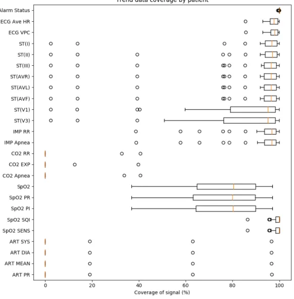
A graph showing the mean, interquartile ranges, and outliers for the data cov-erage of each signal across patients is shown in Figure 4-1.
Figure 4-1: A boxplot showing the mean, interquartile ranges, and outliers for the trend coverage of each signal across patients.
for each individual patient. The majority of the difference between the true coverage and 100% coverage is caused by technical issues that ceased recording, such as the electrodes being detached.
For most patients, ECG lead coverage is very high. The V1 and V3 leads have noticeably lower coverage than the other leads. While most patients receive an 8-lead ECG, some receive a 6-lead ECG, which does not include the V1 and V3 leads, hence the disparity in coverage.
coverage. When the CO2 monitor started collecting data, the impedance-based res-piratory data stopped being collected; thus, this explains most of the cases with abnormally low impedance respiratory coverage.
The SpO2 coverage is noticeably lower than 100%. This is not caused by a few outliers; instead, the SpO2 coverage widely varies across patients. Like the ECG, this is largely due to technical problems that prevent measurement. Specifically, just the SpO2 probes becoming detached accounts for 80.8% of the missing SpO2 coverage.
Notably, the coverage of signals derived from ABP is very low, corresponding to measurements from just three patients. This can be explained by the fact that care providers at Winchester Hospital rarely measure invasive blood pressure. Overall, the signals that come from the ECG have the highest coverage, followed by signals from the PPG. This is expected, as it is standard practice for every patient in the ICU to be connected to an ECG and PPG.
4.2
Alarm Statistics and Alarm Rates
Over all valid recording time, we observed 23,057 alarms, for an average of 196.3 alarms per patient-day. The predominant alarms were the “SpO2 Probe Off”, “Cou-plet”, and “Early VPC” alarms, which composed 25.4%, 11.1%, and 10.0% of the total alarms, respectively.
4.2.1
Alarm priorities and types
Of these alarms, 1,269 (5.5%) were crisis (red) priority, 3,085 (13.4%) were warning (yellow) priority, and 18,703 (81.1%) were advisory (blue) priority. When separated by alarm type, there were 6,420 (27.8%) arrhythmia alarms, 7,332 (31.8%) threshold alarms, 9,286 (40.3%) device alerts, and 19 (0.1%) system alerts. A breakdown of the alarms by both priority and type is shown in Table 4.2.
The number of system alerts is very small. They occur when an error occurs that the monitor cannot identify, but this is a rare occurrence. All red alarms are either arrhythmia or heart rate threshold alarms. This is common in adult ICUs, as
Red Yellow Blue Total Arrhythmia 731 (3.2%) 213 (0.9%) 5,476 (23.7%) 6,420 (27.8%) Threshold 538 (2.3%) 2,199 (9.5%) 4,595 (19.9%) 7,332 (31.8%) Device Alert 0 (0.0%) 673 (2.9%) 8,613 (37.4%) 9,286 (40.3%) System Alert 0 (0.0%) 0 (0.0%) 19 (0.1%) 19 (0.1%) Total 1,269 (5.5%) 3,085 (13.4%) 18,703 (81.1%) 23,057 Table 4.2: Breakdown of alarms by priority and type.
these settings ensure that care providers do not miss these alarms. The red alarms make up a relatively small proportion of the alarms, which are instead dominated by blue alarms. Despite red alarms contributing a comparatively small fraction of all alarms, a disproportionately large effort has focused on reducing the rate of false red alarms, as discussed in Chapter 2.1.1. Our analysis here confirms a prior study from our group that red alarms contribute relatively little to the overall alarm burden [21].
4.2.2
Alarms by device
We can also analyze the alarms by examining which devices cause each alarm. This breakdown is shown in Figure 4-2.
Notably, the vast majority of alarms (86.1%) come from either the ECG or the PPG. This is significant, as it clearly indicates which devices to focus on when developing alarm suppression algorithms. Figure 4-3 gives a more detailed breakdown, describing what alarm messages compose each group.
This breakdown gives further insight into why the ECG and PPG produce the majority of alarms in our patient cohort. The PPG-related alarms represent the plurality of both blue and yellow alarms. The ECG contributes significantly through ST segment threshold alarms, device alerts, and arrhythmias. These arrhythmias include the ones shown in Figure 4-3 at the red priority level, “VPC Run” alarms at the yellow priority level, and “Couplet”, “Bigeminy”, “Early VPC”, and “Freq. VPC” at the blue priority level.
Figure 4-2: Alarm breakdown by priority and device
4.2.3
Alarms by active signals
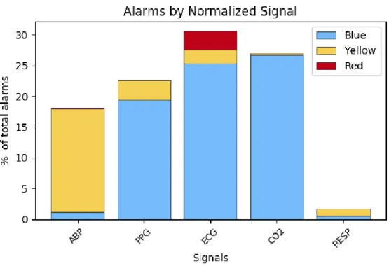
Using the coverage of trend data, as described in Table 4.1, we can normalize the number of alarms by the time that the associated signal was active. The results are shown in Figure 4-4.
As we do not collect trend data for NIBP or the system, we eliminate these alarms from consideration. The number of ABP- and CO2-related alarms increase to similar magnitude as the PPG- and ECG-related alarms when normalized by the coverage of each signal. This could indicate that care providers intentionally avoid measuring ABP and CO2 when unnecessary to reduce the total alarms burden.
4.3
Threshold Alarms
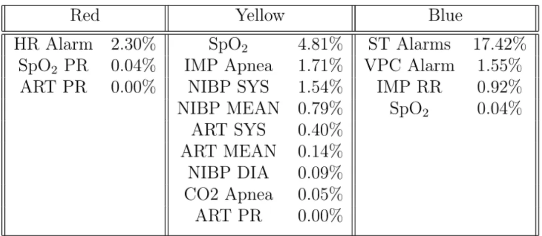
The alarms tagged in the system as threshold alarms, as well as the proportion of each over all alarms observed, are shown in Table 4.3.
Figure 4-3: Alarm breakdown by priority and message
Red Yellow Blue
HR Alarm 2.30% SpO2 4.81% ST Alarms 17.42%
SpO2 PR 0.04% IMP Apnea 1.71% VPC Alarm 1.55%
ART PR 0.00% NIBP SYS 1.54% IMP RR 0.92%
NIBP MEAN 0.79% SpO2 0.04%
ART SYS 0.40%
ART MEAN 0.14%
NIBP DIA 0.09%
CO2 Apnea 0.05%
ART PR 0.00%
Table 4.3: Threshold alarms by priority and percentage of total alarms.
disproportionately large number of alarms. This may be due to artifacts. The number of alarms produced by the SpO2 threshold alarm is unusually small in this patient cohort. Importantly, the Nihon Kohden monitors have a delay for SpO2 threshold alarms, such that the patient’s SpO2 must be at or below the threshold for between 27 and 30 seconds for an alarm to trigger. This would eliminate any alarms caused by brief desaturations, explaining the low number of observed SpO2 alarms.
Figure 4-4: Alarm numbers normalized by data coverage
4.3.1
ST alarms
ST segment elevation and depression both have a number of pathologic implications. Most commonly, ST segment elevation is associated with acute myocardial infarction; this can also appear as ST segment depression in leads distant from the infarct. A non-Q wave infarction may also cause ST segment depression. Depression can also be seen in typical angina, while elevation may be seen in Prinzmetal’s angina [35].
The ST alarms are separable by the ECG lead that measured the threshold-violating signal. The breakdown of ST alarms by lead is shown in Table 4.4.
Lead I II III AVR AVL AVF V1 V3
% of all ST alarms 6.5 6.1 8.5 3.8 4.4 8.8 19.1 42.7 Table 4.4: Breakdown of ST alarms by lead.
The alarms that occur most frequently are ST(V1) and ST(V3). A significant portion of alarms, 44.4%, occur within about fourteen seconds of at least one other ST segment alarm; in fact, every one of these alarms occurs exactly simultaneously with
the other ST segment alarms. The alarms that occur the most frequently together are pairs associated with the V1 and V3 leads, with these making up 37.8% of ST alarm clusters. Alarms associated with the AVF lead and either lead II, III, or both make up another 25.4% of clusters.
4.4
Conclusions
Our results are in partial agreement with previous observations of adult ICUs in academic hospitals.
Inokuchi et al. observed that the monitoring devices that triggered the most prevalent alarms were the ones associated with arterial pressure (33.5%), oxygen saturation (24.2%) and electrocardiogram (22.9%) [12]. Notably, our results similarly show that the PPG- and ECG-related alarms were dominant sources of alarms. The few arterial pressure alarms observed in our study is a result of the lack of arterial pressure coverage; this, in turn, is explained by the setting at a community hospital, as Winchester Hospital rarely measures patients’ arterial pressure.
Chambrin et al. observed the ICUs of two academic hospitals and three com-munity hospitals. The greatest proportion of alarms came from ventilators (37.8%), cardiovascular monitors (32.7%), and pulse oximeters (14.9%) [4]. Again, our results match the high proportion of heart rate and SpO2 related alarms, and again, the lack of ventilator alarms in our study comes from the setting. Patients at Winchester Hospital tend not to be ventilated.
The differences between our results and those of previous studies emphasize the importance of observing a community hospital. Academic hospitals tend to use a wide variety of monitoring devices, while the community hospital we observed primarily used the ECG and PPG. To effectively reduce the number of nuisance alarms across all hospitals, alarm reduction algorithms should focus on alarms from ECG and PPG devices, and blue alarms from these in particular.
Aside from these explainable differences, our results largely agree with previous studies. This contributes to evidence that high alarm rates, especially nuisance alarm
rates, pose issues in community hospitals, with alarm rates similar to those of aca-demic hospitals. The ECG and PPG devices are significant contributors to the total number of alarms.
Chapter 5
Threshold Alarm Analysis
This chapter expands upon the previous discussion of threshold alarms, which com-pose 31.8% of all alarms in our cohort. Specifically, we focus on ST segment, heart rate, and SpO2 Low alarms, as these represent the majority (77.2%) of threshold alarms. First, we report the typical thresholds for each signal and discuss when these are changed by care providers. Second, we describe our methodology for separating alarms into high and low threshold alarms. Third, we consider the duration, excur-sion, and exposure of alarms. We conclude with a discussion of the implications of these statistics.
5.1
Signal Thresholds
Threshold alarms are generated when a signal is equal to or passes either a high or low threshold value for that signal. While thresholds are typically set at a default value, care providers can change them to suit the needs of a particular patient. The default threshold settings are 90% for SpO2 Low, 140 beats per minute (bpm) for HR High, 50 bpm for HR Low, and off for all ST segment thresholds.
In practice, the ST segment thresholds were typically not off; instead, they were most commonly set to 0.200 mV as the high threshold and −0.200 mV as the low threshold. The percent of time each threshold was set at that value and the percent of time it was turned off are shown in Table 5.1. Note that the value for each ST
segment threshold can be set independently of the thresholds for other ST segments. The SpO2 Low, HR High, and HR Low thresholds were frequently set at values other than their defaults. Details on their other settings can be found in Table 5.2. For all thresholds, the threshold settings were unknown for 4.3% of total recording time.
Threshold % Time at ±0.200 mV % Time Off
ST(I) High 93.0 1.43 ST(I) Low 93.0 1.43 ST(II) High 85.1 6.27 ST(II) Low 86.2 6.27 ST(III) High 85.3 5.58 ST(III) Low 86.3 5.58 ST(AVR) High 91.0 1.43 ST(AVR) Low 91.0 1.43 ST(AVL) High 91.8 1.43 ST(AVL) Low 91.8 1.43 ST(AVF) High 91.9 1.43 ST(AVF) Low 93.0 1.43 ST(V1) High 91.0 1.43 ST(V1) Low 91.0 1.43 ST(V3) High 89.2 1.43 ST(V3) Low 90.3 1.43
Table 5.1: ST segment time at typical threshold settings.
Threshold Value % Time at Value SpO2 Low 90 13.4 89 71.9 88 6.1 87 2.7 HR High 140 42.9 150 40.4 160 4.8 180 or 181 4.3 HR Low 50 20.3 45 3.7 40 60.6 35 5.6
Table 5.2: SpO2 and HR threshold settings.
the default SpO2 in other studies, as previously discussed. The ST(II) and ST(III) alarms were set to off more frequently than any other ST segment alarms. All thresh-olds, when changed from their default or typical values, were changed to widen the range of acceptable trend values. This is one strategy care providers employ to reduce the alarm burden.
5.2
Separating High and Low Alarms
Threshold alarms are not labeled as high or low alarms in the alarm message. There-fore, the separation of alarms into high and low threshold alarms must be done man-ually. Alarms were excluded from classification if the threshold was off or unknown at the time of the alarm, or if there was data loss between the “generated” and “ended” messages, as described in Chapter 3.4. Alarms were separated according to whether the high or low threshold was violated during the alarm. However, some events in-volved the ST segment trend crossing both the high and low thresholds during the same alarm. The number of threshold alarms, separated into high, low, and ones that cross both thresholds with this method, is shown in Table 5.3.
5.3
Duration, Excursion, and Exposure
To understand the severity of the events associated with the threshold alarms, we consider the duration, excursion, and exposure of each. The duration is the amount of time that a signal is violating the threshold. The excursion is the absolute value of the greatest distance between the signal and the threshold during an event. The exposure is the integral over time of the difference between the threshold and signal.
5.3.1
SpO
2low
The Nihon Kohden monitors have a delay mechanism built in for SpO2 Low alarms. Specifically, the alarm does not sound unless the SpO2 trend has been equal to or below the SpO2 Low threshold for a variable number of seconds between 27 and 30,
Alarm Number % of category SpO2 Low 1028 100% HR High 294 65.5% Low 155 34.5% ST(I) High 77 30.7% Low 147 58.6% Both 27 10.8% ST(II) High 135 70.7% Low 56 29.3% Both 0 0.0% ST(III) High 171 64.8% Low 71 26.9% Both 22 8.3% ST(AVR) High 45 38.8% Low 57 49.1% Both 14 12.1% ST(AVL) High 54 39.4% Low 62 45.3% Both 21 15.3% ST(AVF) High 192 67.6% Low 76 26.8% Both 16 5.6% ST(V1) High 275 43.5% Low 218 34.5% Both 139 22.0% ST(V3) High 625 41.3% Low 512 33.8% Both 376 24.9%
Table 5.3: Number of threshold alarms.
inclusive. Our analysis treats the duration of SpO2 Low alarms as the full time below the threshold. However, we do not consider events when the SpO2 was not below the threshold long enough to trigger the alarm. Thus, the minimum time of most SpO2 alarms we consider is 27 s. However, we observe a small number of alarms with shorter times, when our recording did not capture the full period of threshold violation before the alarm sounded.
The cumulative distribution functions (CDFs) for each of the duration, excur-sion, and exposure are shown in Figure 5-1. The median duration of SpO2 alarms is 51.2 seconds, while the median excursion is 4.0 percentage points and the median
exposure is 104.4 seconds times percentage points.
Figure 5-1: The left, center, and right subplots show the CDFs for the duration, excursion, and exposure, respectively, for SpO2 Low alarms.
While 90% of SpO2 Low alarms have durations of 150 seconds or shorter, the upper 10% of alarms have abnormally long durations. Visual inspection of these alarms suggests that they are not caused by artifacts. Similarly, the abnormally large exposures are a consequence of alarms with long durations. The lower 90% of SpO2 Low alarms have excursions of 12% or lower. While some of the alarms in the upper 10% appear to be due to measurement problems, others have an unclear cause. Together, these are a future topic of research. Alarms that have both abnormally long durations and large excursions could indicate measurement issues, but raise questions about why a device alert was not issued instead, or why care providers did not address such an abnormal signal for so long.
5.3.2
Heart rate high
Unlike the SpO2 Low alarm, the HR High alarm starts exactly when the patient’s heart rate is equal to or crosses the high threshold. The CDFs for each of the duration, excursion, and exposure are shown in Figure 5-2. The median duration is 3.1 seconds, the median excursion is 7 bpm, and the median exposure is 20.0 seconds times bpm. The durations of the HR High alarms are generally within reason; 90% of alarms have duration less than 15 seconds, and all have duration under 45 seconds. This is
Figure 5-2: The left, center, and right subplots show the CDFs for the duration, excursion, and exposure, respectively, for HR High alarms.
to be expected, as the HR alarms are red priority and therefore should provoke a fast response. While there are many alarms with unusually high excursions, especially considering the already high threshold, many do not appear to be the result of noise or measurement error. Future research could study these more closely to better determine the cause.
5.3.3
Heart rate low
The CDFs of the duration, excursion, and exposure for HR Low alarms are shown in Figure 5-3. The median duration for the HR Low alarm was 2.0 seconds, while the median excursion was 2 bpm, and the median exposure was 3.1 seconds times bpm.
All alarms with a duration greater than 25 seconds are the result of the heart rate being reported as zero. All abnormally high excursions are the result of this as well. These are visible on the graph above, as there are steps at excursions of 40 and 50 bpm, which are the most common HR Low thresholds. These are likely indications of measurement error, as almost all are preceded or followed, or both, by a period of invalid data due to device disconnect or malfunction.
Preventing alarms from sounding for a short delay after measurement resumed would eliminate the alarms that are preceded by measurement error; more generally, eliminating these alarms and instead issuing device error alarms would more
accu-Figure 5-3: The left, center, and right subplots show the CDFs for the duration, excursion, and exposure, respectively, for HR Low alarms.
rately address the situation. Of the total 155 HR Low alarms, 35 (22.5%) are alarms that sound when the HR is reported as zero. The CDFs of HR Low alarms with these eliminated is shown in Figure 5-4, to demonstrate the typical duration, excursion, and exposure of physiologic alarms.
Figure 5-4: The left, center, and right subplots show the CDFs for the duration, excursion, and exposure, respectively, for HR Low alarms when the alarms indicating a zero measurement have been eliminated.
5.3.4
ST segment high
We group all ST Segment High alarms together when considering their duration, excursion, and exposure, the CDFs of which can be found in Figure 5-5. The median duration was 16.4 seconds, the median excursion was 0.090 mV, and the median exposure was 1.690 seconds times mV.
Figure 5-5: The left, center, and right subplots show the CDFs for the duration, excursion, and exposure, respectively, for ST Segment High alarms.
Like the other threshold alarms, the 10% of alarms with the greatest duration appear abnormal in comparison to the lower 90%, which all have duration under 50 seconds. However, the trend data underlying these alarms appear to be physiologically possible, as opposed to appearing noisy or as measurement error. Similarly, large excursion values are not preceded or followed by data that indicate measurement error in most cases. Further research is needed to understand how care providers address these alarms, especially ones with long durations.
5.3.5
ST segment low
The CDFs of the duration, excursion, and exposure for ST Segment Low alarms can be found in Figure 5-6. The median duration was 16.4 seconds, while the median excursion was 0.210 mV, and the median exposure was 3.533 seconds times mV.
Figure 5-6: The left, center, and right subplots show the CDFs for the duration, excursion, and exposure, respectively, for ST Segment Low alarms.
noticeably different from the bulk of alarms. In particular, the alarm with the greatest duration lasts for 1,147 seconds, while all other alarms have duration under 215 seconds. Despite this, the trend data associated with this alarm do not appear noisy or indicate measurement error. The alarms with the largest excursion and exposure are similar, with no obvious explanation for their abnormal values.
5.4
Conclusions
Investigating the CDFs indicates that abnormal HR High and HR Low threshold alarms may indicate device errors. In contrast, abnormally long SpO2 Low and ST segment alarms do not show evidence of measurement errors. Instead, they suggest that care providers allow these alarms to continue for great amounts of time. This difference could be a result of the alarm priority; as HR alarms are red priority, they may receive more immediate attention from care providers. Eliminating alarms clearly caused by measurement error could reduce the number of erroneous HR alarms. Further research is needed to explain the extremely long durations of other threshold alarms.
Chapter 6
Alarm Annotations
This chapter considers the annotations provided for the alarms. We consider basic statistics about which alarms were annotated and the relevant implications. We also examine the duration, exposure, and excursion of annotated alarms. Finally, we examine care providers’ actions in silencing, suspending, and turning off all alarms.
6.1
Annotation Statistics
In total, we had annotations for 756 alarms. As care providers were instructed to not annotate device and system alert alarms, there were 13,752 alarms that could poten-tially be annotated; thus, our annotations represent 5.50% of alarms that could be annotated. Annotations could be given at the bedside monitor or the central station. While the vast majority of alarms were annotated at just one of these monitors, 14 were annotated at both with conflicting messages. Of these, six were arrhythmias that were labeled as advisory at the bedside and actionable at the central station. Another five were arrhythmias or heart rate alarms labeled as nuisance at the bedside and advisory at the central station. An arrhythmia and a ST segment threshold alarm were both labeled as induced at the bedside and nuisance at the central station. One SpO2 alarm was labeled as induced at the beside and advisory at the central station. In nearly every case, the annotation at the central station indicates the alarm is more severe than the annotation at the bedside monitor. These alarms are excluded from
the following analysis, as their annotation is unclear. The breakdown of alarms in observed in each category is given in Figure 6-1.
Figure 6-1: Breakdown of annotations by alarm message and priority.
The top five alarms that had the highest number of annotations relative to the total instances of that alarm were red arrhythmia and red HR threshold alarms. Specifically, the alarms with the highest proportion of annotations were for ventricular tachycardia, asystole, tachycardia, ventricular fibrillation, and heart rate threshold alarms, in decreasing order. One explanation for why care providers annotated these alarms more frequently than others is that, due to the priority level, they were more likely to attend to the patient.
annotation were blue alarms. These could be left unannotated if care providers did not attend to blue alarms, instead mainly prioritizing red alarms. Alarms with no annotations included all NIBP alarms, impedance respiratory alarms, and ST segment alarms for leads I, III, AVF, AVR, and V1. The other alarms with no annotations were alarms that occurred less than twelve times, making it difficult to draw conclusions about them. While the NIBP-related alarms are all yellow alarms, the others are all blue alarms. This supports the idea that care providers typically do not respond to blue alarms. It also suggests that care providers tend not to respond to NIBP-related alarms, though further research is needed.
Generally, all ST alarms have few annotations. Of the eight types, five have no annotations, two have annotation for less than 1% of alarms, and one has annotations for 3.3% of alarms. Our previous observation that ST segment alarms compose a relatively large proportion of all alarms, with the implication that care providers rarely respond to ST segment alarms, indicates that algorithms to suppress nuisance ST segment alarms could be effective in reducing the overall alarm burden in this cohort.
6.2
Annotated Threshold Alarms
To understand why the HR and SpO2 threshold alarms have their annotations, we examine the durations, excursions, and exposures of each. We exclude ST segment alarms from this analysis, as too few were annotated to be considered.
There were 17 SpO2 alarms annotated as nuisance, 80 as advisory, and 6 as ac-tionable. However, the thresholds were unknown for 2 nuisance alarms and 9 advisory alarms, so we cannot calculate the excursion or exposure and therefore we exclude them from our analysis. The HR alarms were separable into HR High and HR Low threshold alarms. The HR High alarms had 1 induced, 13 nuisance, 37 advisory, and 6 actionable, while the HR Low alarms had 1 induced, 5 nuisance, 4 advisory, and 1 actionable. There were 8 nuisance and 18 advisory HR alarms excluded due to unknown thresholds. No alarms were excluded due to invalid data. Table 6.1 gives
the median values for the duration, excursion, and exposure of the alarms that could be analyzed.
Alarm Duration Excursion Exposure
SpO2 Low Nuisance 75.8 s 7.0% 215.0 s · % Advisory 68.6 s 3.0 % 109.6 s · % Actionable 72.7 s 3.0 % 97.8 s · % HR High Induced 1.0 s 0.0 mV 0.0 s · mV Nuisance 4.1 s 13.0 mV 89.1 s · mV Advisory 5.1 s 5.0 mV 17.4 s · mV Actionable 4.1 s 11.0 mV 44.5 s · mV HR Low Induced 8.2 s 50.0 mV 409.6 s · mV Nuisance 13.3 s 40.0 mV 614.4 s · mV Advisory 4.1 s 4.5 mV 12.8 s · mV Actionable 6.1 s 4.0 mV 16.4 s · mV Table 6.1: SpO2 and HR threshold settings.
The most striking difference between nuisance alarms and actionable or advisory alarms is the difference in excursion. This could suggest that large excursions are the cause of measurement error or device noise, as opposed to true physiological changes, although the total number of annotated alarms is quite low.
6.3
Alarm Silencing
Annotations are not the only indication of care provider action that we observed. Care providers are able to temporarily silence, suspend, or turn off all alarms. The default status is all alarms on, in which new alarms can be generated and all alarms produce a sound. Silencing does not end any alarms that are currently on, but prevents them from producing sound. Suspending alarms prevents any new alarms from being generated for the duration of the suspension. Both silencing and suspension have default durations of 2 minutes, and can be set to 1, 2, or 3 minutes in duration, independent of the other. After the duration has passed, the alarms return to the default on status. Turning off all alarms prevents all alarms from sounding until the settings are changed again.
![Figure 3-2: An example of the bedside monitor display screen from the Nihon Kohden Operator’s Manual [26].](https://thumb-eu.123doks.com/thumbv2/123doknet/14243294.487142/30.918.258.652.706.975/figure-example-bedside-monitor-display-kohden-operator-manual.webp)