Recent Boom and Great Recession
The MIT Faculty has made this article openly available.
Please share
how this access benefits you. Your story matters.
Citation
Adelino, Manuel, Antoinette Schoar, and Felipe Severino. “Dynamics
of Housing Debt in the Recent Boom and Great Recession.” NBER
Macroeconomics Annual 32, no. 1 (April 2018): 265–311.
As Published
http://dx.doi.org/10.1086/696054
Publisher
University of Chicago Press
Version
Final published version
Citable link
http://hdl.handle.net/1721.1/121093
Terms of Use
Article is made available in accordance with the publisher's
policy and may be subject to US copyright law. Please refer to the
publisher's site for terms of use.
Dynamics of Housing Debt in the Recent Boom
and Great Recession
Manuel Adelino, Duke University and NBER Antoinette Schoar, MIT and NBER
Felipe Severino, Dartmouth College
Adelino, Schoar, and Severino
The lasting impact of the mortgage crisis of 2008 on the US economy and international financial markets has spurred an intense debate among economists and policymakers about the origins of the crisis. The collapse of collateral values post- 2007 led to a large increase in de-faults, which in turn disrupted banks and the shadow banking system and was a leading cause of the deep recession that followed. Even af-ter large government- stabilization programs, low house prices and de-pressed expectations held back investment and consumption. The rapid increase in household debt over the first decade of the twenty- first century, especially mortgage credit, has been widely documented, but views differ on what drove this expansion in credit. This paper outlines the two major narratives that have been proposed to explain the crisis and lays out the evidence that aims to differentiate them. We call these the subprime view and the expectations view of the boom and bust. We provide new facts and confirm several prior findings on the evolution of debt, homeownership rates, debt- to- income (DTI) ratios, and loan- to- value (LTV) ratios during both the housing boom and the housing bust.1 The results support the idea that house prices and house price
expectations played a central role in both the expansion of credit and the subsequent housing market bust.
One view of the housing boom and bust is that financial innovation and deregulation in the precrisis period led to increased securitization and delegation in underwriting, which in turn exacerbated agency problems within the mortgage origination chain and led to distortions in underwriting (the subprime view). A number of theory papers have laid out particular channels by which these distortions might have af-fected mortgage lending, such as Parlour and Plantin (2008), Dang,
Gor-ton, and Holmström (2010), and Chemla and Hennessy (2014). Popular narratives (such as Michael Lewis’s The Big Short in 2015 and the 2010 movie Inside Job) put forward the idea that increased misalignment of incentives led financial institutions to provide unsustainable credit to low- income and poor- credit- quality borrowers, so- called subprime bor-rowers, who previously might have been rationed out of the mortgage market (see, e.g., Mian and Sufi 2015).
The alternative view emphasizes the role of house price expectations in explaining the increased credit supply (the expectations view). Ac-cording to this view, inflated house price expectations led banks to un-derestimate the potential for losses and the losses given default. Inflated house price expectations might also have led borrowers to increase de-mand for housing and exploit the expanded credit supply.2 However,
heterogeneous priors about house prices by themselves do not lead to boom- and- bust cycles because prices would immediately adjust, and the impact of optimistic agents in the housing market must vary over time in order to generate those cycles. One channel through which the role of optimistic agents changes endogenously over the business cycle is changes in collateral- lending standards.3 Looser collateral standards
after periods of good performance in the housing market (higher com-bined loan- to- value ratios [CLTVs]) can allow more optimistic agents to hold a larger fraction of assets and, as a result, drive up house prices.4
An alternative channel proposes that the number of optimistic agents changes with the credit cycle. For example, if house price expectations are extrapolative or adaptive, initial increases in house prices can feed on themselves; see, for example, Barberis et al. (2015), Lo (2004), Gen-naioli, Shleifer, and Vishny (2015), or DeFusco, Nathanson, and Zwick (2017). Burnside, Eichenbaum, and Rebelo (forthcoming) provide a dif-ferent microfoundation via social contagion, where optimistic agents with tighter priors can convince less optimistic agents to change their beliefs.
What might have triggered these initial changes in house prices and expectations? The savings glut that led to increasing capital inflows to the United States and lower interest rates is often seen as a trigger for increasing house prices (see, in particular, Bernanke 2007; Rajan 2011; Bhutta 2015). These might have been exaggerated by demographic trends in mobility (Ferreira and Gyourko 2011) or gentrification trends (Guerrieri, Hartley, and Hurst 2013).
It is important to understand the primary drivers of the recent boom- and- bust cycle in household leverage, since it not only affects the
diag-nosis but also suggests different policy changes to guard against future crises. If the first view dominates, then regulations that force lenders to have more skin in the game, reduce securitization, and impose stricter screening of (marginal) borrowers are central. Under the second view, the focus needs to be on macroprudential regulation and rules that sup-port the stability of banks, even when asset values change or may be overinflated.5
The discussion above illustrates the challenges of differentiating be-tween the subprime view and the expectations view of the crisis. The explanations are not mutually exclusive and may even reinforce each other. If, for example, market participants believe that house prices can only rise, they may not see a need to screen borrowers because higher house prices protect the lender. As a result, changes in house price ex-pectations may themselves trigger changes in lending standards, and the loosening of credit standards might be the result of rising house price expectations rather than the cause of those increases.6 The
chal-lenge of cleanly testing these models lies not only in the common prob-lem that economic outcomes are endogenously determined, but also in that expectations are generally not observed.
We show, however, that the expectations view and the subprime view have several defining differences. A central prediction of the subprime view is that a relaxation in credit standards leads to cross- sectional dislo-cations in credit flows toward poorer and subprime borrowers, as Mian and Sufi (2009) point out. As a result, aggregate credit flows, DTI ra-tios, and even LTV ratios should increase disproportionately for these marginal groups, independent of house price increases. We show that, instead, and in line with the expectations view, areas with rapid house price increases saw the bulk of the credit expansion and similar in-creases in homeownership rates. In these areas, homeowners also took on more credit by accelerating the speed with which they sell and buy homes (churn) and obtain cash- out refinances. Importantly, though, the credit expansion was not particularly concentrated in low- credit- score or low- income borrowers. At the same time, the distribution of LTV ratios at origination (i.e., the LTV ratios of the new purchases) re-mained unchanged over the boom period, suggesting that lenders took the higher house prices at face value and lent in response to higher house values (higher “Vs”)7. After the onset of the crisis, however, defaults
went up disproportionately in areas where house prices dropped most significantly, and middle- income and average- credit- score borrowers saw a very large increase in their share of total defaults. In what follows,
we provide a comprehensive analysis of the credit dynamics of the re-cent boom- and- bust cycle.
Credit Flows, Stock, and DTI. We first document that there were no significant cross- sectional dislocations in either aggregate credit flows or the stock of household debt across income or FICO bins. Using loan- level data from the Home Mortgage Disclosure Act (HMDA) and Lender Processing Services (LPS), we confirm that the flow of new (purchase) mortgage credit across the income and credit score distribution was stable over the period 2001–2007 (consistent with evidence in Adelino, Schoar, and Severino [2016]). Of course, the dollar amount of purchase mortgage credit grew significantly over this time, but it did so for all income and FICO- score groups. Credit flows, however, may tell only an incomplete story of the stock of household leverage if households across income groups: (a) differentially retire or refinance existing debt, (b) in-crease how quickly they buy and sell houses (churn), or (c) change the likelihood of entering into homeownership. Therefore, we first use Sur-vey of Consumer Finances (SCF) data, which track the entire stock of mortgage debt, including purchase mortgages, second liens, and other home equity lines to show that the stock of DTI at the household level increased proportionally across the income distribution. Foote, Loew-enstein, and Willen (2016) confirm this finding using Equifax data. We then use data from the American Community Survey (ACS) to create a proxy for the household’s debt burden. We look at housing cost as a proportion of income as a measure of the household’s mortgage debt burden, including second liens and other home equity lines. We show that housing costs as a share of income moved together for all home-owners in the data with the exception of households at the very top of the income distribution.
The ACS data also allow us to break out the increase in homeowner-ship cost by states with above- and below- median house price appre-ciation. We find a much higher increase in the cost of ownership for people in high- appreciation areas compared to low- appreciation areas; for example, for the middle 60% of households by income, the cost of owning increases by 6–8 percentage points of income more in these ar-eas than in low- appreciation arar-eas between 2001 and 2006. This incrar-ease is entirely reversed by 2011. These results suggest that the changes in the cost of homeownership are fundamentally tied to area house price movements. A very similar picture emerges when we look at house val-ues as a share of income.
While this is separate from the subprime view of the crisis, one might wonder whether DTI ratios and observable characteristics of house-holds capture the full story of the mortgage expansion. For example, did credit flow to households that were “marginal” borrowers on un-observable dimensions (e.g., due to unobserved future income risk)? Testing for unobservable characteristics is difficult by definition, but we can analyze whether mortgage acceptance rates within DTI bins increased during this period. In figure A1 of the appendix, we show that the acceptance rate of mortgage applications within DTI bins did not go up during the boom. In fact, we see a slight downward trend, especially for the higher income groups. Given that approval rates con-ditional on income bins did not change significantly, it is unlikely that there was a massive change in the selection on unobservables at the same time.
Homeownership Rates. Second, using ACS data on homeownership rates, we show that the boom made homeownership less accessible for the lowest- income households. Starting in 2001, low- income house-holds entered homeownership at lower rates than middle- and high- income households, and households above the 20th percentile all saw similar increases in homeownership over the period. When we break out the results by areas with fast and slow house price growth, we find that the results hold similarly in both types of areas. But the steep de-cline in ownership rates for the lowest- income group already starts in 2001 for areas with low house price appreciation. These results are con-sistent across three large- scale census surveys (the ACS, the American Housing Survey, and the Consumer Population Survey). The patterns are also consistent with Acolin et al. (2017), who show that subprime lending was not associated with increases in homeownership rates, and with Foote, Loewenstein, and Willen (2016), who use the SCF and find no increases in homeownership for low- income households. These re-sults contradict the view that distortions in credit originations occurred at the extensive margin (Mian and Sufi 2016), and that lax lending stan-dards allowed low- income households, who previously were rationed out of the market, to become homeowners. It also suggests that in the post- 2000 period, the Community Reinvestment Act did not achieve its goal of increasing homeownership of lower- income households. Cost of Renting Relative to the Cost of Owning. Third, using ACS data, we show that the gap in the cost of renting versus that of owning
(for recent movers) was relatively close at the beginning of the twenty- first century, but it increases to 4% of income on average at the peak of the boom. After the onset of the crisis, this gap drops by a full 10% of income. For households in the second income quintile, rental costs jump the most and become higher than the cost of owning. These pat-terns are consistent with the expectations view as in Kaplan, Mitman, and Violante (2016), where future house price appreciation sustains the divergence between costs of renting and owning. The results also sug-gest that, once the crisis started, large parts of the housing stock were tied up in foreclosures and drove up rental costs, especially for low- income households.
Churn. Another channel through which households can lever up is by increasing how quickly they move into new (potentially larger) homes. Each time a household moves, it typically repays an older (and usually lower LTV and DTI) mortgage and gets a new mortgage, which resets the mortgage to a new and higher level. We show that the rate at which owners moved into new homes peaked in 2006, with approximately 8% of households moving in each year. This rate increased in lockstep across the income distribution. Low- income households had lower lev-els of churn relative to higher- income ones during the boom, 6% versus 9%, respectively. For all income groups, the rate of movement drops to about 5% during the crisis period and returns to about 6% by 2015. This is in line with the notion that optimistic homeowners exploited increas-ing house prices by flippincreas-ing houses more quickly and usincreas-ing the capital gains in one property as a down payment for a larger home (Stein 1995). For example, Piazzesi and Schneider (2009) show that the fraction of homeowners who are very optimistic about house prices doubled be-tween 2004 and 2006 (from 10% to 20% of the population).
LTV. To better understand the role that house prices played in increas-ing DTI levels durincreas-ing the boom period, we analyze CLTV levels, a cen-tral parameter in determining the tightness of collateralized lending.8
We use data from CoreLogic (formerly DataQuick) for this analysis. A number of theories suggest that increases in house prices play an im-portant role in explaining household leverage via LTV levels (Makarov and Plantin [2013, Landvoigt, Piazessi and Schneider [2015]). Interest-ingly, the distribution of CLTV levels at origination between 2001 and 2007 was very stable, with almost no changes over time. The median home purchase had a CLTV of 90%, and loans at the 90th percentile of leverage had a CLTV of almost 100%, even at the beginning of the first
decade of the twenty- first century. Maybe even more surprisingly, there are no pronounced differences in the evolution of CLTV ratios when we split the data by areas with high and low house price growth or by level of house price. These results are consistent with Ferreira and Gyourko (2015), who use similar data and track CLTVs of households at origination and over time. Taken together, these results do not sup-port a view that lenders relaxed collateral constraints by significantly changing CLTV ratios. Instead, lenders seem to have lent against in-creased home prices without factoring in the risk that house- price levels could be too high or that there might be a house price downturn. This view is supported by Cheng, Raina, and Xiong (2014), who use personal home transaction data to show that midlevel managers in securitized finance did not seem to anticipate the housing downturn. Also in line with the idea that lenders passively lent against increased house prices but otherwise did not significantly increase access to finance for mar-ginal borrowers, we find that households in all income quintiles who purchase homes have similar (and small) drops terms of the stability of employment over the boom. While higher- income households are more likely to have at least one member of the family employed full time, these differences between income levels did not change over the boom. However, at the onset of the mortgage crisis, we see a sudden spike in the share of households with full- time employment, which most likely reflects the tightening of credit during the Great Recession.
Defaults. Finally, when looking at ex post defaults, Adelino et al. (2016) show that middle- income and prime borrowers all sharply increase their share of total delinquencies in the crisis compared to precrisis patterns. This sharp increase, moreover, is concentrated in prime borrowers in high house appreciation areas in the boom (see also Mayer, Pence and Sherlund [2009], who show that near-prime borrowers had a larger proportional increase in delinquency rates than subprimme ones, Albanesi, De Giorgi, and Nosal [2016] using Equifax data).9 This set of facts is most consistent
with the expectations view, where borrowers took out mortgages against inflated house price values and defaulted when house prices dropped.
In light of the evidence presented above, it is important to understand why some of the earlier empirical literature about the housing crisis ar-rived at different conclusions to rule out the relevance of the expecta-tions view. The subprime view as proposed in Mian and Sufi (2009) relies on two main findings. First, the authors suggest that there was a disproportionate flow of new mortgage debt to low- income house-holds. This finding seems to be in direct contrast to the findings
docu-mented above. The discrepancy stems from the fact that Mian and Sufi (2009) use mortgage and income data aggregated up to the ZIP Code level, and not the household level. At the ZIP Code level, mortgage credit can go up for two reasons: either because there is an increase in average mortgage size (DTI) or because of an increase in originations in a ZIP Code due to quicker selling and buying of houses (churn).10 As
shown in Adelino et al. (2016), the negative correlation between mort-gage growth and income growth at the ZIP Code level is entirely driven by the increase in the rate of churn across neighborhoods.11 Therefore,
once we decompose these different margins of credit flows, there is no cross- sectional dislocation in either credit flows or homeownership rates to lower- income or marginal households.
A second major argument to rule out that expectations were the key driver for the credit expansion is that it was instead subprime lending in a ZIP Code (as a proxy for distorted incentives) that drove house price growth. On average, it is the case that neighborhoods with a higher share of subprime lenders (and loans) had quicker credit expansion, since these lenders tend to be in neighborhoods that saw quicker house price growth. However, there is significant heterogeneity in house price growth and the share of subprime loans between neighborhoods. If we do a simple double- sort of ZIP Codes by the market share of subprime lenders and the growth in house prices between 2002 and 2006,12 we
see that growth in mortgage origination sorts strongly with house price growth, independent of the level of subprime lenders in the ZIP Code. This means that credit went up significantly, even in areas with a small fraction of subprime lenders but high house price appreciation. The correlation is much weaker in the other direction: once we control for house price growth in an area, there is only a weak correlation be-tween mortgage growth with the share of subprime lending. This sug-gests that, even though subprime lenders tend to be located more often in neighborhoods that experienced higher house price growth in the boom, they are unlikely to be driving the growth. While it is, of course, not possible to establish causality with this type of cross- sectional anal-ysis, the results again point to the role of asset prices, even when ex-plaining where subprime lending expanded and where not.
In sum, a careful review of the major trends in mortgage markets leading up to the 2008 crisis casts doubt on a one- sided explanation of the events as a subprime crisis. The results presented here support a view of the boom in which financial institutions and banks bought into increasing house prices because of overly optimistic expectations. This broad- based increase in borrowing and housing prices might have
been triggered initially through lower interest rates at the beginning of the twenty- first century. In turn, credit standards may have fallen as a
result of higher house prices because lenders were too willing to rely on collateral values alone.
Our results also show why it is important to understand the drivers of the crisis. We show that, after 2008, credit to lower- income borrowers dropped dramatically and prompted a significant decline in homeown-ership rates for low- income households. Seen through the lens of the subprime view, one might have welcomed the change in mortgage mar-kets as a sign that marginal or low- income groups were now success-fully being screened out. Under the expectations view, however, these facts raise the concern that regulatory changes that more significantly affected lower- income households prevented them from buying houses when prices were historically low, without improving the stability of the mortgage market.
I. Data Description
We use four main sources of data. First, for all household- level survey data we rely on the American Community Survey (ACS one- year and five- year public use microdata samples [PUMS]), an annual survey con-ducted by the census of US households. This is the most reliable data source that allows us to jointly analyze a household’s homeownership and employment status, financial situation, and demographic situa-tion. We also use census data from 1980, 1990, and 2000 for computing historical homeownership rates in figure 7 (similar to, among others, Acolin, Goodman, and Wachter, forthcoming). Census data is obtained from the Integrated Public Use Microdata Series made available by the Minnesota Population Center at the University of Minnesota (Ruggles et al. 2015).
In the appendix, we also confirm the reported time- series patterns of homeownership using the American Housing Survey (AHS) and the Current Population Survey (CPS)/Housing Vacancy Survey (CPS/ HVS), all from the census. The CPS/HVS is a widely cited survey on the aggregate homeownership rate in the United States, but it relies on a much smaller sample than the American Community Survey. As a result, estimates of the homeownership rate in subgroups over time are more reliable using the ACS, which is what we focus on. The appendix shows that, while there are differences in the baseline levels of home-ownership between the different samples, our main results hold in all three data sets (ACS, AHS, and CPS/HVS).13
Second, we use data from the Home Mortgage Disclosure Act (HMDA) data set, which contains the universe of US mortgage applications in each year. The variables of interest for our purposes are the loan amount, the purpose of the loan (purchase, refinance, or remodel), the action type (granted or denied), the lender identifier, the location of the borrower (state, county, and census tract), and the year of origination. We match census tracts from HMDA to ZIP Codes using the Missouri Census Data Center bridge. This is a many- to- many match, and we rely on popu-lation weights to assign tracts to ZIP Codes. We drop ZIP Codes for which census tracts in HMDA cover less than 80% of a ZIP Code’s pop-ulation. With this restriction, we arrive at 27,385 individual ZIP Codes in the data.
Third, we obtain house price data from both the Federal Housing Finance Agency (FHFA) (for state- level house prices) and from Zillow. The ZIP- Code- level house prices are estimated using the median house price for all homes in a ZIP Code as of June of each year. Zillow house prices are available for only 8,619 ZIP Codes in the HMDA sample for this period, representing approximately 77% of the total mortgage orig-ination volume in HMDA.
Fourth, we also use a loan- level data set from LPS that contains de-tailed information on the loan and borrower characteristics for both purchase mortgages and mortgages used to refinance existing debt. This data set is provided by the mortgage servicers, and we have access to a 5% sample of the data. The LPS data include not only loan char-acteristics at origination, but also the performance of loans after origi-nation, allowing us to look at ex post delinquency and defaults. One constraint of using the LPS data is that coverage improves over time, so we start the analysis in 2003 when we use this data set. Coverage of the prime market by the LPS data is relatively stable at 60% during this pe-riod, but its coverage of the subprime market is lower (at around 30%) at the beginning of the sample and improves to close to 50% at the end of the sample (Amromin and Paulson 2009).
Finally, to look at the role of collateral and loan- to- value in the hous-ing market, we use a data set from CoreLogic (formerly DataQuick) that includes all ownership transfers of residential properties available in deeds and assessors’ records over 17 years (from 1996 to 2012) across metropolitan areas in all 50 states. Each observation in the data contains the date of the transaction, the amount for which a house was sold, the size of the first, second, and third mortgages, and an extensive set of characteristics of the property itself.
II. Summary Statistics
We show summary statistics for the 2000 Census and the ACS five- year sample in table 1. The first set of statistics refer to real median income in each sample (2000, 2005, 2010, and 2015), as well as the maximum nomi-nal income for quintiles 1 through 4. The income threshold for house-holds in the lowest quintile is $18,000 as of 2000, and about $23,000 as of 2015, both well below half the median income of households in those periods (note, again, that we report real median income; the median
Table 1
Summary Statistics
2000 2005 2010 2015
A. Income (median, 2000 dollars) 41,900 40,122 39,385 40,161
Upper Bound of each Quintile: Quintile 1 (lowest income) 18,000 19,000 20,200 22,900
Quintile 2 33,300 36,000 39,000 43,400
Quintile 3 51,400 56,800 61,900 70,000
Quintile 4 80,000 90,000 99,800 112,250
B. Homeowner (%) 66.2 67.5 65.3 63.1
Quintile 1 (lowest income) 43.1 42.5 39.2 38.8
Quintile 2 56.5 57.3 55.4 53.1
Quintile 3 67.0 68.6 66.6 64.0
Quintile 4 77.7 80.0 77.8 75.0
Quintile 5 (highest income) 86.9 89.6 87.6 85.1
C. Percent movers (over last 12 months, %) 7.9 8.2 4.9 5.8
Quintile 1 (lowest income) 6.4 6.6 4.4 4.8
Quintile 2 7.8 7.6 4.6 5.2
Quintile 3 8.4 9.0 5.3 6.0
Quintile 4 8.9 8.7 5.2 6.2
Quintile 5 (highest income) 7.7 8.3 4.7 6.2
D. Housing cost/income (movers, %) 26.2 31.0 28.1 24.9
Quintile 1 (lowest income) 52.3 63.9 60.8 59.4
Quintile 2 32.4 39.5 35.1 32.2
Quintile 3 25.7 31.1 27.4 23.9
Quintile 4 21.0 25.3 22.3 20.0
Quintile 5 (highest income) 17.1 19.7 17.5 15.0
Number of observations 5,663,214 1,245,246 1,397,789 1,496,678 Notes: Data from the 2000 Census and the American Community Survey. Panel A shows the income median per year in 2000 dollars in the first row (real income) and then nomi-nal income upper bound for each income quintile. Panel B shows the percentage of home-owners per year and income quintile. Panel C shows the percentage of homehome-owners than moved within the last 12 months per year and income quintile. Panel D shows the hous-ing cost as a percentage of income shown for homeowners who moved within the last year.
nominal income as of 2015 in the ACS was $55,000). This is important to keep in mind when we introduce the results on the share of income spent on housing for each income group.
While we discuss the evolution of homeownership rates in much more detail below, this table shows the level of homeownership for each quintile over time. The main takeaway is that homeownership rates sort strongly with income levels. Households in the lowest quintile hover around 40%, those in the second are about 15 percentage points higher, and households at the very top have a homeownership rate that is above 85% in all years in the data since 2000, and reach close to 90% at the peak of the boom.
We also show summary statistics on the share of homeowners that move in the 12 months prior to the survey year. About 8% of homeown-ers move in each year during the boom period (2000 and 2005), and this drops significantly during the crisis to about 5%. This pattern is gener-ally visible for all income quintiles.
Finally, table 1 shows the average cost of housing as a proportion of household income for homeowners that moved over the last 12 months. Housing costs include, according to the Census Bureau, “payments for mortgages ( . . . ) (including payments for the first mortgage, second mortgages, home equity loans, and other junior mortgages); real estate taxes; [all] insurance on the property; utilities (electricity, gas, and wa-ter and sewer) ( . . . ). It also includes, where appropriate, the monthly condominium fee for condominiums and mobile home costs.” The av-erage for all homeowners is between 25 and 31% over our sample, with significant variation across income quintiles. Households in the bottom quintile of the income distribution spend over 50% of their income on housing, whereas those at the top are at 20% or below. Variation in the share of income spent on housing tracks the evolution of house prices during this period.
III. Distribution of Purchase Mortgages
We first report a direct measure of the dynamics of purchase mortgage origination between 2001 and 2015. We focus on the 8,619 ZIP Codes for which we have house price information from Zillow, the same sample used in Adelino et al. (2016). We split the sample into quintiles based on the median household income from the IRS in each ZIP Code as of 2002 so that ZIP Codes do not move across quintiles over time.
In 2001, the top quintile of households by income represented approx-imately 35% of the total purchase mortgage volume originated in the
United States (figure 1). The top two quintiles made up 60% of the total, while the bottom quintile accounted for less than 10%. As the hous-ing boom progresses, the share of the bottom three quintiles increases, especially in 2004–2006, to a peak of 47% in 2006 (from 40% at the be-ginning of the period). This increase is shared across the bottom three
Fig. 1. Distribution of mortgage debt by income quintile
Notes: Panel A shows the fraction of total dollar volume of purchase mortgages by in-come quintile, and panel B shows the total dollar volume. We use household inin-come from the IRS as of 2002 (i.e., the ZIP Codes in each bin are fixed over time). The cutoff for the bottom quintile corresponds to an average household income in the ZIP Code as of 2002 of $34,000, the second quintile corresponds to $40,000, the third quintile corresponds to $48,000, and the fourth quintile corresponds to $61,000. Sample includes 8,619 ZIP Codes described in the “Data and Summary Statistics” section. Panel A: Share by income quin-tile (IRS ZIP Code income). Panel B: Total volume by income quinquin-tile (in USD billions).
a
quintiles and is not concentrated in the poorest households. This trend reverses in 2006, when the share of the top ZIP Codes by income starts expanding significantly. This is especially pronounced for the top quin-tile of the distribution, where the share of purchase mortgages goes from 30.3% in 2006 to 38.7% in 2012 and 2013. All bottom three quintiles suffer a reduction in approximately equal proportions. This is consis-tent with other evidence on the contraction of mortgage credit to low- income households described in the literature (including, among many others, the quarterly Federal Reserve Bank of New York’s Household Debt and Credit Reports). Panel B shows the pronounced increase and decrease in overall volume of purchase mortgage origination during this period for the 8,619 ZIP Codes in our data. Figure A2 in the appen-dix shows that the distribution of purchase mortgage was also stable across the FICO score distribution.14
In table 2 we show that the growth in mortgage lending between 2002 and 2006 is strongly driven by house price movements, and much less so by variation in the fraction of loans that were made by subprime lenders as of 2002. To show this, we sort ZIP Codes into quartiles based on the fraction of loans in a ZIP Code that are originated by subprime lenders as of 2002 (based on the US Department of Housing and Urban Development [HUD] subprime lender list), as well as the house price growth in the ZIP Code between 2002 and 2006.15 This allows us to
con-sider the separate roles of the presence of subprime lenders (as a mea-sure of aggressive supply of mortgages) and house prices in the growth in mortgage origination in the 2002–2006 period. In panel C we show that the house price dimension is much more important for explaining the growth in total mortgage origination than the share of lending done by subprime lenders.
IV. Stock of Debt
The distribution of purchase mortgage could potentially tell us an in-complete story of the stock of household leverage if households across income groups (a) differentially retire or refinance existing debt, (b) in-crease the speed at which they buy and sell houses (churn), or (c) change the likelihood of entering into homeownership. Figure 2 uses data from the Survey of Consumer Finances tracking the entire stock of mortgage debt, including purchase mortgages, second liens, and other home equity lines. It shows that the stock of DTI at the household level increased proportionally across the whole income distribution.
V. Housing Costs
We next focus on the sample of movers in the American Community Survey (ACS) and show that the cost of owning a home increases for all quintiles during the housing boom and that it closely tracks the evolu-tion of house prices (figure 3). We use housing costs as a percentage of income for recent movers as our measure of debt burden. We focus on re-cent movers to proxy for individuals that rere-cently obtained a new mort-gage to avoid confounding what happens with the stock of homeowners with the flow of new credit. Housing costs in the ACS include mortgage
Table 2
Summary Statistics by House Price Growth and Subprime Origination A. Distribution of ZIP Codes
Low HP Growth 2 3 High HP Growth
Low subprime 535 651 646 338
2 639 610 522 398
3 583 604 484 483
High subprime 435 351 539 801
B. Fraction of Total Purchase Mortgages Originated by Subprime Lenders (as of 2006)
Low HP Growth (%) (%)2 (%)3 High HP Growth (%)
Low subprime 3.8 3.8 3.8 4.3
2 8.0 8.0 8.1 8.0
3 12.6 12.4 12.5 12.7
High subprime 22.8 22.1 23.3 26.1
C. Annualized Growth in Total Purchase Mortgage Origination
Low HP Growth (%) (%)2 (%)3 High HP Growth (%)
Low subprime 7.1 11.3 10.2 14.8
2 7.5 11.0 12.1 15.3
3 7.2 12.1 13.2 17.9
High subprime 8.1 13.6 15.9 18.2
Notes: This table shows descriptive statistics by ZIP Code split by quartiles of the propor-tion of purchase mortgages originated by subprime lenders (subprime lenders are defined by the HUD subprime lender list), as well as quartiles of house price growth between 2002 and 2006. Panel A shows the number of ZIP Codes associated to each subprime/ house price growth cell. Panel B shows the fraction of subprime lenders with respect to all mortgages originated in 2006 in that particular cell. Panel C shows the mortgage growth between 2002 and 2006 within each cell. Data from HMDA, and the sample includes ZIP Codes with nonmissing house price data from Zillow.
payments and any other costs associated with owning a home (taxes, insurance, and utilities, among others). Figure 3 shows the evolution of housing costs for the top four quintiles16. The increase in housing costs is
somewhat higher for the second quintile (at about 6 percentage points) between 2001 and 2006, and it is about 2–4 percentage points for the other groups. This cost drops significantly for all income groups starting in 2006, and in all cases is below the 2001 level by the end of the sample period (2015). One caveat to this analysis is that we cannot control for changes in the geographic composition of the sample in each income quintile. If areas with different housing costs increase or decrease their weight in the sample of movers over time (which likely happens over the house price cycle), this can change the interpretation of the results.
For comparison, panel B shows the cost of renting a home for recent movers. The cost of renting increased consistently throughout the whole sample period, including during and after the financial crisis, for all in-come quintiles in the data. Panel C shows the difference between the costs of owning and renting. The gap in cost for the second income quin-tile starts at zero, meaning that recent movers spent the same fraction of
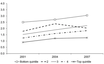
Fig. 2. Mortgage- related DTI by income level
Notes: The figure shows the value- weighted mean DTI of households in the Survey of Consumer Finances. DTI is defined as the ratio of all mortgage- related debt over an-nual household income. The sample includes households with positive mortgage debt. As of 2004, the cutoff for the bottom quintile corresponds to an annual household income of $25,300, the second quintile corresponds to $44,300, the third quintile corresponds to $69,700, and the fourth quintile corresponds to $112,700. Mortgage- related debt includes SCF items MRTHEL (Mortgage and Home Equity Loan, Primary Residence) and RESDBT (Other residential debt). This figure appears originally in Adelino et al. (2016).
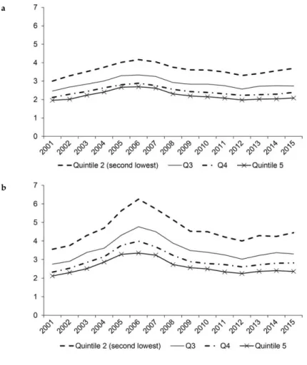
Fig. 3. Annual housing cost as a percentage of income (recent movers)
Source: Data from the American Community Survey.
Notes: Figure shows the evolution of median housing costs by household income quin-tile. Recent movers are defined as those who bought a home within the last year. Housing costs in the ACS include mortgage payments and any other costs associated with own-ing a home (taxes, insurance, utilities, among others). Costs are shown as a percentage of household income. The same plots including the first quintile are in figure A3. Panel A: owners; panel B: renters; panel C: difference between the cost of owning and renting.
b
income on housing irrespective of whether they owned or rented. This gap increases to 4% of income at the peak of the boom, and then drops by a full 10% of income by 2013, consistent with a model in Kaplan, Mitman, and Violante (2016). For the top 60% of households, ownership is associ-ated with a higher cost of housing (by about 4–5 percentage points). This increases slightly by the peak of the boom, and then drops in the bust, to where the cost of owning and renting is the same within each bin.
Figure 4 shows these patterns broken out by states with above and below median house price appreciation. Overall, the message from this figure is that the patterns from the previous figure are significantly more pronounced for areas with a larger boom- bust cycle. Panel A shows that households in quintiles 2 and 3 experience an increase of about 8 per-centage points in the cost of housing as a share of income during the housing boom. Quintile 4 has an average increase of 6 points, and the highest quintile of about 4 points. In contrast, panel B shows smaller increases for all groups of households in states with smaller house price increases, as well as smaller reductions in the crisis.
Table 3 shows regressions of the household- level cost of owning a home on a linear time variable (“year”), as well as its square. All re-gressions control for age and the number of children, as well as state fixed effects. We see a large increase in the burden of housing for all income quintiles, but the results show significantly different patterns for quintiles 3 through 5 during this time period. The difference in the predicted values from this regression amounts to about 1–2 percentage points per quintile at the very peak of the boom. These differences com-pletely disappear at the end of the sample, consistent with the patterns in figures 3 and 4. Columns (2) and (3) split the sample into “boom” and “nonboom” states, and we see that quintiles 1 through 3 are relatively homogeneous in their behavior in boom states, and that quintiles 4 and 5 exhibit statistically different patterns.
VI. Value of Housing as a Proportion of Income
We next consider the evolution of the value of homes as a proportion of household income (the value- to- income ratio). We use value- to- income ration rather than the debt- to- income ratio because data on mortgage balance is not available in the American Community Survey. However, in light of the evidence provided in the next section about the stability of the proportion of housing that was financed with debt, particularly over the boom, and especially for low- priced homes, it is reasonable to
assume that debt to income followed a similar path to value to income. We calculate the value to income for households that purchased a home in the previous 12 months. This avoids confounding the stock of house-holds with the flow of purchases, and provides a better picture of the availability of credit and the decisions made by both financial institu-tions and households.
Fig. 4. Change in housing cost as a percentage of income (recent movers, owners only)
Source: Data from the American Community Survey.
Notes: Figure shows the change in median housing costs by household income quintile. Recent movers defined as those who bought a home within the last year. Housing costs in the ACS include mortgage payments and any other costs associated with owning a home (taxes, insurance, utilities, among others). Costs are shown as a percentage of household income. Panel A: “boom” areas (above median state HPA); panel B: “nonboom” areas (below median state HPA).
a
Value to income increased for households across the whole income distribution (figure 5). The average increase is the same for all house-holds above the 20th percentile up to 2005, and 2006 shows a somewhat larger increase for the second quintile than for the rest of the households. A similar pattern emerges when we focus only on the states with above median increases in house prices, where the 2005–2006 increase is par-ticularly pronounced for the second quintile than for the rest, but where otherwise both the run- up and the fall in the ratio of housing to income is similar for all quintiles. Panel B also shows that the cycle in this ratio is much stronger in high house price appreciation areas, consistent with
Table 3
Housing Cost as a Percentage of Income (Movers Only)
All Boom Nonboom
Year 2.5186*** 3.1746*** 2.0464** 0.4910 0.4513 0.5614 Year2 –0.1635*** –0.2041*** –0.1343** 0.0338 0.0322 0.0365 Quintile 2 × year –0.1164 0.2980 –0.3280 0.1359 0.1624 0.3460 Quintile 2 × year2 –0.0116 –0.0476** 0.0091 0.0090 0.0113 0.0211 Quintile 3 × year –0.6143* –0.1687 –0.9643* 0.2442 0.3375 0.3728 Quintile 3 × year2 0.0200 –0.0120 0.0450 0.0167 0.0258 0.0234 Quintile 4 × year –0.9986** –0.8833*** –1.1932* 0.2460 0.1997 0.4325 Quintile 4 × year2 0.0473** 0.0364* 0.0625* 0.0154 0.0130 0.0258 Quintile 5 × year –1.4978*** –1.6875*** –1.5685** 0.3026 0.2285 0.4044 Quintile 5 × year2 0.0805** 0.0894*** 0.0870** 0.0192 0.0126 0.0255
Age + children controls Y Y Y
Quintile dummies Y Y Y
State F.E. Y Y Y
Number of obs. 526,480 245,588 280,892
R2 0.4 0.38 0.42
Note: Data from the American Community Survey. Boom areas defined as states with above median growth in house prices. Weighted OLS regressions using ACS weights. ***Significant at the 1 percent level.
**Significant at the 5 percent level. *Significant at the 10 percent level.
the evidence in figures 3 and 4 on the cost of owning homes. We show the value- to- income ratio for households in the bottom quintile in figure A4 in the appendix. The burden of housing for the lowest- income house-holds is clearly much higher than that of the top 80%, but the general pattern again closely tracks the variation in house prices.
Table 4 performs a regression analysis that is similar to table 3, but using the value of housing as a proportion of income as the dependent variable. Similar to the regressions in table 3, we again see a strong
Fig. 5. House value- to- income ratio (recent movers)
Source: Data from the American Community Survey.
Note: Figure shows the change in median value of homes as a share of household income by income quintile. Recent movers defined as those who bought a home within the last year. Income quintiles 2–5 shown. Panel A: all states; panel B: “boom” areas (above me-dian state HPA).
a
boom and bust cycle that coincides with house price movements. The predicted values from the regression again show that there is a large increase in the multiple of house value over income for all households, with a particularly strong cycle for quintiles 1 and 2. This is especially pronounced for boom states (column [2]).
VII. Homeownership
We next turn to the evolution of homeownership rates during the hous-ing boom and bust. Homeownership rates provide a good measure of
Table 4
House Value a Percentage of Income (Movers Only)
All Boom Nonboom
Year 0.5740** 1.0866*** 0.3009* 0.1627 0.2019 0.1094 Year2 –0.0376** –0.0705*** –0.0198* 0.0120 0.0153 0.0080 Quintile 2 × year –0.0700 –0.2094* –0.0404 0.0493 0.0707 0.0485 Quintile 2 × year2 0.0048 0.0130* 0.0033 0.0033 0.0052 0.0034 Quintile 3 × year –0.2263** –0.4606*** –0.1642* 0.0682 0.0879 0.0609 Quintile 3 × year2 0.0139** 0.0283*** 0.0102 0.0042 0.0054 0.0048 Quintile 4 × year –0.2821** –0.6103*** –0.1710* 0.0858 0.1137 0.0653 Quintile 4 × year2 0.0177** 0.0381*** 0.0108* 0.0054 0.0073 0.0049 Quintile 5 × year –0.3356* –0.7402*** –0.1898* 0.1154 0.1532 0.0638 Quintile 5 × year2 0.0211* 0.0468*** 0.0116* 0.0070 0.0102 0.0048
Age + children controls Y Y Y
Quintile dummies Y Y Y
State F.E. Y Y Y
Number of obs. 515,866 240,279 275,587
R2 0.25 0.25 0.23
Note: Data from the American Community Survey. Boom areas defined as states with above median growth in house prices. Weighted OLS regressions using ACS weights. ***Significant at the 1 percent level.
**Significant at the 5 percent level. *Significant at the 10 percent level.
the net effect of the expansion of mortgage credit to different house-holds over time (see also Foote, Loewenstein, and Willen 2016). To the extent that credit availability increased for certain groups in the popula-tion, we would expect those groups to switch at a higher rate from rent-ing into ownrent-ing, particularly in the case of groups with lower average homeownership rates. We calculate homeownership rates as the num-ber of households who own their home as a share of all households in each income quintile. The data comes from the American Community Survey one- year surveys, and it covers the 2001 to 2015 period.
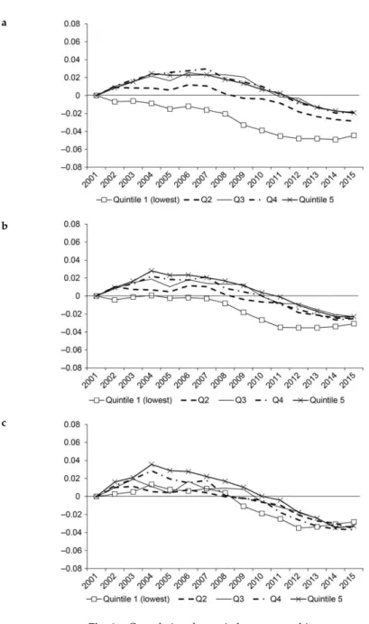
Households in the bottom quintile experienced a reduction in home-ownership rates during the whole period between 2001 and 2015 (fig-ure 6, panel A, shows the evolution of homeownership for all quin-tiles of the income distribution). The increase in homeownership rates is almost monotonically increasing in income in the period before the crisis. In fact, households between the 20th and the 40th percentiles ex-perienced a noticeably smaller increase in homeownership rate than all three quintiles above. The cumulative change in the homeowner-ship rate is about 1 percentage point for the second quintile, whereas it peaks at 2–2.5% for quintiles 3 through 5. Panel A includes all states, panel B focuses on states with above median increases in house prices, and panel C restricts the sample to just the four “sand states” (Arizona, California, Florida, and Nevada), where the housing boom was particu-larly pronounced.
The crisis and recession period is clearly associated with an over-all reduction in the rate of homeownership. Our analysis shows that the reduction was widely shared across the income distribution. The lowest- income households experience a very strong reduction that starts in 2006 and flattens out by 2011. All other quintiles experience a steadily lower homeownership rate that undoes the whole increase of the boom and ends up 2–3 percentage points below their level in 2001 by the year 2015.
Panel B shows that states with rapid house price appreciation experi-enced similar moves in homeownership rates as other states. Specifically, households in the lower two income quintiles seem to have generally smaller increases before the crisis, and a significant reduction in home-ownership rates after the crisis. It is notable, however, that the three top quintiles show a fast reduction in the rate of homeownership after the housing bust. In panel C, we find generally similar patterns as before.
In order to verify the robustness of the overall patterns shown in fig-ure 6, we turn to the American Housing Survey (AHS) and the Current
Fig. 6. Cumulative change in homeownership rate
Notes: Figure shows the share of homeowners within each household income quintile in the American Community Survey one- year public use microdata sample. Homeowner-ship rate is calculated as the share of owner- occupied homes over the total number of occupied homes.
House price appreciation is measured between 2001 and 2006. Panel A: all states; panel B: “boom” areas (above median state HPA); panel C: sand states (AZ, CA, FL, NV).
b
Population Survey/Housing Vacancy Survey (CPS/HVS) and perform the same analysis.17 We show those results in figure A5 in the appendix.
Both the AHS and the CPS/HVS show smaller cumulative increases in the rate of homeownership for households with below median income before the crisis, and large drops after 2007–2008. These results are also consistent with the evidence in Foote, Loewenstein, and Willen (2016), who use the Survey of Consumer Finances and find no evidence that increases in homeownership were concentrated in low- income or mar-ginal borrowers.
Table 5 shows regressions of homeownership status at the individual level on a linear and a quadratic time variable (“year”), as well as in-teractions of the years with each quintile. Figure A6 shows a plot of the predicted values of this regression for ease of interpretation. These regressions include age of the head of household and the number of children as controls, as well as state fixed effects. The coefficients show that the increase in homeownership rate is significantly higher for quintiles 3 through 5 relative to quintiles 1 and 2. The quadratic term is also significantly different for quintiles 2 through 5 relative to the lowest- income households, which closely mirrors the evidence shown in figure 6. Columns (2) and (3) show that the differences across groups stem mostly from nonboom states. In fact, we find that only quintiles 4 and 5 are significantly different (with larger increases in the boom) in the boom states relative to the lowest income quintile. Panel B re-runs the same specification as in the regressions described above, but we form income quintiles within states rather than for the full (pooled) sample. The conclusions are the same as in panel A.
Figure 7 shows a longer time series using data from the decennial census in 1980, 1990, and 2000, combined with American Community Survey five- year PUMS data for 2005–2015. The five- year ACS samples produce more reliable estimates in subgroups than the one- year samples, but they are only available starting in 2005, which is why we use the one- year samples for our year- by- year estimates above.18 Panel
A shows that there was a significant increase in homeownership rates overall in the 1990s, more so than during the 2000–2005 period. The postcrisis period was associated with a large drop in homeownership rates in the United States. Panel B confirms the results using the one- year ACS data in figure 6 for the post- 2000 period, and it also shows that households in quintiles 2 through 5 had already experienced a large increase in homeownership during the 1990s.
Panel A. Pooled Income Quintiles
All Boom Nonboom
Year –0.0019 0.0006 –0.0035 0.0020 0.0030 0.0020 Year2 –0.0001 –0.0002 0.0000 0.0001 0.0002 0.0001 Quintile 2 × year 0.0062** 0.0029 0.0087*** 0.0016 0.0025 0.0018 Quintile 2 × year2 –0.0004*** –0.0002 –0.0005*** 0.0001 0.0002 0.0001 Quintile 3 × year 0.0113*** 0.0056 0.0157*** 0.0023 0.0033 0.0023 Quintile 3 × year2 –0.0007*** –0.0004* –0.0010*** 0.0001 0.0002 0.0001 Quintile 4 × year 0.0121*** 0.0065 0.0169*** 0.0025 0.0039 0.0026 Quintile 4 × year2 –0.0008*** –0.0005* –0.0011*** 0.0001 0.0002 0.0001 Quintile 5 × year 0.0109*** 0.0082* 0.0129*** 0.0022 0.0036 0.0019 Quintile 5 × year2 –0.0007*** –0.0006* –0.0008*** 0.0001 0.0002 0.0001
Age + children controls Y Y Y
Quintile dummies Y Y Y
State F.E. Y Y Y
Number of obs. 13,803,090 6,558,031 7,245,059
R2 0.19 0.19 0.19
Panel B. Income Quintiles Formed within Each State
All Boom Nonboom
Year –0.0014 0.0017 –0.0043 0.0022 0.0034 0.0021 Year2 –0.0001 –0.0003 0.0000 0.0001 0.0002 0.0001 Quintile 2 × year 0.0059** 0.0051 0.0067** 0.0017 0.0026 0.0020 Quintile 2 × year2 –0.0004** –0.0003 –0.0004** 0.0001 0.0002 0.0001 Quintile 3 × year 0.0097** 0.0054 0.0136*** 0.0025 0.0040 0.0031 Quintile 3 × year2 –0.0007*** –0.0004 –0.0009*** 0.0001 0.0002 0.0002 Quintile 4 × year 0.0119*** 0.0075 0.0159*** 0.0027 0.0045 0.0030 (continued)
Table A1 in the appendix uses the five- year ACS PUMS sample for the 2005–2014 period as an additional yearly check on the estimates described for figure 6 (obtained with the one- year ACS sample). The table shows that there is a difference of between 0.5% and 1% for 2005 between the homeownership rates obtained in two samples, but no evi-dence that this is different for the bottom two quintiles relative to the rest. The difference becomes smaller at 0–0.2% for all other years and income quintiles.
These patterns in homeownership rates may seem surprising given the increase in overall mortgage origination during the boom period, including in the number of purchase mortgages (Adelino et al. 2016). Our results show that the increase in mortgage origination in the ag-gregate during this time period did not lead to greater access to home-ownership by individuals at the bottom of the income distribution, and led to relatively modest increases at the middle and the top of the distri-bution. These results are consistent with Acolin et al. (2017), who show that subprime mortgage use at the county level was not associated with changes in the homeownership rate, including for low- income and mi-nority households. Quintile 4 × year2 –0.0008*** –0.0006* –0.0010*** 0.0001 0.0003 0.0002 Quintile 5 × year 0.0107*** 0.0074 0.0137*** 0.0022 0.0042 0.0015 Quintile 5 × year2 –0.0007*** –0.0006* –0.0008*** 0.0001 0.0003 0.0001
Age + children controls Y Y Y
Quintile dummies Y Y Y
State F.E. Y Y Y
Number of obs. 13,803,090 6,558,031 7,245,059
R2 0.19 0.19 0.19
Source: Data from the American Community Survey.
Note: Boom areas defined as states with above median growth in house prices. Weighted OLS regressions using ACS weights. Figure A6 shows fitted values from the regression.
***Significant at the 1 percent level. **Significant at the 5 percent level. *Significant at the 10 percent level.
Table 1
Continued
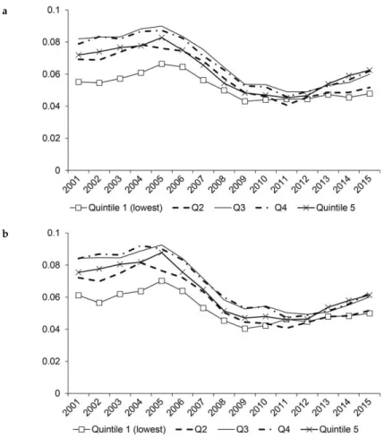
VIII. Movers and Churn
The evidence on purchase mortgage originations shown in figure 1 is based on ZIP Codes rather than individuals. We use data from the ACS to measure the fraction of homeowners moving homes in each year by income level of households rather than ZIP Codes. We show these results in figure 8. We find that already in 2001 about 8% of house-holds in income quintiles 3 and 4 moved homes in each year. This
fig-Fig. 7. Change in homeownership rate 1980–2015
Source: Data comes from the Decennial Census for 1980, 1990, and 2000, and from the American Community Survey five- year public use microdata sample for 2005–2015. Note: Homeownership rate is calculated as the share of owner- occupied homes over the total number of occupied homes. Panel A: all households; panel B: change in homeowner-ship rate by income level.
a
ure was closer to 7% for quintiles 2 and 5, and just below 6% for the lowest- income households. We observe an increase in the share of mov-ers during the boom, with a peak in 2005 that is close to 1% higher at all income levels.
The housing crisis is associated with a dramatic reduction in the rate of movers in the data, with all quintiles showing an average of between 4 and 5% share of movers per year, with an increase in this rate starting in 2011. Importantly, all income levels seem to move in lockstep in both the boom and the bust, which again runs counter to the idea that the
Fig. 8. Share of households moving in the last year (owners only)
Source: Data from the American Community Survey.
Note: Shares within each household income quintile. Panel A: all states; panel B: “boom” areas (above median state HPA).
a
housing cycle was a phenomenon that was particularly pronounced at the bottom of the distribution. Panel B of figure 8 shows similar evi-dence for states with above median house price appreciation. Although the shares of movers are slightly higher than those for all states (panel A), all the conclusions hold for high house price appreciation areas and the cycle follows a very similar path.
IX. Loan- to- Value Ratios
We next consider the evolution of combined loan- to- value (LTV) ra-tios of home purchases using data from deeds records between 2000 and 2012 (from DataQuick, currently CoreLogic). We focus on arm’s- length transactions and include first, second, and third liens for com-puting LTVs.
This analysis means to capture how the debt capacity of housing as an asset class changes over time, and addresses one of the main param-eters used in a wide class of models to capture changes in credit con-straints. Recent evidence from the Federal Reserve Bank of New York shows the evolution of combined loan- to- value ratios for all households (not just LTVs at origination).19 We also show the loan- to- value ratio
for all households from the Flow of Funds data in figure A7. Both the evidence from the Federal Reserve Bank of New York and the Flow of Funds shows the combined position of US households in terms of home equity and includes the evolution of house prices since a home was purchased, as well as the changes in leverage over time (i.e., the stock of loan- to- value ratios in the economy). These measures include the addition of home equity lines of credit and cash- out refinances, as well as quicker buying and selling of homes (quicker churn) and reset-ting of mortgages to higher levels. The purpose of the evidence in this section is, instead, to measure the debt capacity of housing over the recent housing cycle.
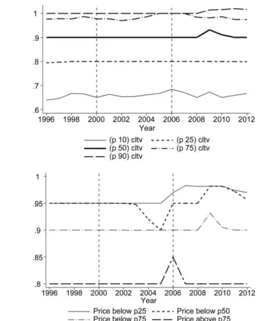
When we look at the loan- to- value ratios at origination, that is, the flow of LTVs of new purchases, we find very small changes over the boom- and- bust cycle across the whole distribution (panel A of figure 9). Panel B shows the evolution of the median LTV for homes at dif-ferent price levels. Again, as in panel A, these medians are remarkably stable, except for a reduction in LTVs at the peak of the boom for homes between the 25th and 50th percentiles. This evidence is consistent with the work of Justiniano, Primiceri, and Tambalotti (2015) and Ferreira
and Gyourko (2015), who similarly do not find that LTVs at the time of purchase changed very significantly during the boom. The patterns of CLTV at origination are very similar for states with above and below median house price appreciation during the boom (figure 10). Overall, the evidence on loan- to- value ratios is not consistent with an increase in one of the key parameters associated with a large relaxation of credit constraints, or, put differently, with a significant increase in the debt capacity of homes.
Fig. 9. Combined loan- to- value ration (CLTV) for home purchase by year
Source: Data comes from CoreLogic (formerly DataQuick).
Note: Sample includes all transactions with positive combined loan to value. Combined loan to value is computed as the sum of the first, second, and third liens taken up to six months after a home purchase transaction. Panel A: all transactions; panel B: median combined loan to value (CLTV) by level of house prices.
a
X. Mortgage Defaults during the Bust
We next show that high- credit- score households and high- income households significantly increase their share of overall delinquencies in the crisis. We show the share of delinquencies by income quintile and FICO scores in figure 11. Delinquency is defined as borrowers missing three or more payments within the first three years after origination. Panel A shows the evolution of the share of delinquent mortgages by
Fig. 10. Combined loan- to- value ratio (CLTV) for boom and nonboom states
Source: Data comes from CoreLogic (formerly DataQuick).
Note: Sample includes all transactions with positive combined loan to value. Combined loan to value is computed as the sum of the first, second, and third liens taken up to six months after a home purchase transaction. Boom states are those with above median house price appreciation. Panel A: “boom” areas (above median state HPA); panel B: “nonboom” areas (above median state HPA).
a
Fig. 11. Mortgage delinquency
Source: Data are from the 5% sample of the LPS (formerly McDash) data set.
Note: Panel A shows the fraction of total dollar volume of delinquent purchase mortgages by cohort, split by ZIP Code income quintile. A mortgage is defined as being delinquent if payments become more than 90 days past due (i.e., 90 days, 120 days, or more in fore-closure or REO) at any point during the three years after origination. We use household income from the IRS as of 2002 (i.e., in all panels ZIP Codes are fixed as of 2002, and cutoffs are the same as those given in figure 1). Panel B shows the fraction of total dollar volume of delinquent purchase mortgages by cohort, split by credit scores. A FICO score of 660 corresponds to a widely used cutoff for subprime borrowers, and 720 is close to the median FICO score of borrowers in the data. This figure appears originally in Adelino et al. (2016). Panel A: IRS 2002 income quintile; panel B: FICO score; panel C: delinquency by house price growth.
ZIP Code income. Panel B shows the same picture by borrower credit score. Prime borrowers represented 29% of delinquencies over the sub-sequent three years for the 2003 cohort, but they make up 61% of de-faults for loans originated in 2006. Finally, panel C shows that when we split borrowers into areas with high and low house price growth during the boom, we observe that most of the increase in prime delinquencies in 2006 comes from loans originated in areas with high house apprecia-tion, consistent with the important role of house prices for defaults. XI. Stability of Employment of Recent Movers
As a final test of possible changes in the underwriting standards during the credit boom, we show in figure 12 that households in all quintiles seem to have maintained similar characteristics in terms of the stability
Fig. 11. (continued) c
of employment over the boom. The boom is associated with a decrease in the number of households that report having at least one household member with full- time employment of about 1–3 percentage points. Importantly, however, this change is common to all income levels, and it is not particularly concentrated in the poorest households. Another way of interpreting these results is that, once we account for household income by binning households into quintiles, this already accounts for
Fig. 12. Stability of employment status (recent movers)
Source: Data from the American Community Survey.
Notes: Figure shows the median share of households who moved in the last 12 months in each income quintile who have stable employment. Stable employment is defined as having at least one full- time employed household member. Panel A: share of recent mov-ers with “stable” employment; panel B: change in share of recent movmov-ers with “stable” employment.
a
many of the common characteristics of moving households. The mort-gage crisis is associated with a sudden spike in the share of households with full- time employment, although this change is short- lived for most groups (with the exception of the highest group).
XII. Conclusion
In sum, a careful review of the major trends in mortgage markets lead-ing up to the 2008 crisis calls into question a one- sided explanation of the events as a subprime crisis. The results presented in this paper sup-port a view of the credit boom where financial institutions and banks bought into increasing house prices because of overly optimistic expec-tations. The catalyst for the initial changes in mortgage demand and house price growth might have been a drop in interest rates in the early twenty- first century that made home purchases more affordable and may have set off the feedback loop between increased house prices and increased expectations. Credit standards may have then fallen as a
re-sult of higher house prices, since lenders were willing to rely on collat-eral values alone in making lending decisions. As our results confirm, the distribution of CLTV levels (for purchase mortgages at origination) stayed stable across the boom period, which suggests that lenders al-most mechanically lent against increasing house price values.
Our results also show why it is important to understand the driv-ers of the crisis. We show that post- 2008, credit to lower- income and low- FICO borrowers dropped dramatically and prompted a significant decline in homeownership rates for lower- income households. Seen through the lens of the subprime view, this might have been a welcome change in mortgage markets, since marginal or lower- income groups were screened out. Under the expectations view, however, these facts raise the concern that these changes targeted lower- income households and prevented them from buying houses when prices were historically low, without improving the stability of the mortgage market.
Table A1
Comparison of ACS One- Year and ACS Five- year Estimates of Homeownership Rate, 2005–2014
A. ACS One- Year
2005 2006 2007 2008 2009 2010 2011 2012 2013 2014 Q1 41.7 42.0 41.6 41.2 39.9 39.3 38.7 38.4 38.4 38.3 Q2 56.6 57.2 57.0 56.2 55.7 55.6 55.1 54.2 53.6 53.3 Q3 67.6 68.5 68.3 68.3 68.0 66.8 65.8 65.7 64.6 64.2 Q4 79.4 79.6 79.8 78.8 78.4 77.9 77.0 76.0 75.6 74.9 Q5 89.2 89.3 89.3 88.8 88.3 87.7 87.2 86.3 85.7 85.3 B. ACS Five- Year
2005 2006 2007 2008 2009 2010 2011 2012 2013 2014 Q1 42.5 42.1 41.6 41.2 40.1 39.2 38.6 38.5 38.5 38.4 Q2 57.3 57.2 57.1 56.1 55.7 55.4 54.9 54.1 53.7 53.3 Q3 68.6 68.6 68.3 68.2 68.1 66.6 65.7 65.6 64.6 64.2 Q4 80.0 79.7 80.1 78.8 78.6 77.8 76.9 76.0 75.6 74.9 Q5 89.6 89.2 89.3 88.7 88.3 87.6 87.2 86.3 85.7 85.3 C. ACS Five- Year/ACS One- Year
2005 2006 2007 2008 2009 2010 2011 2012 2013 2014 Q1 0.8 0.1 0.0 0.0 0.2 –0.1 –0.1 0.1 0.1 0.1 Q2 0.7 0.1 0.1 –0.1 0.1 –0.2 –0.2 0.0 0.1 0.0 Q3 1.0 0.1 0.0 –0.1 0.0 –0.2 –0.1 0.0 0.0 0.0 Q4 0.5 0.0 0.2 –0.1 0.2 –0.1 –0.1 0.0 0.0 0.0 Q5 0.4 0.0 0.0 –0.1 0.0 0.0 –0.1 0.0 0.0 0.0 Note: The table shows homeownership rates across income quintiles computed using the ACS one- year public use microdata sample (panel A) and the ACS five- year sample (panel B). Panel C shows the difference between the two. Panel A uses the same data as figures 3–7. Five- year estimates are not available pre- 2005. For a detailed discussion of the differences between the samples, and the advantages and disadvantages of using each data set, please refer to http://www.census.gov/programs- surveys/acs/guidance/ estimates.html.
302
Fig. A2. Mortgage origination by credit score
Notes: This figure shows the fraction of total dollar volume of purchase mortgages in the LPS data split by FICO score. A FICO score of 660 corresponds to a widely used cutoff for subprime borrowers, and 720 is near the median FICO score of borrowers in the LPS data (the median is 721 in 2003, 716 in 2004, 718 in 2005, and 715 in 2006). The sample includes ZIP Codes with nonmissing house price data from Zillow. This figure appears originally in Adelino et al. (2016).
come quintile. We use household income from the IRS as of 2002 (i.e., the ZIP Codes in each bin are fixed over time). The cutoff for the bottom quintile corresponds to an average house-hold income in the ZIP Code as of 2002 of $34,000, the second quintile corresponds to $40,000, the third quintile corresponds to $48,000, and the fourth quintile corresponds to $61,000. Sample includes 8,619 ZIP Codes described in the “Data and Summary Statistics” section.