66
Charlotte Vrielink
THE ART OF ILLUSTRATING THE IMPOSSIBLE
Marcel Proust’s A la recherche du temps perdu
through the eyes of Kees van Dongen
RELIEF 11 (1), 2017 – ISSN: 1873-5045. P. 66-81 http://www.revue-relief.org
DOI: http://doi.org/10.18352/relief.952 Uopen Journals
The author keeps the copyright of this article This article is published under a CC-by license
Since the publication of Marcel Proust’s A la recherche du temps perdu (1913-1927), multiple artists taken up the challenge of visualizing his modernist magnum opus. In this article, I will discuss the interpretation of Dutch artist Kees van Dongen, who created 77 illustrations for a luxury edition published by Gallimard in 1947. By looking at the way Van Dongen visualized different forms of art, I will argue that Van Dongen’s interpretation is more artistically interesting than has been asserted before, as there are many intertextual and even intermedial references and practices to be found in Van Dongen’s aquarelles.
Le style n’est nullement un enjolivement comme croient certaines personnes, ce n’est même pas une question de technique, c’est – comme la couleur chez les peintres – une qualité de la vision, la révélation de l’univers particulier que chacun de nous voit, et que ne voient pas les autres. Le plaisir que nous donne un artiste, c’est de nous faire connaître un univers de plus.
Marcel Proust, in an interview with Elie-Joseph Bois, 19131 “To refuse to illustrate Proust might be the best way to translate him into images”, Florence Godeau states in her article “In Praise of Iconoclasm: Reflec-tions on the Improbable ‘Illustration’ of À la Recherche” (203). Godeau doubts the possibility of translating into a visual representation exactly those features that have defined the unique character of Proust’s novel À la recherche du temps perdu (1913-1927) for more than a century: abstract reflection, reveries, memo-ries and the characteristic Proustian style. Godeau continues:
To represent a landscape, a character, a decor, a scene is, in principle, an exercise which should be easier than, for example, the desire to give a form to the reverie on
67 ‘Noms de pays’ or to the pages where Proust expresses his aesthetics in Le Temps
retrouvé. How can one make visible that which, in À la recherche, is a part of abstract
reflection and poetic narrative, interlacing in ‘les anneaux nécessaires d’un beau style’ both images and analyses? (203)
Thus, according to Godeau, an artist should be able to intertwine both image and analysis, beauty and thought, into the illustration of the text. In this way, to illustrate La Recherche may be a difficult task indeed; however, this has not stopped artists from creating their own interpretation of this modernist classic over the last decades. For example, Stéphane Heuet made a graphic novel series out of the story, which appeared in six parts between 1998 and 2013. Multiple movie adaptions have appeared, among which Un amour de Swann by Schlöndorff in 1984 and Le temps retrouvé by Ruiz in 1999. Moreover, the seven volumes of La Recherche have even been put onto music by the German composer Stephan Beneking in 2014.2
A few years after the end of the Second World War, in 1947, Gallimard published a luxury edition of the modernist masterpiece by Marcel Proust (1871-1922). The singularity of this particular edition resides in the fact that it contains no less than 77 reproductions of aquarelles by the Dutch fauvist artist Kees van Dongen (1877-1968). The edition consists of three volumes, containing the original seven parts of La Recherche.3 Despite the international
fame of its two main contributors, , this edition has remained largely unknown to literary scholars and art historians. The only mention of Van Dongen’s illustrations in this edition is to be found in Kees van Dongen: het complete grafische werk (2002) by Juffermans & Juffermans. The authors assert that the edition was a great success with the larger public because of the liberal and erotic nature of the images, but that the edition was considered artistically inferior to Van Dongen’s other graphic works (122). In the following paragraphs, after looking at the history of this illustrated edition and providing a background for Van Dongen and his work, I will argue that this claim is unjustified.
A small piece of luxury
Firstly, it is useful to consider the material aspects of this edition, as well as Gallimard’s tradition of publishing bound books, in order to establish the book-historical context in which the illustrated book appeared. This edition of La Recherche was published in 1947 and was considered an édition de luxe. In total, a number of 9250 copies were printed by E. Desfosses in Paris. This edition is printed on a paper of high quality called “papier vélin”, which was aptly named this way since it was said to resemble the skin of a still-born calf.
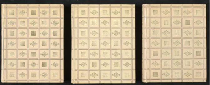
68 Because of its high quality, this kind of paper was only used for luxury editions. The type font is Elzevir Ronalson and the vignettes, the first big letter of each section, are called Grasset. The book binding was designed by Paul Bonet, who was one of the main binders for Gallimard, creating no less than 324 book bindings for this publishing house. This binding is described as “reliures chagra ivoire, décorées de fers spéciaux or et violet”, and indeed, one is able to see small purple and gold lines on the plain ivory background. This binding is also very characteristic of Bonet’s style, which is a graphical one: he uses a lot of geometrical motifs, lines, curves and points [Fig. 1].
In the years before and after the Second World War, there was a real “vague de livres reliés” at Gallimard. Between 1941 and 1967, 620 books with decorated bindings were published. Thirty-nine of them were illustrated (among which La Recherche by Van Dongen) and were referred to as “carton-nages in-quarto illustrés”. They all shared the same format, came at a conside-rable amount of copies, mostly around ten thousand, and were illustrated by contemporary artists. Only four book binders were involved in designing those editions, and Bonet was the most productive among them. If we go back to the publication of bound books at the Gallimard publishing house in general, we see that 1947, the year in which La Recherche was published, was a very productive year for the bound books, the production of that year only being surpassed by the year before, 1946.4
In the Bulletin de la NRF of October 1947, the goal and the intended audience of the livres reliés is announced. First of all, the publisher states that they want to offer “sous une forme élégante les œuvres des écrivains les plus
Fig. 1. The covers of the three volumes of Marcel Proust, À la recherche du temps perdu, Paris, Gallimard, 1947. Collection Koopman, National Library of the Netherlands.
69 appréciés du public lettré”. It is highly probable then that these editions had, above all, a commercial goal: it was not about publishing avant-garde or new books, but about offering works from the literary canon in a high quality edition. Thanks to technical developments, “ces reliures peuvent être offertes à des prix qui en permettent l’accès dans toutes les bibliothèques”. However, as the fact that it concerns a limited edition already shows, these bound books were not meant for everyone: Gallimard aimed for intellectual book collectors, as is shown by the stress on the “valeur bibliophilique croissante”.
It is worth considering that the peak in the publication of luxury editions in 1946-1947 may not be coincidental. In these first years after the war, the longing for luxury and a nostalgia for earlier, more prosperous times were common desires. This mentality is perhaps best illustrated by Christian Dior’s revolutionary New Look which, in the spring of 1947, surprised women all over the world with extremely feminine and opulent dresses, made out of the richest fabrics, that were inspired by the silhouettes and the decadence of the belle époque. In a similar fashion, the wave of luxury editions published by Gallimard responds to the post-war desire for a return to luxury. This particu-lar edition of La Recherche illustrated by Van Dongen is therefore very fitting, as both the author and the artist are strongly associated with the mondain and festive world of the belle époque and les années folles: Proust was a society figure who, like many of his fictional characters, frequented salons and balls orga-nized by princes and duchesses in the upper classes of Parisian society, and Van Dongen has become famous in these same circles as a portraitist of celebrities. Even the content of the text and the illustrations responds to the nostalgia for decadent and sumptuous times: Van Dongen’s aquarelles depict balls, seaside resorts, salons, large diners, gatherings of high society in public parks and on the avenues, and many splendid costumes.
From Delfshaven to Monte Carlo
Even though Kees van Dongen was one of the most famous Dutch painters of the twentieth century and worked his way into the highest circles of Parisian high society, the start of his career was much less glamorous. He was born in 1877 in a middle-class family in Delfshaven, a borough of Rotterdam, and studied at the Rotterdam Academy of Arts. At the age of 19, he decided that the Netherlands were not big enough for him, and he moved to Paris, the centre of all artistic activity at the time. However, his career did not take off immediately; he earned some money by illustrating for the Assiette au Beurre and other satirical magazines, but often had to return home to the Netherlands because of financial problems.
70 In 1901, he moved to Paris permanently. In Montmartre, he came into contact with artists such as Picasso, De Vlaminck, Modigliani and many others, and his art gained more and more recognition, resulting in expositions at the gallery of Ambroise Vollard in 1904 and at the Salon d’automne in 1905. His work of that period is characterized by the movement of fauvism, of which light, colour and expression were the main elements. Although his fauvist period came to an end in 1913, the richness and sensualism remained important characteristics of his style throughout his career. Gaston Diehl describes this style as “a feast for the eye of the spectator” (85), as he used a dense and rich matter, unique harmonies of colour and “a generous line, rich, adroit, with which he defines in great vigorous strokes the silhouettes and hews out the faces with an astonishing power to suggest relief through blunt contrasts” (85). In 1918, the poet and art critic Guillaume Apollinaire announ-ced an exhibition of Van Dongen’s work and praised his particular use of colour:
Ce coloriste a le premier tiré de l’éclairage électrique un éclat aigu et l’a ajouté aux nuances. Il en résulte une ivresse, un éblouissement, une vibration et la couleur conservant une individualité extraordinaire se pâme, s’exalte, plane, pâlit, s’évanouit sans que s’assombrisse jamais l’idée seule de l’ombre. (cited in Diehl, 85)
Van Dongen went to look for inspiration in the most unusual places: he studied sensual models and courtesans in night clubs, went to circuses and other extravagant performances, and travelled to North-Africa, Spain and Italy. After this first successful fauvist period, he became famous in the 1920s as a portraitist of the Parisian high society.
In his later career, Van Dongen’s fame declined, and it is then that his involvement in book illustrations started to increase. It is not certain whether the one is directly linked to the other, but it seems quite logical that he should have gotten involved in illustrating novels to make up for the diminishing sales of his paintings. He illustrated, among others, Les Lépreuses (1946) by Henry de Montherlant, La Princesse de Babylone (1948) by Voltaire, La Révolte des anges (1951) by Anatole France and Le livre des mille et une nuits (1955) by Dr Mardrus, and, of course, A la recherche du temps perdu (1947).
The 77 illustrations in La Recherche feature various subjects. Mostly, we recognize Van Dongen’s familiar topics: high society, portraits, and many (naked) women. But he also painted outside of what seems to be his ‘comfort zone’: for example landscapes, still lifes and more personal or abstract scenes. However, the landscape painting may not have been as unfamiliar to Van Dongen as his fauvist period suggests; his experience with landscapes traces
71 back to his training at the Rotterdam Academy of Arts. Under the influence of the contemporary Dutch school with landscape artists like Jan Toorop and the proximity of the sea and the port of Delfshaven, frequent motifs in the work of the young Van Dongen include canals, windmills and farmyards. In general, his interpretation of Proust is very close to his usual style and subject matter: there are quite a lot of society scenes and naked women. When looking at the style, the illustrations are most similar to the series of aquarelles called Deauville, 1920 that he published in 1931. Deauville is a French seaside town that is quite similar to the village of Balbec in La Recherche; both were very fashionable seaside resorts at the time.
Intermediality or the art of illustrating the impossible
Before taking a closer look at Van Dongen’s illustrations, it is useful to reflect upon book illustrations and the relationship between two different art froms in general. Although intermediality, a term that refers to “the relationships between media and is hence used to describe a huge range of cultural pheno-mena which involve more than one medium” (Rippl, 1), is a research field that has quickly developed since the 1980s, talking about the relationship between text and image is not new at all. From Horace’s ut pictura poesis and the paragone between painting and literature during the Renaissance to modern-day media studies, debates on the relationships between different artistic disciplines are as old as art itself. What does change, however, is the way in which scholars study these relationships. In his introduction to the Handbook of Intermediality (2015), Gabriele Rippl distinguishes four types of intermediality, of which the fourth, “multi- or plurimediality”, is most suitable for this case study. The edition by Proust and Van Dongen can be classified in this cate-gory, since it concerns a combination of media, in this case text and illustration (Rippl, 12).
In my study of the illustrations by Van Dongen, I combine three different ways of analysing images. Firstly, I will make a compositional inter-pretation of the images, as proposed by Gillian Rose in her handbook Visual Methodologies. This first type of interpretation looks at the formal aspects (content, colour, spatial organisation) of the image (Rose, 58-80). Secondly, an iconographic analysis will enhance this interpretation by looking at the way the illustration can be understood. Thirdly, I will look at the social dimension of the images, an approach advocated by Peter Burke in his book Eyewitnes-sing: The Uses of Images as Historical Evidence. Burke states that the iconographic method ignores some important characteristics of the iconotext, because of “its lack of a social dimension, its indifference to social context” (Burke, 40). If the
72 iconotext produces meaning, to whom is this meaning addressed? I have already briefly discussed the social context of the publication of this particular edition when describing the post-war desire for luxury and a nostalgia for a decadent past.
To conclude, it is important to stress that an intermedial transposition of an artistic artefact is never without the risk of distorting, obscuring and mis-representing the original object. Peter Wagner states that since textual and visual media are intrinsically different, “a verbal representation cannot be translated as it were into a visual counterpart without a loss or partial altera-tion of meaning” (Wagner, 380). Therefore, one has to keep in mind that all intermedial transpositions, including this edition with illustration by Van Dongen, are always an interpretation of the original text by the artist and never a direct translation. Proust’s novel and Van Dongen’s paintings are both autonomous works of art, and the illustrations are not meant to simply mimic the text, but rather to open up a dialogue between the two artists in which both artistic practices can be attributed equal importance.
Whilst exploring the subject of intermediality, by looking at the relation between the text of Proust’s Recherche and the illustrations by Van Dongen, I decided to take this a step further. Among the 77 aquarelles, I have selected the ones that depict some kind of artistic experience or art work. Marcel Proust writes a great deal about art in all its forms: from opera to literature and from visual art to musical compositions. This article aims to show how Van Dongen tackled the difficulty of portraying art forms that are not necessarily visual, such as music and literature.
It is important to know that, in the Recherche, the characters who are artists are often said to be inspired by real people. Some of the most common comparisons include the character La Berma, who is said to have been inspired by French actress Sarah Bernhardt, the composer Vinteuil, who is often associated with Saint-Saëns and Fauré, and the painter Elstir, whose work shows stylistic similarities to that of Monet, Whistler and Helleu.
As the illustrations are placed with an equal number of pages in between them, the text that corresponds to the subject of Van Dongen’s work is not always near to the illustration. Therefore I first needed to identify the passages from the text that correspond to the image and the title of the illustration. I also looked at real artists and artworks that may have served as an inspiration for Van Dongen, especially because many of the chosen themes would normally not appear in his oeuvre.
73
Deception at the theatre
Van Dongen’s illustration “La Berma dans Phèdre” [Fig. 2] corresponds to the story of the narrator’s first visit to the theatre in the beginning of A l’ombre des jeunes filles en fleurs. Marcel had been longing to see the famous actress La Berma for a long time, and had high expectations of her performance in Racine’s classic tragedy, but was bitterly disappointed: “Hélas! Cette première matinée fut une grande déception” (Vol. I, 312). The narrator especially remembers the monotony of the sentences uttered and the lack of a sensible interpretation by the famous actress:
[…] elle aurait certainement des intonations plus surprenantes que celles que chez moi, en lisant, j’avais taché d’imaginer; mais elle n’atteignit même pas jusqu’à celles qu’Œnone ou Aricie eussent trouvées, elle passa au rabot d’une mélopée uniforme toute la tirade où se trouvèrent confondues ensemble des oppositions pourtant si tranchées qu’une tragédienne à peine intelligente, même des élèves de lycée, n’en eussent pas négligé l’effet ; d’ailleurs, elle la débita tellement vite que ce fut seulement quand elle fut arrivée au dernier vers que mon esprit prit conscience de la
monotonie voulue qu’elle avait imposée aux premiers. (Vol. I, 315-316, my emphasis)
Van Dongen’s depiction of this scene shows the actress, dressed in a light blue gown, standing on the stage and surrounded by decor walls painted in very saturated colours [Fig. 2]. However, the colours are vivid, but not harmonious and very uniform. In this way, the monotony and the lack of harmony of the performance are translated into the flatness of the illustration: there are only empty, plain coloured surfaces of colour in the background with abrupt edges, no smooth transitions as we will see in his other illustrations. As a star of the show, La Berma does not stand out: in her light-coloured dress, she almost disappears against the bright background. Moreover, the spatial organisation, angle and use of light in the illustration emphasize the artificial character of the performance. As the point of view is slightly moved to the side of the stage, the spectator is able to look behind the curtains and the decor pieces. This effect is enhanced by the use of colour, as the bright yellow floor in the left corner shows the front of the stage in full lighting, whereas the stage gradually becomes darker in the back of stage, with clear cast shadows on the floor behind the stage curtains and walls. Therefore, the illustration makes the spectator aware of the artificiality of La Berma’s performance, which was not moving and convincing enough to take the narrator out of the theatre setting and into the emotional story of the Grecian queen.
As said before, La Berma is said to be inspired by the legendary actress Sarah Bernhardt. In fact, Bernhardt also interpreted the role of Phèdre in Racine’s play, and the cover of Le Théâtre from December 1899 shows a portrait
74 of her in the title role [Fig. 3]. The similarities between this cover and Van Dongen’s painting are striking: one is able to recognize the pale blue colour of the dress, the Grecian-style, draped loose shape of the dress, the head drama-tically tilted back, the position of the arms and the closed eyes. I seems rather likely that Van Dongen was inspired by this depiction of Sarah Bernhardt for his interpretation of the scene in A l’ombre des jeunes filles en fleurs. However, the differences between the two images could also be significant: whereas Bernhardt is surrounded by three other actresses, La Berma stands alone on the stage, representing the well-known but fairly overestimated actress that Proust describes in his novel.
“Une grande fresque musicale”
The severity and harshness of the juxtaposition of the different colour combinations are made especially clear when compared to “Le septuor de Vinteuil” [Fig. 3], in which one also encounters bright and diverse colours, from the vivid fuchsia of the stage, the cobalt blue chair, to the bursts of coral and yellow in the background, combined with the dark suits of the musician and his audience; and still, the general impression of the illustration is a
Fig. 2 (left). Kees van Dongen, « La Berma dans Phèdre », in Marcel Proust,
À la recherche du temps perdu, Paris, Gallimard, 1947, Vol. I, 313.
75 Fig. 4. Kees van Dongen, “Le septuor de Vinteuil”, in Marcel Proust,
À la recherche du temps perdu, Paris, Gallimard, 1947, Vol. III, p. 169.
harmonious and calming composition. This illustration depicts the moment in which an unknown musical piece, the “septuor” by the deceased composer Vinteuil, is performed for the first time at a soirée organised by the Verdurin family, years after the performance of Vinteuil’s “sonate” in Du côté de chez Swann. Van Dongen paid attention to the smallest details of the scene descri-bed by Proust in La Prisonnière, from the privileged position of the host (“Mme Verdurin s’assit à part” (Vol. III, 169) to the hairstyle of the musician Morel (“Quant à Morel, une mèche, jusque-là invisible et confondue dans sa cheve-lure venait de se détacher et de faire boucle sur son front” (171).
76 Apart from these physical details, the visualization of a musical compo-sition is not equally evident. How do you portray an art form that is not seen, nor read? How to put a musical experience, into words or images? Proust and Van Dongen resorted to the same means: colour. Whereas Van Dongen created a pictorial interpretation of the composition, Proust wrote a scene that is per-haps best described as an ekphrasis of the septuor, as he describes the piece by Vinteuil as if it were a painting: “[…] il peignait sa grande fresque musicale, comme Michel-Ange […] de tumultueux coups de brosse au plafond de la chapelle Sixtine” (173). To the narrator, the impression he experiences during the performance of the composition resembles the red colours in the morning sky:
Tandis que la sonate s’ouvrait sur une aube liliale et champêtre,[…] c’était sur des surfaces unies et planes comme celles de la mer que, par un matin d’orage déjà tout
empourpré, commençait, au milieu d’un aigre silence, dans un vide infini, l’œuvre
nouvelle, et c’est dans un rose d’aurore que, pour se construire progressivement devant moi, cet univers inconnu était tiré du silence et de la nuit. Ce rouge si nouveau, si absent de la tendre, champêtre et candide sonate, teignait tout le ciel, comme l’aurore, d’un espoir mystérieux. Et un chant perçait déjà l’air, chant de sept notes, mais le plus inconnu, le plus différent de tout ce que j’eusse jamais imaginé, de tout ce que j’eusse jamais pu imaginer, à la fois ineffable et criard, non plus un roucoulement de colombe comme dans la sonate, mais déchirant l’air, aussi vif que la nuance écarlate dans laquelle le début était noyé, quelque chose comme un mystique chant du coq, un appel ineffable, mais suraigu, de l’éternel matin. (Vol. III, 170)
These colours (purple, red, pink, scarlet), which are slightly reminiscent of Monet’s Impression, soleil levant, also constitute the main colour scheme used by Van Dongen. The harmony of the colours is representative of the immersion into the music the narrator experiences right after the first notes have been played: “Le concert commença, […] je me trouvais en pays in-connu”(169). As opposed to the theatrical performance by La Berma, which never escapes its artificiality, every composition made by Vinteuil is a whole universe in which the auditor is immersed: “Et je ne pouvais m’empêcher, par comparaison, de me rappeler que, de même encore, j’avais pensé aux autres mondes qu’avait pu créer Vinteuil comme à des univers clos […]” (171). Van Dongen even painted the audience with their eyes closed, as though they are being transported to another world. In this way, he managed to translate the impression of the performance into his illustrations, from the deception caused by La Berma to the sweet immersion into another world caused by Vinteuil’s musical composition.
77
Literature as the ultimate “madeleine”
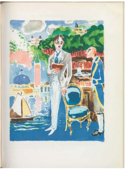
Florence Godeau deemed the illustration of the Recherche practically impos-sible, as she could not imagine a way in which an artist could visualize “abstract reflection” (203), which makes up such a large part of the novel. Indeed, to portray an artistic performance is one thing, but to depict a theory of art is not evident either. How could one visualize the way art works, according to Proust? To see how Van Dongen faced this challenge, it is useful to look at one of the most interesting illustrations of the novel, entitled “Evocations”, where various little scenes have been merged into a single image [Fig. 5]. The illustration depicts a long sequence of memories, art theories and philosophical thoughts that present themselves to the narrator when he finds himself in the library of the Guermantes family in the last volume of the novel, Le temps retrouvé.
In this long scene, spread out over some fifty pages, the narrator reveals his ideas about the nature and goal of literature, and how these ideas have changed over time. Standing in the library of the Guermantes, the narrator picks up a book, François le Champi by George Sand (which also appeared in the very beginning of the novel, in Combray), which immediately reminds him of his youth in his aunt’s house in Combray, where his mother read this book to him when he could not sleep. For him, this particular book had become “l’essence du roman” (Vol. III, 584); it was a “titre qui m’avait donné l’idée que la littérature nous offrait vraiment ce monde de mystère que je ne trouvais plus en elle” (584). Now, many years after the nights in Combray, the narrator realises that literature has acquired a new meaning for him. It is not a world of mystery; the only thing you can encounter in literature is in fact, yourself: “Cet étranger, c’était moi-même, c’était l’enfant que j’étais alors, que le livre venait de susciter en moi […]” (584).
In this way, the book had become an instrument of the famous Proustian involuntary memory: literature did not transport him into mysterious worlds he had never known before, but it brought him back to a forgotten part of himself, in this case an episode from his childhood. By contemplating this occurrence of involuntary memory, he recalls many others he has experienced during his lifetime: “la vue d’arbres que j’avais cru reconnaître dans une promenade en voiture autour de Balbec, la vue des clochers de Martinville, la saveur d’une madeleine trempé dans une infusion” (572). In the same way, some unequal stones in the courtyard of the Guermantes house remind him of the baptistery of the Saint Mark’s Basilica in Venice. The passage ends with another major revelation of the narrator: he finally recognizes his vocation of becoming a writer, where his ideas on the essence of writing literature remains
78 the same as for reading it: the writer should not invent unimaginable or mysterious worlds, but he should only write about what is already in him: “[…] je m’apercevais que ce livre essentiel, le seul livre vrai, un grand écrivain n’a pas, dans le sens courant, à l’inventer puisqu’il existe déjà en chacun de nous, mais à le traduire. Le devoir et la tâche d’un écrivain sont ceux d’un traducteur” (589).
In “Evocations”, Van Dongen starts off by placing the narrator (who, depicted with a small moustache and his hair parted in the middle, shows a striking resemblance to Proust) in the centre of the composition, holding a book. Van Dongen sets the stage by depicting the Guermantes library on the right side of the painting, even including “[…] un maître d’hôtel depuis long-temps au service du prince de Guermantes m’ayant reconnu, et m’ayant apporté […] un choix de petits fours, un verre d’orangeade […]” (574).
However, in the rest of the painting, Van Dongen departs from a realis-tic portrayal of the library by depicting various scenes and memories evoked by the involuntary memory of the narrator: from top right to bottom left, one distinguishes the Saint-Hilaire church, representing Combray, the madeleine and his night with François le Champi; the castle of the Duke and Duchess of Guermantes; the palaces and canals of Venice; and the seaside resort of Balbec. The borders between those scenes are all very fluid and unclear, thus stressing the associative manner in which the memories appear to the narrator. There is a clear distinction between the “real” setting, the library, and the scenes that are evoked by involuntary memory: the library is painted in darker colours, with sharper contrasts, whereas Van Dongen almost only used light and soft colours for the depictions of the memories; this creates a dream-like setting, which Gillian Rose would define as an “atmospheric perspective”(60).
The fact that the image mostly consists of bluish hues, from a soft pale blue to a vivid cobalt, is also significant. The moments preceding his associa-tion of his involuntary memory with the memory of the baptistery in Venice, the fragments that first come to the surface are visions of colour, a blue colour: “La difference, purement matérielle, était dans les images évoquées; un azur profound enivrait mes yeux […]” (573); “[…] une nouvelle vision d’azur passa devant mes yeux; mais il était pur et salin, il se gonfla en mamelles bleuâtres; […] et maintenant devant cette bibliothèque de l’hôtel de Guermantes, elle déployait, réparti dans ses pans et dans ses cassures, le plumage d’un océan vert et bleu comme la queue d’un paon.” (574). One could even go as far as to say that the reflection of the Venetian palaces into the water, which is not mentioned in the text, is Van Dongen’s way of stressing the concept of
reflec-79 tion: just as the canals mirror the skyline of Venice, literature should be a mirror for the reader in which to discover himself.
In this way, Van Dongen’s interpretation incorporates the actual scene in the library, the memories evoked by the book, the associative and dream-like nature of these reveries, and Proust’s vision on literature, by using content, composition of the different images as well as the deliberate use of colour.
Fig. 5. Kees van Dongen, “Evocations”, in Marcel Proust, À la recherche du temps perdu, Paris, Gallimard, 1947, Vol. III, p. 569.
80 After having analysed only a small part of Van Dongen’s illustrations for the Recherche, we can safely state that the artistic interest of these images is much more significant than Juffermans sr. and jr. suggest. The illustrations surpass the mere transposition of the plot into images; Van Dongen also succeeded in visualizing a variety of abstract ideas, such as emotions of the narrator, descriptions of musical compositions, long-forgotten memories, and theories on the nature and use of literature. Not only did the Dutch artist make use of his personal style and themes and did he take into account the finest nuances of the text, he also used external source material to enrich his illustrations, as shown by the numerous similarities between the persons depicted in his work and real-life figures such as Sarah Bernhardt and Marcel Proust himself.
Van Dongen’s most striking and most personal technique in overcoming the difficulty of an intermedial transposition of words into images is the use of colour, his greatest talent according to Guillaume Apollinaire, who had already recognised it in 1918. By playing with the particularities of colour (the vividness and nuances of the hues, as well as the harmonies created by juxtaposing them), Van Dongen has shown, to name but a few examples, the differences between reality and imagination, between harmony and disso-nance, and is even capable of determining the entire atmosphere of the illustration, as we have seen in “Le Septuor de Vinteuil”.
Since there is never a one-on-one transposition of an artwork when it transgresses the borders of medial genres, as different media forms will always retain their media-specific qualities, every intermedial adaptation of an artistic work should be seen as an autonomous work which reflects the inter-pretation and vision of the artist. Therefore, to contradict Godeau, it is never impossible to illustrate a novel, however abstract it may be, for there is not one “right” visualization. And, in fact, perhaps there was never a writer who appreciated and celebrated the diversity of different artistic interpretations more than Marcel Proust himself:
Le seul véritable voyage, le seul bain de Jouvence, ce ne serait pas d’aller vers de nouveaux paysages, mais d’avoir d’autres yeux, de voir l’univers avec les yeux d’un autre, de cent autres, de voir les cent univers que chacun d’eux voit, que chacun d’eux est; et cela nous le pouvons avec un Elstir, avec un Vinteuil, avec leurs pareils, nous volons vraiment d’étoiles en étoiles. (Vol. III, 177)
81
Notes
1. Le Temps, 13 novembre 1913.
2. Sophie Levie offers an extensive overview of these and other adaptions of Proust’s novel in her article “Recycling Proust. Over intermedialiteit en de Recherche”, Jaarboek van de Marcel
Proust Vereniging, 26/27, 2000, 61-72.
3. As it concerns a luxury and limited edition, the set of three volumes is sold for hundreds of euros at online auction sites nowadays. The illustrations by Van Dongen are also sold individually at art galleries. In the Netherlands, a complete and well-preserved copy of the edition can be consulted at the National Library in The Hague, as part of the Koopman Collection, as well as in the library of the Rijksmuseum in Amsterdam.
4. For an extensive overview of the history of the publication of the bound book at Gallimard, see Huret 1997 (p. 33). Huret shows the production of these books from 1941 to 1967, the top five years completely consisting of the post-war years: 1946 (73 publications), 1947 (67), 1945 (57), 1948 (51) and 1947 (47).
Works Cited
Peter Burke, Eyewitnessing. The Uses of Images as Historical Evidence, Ithaca, Cornell University Press, 2001.
Louis Chaumeil, Van Dongen: L’homme et l’artiste, la vie et l’oeuvre, Geneva, Cailler, 1967. Gaston Diehl, Van Dongen, Paris, Flammarion, 1968.
Florence Godeau, “In Praise of Iconoclasm: Reflections on the Improbable ‘Illustration’ of À
la Recherche”, in Nathalie Aubert, Proust and the Visual, Cardiff, University of Wales Press,
2012, 203-218.
Anita Hopmans, De grote ogen van Kees van Dongen, Leuven, Exhibitions International, 2010. Sjef Houppermans, “À la recherche des images perdues: Proust et Heuet”, RELIEF - Revue
électronique de littérature française, 2:3, 2008, 398–423.
Jean-Étienne Huret, Les cartonnages NRF : bibliographie, Paris, Librairie Niçaise, 1997.
Jan Juffermans & Jan Juffermans jr., Kees van Dongen: het complete grafische werk, Utrecht, AW Bruna Uitgevers, 2002.
Louis Jan Koopman, Catalogus van de bibliotheek van Louis Jan Koopman (1887-1968), The Hague, ca. 1960.
Sophie Levie, “Recycling Proust. Over intermedialiteit en de “Recherche”, Jaarboek van de
Marcel Proust Vereniging, 26/27, 2000, 61-72.
Marcel Proust, A la recherche du temps perdu, Paris, Gallimard, 1947 (National Library of the Netherlands: KW KOOPM B 557-559).
Gabriele Rippl (ed.), Handbook of Intermediality. Literature – Image – Sound – Music, Berlin/ Boston, De Gruyter Mouton, 2015.
Gillian Rose, Visual Methodologies: An Introduction to the Interpretation of Visual Materials, London, Sage, 2012.
Peter Wagner, “The Nineteenth-century Illustrated Novel”, in Gabriele Rippl (ed.), Handbook
of Intermediality. Literature – Image – Sound – Music, Berlin/Boston, De Gruyter Mouton, 2015,