RESEARCH OUTPUTS / RÉSULTATS DE RECHERCHE
Author(s) - Auteur(s) :
Publication date - Date de publication :
Permanent link - Permalien :
Rights / License - Licence de droit d’auteur :
Bibliothèque Universitaire Moretus Plantin
Institutional Repository - Research Portal
Dépôt Institutionnel - Portail de la Recherche
researchportal.unamur.be
University of Namur
ArtVis: Combining Advanced Visualisation and Tangible Interaction for the
Exploration, Analysis and Browsing of Digital Artwork Collections
Dumas, Bruno; Moerman, Bram; Trullemans, Sandra; Signer, Beat
Published in:
Proceedings of the 2014 International Working Conference on Advanced Visual Interfaces (AVI '14)
DOI:
10.1145/2598153.2598159
Publication date:
2014
Document Version
Peer reviewed version
Link to publication
Citation for pulished version (HARVARD):
Dumas, B, Moerman, B, Trullemans, S & Signer, B 2014, ArtVis: Combining Advanced Visualisation and
Tangible Interaction for the Exploration, Analysis and Browsing of Digital Artwork Collections. in Proceedings of
the 2014 International Working Conference on Advanced Visual Interfaces (AVI '14). ACM Press, pp. 65-72.
https://doi.org/10.1145/2598153.2598159
General rights
Copyright and moral rights for the publications made accessible in the public portal are retained by the authors and/or other copyright owners and it is a condition of accessing publications that users recognise and abide by the legal requirements associated with these rights. • Users may download and print one copy of any publication from the public portal for the purpose of private study or research. • You may not further distribute the material or use it for any profit-making activity or commercial gain
• You may freely distribute the URL identifying the publication in the public portal ?
Take down policy
If you believe that this document breaches copyright please contact us providing details, and we will remove access to the work immediately and investigate your claim.
ArtVis: Combining Advanced Visualisation and Tangible
Interaction for the Exploration, Analysis and Browsing of
Digital Artwork Collections
Bruno Dumas, Bram Moerman, Sandra Trullemans and Beat Signer
Web & Information Systems Engineering LabVrije Universiteit Brussel Pleinlaan 2, 1050 Brussels, Belgium
{bdumas,bmoerman,strullem,bsigner}@vub.ac.be
ABSTRACT
We present ArtVis, an application combining advanced visualisa-tion techniques and tangible interacvisualisa-tion to explore a large digital collection of almost 28 000 European artworks managed by the Web Gallery of Art. In order to get new insights by exploring, analysing and browsing the artworks, our graphical ArtVis user in-terface offers three complementary but synchronised visualisation components. We further developed a tangible ArtVis user interface for the playful exploration and seamless integration of the digital artwork collection with physical artefacts. A formative evaluation of the ArtVis prototype revealed that users are able to answer rel-atively difficult questions as well as get some new insights based on the vast amount of data. A second user evaluation of the tangi-ble ArtVis interface has shown that this sort of physical interaction attracts users and stimulates them to further explore the digital art-work collection.
Keywords
ArtVis; information visualisation; faceted browsing; tangible inter-action; artwork explorer.
Categories and Subject Descriptors
H.5.m. [Information Interfaces and Presentation]: Miscella-neous
General Terms
Experimentation; Human Factors.
1.
INTRODUCTION
The digital information explosion that we have witnessed in recent years makes information visualisation more important than ever. Domain experts apply various information visualisation techniques to extract new knowledge from large data sets or to effectively com-municate existing knowledge. Advanced visualisation techniques have been used as an expert tool in domain-specific visual data
Permission to make digital or hard copies of all or part of this work for personal or classroom use is granted without fee provided that copies are not made or distributed for profit or commercial advantage and that copies bear this notice and the full citation on the first page. Copyrights for components of this work owned by others than the author(s) must be honored. Abstracting with credit is permitted. To copy otherwise, or republish, to post on servers or to redistribute to lists, requires prior specific permission and/or a fee. Request permissions from [email protected].
AVI’14,May 27–29 2014, Como, Italy
Copyright is held by the owner/author(s). Publication rights licensed to ACM. ACM 978-1-4503-2775-6/14/05 ...$15.00.
http://dx.doi.org/10.1145/2598153.2598159
mining over the last decades. However, while advanced visualisa-tion techniques are nowadays commonly used, the corresponding interaction techniques did not progress at a similar pace as stressed by Lee et al. [10]. We present our investigation on using a tangi-ble user interface to interact with the advanced ArtVis visualisation of European art produced between the 11th and the 19th century. ArtVis allows visitors to explore a data set of approximately 28 000 artworks from the Web Gallery of Art database containing detailed information about the pieces of art, the artists as well as the art-work inspiration, artistic schools and artart-work form. In contrast to most existing applications for museum exhibitions, ArtVis does not focus on providing information about specific artworks but rather aims to provide new insights based on the exploration and analysis of a large digital artwork collection. Our solution lets users explore the data set rather than constraining them via a query-oriented en-vironment. To meet the goal of free exploration, we have defined three requirements based on the extent of knowledge available in the database. These three requirements have then been used to de-fine the graphical ArtVis user interface. We further enhanced the ArtVis prototype in order to make it more attractive and stimulat-ing by integratstimulat-ing the information visualisation approach with a tangible user interface. The exploration of the fusion of informa-tion visualisainforma-tion and tangible interacinforma-tion in the context of museum exhibitions is another contribution of the presented work.
We discuss two evaluations of our ArtVis prototype. The goal of the first evaluation was to check whether the application meets the three requirements that we have defined as main guidelines when designing ArtVis. The second evaluation assessed the overall user experience with the ArtVis prototype. Our current ArtVis prototype combines advanced visualisation techniques with tangible interac-tion to filter relevant informainterac-tion via faceted browsing as described by Yee et al. [20].
We start by presenting the foundations of ArtVis and discussing some related work in the domain of user interfaces for digital art-work collections. This is followed by a description of a number of requirements which drove the design phase of ArtVis. We then introduce the functionality offered by ArtVis and provide technical details about the architecture and implementation of the prototype. After describing the tangible user interface, we present two evalu-ations of the ArtVis prototype. The discussion of future research directions is followed by some general conclusions.
2.
RELATED WORK
Information visualisation relies heavily on visual perception and its capabilities to efficiently recognise patterns and shapes. As a matter of fact, the visual perception has the largest bandwidth of all of our human senses [11]. It therefore makes sense to exploit the innate abilities of the human visual perception when designing a system for the exploration of large data sets. An effective vi-sualisation further demands for the possibility to interact with the visualised information as stated by Shneiderman [14] in his Visual Information Seeking Mantra:
“Overview first, zoom and filter, then details on demand.” As a generalisation of the interaction with a visualisation, Keim [7] introduced the concept of linking and brushing, which describes a technique for interacting with multiple visualisations showing the same data set from different angles. Brushing means that a user will select a portion of the displayed data on which they want to get extended information. In turn, linking means that the brushed elements will be highlighted in the other visualisations.
Information visualisation in the context of artworks has mainly revolved around displaying a collection of artworks and allowing users to select a specific artwork in order to get more detailed in-formation. A representative of these type of systems is the work of Ciocca et al. [2] which focusses on displaying collections of artworks on multi-touch displays. The Google Art Project1 deals
with the visualisation of high resolution pictures of artwork collec-tions from numerous highly reputed museums around the world. Going one step further, Wang et al. [19] created a semantic data-based recommendation system. Nevertheless, these solutions pro-vide only the “details on demand” part of Shneiderman’s visual information seeking mantra. The filtering is restricted to simple query-based search and the overview is limited to displaying a fi-nite set of thumbnails at best. The work of Ossenbruggen et al. [13] offers the possibility to explore a large data set of paintings through the use of keywords and semantic techniques. Note that this work inspired LISA, a thesaurus-based comparison search application by Amin et al. [1]. However, similar to the previously mentioned projects, a user is lost if they do not know in advance what type of information they are looking for.
In contrast, the goal of our ArtVis application was to adopt the vi-sual information seeking mantra by first offering an overview of the domain and then providing users with a set of predefined zoom-ing and filterzoom-ing tools. The explorative functionality provided by ArtVis supports users in serendipitous discoveries as described by Thudt et al. [16], where details of a given artwork can be queried on demand. Our ArtVis solution is more in line with projects like EMDialog [5], which offers interactive information visualisation on large displays. EMDialog presented two interlinked informa-tion visualisainforma-tions of the discourse about the artist Emily Carr along contextual and temporal dimensions. The valuable suggestions for information visualisation in public spaces by the authors of the EMDialog solution have also been incorporated in the design of ArtVis. However, we target information exploration on a larger scale than the EMDialog project by taking into account the large amount of artworks managed by the Web Gallery of Art project. A similar approach has been explored by Hinton [6] for the visualisa-tion of large heritage data sets.
1
http://www.googleartproject.com
Tangible interactionhas been pioneered by Hiroshii Ishii [17], with the goal of allowing users to interact with digital information by us-ing physical objects. The field has grown since these early works with research expanding in multiple directions. The embedding of RFID tags in physical objects has, for example, been used by Nunes et al. [12] to link physical artefacts and digital pictures and memories. Our tangible user interface goes further by associat-ing physical artefacts with queries in a way similar to the work of Ullmer et al. [18]. Note that our tangible ArtVis interface is re-lated to the use of tangible objects such as magnifying glasses in visualisation as described by Spindler et al. [15].
3.
REQUIREMENTS
The Web Gallery of Art (WGA)2website is a virtual museum and
searchable database of European paintings and sculptures of the Romanesque, Gothic, Renaissance, Baroque, Neoclassicism and Romanticism periods (1000–1850). The Web Gallery of Art web-site was an outcome of a larger project which started in 1996 with the aim to develop new techniques for the use of the Internet in visual education. The Web Gallery of Art can therefore also be seen as an educational online tool in art history. Due to the lim-ited available resources, the WGA’s collection focusses on artworks produced between the 11th and 19th century. While the WGA does not cover artworks created after 1850, it still represents a highly valuable resource for artworks ranging from Romanesque to Ro-mantic. As explained later, for our ArtVis project we rely on a complete snapshot of the Web Gallery of Art database, which cur-rently consists of almost 28 000 pieces of art.
The goal of ArtVis was to create an application that by its design stimulates and attracts users, and invites them to explorethe large number of artworks managed by the Web Gallery of Art. The rich WGA data set is difficult to explore via its current web interface if one does not know what to look for. Our new ArtVis interface had to be self-explanatory in order to be accessible to users with little or no expertise in computing and to encourage the active exploration of the WGA data set. However, the extent of features that could be added to the ArtVis prototype were dependent on the content of the WGA data set. Based on the information available in the WGA, we defined a number of typical questions that a user should be able to answer while working with ArtVis. This set of questions helped us in delimiting the actual features of the final ArtVis user interface. Out of this pool of potential questions, we selected the following three representative questions—each covering a different dimension of exploration—to drive our design and implementation of ArtVis:
1. “Which Italian city was the most active one during the 15th century?”
2. “During which century was sculpture in Europe at its peak?” 3. “Could you show me all the paintings currently exposed in
the Memling Museum in Bruges?”
Each of these three questions is representative for other questions which might be answered by using related interaction mechanisms. More importantly, each of the three questions covers a specific re-quirement for our ArtVis application. The first question, “Which Italian city was the most active one during the 15th century?”, covers the following requirement which is directly related to in-formation exploration:
2
Explore
Browse
Analyse
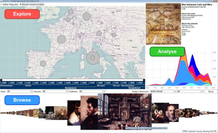
Figure 1: Graphical ArtVis user interface consisting of the Explore, Analyse and Browse panels
Requirement 1: “The user should get a better insight into the field of medieval artwork by performing geographical queries. The resulting dimensions are displayed on a world map and allow for further dynamic exploration by means of panning and zooming in-teraction.”
The second question, “During which century was sculpture in Eu-rope at its peak?”, requires an analysis of the data set in order to be answered. This analysis can, for example, be based on a graph visualisation showing the evolution of the production of different types of artworks over time. This second type of question resulted in the definition of the following requirement:
Requirement 2: “The user should get a better understanding about the evolution of the artistic production by visually analysing differ-ent dimensions of the stored data over time.”
The third question, “Could you show me all the paintings currently exposed in the Memling Museum in Bruges?”, demands for brows-ingthe representations of a number of artworks and the possibility to get detailed information about a selected piece of art. A third requirement can therefore be expressed as follows:
Requirement 3: “The user should be able to browse the data set and find artworks based on query arguments such as the artist’s name, the type of artwork, a location or a time period. The naviga-tion through the list of artworks should be supported via a fisheye view and once an individual artwork has been selected, the user should get a full description together with an enlarged image of the artwork.”
These three requirements for the exploration, analysis and brows-ingof information were instrumental in the design of the ArtVis user interface as described in the following section.
4.
ARTVIS PROTOTYPE
We based ourself on the three requirements described in the pre-vious section when defining the layout and design of the ArtVis visualisation shown in Figure 1. The ArtVis view is divided into the Explore, Analyse and Browse panels. Each of the three main panels covers a different facet which is linked to one of our three requirements. There is also an additional Detail panel at the upper right-hand side to show some details about a selected artwork. While not being a full linking and brushing interface, the ArtVis interface retains the core principles from linking and brushing by combining and synchronising different visualisation methods. It was designed in a way that the three panels shown in Figure 1 are synchronised. Selecting a subset of data in one of the panels directly influences the information displayed in the other panels. For example, after selecting a specific artwork inspiration (e.g. reli-gious artworks) in the Analyse panel, the Explore and Browse panel are updated accordingly and show only information about religious artworks. However, some actions such as selecting an artwork only update the Detail panel.
For the implementation of the presented view panels, we used the Java-based Prefuse information visualisation toolkit described by Heer et al. [4]. Prefuse offers a rich set of features for data mod-elling, visualisation and interaction. Furthermore, it provides some optimised data structures for tables, graphs and trees, as well as a number of layout and visual encoding techniques. Last but not
least, Prefuse offers support for animation, dynamic queries, inte-grated search and database connectivity. A MySQL database was used to locally store the data of the Web Gallery of Art. In the following we describe each of the three main panels in more detail.
4.1
Explore Panel
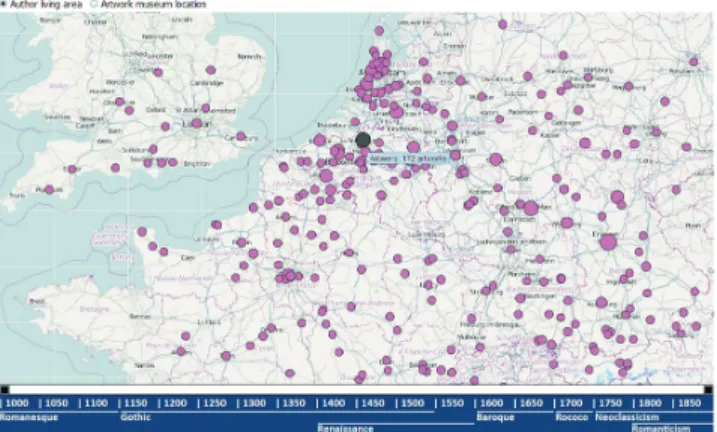
To address the first requirement for information exploration, we use a 2D map-based visualisation in combination with a time slider as illustrated in the Explore panel shown in Figure 2. The screenshot highlights the cities in Northern France and Belgium where reli-giously inspired art was produced from 1000 to 1850. Note that the pink colour of the circles indicates that the artwork inspiration Religioushas been selected in the Analyse panel shown in Fig-ure 3, since a different colour is used for each dimension.
Figure 2: Explore panel showing religious art production in Northern France and Belgium between 1000 and 1850 The map in the Explore panel provides a geographical indication of the artwork production. The visualisation in Figure 2 shows the results aggregated by city. The size of the circles is propor-tional to the number of artworks produced or exhibited in a city or country. The user can pan the map to reach any destination in the world. Note that the map is based on the OpenStreetMap3
project and the user can zoom between a city-level and a continent-level view. Two radio buttons located above the map let the user switch between the Author living area and the Artwork museum location. While the Author living area pro-vides a geographical overview of artist birthplaces, the Artwork museum locationshows in which museums the artworks are currently located. Finally, two slider buttons on the timeline located at the bottom of the Explore panel allow for restricting the time pe-riod to any time range, starting with the entire 850 years down to a minimum range of 100 years. Note that for convenience, the main art movements (e.g. Romanesque, Gothic or Renaissance) are also indicated on the timeline.
4.2
Analyse Panel
The goal of the Analyse panel shown on the right-hand side of Fig-ure 1 is to visualise information about the evolution of the number of artworks over time for different dimensions (e.g. artist schools, artist inspirations or artwork forms). In the visualisation of the Analyse panel, we make use of a stacked area chart and allow the user to select one of the artwork dimensions for which they want to track the evolution.
3
http://www.openstreetmap.org
Figure 3: Analyse panel showing the evolution of artwork in-spirations over time
An example of the Analyse panel is highlighted in Figure 3. By de-fault, the chart shows the cumulated totals of all artworks for the se-lected dimension. The user can select one of the values by clicking on the chart or by selecting it from the second combo box. For in-stance, Figure 3 outlines the evolution of artwork inspirations over time. By clicking on one of the coloured areas, the Analyse and the Explore panels are updated and only show information related to the selected category. This way, users can geographically and tem-porally explore the evolution of semantic dimensions by exploiting the capabilities of the previously described explore panel.
4.3
Browse Panel
The Browse panel is shown at the bottom of Figure 1. It uses a fish-eye distortion technique to display a total of 50 artworks while pro-viding users the possibility to get more details about selected art-works. The small thumbnails are enlarged when the user moves the mouse over them. The closer the mouse pointer is to a thumbnail, the larger the distortion factor becomes. Furthermore, a tooltip pro-vides some basic information about the artist and their artwork and after clicking on an artwork, details are shown in the Detail panel at the upper right corner of the screen. Finally, three combo boxes above the artwork fisheye view allow for custom queries based on an artist’s name, the artwork title and the name of the museum. Thereby, a user also has the possibility to input specific and con-strained queries in the system to get more information about a spe-cific artist or artwork.
5.
TANGIBLE ARTVIS INTERFACE
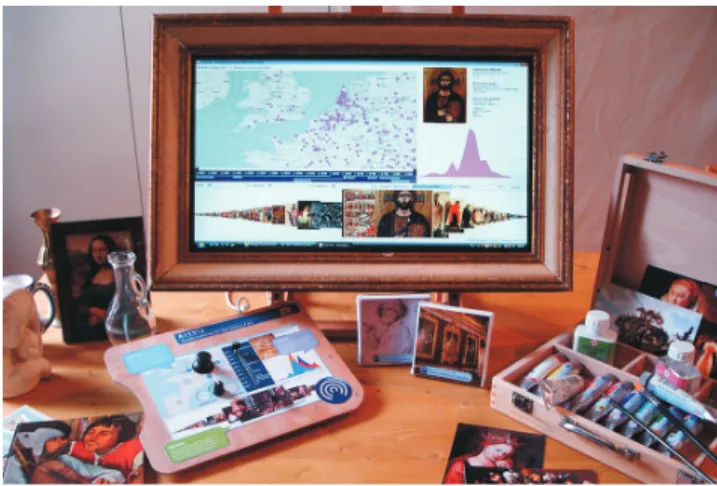
In order to provide users with an attractive and stimulating user interface, we created a tangible user interface to interact with the graphical ArtVis user interface. A secondary goal of the tangible user interface was to create a sufficiently constrained and rugged interface that children could use without fear of breaking it. The tangible setup highlighted in Figure 4 consists of a picture frame on a painter’s easel, a painter’s tube box and palette, some paint tubes, postcards as well as a few other artefacts including a small sculpture or a glass jug. In this setup which represents a painter’s working environment, each object can be used to interact with ArtVis and any output is shown on a screen which has been embedded into the picture frame.
Figure 4: Tangible ArtVis interface with all physical artefacts
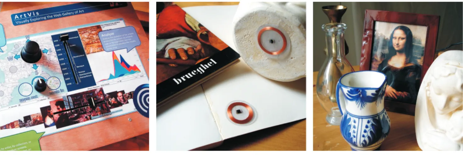
The tangible ArtVis interface has been developed based on Phid-gets. Phidgets are USB-controlled low-cost plug-and-play hard-ware components described by Greenberg and Fitchett [3]. A robust API that is available for a number of programming languages sim-plifies the communication with different Phidgets. For our tangible ArtVis interface, we assembled a number of Phidget controls on the painter’s palette as highlighted in Figure 5(a). The painter’s palette has further been covered with a printed guideline to provide a self-explanatory description on how to interact with the ArtVis application.
The painter’s palette combines the most prominent ArtVis controls. A small joystick is used to control the panning of the map while a rotation sensor is used to control the zoom level. A slider allows for navigating through the 850 year time span covered by ArtVis, with a fixed range of 100 years. Another slider is used to navigate through the artwork thumbnails shown in the Browse panel. Fi-nally, an RFID reader which can detect RFID-tagged objects as the ones shown in Figure 5(b) has been integrated in the lower right part of the palette. Filters such as the artist school, artwork inspiration or artwork form can be accessed through RFID-tagged objects. As an illustration, the production of different forms of artwork can be discovered by selecting one of the artefacts shown in Figure 5(c). For instance, the selection of the glass jug will show the evolution of glassware whereas the statue will give insights about the evo-lution of sculpture. Additionally, specific RFID tags for authors or museums can be integrated into books on these subjects. For example, a book about the Louvre museum in Paris will show a se-lection of the Louvre’s colse-lection together with the location where the artists were living.
6.
EVALUATION
The contribution of ArtVis is twofold. In a first step, we have de-fined visualisation requirements for the exploration of the WGA data set. In a next step, ArtVis has been extended with a tangible user interface to attract and stimulate end users in museum settings. We conducted two evaluations in order to assess these two contri-butions. The first evaluation verified the requirements which drove the design process, whereas the second evaluation measured the user experience with ArtVis. Both evaluations that we have carried out are an example of an evaluating communication through visu-alisationscenario as mentioned in the classification of empirical studies for information visualisation applications by Lam et al. [8].
6.1
Evaluation of the Requirements
The first qualitative user assessment was conducted based on the graphical ArtVis user interface presented earlier in this paper. In order to delimit the evaluation to strictly the verification of our vi-sualisation requirements implemented in the graphical user inter-face, in this first evaluation we have eliminated the tangible user interface and replaced it by mouse and keyboard. We had ten par-ticipants aged between 20 and 62 years, with an average age of 44.3 years. Six participants were male and four were female. Further-more, two participants mentioned that they had advanced computer skills while the remaining eight participants had either basic or in-termediate computer skills. Finally, seven participants declared to have some interest in art but no participant was an art connaisseur. The main goal of our evaluation was to assess whether users who work with the ArtVis application for the first time are able to find relevant information via the predefined visualisation requirements. In order to ensure that we cover most of the functionality offered by the ArtVis graphical user interface, we took great care in defining a number of closed questions to be answered with the help of ArtVis. It should be noted that in a typical museum environment, the visi-tors are not given explicit tasks or questions but rather explore the information managed by ArtVis based on their own preferences. Nevertheless, the presented evaluation should measure the ability to explore information by the visualisation requirements in a valid manner which is not possible in an in-context evaluation design. Therefore, we conducted a task-oriented evaluation in order to ver-ify the visualisation requirements and took the exploration based on the users’ own preferences into account in the evaluation design of our user experience evaluation. The users got three questions for each, the Explore, Analyse and Browse panels, and three questions which required a combination of searches in different panels. Dur-ing the evaluation, the followDur-ing 12 questions had to be answered by using ArtVis:
Analyse:
1. When was the Flemish school at its peak?
2. What was the biggest inspiration for European artists around the year 1500?
3. Illumination is the art of decorating books. What can you say about its evolution over time?
Explore:
1. What are the top three European countries over the period 1000-1850?
2. What was the most active Italian city during Renaissance? 3. Give three American cities where you can find 18th century
European art. Browse:
1. One of the paintings in the Groeninghe Museum in Bruges is showing a very cruel scene. What is the title of this work? 2. We all know Brueghel for his famous rural and childish
scenes. But what is his first name?
3. In which museum can I find ‘The Geographer’ by Johannes Vermeer?
Combined:
1. I am interested in 17th century landscapes. Which city in the Netherlands do you recommend me to visit?
(a) Painter’s palette (b) RFID-tagged book and sculpture (b) Objects representing different types of artwork
Figure 5: Tangible ArtVis user interface components
2. Explore the region where you were born. Have a look at the artworks that were produced in your neighbourhood. Write down the names of some artists. Did you know them already? During which period were they active?
3. Leonardo da Vinci was born in Italy in 1452. But what hap-pened to his oeuvre? Is the majority of it still in Italy? Name one of the pieces that can be found in the United Kingdom. In which museum is it located?
Before the users were handed out the questions, they were informed about the application. We explained them that ArtVis consists of a database containing a large number of artworks and offers ad-vanced visualisation techniques in order to enable the user to gain new insights from that data. Since in a typical museum environ-ment, the museum visitors use the application only once and prob-ably for a short time without an elaborated introduction, we have limited the researcher’s participation. The only information that was handed out to the participants was a printed guideline card to ensure that everybody got the same information. The guideline card consists of the screenshot shown in Figure 1, with small text blocks describing each panel.
Requirement Answered questions Correct answers
Analyse 100% 93.33%
Explore 100% 83.33%
Browse 100% 86.66%
Combined 100% 93.33%
Table 1: Results of the requirements evaluation
Our evaluation’s goal was to know whether the typical user could find the answers to the twelve questions presented earlier. The first thing to note is that all participants answered all the questions. The average correctness of the answers for all questions related to each visualisation panel and the combined panels indicates that users managed to explore the relevant information by using ArtVis as il-lustrated in Table 1. Furthermore, the score of each participant’s correct answers varied from 75% up to 100%, with an average of 89% correct answers. It further took them between 30 and 50 min-utes to answer the twelve questions, with an average of 36 minmin-utes.
It was remarkable to see that even after having spent 30 to 50 min-utes to answer the questions, some participants continued to work with ArtVis in order to gain new insights. While our task was repre-sentative for the type of questions that can be answered with ArtVis, some of these questions would be difficult to answer by using the approaches introduced in the related work section.
6.2
User Experience Evaluation
The second evaluation investigated the user experience of ArtVis since the aim was to attract and stimulate users in exploring the relevant artwork information. In contrast to the evaluation of the visualisation requirements, for this evaluation the tangible user in-terface was again included in the prototype. We had eleven partic-ipants aged between 21 and 26 years. Four were female and seven male. Out of the eleven participants, one user followed art school but not particularly directed to the artworks in the data set, whereas six participants had an interest in artworks as leisure and four par-ticipants stated that they did not have a general interest in art. The fact that visitors in a museum setting have different levels of art knowledge is therefore reflected in our set of participants. In order to fill in the evaluation design of evaluating communi-cation through visualisationscenario [8], the data collection was done through observation, a questionnaire and semi-structured in-terviews. Note that the evaluation was conducted in a laboratory setting since it was out of our possibilities to install ArtVis in a real museum setting. Participants were given a similar introduction to ArtVis as in the first evaluation by explaining them that ArtVis consists of a database containing a large number of artworks and offers advanced visualisation techniques in order to enable users to get new insights from that data. In contrast to the first evalua-tion, we did not hand out a guideline card with small text blocks describing each panel. Instead, the guideline card was integrated in the painter’s palette as shown in Figure 5(a). Furthermore, we informed the participants about the integration of RFID tags in all physical artefacts forming part of the ArtVis setting. We did not elaborate on the functionality of each artefact in the tangible inter-face since in a museum setting there would also be no guidance. Each participant had to explore the artworks data set by their own preferences during at least five minutes. There were no specific tasks given in order to imitate a real museum setting. The
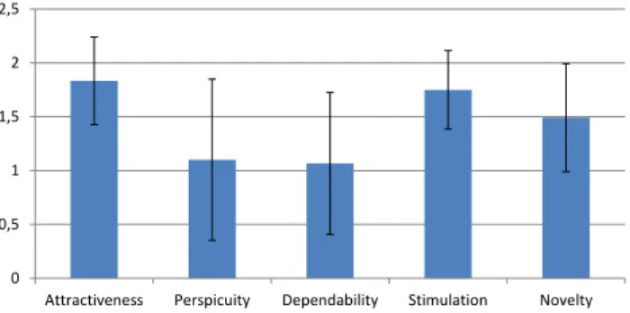
interac-tion with ArtVis was observed whereas quesinterac-tions by the participant were noted down and answered to a level that their overall interac-tion was not influenced or biased. After the use of ArtVis, we inter-viewed each participant by means of a semi-structured interview. In this interview, we asked open questions about what makes ArtVis attractive, what made ArtVis fun to work with, the experienced dif-ficulties and potential improvements that should be applied before installing the prototype in a museum. Besides these open questions, we asked more details about certain observed activities in the obser-vation. Finally, the participants were given a questionnaire in order to measure the user experience. We have used a standardised user experience questionnaire developed by Laugwitz et al. [9]. Five scales are evaluated including attractiveness, stimulation, perspicu-ity, dependability and novelty. Each scale is measured via four to six factors. Furthermore, each factor is measured on a 7-point Lik-ert scale between the opposites. For example, a factor of the scale attractiveness is a 7-point Likert scale between annoying and en-joyable. In addition, our results have a Cronbach alpha above 0.7 for all five scales. The results of the questionnaire show a positive evaluation of all five scales as highlighted in Figure 6. Note that in the graph the negative side of the 7-point Likert scale is omitted since all scales have positive means and the error bars indicate the confidence interval with a significance of 0.05 (p = 0.05). Due to the use of scales which are constructed out of several factors, it is rare to observe means higher than two since extreme values are hidden in the means of the factors.
0 0,5 1 1,5 2 2,5
Attractiveness Perspicuity Dependability Stimulation Novelty
Figure 6: UX evaluation
Attractiveness and stimulation do have a high mean with a rela-tively small confidence interval which confirms our goal of attract-ing and stimulatattract-ing users. The positive evaluation of attractiveness and stimulation was also apparent during the observations and in-terviews. During the first evaluation, users still kept on playing with ArtVis although the questions were completed. Similarly, in the second evaluation, users often explored ArtVis longer than the minimal five minutes even though they did not have any mandatory tasks to fulfil. Additionally, a participant who had no real interest in art stated “Cool, normally it is my boyfriend who always talks about artworks when we visit a museum but with this tool I can beat him with my art knowledge without having to read about paintings. If you place it in a museum, I am the kind of person who will play with it for a long time in order to have fun. Certainly, with the scannable artefacts.”. In all observations, we could see that users used almost all the artefacts included in the tangible user interface in order to interact with the visualisation panels. This was also re-flected in the interviews where 9 out of 11 participants found the tangible user interface the most fun component of the ArtVis in-stallation. In the tangible user interface, the painter’s palette shown in Figure 5(a) was the most pleasant component.
Compared to the attractiveness and stimulation scales, we need to be careful with the interpretation of the perspicuity and depend-ability scales. Although they have still a positive evaluation with a mean just above one on the positive side of the 7-point Likert scale, the confidence interval is not so small. After a deeper look into the collected data of the different factors constructing these scales and the observations as well as the interviews, we can explain these results. From the interviews we identified that users experience dif-ficulties with the digital feedback after a query has been invoked via an artefact forming part of the tangible user interface. For example, when a user hovers over the painter’s palette with a paint tube repre-senting a particular art school, this is reflected in the Analyse panel by changing the values of the chart and by indicating the queried art school as the value in the combo box below the chart as illus-trated in Figure 1. Nevertheless, users did not always notice this change in the combo box and were wondering whether their query succeeded. After executing a query, participants often further ex-plored the information via the painter’s palette. In this interaction, users were sometimes not aware anymore which query they had performed before. A participant mentioned “Sometimes I just do not know anymore which art school I am browsing since when I hover an artefact a lot of information is changed in the graphical user interface. It was not clear at first to me that the value in the combo box indicates the art school which I had queried.”. The lack of more obvious user feedback could have lead to the higher scores for factors such as unpredictability. This issue could be solved by improving the feedback about the current application state. In ad-dition, some users did not like the “unknown” behind the artefacts containing an RFID tag. Although the artefacts are labelled with the dimension they represent, a common advice was to integrate a guideline which illustrates the functionality of the artefacts forming part of the tangible user interface. On the other hand, the majority of participants indicated that this “unknown” functionality stimu-lated them to try out these artefacts while exploring the artworks data set.
Finally, we observed that a few users with a certain degree of art knowledge were looking for specific painters or artworks. Once they had found a particular subject, they started to explore related information from there on. This is in contrast with the majority of users who started with the exploration of art information at a general level before narrowing it down via queries. Nevertheless, it might be useful to extend the functionality of the currently existing search boxes and make them more obvious.
7.
DISCUSSION AND FUTURE WORK
The idea of the linking and brushing approach is to combine differ-ent visualisation methods to overcome the shortcomings of a single technique. A user can select multiple items in one visualisation and see how these items are reflected in another visualisation. ArtVis currently only supports partial linking and brushing. For example, a selection in the Analyse panel is reflected in the Explore panel but not the other way around. In the future, we therefore plan to support full linking and brushing where a user can, for instance, se-lect multiple cities or countries in the Explore panel and study the evolution of the related artwork dimensions in the Analyse panel. The current version of our tangible ArtVis user interface supports the selection of different dimensions based on a single physical artefact. We are currently further extending the tangible ArtVis user interface in order to support more advanced queries based on the combination of multiple physical artefacts. Our evaluation of ArtVis in a laboratory setting, focussed on the verification of the
visualisation requirements and the user experience in order to mea-sure the attractiveness and stimulation. In the near future, we plan to perform a detailed evaluation of the tangible user interface in a museum setting, possibly already including some of the more ad-vanced tangible query functionality.
An installation of ArtVis has been presented to a larger audience as part of a science fair where the prototype has also been exten-sively used by children. While there was a strong interest from people with an art background, visitors motivated us to apply the same tangible interface for the exploration of large data sets in other exhibition settings. More importantly, in discussion with multiple teachers we identified that, in addition to the domain of interac-tive exhibitions, there might be a significant potential to use the ArtVis prototype in classroom settings. An important aspect of active learning is the exploration and investigation of specific in-formation and data sets in order to gain new insights. These tasks could be perfectly supported via the explore, analyse and browse functionality offered by ArtVis.
8.
CONCLUSION
We have presented ArtVis, an application that combines advanced visualisation techniques with tangible interaction to explore a large collection of European artworks. The content of the Web Gallery of Art can be explored, analysed and browsed via three different views. The presented tangible ArtVis user interface serves two purposes. First, it improves the usability of the ArtVis application by defining and restricting the operations offered via the painter’s palette. Second, it suggests queries through the use of tangible objects, with each object having a specific meaning (or query) at-tached to it. A major design challenge for applications to be used in museum settings is to provide a usable and inviting interface in order that visitors are encouraged to explore the application. Our user experience evaluation of ArtVis highlights that the tangible user interface indeed attracts and stimulates users. We foresee that by constraining the input space through the use of tangible inter-faces, museum visitors will feel more confident in exploring an un-known application. Last but not least, the presented combination of advanced visualisation and tangible interaction has not only the potential for exploring rich data sets in other exhibition domains, but might also provide opportunities for active learning and the ex-ploration of information in educational settings.
Acknowledgments
Bruno Dumas is supported by MobiCraNT, a project forming part of the Strategic Platforms programme by Innoviris. We would fur-ther like to thank all the study participants.
9.
REFERENCES
[1] A. Amin, M. Hildebrand, J. van Ossenbruggen, and L. Hardman. Designing a Thesaurus-based Comparison Search Interface for Linked Cultural Heritage Sources. In Proc. of IUI 2010, Hong Kong, China, February 2010. [2] G. Ciocca, P. Olivo, and R. Schettini. Browsing Museum
Image Collections on a Multi-Touch Table. Information Systems, 37(2), April 2012.
[3] S. Greenberg and C. Fitchett. Phidgets: Easy Development of Physical Interfaces Through Physical Widgets. In Proc. of UIST 2001, Orlando, USA, November 2001.
[4] J. Heer, S. K. Card, and J. A. Landay. Prefuse: A Toolkit for Interactive Information Visualization. In Proc. of CHI 2005, Portland, USA, April 2005.
[5] U. Hinrichs, H. Schmidt, and S. Carpendale. EMDialog: Bringing Information Visualization Into the Museum. IEEE Transactions on Visualization and Computer Graphics, 14(6), November 2008.
[6] S. Hinton and M. Whitelaw. Exploring the Digital Commons: An Approach to the Visualisation of Large Heritage
Datasets. In Proc. of EVA 2010, London, UK, July 2010. [7] D. A. Keim. Information Visualization and Visual Data
Mining. IEEE Transactions on Visualization and Computer Graphics, 8(1), January 2002.
[8] H. Lam, E. Bertini, P. Isenberg, C. Plaisant, and S. Carpendale. Empirical Studies in Information Visualization: Seven Scenarios. IEEE Transactions on Visualization and Computer Graphics, 18(99), September 2012.
[9] B. Laugwitz, T. Held, and M. Schrepp. Construction and Evaluation of a User Experience Questionnaire. HCI and Usability for Education and Work, 5298, 2008.
[10] B. Lee, P. Isenberg, N. H. Riche, and S. Carpendale. Beyond Mouse and Keyboard: Expanding Design Considerations for Information Visualization Interactions. IEEE Transactions on Visualization and Computer Graphics, 18(12), December 2012.
[11] T. Nørretranders. The User Illusion: Cutting Consciousness Down to Size. Viking, 1991.
[12] M. Nunes, S. Greenberg, and C. Neustaedter. Sharing Digital Photographs in the Home Through Physical Mementos, Souvenirs, and Keepsakes. In Proc. of DIS 2008, Cape Town, South Africa, April 2008.
[13] J. Ossenbruggen, A. Amin, L. Hardman, M. Hildebrand, B. van Assem, B. Omelayenko, G. Schreiber, A. Tordai, V. de Boer, B. Wielinga, J. Wielemaker, M. de Niet, J. Taekema, M. van Orsouw, and A. Teesing. Searching and Annotating Virtual Heritage Collections with Semantic-Web Techniques. In Proc. of Museums and the Web 2007, San Francisco, USA, April 2007.
[14] B. Shneiderman. The Eyes Have It: A Task by Data Type Taxonomy for Information Visualizations. In Proc. of VL 1996, Boulder, USA, September 1996.
[15] M. Spindler, C. Tominski, H. Schumann, and R. Dachselt. Tangible Views for Information Visualization. In Proc. of ITS 2010, November 2010.
[16] A. Thudt, U. Hinrichs, and S. Carpendale. The Bohemian Bookshelf: Supporting Serendipitous Book Discoveries Through Information Visualization. In Proc. of CHI 2012, Austin, USA, May 2012.
[17] B. Ullmer and H. Ishii. The metaDESK: Models and Prototypes for Tangible User Interfaces. In Proc. of UIST 1997, Banff, Canada, October 1997.
[18] B. Ullmer, H. Ishii, and R. J. K. Jacob. Tangible Query Interfaces: Physically Constrained Tokens for Manipulating Database Queries. In Proc. of Interact 2003, Zurich, Switzerland, September 2003.
[19] Y. Wang, N. Stash, L. Aroyo, P. Gorgels, L. Rutledge, and G. Schreiber. Recommendations Based on Semantically Enriched Museum Collections. Web Semantics: Science, Services and Agents on the World Wide Web, 6(4), November 2008.
[20] K.-P. Yee, K. Swearingen, K. Li, and M. Hearst. Faceted Metadata for Image Search and Browsing. In Proc. of CHI 2003, Fort Lauderdale, USA, April 2003.