Error prevention in online forms: Use color instead of asterisks to mark
required-fields
Stefan L. Pauwels
*, Christian Hübscher, Stefan Leuthold, Javier A. Bargas-Avila, Klaus Opwis
University of Basel, Faculty of Psychology, Department of Cognitive Psychology and Methodology, Basel, Switzerland
a r t i c l e
i n f o
Article history:
Received 19 December 2008 Received in revised form 26 May 2009 Accepted 26 May 2009
Available online 23 June 2009 Keywords: Online forms Required-fields Error prevention User feedback Interaction design
a b s t r a c t
In this study, a simple but important user interface design choice is examined: when marking required-fields in online forms, should GUI designers stick with the often used asterisk that many form design guidelines cite as the de-facto web standard, or should they choose a colored background as a new design solution to visually signal which input fields are required? An experiment with 24 participants was conducted to test the hypotheses that efficiency, effectiveness and satisfaction ratings of colored required-fields exceed those of asterisk-marked required-fields. Results indicate that colored required field marking leads to fewer errors, faster form fill-in in and higher user satisfaction.
Ó 2009 Elsevier B.V. All rights reserved.
1. Introduction
Entering data into forms is the information worker’s equivalent to the factory worker’s placing items on a conveyor belt. Both com-puter applications and machines installed along the conveyor belt are fed input, data or items, based on which they carry out certain transformations. In order to avoid process errors (e.g. transforma-tions applied to the wrong item, yielding undesirable or at least unpredictable results), both computer applications as well as fac-tory machines need to stop processing and alert the worker if no input is present. If input is present and properly formatted as re-quired by the transformations applied, both types of machines work with great speed and accuracy.
As Frederick Winslow Taylor, the founder of scientific manage-ment, argued, companies should strive for the greatest possible productivity, because this leads to the greatest possible prosperity for company owners and workers alike (Taylor, 1911). Productivity can be defined as data or items processed per time unit (US Federal Bureau of Justice Assistance, 2008). Thus, for computer applica-tions, in order to achieve greatest possible productivity, companies need to prevent errors in data input and design input systems to maximize input and transformation efficiency. Knowing what
input a process needs in order to proceed and how exactly to enter data in the correct format are the two main problems form design needs to address from the information worker’s perspective. This study examines a part of the first question: how should required input fields for data input on an online form be marked?
Wroblewski (2008)mentions three different usage contexts of online forms: e-commerce applications, applications for social interactions, and productivity-based applications. He finds that form design should not be neglected by companies with online user interfaces, stating increased completion rates of between 10% and 40% from improvements indicated by his research and experience. Spool (in Wroblewski, 2008) mentions a real-life example of an online form redesign yielding increased revenues of $1.5 million in the first week, with a total of over $300 million increased revenue in the first year.
1.1. Theoretical background
Cooper et al. (2007)devote the first chapter of their textbook on user interface design to goal-directed design, which rests on the awareness that human behavior is goal-oriented from the age of three (Klossek et al., 2008). Behaving in a goal-oriented way means that users choose their actions in order to get as much value as possible from an IT system with the least amount of effort expended. As for forms, they will try to enter the least possible amount of data in order to get the desired result, e.g. start or pro-ceed with a process or become authorized to do something. The only reasons to enter more information are either errors in input field validation, or the system’s failure to interpret the user’s input
0953-5438/$ - see front matter Ó 2009 Elsevier B.V. All rights reserved. doi:10.1016/j.intcom.2009.05.007
* Corresponding author. Address: University of Basel, Faculty of Psychology, Department of Cognitive Psychology and Methodology, Missionsstrasse 60/62, 4058 Basel, Basel-Stadt, Switzerland. Tel.: +41 61 267 35 68; fax: +41 61 267 06 32.
E-mail addresses:[email protected](S.L. Pauwels),[email protected]
(C. Hübscher),[email protected](S. Leuthold),[email protected](J.A. Bargas-Avila),[email protected](K. Opwis).
Contents lists available atScienceDirect
Interacting with Computers
in such a way as to arrive at a single possible path of the process, therefore asking for more information.Cooper et al. (2007)argue that it is best to provide the user with rich modeless feedback, sig-naling that required data is missing without interrupting the user’s work.
Most web design guidelines are derived from a rather small set of heuristics like ‘‘Minimize the user’s memory load” or ‘‘Provide an obvious way to undo actions” (e.g.Nielsen and Landauer, 1993; Polson and Lewis, 1990).Nielsen (1994)shows that a few heuris-tics are indeed enough to explain a remarkable number of observed usability errors. Tidwell (2005)presents 12 behavioral patterns gathered from user observations, and derives the heuristic of marking required input fields from the pattern of ‘‘deferred choices”, stating that users often want to or have to skip input fields and may want to come back to them later. Considering the five usability metrics introduced byNielsen (1993), the marking of required-fields can be assumed to contribute mainly to effi-ciency and error prevention, which, for online forms, translates into four steps:
(1) The user’s perceptive and cognitive acts of finding the required-fields with respect to the current task.
(2) Entering properly formatted data into the input fields as quickly as possible.
(3) Navigation between form input elements.
(4) Validation of form input, where each blank required input field and each formatting error decreases efficiency substantially.
The first step is addressed by all web design guidelines exam-ined for this study, which argue that required-fields should be clearly marked in order to make users efficient and prevent errors (Fowler et al., 2004; Horton, 2005; Koyani et al., 2004; Shneider-man and Plaisant, 2004; Tidwell, 2005; Wroblewski, 2008). One exception is found in the Apple Human Interface Guidelines (Apple Inc., 2008), which states that, to prevent visual clutter, an asterisk or custom icon next to a required input field should be displayed only after the user attempts to leave the current context (e.g. by clicking Continue or OK).
WhereasHorton (2005)is satisfied with marking required-fields, other guidelines explicitly state design solutions: Wroblewski (2008)argues use of an asterisk, because it has become the de-facto standard on the web, and, for top-aligned input field labels, even the use of ‘‘* required” instead of the asterisk alone. He warns not to use the same indicator for required-fields as for optional fields through-out a web site.Fowler et al. (2004)also argue for the asterisk, but mention the use of arrows or other symbols to indicate required-fields. They advise against using color (for either field background or label) or boldface, because screen readers are not able to interpret their meaning, necessitating a lot of guesswork for the visually im-paired or blind people using screen readers.Shneiderman and Plai-sant (2004)state having taken their guidelines from practitioners’ works, since there is ‘‘a paucity of empirical work on form fillin”. They argue that optional fields should be marked with the word ‘‘optional” or another distinct visual mark, and that optional fields should be placed after required-fields. In addition, they recommend using a clear completion signal, so users understand at what point they can safely submit the form because all necessary information has been entered.
In the only empirical study that has been identified to date,
Tullis and Pons (1997)compared several possibilities for mark-ing required input fields. They found only small differences in completion time between chevrons placed before the field label and colored fields, but users preferred colored fields to chevrons in ratings on scales of visual appearance and overall effectiveness.
As for the second and third steps, entering data in the right for-mat and navigating between input elements: because expert users are fastest if they do not have to home between mouse and key-board, speeding up form input entry is a main priority of form design.Shneiderman and Plaisant (2004)advise enabling the tab key to move the cursor between fields. Many other guidelines for form entry and form navigation can be found in the works quoted above, like considering the layout of form input elements or using effective default values. For this study, it is sufficient to state that if users are able to enter data as quickly as possible, they are faster the fewer input fields that are required and the fewer optional ones they have to attentively process in order to rule them out and focus on the required ones. The most efficient form is the one that has the fewest possible required-fields grouped together, clearly indi-cating that users can submit the form once they have completed the fill-in of the group. This line of argument is found in several works, e.g.Fowler et al. (2004) and Wroblewski (2008).
Concerning the fourth step, validation of form input, Bargas-Avila et al. (2007)researched the presentation of error messages but not the marking of required-fields. Their Modal Theory of Form Completion suggests that users enter data into a form while in completion mode before being mentally ready to address errors in revision mode. It is not known whether required-field markings support users during completion mode, revision mode or both.
Bargas-Avila et al. (2007)show that users tend to just overlook messages relevant for evaluation during completion mode. Form fill-in performance is not negatively influenced by this. Therefore it can be assumed that good required-field design cannot do any harm even if unnecessarily present in completion mode.
Practitioners in form design mention the trade-off between effi-ciency and error prevention (Baxley, 2002): Forms can either be optimized for expert users, who know data type and format of every single entry field, or they can be optimized for novice or infrequent users in order to prevent data entry errors. Thus, form design should take into consideration variance in user behavior (frequent vs. infrequent users; expert vs. novice users) in order to maximize efficiency, and de-facto standards, using what users already know and understand to prevent errors in data entry.
The different theoretical and practical considerations men-tioned above can be summarized into two overarching guidelines:
(1) Make required-fields clearly visible on first sight (Fowler et al., 2004; Horton, 2005; Koyani et al., 2004; Shneiderman and Plaisant, 2004; Tidwell, 2005; Wroblewski, 2008) in order to facilitate fill-in for novice users and speed up per-ception by expert users. An asterisk is probably not the pre-ferred visual mark because it takes more time to perceive (Ware, 2008), although it can be read by a screen reader (Fowler et al., 2004).
(2) Add additional visual elements if the user wants to leave the context and a required-field is still empty, in order to draw his attention to the correct location on the screen (Apple Inc., 2008). This supports the switch from completion mode to revision mode (Bargas-Avila et al., 2007) and is modeless (Cooper et al., 2007).
This study is concerned with the overarching guideline 1 men-tioned above, namely the marking of required-fields. The aim of the study is to explore an alternative to the visually not very salient asterisk next to field labels: marking required-fields by coloring their background, a measure that should ease form fill-in for users according to recommendations to clearly mark required-fields. In particular, professional users of a financial services firm were asked to fill out a rather complex online form in a real-life task. The number of errors they committed was measured as was the speed with which they could complete the form when the
required-fields of the online forms were either marked by an aster-isk, as is the convention in web design (Wroblewski, 2008), or colored. In this study, the following questions are explored: does marking required-fields with background color instead of using an asterisk besides the text label lead to fewers errors in form fill-in? Are participants able to complete form fill-in faster if required-fields are marked with background color instead of aster-isks? And finally, does marking required-fields with colored back-grounds affect user satisfaction positively compared to asterisk markings?
2. Method
2.1. Design
For this study, participants filled out two different versions of a form that is part of a browser-based CRM application. The study used a related samples design. The independent variable was the type of marking applied to required-fields. It had two levels: mark-ing by labels with asterisks and markmark-ing by colored field back-grounds. Figs. 1 and 2 show parts of the forms with different marking types for required-fields.
Dependent variables were the number of errors a participant made during the task, task completion time and a post-test question-naire to assess a participant’s satisfaction with the user interface. Once a participant tried to submit a form, each empty required-field was counted as an error. A message was presented to the user, con-taining information about the missing required-fields. The form was not submitted until all required-fields were complete. The short form of QUIS (Chin et al., 1988), a validated and widely used ques-tionnaire (Shneiderman and Plaisant, 2004) for user interface satis-faction, was applied to measure user satisfaction.
2.2. Participants
The study was conducted with 24 participants. Their age ranged from 21 to 48 with a mean of 32 (SD = 7.2). Thirteen of the partic-ipants were women. All particpartic-ipants were employees of a financial institute. They were all users of the CRM application from which the manipulated forms were taken. The CRM application imple-mented both versions of required-field markings in different screens in an inconsistent manner, therefore participants were used to both variants.
2.3. Apparatus and materials
The two versions of the web based form were recreated as part of a mock-up of the CRM application using HTML and Adobe Flash technology. Flash was used so the look and feel of the proprietary CRM application could be mimicked. The mock-up was presented on a laptop computer and sessions were recorded with the usabil-ity test recording software TechSmith Morae (version 2.0.1). Errors were tracked using markers in Morae. Task completion time was logged automatically by the software. Participants received a paper interview guide that included a short demographic questionnaire, the instructions to the two tasks they had to complete, and the short version of QUIS after every task. Finally, two additional ques-tions were added, to explore whether the experimental task was realistic and how frequently the participants encounter it during their work.
2.4. Procedure
Participants completed the experiment individually. They were presented with the start page of the application mock-up and were
told to complete the questions and tasks in the interview guide. The two tasks in the interview guide had the following form:
‘‘Customer hCi called and asked you to buy hNi registered shares of hStock Xi (Symbol: hYi) at market. Use portfolio number hZi.”
After completing the task, all participants answered the satis-faction questionnaire and the task suitability questions. Every par-ticipant completed two tasks, one for every required-field marking type. The order of the two required-field marking types was alter-nated to counter sequence effects: half the participants’ forms had required-fields marked by asterisks during the first task and colored backgrounds during the second task, the other half of the participants had forms with required-fields marked by colored backgrounds during the first task and asterisks during the second task.
3. Results
The measured dependent variables of the two required-field marking conditions are shown inTable 1.
To test the hypotheses that colored backgrounds as required-field markings lead to fewer errors, faster form fill-in and greater satisfaction compared to asterisk markings, t-tests for related sam-ples and an alpha level of .05 were used. There were statistically significant differences: marking required-fields by colored background caused fewer errors, t(23) = 2.777, p = .006, shorter
task completion time, t(23) = 1.836, p = .04, and higher satisfaction, t(23) = 1.754, p = .047 (one-tailed tests).
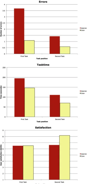
To control the applied sequence effect counter measures, the data were analysed using two-way analyses of variance (ANOVA) with required-field marking (asterisk, colored background) and experi-mental sequence (asterisk – colored background, colored back-ground – asterisk) as the two factors and an alpha level of .05. Dependent variables were, again, number of errors, task time and satisfaction.Fig. 3shows that in the second trial, participants com-mitted fewer errors, F(1, 22) = 6.102, p = .022, were faster, F(1, 22) = 19.844, p < :001, and were more satisfied, F(1, 22) = 4.510, p = .045, no matter what task they did second. Alternating the order of required-field markings in the tasks successfully coun-tered these sequence effects as all three analyses showed no signif-icant main effect for experimental sequence for number of errors, F(1, 22) = 2.538, p = .125, task time, F(1, 22) = .023, p = .881, and sat-isfaction F(1, 22) = 2.631, p = .119.
4. Discussion
Participants completed form fill-in committing significantly fewer errors when required-fields were indicated by colored back-grounds rather than by the usual asterisk. Furthermore, the colored background let them complete the forms significantly faster and more satisfied.
Since we measured task completion time as the duration from initial display of the form to its successful completion, we have to assume that task times were influenced directly by whether a form could be submitted free of errors on the first try or whether the participants had to deal with it again after an unsuccessful at-tempt. The influence of task completion times was therefore to a large degree moderated by the number of errors committed. This had the advantage of getting a realistic picture of the actual time
Fig. 2. Part of the stock exchange order form with required-fields marked by asterisks besides labels.
Table 1
Statistical parameters for different required-field markings.
Asterisk Colored background
Measures n M (SD) M (SD)
Number of errors 24 2.540 (2.621) .830 (1.239) Task completion time (s) 24 152.852 (96.008) 108.146 (71.912) Satisfaction (QUIS) 24 6.560 (1.454) 7.342 (1.775)
loss during form fill-in from the users perspective: Complete successful form fill-in takes 41% more time if required-fields are not properly highlighted. It was also shown that, although a gen-eral performance increase from first to second form fill-in exists, this benefit is in addition to any required-field-marker related differences. In other words, colored backgrounds are better mark-ers for required-field than asterisks no matter how well a form is known.
An important question is why required-fields with colored backgrounds help participants to commit fewer errors? Although the asterisk is a de-facto standard to indicate required-fields, it seems the additional saliency provided by the colored background, which is of course much larger than the asterisk, has a much better
chance of preventing incomplete form submission. The fact that participants were significantly more satisfied with the forms with colored required-fields suggests that the raised saliency is a wel-come help rather than an annoying or unnecessary distraction.
The practical implications of this study are therefore that form designers can ease form input for users by marking required-fields with a colored background. One disadvantage of colored required-fields was mentioned earlier: the inability of screen readers to rec-ognize the color-markings. Consequently we advise designers to use colored backgrounds as an additional marker of required-field rather than an exclusive one.
However, this study does not answer the question, to what de-gree this finding is applicable to other forms. The form used in this experiment was quite complex and targeted towards a professional completing a critical task. Many forms on the Internet (e.g. forms for account creation) are smaller and have fewer or less dire conse-quences in the event of errors than an erroneous stock exchange order. However, many online forms are appearing in various order and checkout process pages where the support provided by improved required-field marking could prove helpful. It should be mentioned, that it is not possible to draw any conclusions on what color should be used to highlight the required-fields’ backgrounds. Yellow1 backgrounds provided the results reported here, but different factors could influence the best color choice. Usage of colors throughout a page’s or application’s design could influence saliency of yellow required-fields as well as general or site-specific information or warnings implied by the use of certain colors.
Acknowledgement
The authors would like to thank the Zürcher Kantonalbank (ZKB) in Zurich, Switzerland for the support and funding of this re-search as part of the UCD ZKBconnect project.
References
Apple Inc., 2008. Apple Human Interface Guidelines: User Experience. <http:// developer.apple.com/documentation/UserExperience/Conceptual/AppleHI Guidelines>.
Bargas-Avila, J.A., Oberholzer, G., Schmutz, P., de Vito, M., Opwis, K., 2007. Usable error message presentation in the world wide web: Don’t show errors right away. Interacting with Computers 19 (3), 330–341.
Baxley, B., 2002. Making the Web Work: Designing Effective Web Applications. Sams Publishing.
Chin, J.P., Diehl, V.A., Norman, K.L., 1988. Development of an instrument measuring user satisfaction of the human–computer interface. In: CHI’88: Proceedings of the SIGCHI conference on Human factors in computing systems. ACM, New York, NY, USA, pp. 213–218.
Cooper, A., Reimann, R., Cronin, D., 2007. About Face 3: The Essentials of Interaction Design. John Wiley & Sons.
Fowler, S., Stanwick, V., NetLibrary, I., 2004. Web Application Design Handbook: Best Practices for Web-based Software. Morgan Kaufmann.
Horton, S., 2005. Access by Design: A Guide to Universal Usability for Web Designers. New Riders Publishing Thousand Oaks, CA, USA.
Klossek, U.M.H., Russell, J., Dickinson, A., 2008. The control of instrumental action following outcome devaluation in young children aged between 1 and 4 years. Journal of Experimental Psychology: General 137 (1), 39–51.
Koyani, S.J., Bailey, R.W., Nall, J.R., Allison, S., Mulligan, C., Bailey, K., Tolson, M., 2004. Research-Based Web Design and Usability Guidelines. Health and Human Services Department, Washington, DC.
Nielsen, J., 1993. Usability Engineering. Academic Press.
Nielsen, J., 1994. Enhancing the explanatory power of usability heuristics. In: Proceedings of the SIGCHI Conference on Human Factors in Computing Systems. pp. 152–158.
Nielsen, J., Landauer, T., 1993. A mathematical model of the finding of usability problems. In: Proceedings of the SIGCHI Conference on Human Factors in Computing Systems, 206–213.
Polson, P.G., Lewis, C.H., 1990. Theory-based design for easily learned interfaces. Human–Computer Interaction 5, 191–220.
Shneiderman, B., Plaisant, C., 2004. Designing the User Interface: Strategies for effective Human-Computer Interaction. fourth ed. Addison-Wesley.
Fig. 3. Average numbers of errors, task completion times and satisfaction ratings for different required-field markings split by task position.
1
For interpretation of color in Figs. 1 and 3, the reader is referred to the web version of this article.
Taylor, F.W., 1911. The Principles of Scientific Management. Harper & Brothers Publishing. Tidwell, J., 2005. Designing Interfaces: Patterns for Effective Interaction Design. O’Reilly. Tullis, T.S., Pons, A., 1997. Designating required vs. optional input fields. In: CHI ’97: CHI ’97 Extended Abstracts on Human Factors in Computing Systems. ACM, New York, NY, USA, pp. 259–260.
US Federal Bureau of Justice Assistance, 2008.<http://www.ojp.usdoj.gov/BJA/ evaluation/glossary/>.
Ware, C., 2008. Visual Thinking for Design. Morgan Kaufman.
Wroblewski, L., 2008. Web Form Design: Filling in the Blanks. Rosenfield Media.