HAL Id: hal-01833223
https://hal.archives-ouvertes.fr/hal-01833223
Submitted on 26 Jul 2018
HAL is a multi-disciplinary open access
archive for the deposit and dissemination of
sci-entific research documents, whether they are
pub-lished or not. The documents may come from
teaching and research institutions in France or
abroad, or from public or private research centers.
L’archive ouverte pluridisciplinaire HAL, est
destinée au dépôt et à la diffusion de documents
scientifiques de niveau recherche, publiés ou non,
émanant des établissements d’enseignement et de
recherche français ou étrangers, des laboratoires
publics ou privés.
MDE in Support of Visualization Systems Design: a
Multi-Staged Approach Tailored for Multiple Roles
Ivan Logre, Anne-Marie Dery-Pinna
To cite this version:
Ivan Logre, Anne-Marie Dery-Pinna. MDE in Support of Visualization Systems Design: a
Multi-Staged Approach Tailored for Multiple Roles. Proceedings of the ACM on Human-Computer
Inter-action , Association for Computing Machinery (ACM), 2018, 2 (EICS), pp.14. �10.1145/3229096�.
�hal-01833223�
a Multi-Staged Approach Tailored for Multiple Roles
IVAN LOGRE,
Univ. Grenoble Alpes, CNRS, Grenoble INP∗, LJK, 38000 Grenoble, FranceANNE-MARIE DÉRY-PINNA,
I3S, UMR 7271, Université Côte d’Azur, CNRS, Nice, FranceVisualization systems such as dashboards are commonly used to analyze data and support users in their decision making, in communities as different as medical care, transport and software engineering. The increasing amount of data produced and continuous development of new visualizations exacerbate the difficulty of designing such dashboards, while the visualization need is broaden to specialist and non-specialist final users. In this context, we offer a multi-user approach, based on Model Driven Engineering (MDE). The idea is for the designer to express the visualization need by characterization, according to a given taxonomy. We provide a Domain Specific Language (DSL) to design the system and a Software Product Line (SPL) to capture the technological variability of visualization widgets. We performed a user study, using a software project management use case, to validate if dashboard users and designers are able to use a taxonomy to express their visualization need.
©ACM, 2018. This is the author’s version of the work. It is posted here by permission of ACM for your personal use. Not for redistribution. The definitive version was published in PACMHCI, Vol.2, ISSN 2573-0142 http://doi.acm.org/10.1145/3229096 CCS Concepts: •Human-centered computing → Visualization systems and tools; Visualization design and evaluation methods; •Software and its engineering → System modeling languages;
Additional Key Words and Phrases: Visualization; Meta-Model; Domain Specific Language ACM Reference Format:
Ivan Logre and Anne-Marie Déry-Pinna. 2018. MDE in Support of Visualization Systems Design, a Multi-Staged Approach Tailored for Multiple Roles.Proc. ACM Hum.-Comput. Interact. 2, EICS (June 2018),17pages.https://doi.org/10.1145/3229096
1 INTRODUCTION
The Gartner Group expects an increase of 45% of the connected objects from 2018 to 20201, reaching more than 20 Billions data producing objects. Currently, only a minority of the produced data is exploited. From this increase, a need
for data visualization systems raises. A visualization system is defined as “the visual display of the most information
needed to achieve one or more objectives” [10]. Two types of visualization systems are identified : exploratory and
analytic[18], depending on the intent behind their usage.
On the one hand, in the exploratory paradigm, the visualization system supports the users in the incremental
definition of their objectives. Both the relevant subset of data and the specific user tasks are undefined at the start of the
visualization design process. To ease the exploration, the design of such systems focuses on a high degree of interaction,
on a wide variety of visualizations and ideally on reconfiguration capabilities. For example, when data journalists work
on unstructured data from social network to extract knowledge about a given event as a terrorist attack, they require
to process different aspects on the data to identify an interesting hidden factor. It implies a need for a set of various
visualizations, refined by steps as their understanding of the data evolves.
1
https://www.gartner.com/newsroom/id/3598917
Authors’ addresses: Ivan Logre, Univ. Grenoble Alpes, CNRS, Grenoble INP, LJK, 38000 Grenoble, France, ivan.logre@univ- grenoble- alpes.fr; Anne-Marie
Déry-Pinna, I3S, UMR 7271, Université Côte d’Azur, CNRS, Nice, France, anne- [email protected].
2018. Manuscript submitted to ACM
On the other hand, in the analytic paradigm, the visualization system is tailored for a specificdiagnosis goal. It is commonly used for diagnosis in fields as various as management, healthcare, transport and energy. An analytic
visualization system captures the business knowledge of the users, using proven indicators to detect abnormalities
in order to support them in the decision making process. In this context, the user tasks and the proper data sets to
exploit are defined during the design of the system. To support the diagnosis goal, the design of such systems relies on
the identification of the relevant visualizations to use and their connections. For example, the post-operation medical
monitoring for cardiac diseases is a well-defined process which follows an approved protocol. The physician requires to
compare a given set of vital signs ;e.g., the heart rate, the blood pressure, the breathing capacity and the evolution of the white blood cells concentration ; with fixed indicators, in order to provide the relevant medication.
The context of visualization systems provides two challenges :(i) the support of the system design, i.e., a modeling challenge, and(ii) the choice of relevant visualizations among the available widgets offered by visualization libraries, i.e., a variability challenge. A classical way to support the design of complex systems (cf. (i)) in the Model-Driven Engineering (MDE) paradigm is the use of a Domain Specific Language (DSL). While the abstract syntax captures the structure of the domain in a meta-model, a concrete syntax allows the design of conform models through textual or
graphical representations. Designing at the model level instead of working on code allows to reason about the system,
by usinge.g., verification, validation or generation mechanisms. Software Product Lines (SPLs) are suitable to model variability of visualization solutions (cf. (ii)) and relies on strong logical foundations and configuration support. SPLs are defined as “a set of software-intensive systems that share a common, managed set of features and that are developed
from a common set of core assets in a prescribed way” [17].
In this article, we focus on analytic visualization systems intended for a known diagnosis task. The corner stone of
our contribution is to apply MDE to the design of visualization systems, to provide to each user the relevant support
to ease their task in the diagnosis process. We build on prior work by Logre et al. [14] but offer(i) to integrate it in a whole multi-user design approach, with an emphasis on the system designer role supported through a characterization
process, and(ii) to validate it with a user experiment focused on this specific role.
The outline of this article is the following. First, we provide in Sec.2a software project management use case, to be
used as a running example and to validate our contribution and we define the involved users, their materials and our
requirements. Then, we detail our designing approach step by step in Sec.3, highlighting the use of a visualization
widget catalog. The Sec.4explains how the catalog is produced using SPLs and the possible interactions with our
identified roles. Then, in Sec.5we validate our approach through a user experiment. We discuss the related work
in Sec.6. Finally, Sec.7compiles the conclusions, limits and perspectives of the contribution.
2 CONTEXT AND SCOPE
According to the given definition, the design of an analytic visualization system implies the selection of a relevant set
of visualizations (how), depending on the role of the user (who), with respect to the considered data (what) and the identified user task (why). In this section, we provide a illustrating use case, we detail the inherent complexity of these dimensions and we identify the requirements to be addressed in order to support the design of visualization systems.
The design of a visualization system is a complex task addressed by a large variety of methods. In human-centered
design, the software designer captures the needs of the final user, for example through the use of interviews, task
models or user stories. Then, they iterate on mock-ups and prototypes of increasing fidelity, and evaluate it directly
with the final user, leading toward a final viable implementation. The choice of the proper designing tools and methods
is highly dependent of the context.
The diagnosis goal, performed through visualization systems, is intrinsically linked to the domain of application.
For a better understanding, we describe an illustrating use case, re-used for the validation. Numerous indicators are
defined in terms of project management in the software engineering field. Both the project leader and the team members
themselves use visualization systems to assess the health of the project, by analyzing data extracted from software
engineering tools such as ticketing systems, version control systems and testing frameworks. We interviewed three
software engineering professors to extract the following coarse-grained tasks and their respective impact on the decision
making process in terms of grade:
• compare the tickets volume resolved by each team member, to evaluate their relative contributions; • calculate the average period required to resolve tickets, to estimate the technical debt;
• detect bad patterns in the evolution of ticket status (to do, in progress, done) through time, to prevent bottleneck situation;
• compare the distribution in the team of ticket attribution, for each status, to identify available and overbooked resources.
In this context, the team members (e.g., students of a software engineering module) are using the same visualization system as the teacher who grades.
Visualization systems are fast evolving systems as the final user often expresses new requirements emerging from the
usage (e.g. highlight a new aspect of the data in specific conditions). In the software engineering use case for example,
each teaching assistant customize her monitoring dashboard, and specialize it during the semester for specific needs for
some groups (e.g. if suspicion of laziness rises about a student). Within the MDE paradigm, the use of models provides
a higher abstraction space to design the system, it diminishes the cost of modifications and helps to quickly produce
high fidelity prototypes, and handles the variability of concrete solutions. In our case, it allows to reason aboutabstract visualizations (i.e., a visual space designed to highlight identified characteristics or properties of its input data), instead of enduring the technological complexity of numerousconcrete widgets (i.e., specific implementations of a visualization, unit of code). We offer an approach based on three layers of the MDE paradigm and three roles. The corner stone of our
contribution lies in the definition of thesystem designer role, which is neither a specialist in visualization nor the final user, and her usage of characterization to design a visualization system.
While the relevant indicators for a given diagnosis task are defined, the users needs evolve with their degree
of expertise, the object under study, and the context of use. Therefore, there is no such thing as an absolute, ideal
visualization system even in the analytic paradigm. This inherent difficulty implies that not all users are able to design
their own visualization system. We propose to characterize three roles involved in this design:
Visualization experts are visualization professionals, they possess the knowledge required to specify which visualization is suitable for a given task;
Final users possess the business knowledge, without any assumption on their ability to understand the visualization system internal behavior;
System designers are software engineers, they are expected to capture both business and visualization knowledge and provide executable solutions suitable for the final user task.
Within the software project management use case, Atlassian2engineers are the visualization experts, providing visualization widgets adapted to their software tools (i.e., Jira, Bitbucket, Confluence). The system designer is the professor responsible of the SE module, and the final users are the students. In this use case, teaching assistants are both
2https://www.atlassian.com/
system designer and final users, as they are allowed, and encouraged, to modify the visualization system they will use
while supervising the project teams. These roles are meant to be generic, to help defining the knowledge requirements
during the different steps of the visualization design. Note that depending on the specific context, a unique actor of
a project may assume several roles,e.g., Human-Computer Interface (HCI) engineers are suitable candidates for both the visualization expert and the system designer roles, maybe even the final user one if they design the visualization
system for their own usage.
The number of available visualizations is growing thanks to the expansion of the web and the increase of objects
producing data, as introduced in Sec.1. Many libraries offer their own implementations of visualization,i.e., widgets, e.g., AmCharts3
, Highcharts4, Vega5, Datamatic6and Google Chart7. While classical visualizations are offered by several libraries, their respective implementations modify their capabilities,e.g., the number of data series a widget able to aggregate directly impacts its comparison capability. Furthermore, the number of available widgets is increasing. For
example D3.js8offered 133 visualization widgets in April 2014, 235 in January 2015 and 368 in June 2017. This diversity of solutions in terms of number and features worsen the choice of suitable visualizations at design time. It also motivates
a prototyping approach where some aspects of the systems are kept undecided to allows the final user to compare the
corresponding solutions.
In this context, given the three roles and the diversity of visualization widgets, the main challenge is for the system
designer to choose appropriate visualizations. To ease this choice, we offer to constitute a tooled catalog of available
visualizations. We identify three requirements on this catalog:
Multiplicity (R1): the catalog must benefits from the existence of multiple reusable visualization widgets without imposing to the system designer to browse them all;
Heterogeneity (R2): the catalog of visualizations must take into consideration the heterogeneity of the concrete artifact of the solution space,i.e., the widgets extracted from visualization libraries;
Automation (R3): the explicit choices required from the system designer must be minimized, from selection of suitable solutions to the production of an executable solution.
3 MULTI-STAGED APPROACH
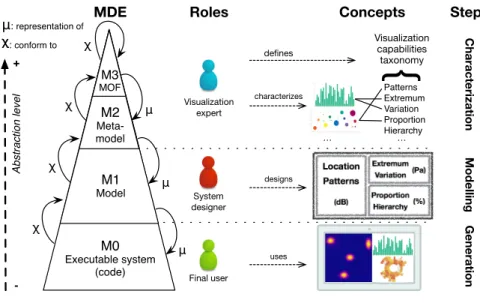
Given the identified roles, we offer a design approach based on the MDE levels of abstraction. We identify the contribution
of each role and associate it with the appropriate level as depicted by Fig.1. In this section we focus on the design from
a user point-of-view and its impact on roles, thus defining a multi-staged approach. The specifics about the definition
of the modeling tools implementing this approach and their behavior are detailed in the Sec.4.
The first step, calledCharacterization, is the constitution of a catalog encompassing the capabilities of our solution space,i.e., the considered visualization widgets. To do so, we reuse a taxonomy of the visualization capabilities defined and maintained by the data journalism community [14]. We then rely on the knowledge of visualization experts to
characterize the visualizations,i.e., to indicate for each widget which of the fifteen capabilities of the taxonomy it satisfies. For example, as depicted by the top part of the Fig.1, bar charts are suitable to highlight data extreme values
(maximum and minimum) at a glance and to perceive variations, while bubble charts are suitable to render proportions
3 http://www.amcharts.com 4 http://www.highcharts.com 5 http://trifacta.github.io/vega/editor/index.html 6 http://datamatic.io/ 7 https://google- developers.appspot.com/chart/interactive/docs/gallery 8 http://d3js.org
Ab st ra ct io n le ve l + -μ: representation of χ χ: conform to Imp lé me n ta tio n M0 Executable system (code) M1 Model M2 Meta-model M3 MOF χ χ μ μ μ Visualization expert System designer Final user Patterns Extremum Variation Proportion Hierarchy … Visualization capabilities taxonomy
{
MDE Roles Steps
χ χ … defines characterizes Concepts designs uses Characterization Modelling Generation
Fig. 1. Overview of the design approach - Role contribution per abstraction level
and to detect patterns among the data series. This characterization has already been started by the visualization
community9. During this step, we address theR2requirement by establishing a common vocabulary of comparison among the heterogeneous widgets for the visualization expert, which increases the field of possibilities of the system
designer. Note that, this data journalist taxonomy serves as base reference for visualization intents, independently of
any use case specific knowledge. However, some domains require to specialize or extend it, for example cardiologists
may want to extend therelationship intent in two separate concepts : correlation and causality. The concrete mechanism behind this extension ability is detailed in the Sec.4.3.
The second step, calledModeling, is for the system designer to modeling the visualization system, by defining the layout of the system and characterizing the intent behind each abstract visualization she designs using the taxonomy.
The design of the visualization system is an incremental process, therefore the system designer is able, at any time, to :
• Organize the layout of the visualization system, by adding or fragmenting a column of a line, as spatial proximity affects the analysis of correlated data.
• Fill a space with an abstract visualization.
• Add a visualization intent to characterize an abstract visualization and narrow its solution space. • Specify which data set feeds the visualization.
• Interrogate the catalog about of the number and names of the visualizations still available for a given abstract visualization, to verify that its current intent characterization can be satisfied by at least one concrete widget.
• Go backward by removing any specified capability, without any consideration about their addition order, useful if the model reaches a state where no widget can satisfy the characterized intent.
• Specify a visualization library to put aside, for example because of a payable usage license for business purposes, or on the contrary a library to be limited to, because of technological constraints.
9
https://datavizcatalogue.com
• Choose one widget to implement a given abstract visualization, among the set of suitable widgets returned by the catalog.
In the example depicted by the middle part of the Fig.1, the system designer specifies that the first left abstract
visualization must display thelocation and highlight noise patterns of the recorded sound. The catalog answers that four widgets satisfy both these intents : the three choropleths of Vega, Datamatic and Google Chart libraries, and the
heat map of Vega. The main objective of this step is to ease the selection of a suitable visualization widget by providing
ways for the system designer to express the final user need at an appropriate level of abstraction (cf. R3). Note that the data sets have been reduced to their units of measure in the Fig.1only for synthetic purposes (here “dB” for decibels).
The final step is theGeneration of the executable code implementing the visualization system, as modeled by the system designer, and to be used by the final user. The bottom part of the Fig.1illustrates a dashboard intended for
acoustic analysis, where the final user is able to locate sources and evaluate their intensity on a heat map, to analyze the
emitted frequency ranges on a bar chart and to visualize the proportion of each type of the uncertainty hierarchy on a
sunburst chart. As the choice of a widget is driven from its characterization by the system designer, each generated
visualization provides insights to the final user about the intended capability, and therefore allow her to be proactive by
submitting proposal to adapt the visualization system using the same vocabulary. TheModeling step classically ends when a concrete widget has been chosen for each designed abstract visualization of the system. However, depending on
the expertise of the final user, the system designer can preserve several possibilities of suitable widgets for her abstract
visualization (cf. R1), and generate several visualization systems to let the final user choose according to its context.
4 MODEL-DRIVEN DESIGN
We defined in Sec.3the multi-staged approach,i.e., the relations between the steps, the roles and our requirements while identifying a necessary artifact : a visualization catalog. In this section, we detail how to build this catalog
implementation along with the required tooling to interact with it and generate code.
4.1 Supporting the visualization expert to build the catalog
Given the matrix of characterization of the widgetsw.r.t. the taxonomy capabilities produced by the visualization experts, our goal is to build a tooled catalog modeling the variability of this solution space for the system designer. In
the SPL paradigm, a common solution to model variability is to use aFeature Model (FM). A FM is a feature-centred hierarchical representation of a propositional logic formula that expresses characteristics of an object under study
which encompasses the variability of all the available concrete solutions. A classical way to build a variability model of
a solution space is to merge all available products into one FM [3] (i.e., our catalog FM).
Each characterized widget is expressed as a variability-free feature model (FM) in the Familiar language10(i.e., an atomic FM). We consider for example two widgets from the AmCharts library: its pie chart and line chart implementations.
Each widget is declared as a FM in Familiar (as depicted by the Fig.2).
To produce a unique model for the system designer to interact with, we need to compose the atomic FMs of each
characterized widget as illustrated by Fig.3. To do so, we reuse the “merge with strict union” operator [2] which ensures
to produce a merged FM encompassing all the capabilities of its input and nothing more. On the example, theW1and W2atomic FMs are declared in Familiar and are then merged as follow:
10
http://familiar-project.github.io/
w1
Name
Pie Chart AmCharts
Library Concern
Proportion PartWhole Scalar Discrete Comparison
w2
Name
Line Chart AmCharts
Library Concern
Overtime Variations Scalar Patterns Extremum
Fig. 2. Graphical representation of W1and W2atomic FMs
µ
L L'µ
sL sL' s w1 w2 w3 ... ... s2 s1 s3 w1 w2 w3 Mandatory feature Optional feature XOR OR L wi Library Widget CSV to FMFig. 3. Merging FM process
w_1 =FM ( w i d g e t : Name L i b r a r y C o n c e r n I n p u t O u t p u t ; Name : " P i e ␣ C h a r t " ; L i b r a r y : " a m c h a r t s " ; C o n c e r n : C o m p a r i s o n P r o p o r t i o n P a r t T o A W h o l e S c a l a r D i s c r e t e ; I n p u t : " 2 D _ i " ; O u t p u t : " 1 D_o " ; ) w_2 =FM ( w i d g e t : Name L i b r a r y C o n c e r n I n p u t O u t p u t ; Name : " L i n e ␣ C h a r t " ; L i b r a r y : " a m c h a r t s " ; C o n c e r n : P a t t e r n s O v e r T i m e S c a l a r V a r i a t i o n s E x t r e m u m ; I n p u t : " 2 D _ i " ; O u t p u t : " 2 D_o " ; ) . . . a m c h a r t _ l i b r a r y = m e r g e s u n i o n w_ ∗
This merging operator produces the catalog FM illustrated by Fig.4. Note that theName sub-features are not depicted due to constraints on space. Both the translation from a characterization matrix to FMs, and the merge of atomic FMs
to the catalog FM are automated, which partially address theR3requirement.
4.2 Tooling the catalog for the system designer usage
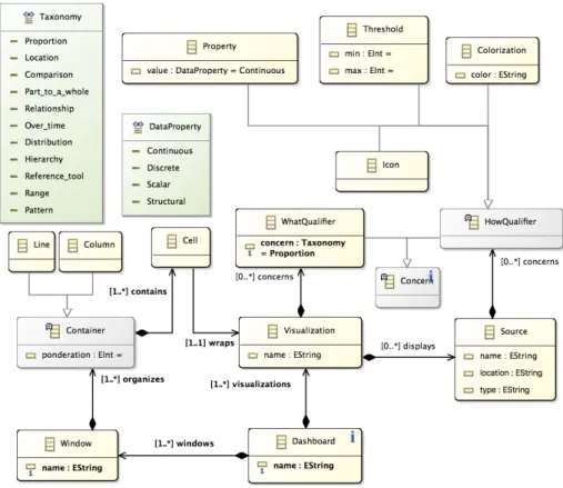
As depicted in the middle part of Fig.1, the system designer task is to model the visualization system. We support this
user by providing a DSL. A meta-model captures the structure of visualization systems, as illustrated by the EMF11
11
https://www.eclipse.org/modeling/emf/
Widget Key Mandatory feature Optional feature XOR OR Library
Google Vega Datamatic HighCharts AmCharts Concerns Extremum Variation Range Comparison Proportion Distribution Scalar OverTime Discrete Pattern Location Relationship Part to a Whole Probability Hierarchy Name
…
Fig. 4. Catalog feature model resulting from merging widgets FMs
implementation depicted in Fig.5. It defines a dashboard as a layout of weighted columns and lines, filled with abstract
visualizations. The visualization intended capabilities are specified by using concerns extracted from the taxonomy.
Using the provided XText12concrete syntax, one can instantiate conform models, as illustrated by the running example in the following code. Note that this textual syntax is given as an example, the scope of this article is not to define
the proper concrete syntax, though we plan to investigate the benefits of graphical syntax’s in this context,e.g., using Sirius13. D a s h b o a r d A c o u s t i c D i a g n o s i s : V i s u a l i z a t i o n s : S c e n e s h o w s L o c a t i o n a n d P a t t e r n s o f I n t e n s i t y ( dB ) F r e q u e n c i e s s h o w s E x t r e m u m a n d V a r i a t i o n o f P r e s s u r e ( P a ) U n c e r t a i n t y s h o w s P r o p o r t i o n a n d H i e r a r c h y o f E r r o r ( % ) P o s i t i o n i n g : C o l u m n s i z e d 1 : [ S c e n e ] | C o l u m n s i z e d 1 : [ F r e q u e n c i e s ; U n c e r t a i n t y ]
The system designer needs to interact with the catalog FM to choose a suitable widget for each abstract visualization
she designs. To do so, the system creates aconfiguration of the catalog FM on which she selects, unselects or deselects features to reduce the solution-space incrementally, narrowing it to eventually reach a relevant and concrete solution.
Note that in this contextdeselection is the opposite of selection : a deselected feature is forbidden in the resulting product; whereas theunselection of a feature removes it from the selectable sets of features. The resolution of this configuration according to the inner logic-based formula of the catalog FM relies on strong logical foundations and SAT-solving,
which has been experimentally proved to be efficient for the FM class of problem [16]. The example of design developed
in Sec.3corresponds to the following code when using Familiar . Thanks to the semantics of the “merge with strict
union” operator, such a configuration can only lead to widgets as characterized by the visualization experts.
f m l > c = c o n f i g u r a t i o n f m m e r g e d c : ( CONFIGURATION ) s e l e c t e d : [ W i d g e t , L i b r a r y , Name ] d e s e l e c t e d : [ ] f m l > s e l e c t L o c a t i o n i n c r e s 0 : ( BOOLEAN ) t r u e f m l > s e l e c t P a t t e r n s i n c r e s 1 : ( BOOLEAN ) t r u e f m l > c o u n t i n g c 12 http://www.eclipse.org/Xtext/ 13 https://www.eclipse.org/sirius/
Fig. 5. Meta-model of a visualization system
r e s 2 : ( INTEGER ) 4 f m l > u n s e l e c t e d F Name i n c
r e s 3 : ( SET ) { C h o r o p l e t h . V e g a ; C h o r o p l e t h . D a t a m a t i c ; C h o r o p l e t h . G o o g l e ; H e a t M a p . V e g a }
As the meta-model contains the taxonomy concepts used by the visualization experts to characterize the widgets,
we can automatize this configuration process by translating actions on the model (e.g., adding a intent to an abstract visualization) to its impact on the configuration (i.e., selecting the corresponding feature and returning the number of suitable widgets), which address theR3requirement. According to SPLs best practices, each valid and final configuration is a concrete product, in our case a widget, and its code assets are available for reuse. In our implementation, we
defined String Patterns from freely accessible and reusable widgets. We use code generation mechanism to browse the
visualization system model and to generate the HTML5 structure and layout corresponding to itscells, while injecting data sets into the reusable widgets to instantiate the Javascript code of the widgets. Our current implementation does
not address the relations between visualizations such as temporal synchronization and is limited to the interactions
provided by the libraries.
4.3 Supporting the update of the catalog by a visualization expert
We now know how to build and use the visualization catalog, taming the variability of the visualization widgets
expressed in the multiplicity and heterogeneity requirements (respectivelyR1andR2). However, the main motivation Manuscript submitted to ACM
of our work is the ever growing number of solutions. Therefore, this section addresses the increment of the catalog to
detail the limits of the automation (R3) and the required effort required for visualization experts.
If a visualization expert wants to add her newly developed reusable widget to the catalog, she only has to characterize
it according to the taxonomy capabilities (complexity inO(c) where c is the number of capabilities). The translation into an atomic FM and its merging with the current catalog FM are automatized. In the same way, to add an entire
visualization library to the catalog, one needs to characterize each offered widget, as depicted by Fig.3, (complexity in
O(wL′∗ c) where wL′is the number of widgets in the new libraryL′andc the number of capabilities). Finally, to add a capability to the taxonomy, one need to add it to the enumeration in the meta-model and to characterize the current set
of widgets according to this capability (complexity inO(w) where w is the number of widgets in the catalog). There is no need to manually edit the catalog FM even if the new capability is a specialization of a current one (e.g., Correlation w.r.t. Relation). In that case, all widgets satisfying Correlation will satisfy Relation by definition and the merging process ensures that this constraint will be preserved on the catalog FM.
For example, one may want to add the concept of input and output dimensions to the widget characterization to
reduce automatically the solution space of an abstract visualization according to the number of dimensions of its
attached data. In this case, we need to know for each widget, the number of dimensions expected as an input, and
the number of dimensions rendered. These two values are not necessarily equals, for example an angular gauge chart
expects 2D data (atime, value map) but renders only in 1D (only one value rendered at any moment).
4.4 Implementation
The implementation of our contribution is composed of both generic and use case specific artifacts. Generic code units
include the transformation from a CVS matrix to feature models, the merging of atomic FM into a catalog FM and the
configuration of a product through (un/de)selection of features using Familiar . The artifacts specific to the software
engineering use case and reused in the validation encompass 73 atomic widgets FMs, the merged catalog FM, the
abstract visualization meta-model abstract and concrete syntaxes using EMF and XText and 19 widget templates for
code generation.
5 VALIDATION
The corner-stone of our contribution is to support the system designer in her task of choosing suitable visualizations
during the design of the system using a characterization process. This section offers a partial validation of this aspect of
the approach, using the implementation described in Sec.4. It explores the hypothesis that, using our characterization
approach, system designers are able to express a visualization need and reach a satisfying set of concrete widgets.
We apply this user experiment to our project management in software engineering use case. We interviewed the
responsible of a SE module to capture the coarse-grained tasks detailed in Sec.2and we validate that the use of the data
journalism taxonomy is sufficient to reason about these tasks. The goal of this experiment is not to validate the current
Familiar interface implementation of the catalog interface, therefore the interaction with the system are performed by
the experimentation assistant.
5.1 Protocol
To test on the system designer role, we gathered a test population of 12 teaching assistants in computer science. We
prepared 73 samples of visualization widgets (i.e., the units and nature of the displayed data are hidden), extracted from
5 libraries, and the catalog representing their variability as described in Sec.4. The objective is to compare two methods
used to choose a visualization, given a task to satisfy.
Method Manual: A printed set of concrete samples of widgets is given, sorted by library. The subject familiarizes herself with the set of widgets during 5 minutes. The task is given by writing. The subject is allowed at any time
to browse forward or backward the set of widgets and to add or remove a widget to her choices. The subject
stops the task resolution at will, when satisfied with her set of widget choices.
Method Characterization: A printed list of the taxonomy capabilities and their definition is given. The subject familiarizes herself with the taxonomy and ask precision about the definition of the capabilities during 5 minutes.
The task is given by writing. The subject is allowed at any time to select, unselect or deselect a capability. When
satisfied with a capability set, the subject can interrogate the assistant about the current number of suitable
widgets and their concrete samples. This action identify the end of aniteration in the choice process. If the subject is not satisfied with the resulting set of widgets presented by the assistant, she can start a new iteration.
If she is, she identify which of these resulting widget are suitable in her opinion.
The interaction with the catalog is handled by the assistant to avoid any technological bias. There is four ticketing
tasks to satisfy, described in Sec.2. Half the test population (later called pop.Manual) start by the method Manual on the first and second tasks (step 1), and then use the method Characterization on the third and fourth tasks (step 2). The other half (later called pop.Characterization) do the opposite order. Finally, the subject recover the first visualization she satisfied with the methodManual, and satisfies it with the method Characterization (step 3, i.e., task 1 for pop. Manual and task 3 for pop. Characterization).
During this test our observation criteria, with the authorization of subjects, are:
• the time spent to satisfy each task,
• the number and names of the widgets chosen for each task (Manual method only), • the time for each iteration (Characterization method only),
• the selection, unselection, deselection of capabilities for each iteration, and the number and names of the resulting set of widgets (Characterization method only),
• the number and names of the satisfying widgets in the resulting set according to the subject (Characterization method only).
5.2 Results
First we compare the results on theManual and Characterization methods. Then we look into the learning effect of both methods. Finally we detail quantitative results about the performances of theCharacterization method.
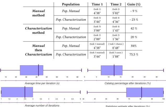
Method comparison. The Fig.6displays the average time per task required to choose a set of widget with both methods, and the relative gain, and the Table1details these results. Note that these results are presented per task, but do not include
step 3 data,i.e., task 1 or 3 satisfied again by characterization after being resolved manually. The gain column is calculated from both method averaged time according to the formula(T imeM anual− T imeChar act er izat ion)/T imeM anual. We can see that, for all tasks, the subjects spent less time with theCharacterization method, with a average gain greater than 50% (i.e., 20% in the worst case and 68% in the best case).
Learning effect analysis. We measure the time gained by the repetition of use of a method to provide insight about the learning capabilities of each method, and the use of theCharacterization method by users used to the Manual method. Manuscript submitted to ACM
Fig. 6. Time comparison (s) and gain (%) between methods, per task Table 1. Average time spent per method and per task
Tasks Manual (avg) Characterization (avg) Gain (%)
Task 1 4’38" 2’00" 56,9%
Task 2 5’02" 1’36" 68,3%
Task 3 3’44" 3’00" 19,7%
Task 4 4’36" 1’45" 62%
Average 4’30" 2’05" 54%
The Table2detail, per method, the time spent on the first task, the second, and the gain calculate according to the
formula(T ime1− T ime2)/T ime1. For example, the first line is read : “Pop. Manual spent, in average with theManual method, 4 minutes 38 seconds on task 1, 5 minutes 2 seconds on task 2, which implies a loss of efficiency of 9%”. We can
see that the second use of theCharacterization method decreases the time spent from 20 to 42% in average, while the second use of theManual method increases the time spent between 9 and 23%. The two last lines detail the use of the Characterization method on a task, after it previous resolution through the Manual method. These measures provide insights about the gain provided by theCharacterization to users with a set of widget to reach in mind for a specific task. In these conditions, the subjects spent 4 to 5 times less to reach a satisfying set of widgets.
Characterization performances. To evaluate this method, we present four metrics in Table3: • the average time per iteration, to measure the difficulty to choose capabilities;
• the average number of iteration performed per task, to measure the difficulty to converge to a satisfying set of widgets;
• the average percentage of the catalog resulting after the iterations, to measure the efficiency of the configuration; • the average percentage of widget satisfying in the resulting set according to the subject, to measure the relevancy
of the configuration.
The Fig.7illustrates the five quartiles for each of this measures. For example, the median time per iteration is less
than 42 seconds, with a minimum at 5 seconds and a maximum at 84 seconds, and with 50% of the results between 24
and 46 seconds. These results provides insights about the easiness of usability of theCharacterization method, which necessitates only 2.5 iterations per task with a median time of 42 seconds. These iterations reduce the solution space to 12% of its total volume, with a median satisfaction ratio of 81% on this resulting subset.
Table 2. Time gained by the repetition of use of each method
Population Time 1 Time 2 Gain (%)
Manual method
Pop. Manual (task 1)
4’38"
(task 2)
5’02"
- 9 %
Pop. Characterization (task 3) 3’44" (task 4) 4’36" - 23 % Characterization method
Pop. Manual (task 3)
3’00"
(task 4)
1’45"
42 %
Pop. Characterization (task 1) 2’00" (task 2) 1’36" 20 % Manual then Characterization
Pop. Manual (task 1 manual) 4’38"
( task 1 charac.)
0’48"
84%
Pop. Characterization (task 3 manual) 3’44"
(task 3 carac.)
1’08"
75,5 %
Average number of iterations
Average time per iteration (s) Catalog percentage after iterations (%)
Satisfying widgets after iterations (%)
Fig. 7. Characterization method performances
To analyze theCharacterization method at finer grain, we offer to classify conditions of testing according to the number and the order of the tasks, in order to avoid averaging the learning effect into our results. For example, the
first use of theCharacterization method may be easier if the subject browsed manually the set of widgets several time before (i.e., in pop. Manual). We detail six segments, each representing a different situation where a subject used the Characterization method, thus we separate the result according to the considered task and the order of method testing. These segments are later notedSi, withi in :
(1) i.e., task 3 by pop. Manual, (2) i.e., task 4 by pop. Manual, (3) i.e., task 1 by pop. Manual,
(4) i.e., task 1 by pop. Characterization, (5) i.e., task 2 by pop. Characterization, (6) i.e., task 3 by pop. Characterization.
As displayed in the Table3, each segment average time spent is included between 49 and 23 seconds and the average
iteration time is 39 seconds. Subjects need an average of 2.53 iterations to reach a satisfying subset of the catalog, which represents 13% of the catalog and is constituted at 80% of satisfying widgets, the values per segment being included
between 76% and 83%. We notice that, for these three metrics, the segment values are close from the general median
detailed above, which provide insight about the stability of performances of theCharacterization method among the test situations. This result segmentation shows the impact of the increasing tasks difficulty on the time spent: the time
Table 3. Averaged results, per segment, for each method
Measures \ Segment Avg
S1 Avg S2 Avg S3 Avg S4 Avg S5 Avg S6 AVG Average time per iteration 0’47" 0’49" 0’23" 0’38" 0’39" 0’38" 0’39" Average number of iterations 3,5 2 2 3,33 3 2 2,53 Catalog volume after iterations (%) 9% 14% 15% 16% 8% 12% 13% Satisfying widgets after iterations (%) 83% 81% 80% 76% 76% 82% 80%
Table 4. Feedback about benefits and drawbacks, with number of occurrences
Feedback Occurrences
Benefits
Cognitive proximity between
the visualization need and the characteristics
10 / 12
Swiftness to obtain satisfying widgets 8 / 12
Discovery of new widgets 6 / 12
Drawbacks
Necessity to be familiar with a vocabulary
Necessary learning process
6 / 12
Validity of the current characterization
of the offered widgets
4 / 12
spent to reach a satisfying set on the task 1 (S3andS4) is inferior to the time spent on task 2 (S5), inferior itself to task 3 (S1andS6), and task 4 (S2). However this difficulty does not seem to have a sensible effect on the number of iteration nor the satisfaction about the reached widget subset.
5.3 Discussion
These results show that by using a given taxonomy, subjects converge toward a subset of widget in a reasonable time, 2
minutes 5 seconds in average. The number of iteration needed stays low, near to 2.5, each realized in 39 seconds in average. The number of widgets selected by the subjects represents less than 1/6th of the total catalog and is constituted at 80% by satisfying widgets. We conclude that the level of difficulty of theCharacterization method is adapted to the system designer task and allows to reach relevant artifacts. In terms of comparison, the test shows that using the
Characterization is faster than a Manual choice, for all tested tasks, with an average ratio of 52% of time spent. Moreover, the overhead due to the learning of the taxonomy decrease, as illustrated by the average 33% decrease of time spent on
consecutive use of theCharacterization, while the time for the Manual method seems to increase.
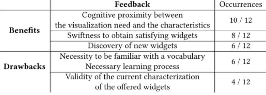
We collected qualitative feedback at the end of the user experiment to capture the subjects opinions about benefits
and drawbacks of theCharacterization method. The Table4compiles the answers with the most occurrences. It confirms the time gained and the relevancy of the approach by characterization. In addition, more than half the subjects declared
that the subset returned by the catalog contained widgets they would not have choose manually because of their
apparent complexity among the whole set, but found relevant after consideration. Some subjects were surprised about
the subsets returned by the catalog,i.e., about the association between some capabilities and some widgets, which motivates further the approach ability to specialize the taxonomy. Indeed this experiment is limited to the use of the
current widget characterization, using a generic visualization taxonomy. To assess the relevancy of these results, the
same experiment has to be performed using domain-specific characteristics, in this case by capturing the vocabulary
used by SE project manager to characterize their visualization need.
Note that we did not analyze the relevancy of the participant’s choice of visualizations. Doing so would required
to identify the best visualization for each task, and/or provide some distance function between the chosen one and
the task. Our approach is closer from the fast-prototyping paradigm where the designer is allowed to try what seems
to fit the task according to her understanding of the context, and change it later, instead of identifying an absolute
theoretical best.
6 RELATED WORK
TheCAMELEON Reference Framework (CRF, [6]) offers a methodology for human-computer interfaces design and generation. Our meta-model can be seen as a specialized implementation of the abstract visualisation layer described in
CRF, allowing one to design data visualisations that are not yet supported by UsiComp [11] (reference implementation of
the CRF). Indeed, the support in UsiXML is currently more focused on form-based interfaces than on data visualization.
COntext sensitive Multi-target widgETs (COMETs, [9]) model abstract interactors that can be composed to design UIs. The effort has been placed on the context adaptation of those form interface elements. Such an approach is complementary
to ours, handling the context awareness part as we focus on the characterization and design of visualization systems
and the link with real world solutions, provided that COMETs could represent visualization widgets. The concept of
mashups as “composed applications” has reach the user interfaces domain [23]. This way of composingUser Interfaces (UIs) suffers from a lack of globalization of their composition process, mainly focused on spatial arrangement and
connection between data and widgets, where our multi-staged approach brings useful concepts to support the system
designer in her choice through visualization concerns. Work on spatial composition in mashups is nonetheless an
inspiration for further work.
TheInteraction Flow Modeling Language (IFML, [19]) is a standard of theObject Management Group (OMG) dedicated to model and generate front-end applications and human-computer interactions. IFML’s purpose is to model front-end
of applications composed of several layers, supporting the compositions required in such domain and the links with
other layers of the application. In comparison, our approach is dedicated to the design of visualization systems. Both
approaches are complementary, as our abstractVisualization concept can reify the IFML concept of ViewComponent in order to handle this specific type of visualization, and our multi-role approach could use IFML expressiveness in terms
of events and user actions to define dashboard transitions.
While our contribution is not to validate the data journalists taxonomy, our approach can benefit from other existing
visualization taxonomies. Using operational characterization [7], we can support the visualization expert in their
understanding of how to apply and implement visualization techniques, characterize it and ultimately provide it to
system designer. Tory and Möller’s taxonomy [22] offers to fill the gap between the classification of data and the render
of visual information by categorizing the algorithms used in this transformation. Because of its complementary with
the capability taxonomy we use, we started to integrate its criterion (e.g., Discrete and Continuous classification). The four key dimensions of decision support environment described in the information visualization taxonomy [4] (content, interaction, organization and representation) offer a possible hierarchy to apply to the capabilities used in our approach, easing the characterization and the configuration process.
SPL engineering techniques [8,17] have been used in many domains, but only a few works considered them in the
context of UIs. Blouinet al. use aspect-oriented techniques coupled with feature selections based on the context change Manuscript submitted to ACM
at runtime so that dynamic adaptations of UIs can be realised [5]. Variability modeling and SPL techniques are also used
to cover the whole development of Rich Internet Applications, including UIs components [15]. However, it only captures
the UI relations to the rest of the web architectures, not the fine-grained selection of widgets. As for the construction
of the feature models from the widgets description, the followed approach is directly inspired from Acheret al. work where the authors automatically extract a feature model from tabular data describing wiki engines [1]. This approach
seems the best suited to our needs as other extraction techniques deal with different software artifacts such as source
code [24], some models [25], or feature combinations [12]. Besides, the merge operation on feature models that we use
in our approach is itself based on the results of She et. al. on reverse engineering feature models [21]. Multi-staged
configuration processes [20] allow delaying critical feature choices and establishing priorities in the configuration
process. It could be useful in our context to guide the system designer in her design,e.g., by suggesting to specify the data before adding a new visualization characteristic to benefits from the input/output criterion of our SPL.Multi Product Lines (MPL) approaches [13] are classically used to address variability of (utlra) large-scale systems. As sensors producing data present a variability equivalent to the one exposed in this article about visualization widgets, the use of
MPL is a promising lead to handle multiple domain design variability in our context.
7 CONCLUSIONS AND PERSPECTIVES
In this article we described a tooled approach addressing two challenges : the design of visualization systems, and the
choice of suitable visualizations among the technological variability of this domain. This approach is illustrated by a
software engineering use case, but not limited to it. We mapped each of the identified roles involved in this process with
the classical abstraction level of MDE and define their tasks and the requirement to address. Using feature model and
composition to address the multiplicity and heterogeneity of the available widgets, we support visualization experts in
their definition of a catalog encompassing the variability of the visualization domain, through the characterization of
the widget capabilities. We provide a domain specific language tailored for the design of visualization systems and
linked to the catalog SPL to help the system designers to model the system and choose a concrete widget suitable for
each abstract visualization, offering a semi-automatized tooled support. Finally we use code generation mechanism to
provide a executable system to the final user. We designed a user experiment to validate our characterization-based
choice of suitable visualizations and showed that system designer are able to reach a satisfying set of widgets using a
characterization approach.
As future work, we plan to test the extension capability of the catalog by specializing the taxonomy to a constraining
domain such as health-care. The result of our user experiment motivates further validation on the compatibility of
the chosen widgets set and on the discovery of new visualizations from the final user point of view. The current
implementation of our model support to the system designer is limited to a textual concrete syntax. To fully validate the
approach we need to define a graphical syntax tailored for dashboards, for example using Sirius, and test its usability
with visualization system designers.
ACKNOWLEDGMENTS
This work has been supported by the LUG2 project (French government’s F UI -Single Inter-Ministry Fund program) led
by MicrodB14.
14
http://www.microdb.vibratecgroup.com
REFERENCES
[1] Mathieu Acher, Anthony Cleve, Gilles Perrouin, Patrick Heymans, Charles Vanbeneden, Philippe Collet, and Philippe Lahire. 2012. On extracting
feature models from product descriptions. InVaMoS, Ulrich W. Eisenecker, Sven Apel, and Stefania Gnesi (Eds.). ACM, 45–54.
[2] Mathieu Acher, Philippe Collet, Philippe Lahire, and Robert B. France. 2009. Composing Feature Models. InSLE (Lecture Notes in Computer Science), Mark van den Brand, Dragan Gasevic, and Jeff Gray (Eds.), Vol. 5969. Springer, 62–81.
[3] Mathieu Acher, Philippe Collet, Philippe Lahire, and Robert B. France. 2013. FAMILIAR: A domain-specific language for large scale management of
feature models.Sci. Comput. Program. 78, 6 (2013), 657–681.
[4] Wan Adilah Wan Adnan, Nik Ghazali Nik Daud, and Nor Laila Md Noor. 2008. Expressive information visualization taxonomy for decision support
environment. InConvergence and Hybrid Information Technology, 2008. ICCIT’08. Third International Conference on, Vol. 1. IEEE, 88–93. [5] Arnaud Blouin, Brice Morin, Olivier Beaudoux, G. Nain, Patrick A., and J.-M. Jézéquel. 2011. Combining Aspect-oriented Modeling with
Property-based Reasoning to Improve User Interface Adaptation. InProceedings of the 3rd ACM SIGCHI Symposium on Engineering Interactive Computing Systems (EICS ’11). ACM, New York, NY, USA, 85–94.
[6] Gaëlle Calvary, Joëlle Coutaz, David Thevenin, Quentin Limbourg, Laurent Bouillon, and Jean Vanderdonckt. 2003. A Unifying Reference Framework
for multi-target user interfaces.Interacting with Computers 15, 3 (2003), 289–308.
[7] Ed Huai-hsin Chi. 2000. A taxonomy of visualization techniques using the data state reference model. InInformation Visualization, 2000. InfoVis 2000. IEEE Symposium on. IEEE, 69–75.
[8] P. Clements and L. M. Northrop. 2001.SPL : Practices and Patterns. Addison-Wesley Professional.http://www.amazon.ca/exec/obidos/redirect?tag= citeulike09- 20&path=ASIN/0201703327
[9] Alexandre Demeure, Gaëlle Calvary, and Karin Coninx. 2008. COMET(s), A Software Architecture Style and an Interactors Toolkit for Plastic User
Interfaces. InDSV-IS. 225–237.
[10] Stephen Few. 2006.Information Dashboard Design. O’Reilly.
[11] Alfonso García Frey, Eric Ceret, Sophie Dupuy-Chessa, Gaëlle Calvary, and Yoann Gabillon. 2012. UsiComp: an extensible model-driven composer.
InEICS. 263–268.
[12] Evelyn N. Haslinger, Roberto Erick Lopez-Herrejon, and Alexander Egyed. 2013. On Extracting Feature Models from Sets of Valid Feature
Combinations. InProceedings of the 16th International Conference on Fundamental Approaches to Software Engineering (FASE’13). Springer-Verlag, Berlin, Heidelberg, 53–67. https://doi.org/10.1007/978- 3- 642- 37057- 1_5
[13] Gerald Holl, Paul Grünbacher, and Rick Rabiser. 2012. A systematic review and an expert survey on capabilities supporting multi product lines.
Information and Software Technology 54, 8 (2012), 828–852.
[14] Ivan Logre, Sébastien Mosser, Philippe Collet, and Michel Riveill. 2014. Sensor Data Visualisation: a Composition-based Approach to Support
Domain Variability. InEuropean Conference on Modelling Foundations and Applications (ECMFA’14). Springer LNCS, York, United Kingdom, 1–16.
https://hal.archives- ouvertes.fr/hal- 01322526
[15] Santiago Meliá, Jaime Gómez, Sandy Pérez, and Oscar Díaz. 2010. Architectural and Technological Variability in Rich Internet Applications.IEEE Internet Computing 14, 3 (2010), 24–32.
[16] Marcilio Mendonca, Andrzej Wasowski, and Krzysztof Czarnecki. 2009. SAT-based analysis of feature models is easy. InProc. of the 13th Inter. SPL Conference. Carnegie Mellon University, 231–240.
[17] Klaus Pohl, Günter Böckle, and Frank J. van der Linden. 2005.SPL Engineering: Foundations, Principles and Techniques.
[18] Jonathan C Roberts. 2007. State of the art: Coordinated & multiple views in exploratory visualization. InCoordinated and Multiple Views in Exploratory Visualization, 2007. CMV’07. Fifth International Conference on. IEEE, 61–71.
[19] Gustavo Rossi. 2013. Web Modeling Languages Strike Back.IEEE Internet Computing 17, 4 (2013), 4–6.
[20] Julia Schroeter, Peter Mucha, Marcel Muth, Kay Jugel, and Malte Lochau. 2012. Dynamic configuration management of cloud-based applications. In Proc. of the 16th Inter. SPL Conference-Vol2. ACM, 171–178.
[21] Steven She, Rafael Lotufo, Thorsten Berger, Andrzej Wasowski, and Krzysztof Czarnecki. 2011. Reverse engineering feature models. InICSE, Richard N. Taylor, Harald Gall, and Nenad Medvidovic (Eds.). ACM, 461–470.
[22] Melanie Tory and Torsten Moller. 2004. Rethinking visualization: A high-level taxonomy. InInformation Visualization, 2004. INFOVIS 2004. IEEE Symposium on. IEEE, 151–158.
[23] Scott Wilson, Florian Daniel, Uwe Jugel, and Stefano Soi. 2012. Orchestrated User Interface Mashups Using W3C Widgets.InCurrent Trends in Web Engineering, Andreas Harth and Nora Koch (Eds.). Lecture Notes in Computer Science, Vol. 7059. Springer Berlin Heidelberg, 49–61.
https://doi.org/10.1007/978- 3- 642- 27997- 3_5
[24] Yinxing Xue. 2011. Reengineering Legacy Software Products into Software Product Line Based on Automatic Variability Analysis. In33rd International Conference on Software Engineering (ICSE ’11). ACM, New York, NY, USA, 4.
[25] Xiaorui Zhang, Øystein Haugen, and Birger Møller-Pedersen. 2011. Model Comparison to Synthesize a Model-Driven Software Product Line. In
SPLC, Eduardo Santana de Almeida, Tomoji Kishi, Christa Schwanninger, Isabel John, and Klaus Schmid (Eds.). IEEE, 90–99.
Received February 2018; revised April 2018; accepted June 2018