To link to this article : DOI :
10.1007/s11042-016-3714-6
URL :
https://doi.org/10.1007/s11042-016-3714-6
To cite this version :
Celentano, Augusto and Dubois, Emmanuel A layered
structure for a design space dedicated to rich interactive multimedia content.
(2017) Multimedia Tools and Applications, vol. 76 (n° 4). pp. 5191-5220.
ISSN 1380-7501
Open Archive TOULOUSE Archive Ouverte (OATAO)
OATAO is an open access repository that collects the work of Toulouse researchers and
makes it freely available over the web where possible.
This is an author-deposited version published in :
http://oatao.univ-toulouse.fr/
Eprints ID : 18781
Any correspondence concerning this service should be sent to the repository
administrator:
[email protected]
A layered structure for a design space dedicated to rich
interactive multimedia content
Augusto Celentano · Emmanuel Dubois
Abstract In this paper we propose and discuss a layered organization for a design space suitable for the visualization of and interaction with rich in-formation environments, made of multimedia and multidimensional informa-tion, supporting multi-device deployment. We propose to associate each de-sign space layer to a different category of information, corresponding to dif-ferent user goals and exploration spaces. Extending the focus+context and overview+detail approaches typical of complex information visualization, the layered design space and the associated information categories cover a wide range from a global universe of discourse down into the ultimate data items, through discrete intermediate steps corresponding to refinements of details and of navigation functions. Each category defines an association with a specific knowledge goal, the deployment on a suitable class of devices and the access through adequate interaction techniques. Such design process is applied to two case studies, one in the domain of cultural heritage fruition, the other in energy consumption management.
Keywords Analytical approach · Design space · Multidimensional data · Multi-device · Multimedia · Zooming interface
1 Introduction
Analyzing and managing complex information spaces at several levels of detail, switching between general overviews and detailed views, examining informa-tion under different perspectives, and keeping track of informainforma-tion context are A. Celentano
DAIS, Universit`a Ca’ Foscari Venezia, Venice, Italy E-mail: [email protected]
E. Dubois
Universit´e de Toulouse III & CNRS, IRIT, Toulouse, France E-mail: [email protected]
representative examples of activities that are frequently performed and whose benefits are validated by a large and important literature (see [14] and [34] for a quite comprehensive review).
To support such activities, users benefit from interfaces able to integrate different levels of exploration and to manage multiple views. Such interfaces improve the users’ ability (1) to better understand the meaning of a specific in-formation, (2) to capture the relations between the information components, their details, etc., and (3) to filter, select and compare contents according to specific knowledge goals and application needs. Concrete examples of the use of this kind of interactive situations are documented in the exploration of networks, social environments, for the analysis and visualization of multi-dimensional scientific data and for exploration of information related to real and virtual spaces represented on a map [1, 15, 17, 20, 29, 40].
To balance the extension of space, richness of information and presence of presentation spaces combining personal and public devices, multi-view in-terfaces and new interaction techniques have been designed. They extend the two-level visualization techniques known as focus+context (hereafter referred to as FC) and overview +detail (hereafter referred to as OD) to more complex architectures combining multi-level visualization with multi-device deployment and other advanced equipment available today.
1.1 Contributions of this paper
The paper has two main contributions: a design space and its evaluation. First, to address the complex design situation described above, we introduce, illustrate with examples and evaluate a layered design space for visually rich information environments. In general terms, a design space is a structured organization of the considerations that should be taken into account to design and implement different solutions to a problem. The design space we propose is based on a hierarchy of five different layers devoted to different information categories and targeted to different knowledge goals and needs by users. The layers map on a discrete but complete range of perspectives over an information environment, starting from the most general overview on the whole data space (that we call the Universe of discourse) down to detailed data (that we call data Items). In the Universe of discourse a Scenario layer defines the context for the user navigation, within which one or more Regions of interest enclose the area the user wants to explore in detail; one or more multidimensional Compounds aggregate the elementary and ultimate data Items contained in the Region of interest.
Such a design space is intended to assist the design process as a whole, helping the designer to face relevant design issues and to organize their com-bination. It is a conceptualization of the main properties of the class of appli-cations supporting the interactive visualization of rich multimedia and mul-tidimensional information environments. As such, it is a conceptual tool to
support the design in this domain, and is similar to a domain-specific concep-tual design model.
Concretely, our approach adopts a specific focus on the requirements re-lated to the different categories of information involved at each layer of the information environment. Its main benefit is to support the identification of a clear distinction between the information layers at design time: it there-fore helps the designer to reason about the selection of the most suitable and functional visualization and interaction design solutions corresponding to the different information categories, coherently with the different users’ knowl-edge goals. In the paper the design space is discussed using two examples that progressively and accurately illustrate the different concepts.
As the evaluation of a design space is not targeted to a specific product but to the organization of the design activity itself, it is independent of any specific application; consequently, its target is not the final result of a design case, but the design process itself. This perspective poses new issues about the evaluation process, and this is the second contribution of this work that we’ll discuss in a dedicated section.
1.2 Paper overview
This paper is a revised and extended version of the paper titled “A Design Space for Exploring Rich and Complex Information Environments” presented at the CHItaly 2015 symposium [11]. The two case studies discussed have been reorganized and improved to clearly describe how the properties and goals of each layer are considered, and how the design reflects such properties and goals in terms of presentation, interaction and device deployment. The assessment of our proposal has been largely extended with respect to the symposium’s paper to discuss the benefits of the design space, the design process in which it must be used and the different aspects of its validation.
The paper is organized as follows: we provide in Section 2 a rationale for a layered design approach of the visualization and interaction with a rich information space, with respect to the existing state of the art. Based on two simple examples, we then introduce in Section 3 our layered design space approach. In Section 4 we discuss two concrete case studies in the domains of cultural heritage promotion and energy management control. In Section 5 we discuss our proposal in terms of process of use and of its validity. The relevant literature on which our work is grounded is reviewed in Section 6. In Section 7 we draw the concluding remarks.
2 A rationale for layering visualization and interaction design
In this paper we focus on complex information environments that subsume a discrete, possibly recursive, hierarchy of OD and FC relations. The mo-tivations for identifying layered information categories in such contexts are
supported by the need to offer to designers a framework in which the choices about (1) visualization at multiple levels, (2) progressive information disclo-sure, (3) interface technology and (4) interaction functions are contextualized by the users’ needs in terms of information discovery and exploration. Such contextualization gives users the best way to understand the relations between the information content and its appearance, to locate and properly visualize the information needed at any step of a complex exploration, and to access its details in the most effective way. It requires to identify at each level of analysis the best suited visualization model, the amount of details and the information dimensions to expose.
In traditional multilevel paradigms such identification is left to the de-signer skill. But even in presence of models and guidelines about information visualization and interaction, there is no systematic cue helping designers to identify the levels of detail in which a shift of device, visualization model, rep-resentation type, etc., is needed. We have identified three major reasons for overcoming this lack of guidance with a layered design framework where layers are linked to different information categories and use.
Indeed, let’s first consider the interface structuring in traditional multi-level contexts. It is often assumed that the relations between a detailed infor-mation and an overview are simple. For example, the overview is an organized collection of data or a geographic region and the detail is an element of the collection or a magnified part of the region. In other cases, overview and detail provide different views on the same information in terms of presentation and interaction possibilities. An example is the relation between a map view vs a street view in Google Maps: besides the different rendering of the streets, in map view navigation is done by moving the map and directly pointing to individual locations, while in street view navigation is done by clicking to-wards selected directions in a continuous walking. In general, in rich multime-dia and multidimensional information environments the relations between an overview and its details are complex complex and largely influenced by user’s goal. Therefore, adopting a layered design space will offer the opportunity to better emphasize the mapping between the data and the users at each level (information, input, output), thus following the design approach proposed by Card and Mackinlay in [10].
A second reason for adopting a layered design framework, is that the user does not need to perceive all data together at the same time: depending on the information needs of each user, different aggregations of elementary data may benefit from different detail views within the same overview (e.g., different levels of a space hierarchy, different information targets). Therefore, a correct adaptation of the set of data to visualize justifies the need for a structural discretization of the intermediate levels, where each level has a specific goal and role.
A third reason concerns the interaction functions: a multi-level paradigm based on two levels at a time is conceived for random access to detail data within an overview; the overview presents the whole information environment, the user selects the area of interest, details follow accordingly. In applications
Fig. 1 Two screenshots from the France 24 Weather Forecast program.
managing complex multimedia and multidimensional information some form of feedback is required to assist and guide the user while exploring the data set. After identifying the different information content in an overview and in the corresponding set of details, information exploration should be organized (and suggested) according to the relations between the two sets taking into account what type and amount of knowledge each level of detail or synthetic overview means. Instead of considering the transformation flow from the data to its visualization, the focus is placed on the data flow followed by the user when interacting with the data visualization. Similarly to Chi’s paper [13] who emphasizes the need to help understanding how the data is transformed into a representation, our design space will be useful to help the designer think in terms of the user’s exploration process and its support. As a result of a design activity based on a layered design space, the user is assisted in structuring interaction into subtasks, therefore assuming/enforcing a systematic and goal oriented exploration of contexts and overviews to access detail data.
3 A layered design space for multimedia structured information As explained in the previous section, different information layers with different visualizations and information content raise issues in terms of usability because establishing clear links among data, browsing from one set of information to another and interacting with the different layers is highly complicated. We first present two simple examples, and then we introduce a five layer design space for different exploration goals, showing how they are coherent with these two examples.
3.1 Two basic examples: Weather Forecast and Google Maps
These two applications relate different levels of information presentation with different objectives and content. While simple — indeed they do not even require design models — they illustrate the major concepts of our design space. A very basic example (although it is not an interactive application) is the Weather Forecast program presented by France 24 on TV. As shown in Fig-ure 1, the forecast is explained by a two level visual representation: on the bottom left, a part of a continent highlighted on the Earth globe by a white
rectangle contextualizes the weather information displayed; such information, the focus of the program, includes the relief and the type of terrain of the highlighted part of the Earth (forests, desert, mountains, etc.). The main in-formation relating to this area includes a selection of the major cities and for each the temperature and weather forecast, the date, and a crawling text with last news, which represent the detailed information. The display is animated showing in sequence the forecast for the day and the following three days for each highlighted zone of the Earth.
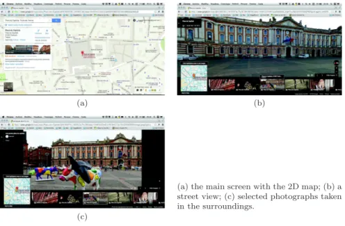
A more complete yet simple example is provided by Google Maps, whose main screen (Figure 2a) is split into several areas, each hosting a different view: the map in the main area is a background information acting as a reference for understanding the other views; it is an overview of the area mapped and a context for the different types of information that the user can select. A summary of the types of information and visualizations available is displayed on the left; a small map icon in the left bottom part switches to Earth view, while a few widgets in the right bottom part of the screen manage the view.
When the Street View service is activated the content of the page changes to present the perspective of a pedestrian on the selected route (Figure 2b); in terms of OD – FC visualization it is a focus, while the small 2D map on the left defines the context of the view of the street. A list of photographs taken from or near to the pedestrian’s position is a set of additional details within the Street View global environment (bottom panel of Figure 2b).
These three sets of information may be explored according to specific ex-ploration goals: the map can be moved, zoomed and unzoomed to show at different scales different contents and details; it can also be annotated with
(a) (b)
(a) the main screen with the 2D map; (b) a street view; (c) selected photographs taken in the surroundings.
(c)
user selected marks and information. The type of the map can be changed switching from a simple symbolic representation to a realistic rendering show-ing the complexity of the urban texture. The photographs show urban details from different visual perspectives and with greater details permitted by the nearer point of view (Figure 2c). The photographs may also refer to different near locations allowing the user to jump to different places as an alternative to freely moving the pedestrian placeholder on the map.
3.2 Framing the goal of a new design space
As opposed to most of the existing works in the literature that focus on the de-sign of new visualization and interaction techniques, our target is the definition of a structured design space making more evident the complex relationships that exist between:
1. the information architecture, its structure and organization, with special attention to multimedia and multidimensional data,
2. the information presentation, including the visualization according to sev-eral levels of zoom on detail and the device deployment, possibly involving different devices, and
3. the way information can be accessed and progressively explored according to user needs.
To this end, we propose a five layered design space that
1. explicitly pinpoints the different goals a user may meet while exploring complex information,
2. distinguishes different levels of details and different solutions for informa-tion visualizainforma-tion and interacinforma-tion, and consequently
3. relies on the additional use of different design approaches.
The design support based on these layers should cover functions like the identification of the global data space and of low level data, their relationships, their visualization and interaction techniques, the selection of proper starting points and information environments for specific applications, the definition of workspaces for accurate data exploration, the deployment on one or more devices and the definition of their coordination. This last issue is in our opin-ion relevant in mixed public/private environments and for systems managing complex and structured information that could be explored more profitably on separate and dedicated devices.
Each design space layer corresponds, at run time, to a different visualization and interaction space guiding the user in accessing the information from a general overview down to the details, maintaining visible the relations between different levels of refinement, choosing the most appropriate presentation styles and proposing suitable and effective interaction modalities.
A general filtering mechanism can be applied to select the subsets and at-tributes to process and to define the perspective under which data is presented and explored.
3.3 Layered design of information visualization and interaction
According to the approach described above, we propose to organize the design space into five layers, based on the identification, definition and characteriza-tion of five categories of informacharacteriza-tion from the most comprehensive to the more specific and detailed: Universe, Scenario, Region of interest, Compound and Item.
Universe. The first design layer is targeted to the most general and com-prehensive category of information, the Universe of discourse (or simply the Universe). It encompasses the whole information processed by some interactive application, and defines a knowledge domain that can be explored in different times and ways but is always related to a coherent goal and application.
Information in the Universe is basically a structured set of data of multime-dia and multidimensional nature, and is indeed quite abstract. Being possibly huge, in most cases it cannot be represented completely at once; applications are likely constrained to operate on a part of it that defines the borders and the extension of the application information domain (as opposed to the knowledge domain).
Conceptually the Universe could be visualized on a structured space such as a map, a 3D environment, an abstract diagram, etc. In practice, its ampli-tude prevents to represent it completely in one view, and different categories, the Scenario and the Region of interest, will be introduced for this purpose. At design time the Universe is defined with methods and tools typical of in-formation systems design; a projection on the possible scenarios is necessary to avoid a too high degree of abstraction, but is not part of this design layer. In the two simple example discussed in Section 3.1 the Universe is the set of data that describe the whole application environment: a simplified map of the world and weather data concerning the cities addressed by the France 24 weather forecast program, and the Google Maps database.
Scenario. The second layer is targeted to design the Scenario, which is the part of the Universe relevant for a user with respect to a specific knowledge goal represented by an application, and subject to a uniform perceptual rep-resentation. The information category contained in this layer can be accessed, visualized, navigated, queried, possibly modified, etc. Suitable representations depend on the application domain, but in our view a primary role is taken by map based representations. Space representation and space related reasoning are in fact fundamental attitudes of humans; according to Kuhn [26], “space is fundamental to perception and cognition because it provides a common ground for our senses as well as for our actions.”
In the design of the Scenario the user interaction is considered a primary function, while data design is mainly a partitioning of the Universe coherent with the part of the domain represented. Since from this level data is visible, the choices about the extent at which data is visualized, how it is visualized and how a user can interact with it are central. Referring to FC and OD
models, we note that the Scenario has properties both of a context and of an overview: as a context it defines the overall environment within which the user can explore information, and visually links the environment to the meaningful details; as an overview it can represent the integration of all the detailed view the user can access.
With reference to the examples of Section 3.1, in the France 24 Weather Forecast example the Scenario is the part of the world visible in the left bottom part of the screen, while in the Google Maps application the Scenario is the 2D map acting as a context both for general exploration and for Street View positioning.
Region of interest. The third layer is bound to design of the Region of interest (ROI), defining an area of the Scenario that can be explored in detail with proper interaction techniques, possibly on other devices than those used for the Scenario. The design should therefore be targeted to visualize the content of this third information category in a way suitable for its navigation. The ROI plays several roles: it is part of the Scenario; the associated in-formation category is made of inin-formation of a given type, referring to the same exploratory goal and with a size adequate for a continuous interaction session. For example, it can be a portion of a map delimited by some concrete or conceptual border such as a set of streets enclosing buildings of a certain type, or a city district devoted to specific activities. As such it could be de-fined as a focus for the Scenario and a context for the subsequent category, the Compound (defined later).
The second role of the ROI is to support interactive exploration (and pos-sibly modification) by the user, relying on proper devices to show and access the content. Rather than being a level of information associated to specific vi-sualization properties, the ROI is characterized by the amount of information that can be actively explored in a continuous user session, showing its struc-ture and making clear its semantic. Moving the ROI in the Scenario changes the borders of the accessible information. A series of ROIs of increasing detail (and decreasing size in a spatially based visualization) makes thus sense as a way to refine information exploration.
The third role of the ROI is to mark a point where a change in the in-formation deployment on devices can occur, or where a change can occur in terms of information dimensions presentation and interaction: for example, by entering a world different from the initial one, adopting new dimensions to represent more detailed information, changing the visualization space and the interaction modality, etc.
As to the examples of Section 3.1, the Region of interest is clearly high-lighted with a white rectangle on the visible part of the globe in the France 24 Weather Forecast program, and is displayed in greater detail on the main screen. In Google Maps, the ROI for the Street View service is the small 2D map on the left showing the immediate surrounding of the pedestrian position, marked with a balloon on the map itself.
Compound. The fourth layer includes the Compound, an information cate-gory which is a set of structured and elementary data contained in the ROI, presented and accessed according to visualization and interaction modalities appropriate for the information type.
From the visualization and interaction point of view the concept of Com-pound in our proposal is close to the concept of detail and focus of traditional OD and FC interfaces; being related to a ROI that can change its extension and coverage of the information environment, it can appear at different de-grees of refinement and visualization types: 2D, 3D, symbolic and metaphoric representations can produce very different visualizations of the same informa-tion.
In the France 24 Weather Forecast example the Compound is the main screen showing the approximate position of a selected set of cities with data about temperature, weather conditions and a reference date (hour for the current day). In Google Maps the Compound is the set of information arranged on the screen as in Figure 2b composed of the street view, the pedestrian location and a set of photographs.
Item. The fifth and final layer is associated to the data Items, the ultimate information of some type related to the context, whose knowledge is important for the user.
The distinction between the Compound and the Item layers is relevant in the context of multimedia information and multidimensional data, complex aggregations of simple data elements or of data elements of different type and representation. The two layers could consequently be merged in simple cases, i.e., when the two information categories are mono-dimensional or of similar nature. However, since our design space hierarchy explicitly addresses information environments involving multimedia and multidimensional data, the separation of the two concepts is in our view relevant.
Differently from previous design layers, the relations between Compound and Item are mostly based on structures rather than on detail levels. Com-pounds are aggregates of Items whose relationships depend on the Items types, media and meaning, rather than scope. A Compound could in some cases act as an overview (e.g., a synthesis) of a set of data, but that depends mostly on how data can be visualized in aggregated and exploded forms.
Referring to the example introduced in Section 3.1 the ultimate data items are the individual temperature values and weather icons in the weather forecast program, and the set of information annotated on the map, the view from the pedestrian’s position and the individual photos taken from that point or in the surroundings in Google Maps.
Recursion. Further insight into data can set or change the perspective of the observer, leading to a recursion in the data analysis process, as much as described by Perlin and Fox [30] and by Feiner and Beshers [18]. This recursion mechanism therefore opens up the possibility to go over the five layers identified: besides the Universe, which defines the overall information
space, any of the remaining four layers can indeed be considered as a new Scenario and can therefore trigger the identification of new ROIs, Compounds and Items. Such recursive layering supports a complementary user’s activity similar to a continuous zooming into details, but with the additional benefit of associating at any recursion level the proper visualization and interaction goals. Recursion thus permits some flexibility in the amount of layers defined and allows the designer to adapt the design according to task and sub-tasks of the user’s activity.
As an example, in a cultural heritage application (like the one discussed in Section 4.1) the data Item accessed at the end of a complex exploration of a historical city (the initial Scenario) can be a church which is the target of a path leading from the district (the ROI) to its content; the church can be the start of a new exploration of the artworks contained in it, by selecting a proper temporal or authorial view as a new Scenario, then zooming on a new ROI defined by a part of the church, e.g., the apse, to a mosaic (the Compound) and to the associated information (author, technique, historical references, images) which is the new Item layer. In the first case, interactive features that apply to the church are limited to an observation and maybe to a selection to access a textual description of the church or save an image of it. In the second case, interactive features that apply to the church may include, e.g., 3D navigation supports.
Perspective. A filter can act on all the levels below the universe to change the type of information explored: the perspective. Different perspectives highlight different properties of data. A perspective can be the result of applying a filter to information, to select only a subset of instances or of their attributes. It can be a selection on an ontological description of the information structure [33]. It can also be a view modifier which changes the presentation of a set of data, e.g. according to one of the many visualization models described in literature [1, 14, 34, 37]. Through the concept of perspective a multidimensional set of data can be projected on different subsets of its attributes allowing different features to be analyzed.
From the visualization and interaction points of view, as the five layers associate design spaces to an integration of OD and FC techniques, different sets of information coexist: some correspond to a detailed version of another, some are providing references to others, some are adding meaning and further information to another set. When exploring the information environment, all such sets of data cannot be perceived and manipulated in the same place and at the same time. Which data can be viewed and accessed and how it can be manipulated depends thus on the level of presentation and the perspective.
4 Application of the design space hierarchy to two case studies
In this section we present and discuss two case studies involving rich multi-media information space in which we have applied our layered design space.
Both projects have been briefly described in their initial stage in [11]. In this section we apply the layered design space to generate and test in a systematic and organized way a number of alternatives in presentation, interaction and deployment
The first case study is in the area of cultural heritage: it stems from a multimedia installation developed for an art exhibition at Ca’ Foscari Uni-versity in Venice, and aims at building an educational application addressing the relations between art, architecture and the city. This case study is mainly targeted to the use of different multimedia material from the Web, often of heterogeneous nature, into a consistent interface, and to the relationships be-tween shared and private devices for information exploration at different levels of detail.
The second case study is in the field of energy management control and evolves from a prototype developed in the initial stage of the neOCampus project, a large project at the University of Toulouse. This case study is mainly targeted to the analysis of different interaction techniques for actively explor-ing multidimensional information organized in maps and virtual worlds.
In both case studies we first discuss the identification of the five layers involved and the information contained in each of them; then, as described in Section 3.2, we focus on the design decisions about the properties of each layer in terms of presentation, interaction, deployment on the devices and relations between layers.
4.1 A case study in cultural heritage
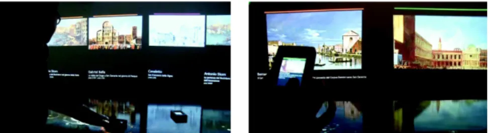
In the context of an art exhibition held at Ca’ Foscari about the experience in Venice of the artist William Congdon, a protagonist of the American Action Painting, a multimedia installation was prepared. It is made of three large interactive tables showing three maps of the city of Venice where a number of spots marked the city places depicted by famous painters. Each table was dedicated to a different historical period: Renaissance, XVIII-XIX Century, modern era. Users could touch the spots with customized mobile devices to “grab” a set of artworks referred to that location and neighborhoods, that could then be displayed on the mobile device with additional information, or projected on a few shared projectors surrounding the table (Figure 3). Each table was thus providing a general overview and a context to the focused explo-ration of artworks’ details on the personal devices and the shared projections. The installation was appreciated by the visitors, who left positive comments in the exhibition guestbook. They acknowledged the interactive system in two directions: as a complement to the works on exhibit, that could be compared to the representations of the same landmarks of Venice as depicted in the past; and as a stand-alone showcase of different ways to represent the same city location or landmark according to different artistic sensibility, technique, culture, historical perspective, etc.
Fig. 3 Two views of the installation for the Congdon’s exhibition.
After the exhibition’s closing we decided to use this experience as a basis to create a new learning environment for explaining the evolution of art and architecture in Venice during centuries. The basic idea was still to show the architectures and the artworks in the urban context, but due to the educational aspects of the installation we planned to include much more information about the artworks themselves and the architectural aspects of the city.
Assuming that the architectures and the artworks are the ultimate focus of the user exploration, we decided to rely on our design space to guide our reasoning on the progression from a general overview to the detailed informa-tion and to deploy the informainforma-tion on different devices: a large shared device acting both as an overview of the city relevant areas and a continuous con-text for exploring them in detail, and personal devices (tablets and possibly smartphones) for personalized access to detailed information.
To favor the presence of a large information set open to the most am-ple collaboration to extend and maintain it, we decided to reuse information available on the Web taken from different sites such as Wikipedia, cultural in-stitutions, museum’s sites, culture and tourism portals, etc. The system would be designed as a web application aggregating such diverse information into composite interfaces at the outer levels, giving access to the original sites at more detailed levels.
The project is currently in development; here we present some results of the design phase, containing the overall organization of the information, its layering according to our design space and the intended deployment on two types of hardware: a large interactive table and a medium-sized tablet.
4.1.1 Identifying the information layers
The Universe is a repository of information containing a large set of references to artworks and architectures in Venice. References are indexed by common metadata and linked to the web sites and pages hosting their description. Even if as a comprehensive repository it is meaningful for educated art scholars, it can be explored effectively in an educational environment only by selecting (filtering) information according to some criteria which actualize the domain and goal of the application.
Each historical or artistic period and each theme (architecture, art, etc.) is potentially a different Scenario that selects a sub part of the Universe
repos-itory and represents it on a large shared device. We describe here a Scenario which focuses on the architectures and landmarks of the insular city of Venice, and which is visualized as a map where selected areas can be explored. The users can participate in its exploration accessing the relevant content through the Region of interest layer, where each ROI corresponds to one of a set of city districts. In the Scenario the ROIs are visible as distinguished areas of the city, but the architectures and landmarks located in them are not individually distinguishable. They become visible in the ROI layer, marked by spots that can be individually selected to access the Compound layer.
At the Compound layer each Compound is a palace, a church, an archi-tectural element like a square or a bridge, or an artwork (painting, statue, drawing) for which a set of elementary information or views can be exposed, each representing an information Item, corresponding to a Web page or a portion of a Web site, that can be addressed and consulted individually.
4.1.2 Refining each layer in the context of the overall design space
Universe. The Universe is not visible, and its design occurs only at the repos-itory level. Nevertheless, its content and structure affects the Scenarios that can be designed and their use. In our case study, the Scenario is defined within a geographical, historical and thematic classification, and the ultimate detailed information accessed by the users is presented in the form of Web pages. The Universe repository must associate to each relevant architecture element and artwork its location in Venice, a thematic and historical classification, an a set of links to relevant Web content.
Scenario. The Scenario is represented as a Satellite view of a Google map projected on the original large table hardware. Being shared between the users, the interaction with the map is limited to avoid conflicts. The map can only be zoomed and moved at some extent to enhance the identification of the areas defined as Regions of interest, because they are not distributed evenly on the city area but are located mostly in the center of the city.
Region of interest. The relations between the artworks, the architectures and the city districts show a clear distribution in a few areas of most of the artistic assets of the city: the St. Mark area, the Rialto bridge, the Accademia, the surroundings of the most important churches and palaces, etc. To retain coherence in the set of artworks subject to an accurate exploration (also based on the availability of meaningful information on the Web), we have designed a small number of predefined Regions of interest, avoiding arbitrary selections by users that would lead to two unwanted results: the possible mixing of art-works and architectures incoherent from an educational point of view, and the overload of the application with a huge number of objects and information con-tents. The actual areas where relevant artworks exist are visibly differentiated from the urban texture allowing users to target their exploration properly.
(a) (b)
(a) The Scenario with some predefined ROIs; (b) a close view of a ROI with spots marking relevant architectures and muse-ums; (c) a Compound collecting multime-dia Items.
(c)
Fig. 4 Three layers and associated information categories of a cultural heritage application.
The ROI, implemented as an annotated local map in the Satellite view of Google Maps (Google Earth for the tablet implementation), shows a number of spots of different colors on the area of the city defining the ROI itself, the colors being representatives of artwork types: churches, palaces, architectures, museums, etc.
The choice of a specific ROI marks also the switch from the shared device hosting the Scenario to a personal device (a tablet) used for individual explo-ration. The ROI can be transferred on the tablet with suitable actions and gestures (not yet designed but not relevant at the information design level). With reference to the visualization, on the tablet the ROI is equivalent to the overview or a context view in a traditional OD – FC system, while on the table the ROI is a detail or focus of the Scenario representing Venice. Compound and data Item. By selecting a relevant spot in the ROI the Compound layer is accessed on the same mobile device. Since the information associated to an artwork is complex and large, the Compound is indeed a set of data Items (a multidimensional information) of different multimedia nature: text, pictures, videos and audio narrations, references to external documents, etc. It offers, therefore, several implementation options, such as opening a pop up on the tablet or replacing the tablet content by a new window in a gallery style, or other.
Figure 4 shows the visualizations in the different categories as implemented in a current prototype: in Figure 4a the Scenario is shown, where six areas
of the city are highlighted; in Figure 4b the ROI corresponding to the St. Mark’s square is shown, where the Basilica and other relevant architectures are located; in Figure 4c a Compound concerning the Basilica displays, in three different panels, detail information from Wikipedia, a list of relevant websites and an image gallery. The ROI remains visible in the fourth bottom left panel as a visual context for this Compound; it can be enlarged filling the screen to start a new Compound selection.
As in the original exhibition, one more switch in device deployment is fore-seen in case the system is installed in an open public space (like the University main hall), and concerns the data Items of type image and video: they can be selected from the Compound view and publicly visualized through a wall projection.
4.2 A case study in energy consumption monitoring
The neOCampus project initiated and funded by the University of Toulouse is a multidisciplinary approach towards the definition of a smart, sustainable and innovative campus. Ecologists, computer scientists, material scientists, electricity specialists, thermal and acoustics experts together combine their expertise to offer new services on the campus and reduce the ecological foot-print of the campus. In this context, the energy consumption monitoring is one of the sub-objectives identified that contributes to better manage the energy consumption. Accessing this information relies on a huge information system, including historical and instant energy consumption, different types of energy (gas, electricity, heating, water, etc.), regarding buildings and floors, rooms and even individual devices. To refine this system and provide the user with an appropriate interactive setting for visualizing information, we applied our layered design space to the definition of the visualization and the interaction aspects of the application.
This case study complements the case study in cultural heritage described in previous section since it faces at the same time multimedia content (in form of Virtual Reality scenes), multidimensional quantitative information and multiple device deployment, where the personal device (a smartphone) is used not only for private information visualization but also as an interaction device. As in Section 4.1, we first identify the information layers and describe their content; then we refine them in terms of interaction design.
4.2.1 Identifying the information layers
The Universe is composed of the multiple sites of the University spread over different and clearly separated geographical sites of the city. This layer includes for each site a large amount of information related to energy equipment and services. Of course each site is independent in terms of heating management and electric power subscription: therefore only a limited part of the University area is really useful to the energy manager of each site. The same applies for
all other users of this visualization platform. It thus requires the definition of different scenarios.
The Scenario addressed in this case study is limited to the energy moni-toring on the scientific campus, whose buildings are physically located on the same geographical area of the city. Architectural information, furniture and other content related to the buildings of the scientific campus are part of this scenario. Data related to energy consumption is not visible in this layer.
The Region of interest can be metaphorically seen as a lens magnifying an area of the campus; in this layer the user will have access to a different, more detailed and architecturally structured view that includes the energy consumption data. The area covered by the lens can be the whole Scenario or a part of it. In the ROI the 2D map of the campus is also accessible.
The Compound includes a complementary representation of every building present in the ROI: it is a 3D rendering that makes evident the extension on the map of the building and its architectural structure (floors, rooms), to which energy consumption data is related. The 3D rendering inside the ROI can be explored by adjusting the point of view. The data related to energy consumption becomes visible at this level.
Finally, the ultimate Items in this scenario are the set of multidimen-sional information describing the energy consumption as numerical values with proper units: different perspectives can be selected to filter such data, such as instant data, historical data, relative data (i.e., percentage of the campus), etc.
4.2.2 Refining each layer in the context of the overall design space
Since the neOCampus project is also promoted as a container of different coordinated research activities, we tested several designs for the five layers, in order to evaluate the coherence of our design environment across different visualization techniques and interaction opportunities for the user.
Universe. The Universe remains invisible to the user also in this case study. As a consequence, there are no presentation and interaction features. As in the previous case study, the Universe is an information system containing data about the energy consumption over a period of time, plus a description of the campus layout, the buildings, their architectural properties and the placement of energy related equipment.
Scenario. From a presentation point of view, the Scenario is presented on a large shared device. The presentation of the Scenario contains the spatial organization and names of the buildings, streets and trees of the campus: it is an overall annotated 2D map of the campus. In the final version the project will provide two installations. The main installation is based on a large interactive table in the administration building, where the application for the evaluation of the energy consumption is implemented in its full functionality. A second installation, with a different goal and a limited set of functions for educational
(a) (b)
(a) a Scenario with a ROI highlighted; (b) a Compound including 3D building rendering and summary consumption data displayed on a mobile device hovering over the ROI; (c) Items with instant energy consumption information.
(c)
Fig. 5 Three layers and associated information categories of energy consumption monitor-ing application.
purposes, will be located at the entrance of the University campus, where a wide vertical screen will allow several users to explore the energy related parameters.
In terms of interaction control of the Scenario, users can designate the different buildings, identify their position and extension in the map. Users can also zoom into the Scenario to better distinguish the contour of a building but doing so is keeping constant the domain of the information displayed. Finally, users can select the Region of interest that gives access to energy related information (Figure 5).
With regards to the previous layer, the user does not have the possibility to select a different scenario in the Universe in the current state of the project: only one site of the University is concerned by the application.
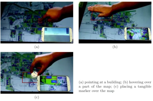
Region of interest. From a presentation point of view, several design al-ternatives have been considered. In one case (C1) a graphical representation highlights the position and size of the ROI in the Scenario.
With regards to the previous layer, this design adds an additional feedback to the Scenario to establish a visible link between the ROI and the Scenario: in Figure 5a, showing an early prototype interface, a colored frame marks the ROI borders, helping the user to better understand how the part of the scientific campus selected by the ROI is related to the whole campus.
(a) (b)
(a) pointing at a building; (b) hovering over a part of the map; (c) placing a tangible marker over the map
(c)
Fig. 6 ROI selection in the Scenario.
Other solutions are shown in Figure 6 which provide different forms of link with the Scenario: a finger touch leaving a visible trace of the ROI extension that disappears when the user removes his/her finger (Figure 6a) (C2); holding a hand above the desired area of the Scenario displaying the map (Figure 6b) (C3); or even placing a tangible brick on the Scenario to select a portion of the map (Figure 6c) (C4). This final solution presents one advantage over the two others: once the ROI is defined a physical mark remains clearly visible on the Scenario, in addition to the virtually rendered ROI contour, to highlight the current place of exploration of its details.
From an interaction control point of view, the available functions depend on the solution adopted for the visualization. In the case C1 based on the interactive table (Figure 6), the size of the ROI, its position and contour can be adjusted by the user: multi-touch interaction on the horizontal table has been implemented. In the cases C2 and C3, a set of predefined ROIs are also available, associated to each individual building; selecting a building activates the corresponding ROI, as shown in Figure 6a. Physical actions rotating the tangible brick in the case C4 control the size of the portion of the Scenario to enclose in the ROI. Finally in the case of the second setting involving a vertical screen, gesturing toward the vertical board to mark the upper left corner of an ROI and its lower right corner is available in the second setting.
With regards to the previous layer, it is mainly the position of the ROI that can be adjusted with regards to the Scenario as described in the different interaction control features mentioned above.
(a) (b)
(c) (d)
Fig. 7 Four interaction controls for ROI manipulation: (a) a smartphone hovering on the Scenario; (b) the world in hands control; (c) the camera on fingers control; (d) the camera on stickcontrol.
Compound. From a presentation point of view, information of this category has to be perceived by the user who defined its ROI. Therefore the use of a personal device is unavoidable: it offers a sort of a private view on the energy visualization system. In our implementation of the system a smartphone was used to display a 3D rendering and provide access to the energy information. In addition to the architectural structure, the equipment is represented (lights, computer, etc.) and carousels containing an icon for each energy flow (a yel-low lightning for electricity, a blue flame for gas, etc.) are attached to the corresponding elements (building, floor, room, device) in the 3D visualization. With regards to the previous layer (ROI), Figure 5a shows inside the coloured frame representing the ROI, a pointer mark that depicts the po-sition and orientation of the user in the ROI, thus providing the user with a support to better take its bearing in the 3D space: it is therefore helping the user to understand how the information of the copound s/he is looking at are related to the portion of the Scenario selected by the ROI.
In terms of interaction control, four distinct solutions have been designed and implemented (Figure 7). In a first one the position of the smartphone over the interactive table containing the scenario was used to adjust the point of view position and orientation in the ROI. In this setting, with regards to the previous layer (ROI) a tight coupling between the Compound and the ROI (and subsequently the Scenario) was therefore involved. But its use was
leading to important user’s fatigue, due to ample mid-air manipulations of a smartphone over an interactive table (Figure 7a).
Three other solutions have thus been considered: “world in hands”, “cam-era on fingers” and “cam“cam-era on stick”. The goal of these designs is to avoid the mid-air interaction above the device presenting the previous layer. In these new settings the 3D representation corresponding to the selected ROI is virtu-ally attached behind the smartphone. The “world in hands” version consists in grasping and performing gestures with the users hand behind the smart-phone: this metaphorically represents the fact that the user rotates, zooms or translates the Compound, i.e., the virtual 3D representation attached be-hind the smartphone (Figure 7b). The “camera on fingers” version adopts a different view: instead of manipulating the 3D representation, only the point if view in the Compound, i.e., in the 3D representation is adjusted: the fore-finger represents the position of the virtual camera while the middle fore-finger represent the direction towards which the camera is oriented (Figure 7c). The “camera on stick” version is another solution for controlling the virtual camera position in the Compound: position and orientation of the virtual camera are defined through the position and orientation of a tangible stick (Figure 7d). These four interaction controls highlight the possibility to test tangible versus gestural interaction technique, with high or low coupling with the ROI and totally independently of the data displayed, or more precisely with respect to the different information categories involved.
Interestingly, no interaction control available here has an effect on the previous layer. These three additional solutions reduce the physical coupling between the space on which the Compound is perceived and the space corre-sponding to the ROI.
Items. In terms of rendering, the data selected is displayed on the smart-phone screen. It involves textual labels presenting the energy consumption data aligned with the corresponding 3D element displayed in the detail.
5 Discussion
In this section we evaluate our layered design space according to three dimen-sions: (1) the benefits of using it to organize the design of the presentation and interaction features of a rich multimedia information system; (2) the in-terpretation of the design space as the first component of an articulated design process controllable and extensible; (3) the assessment of its validity according to an evaluation model proposed in the literature.
5.1 Benefits of the design space
From the illustration of the use of the design space in the two complex case studies of Section 4, it appears that it allows to identify five different categories
of information, each attached to one of our layers. A first benefit of this de-composition is thus to clearly structure and help understand the information space and its content. A second benefit of the design space is that it allows to clearly decouple the reasoning about the information content on one hand and the design of the information presentation and interaction on the other hand. This contributes to better cover the design of these two complementary design aspects. Given the identification of the five layers, the design of the content and interaction functions of the information system can be split into five separate steps. A third benefit is therefore that the designer may better focus on each part of the multi-space information system without having to permanently think at the system as a whole.
These three benefits represent the three pillars of the design space, justify-ing its interest mainly in the context of a first stage design, before applyjustify-ing to more technical issues like the design of the interaction techniques, the visual styling, etc.
Today, almost all interfaces oriented to information seeking, even if orga-nized in different ways and related to different interaction techniques (e.g., discrete vs continuous, localized vs distributed, with homogeneous vs het-erogeneous representations), comply with the so-called Shneiderman’s mantra of information visualization [37]: “Overview first, zoom and filter, details on demand”, recommending a stepwise refinement of information based on pro-gressive disclosure, selection of relevant content and final display of the finest details. Differences in the way such mantra is obeyed exist and are often related to the underlying interface technology. Nevertheless, little attention has been paid to the conceptual design of the transition between an overview/context level and a detail/focus level. Beyond the Shneiderman’s mantra there is no association of the terms overview, filter, zoom and detail to an operational semantics that could drive a designer to decide, e.g., when a zooming inter-face should switch to a different representation of data, or should deploy to a different device, or how the space of a single device should be split between overview and detail.
As opposed to the support provided by our layered design space, the OD and FC models discussed in the literature and implemented in systems avail-able to the public and in experimental prototypes do not suggest designers how to split content and how to represent an overview content with respect to a detail, or how to define the extension and the level of detail of the focus with respect to the surrounding context, or even what interactive operations should be associated to the two levels. Everything is left to the ability of the designer, and is evaluated only a posteriori with empirical tests.
Surprisingly, an attempt to use the Shneiderman’s model to create an as-sociation between the levels of a multi-level information space and the design of a software system has been made in the field of Software Engineering1: the
system’s context and the containers are associated to the overview level,
ing and filtering reveal the components level and the details are represented by the individual classes that implement the software.
Finally, the proposed design space is not limited to a specific set of data type or representation. Although it was mainly applied to map based systems in the described example, any kind of data can be considered when dealing with our design space.
Therefore, as opposed to the works in the literature, the proposed design space adopts an original point of view and constitute a novel contribution to the design of rich multimedia information systems. To assist its use and better take advantage of the design space, we have also extracted from our experience some guidelines about its use.
5.2 Towards a process of use of the design space
From our experience in using the design space, and especially from the two case studies discussed in Section 4, we were able to extract some principles leading to the organization of a design process that a designer should follow when designing rich multimedia information systems.
As a first step, the designer should identify the five layers: what infor-mation exists in each layer, what is its type and structure, what is visible, navigable and accessible and consequently what are the borders between the layers. In this way we have clearly identified in the two case studies the tran-sition between the Scenario and the Region of interest as the locus in which information to be detailed appears, leaving to the Scenario the role of signaling its presence and to the ROI the role of making it visible and addressable. In the same way we have distinguished the Compound from the data Items, as-signing to the first the role of showing individual data elements in the context of a multidimensional information, where the relations between data is more meaningful that the single information values independently.
The subsequent design steps involve the design of the information presenta-tion and interacpresenta-tion in each layer. Presentapresenta-tion concerns both the visualizapresenta-tion models of the information within a layer, and the relations with the surround-ing layers; interaction concerns the way in which information in a layer is navigated and manipulated, and how the user can move between layers in a coherent way. As we have shown in Section 4.2 by proposing different inter-action techniques, the design of the interinter-action function within a layer are decoupled form the other layers and depend only on the information type, its deployment and the metaphor behind the system operational design.
As a result, it appears that this design process helps to identify the layers and build a rationale behind the choices taken at each layer about the in-formation presentation and the interaction opportunities offered to the users. Having identified such a design process based on our layered design space rein-forces our initial claim that it increases the understanding of the information processed and leads to a more conscious design of the different levels of detail at which information can be exposed, visualized and navigated. It also
con-tributes to support the claim that this design space improves the ability to organize in a rational way a multi-level data presentation.
5.3 Assessment of the design space
The pros of our design space resulting from the discussion about the two case studies and the design process supporting its use is, however, not sufficient to conclude that in general it is more valuable with respect to other possi-ble design methods. What we have shown, up to now, is that such a design space advances over the existing interface and interaction models based on multi-level visualization of complex information thanks to the better defined relationships among the different layers: this approach allows a designer to modularize the design and reason on different alternatives in a coherent frame of reference.
Consolidated techniques exist in the area of Human Computer Interaction for evaluating the quality of an interface, based on the controlled execution of practical tests involving users in real or controlled tasks, and measuring their response in quantitative or qualitative terms. In such experimental studies the goal is to collect data to prove that the proposed interaction space is effective for the user with regards to the task to perform.
The evaluation of a design space proposal not targeted to a specific product but to the organization of the design activity itself, and independent of a specific application is, however, situated on a different level: the goal becomes to prove that the proposed way of designing interactive spaces is effective for the designer. The goal of the evaluation is, in fact, not the final result of a design case, but the design process itself. Performing a controlled evaluation is in this case extremely complex from the organization point of view. Indeed an attempt to solve this problem by evaluating the final implementation of two or more design activities made by different designers or by the same designer in different times, assigning a higher score to the best implementation, encounters a number of obstacles: for example, if the same designer is involved in the design of the same artifact twice, with two different methods, necessarily the second time would be primarily influenced by the first trial; or if the artifact is different in the second case, there is no way to control that the two artifacts are of equivalent complexity, richness, and relevance to the domain. If the test is repeated over several designers as an inter-subject experiment, then again the result may be biased by the personal knowledge and experience of each participant.
According to Toleman and Welsh [39] “Experimental approaches to user interface evaluation of software development tools are feasible, but difficult” due to the need of experienced users able to evaluate the interaction, the development of typical tasks and the availability of experimental resources.
Differently from the research on interfaces and interaction methods, ac-cording to Zimmerman et al [41] research on the design process has had much less impact on the HCI community than in other areas, resulting in lacking
models for evaluating such research. The authors propose four criteria (quoting literally, “four lenses”) to evaluate an interaction design research contribution: process, invention, extensibility and relevance; we believe that our contribution sheds new ideas in all these four aspects.
From the process point of view, sufficient detail must be provided to make other designers able to reproduce the design process; we have detailed in Sec-tion 3.3, exemplified in SecSec-tion 4 and clarified in SecSec-tion 5.2 how the five layers are related each other, what is their expected scope in the overall information space, how they are related to the user needs, how they can be recursively applied to create a continuum on the information level of details and, finally, how they can be combined with filters and selections to shape and constrain the information space to specific applications.
Our proposal is also an original contribution (invention), since it not only extends traditional approaches in visualization like overview+detail and fo-cus+context with a layered design space, but associates to each layer proper-ties related to the user goals in information exploration. It is also extensible since the five layers define also five different levels of information detail which can be recursively iterated to cope with very large and articulated information spaces.
As to the relevance point of view, differences exist in evaluating it in HCI context. According to [3, 19], there are three common ways for an HCI practi-tionner to evaluate his/her work:
1. The first addresses the evaluation of performance and usability of the re-sulting products. Beyond what was discussed above on the differences be-tween evaluating a product and evaluating a design process, several biases exist here due to the way the evaluation are performed, such as the num-ber of participants, the effectiveness of heuristics evaluation, etc., which can lead to different results under different conditions.
2. A second way, drawn from software engineering practices, evaluates cost-justifying usability. Most of these approaches are based on estimated cost, and a priori benefits. Quoting the authors “it may be difficult to utilize literature on cost-justification as support for choosing between different HCI method”.
3. A third way is to take into consideration the perceived usefulness of the HCI methods involved by HCI practitionners. More specifically, Følstad et al [19] report that participants to a survey had to select the three most important out of nine alternatives of design-input methods. On overall, the most frequently selected answer was to suggest new design alternatives (29%), followed by new understanding of users / task / context (25%) and the third only most frequently selected answer was related to the usabil-ity of the produced system (23%). In conclusion, usabilusabil-ity evaluation of produced systems does not seem so important and does not reflect on the design process per se.
Relying on the usability of the produced interactive system could therefore be a non satisfactory answer to establishing the relevance and validity of a design method, neither is the evaluation of its costs and benefits.
In this context, and before being able to massively spread the design method and collect huge set of empirical data among a large panels of case studies, designers and interactive systems, another approach for evaluating the relevance and validity of a design method for HCI has been proposed by Beadouin-Lafon in [7]. This approach has been developed as a support to evaluate design models and resources. It is based on the assessment of the design model along three properties: descriptive power, evaluative power and generative power.
Such properties have been used by other authors [16, 25] to evaluate the quality of interaction and interface design approaches, and have proved to be effective in such evaluation. Assessing the validity of our design approach thus relies on the analysis of how designers might take advantage of it.
According to Beaudouin-Lafon, the descriptive power of a design resource characterizes its ability to describe a significant range of different solutions covered by the considered design framework.
Our proposal stems from the properties of OD – FC interfaces and inter-prets them comprehensively under four dimensions of information:
– amount (how much is visible at each level),
– type (what is the information representation at each level), – use (what is the user goal in accessing information), and
– deployment (where information is located and how the different devices interact).
It allows a designer to clearly describe in a discrete sequence of steps how the information is progressively disclosed and how the information attributes can be grouped and presented in meaningful ways.
The evaluative power characterizes the interaction design approach to as-sess and differentiate multiple design alternatives. In our layered design schema each layer is clearly identified with respect to the others and can be tested, refined and changed almost independently. This is clearly visible in the case study about energy management where several interaction solutions where de-signed and adopted both for the selection of the ROI and for the control of the user navigation in the information corresponding to the Compound layer. The two layers are independent also because they are deployed on independent devices, a choice that stems from the different goals of a user selecting what part of the Scenario to explore (see Figure 6), how to explore it, and what data to access.
The generative power describes the ability of the interaction design model to create new designs. Several aspects of our proposal effectively help designers in generating solutions. For example, in the energy consumption case study, some design includes an additional feedback in the ROI to more explicitly link the Scenario to the Compound. For example, in Figure 5a, a pointer whose position and orientation can be adjusted marks the position and orientation
towards which the user watches. As opposed to this solution, the set of so-lutions that first relies on a finger touch (Figure 6a) leads to the drawing of a red rectangle highlighting the border of the ROI; but with none of the three alternative techniques worlds in hand, camera on fingers, camera on stick (Figures 7b, 7c, 7d) is an additional feedback provided in the ROI to show the current orientation of the 3D object or of the virtual camera. These two ex-amples highlight how thinking at different layers of the system may drive the designer in identifying the appropriate interaction features to include.
6 Related work
In this section we first discuss the relevance of map based information envi-ronments as predominant application domains for rich information spaces, in which we have framed our proposal. We then review the domain of information visualization, with a focus on OD, FC and zooming interfaces for multi-level visualization on which our design space is rooted; we also provide a survey of the domain of multi-resolution displays that support visualization at different scale with special hardware. Finally we review and comment the main pro-posals appeared in the literature to analyze and evaluate the design spaces for information visualization systems.
6.1 Map based information
Frequently, rich information relates to a geographical, metaphorical or virtual space described by a map that represents at the same time the information container and the visualization and interaction environment [1, 20]. Maps are used not only for real geographic information, but also metaphorically to high-light relationships between different parts of the information and to help users to move in complex cognitive spaces [12, 40]. Maps show physical elements such as cities, rivers, mountains, etc., or buildings, roads and other human artifacts, according to the chosen level of detail and type of visualization. In addition, maps also show abstract data belonging to several knowledge domains (e.g., demography, economy, environment, etc.) that can be explored and focused in the proper context [9]. The growth of applications and services like Google Maps (and similar programs by other companies), based on geographic models and metaphors to represent and correlate information, has improved the famil-iarity with map based information and promoted accordingly the development of user interaction systems.
The data contained in these spaces belongs to different types (e.g., numeric, text, images, sets, multimedia, multidimensional aggregations, links and ref-erences, etc.). Data can be composed at different levels and can be viewed in different ways. Data can be arranged in series, such as historical series, in tables and networks, or simply reflect synthetic values such as average, max-imum/minimum, etc. Data can link or refer other data, possibly resulting in