1
Automatic Documentation Generation from Source Code
by Denise Che
S.B., Massachusetts Institute of Technology (2015), Computer Science and Engineering
Submitted to the
Department of Electrical Engineering and Computer Science in Partial Fulfillment of the Requirements for the Degree of Master of Engineering in Computer Science and Engineering
at the
Massachusetts Institute of Technology September 2016
© Massachusetts Institute of Technology 2016. All rights reserved.
The author hereby grants to M.I.T. permission to reproduce and to distribute publicly paper and electronic copies of this thesis document in whole and in part in any medium now known or
hereafter created.
Author: ________________________________________________________________ Department of Electrical Engineering and Computer Science
August 16, 2016
Certified by: ________________________________________________________________ David Karger, Professor of Computer Science and Engineering
Thesis Supervisor August 16, 2016
Accepted by: ________________________________________________________________ Christopher J. Terman, Chairman, Masters of Engineering Thesis Committee
2
Automatic Documentation Generation from Source Code by Denise Che
Thesis Supervisor: David Karger, Professor of Computer Science and Engineering Submitted to the Department of Electrical Engineering and Computer Science September 2016
In Partial Fulfillment of the Requirements for the Degree of Master of Engineering in Computer Science and Engineering
ABSTRACT
Many systems lack robust documentation because writing documentation comes at a cost for developers and offers little immediate benefits. To motivate developers to write more
documentation, we need a framework that beneficially incorporates documentation into the functionalities of the codebase. We explored this idea in the context of Exhibit, a data publishing framework developed at MIT CSAIL’s Haystack group. Exhibit enables those without much programming experience to create data-rich interactive webpages. We created an automatic documentation system with an approach that motives the creation of rich specifications by developers, which leads to good documentation. The code required for documentation benefits developers by simplifying the codebase and providing fault tolerance through a modular error checking mechanism. This system intends to aid new and returning users of Exhibit in learning the Exhibit syntax and in creating their Exhibits by providing extensive, up-to-date
documentation for all the available views and facets in Exhibit along with an interactive example component. The interactive example component provides an interface that allows users to
experiment with combinations of the different settings and also aids developers during the unit testing process.
3
Table of Contents
Title Page ……… 1 Abstract ……….. 2 1 Introduction ……….. 4 1.1 Overview ……….. 4 1.2 Goals ……… 4 1.3 Related Work ………... 5 1.4 Chapter Overview ……… 6 2 Background ………….……….……… 8 2.1 Introduction to Exhibit ………....……… 10 2.1.1 Exhibit Views ………. 10 2.1.2 Exhibit Facets ………. 122.2 Current Exhibit References ……… 15
3 Exhibit Interactive Documentation System (EIDS) ……… 18
3.1 Use Cases ……… 19
3.2 Documentation Components ……….. 19
3.2.1 Top Panel ……… 19
3.2.2 Extension and Component Specific Documentations ……… 20
3.2.3 Attributes Table and Interactive Example ………. 21
4 Generating Documentation from Source Code ………... 22
4.1 Leveraging Common Components ………. 22
4.1.1 Setting Specifications ………. 24
4.1.2 Accessor Specifications ……….. 25
4.2 Purpose of Specification Fields ……….. 27
4.3 Presentation of Specifications ………..……….. 30
5 Interactive Examples ……….. 36
5.1 User Experience ……….. 36
5.1.1 Autocomplete ……….. 37
5.1.2 Undo and Redo Functionality ………. 38
5.1.3 Propagation of Errors ……….. 38
5.2 Implementation Details ………... 39
5.2.1 Configuration Objects ………. 39
5.2.2 Dataset Selection ………..……... 40
5.2.3 Updating the Component with Example Configuration Object ……….. 41
6 Developing Future Components ………. 42
7 Conclusion ……… 44
7.1 Summary ……….. 44
7.2 Future Work ………. 45
4
Chapter 1
Introduction
This chapter explains the current problems with software documentation as well as the motivation for creating the automatic documentation system described in the later chapters.
1.1 Overview
Documentation is the bridge that connects developers of a program to its users and its future developers. It allows increased utilization of the software and helps users maximize their efficiency. Even though the benefits of documentation is clear and strong, many programmers neglect to include documentation because it comes at a cost for developers without generating substantial benefits for them. In order to encourage developers to provide more documentation for their works, we need an approach where documentation is an outcome of a process that is beneficial to the developer. In this thesis, we explore an approach to specifying functional components that makes it easier for developers to write them and generates documentation as a side effect.
1.2 Goals
This thesis aims to explore ways to generate documentation and examples that benefit both the users and the developers and focuses on systems with a collection of functions that take in a series of typed inputs. Adding some typing logic to codebases written in untyped languages not only helps programmers avoid mistakes but also encourages them to provide some level of
5
documentation [1]. Having a modular type-checking mechanism rescues developers from needing to process each input individually and allows inputs to be checked prior to run-time. In addition, the type information can be reflected to the users through documentation.
We explore these ideas in the context of Exhibit, a data publishing framework written in JavaScript, one of the most popular untyped languages. The framework consists of a set of widgets that can be configured by a series of typed settings. These widgets with typed settings are analogous to functions with typed inputs and benefit greatly from a common type checking mechanism. In fact, the Exhibit codebase already contains code components that include some type details, so we want to leverage these components and augment them in order to generate comprehensive documentation and examples.
Through the process, we enriched an extensible typing system that lets developers specify inputs to the widgets, showed how to transform this information to end user documentation, and
provided live examples of these widgets.
1.3 Related Work
Much work has been done in the past to improve the efficiency of programmers. Most come in forms of either static documentation or example code. Static documentation usually includes a list of all the possible interactions that the application provides, while the examples display code snippets and the resulting outcomes.
6
Certain tools have leveraged type systems for documentation and checking purposes. Some take advantage of the different elements of the source code to generate static documentation. For example, the JavaDoc tool generates documentation pages from the comments in the source code. Many similar tools exist for JavaScript, including JsDoc Toolkit, which also relies on parsing comments. Although these tools are widely used and do generate effective
documentation to guide users, they are still imperfect because the comments are added purely for documentation purposes. Since they don’t simplify the code in any way, they come at a cost to developers without presenting them with any benefits.
Others studies have demonstrated the importance of example code. It is common for users to copy existing code samples from online and place great trust in their correctness [2]. One paper investigated the benefits of combining interactive documentation with example code in the code editor and discovered that it significantly increased the correct usage of the examples [3].
Similarly, the Codelets paper explored treating examples as “first class objects” in the text editor, allowing users to interact with the example even after the code is pasted [4]. These studies prove that example code is indeed helpful for the users. Ideally, we want these examples to also benefit the developers who created them.
1.4 Chapter Overview
Chapter 2 contains some background information on Exhibit, the framework we focused on to explore these ideas. Chapter 3 provides an overview of the system and its common use cases, while Chapters 4 and 5 detail the inner workings of the system. Chapter 6 talks about what developers of new components need to do in order for their components to be compatible with
7
the documentation system. Lastly, Chapter 7 summarizes the main ideas mentioned in the paper and points out some future work that would make the system even more robust.
8
Chapter 2
Background
As more people are utilizing the internet to spread their ideas, to share their findings, and to collaborate with others, creating content on the web is no longer limited to those who are trained developers. This phenomenon, known as end-user programming, is fueled by the availability of tools that allows people from varying backgrounds to create their own computer programs without proficiency in a programming language.
Exhibit is a data publishing framework that allows users to insert data visualization elements into their web pages using simple, easy to learn HTML attributes without any JavaScript code. Figures 1 and 2 demonstrate a webpage created using the Exhibit framework along with the code used to generate the page.
9
Figure 2: code used to generate the Exhibit webpage from Figure 1
One obstacle that many Exhibit users currently face is the lack of comprehensive and up-to-date documentation for the framework. To create an Exhibit, users have to rely on multiple
incomplete and outdated references to determine some of the different ways to configure their Exhibits. Many also study the existing sample Exhibits to observe how the code is transformed into the visualizations, but the number of examples is limited and they don’t display all possible configurations. This shows that Exhibit users are in need for more complete documentation and examples; however, it is hard to convince developers to provide the necessary documentation. The automatic documentation system described in this thesis solves the problem through a framework that benefits developers by simplifying the code base and providing a new approach to test components. The resulting product also provides Exhibit users with a resource that not
10
only documents all of the available settings for each Exhibit view and facet component but also displays the effects of different combinations of the settings through interactive examples.
2.1 Introduction to Exhibit
Exhibit was developed at MIT CSAIL’s Haystack Group to facilitate the creation of data-rich, interactive web pages. It offers a variety of views to present data, facets to filter data, and lenses to format data. With the help of Exhibit, users can build interactive web pages without much web programming experience; it allows users to insert visualizations into their pages with just a few HTML tags. HTML, being a markup language, is easier to learn than other languages. More experienced users are given the option to configure additional settings to fine-tune their views.
2.1.1 Exhibit Views
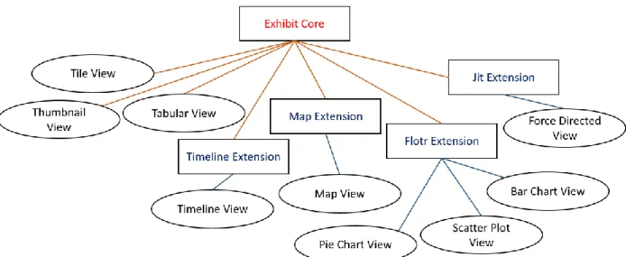
Exhibit presents a set of views that are available for users to present their data. Currently there are nine views for users to choose between: Tabular View, Thumbnail View, Tile View, Map View, Timeline View, Scatter Plot View, Bar Chart View, Pie Chart View, and Force Directed Network View. Some of them belong to the core of Exhibit while the others are part of
extensions to Exhibit (Figure 3). To insert an Exhibit into their webpage, users have to include a script tag that links to Exhibit’s source code in their HTML document, as shown in Figure 4. If users want to add a view from an extension, they must include additional script tags to gain access to these extension libraries. Having the extension libraries separate from the core Exhibit codebase allows users to only load them if necessary, thus decreasing the amount of time required for the Exhibit codebase to load.
11
Figure 3: Exhibit views and extensions
Figure 4: script tag to include the Exhibit library
Each view comes with a collection of settings that users can specify to customize their view. Some are more basic and are essential in order for the view to render, while others are more esoteric and are intended for more complex use cases. For example, to render a bar chart view, as shown in Figure 5, users are required to specify values for the x and y attributes. Additional attributes available but not required include yAxisMin, the minimum value on the y axis, and valueLabel, the axis label for the dependent variable.
12
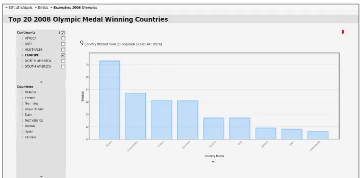
Figure 5: example bar chart view displaying top-20 2008 Olympic medal winning countries
2.1.2 Exhibit Facets
Exhibit also provides a series of facet components that can filter the data being displayed. The available facet types include the default list facet, the cloud facet, the slider facet, and the text search facet. All facets currently belong to the core Exhibit codebase, so no additional libraries are needed in order to insert them.
13
Figure 6: list facet filtering on the continent property
The facets filter the data using a property from the data. Figure 6 provides an example of a list facet that is filtering the Olympic medal dataset from Figure 5 using the continent property. Each entry in this dataset corresponds to a different country, and each country has a continent property specified. The example indicates that only one of the countries in the dataset is in Africa, four are in Asian, one is in Australia, nine are in Europe, and five are in the Americas. Clicking on any one of them would filter the view to only show countries from that continent. Figure 7 illustrates an updated version of the bar chart from Figure 5 after the view is filtered to only show countries from Europe.
14
Figure 7: bar chart view filtered to only display countries from Europe
As new users explore what Exhibit has to offer, they oftentimes refer to online documentation and sample code to learn what they could do with each Exhibit component. Previous studies of Exhibit have discovered that almost all users create their Exhibits by referring to an existing example, and that there is a great demand for more examples to be available [5]. Exhibit
currently lacks a single source that documents all the possible configurations that one can make with each Exhibit component. There is a design gallery that gathers and displays select Exhibits found on the web, but this collection is not extensive enough to inform users everything they can do with Exhibit.
15
2.2 Current Exhibit References
There are multiple existing references for Exhibit, but they are scattered and much of the content is not up to date. They serve different purposes and require some effort to find. Each contains useful information but not comprehensive enough to be used on its own.
Currently, official documentation pages are only available for a select few of the views, namely the Flotr2 and JIT extension views. These documentation pages display the settings that can be configured along with a basic code snippet of how that component can be inserted, as shown below in Figure 8.
Figure 8: sample code showing how to insert Exhibit bar chart
For the other Exhibit components that don’t have an official documentation page, users need to rely on wikis, tutorials, and references to determine what features are provided. These tutorials and references contain useful information but are hard for users to find and for the developers to maintain.
As newer versions of Exhibit become available, it is hard to keep these scattered references up to date. Many of the current references still show syntax from Exhibit 2, an older version of the framework. For example, shown below in Figure 9 is a code snippet to insert a tabular view
16
found on the Reference Documentation for Exhibit page of the Simile Widgets Documentation Wiki [6].
Figure 9: code to insert tabular view with outdated Exhibit 2 syntax
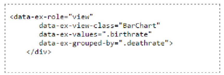
The same snippet written using Exhibit 3.0 syntax seen in Figure 10 uses snake_case instead of colons and camelCase to separate words within an attribute. In addition, “data-ex” is prepended to each setting instead just “ex”.
Figure 10: code snippet to insert tabular view with current Exhibit 3.0 syntax
Inconsistencies become even more apparent when the resources are not written by the Exhibit developers. Not only is the syntax out of date, additional settings that are introduced in the newer versions are not present in the documentations.
Automatically generating documentation from source code avoids these problems by havin g all documentation available in one place and allowing regeneration of documentation after
modifications to the codebase. The information used for documentation is directly in the
codebase rather than scattered across various references. Also, since documentation is generated directly from the source code, it always reflects the most up-to-date content.
17
The code snippets provided by the existing Exhibit documentation pages, as shown in Figure 8, are not complete enough for users to just copy and paste into their own code. Expanding these examples could potentially lead to a substantial increase in the usage and utility of these documentation pages.
These ideas motivated the creation of the Exhibit Interactive Documentation System (EIDS), Exhibit’s interactive documentation tool, which provides both static documentation generated from the source code and an interactive widget editor. EIDS relies on an extended typing system to benefit both Exhibit end users and developers. The extended typing system contains sufficient information to generate documentation and interactive examples for the Exhibit users. This tool encourages developers to provide these documentation functionalities by simplifying the processing stage using the additional information provided in the specifications to parse and check inputs.
18
Chapter 3
Exhibit Interactive Documentation System (EIDS)
This project aims to investigate the idea of automatically generating documentation from the source code for codebases similar to Exhibit. We refactored parts of the codebase to allow EIDS to exploit the richness of the existing codebase. Our system reads the specifications for a
component and generates documentation page that contains two main parts- the documentation of all the available interactions and an interactive example (Figure 11).
19
3.1 Use Cases
There are many potential uses cases for this documentation system.
New Exhibit users can use the interactive examples to see what Exhibit provides. It allows them to create their first Exhibits without having to worry about the syntax. Returning users can learn more about each component by reading the documentation
provided in the attributes table
Users of all levels can use the interactive examples to create a working configuration of their Exhibit component and then insert the produced HTML code snippet into their own code
Developers can use the interactive examples for unit testing purposes. After making updates to the code, they can try different configurations to ensure that the changes didn’t break any existing functionalities.
3.2 Documentation Components
The following sections break down the major components of the documentation system.
3.2.1 Top Panel
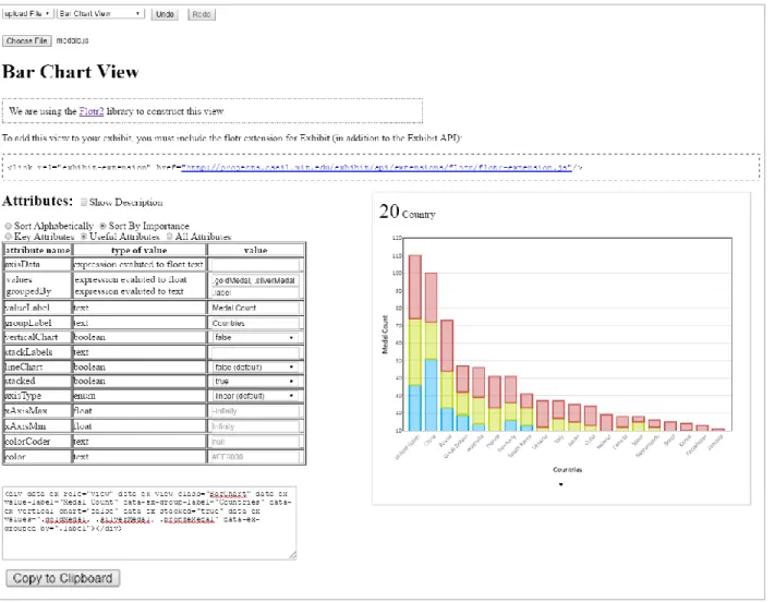
The top panel, seen in Figure 12, allows users to select the dataset and component of their choice. When the user switches to a different component, the documentation table and the example shown will update accordingly. The documentation system comes with a default collection of datasets that users can use to generate examples. They are also provided with the option to upload their own dataset, either in JSON or TSV format. The interactive examples are generated using the chosen dataset for the given component.
20
The undo and redo buttons give users more flexibility when they’re interacting with the examples. Implementation details can be found in Section 5.2.
Figure 12: dataset and view selection panel (Top Panel)
3.2.2 Extension and Component Specific Documentation
The section underneath the top panel contains documentation that is specific to the component and its extension library if it is not part of the core Exhibit library. This contains additional information that is essential for the users to know in order for them to insert this component into their own webpage.
The sample documentation page for the bar chart view from Figure 11 contains extension specific documentation for the Flotr2 extension library (Figure 13). It reminds users that an extension-specific script needs to be included in the HTML header in order for Exhibit to render the bar chart view.
21 3.2.3 Attributes Table and Interactive Example
The rest of the page contains an attributes table on the left and an interactive example on the right. The attributes table displays information on all the settings that the users can modify in order to customize the component. Users can input their choices in the last column and see the example update accordingly. The changes in the settings are also reflected in the HTML code snippet found underneath the table (Figure 14). This code snippet corresponds to the HTML tag that is used to generate the example view. Users can upload their own dataset, modify the settings to produce the view that fulfills their purpose, and then copy and paste the code snippet into their own HTML file to produce the same view. A “Copy to Clipboard” button is available underneath the code snippet for easy copying. Users can also modify the code snippet directly or paste an existing Exhibit code snippet for the current component into the editor, and both the example and the attributes table entries will update accordingly.
Figure 14: HTML code fragment that corresponds to the example view seen in Figure 6
Chapter 4 focuses on the augmentations we made to the source code and how the source code is transformed into the attributes table, while Chapter 5 delineates how the interactive examples are generated and used.
22
Chapter 4
Generating Documentation from Source Code
Instead of requiring developers to author documentation, EIDS pulls information from the source code to produce meaningful documentation. The goal of this system is to not only benefit users with more complete documentation and a more exhaustive set of examples but also to aid
developers by decreasing the amount of work they have to put in. This incentivizes developers to provide the information necessary for documentation, thus allowing the documentation
framework to persist even after code refactoring and new component additions
4.1 Leveraging Common Components
As mentioned in Section 1.3, many documentation frameworks rely on augmenting the
comments to provide sufficient information for documentation. Incorporating those into Exhibit would require adding comments of a particular style to the whole codebase. These comments would need to be updated whenever new features are added, which adds additional burden to the developers. Developers in general don’t have the time and are not willing to write additional code, such as comments, that don’t immediately benefit them, so we attempted a different approach that utilizes components of the code that are essential to its functionalities.
The existing Exhibit codebase contains crucial code elements that provide information on what can be done with each component. We refactored and augmented these elements with additional parameters in order to provide sufficient information for documentation purposes. The additions
23
to the codebase provides a uniform approach for developers to document their code and to create examples. The automatic input parsing and checking mechanism alleviates the need for
developers to process each widget input individually.
Most of the Exhibit views and facets follow the same template and have many elements in common. Relying on existing elements reduces additional work for the developers, so we want to take advantage of these similarities and use them to generate the documentation. Most of the available attributes for each component are represented in either its setting specification or its
accessor specification. These specifications provide a way for developers to specify the
requirements and purpose for each widget input and allow a common mechanism to process them. Attributes that belong to these specifications are processed automatically by utility functions. Their values are parsed, checked, and passed directly to the code without the
developers of the individual views having to write additional code to process each individually. In addition, the specifications contain robust information about each widget input and can be used to generate documentation and examples.
Setting attributes and accessor attributes are separated into these two groups because they are processed differently. Attributes that are part of the setting specification are settings that allow users to customize the appearance of their views. Examples of these include the width of a plot, the axis labels, and whether to show a footer. They affect the presentation of data but not the retrieval of data from the database. The other attributes that are part of the accessor specifications take in properties of the data. When these attributes are processed, the values corresponding to
24
these properties are retrieved from the database. Setting and accessor specifications are explained in more detail in Section 4.1.1 and Section 4.1.2 respectively.
4.1.1 Setting Specifications
Each view and facet in Exhibit relies on a setting specification to keep track of information about the component’s settings that the user can modify. These specifications provide what is
effectively a typing mechanism that determines how each setting should be checked and processed. In the case where users provides an invalid value for a setting, an error message is displayed in the browser console to warn users of their mistake. With this automatic processing in place, developers no longer need to write code to manually parse and check each user input separately, resulting in cleaner and safer code.
Figure 15: setting specification for the bar chart view prior to augmentation. Lists all settings that user can modify
As shown in Figure 15, the setting specification entries prior to augmentation only detailed the names of the settings, their types, their default values, and the choices that the user can make.
25
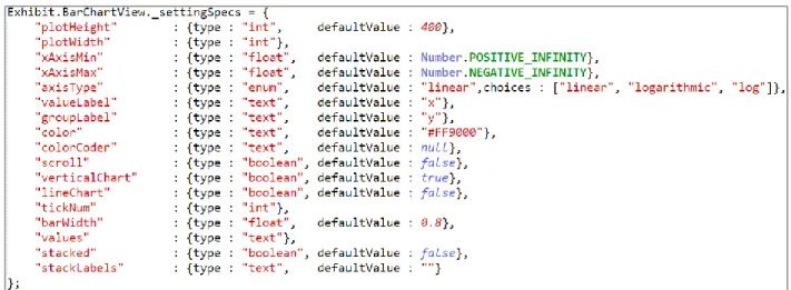
We added additional fields to the setting specifications both to provide more extensive
information to the users and to make the code more organized and uniform. The updated settings specifications for the bar chart view is shown below in Figure 16. The new fields are “required”, a Boolean indicating whether a value must be given in order for the view to render,
“importance”, a float corresponding to the importance of the setting, and “description”, a short description of the setting’s functionalities.
Figure 16: augmented setting specification for the bar chart view
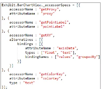
4.1.2 Accessor Specifications
In addition to the setting specification, a few of the components also possess an accessor
specification that describes how the dataset values are accessed (Figure 17). These are additional
26
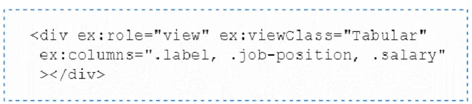
more data properties chained together and are used to traverse the database to retrieve data for each item in the dataset. For views, accessors take in the dataset properties that are to be
presented in the widget. For example, the “data-ex-columns” attribute for the tabular view shown in the code snippet in Figure 10 refers to the properties of the data to be rendered as columns. Each item in the dataset is represented by a separate row. The value
“.label, .job_position, .salary” indicates that the columns should be showing data for the label, job_position, and salary properties of each item. Each part of the specification corresponds to how a specific accessor is created.
Similar to the setting specification, the information contained in the accessor specification can also be presented in a user-readable manner and was augmented to provide more meaningful documentation. The accessor specification for the bar chart view before and after augmentation are shown in Figures 17 and 18.
Figure 17: accessor specification for the bar chart view prior to augmentation. Describes how the dataset values are accessed
27
Figure 18: augmented accessor specification for the bar chart view
Like the settings specifications, new fields were added to the accessor specifications in order for a select number of views to take full advantage of the accessor specification. Previously, these views either didn’t use an accessor specification or only used it partially, accessing some of their data directly. Accessor specifications are also introduced to the facet components to distinguish attributes that take in properties of the data from the rest.
4.2 Purpose of Specification Fields
Augmenting the setting and accessor specifications allows for more fine-grained processing of the attributes. This section documents the purpose of these specification fields and how they help
28
simplify the codebase, while Section 4.3 describes how they’re transformed into documentation to benefit the users. All of fields explained below are common to both the setting and accessor specifications. Many of them are used for automatic error detection during the attribute
processing stage, thus reducing code repetition and promoting safer coding practices. These fields are beneficial for developers even if no documentation is generated from them.
Although these fields are beneficial for both the developers and the documentation users, default values are in place to allow both the widgets and the documentation to still render when fields are missing. In these cases, the documentation would just not be as robust and the developers would have to parse and check widget inputs manually.
Type
The type field specifies which type the given value is parsed into. When no type is specified for an attribute, the default type is text. If the type of the user’s input doesn’t match that in the specification, an error message is displayed to the users in the console.
Default Value
The default value field specifies the value used in the case where no value is provided by the user. For example, the default value for the plotHeight attribute of the bar chart view is 400. If that attribute is not specified in the view’s div tag, the plot height would automatically be set to 400 (Figure 19).
29 Choices
The choices field contains a list of available options for an enum typed attribute. For example, the “shape” attribute for the force directed view has the options triangle, square, circle, and star. During attribute processing, the user’s input value is checked against these choices, and if it doesn’t match any of them, an error is returned.
Description (new)
The description field is a text description of what that attribute is and how it’s used. Adding a description improves code readability and greatly improves users’ understanding of the attribute.
Required (new)
Required is a newly added Boolean field that also contributes to error detection. It indicates
whether a value is required for that attribute. The components do not get rendered in the case where required attributes are missing.
Importance (new)
The importance field is used to specify how important an attribute is. It takes in a float value between 0 and 10, with 5 being the default. Using floats allows for more discrete levels of importance and potentially provides an overall ordering of all the attributes. Attributes with higher importance values are the ones that users should focus on more, while the ones with lower importance values are only needed for special circumstances.
30 Dimensions
The dimensions field is present to indicate how many values each attribute takes in. The default dimension is 1 when no dimension is specified. The dimension specified tells the utility
functions how many values to parse and to return. If fewer values are given than specified in the dimensions field, an errors is thrown.
A “*” is used to indicate that the attribute can take in any number of values. An example of this is the “columns” accessor attribute for the tabular view, which allows users to show as many columns as they want in the table. The number of columns corresponds to the number of dataset properties provided. If they don’t provide any, all the properties in the dataset would be
displayed.
Adding a “+” after a number means at least that many values must be given. For example, a dimension of “3+” means that users must provide at least three values for that attribute.
4.3 Presentation of Specifications
This section touches on how the fields described in the previous section are presented to the users through the attributes table component of the documentation page. Although setting and accessor attributes are described separately in the respective specifications, they are not distinguished when displayed in the documentation. They are separated in the specifications because they require different processing, but that information is not helpful for the users.
31
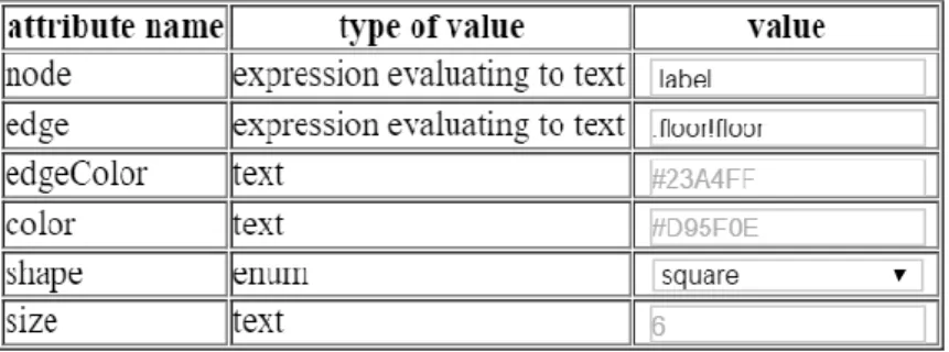
The right-most column of the attributes table contains input elements where users can enter values for the corresponding attributes with error checking (Figure 20). The values entered are used to update the interactive examples. This section focuses on the static documentation from the users’ perspective, so the value column will not be discussed in detail here. More details about the interactive component can be found in Chapter 5.
Figure 20: attributes table compressed view
Type
The type field is presented to the users in the second column of the attributes table (Figure 20). For accessor attributes, the type is specified as an expression evaluating to a particular type, instructing users to provide an expression instead of just a value of that type. For example, as shown in Figure 20, the type for the node accessor attribute is an “expression evaluating to text”.
Default Value
For enum and Boolean attributes, the default values are automatically selected in their dropdown menus and are marked as default, whereas the default values for the other attribute types are shown as a placeholder greyed out in the input box (Figure 21).
32
Figure 21: default values shown in the attributes table
Choices
The choices for an enum or Boolean attribute are available in the drop down menus of the value input column (Figure 22). Using a dropdown menu helps users reduce errors by forcing them to use a valid choice.
Figure 22: choices for the shape attribute in the force directed view
Description (new)
Users are given the option to have the descriptions displayed as a column in the table (expanded view shown in Figure 23) or to have them as a tooltip for that row (compressed view shown in Figure 20). The expanded view allows the descriptions to be viewed more easily and benefit users who are more focused on learning about the functionality of the attributes, while the compressed view benefits users who are using the interactive example by allowing more space for the widget to display.
33
Figure 23: attributes table expanded view
Required (new)
Required attributes are highlighted red until a value is entered (Figure 24). Sometimes, different groups of attributes make the same underlying changes and only one group is required. For these cases, the attribute inputs are all highlighted until one of the alternatives is satisfied. For
example, the getLatLng accessor in the map view is used to retrieve values for the latitude and longitude of the locations. Depending on the format of their data, users are given the option to specify two separate properties for the latitude and longitude using the lat and lng attributes or just one property using the latlng attribute. For the latter option, the data for that property needs to be in the format of two floats separated by a comma. These options are specified in the accessor specification as two alternatives for the accessor with name getLatLng, as shown in the accessor specification snippet for the map view in Figure 25. As seen in Figure 24, dotted cell borders are used to separate the different alternatives instead of the usual solid borders. Since the accessor is marked as required, one of the two alternatives must be satisfied. Only after a value is given for the laglng attribute or after values are entered for both the lat and lng attributes would the highlighting for all attributes belonging to that accessor be removed.
34
(a)
(b)
(c)
(d)
Figure 24: two alternatives for the getLatLng accessor for the map view (a) highlighted – no values filled in
(b) not highlighted – latlng value filled in (c) highlighted – only lat filled in
35
Figure 25: accessor specification snippet showing the getLatLng accessor for map view
Importance (new)
The importance value, float between 0 and 10, is translated into an importance level according to the table in Figure 26. Attributes that are marked as required are automatically designated high importance regardless of their importance value. Users are given the option of viewing attributes of high importance only, attributes of high and medium importance only, or all attributes. For the attributes currently shown, users can also choose to reorder them alphabetically, making it easier to locate a particular attribute.
Value Level > 7 High 3 – 7 Medium
< 3 Low
36
Chapter 5
Interactive Examples
The auto-generated documentation described in Chapter 4 informs users what settings are available for each component. Providing them with extensive examples will further improve the user experience.
As discussed in Section 1.3, many studies have demonstrated the effectiveness of example code; however, users sometimes incorporate example code incorrectly and tend to delay testing code copied from the internet, resulting in a lengthened debugging process [3]. One approach to increase the correct usage of examples, as described in the Codelets paper, is to treat examples as “first class objects” in the text editor [4]. We try to tackle this problem by providing users with interactive examples that allow them to configure the examples to their satisfaction before adding them to their code.
5.1 User Experience
An interactive example is available for each Exhibit view and facet component. These interactive examples allow users to configure the settings, accessors, and dataset used. Dropdown menus in the top panel (Figure 27a) allow them to select the component and the dataset of their choice. As discussed in Chapter 4, the last column in the attributes table consists of input elements for users to modify attribute values (Figure 27b). Similarly, users can also edit the code snippet (Figure
37
27c) to update the attribute values. Once the user modifies an attribute value or switches to a new dataset or component, the example widget (Figure 27d) updates accordingly.
Figure 27: components related to interactive example (a) top panel
(b) value input column (c) code snippet (d) example widget
Below are some additional features added to make the interactive examples easier to use and more fault tolerant.
5.1.1 Autocomplete
As mentioned in Section 4.1.2, accessor attributes take in expressions, a set of one or more dataset properties chained together. The set of available properties are collected from the current dataset and provided as autocomplete values for each of the accessor attributes (Figure 28). The
38
autocomplete functionality on a textbox is used instead of just a dropdown menu because certain accessor attributes allow a list of expressions instead of just one and expressions can be a chain of properties. The autocomplete feature shows users what the available properties are.
Figure 28: properties provided as autocomplete values for the axisData accessor attribute
5.1.2 Undo and Redo Functionality
The undo and redo buttons found in the top panel (Figure 27a) allows users to undo the last changes done or redo an undone change. This functionality brings fault tolerance by keeping track of the previous states of the interactive example. The changes that can be undone include attribute value updates, dataset selection changes, and component selection changes.
5.1.3 Propagation of Errors
To prevent fatal errors from occurring when some of the required attributes are left empty, the example widget is reconfigured only when all the required attributes are filled in; however, certain invalid input values could still result in errors during reconfiguration. In that case, the error message produced by Exhibit is displayed in the panel where the widget is usually shown. Figure 29 shows what would happen when a missing attribute is not filled in, and Figure 30 displays the error message shown when an invalid value is given for an accessor attribute.
39
Figure 29: component is not rendered if required attributes are not filled in
Figure 30: error message when invalid value is given for an accessor attribute
5.2 Implementation Details
The following sections explains the data structures used to keep track of the widget state. They also touch on how dataset selection and attribute value modifications are processed.
5.2.1 Example Configuration Objects
A JavaScript object, referred to in the rest of the paper as the example configuration object, is used to keep track of the current state of the interactive component shown (Figure 31). It maps each attribute to its user specified value. A new configuration object is created for each change that the user makes and is stored in a stack-like data structure to enable undo and redo
40
Figure 31: example configuration object for the state of the bar chart in Figure 12
There are two ways to modify the example configuration object. As mentioned earlier, the rightmost column in the attributes table contains input elements for users to select values for each attribute. The example configuration object is updated for each change to these input elements. The example configuration object can also be updated by editing the HTML snippet. This provides users with an easy way to store and reuse configurations of their choice. The HTML snippet shown in Figure 14 corresponds to the example configuration object from Figure 31. If the example configuration object is updated via the input elements, the HTML snippet also updates accordingly. Similarly, editing the HTML snippet would also cause the input elements to automatically update. In short, the input elements and the HTML snippet always reflects the current state of the example configuration object.
5.2.2 Dataset Selection
A select number of default datasets are provided for the interactive example. The example configuration objects are independent from the selected dataset, so the configuration is preserved upon dataset changes; however, some of the accessor attribute values would need to be updated to properties of the new dataset.
In addition to the default datasets, users are also given the option to upload their own dataset. The uploaded file’s content is read in and embedded into the HTML file inside a <script> tag.
41
Embedding the data into the HTML document is one of the ways that Exhibit allows users to specify their datasets. An HTML fragment id is then used to locate the file content when loading it into the Exhibit database.
Both Exhibit and its database are recreated or refreshed when a dataset selection changes. This ensures that the database is clean before the new datasets are loaded.
5.2.3 Updating the Component Example Configuration Object
The example widget is refreshed upon each example configuration object and dataset selection update. First, the example configuration object is translated into an HTML snippet, same as the one presented to the users. The HTML div is then added to the document and Exhibit is
reconfigured on that page. During the reconfiguration process, Exhibit rerenders each component on the page according to the attributes specified.
42
Chapter 6
Developing Future Components
In order for a future component to be compatible with the documentation system, it needs to utilize the setting and accessor specifications. Component developers can easily model their new components off of existing ones.
To register the new component to the documentation system, the component namespace needs to be added to an existing extension specification. This step is required in order for the system to recognize the existence of the component. Figure 32 shows the extension specification for the core Exhibit library. It contains a view specification and a facet specification that lists all the views and facets available in the core Exhibit library. Each Exhibit extension library has its own extension specification and documents the available components in that extension. Certain extension specifications also include an HTML snippet that provides the extension-specific documentation mentioned in Section 3.2.2.
43
Figure 32: extension specification for the Exhibit core
For components that use inheritance or composition, their dependencies are also listed in the specifications. For example, the thumbnail view is created by first creating an ordered view frame using composition, but this implementation detail is hidden from the users. Users are not aware of the existence of an ordered view frame. From their point of view, all the settings belong to and are specified for the thumbnail view. The dependencies list tells the documentation system to also read in the setting and accessor specifications for the ordered view frame and have them available to the users as part of thumbnail view.
44
Chapter 7
Conclusion
The thesis explores the ideas of automatically generating documentation from source code for code bases with a set of functions that take in typed inputs. We extended Exhibit’s typing system and created EIDS to parse the specifications to automatically generate documentation as well as an interactive widget editor.
7.1 Future Work
Additional changes can be made to the codebase to further code modularity and increase user fault tolerance. For instance, constraint fields, such as maximum value and minimum value, could be added to the setting and accessor specifications to provide more fine-grained attribute processing. For example, attributes that handles element width and height should not allow negative inputs. Having a minimum value of 0 allows the attribute processing mechanism to spot more invalid inputs. The constraint information can then be used to generate the corresponding documentation.
In addition to logging errors in the browser console, presenting errors directly on top of the widget when the users are in dev mode would further increase coding efficiency and reduce errors.
45
By relying on the setting and accessor specifications of each component to generate rich
documentation, the framework also revealed the similarities between the structure of a view and that of a facet. Future work on Exhibit include the refactoring of views and facets to extract out code that are common to both. Both take in and process a configuration of attributes, except views render the data while facets filter the data. The overlapping elements could be factored out into a common parent class.
7.2 Summary
EIDS provides a centralized resource for users to look up all the available ways to configure an Exhibit view or facet; however these documentation and examples do not replace the current tutorial that provides a step-by-step guide for new users to create their first Exhibits [7]. They supplement the tutorial in helping users learn what else they can do with each component in addition to the examples provided in the tutorial.
The augmentations required to make each Exhibit component compatible with the system also benefits Exhibit developers by providing more modularity for the fetching and processing of parameters. In addition, developers can also use the interactive examples for testing purposes. Hopefully, this system will provide the often-missing incentive for developers to provide the information needed to document their code.
46
Bibliography
[1] Tobin-Hochstadt, S., & Felleisen, M. (2010). Logical types for untyped languages. ACM SIGPLAN Notices SIGPLAN Not., 45(9), 117. doi:10.1145/1932681.1863561
[2] Kramer, D. (1999). API documentation from source code comments: A Case Study of Javadoc.Proceedings of the 17th Annual International Conference on Computer Documentation - SIGDOC '99.
[3] Brandt, J., Guo, P., Lewenstein, J., Dontcheva, M., & Klemmer, S. (2009). Two studies of opportunistic programming. Proceedings of the 27th International Conference on Human Factors in Computing Systems - CHI 09.
[4] Oney, S., & Brandt, J. (2012). Codelets. Proceedings of the 2012 ACM Annual Conference on Human Factors in Computing Systems - CHI '12.
[5] Benson, E., & Karger, D. (n.d.). End-users publishing structured information on the web.Proceedings of the 32nd Annual ACM Conference on Human Factors in Computing Systems - CHI '14.
[6] Reference Documentation for Exhibit. (n.d.). Retrieved August 1, 2016, from http://www.simile-widgets.org/wiki/Reference_Documentation_for_Exhibit
[7] "CAR Hands-On: Simile Exhibit Framework". People.csail.mit.edu. N.p., 2016. Web. 1 Aug. 2016.