Aesthetics of the Qur’anic Epigraphy on the Taj Mahal by
Rio Fischer
B.A. Philosophy & Middle Eastern Studies Claremont McKenna College, 2012
SUBMITTED TO THE DEPARTMENT OF ARCHITECTURE IN PARTIAL FULFILLMENT OF THE REQUIREMENTS FOR THE DEGREE OF
MASTER OF SCIENCE IN ARCHITECTURE STUDIES AT THE
MASSACHUSETTS INSTITUTE OF TECHNOLOGY June 2017
©2017 Rio Fischer. All rights reserved.
The author hereby grants to MIT permission to reproduce and to distribute publicly paper and electronic copies of this thesis document in whole or in part
in any medium now known or hereafter created.
Signature of Author: __________________________________________________ Department of Architecture
May 25, 2017
Certified by: __________________________________________________________ James Wescoat
Aga Khan Professor Thesis Supervisor
Accepted by:__________________________________________________________ Sheila Kennedy
Professor of Architecture
3 Committee:
James Wescoat, PhD Aga Khan Professor Thesis Supervisor
Nasser Rabbat, MArch, PhD Aga Khan Professor
5 Aesthetics of the Qur’anic Epigraphy on the Taj Mahal
by Rio Fischer
Submitted to the Department of Architecture on May 25, 2017 in Partial Fulfillment of the Requirements for the Degree of Master of Science in
Architecture Studies ABSTRACT
This thesis examines the Qur’anic epigraphic program of the Taj Mahal. Following the 1989 Begley & Desai book Taj Mahal: an Illustrated Tomb, the flourish of scholarship that would expectedly follow a complete epigraphical catalog never arrived. Despite being well-known and universally cherished as indicated by the Taj Mahal’s recognition as a UNESCO world heritage monument and as one of the New 7 Wonders of the World, there is insufficient research directed towards the inscription program specifically.
In order to focus the scope of the project, I employ phenomenological methodology, using a typical visit to approach the most salient, prominent inscriptions. I argue that the epigraphic program operates on three distinct, hierarchical registers: aesthetic, symbolic, and then denotative. Furthermore, I argue that the inscriptions hint towards a preferred way to approach the site.
The thesis argues that the primary concern of the calligraphic design on the Taj Mahal is aesthetics. This study finds that letter forms and overall design of the script contribute to a presentation of the Qur’an as visually balanced and demonstrates that this balance was the primary design consideration. Furthermore, the thesis considers the calligraphic aesthetics at multiple scales and shows that aesthetic considerations overlap at various distances and vantages. Finally the thesis questions the strict separation of aesthetics from symbolic reading offering alternative interpretations involving a connection between symbolic meaning and aesthetics.
Thesis Supervisor: James Wescoat Aga Khan Professor
7 I dedicate all of my work herein to my mother whose
9 Acknowledgments
This thesis would not be possible without the continual guidance of my advisor, Professor James Wescoat. His dedication to scholarship as well as to his students is an extraordinary resource for MIT and the School of Architecture and Planning. I am continually grateful for his input, advice, and compassion. Working with Professor Wescoat has been a delight. I am still impressed by his extensive knowledge and experience.
I also would like to thank Professor Nasser Rabbat whose insightful input and critical mind were important driving factors in the development of my thesis as well as my education at MIT. I believe that the goal of each Aga Khan student here, whether admitted or not, is to make their work satisfactory in his eyes. Any valuable discovery in my thesis is due more to my committee’s dedication than to my insight.
Without the generous support of the MIT International Science and Technology Initiatives (MISTI) this thesis would have never gotten off the ground. I am grateful for their support and proud to be part of a program which enables a multitude of scholars to participate in inspiring initiatives worldwide.
I am grateful for the dedication of the History, Theory, and Criticism (HTC) faculty at MIT. Their tireless efforts ensure that students here receive all possible advantages. Their work is
thought-provoking, rigorous, and interesting. I thank Professor Lauren Jacobi especially for her contributions to this project during our reviews.
I thank my friends and colleagues at MIT, especially those in the Aga Khan program. I am continually inspired by your ideas, impressed by your engagement, and touched by your kindness. Without Huma, Garine, Alaa, and Ali, my time here would seem comparatively hollow.
Finally, I thank my family, who have always been supportive, in any way possible. I owe them everything. I always aspire to make my parents proud.
10
Table of Contents:
I. Introduction 11
II. Chapter 1: Review of relevant literature 15
III. Chapter 2: Methodology and theoretical framework 21
IV. Chapter 3: Approaching the Tomb 27
A. Introduction 27
B. Great Gatehouse from the South 30
C. Opening from the gatehouse 35
D. On Axis: privileged scenes 37
E. Reflecting pool looking north 39
F. The gardens 41
G. Plinth base looking towards the tomb 42
V. Chapter 4: On the plinth 44
A. Introduction 44
B. Opening 45
C. Circumambulating the exterior 53
D. Portals inside the arches 56
E. Guesthouse and mosque 59
VI. Chapter 5: Interior 60
A. Introduction 60
B. Entering the tomb 61
C. Circumambulating the central room 63
D. Cenotaph 65
VII. Chapter 6: Departure 69
A. Introduction 69
B. From the Plinth 71
C. Gatehouse 72
11 Introduction
The Taj Mahal was commissioned in 1632 by then Mughal Emperor Shah Jahan shortly after the death of his wife Mumtaz Mahal. The funerary garden complex, completed over the next two decades, represents the conflux of various historical, theological, architectural, artistic, economic, and social contingencies.1 The complex represents the apogee of Mughal monumental funerary gardens due not only
to its splendor and architectural excellence, but also due to the subsequent shift away from grand monumental architecture to more modest burials initiated by Aurangzeb after which declining Mughal economic power limited similar architectural undertakings. In this sense, the Taj Mahal complex can be seen as the culmination of a short yet influential period of royal monumental tomb gardens beginning with Akbar’s commission of Humayun’s tomb in Delhi.
Among other design features that set apart the Taj Mahal from previous monumental tombs is the epigraphic program, which is the most extensive existent Islamic calligraphic program today.2 With
twenty-five Qur’anic Surahs produced in part or in entirety, calligraphic inscription adorns significant portions of the Taj Mahal complex.3 This inscription program also operates within a series of calligraphic precedents in
Muslim South Asia. Beginning in the Sultanate period Qur’anic inscription proved significant within architectural projects including the Qutb Minar complex in Delhi.4 The most relevant precedent is the
Buland Darwaza at Fatehpur Sikri due to both the scale, style, and location of inscription: monumental Thuluth inscribed in a band framing an iwan arch in a massive gatehouse (figure 1).5 The inscription,
however, produces significantly different visual effect. The gatehouse inscription is produced by relief
1 See Ebba Koch, The Complete Taj Mahal, 2006
2 Ibid. pg. 224. There are no existent architectural sites with more calligraphic inscription, however there are written
sources providing examples of more extensive epigraphic programs including the prophet’s mosque in Medina which purportedly had the entire Qur’an inscribed on its walls.
3 Throughout the paper I use the Arabic word Surah of which 114 comprise the Qur’an due to its common usage in
English texts. To refer to specific verses I use the English word instead of the Arabic ayat.
4 See Richard Ettinghausen’s essential paper, “Arabic Epigraphy: Communication or Symbolic Affirmation” 1974. 5 For a review of Mughal monuments, see R Nath, Calligraphic art in Mughal architecture, 1979 and Wayne Begley,
12
carving the stone of the structure. As such, the inscription does not produce color contrast on the structure, and is difficult to recognize at distance. The tomb of Itimad ad-Dawla completed roughly ten years before the Taj Mahal on the opposite bank of the river provides another important precedent for the Taj Mahal. The white marble mausoleum features prominent inlay on the exterior and interior. A band of relief carved marble inscription runs along the building directly above the arches. The script style generally resembles that of the Taj Mahal including two registers of text stacked vertically and interlocking letter forms. The relief carving, however, does not provide the same visual effect of the inlay calligraphy on the Taj Mahal.
Fig. 1 Calligraphy at Fatehpur Sikri
Furthermore calligraphic script itself has a rich history including widespread use in the South Asian context. Monumental Thuluth, the script employed for the Qur’anic inscriptions, bears a long tradition and historical development. Consensus points to Ibn Muqla as the innovator of the script within 10th century
Baghdad chancery. Although there were cursive scripts in use at the time of Ibn Muqla’s reforms, his principles of geometric regularity coupled with innovative ways to cut the pen obliquely remain an essential turning point in the development of Arabic cursive scripts. al-khat al-mansoob, as these scripts are known, is further implemented by Ibn al-Bawwab. Consistent with this great-calligrapher model of script
13 development in which individual scribes trace their knowledge of specific scripts to master writers as a chain of transmission, Yaqut al-Musta’simi is the next essential character in the development of cursive scripts. He recodified “the six scripts” including Thuluth.
Fig. 2 Thuluth by Yaqut al-Mustasimi6
Monumental Thuluth reflects a conscious design decision evoking specific aesthetic and formal concerns. It is important to note that although it was an important, widely used script, Thuluth was merely one of multiple scripts employed in Mughal inlay. Equal in importance and implementation was Nastaliq, which was then a relatively recent development emerging out of Persian calligraphic practice. Nastaliq, however, would prove unsuitable for writing Qur’anic inscription as this practice was extremely rare.7 Thus,
Nastaliq is reserved mainly for inscriptions of Persian text, and not Qur’anic verses. Naskh script was also in widespread use in the Mughal court, although this was reserved primarily for manuscripts.8
6 Library of Congress ascs.004
7 There is nothing inherently unsuitable about using Nastaliq 8 See P.I.S M. Rahman, “Mughal Calligraphy” Islamic Studies 1987
14
Amanat Khan, who designed the Taj Mahal calligraphy, had a preference for Thuluth; the three other known examples of inscription attributed to him are all produced in similar Thuluth script. It is not particularly odd to render Qur’anic inscription in Thuluth, however in the case with Persian verse, Nastaliq was generally preferred in the Mughal Empire. Thus, the Sarai Amanat Khan (dated around 1640) demonstrates the calligrapher’s commitment to the script. As such, the selection of Amanat Khan as the designer of the epigraphic program presumably also entails the selection of Thuluth script.
15 Chapter 1: Review of relevant literature
Historical studies of the Taj Mahal intersect multiple disciplinary approaches. Work on calligraphic inscription is found primarily in architectural histories. The scope of this review covers primarily works directly pertaining to the Taj Mahal before broadening to include some primary examples of architectural calligraphic studies in Arabic script.
Ebba Koch’s The Complete Taj Mahal approaches The Taj Mahal site from the perspective of architectural history situated within a cultural urban context.9 Her writing spans disciplinary approaches
and relies on resources including measured drawings, site plans, primary accounts, and accounts of building construction and conservation. Her text is divided into five sections. “Mughal Agra, a riverfront garden city” continues the thinking of her 2005 article in Muqarnas “The Taj Mahal: architecture, symbolism, and urban significance” where she contextualizes the Taj Mahal site within the garden culture of Mughal Agra.10 She
examines property records to create an understanding of the gardens along the Yamuna River. Her second section, “The construction of the Taj Mahal” examines both the sourcing and production of the Taj Mahal. Here she contextualizes the Taj Mahal within a larger arc of Mughal funerary architectures. “III More than a tomb: the parts of the Taj Mahal” catalogues and describes the various elements of the complex with equal focus on periphery structures and the central tomb in order to emphasize her reading of the site as an entire multi-functional complex. “IV The paradisiacal house of the queen” which includes discussion of the epigraphic source work examines the funerary significance of the gardens, structure, and decoration. The final section “Everybody’s Taj Mahal” extends the significance of the structure into folklore, popular understanding, and reconceptualization through historical iterations. Although she continually addresses questions of significance, her text focuses on architectural historical methods and the inclusion of
9 Ebba Koch, The Complete Taj Mahal, 2006
16
epigraphic sources as part of additional angles approaching the site provide a cursory survey of the material.
The text is particularly strong in covering the many approaches utilized to study the Taj Mahal, but only in regards to a traditional architectural historical approach does Koch provide a comprehensive study of the material. The specific use of the calligraphic inscription is used in relationship to the funerary complex as a paradise garden housing the body of the queen. She briefly alludes to Qur’anic passages selected, and describes the material and aesthetic qualities of the inscription, but her analysis pertains mainly to symbolic readings.
Wayne Begley dedicated a great deal of his career to developing Mughal Architectural history. His first key work provides an overview catalog of Islamic inscriptions in India organized chronologically.11
Following this regional level survey, Begley with Desai accomplish a site specific survey for the Taj Mahal four years later.
The Illumined Tomb, published by Begley and Ziyaud-Din Desai provides an extensive survey of Taj Mahal textual material.12 Cataloging translations of primary source materials including documented
records as well as court histories, this volume provides essential historical evidence pertaining to the construction, utilization, and reception of the monumental site.
Furthermore, Begley & Desai provide documentation and translation of the Taj Mahal inscriptions. They separate the inscriptions by historical and Qur’anic categorization. Their comprehensive study translates each passage in order of appearance at the site. They present the material, along with photographic sources, as a collection of all available epigraphic sources. The book includes contextualization of the Taj Mahal epigraphy within other examples of Amanat Khan.
11 Wayne Begley, Monumental Islamic Calligraphy from India, 1985
12 Wayne Begley and Ziyaud-Din Desai, The Illumined Tomb: an anthology of seventeenth-century Mughal and
17 Although this text provides invaluable access to textual sources, it does not provide commentary or analysis. The authors eschewed any attempt at interpretation, claiming that an interpretive volume would follow. They also made no reference to a narrative construction based on the ordering of the text. In this regard the ideal photographs and the order of the text abstract the inscription from the architectural context.
In other works such as Begley’s “The Myth of the Taj Mahal and a New Theory of Its Symbolic Meaning” (1979) the author incorporates the epigraphic survey within an interpretation of the symbolic meaning of the Taj Mahal site.13 This article puts forth a deterministic understanding of the calligraphy
which fails to find the nuance when considering audience, and the relationship between the inscriptions and the site. Begley also provides a biographical piece about Amanat Khan in which earlier calligraphic context provide an arc of monumental inscription leading up to the production of the Taj Mahal.14
Ram Nath, the retired professor of history at University of Rajasthan, published Calligraphic Art in Mughal Architecture, which extends beyond merely cataloging inscription and provides description of the form and content of inscription on monumental Mughal structures.15 The author rightly claims this to be
the first such study of its kind. His work focuses on the content of the inscription rather than the formal qualities of the script, a methodology which produces a narrow understanding of the textual significance. Nath’s texts are particularly useful in reconstructing an early historiographic arc of Mughal architectural history. Due to the length and productivity of his career, Nath is positioned within an early contemporary historiography which provides access to late 19th and early 20th century histories in context.
The Immortal Taj Mahal continues the work of historians such as James Fergusson and E. B. Havell as well as other contemporaneous historians of the British era. Similar to Ebba Koch’s recent book, this publication first provides South Asian funerary architecture as historical context before examining the Taj Mahal site
13 Wayne Begley, “The Myth of the Taj Mahal and a New Theory of its Symbolic Meaning” 197
14 Wayne Begley, “Amanat Khan and the Calligraphy on the Taj Mahal.” Kunst de Orients, v. 12 n1-2, pg.5-60 15 Ram Nath, Calligraphic Art in Mughal Architecture, 1981
18
itself.16 Then, he provides a detailed examination of the ornamentation followed by discussion of popular
meanings, tales, and folklore surrounding the site and its construction.
Framed within a larger architectural context, James Wescoat and Joachim Wolschke-Bulmahn’s text from a Dumbarton Oaks symposium provides a useful overview of Mughal garden studies.17 Dealing
with a major theme of complicating available sources used when interpreting Mughal gardens, the sources of garden studies pair well with an aesthetic interpretation of the Taj Mahal calligraphy. Wheeler Thaxton’s paper in that symposium serves well to connect textual aesthetics to garden motifs. He argues that poetry does not serve as a useful source to understand formal qualities of Mughal gardens due to the reliance on pre-established poetic conceits already present in Persian traditions. Despite this, the poetic sources aptly demonstrate an aesthetic connections with garden design.
Moving broadly towards Arabic architectural inscription, Erica Dodd and Shereen Khairallah provides an exhaustive index of Qur’anic epigraphy employed on architecture.18 Volume II of their work
organizes the inscriptions by Qur’anic verse, geographic location, and location on the building within comprehensive indexes. The arrangement and presentation of this evidence favors the conclusions put forth in the first volume: that Medieval Islamic art operates as a continuity of theological and artistic practices arising from Classical traditions.
Their text, to which anyone working with Islamic inscription owes a debt of gratitude, provides access to wide inter-regional context. These comparisons, rooted within empirical methodologies, enables rigorous approaches to comparative work within the field. This methodology, however, risks flattening the site specific contingencies into broader categorical data which can be indexed.
16 Ram Nath, The Immortal Taj Mahal, 1972
17 James Wescoat and Joachim Wolschke-Bulmahn, Mughal Gardens: Sources, Places, Representations, and
Prospects, 1996
19 Sheila Blair continues, in a sense, the work of Dodd and Khairallah by providing a broad look at Islamic writing in order to understand large scale comparisons across culture and temporal divides.19 Her
work attempts to explain diachronic shifts in writing through the promulgation of innovative developments spawning from great masters such as Ibn Muqla and Yaqut al Mustasimi. Again, the cost of such an expansive project is the specific context of the manuscript or site. Blair organizes her argument chronologically with breaks associated with political histories.
Muhammad Gharipour and Irvin Cemil Schick edit a volume presenting an alternative approach to Dodd and Khairallah’s, and Blair’s. Calligraphy and Architecture in the Muslim World (2014) is a collection of articles organized broadly by region, temporal, or dynastic separators.20 Their approach ensures the
recognition of site specific complexities and contingencies. Less able to make broad conclusions about the whole of Islamic Inscription, this approach necessitates site specificity. Their text allows for later comparative work to be done, but only carefully through small scale projects.
In terms of specific development of monumental architectural scripts, the work of Yasser Tabbaa is invaluable. He posits the development of proportional cursive scripts within a larger theological debate between Abassid and Fatimid theological stances.21 He argues that the form of calligraphic scripts arrive
through theological considerations; moving from Kufic to cursive scripts implies a theological distinction in understanding access to the text of the Qur’an as sufficient, or mostly sufficient, to access liturgical significance. Simply, cursive Qur’anic text is meant to be read.
Within the Mughal context specifically, P.I.S Mustafizur Rahman, published a brief paper documenting calligraphic trends and practice from the reign of Babur to Aurangzeb.22 His paper identifies
broad scriptural developments as well as locating specific preferences for script styles such as the trend
19 Sheila Blair, Islamic Calligraphy, 2005
20 Muhammad Gharipour and Irvin Cemil Schick, Calligraphy and Architecture in the Muslim World, 2014 21 Yasser Tabbaa, The Transformation of Islamic Art During the Sunni Revival, 2002.
20
towards Nastaliq due to its relative novelty. His paper briefly considers aesthetic implications especially when considering the calligraphic practices of the emperors specifically.
Tim Edensor provides a dramatological approach to a visitor experiencing the Taj Mahal complex.23
Working within phenomenological traditions of experience as well as sociological methods, Edensor examines the Taj Mahal site from the perspective of a “typical visitor.” His work provides an approach which allows for a broadening of experience from a singular phenomenological access to the site and instead permits varied readings gleaned from visitors representing disparate cultural, social, and language backgrounds.
For the purpose of my study, Edensor provides a way to abstract my observations into a more generalized framework of a tourist experiencing the site, applying my observations and photographs as part of an experiential moment for a tourist.
21 Chapter 2: Methodology and theoretical framework
The importance of this study lies mostly in the lack of any endeavor to specifically address the inscription program as an aesthetic element. There has been significant work documenting and cataloging Mughal epigraphy, but no similar attempt at explicating meaning and significance. It is necessary to add an interpretation of the inscriptions in order to further the depth of understanding this monument. The study has further implications of interest with its potential to highlight various tensions existent in Islamic religio-political entities.24
This mode of approaching the inscription, however, runs risk of decontextualizing the written word from the aesthetic and experiential features of this writing. Epigraphy does not operate as a neutral source of information, but is charged with aesthetic, political, religious, and cultural registers. Recognizing this intractable formation of writing, especially writing the Qur’an, this thesis bridges this epigraphic understanding of text as historical data with an architectural sense of aesthetics.
The Taj Mahal inscriptions are typically treated as a source of historical evidence augmenting the scant philological record. Whereas some epigraphic inscription – such as the signature of Amanat Khan - is readily available for dating and biographical information, the Qur’anic inscription is also utilized as explanation of the meaning of the site. Mughal Architectural Historian Ebba Koch writes, “Surface and ornament are our most immediate window into the meaning of the Taj Mahal” Or, as Mughal Architectural Historian Wayne Begley puts it in his 1976 paper: “In view of this obvious concern with visual and decorative effect, the content of the inscribed Koranic passages must have been a matter of equal, if not greater, concern to the scholar in charge of the selection.” The scholastic consensus finds the aesthetic concerns of the inscription program either secondary, or supplementary to the pursuit of symbolic meaning. Although
24 It is important to note that there is Qur’anic commentary about grave practices. One commonly held belief is that graves should not have structures over them, should be unmarked (with any distinguishing features which would signify an individual), and should be modest and small. For hadith on graves see Sahih Muslim v.4 ch. 47, 199, 200. The Taj Mahal obviously flies in the face of all of these regulations and raises interesting questions about the nature and function of the site and the category of Islamic funerary gardens broadly speaking.
22
he inscription program contributes to an overall religio-political significance blanketing the site, the primary concern is aesthetic.
Each chapter of this thesis will deal with a specific space of the site and how it relates to the epigraphic program. This arrangement allows for the construction of multiple possible narratives which in turn posit alternative possible relationships between the Qur’anic program and the complex. The order of the thesis will follow the order in which the monument’s inscriptions are experienced, but the relationship between these specific inscriptions and larger epigraphic framing questions remains unclear.
The Taj Mahal epigraphy is characteristically considered as evidence pertaining to the meaning of the site.25 The program, along with other decorative elements, provides clues as to how the monumental
tomb was intended to be interpreted and understood. In this regard, authors consider the epigraphy as a textual source which can broaden and deepen our understanding of the monument. The historical epigraphy dates the site and identifies the calligrapher. The Qur’anic epigraphy blankets the monument in religious significance and hints at the theological implications at work during the creation of this Islamic burial site.
As such, the way the text looks becomes critically important to further our understanding of both the function of the inscription program as well as the way these inscriptions become discernable at a specific point.
To enable the inclusion of aesthetic considerations within a larger understanding of textual inscriptions, this thesis relies on a phenomenological walk-through of the site. In this walk-though I focus on aesthetic and experiential considerations pertaining to the inscription program without isolating the text from other decorative and architectural concerns present. Included here is a series of photographs
25 Ebba Koch writes, “Surface and ornament are our most immediate window into the meaning of the Taj Mahal,”in
The Complete Taj Mahal pg. 224. Or, as Mughal Architectural Historian Wayne Begley puts it in his 1979 paper: “In view of this obvious concern with visual and decorative effect, the content of the inscribed Koranic passages must have been a matter of equal, if not greater, concern to the scholar in charge of the selection.”
23 which provide a rudimentary sense of how one encounters the calligraphic inscription, and how these inscriptions mutate from point to point in the site. 26
This thesis argues for aesthetic consideration as the primary determination of calligraphic form and function. As such, it is incumbent to suggest an overall aesthetic framework within a Mughal context. This proves difficult not only due to the lack of Mughal textual sources on aesthetics, but also the contemporary tendency to provide incomplete systems in which aesthetics are addressed relationally to other more evidenced concepts.27 The limited corpus entails that most attempts at unified aesthetic theory remain
speculative and limited.
Mughal Aesthetics is an insufficiently developed field. It is limited especially by the inordinately small number of texts surviving on theoretical concerns of art and architecture. Furthermore, secondary attempts at Mughal aesthetic theory are few and exist relationally to other areas of study with greater evidence available. Art Historian Gregory Minissale’s text posits Mughal Aesthetics within an Anti-European and European dialectic in which Mughal aesthetics (of painting) must be considered through endogenous cultural construction. His aesthetic framework, however avoids cultural pitfalls by remaining largely formal: addressing concerns of geometry and proportionality. Islamic Art Historian Valerie Gonzalez’s text on Mughal aesthetics and hybridity also relies more heavily on the interlocutor of hybridity than establishing comprehensive aesthetic theory.
In their historiographic introduction to the field of Mughal Gardens James Wescoat and Joachim Wolschke-Bulmahn, separate modern interpretations of Mughal garden aesthetics into subjective and
26 The use of photography is not to imply a scenic approach to the landscape but rather serves as a singular point in
a multi-scenic approach in which the photographs are expanded or disrupted by textual description
27 See Valérie Gonzalez, Aesthetic hybridity in Mughal painting, 1526-1658, 2015 in which aesthetics are considered
in relation to cultural hybridity and the success of Mughal or George Minisale Images of Thought, Visuality in Islamic India 1550-1750, 2006 in which Mughal Painting is considered free from Western historical tropes. He considers formal qualities and proportional geometries of the painting composition as the major source of aesthetic principles.
24
formal aesthetics.28 The writers are largely critical of subjective aesthetics due to romantic tropes of
picturesque gardens associated with Orientalist views. This thesis reconsiders the subjective aesthetic as a useful category deepening our understanding of the Taj Mahal complex.
Although there exist extensive sources comprising a corpus of writing on calligraphic form, these sources pertain chiefly to earlier medieval periods. Within the Mughal context there is limited writing on calligraphic aesthetics. Therefore, in order to patch together a way of seeing aesthetics, this thesis includes distinct yet intersecting sources of poetics, garden studies, and painting. By including considerations from distinct sources, aesthetics are approached, albeit with varying degrees of clarity, as a complete system of principles guiding design decisions.
There are broad principles pertaining to design which are accessed through a wide array of sources. Perhaps the most important principle is the emphasis on balance. This abstract principle applies to painting, architecture, garden design, literature, and as we will see, calligraphy. The appreciation and reliance on balance is acutely seen in the lateral symmetry of Mughal architecture, but is similarly present in the calligraphic design. Second is the notion of a unified theory of aesthetics. At times difficult to salvage from Orientalist tropes, this concept posits that Mughal aesthetic principles apply across mediums and are mutually contingent with other philosophical constructs such as justice.
One of the connections between Mughal garden design and textual aesthetics comes from Mughal conception of poetics. Wheeler Thackston argues that poetic sources offer limited help in understanding the formal, phenomenological, and symbolic characteristics of gardens due to their heavy reliance on previously established tropes codified within Persian poetry.29 Mughal garden poems describe landscapes
more closely resembling Persian geographies than those of India. As such, the adoption of Persian poetics
28 See James Wescoat and Joachim Wolschke-Bulmahn, “Sources, Places, Representations, and Prospects: A
Perspective of Mughal Gardens,” in Mughal Gardens: Sources, Places, Representations, and Prospects, Ed. James Wescoat and Joachim Wolschke-Bulmahn.
29 See W. M. Thackston, “Mughal Gardens in Persian Poetry,” in Mughal Gardens: Sources, Places, Representations,
25 therefore reveal more about Mughal literary practices than about the qualities of gardens. This poetic descriptions, however, serve wonderfully to augment our understanding of Mughal aesthetics.
Furthermore there is a longstanding relationship between poetic descriptions of gardens and poetic descriptions of writing. al-Tawhidi’s manuscript on handwriting includes reference to gardens and flowers in relation to text. He writes, “'Abd al-Hamid said: Barren soil is some thing desolate. A flower garden, on the other hand, is something pretty, and when it is in bloom, its beauty is perfect. Thus a handwriting without dots and diacritical points is like barren soil. On the other hand, a handwriting that is provided with dots and diacritical points is like a garden in bloom.”30 Later he adds, “'Abd al-Hamid b.
Yahya,… Handwriting is a garden whose flowers are instructive remarks.”31 Either merely as poetic conceit
or a conceptual connection, these metaphors imply that there exists a guiding aesthetic principle connecting distinct forms.32 In other words, that which makes flowers and gardens beautiful also makes
writing beautiful.
It is important to consider non-textual sources such as paintings as important contributions to our understanding not only of aesthetic principles but also how landscapes were seen in a Mughal context. Rather than a series of perspectival scenes, Mughal painting provides multiplanar views of landscapes which combine a series of perspectives combined to produce a series of representations of a landscape. As such, a phenomenological study of the Taj Mahal needs to incorporate this multi-scenic approach to
30 See Franz Rosenthal Trans., “Abu Ḥaiyun al-Tawḥidi on Penmanship,” Ars Islamica Vol. 13, 1948. Pg. 18 31 Ibid. pg. 12
32 The obvious problem here is that these aesthetic principles from the 11th century have little if any bearing on 17th
century ways of seeing. I am conflicted as to whether this connection has salience. On one hand, calligraphic arts are seen as chain of transmission from original masters such as Yaqut, which implies that texts were still read to provide understanding of how to produce calligraphic forms. On the other hand, the obvious distance geographically and temporally makes this a weak connection. Despite this, the prevalence of poetic conceit at least reinforces the notion of a guiding aesthetic principle spanning distinct art forms. I.e. there isn’t an aesthetics of painting, and an aesthetics of architecture, but rather there is merely aesthetic principles which govern both painting and architecture.
26
landscape.33 In this thesis, the scenic photographic representation is disrupted by textual description to
approach an alternative reading of the space.
27 Chapter 3: Approaching the Tomb
Introduction
Fig. 3 Plan of Taj Mahal34
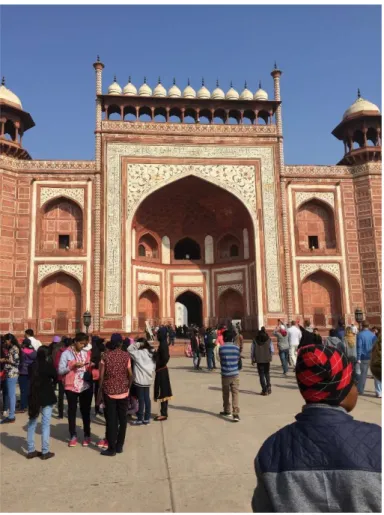
The Taj Mahal is a large funerary complex including a series of buildings and landscapes all of which contribute to an overall sense of monumentality and importance. The current context provides a distinct rupture between the contemporary urban location within Agra and the historical space of the Taj. This break is emphasized not only by the selective preservation of site at the boarder of the courtyard south of the gatehouse marked by large imposing walls with massive gates and also the presence of security checkpoints situated within these walls. The historical caravansaries and other urban constructions from the Mughal Era are replaced with the contemporary urban fabric packed with shops, restaurants, vendors, and transportation services all which profit from the influx of tourists.
28
There are three possible entrances to the site, each with a specific aesthetic feel. Although the site operates within a larger designed area, it is removed in part from its original urban context. Once in the site, there are multiple pathways which funnel through specific points moving the visitor along. For example, all entrances lead to the forecourt which in turn offers multiple pathways to the gatehouse. From the gatehouse, the charbagh opens providing multiple paths to two possible plinth access points.35 In this
regard, there is not a singular order to walkthrough and experience the site, but rather an overall immersion within an expansive garden-tomb.
It is critically important to consider the gardens and the periphery buildings in addition to the mausoleum. Aesthetically, and functionally these elements serve essential roles. Even economically, the gardens provided annual income in the source of fruits for the foundation, maintenance, salaries, and charitable services associated with the complex.36
35 Even though it could be argued that the Taj Mahal Garden is not a charbagh, but instead should be considered a
riverfront garden, I employ the term throughout to describe the main garden of the Taj Mahal complex. There as the term was widely understood in Mughal sources.
36 Although no endowment document survives for the Taj Mahal, Begley and Desai provide the Waqf for Wazir Khan’s mosque at Lahore as a model for a likely endowment structure. The Illumined Tomb, 1989, pg. 183
29 Beyond functional services, the garden operates within a system of signification. The popular reading of the charbagh is as a representation of paradise. Along with the didactics on site preferring this symbolic reading of the garden form, Begley and others argue for the paradisiacal reading of the garden and the site as a whole. 37 In defense of this reading he employs Surah al Fajr, the first one encounters on the south
facade of the gatehouse. Although this reading is cohesive, it does not provide a complete understanding of the grounds and the significance of the site. Also, the garden and the architecture provide worldly delights through a pleasant, enjoyable micro-environment. Furthermore, the symbolism employed throughout the site operate not only on religious levels, but also further political claims for legitimacy and supremacy. The aesthetics of the text, both in terms of script usage and larger site-scale experience have not received sufficient attention. I develop an aesthetic interpretation which adds to the current understanding of these textual inscriptions.
37 See Begley “The Myth of the Taj Mahal and a New Theory of its Symbolic Meaning,” 1979 and Koch, The Complete
30
B. The Great Gatehouse from the south
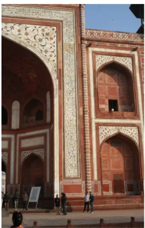
The gatehouse provides the only way into and out of the Taj Mahal charbagh. Royal visits to the site during the Mughal period would frequently arrive by boat: An access point which no longer exists due to security fences and the absence of a dock. As such, all contemporary visitors arrive through the large south facing archway. Providing the first calligraphic encounter, this archway sets the tone of the site. Its large impressive span, balanced decorative features, ornate inlay and engraving, and iconic color and material are repeated throughout the site. The major architectural features: a large iwan, pietra dura inlay in the spandrel, calligraphic inscription framing the arch, and flanking guldastras and chattri repeat throughout the major structures of the site.
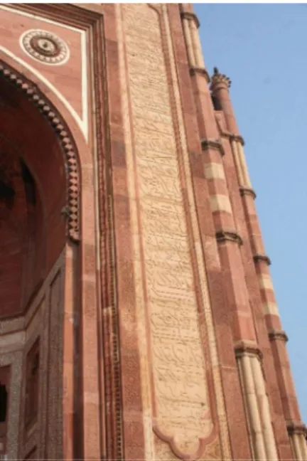
31 The calligraphy, an inscription of Surah al-Fajr, provides an introduction to the style, content, and location of calligraphic inscription found throughout. The iconic Thuluth script employed by Amanat Khan, is easily recognizable and discernable from the point of encounter. The relatively small scale of this courtyard means that the calligraphy can always be seen as text.38 The calligraphy of al-Fajr is seen first
from relatively close positions. It becomes most discernable at the base of the platform where a single step separates the garden courtyard from the platform of the gatehouse. The high contrast of white marble band - on which the calligraphy is inscribed - against the red sandstone of the gatehouse structure accentuates the text and reemphasizes the pietra dura inlay in the decorated chevron corner detail which shares color with the sandstone (figure 6).
38 This is when compared to the large expanse of the charbagh.
32
The Taj Mahal calligraphy is distinct from most Mughal case studies by employing two contrasting materials: one for the ground and one for the lettering. Koch argues for material hierarchy corresponding to political-social hierarchy. 39 The all marble tomb bearing the royal bodies is accordingly elevated above
the red sandstone structures of the complex in which marble is reserved only for special features such as the dome or the calligraphic frame.
The visual contrast created by the inscription emphasizes these material distinctions. The text creates high color contrast between black lettering and white negative space. This color contrast mutually emphasizes the material qualities of both elements. The white marble is emphasized as an important material in the construction of the site and the black lettering is clearly rendered on the white background.
This high color contrast is also seen in Mughal painting which frequently pairs reds with greens and blues with yellows. Sometimes seen for their allegorical qualities to emphasize conflict between two factions or moralistic fables, the color contrast also serves to create dynamic composition full of vivid movement, and bold patterns. Furthermore, these bold color combinations were often reserved for depictions of royal figures. Thus, within a larger Mughal artistic milieu, high contrasting colors could be seen as a mark of aesthetic excellence.
From a distance, these two colors blend creating bands of color on the facade. As such, the calligraphy operates at multiple distances providing important color patters from afar and high contrast up close.
Surah al-Fajr references historical events of retribution directed towards ‘Ad Iram, the Thamuds, and the Phaoros.40 The conquest of ‘Ad Iram is previously mentioned in Surah An-Najm v.50. The Surah
seems like a curious choice to introduce a piece of monumental architecture due to the negative depictions
39 Ibid. 215
40 Here the Qur’an is referring to either lost cities or since nonexistent civilizations. The Ad Iram refers to a lost city of unknown origin. The Thamuds were a tribe living in the Hijaz centuries before the time of the Prophet
33 of the architectural projects of these three pre-Islamic civilizations. “The words dhat-ul-`imad (of lofty pillars) have been used for the 'Ad because they built high buildings and the pattern of architecture of erecting edifices on lofty pillars was introduced by them in the world. At another place in the Qur'an this characteristic has been mentioned in connection with the Prophet Hud,41 who said to them: "What, you
erect for mere pleasure a monument on every high spot, and build huge castles as if you were immortal!" (Ash-Shu`ara': 128-129).”42 How do we understand contextualizing a grand architectural project within
these words directly addressing monumentality? Is the text to be understood as a self-critical reflection on the difficult of erecting monuments within an Islamic context or is it to be understood metaphorically as a register of the conquest of Islam over South Asia as mirroring the spread of Islam north from the Hijaz?
The tension evident in this Surah highlights the multifaceted areas of discontinuity in interpreting the Taj Mahal itself. Impossible to reach an understanding of the monument from a single source or function, the monument operates within intersecting social, religious, and political spheres. The iconography present attempts to mediate among various factions in the Mughal court evidencing a noteworthy self-historicity promoted by the decorative program.
It is important to note that the interpretation of the Taj Mahal as a representation of paradise would be supported by final two verses of the Surah: So enter with my servants and enter my paradise.43 If
we are to understand the text as the “front matter” to the monument, then the last few verses serve as salient evidence for those who argue that the charbagh funerary garden is symbolic of otherworldly paradise gardens (jannah). Alternatively, we can understand the invitation as an introduction to a splendid space of natural and designed beauty. The garden, and structures combine to create a pleasant space of
41 Prophet Hud is a prophet mentioned in the Qur’an – the eleventh Surah is named after him – who is sometimes associated with the pre-Israelite ‘Eber.
42 See Tafsir Maududi Tafhim-ul-Qur’an on “Surah al-Fajr” available in translation on englishtafsir.com 43 One popular conception of Mughal Funerary gardens is that of a representation of a literal paradise in the hereafter. see James Dicke “Mughal Garden: Gateway to Paradise” 1985, Elizabeth B Moynihan Paradise as a Garden: in Persia and Mughal India (1979),
34
enjoyment. In this framework, the calligraphic inscription works with the natural beauty of the garden, and the architectural magnificence to create an overall space of enjoyment. The natural beauty of the environment including birds, animals, shrubs, grasses, trees, and water combine with specific artistic creations to produce an overall pleasing environment akin to paradise.
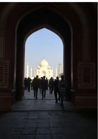
35 C. Opening from the Gatehouse
The gatehouse interior provides the first spatial break after entering the site through one of the three security checkpoints. Visual contact can be maintained with the Taj Mahal mausoleum while approaching and passing through the gateway if the visitor remains on axis. The space of the gatehouse, however, still provides a significant spatial break between the central charbagh and the periphery gardens and architectural features. The dim lighting, expansive space, aural disjunctions all contribute to a sense of spatial demarcation.
The interior of the gatehouse itself is particularly plain. Employing iterated marble inlay designs present throughout the site, the interior maintains the visual language of the site without drawing attention to its decorative program. Notably, the marble bands framing the arch, rather than creating a rectangular form to house calligraphic inlay, follows the form of the arch and bears no decoration except a black marble
36
border. Here is the first instance of a location that is left unadorned with calligraphic inscription. It would be reasonable to inscribe calligraphy in this frame given the location of calligraphy in other structures on site. Especially contrasting monuments from the Sultanate period in South Asia, the Taj Mahal employs relatively few inscriptions providing a balance to the text and also emphasizing the importance of the present text.44
From this interior, the Taj Mahal mausoleum emerges visually as a visitor passes into the garden. Obstructed only by the bustle of the site, and the occasional need to mind one’s step, the image of the mausoleum remains fixed and framed within the confines of the gaze, and the archway. Passing through the archway, this fixedness gives way to a series of vistas and visual distractions throughout the gardens: fountains, trees, floor patterns, birds, and flanking architecture attract the attention of the visitor.
44 Compare, for example, the complex at Qutb Minar in which a great majority of the exterior surfaces are
elaborately adorned with carved calligraphic inscription. The effect here was one of overwhelming presence of text, rather than a visual balance and striking presence of specific, selected verses.
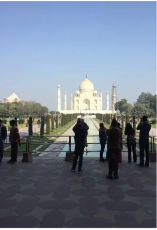
37 D. On Axis: Privileged scenes
Since it is impossible to walk towards the mausoleum on axis due to the presence of a water-channel with fountains, specific on axis views are privileged in light of their availability. Only when architectural features intersect the central channel can the mausoleum be viewed on axis. The first such view is available directly exiting the gatehouse. The raised gatehouse platform gives way to the gardens below via two sets of stairs on either side of the platform. From the center of the platform, the frame of the Taj Mahal mausoleum can be accessed on axis (figure 8).
From this distance, the details of the Taj Mahal facade are inscrutable. Only the major architectural features such as the dome, the chattris, the minarets, the plinth, and the iwan are prominent. Other minor details are observable but difficult to make out. Furthermore, the details of the garden which visually direct
38
the gaze distract from the more minute details on the facade. The side structures are visible only by their domes emerging from above the tree line.
From this distance, the calligraphy would seem to be completely inaccessible. However, the calligraphic inscription blends together effectively forming a band of darker color around the arch. The Surah is accessible only as a band of color
Given the long reflecting pool along the site, on-axis views of the Taj Mahal are available only at these privileged sites for observation. As such, the privileged scenes provide strong still-frame impressions of an otherwise moving, lively scene. As such, the spaces on axis are designed to highlight moments of pausing to look and appreciate the architecture at different scales and distances.
39 E. Reflecting pool looking north
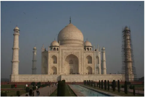
The second on-axis vista is available at the center of the garden from a marble reflecting pool. From this vantage, the visitor may freely survey the extent of the site along both intersecting axes. The view of the mausoleum itself gains clarity of detail. Elements which from afar blend together at this point are distinct. The decorative inlay bands under the dome rather than a single shade can be seen as four distinct motifs. Large cuts into the marble such as cartouches, and the muqarnas pattern become visible. Shades of marble, distinct due to the staggering in the cleaning process, grow distinguishable. Black marble inlay on the minarets appear as thick grout lines. The large central pishtaq begins to show depth into the building due to foreshortening caused by shadows.
Fig. 9 Mausoleum from the reflecting pool
The large scale calligraphy at this point is recognizable as text; some letter forms are distinguishable. As a whole it is extremely difficult to read. Although it is discernable as text, the calligraphic inscription remains most prominent as a rectangular band of color on the pishtaq. Other decorative elements such as the lotus pattern underneath the dome and the Persianate patterns along guldasta also blend to singular bands of color. The pietra dura therefore receives extra attention at this scale. The slight
40
elevation of the pool accentuates these vistas and create a sense of emphasis on the structures on plinths elevated above the garden floor – mainly the mausoleum, but also the side structures and the entry gatehouse.
41 F. The Gardens
The gardens provide pleasant environments away from the central processional axis of the Taj site. Seeing significantly less activity than the central axis today, the shady tree-lined walkways provide peaceful respite from the bustling crowd of the Taj Mahal.
The fourfold garden plan (charbagh) features prominently with the calligraphic inscription in arguments for a symbolic reading of the Taj Mahal as paradise. Wayne Begley argued for the paradisiacal gardens as a representation of heaven on Earth.45 Ebba Koch provide a more modest claim that the gardens
are eschatologically positioned by only through synecdoche.46
Aesthetically, the pleasant setting of the garden connects more broadly to the calligraphy and floral details in pietra dura on the built structure. Although formally distinct, the details on the structure weave a broader natural garden setting onto the building’s skin. In this regard, the interconnected aesthetics of script and floriated with the natural beauty of the garden posit a broad framework for approaching and appreciating the site’s beauty.
Fig. 10 The Gardens looking North East
45 See Begley, “The Myth of the Taj Mahal and a New Theory of its Symbolic Meaning,” 1979. 46 See Koch, “The Taj Mahal: Architecture, Symbolism, and Urban Significance,” 2005.
42
G. Plinth base looking towards the tomb
From this position in the garden, the decorative details gain clarity (Fig 11.) The text of Surah Ya-Sin is both recognizable and its letter forms are discernable. It still creates a band of color which accentuates the architectural features of the façade. Here we clearly see the scale from the presence of people both in the garden and on the edge of the plinth. The inscription begins at nearly twice the height of a person, where it extends skyward. Functionally, this text projects outward, relating to the space of the site as a whole. From the south, here, the text is encountered from the space of the garden. From the west and east, the text relates to the space of the Mosque and the guesthouse respectively. From the north, this relationship is less clear as the site end abruptly at the edge of the Jumna River. I suggest that with the
43 presence of boat traffic, including the propensity for the royal family to travel by way of boat and even approach the Taj site from the north, this inscription therefore projects outward into the space of the river. An important finding of this research is that the calligraphy of the iwan is best experienced from the right hand path. Although from colonial times to the present foot traffic generally moves through the site on the left hand side, the location of calligraphic inscription suggests that it would be better experienced from the right. On approach through the garden, the right hand path places a visitor directly in line with the introductory verses of the inscribed Surah Ya-Sin. The scale and location of this Surah on the exterior of the iwan makes this Surah best approached from a distance. The trend is true of all exterior calligraphic inscriptions on iwans suggesting that the ideal way to circulate through the site is via right-side pathways, unlike current trends.
44
Chapter 4: On the plinth A. Introduction
At the northern end of the charbagh, the elevated sandstone base rises markedly above the garden space. This platform demarcates and connects the key structures – the marble mausoleum, the flanking sandstone mosque to the West, and its mirror to the East - from the rest of the complex. At the center of the platform, the large marble plinth rises above this platform. This chapter will consider the experience while on the marble plinth specifically.
The Taj Mahal plinth is accessible by two sets of stairs along the East-West access which functionally disrupt any chance of visual continuity while approaching the mausoleum. After a smooth approach through the garden which the details of the south facing façade gradually become clear and legible, there is a distinct break. The size of the plinth blocks visual access to the epigraphy and the inlay on the façade. In this sense, the stairwells carved into the plinth act as portals onto the plinth and into a different scale of experience.
Views of the tomb from the plinth are limited by close proximity. The dome, chattris and guldastras are largely obscured from vision by the large iwan. Despite their massive scale, observation of the calligraphic elements on the façade are largely plagued by suboptimal viewing angles, excessive light, and problems of scale.
There are five complete Surahs inscribed on the exterior facades. Surah Ya-Sin occupies all four sides of the exterior. Within the arches, there are calligraphic spaces framing the portals: al-Takwir from the south. al-Infitar from the west, al-Inshiqaq from the north, and al-Baiyina from the East. The smaller scale calligraphic spans nestle within thef larger inscriptions of Ya-Sin.
45 B. Opening
As a visitor exits the garden and enters the plinth, we again have a point of visual confinement, and darkness. One is shuffled through a narrow stairwell in which visual contact with the mausoleum and the garden are severed, although the presence of the plinth wall already breaks most contact with the mausoleum. The plinth is entered from two stairs cut into the southern edge of the plinth. These stairs function as a distinct break in the experience of the Taj. Coming from the large, open space of the lower base the visitors are channeled through open metal doors into a narrow, dark passage (figure 12).
The wide vistas, bright space, and looming presence of the mausoleum become reduced to a singular tight space with smooth marble. Furthermore, the massive size and close proximity of the plinth means that one is entirely cut off from the calligraphy as well as any other details on the façade. These stairs open onto a platform on the southern end of the plinth. The edge of the plinth is bound by a small marble wall, which provides no effective barrier to falling.
46
The mausoleum emerges at a personal scale. Rather than a smooth transition, the stairs cutting through the plinth create two distinct experiential frameworks. On the plinth, the arches and niches show depth into the building. Through screens and passageways, one can see the interior. Intricate carved and inlayed details are visible and discernable. Even the grain of the marble takes on characteristics. The south facing façade rises skyward; for the first time, the inscription is more prominent than the pietra dura floriated patterns due to the relative position of the two decorative elements. The text of Ya-Sin, which extends from above the dado, is immediately visually accessible. To view the floriated pattern, one must look sharply upward (figure 13).
Fig. 13 South facing facade from the plinth
Arriving on the plinth, the visitor is engulfed in marble. The floor provides a sense of immersion which furthers a sense of interiority. The booties given by the Archeological Survey intensifies this feeling. Furthermore, the separation of the plinth from the rest of the site, detaches and elevates the plinth.
Approaching the plinth from the right staircase is preferred. These stairs deposit the visitor directly in line with the opening text of al-Takwir, and closely in line with Surah Ya-Sin already viewed. Then, to
47 circumambulate the structure, the viewer would cross over from the opening lines moving up to the later lines (closing in the case of the shorter Surah) moving down the left side of the facade. During this time crossing over the central axis, the viewer has an opportunity to pause and appreciate the intricacy of the script (figure 14).
Fig. 14 Ya-Sin Detail on Southern facade
During this pause, one can appreciate the calligraphic composition producing the overall visual effect of the text. Following the beginning of Surah Ya-Sin along the right register of text, it becomes clear that the letter forms, spacing, and location are determined by aesthetic considerations. Beginning with the easily recognizable Bismillah, which occupies the entire lower part of the register, the text then bifurcates into two concurrent bands of text, one above the other separated by strong horizontals.47 These horizontals
are the formed by the tail end of the letters alif maksura and ya written in the terminal form. Vertical extenders on the letters alif, lam, Ta(ط ), Dha(ظ ), and kaf rise from the bottom register of text through
48
the top register. As such, the arrangement of the words is manipulated to ensure that letters with long extenders are written on the bottom register and letters used to produce horizontal dividers come in the upper register.
Subsequently, individual verses and even individual words are disrupted in order to maintain the overall balance of the inscription. From afar, the text appears to run smoothly along two bands at regular intervals. To produce this visual effect, however, the text is cut and rearranged. 36:4 prominently shows the willingness to rearrange word order to create visual balance (figure 15). The verse is arranged with careful attention to visual continuity which in turns creates textual discontinuity. The line begins in the top left with “ala” which tails back to the right to create the strong horizontal line dividing the upper and lower band of text. “Ala” provides an interesting design problem due to both the presence of a lam which is normally produced on the lower band of text and also a terminal alif maksura which are written from the top register to create the horizontal dividers. The terminal alif or ya is rarer than letters with vertical ascenders, and therefore the terminal alif maksura takes precedence determining the position of “ala” on the upper register. The line then moves directly below and slightly to the right where the word “Sirat” reads as it would normally appear from the right to left with two long extenders which interlock with three letters in the upper band of text. The line then jumps back and up to produce the final word (mustaqim) on the upper band of text. We can see that the visual continuity of the inscription as a whole is produced only by reorganizing word order within each verse. As such, we can extrapolate that the visual continuity takes
49 precedence over the textual continuity. It is more important to see the text with visual balance than with textual consistency or legibility.
Fig. 15 Detail of Ya-Sin
Strong vertical extenders create regularly spaced visual rhythm and patterned geometry when paired with the horizontal bisector and the angular strokes of the kaf and the lam-alif. This rhythm accentuates the balanced spacing between script and negative space. The significant fluctuation between thick and thin pen-strokes creates a vibrant sense of motion in the text. Overlapping letters accentuate this movement and also create depth in the text.
This verse also provides insight into the use of nestling in which part or all of a letter is written within the form of another letter. We see the Sod in Sirat nestle within the terminal nun from the previous verse’s almurasilin. The letter pointing of that nun in turn nestles within the loop of the Sod. The resulting effect is concentric nestling which interlock verse 36:4 and verse 36:5 (figure 16).
50
Fig. 16 Detail of Ya-Sin 36:4-5
Verses are further connected by the presence of interlocking letters. There is significant overlap throughout the text where letters are written on top of other letters. These points are at times amplified by placing letters specifically in order to draw attention to these overlaps such as the vertical extender of the lam in ghafilun running directly through the fa from the previous word (figure 17). This overlap not only creates a dense script which completely fills the space, but also provides a sense of depth and complexity to the script.
Fig. 17 Detail of Ya-Sin 36:6
Furthermore, the choices pertaining to letter pointing clue the aesthetic considerations at play when producing these inscriptions. Take for example the final word in verse 36:5, “mustaqim” (figure 15.)
51 There are three instances of letter pointing here: two dots to form the ta, two dots to form the qaf, and two dots to form the ya. The two dots above the sin are letter pointing for two dhals from verse 36:7 and are not part of this verse. The two dots of the ta are arranged horizontally whereas the two dots of the qaf are arranged vertically. The letter pointing appear between regularly spaced vertical extenders, but the presence of the qaf letter form dictates a vertical arrangement as to not crowd the space around the serif on the vertical extender. The spacing between letter forms, letter pointing, and diacritical marks is maintained at relatively constant intervals. The negative space of the calligraphy is actively used to exemplify the overall balance of the composition. This essential element of calligraphic inscription is described in al-Tawhidi’s early treatise on penmenship as “Tafrik” or division of letters such that they do not encroach on each other.48
Fig. 18 Detail of Ya-Sin (36:5)
Textual disruption is also seen at the scale of individual word such as 36:5 in which words and letters are written out of order. When seen overall 36:5 has a fairly cohesive block of text visually: it appears to be a singular unit (figure 18). To produce this visual cohesion, the text is cut and rearranged such that there is no textual continuity. For example the last two letters in the second word in the verse, “aziz”
52
appears to be connected to the first three letters from the first word of the previous verse “tanzil” (figure 19). In order to maintain the visual balance of the verse, the textual continuity is discarded entirely.
53 C. Circumambulating the exterior
Once on the Taj Mahal plinth, one can either enter the tomb interior directly from the top of the stairs, or walk around the exterior on the plinth. I chose to first circumambulate the plinth in order to replicate a likely approach taken by a Mughal era visitor as well as accessing the extent of Surah Ya-Sin. The arrangement of this Surah implies this path. Since the Surah begins on the south facing façade, and continues clockwise around the exterior, the order of experience when visiting the site should likely mirror this arrangement.
Circumambulation plays a major role in processional approaches to pilgrimage spaces.49 In Islam
there is a strong history of circumambulation, most importantly the Kaaba. Notably, the Kaaba circumambulation runs in a counter-clockwise direction, and since tawaf is an integral part of orthodoxy, there are specific regulations governing its form and procedure. The major distinction with the Kaaba is that the kiswah epigraphy, which reads in the opposite direction of circumambulation, is comprised of short statements of faith within cartouches. Other Islamic monuments such as the Alhambra in Granada largely implement this model of distinct expressions as opposed to an epigraphic narrative. The Dome of the Rock epigraphy also implies a circumambulation following the arrangement of the text. Here two bands of text produced from a quilting of Qur’anic passages into a single cohesive, polemic text run along the upper registers of the building’s interior.
Within the South Asian context, Sufi shrines provide context for pilgrimage sites. Pilgrims to these shrines – such as the Nizamuddin Chisti or Salim Chisti Shrine – circumambulate clockwise in concentric circles, sometimes touching the inscribed Qur’anic verses. That the Taj Mahal interfaces with these traditions of circumambulation pose interesting questions pertaining to the meaning and function of the
49 Koch notes that the Taj Mahal has been an important pilgrimage site for Muslims and Hindus alike in South Asia:

![Cycloaddition dipolaire [3+2] à partir d'hétérocycles aromatiques N-aminés](data:image/gif;base64,R0lGODlhAQABAIAAAP///wAAACH5BAEAAAAALAAAAAABAAEAAAICRAEAOw==)