Volume 44(1)
Winter/Hiver 2018
Learning with Multiple Representations: Infographics as Cognitive Tools for
Authentic Learning in Science Literacy
Apprendre avec des représentations multiples: l'infographie de presse
comme outil cognitif pour l'apprentissage authentique en science
Engida Gebre, Simon Fraser University
Abstract
This paper presents a descriptive case study where infographics—visual representation of data and ideas—have been used as cognitive tools to facilitate learning with multiple
representations in the context of secondary school students’ science news reporting. Despite the complementary nature of the two research foci, studies on cognitive tools and multiple
representations have evolved independently. This is because research on cognitive tools has narrowly focused on technological artifacts and their impact on learning outcomes with less attention to learner agency and activity structures. This has created challenges of sustainably applying cognitive tools in classroom teaching and learning. Using data from a design-based research project where secondary school students created authentic infographic-based science news reports, this study demonstrates how infographics can serve as process-oriented cognitive tools for learning and instruction of science literacy in classroom contexts. Results have
implications for the study and design of learning environments involving representations. Résumé
Cet article présente une étude de cas où l'infographie de presse – offrant une
représentation visuelle de données et d’idées – est utilisée comme outil cognitif pour faciliter l'apprentissage au moyen de représentations multiples dans le contexte de production de rapports scientifiques par des élèves du secondaire. Malgré la complémentarité des deux axes de
recherche, les travaux sur les outils cognitifs et sur les représentations multiples ont évolué séparément. En effet, la recherche sur les outils cognitifs s'est strictement concentrée sur les artefacts technologiques et leur impact sur les résultats d'apprentissage mais a accordé moins d'attention à l’action des apprenants et aux structures des activités. Il en résulte des défis pour l’application durable d’outils cognitifs dans l'enseignement et l'apprentissage en classe. À partir de données issues d'un projet de recherche orientée par la conception (design-based research) dans lequel les élèves du secondaire ont produit des rapports scientifiques authentiques intégrant des infographies de presse, cette étude montre comment l’infographie de presse peut servir
d'outil cognitif axé sur les processus pour l'apprentissage et l'enseignement en classe de la littératie scientifique. Les résultats ont des implications pour l'étude et la conception d'environnements d'apprentissage faisant usage de représentations.
Introduction
Cognitive tools are technologies that support and facilitate human activities during learning, thinking, problem solving, and knowledge representation (Jonassen, 2003; Jonassen & Reeves, 1996). Research on cognitive tools predominantly supports the view that learning technologies (mainly computers), when used as cognitive tools, have the potential to significantly contribute to various aspects of student learning (Herrington & Parker, 2013; Jonassen & Carr, 2000; Lajoie, 2000). A number of primary and meta-analysis studies in K-12 and post-secondary education (e.g., Bera & Liu, 2006; Danielson, et al., 2007 Hung, 2008; Schmid et al., 2009) identified the benefits of using computers as cognitive tools. However, the presence and use of cognitive tools in classroom learning and instruction is, at best, minimal. Studies determined that there is a lack of understanding about the nature and design of cognitive tools for authentic learning environments leading to “too brief and/or inappropriate” application of cognitive tools in classrooms (Kim & Reeves, 2007, p. 210). The reason for this problem is a narrow conceptualization of cognitive tools and the subsequent framing of studies about their impact on students’ learning (Bain, McNaught, Mills & Lueckenhausen, 1998; Jonassen & Carr, 2000; Kim & Reeves, 2007). Cognitive tools (and learning technologies in general) have been incorrectly conceptualized as artifacts or products rather than as interactive processes (Amiel & Reeves, 2008). Consequently, researchers focused on developing software tools that facilitate learning of specific content often in a way that gives limited agency to the learners. Studies on computers as cognitive tools has focused more on determining the impact of the tools on student achievement and less on the pedagogical support that need to accompany the use of tools
(Iiyoshi, Hannafin & Wang, 2005).
The use and study of cognitive tools in classroom learning environments requires considering a) cognitive tools as sociotechnical systems, that involve both social and
technological aspects, rather than as only computer-related artifacts and b) learner agency and related pedagogical support as essential factors. In this study, I frame infographics—defined as visual representations of data and ideas (Gebre & Polman, 2016; Polman & Gebre, 2015)—as a genre of multiple representations and process-oriented cognitive tools and outline its affordances for engaging secondary school students in science and data literacy projects. More specifically, this study answers the question “What role do infographics play when used as cognitive tools to support young adults’ engagement in science news reporting?” The study will help educators in using infographics in the study and design of active and engaging learning environments.
Conceptual Background Research on Cognitive Tools and Students’ Learning
Kozma (1987) defined cognitive tools as “software programs that use the control
capabilities of the computer to amplify, extend, or enhance human cognition” (p. 21). Similarly, Jonassen and Reeves (1996) defined the term as “… technologies, tangible or intangible, that enhance the cognitive powers of human beings during thinking, problem solving, and learning”
(p. 693). In addition to “cognitive tools”, researchers also used different phrases such as “cognitive technologies” (Pea, 1985), “technologies of the mind” (Salomon, Perkins, & Globerson, 1991), and “mindtools” (Jonassen, 2000; Jonassen & Carr, 2000). Two things are common in this body of literature. First, there is an emphasis on computer-related technologies as cognitive tools. Second, it predominantly supports the view that computer technologies, when used as cognitive tools, have the potential to significantly contribute to aspects of student
learning; this view is common in both post-secondary and K-12 contexts.
In the context of post-secondary education, the use of cognitive tools has been reported to improve students’ satisfaction and learning of literacy (Lo, Affolter & Reeves, 2002), support medical diagnostic problem solving (Danielson et al., 2007), develop learners’ ability in systems modelling and understanding (Hung, 2008), and enhance learners’ problem solving and
representation (Liu et al., 2009). In the area of veterinary medicine, Danielson et al. (2007) used “diagnostic pathfinder” software as a cognitive tool and studied the impact of the tool on
students’ diagnostic problem-solving skills. The researchers reported that students who used the diagnostic pathfinder scored significantly higher on the final exam than those who did not use the tool. Similarly, Hung (2008) examined graduate students’ performance in a “systems thinking and modelling” course using a pre-post design involving use of modelling software called Powerism as a cognitive tool. The study reported that post-test scores were significantly different from pre-test scores, especially in aspects of representing systems models such as connectivity, cause-and-effect relationship, and feedback loops. Such positive results are also reported in K-12 schools (e.g., Bera & Liu, 2006; Manlove, Lazonder, & de Jong, 2009; Stahl, 2006).
Notwithstanding the above-mentioned benefits, there is a lack of clarity related to the use and study of cognitive tools in classroom contexts. Is it the features of the tool or the nature of use that makes a computer a cognitive tool? Some researchers (e.g., Jonassen, 2000) argued that cognitive tools are general-purpose applications such as databases and spreadsheets and whether they serve as cognitive tools or not depends on the nature of the learning activities that students work on using the tools. However, empirical studies on the subject have used specific
applications often developed by the research team to help students learn specific disciplinary content. For example, Bera and Lui (2006) used CD-based hypermedia software, Alien Rescue, as a cognitive tool to assist grade six students in cognitive processing of information. Jonassen (2000) contends that no matter how many applications are developed, they do not cover a fraction of the materials students are expected to learn at school. K-12 and college students also experience challenges of representing their understanding in multiple ways because they do not often learn with multiple representations and they fail to develop cognitive flexibility (Jonassen and Carr, 2000).
As Wu and Puntambekar (2012) noted, no single representation is capable of supporting learners’ engagement with learning processes ranging from problem definition to collecting and analyzing data and to making inferences and representations. One way of addressing this
problem is to focus on learning design and to consider the holistic socio-technical system in the study and use of cognitive tools. In this study, socio-technical system refers to the combination of learning contexts, learning activities, learner agency, and learning tools. The role of
enhanced perspective about cognitive tools (Kim & Reeves, 2007) that focuses on the nature and process of tool use, rather than the absence or presence of the tools per se. This conceptualization provides useful framework in that it a) considers what students do with the technology and how that relates to intended learning outcomes, b) represents authentic situations where students may use different tools at different stages of their project or problem solving process, and c) considers the process aspects of learning rather than just the outcomes as measured by achievement tests. This view does not undermine the actual or perceived usefulness of technological tools. It rather highlights learner agency as it relates to the process and purpose of technology use.
Infographics as Cognitive Tools
Student-generated multiple representations are one area where process-oriented cognitive tools can be achieved in practice. Multiple representations, also referred to as “multiple external representations” (Wu & Puntambekar, 2012) refer to the use of different visual tools and text to organize and represent ideas/data that describe a phenomenon (Gebre & Polman, 2016). Multiple representations are widely used resources and constitute an emerging field of study and practice in science education (Gilbert, 2008). Although prior studies on use of multiple representations focused on students’ learning from expert generated representations (Hegarty, Carpenter & Just, 1991; Bowen & Roth, 2002), there is increasing emphasis on student-generated representations in recent years (Gebre & Polman, 2016; diSessa, 2004; Van Meter & Garner, 2005).
Accordingly, researchers have suggested ways of using infographics-based instruction in various disciplines (e.g., Sudakov, Bellsky, Usenyuk & Polyakova, 2016; VanderMolen & Spivey, 2017)
Infographics (short for information graphics) are a genre of multiple representations that use visual tools to represent data and express ideas often to the general public rather than the scientific community (Polman & Gebre, 2015). Although infographics are sometimes narrowly defined as data visualization (e.g., Cairo, 2013), often in relation to the recent explosion in publicly available data, they are not just visual representations of quantitative data. They use qualitative data, represent ideas and processes (e.g., flowchart), and include layout and design related issues. They also use a range of representational tools as well as qualitative cues in the form of colours and alignment to direct readers and facilitate their understanding of the
represented phenomenon. Infographics are not new tools as they have been in use for hundreds of years (Thompson, 2016). La Pérouse’s “Chart of Discoveries” in 1787 and Edwin
Hergesheimer’s 1861 “map showing the distribution of slave population in southern states of the United States” are two of the many examples representing early use of infographics to organize and communicate map related data (Latour, 1986; Thompson, 2016). The use of infographics in learning and instruction is fairly recent, however.
In recent years, infographics are increasingly used in science communication and
education. A number of publication outlets, including The New York Times and The Guardian as well as major government institutions such as the US Centers for Disease Control
(https://www.cdc.gov/socialmedia/tools/InfoGraphics.html), the Office of Research Ethics
(https://ori.hhs.gov/infographics), Department of Homeland Security (
https://www.dhs.gov/blue-campaign/infographic), and the National Health Institute (
https://www.nih.gov/allofus-research-program/infographics) use infographics as tools for communicating science to the general public.
Accordingly, the nature of infographics has also changed over time. Recent infographics include not just maps and quantitative charts, but also combine icons, flow diagrams, symbolic notations,
and textual descriptions in one representational artifact. From the perspective of science communication, infographics support rich description of scientific phenomenon, have visual appeal to engage readers for a longer duration, and help to reach readers with different backgrounds (Mol, 2011).
From the perspective of learning sciences, infographics are not just resource to learn from but also cognitive tools to learn with. Learning with implies using the tools as resources to construct knowledge and facilitate understanding of a phenomenon. In a context where students generate the infographics by themselves, these inscriptions will help them materialize a concept or concretize their understanding. Such inscriptions are not just means of externalizing the learner’s understanding, but they are also tools of constructing and progressively refining internal representations as well. That is, internal (mental) representations of a topic are not preconditions for external representations; they are constructed and refined in the process of building the external representation. In the learning process, constructing the infographics helps students to develop non-linear ways of thinking, reasoning and representing (Wu &
Puntambekar, 2012). Researchers also determined that using multiple representations, such as infographics and modelling, helps learners to develop scientific argumentation and writing skills (Demirbag & Gunel, 2014; Namdar & Shen, 2016), establish relationship between concepts (Jonassen & Carr, 2000), determine representational adequacy and enhance their representational competence (Gebre & Polman, 2016; diSessa, 2004).
What we glean from the extant literature is that despite the complementary and related nature of studies on cognitive tools and multiple representations, research on the two areas has evolved independently. Moreover, information on implementing multiple representations as cognitive tools and ways of dealing with complex situations in classroom practices is missing (Kim & Reeves, 2007; Wu & Puntambekar, 2012). In this paper, I use case study data from our design-based project and articulate infographics as process-oriented cognitive tools. In the process, I also outline ways of implementing this model in classroom-based instruction.
Project and Methods
STEM Literacy through Infographics was a design-based research and development project, funded by the US National Science Foundation. Its purpose was to develop young adults’ science literacy through creation and authentic online publication of science news infographics. The research site was a socioeconomically diverse suburban secondary school in Midwestern United States. A total of 138 students (grades 9 and 10) participated in the project. A teacher, who was also a member of the project team, with a B. Sc. in biology and more than 10 years of teaching experience, implemented the project in his general chemistry class once a week on average for the duration of each semester (with different groups of students). The research site was chosen based on a) the diversity in the student population of the school, b) the school’s proximity to the research university, and c) the membership of the teacher to the research team. The project has ethics approval from the research university and the secondary school.
In the first few weeks of the project implementation, the teacher displayed a series of infographics in his class and asked the students to discuss in groups and write summaries about each infographic. He also asked them to discuss how the infographic could be improved both in terms of content and use of representational tools. Then, students started working on creating
their own infographic-based science news reporting. Students chose to work individually or in pairs on a project that involved six steps. First, students identified a science related topic to work on. Because the project was integrated with a general chemistry class, students were advised to choose topics related to general science. Given that the purpose of the project was developing science literacy as it related to the life of the students, the choice of project topic was fairly open-ended. Students were advised to identify three to five possible topics for their project and list them in order of preference. They then pitched their topics together with the rationale as to why they wanted to work on the topic, where they expected to get data from, the relationship of their topic to general chemistry, and the relevance of their infographic to would-be readers. Based on the feedback from the teacher and their classmates, students then decided on their project topic.
Second, after deciding on their topic, students searched for relevant data from online sources and databases (e.g., the Centers for Disease Control, National Institute of Health, Environmental Protection Agency, to name a few). Third, students organized the data and created an infographic using Microsoft Excel and Apple Numbers as data analysis tools and Apple Pages as a canvas for representation. Fourth, students provided feedback to peers using VoiceThread, an online collaborative tool. We uploaded the draft versions of each infographic to VoiceThread and created accounts for each student. Students then logged into their account and provided text comments to their peers. VoiceThread has features to allow audio, video, or text feedback. However, the teacher asked the students to comment using only the text feature. Fifth, students obtained feedback from an external editor who was a member of the research team. The editor, with PhD in chemistry, is a research professor at a public university near the research site and has 18 years of experience as a science news editor for the American Chemical Society. The external editor provided comments to every draft version of the infographic using Adobe
Acrobat’s commenting tool. Finally, students revised their infographics based on peer and expert reviews and submitted the final version for potential online publication at (website withheld for blind review). Figure 1 below summarizes the learning activities, resources and outcomes.
Figure 1. Learning activities, resources, and outcomes.
This study used five sources of data. The first was infographic benchmarks. While choosing their topic, students were required to prepare an infographic benchmark—a tool that consists of a) description of their project idea and justification about the relevance of their project both to possible readers and to the field of general science literacy, b) possible credible data sources often in terms of websites, and c) a manual sketch of their initial idea about what their infographic would look like when it is completed. This sketch was designed as a learning activity to help students make an informed prediction concerning both the layout of their infographic and the nature of information that will be included. The second data source was student-generated infographics—in almost all cases this involved three versions including the initial sketch, the first electronic draft and the final version. The third source of data was classroom observation notes where the author attended 24 sessions in three sections and took note about classroom processes. Classroom observation focused on various aspects of enacting the project in the classroom, such as the nature of help the teacher provided, students’ choice and use of representational tools, students’ search for data and ways of determining credibility of data sources. The observer also occasionally talked to students and asked them questions to make them think more about certain aspects of their project. The fourth data source was end-of-project interviews where we interviewed selected students about their experience in the project. Some of the interview questions were: a) What made you choose to work on this topic? b) Tell me about your process of searching for data, c) Please walk me through your infographic and describe the various parts? d) What did you learn from the project? and e) What do you expect readers to take from this infographic? All the interviews were transcribed verbatim and relevant responses were used in building the cases presented in the results section. The final source of data was
documentation of peer and editor feedback.
Feedback/Support
Teacher, peer, editor
Topi c Sele ct io n Data S ear ch Dr af t Inf og rap hi c R ev isi on/ Fi nal ver si on Outcomes • Science literacy • Representational competence • Publication Learni n g A ct iv it ies Tools/resources
Websites & Databases (NIH, CDC, Mayo
Clinic)
Visualization tools (Apple Pages, Apple
Numbers, MS-Excel)
This study used a multiple case study approach where a case consists of one infographic project—including project related artifacts, conversations, and feedback processes. While each case is interesting in terms of how learners approached and developed their respective projects, the purpose of the study is more instrumental (Stake, 2006) in that it tries to illuminate how students can combine resources and activities as cognitive tools in producing infographic-based science news reports. Accordingly, data analysis involved iterative process of a) building cases using data from multiple sources, b) determining the similarities and differences between cases in terms of using tools and approaching their projects and c) identifying the various tools students used at different phases of their project.
Results Description of Cases
In this section I present three cases or projects where students worked on infographic-based science news reporting. The cases were selected infographic-based on their contribution to the conceptual framework presented above—infographics as cognitive tools.
Case One: Nutritional value in the top fast food restaurants in the United States (“Restaurants” for short). Two grade nine students who wanted to know more about the
nutritional value of different meals in fast food restaurants worked on this project in Fall 2013. In their description and justification of the project, the students wrote, “This infographic is about which fast food restaurants is the best to eat based on the nutritional value of their food.” They also described the aspects they would consider for their project by stating, “the main nutritional factors will be taken into equation, such as calories, total fat, sodium and carbs”. Restaurant websites such as www.bk.com, https://www.mcdonalds.com/us/en-us.html, and
http://fastfoodnutrition.org were stated as possible data sources. Figure 2.1 presents the initial
sketch of the Restaurants infographic.
What we can learn from this sketch is that students were initially thinking of comparing restaurants (e.g., McDonalds, Taco Bell, White Castle) in terms calories, total fat, carbohydrate, protein and sodium. The bar chart captured the variables and the comparative nature of the representation. However, labeling each bar with the name of a restaurant implies that students did not yet realize the problem related to the unit of analysis. After searching for and organizing data, students created the infographic electronically (Figure 2.2).
Figure 2.2. Draft version of Restaurants infographic.
Figure 2.2 presents the draft version of the initial infographic (note that the small yellow square indicates the editor’s comment). One can observe that the draft version shown in Figure 2.2 included a proper unit of analysis for comparing nutritional values. The comparison is now nested or made hierarchical in that nutritional values are first presented per serving such as big mac, bacon habanero ranch, double whopper, etc. Servings are then grouped within restaurants, thereby providing multiple dimensions of comparison—within a serving, between servings, and between restaurants. In this version, students also used colours to differentiate various nutritional values within a serving. They also chose an equal number of servings per restaurant to facilitate comparability.
The external editor observed both representation and content related issues in the draft version and provided the following comments: a) “No background [colour]”, b) “I hope that you plan to show something more than hamburgers. What about salads or fries or chicken
sandwiches, etc.?” The students then revised their infographics and produced another draft (not presented here but was similar to the final version in Figure 2.3). The editor provided a three-part comment to this revised version that included appreciation of the work students did and
suggestion for further refinement, “Nice. You should add a bar for the recommended daily allowance. I am not sure that you need to put the numbers next to the bars. It makes it pretty busy”. When producing the final version, the students included bars the recommended daily caloric allowances for both men and women, but left the numbers at the end of the bars as they were.
Figure 2.3. Final version of Restaurants infographic.
This final version was an improvement over the draft version. It included bars for recommended values, as suggested by the editor (note that the recommended value was described in text in the draft version). Students included more meals or servings under each restaurant. A new restaurant (Panera) was also added. This resulted in changing the orientation of the design as well. The researcher is not claiming factual accuracy or representational
“correctness” in this infographic. Rather, I focus on how students’ project and representation progressed over time and how the student authors used various tools at various phases of the project. It is also worth noting here that this project, unlike the cases presented below, was not exposed to peer review using VoiceThread because it was done in a semester after the use of the tool was discontinued.
Case Two: Sports Drinks. A grade nine student worked individually on the “Sports Drinks” project in the spring of 2013. Describing it in her benchmark, the student explained that her project was about “the effects of sports drinks and how healthy they are. This is related to athletes and others who drink sports drinks, it lets you know what is in them”. She provided http://nutritiondata.self.com as one of her possible data sources. The following excerpt from the end-of-project interview with one of the researchers presents the student’s rationale for choosing her topic.
Researcher: First question is, How or why did you choose this topic?
Student: I play sports a lot, …I usually drink only water…all my friends drink all these drinks. So, I just decided, for the fun of it, to show my friends how bad {laugh} their drinks were compared to my water.
Researcher: So you had a sense that they were bad? Student: Yes.
Researcher: Where did that sense come from?
Student: Because obviously they are giving you energy, so what is in that, that is giving you energy? Is it bad things that is [sic] giving you energy or, like good nutritional things?
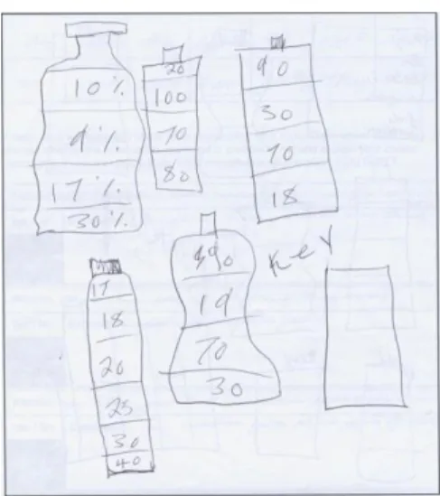
Figure 3.1 presents the initial sketch of the Sports Drinks infographic. The student planned to include bottles representing different brands, each segmented into nutritional values. There is no indication of potential scaling of each partition on a bottle to the proportion of nutritional value it represents. Thus, comparing values necessitates comparing across numbers— almost similar to reading data from a table. After collecting and organizing her data, the author created the first version of her infographic (Figure 3.2).
Figure 3.1. Initial Sketch of Sports Drinks.
Figure 3.3. Final version of Sports Drinks.
Figure 3.2 presents multiple dimensions of comparison and provides insight about the student’s appropriation of representational tools. The six bottles represent four brands of sports drinks, water and recommended daily allowance. To facilitate comparability, the student used equal size bottles (8 fl oz) and explained, “…because some bottles are bigger than others, I had to make sure they were all the same”. She also employed different colours for differentiation. The student also attempted to scale the size of the boxes on each bottle to the amount of
nutritional value (note that the numbers do not add up to 100%, so size does not represent strict proportional amount). This first draft aligns well with what she planned and described in her benchmark. This time, the student tried to facilitate readers’ understanding by including a bar chart that compares nutritional values (e.g., calories) among different sports drinks. This chart a) provides visual insight that the numerical values on each bottle do not provide and b) exemplifies the generative power of representations in that a new representation is constructed based on existing ones to provide additional value and to ensure completeness of representations. However, the data was the same for the boxes and the bar chart.
This student received peer feedback using VoiceThread and editor feedback using the Adobe Acrobat commenting tool. The peer comments on this specific infographic focused on a) readability, b) credibility of sources, c) layout/representation issues and d) answering the “So what?” question. Most comments were stated in the form of a question such as “what are your sources?”, “Is there a way to make the colour visible?” Students also raised message related issues such as “What units are the numbers on the side?” In a comment that reflected the “So what” question, one student asked “Could you possibly make a final conclusion? Maybe which one best suits your daily needs?” In his comments on the same version, the external editor also asked, “What are your sources?” His comments about the representation identified the repetitive nature of numeric representations as he wrote,
You have essentially presented the same data twice. The difference is that the graph scales the numbers, which the little bottles do not. Water has 0 everything and doesn't work on your graph. I would have emphasized the scaled data and gotten rid of the bottles. What is the take away message from this? Why didn't you also compare cost?
The student addressed the editor’s comments in the final version of her infographic (Figure 3.3). She got rid of the repetitive information by converting the boxes into a bar chart on each bottle icon thereby making data more comparable both individually and across bottles. She also included cost-related data. In her description of the take away message during the end-of-project interview, the student explained that her infographic helps readers to “see the bottles of the different brands and to take away that what they are drinking, they need to watch because it is not healthy…I’m sure people don’t pay attention to know how much calories and stuff are in these drinks”. Concerning her own learning, the student reported, “I learned water is the best. I already kind of knew that, but I mean I did not realize how unhealthy the rest were. I [also] learned how to make [data] visible… how to take, like, facts and stuff and make it to where people can understand it”.
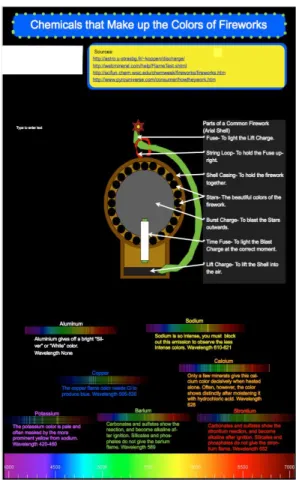
Case Three. Chemicals that make up the colour of fireworks (“Fireworks” for short). A grade nine student created this infographic. He chose the topic because he wanted to learn more about and strengthen his understanding of the wavelength of chemicals. He explained, “we had learned about, like, the wavelength charges of different chemicals earlier in the year. And since we had to make our infographic about something in chemistry, that popped in my mind, like, first thing. I always wondered how a firework was made”. He provided two possible data sources on his benchmark, http://scifun.chem.wisc.edu and
http://www.chemistryexplained.com/Fe-Ge/Fireworks.html. Figure 4.1 presents the initial sketch
of this infographic and the aspects that the author planned to address.
Figure 4.1. Initial sketch of Fireworks.
This initial sketch presents both illustrative and comparative layout of information. The author planned to illustrate types of fireworks and to compare them side by side with descriptive text in between. The other comparative layout relates to different elements of fireworks and colours in terms of wavelength. The sketch included a placeholder for the title, the author’s name and possible data sources. After searching for relevant data from various sources, the student created the first draft of the infographic using Apple Pages (Figure 4.2). This infographic has considerably less numerical data than the previous two projects. The diagram rather presents the
In Figure 4.2, the author included what he had planned out in the initial sketch. For example, the title, author name (deleted for anonymity) and the scale of the wavelength chart at the bottom were included as planned. There is also improvement in terms of both structure and content. Figure 4.2 has detailed illustration of components of a firework, as opposed to the planned comparative presentation of types of fireworks in the initial sketch. The wavelength of each element is presented and described. The feedback from the external editor focused on design (“…you have arranged your infographic upside down. Sources to bottom, colors to the top. Why don’t you put an arrow on the important emission lines?”) and content as he pointed out the absence of units in the measure of wavelength (“units! I assume it is in nanometers”). Peers also identified issues about comparability of units between wavelength measures and the scale on the ruler. One student wrote, “the number [on the ruler] goes by thousands but in the description the numbers go by hundreds”. Another student focused on the busy nature of the design, “you could maybe take some of the colors out and make it not so much going on”. The student worked on revising his infographic by considering the comments. Figure 4.3 presents the final version of the Fireworks infographic.
Figure 4.3. Final version of Fireworks.
The improvement from the draft to the final version involved mainly design issues. The final version has both the sources and the illustrative diagram at the bottom of the page and the scale (ruler) on the side. The units of the wavelength are included and the scales are made comparable (both in hundreds). He also enlarged the spectra for colors, included arrows to indicate emission lines and added text description that informs how fireworks are made. During the end-of-project interview, the student expressed what he learned in terms of content, “I’ve learned that it’s not just gun powder that makes this and it actually is a reaction with different elements. And it’s more than everyone thinks it is”.
Features of Infographics as Cognitive Tools
In this section I use the cases presented above and build a framework for infographics as cognitive tools that support students’ learning in authentic (classrooms) contexts. Cognitive tools need to support students’ learning and engagement in their learning process. I identified the following four features of infographics as cognitive tools: open-endedness, layering and construction, iteration and refinement and collaboration and feedback.
Open-endedness of tools and representations. Open-endedness implies that students have the agency to make active decisions, rather than being restricted about how and when to use technological tools based on what they want to achieve in the learning process. Open-endedness also means promoting flexibility for learners to use different tools at different phases of their
available tools. As described in the cases above, students in the infographic project used a) a benchmark to outline their project, justify its relevance, and consider possible data sources, b) sketching to organize their initial idea and predict or imagine what their infographic would look like when completed, c) databases (e.g., the Centers for Disease Control, CIA fact book, Mayo Clinic) and the Internet as possible data sources to search for and retrieve relevant data, d) MS-Excel and Apple Numbers as data analysis and organization tools, e) Apple Pages as a
visualization tool, and f) VoiceThread as a feedback and collaborative tool. All these tools served different purposes at different phases of the students’ engagement with the project. This is not to imply that specific-purpose tools are not relevant. It is to underscore that the learning activities need to guide the decision on choice of tools, rather than the other way around, and that students make the appropriate decisions. The benefit of such process-oriented design is that it promotes learner-control (Lim & Barnes, 2005) and enhances flexibility to address students’ diverse learning needs and contexts (Iiyoshi, et al., 2005).
Layering and construction. Creating an infographic is a knowledge construction process. It allowed students to work on multiple layers including the data, visualization, and the holistic infographic layers. The data layer is about determining data sources, understanding the nature of relevant data, and organizing and analyzing the data. Participating students determined possible data sources and stated them while preparing their benchmark. They also had to
determine the nature of the data (e.g., quantitative versus qualitative, categorical versus interval data, or actual versus proportional data), establish comparability, and organize the data. An example is the Sports Drinks infographic, where despite the difference in the actual amount of drink in various brands, the author established comparability by converting the representation to 8 fluid ounces. Data visualization is the second layer where students made choices related to determining what kind of visualization helps to represent the kind of data they have. For
example, pictures and drawings provide physical association with the represented object (Yore & Hand, 2010). Quantitative graphs, on the other hand, do not have physical association with the represented data; rather, they provide insight about the inherent structure of the data. Process related data is best represented using a flowchart or schematic diagrams. Decisions about the type of visualization depends on the nature of the data students have, the features of the visualization tool, and students’ understanding of the relationship between the two—data and representation (Yore & Hand, 2010). The choice of a stacked bar chart in the Restaurants
infographic represents multiple layers of comparison that the authors wanted to represent. On the other hand, the qualitative nature of the data in the Fireworks project led to illustrative
representation. The third layer is the infographic or holistic layer. In this case, the infographic becomes a collection of visualizations involving various data and ideas representing the authors’ understanding of the topic. The students addressed various aspects of the project under
consideration and prepared their data-driven science news reports. In addition to addressing various aspects and visualizations, this level is also about the design and layout of the representations serving communicative functions.
Iteration and refinement. One of the affordances of infographics is promoting the process aspect of learning and the iterative nature of knowledge construction. Students traversed between the process of representation and looking for more data based on their determination of representational adequacy. When students thought their infographic was not complete enough to communicate their understanding of the topic, they went back to data search and analysis. If they came up with new information, they revised their representation. This process involved
re-analysis of existing data or obtaining additional data. The sketch, draft, and final versions of each of the cases presented above demonstrate the progress from the initial idea about the project to the authors’ relatively complete understanding and representation of the phenomenon. What we observe from the subsequent versions is not a dramatic change in the purpose or nature of the project. Rather, it is an adjustment of the scope and inclusion of more details about the topic as well as modification and refinement of representations. The Restaurants infographic is an exemplary case where the students’ understanding, and representation was refined over time. According to the sketch, the authors were planning to compare restaurants in terms of nutrients (e.g., calories and fats). What we see in the draft version is that as soon as they started collecting data that the planned comparison was no longer viable because values are normally provided per serving not per restaurant. The source of the refinement idea could be the authors’ realization of new or different ideas or comments provided by knowledgeable others. Regardless of the source of the new ideas, the iterative nature of the process allowed authors to refine both the quality of their representation and their understanding of the topic. They added more relevant aspects of the topic and modified their visualization as they progressed from the initial to the subsequent
versions. In the process, students also determined the adequacy or completeness of their representation, which is a challenge for students while learning with representations (diSessa, 2004).
Collaboration and feedback. In this project, students chose to work individually or in pairs. Two of the cases presented above were done in groups allowing collaboration between authors, the other two were created individually. However, all students participated in providing feedback to their classmates. Uploading the draft versions on VoiceThread and engaging
participants in the process of providing and receiving feedback created multiple learning opportunities. The first was learning about ways of providing constructive feedback. The majority of feedback ideas were provided in the form of a question as opposed to a declarative (directive) statement, thereby inviting the authors to a conversation and possibly encouraging them to evaluate the suggested idea or answer the question. For comment providers, it gave an opportunity to learn about how their peers approached their respective projects. Students chose their own topics, which meant each project was unique. By going through various projects and trying to understand them before providing feedback, students learned about the nature and scope of other projects, as well as the different types of representations their peers employed in
communicating their understanding. The third opportunity was the possibility for authors to use their peers as a test audience. Given that students were creating the science infographic for teen audience, the peer feedback process also allowed the student authors to use their classmates as a test audience and determine how prospective audiences would possibly understand their
infographic. Student authors also benefited from peer comments that focused on different aspects of quality infographics. Gebre & Polman (2016) reported the details of peer feedback as it related to quality infographics and the feedback from the external editor.
The external editor mimicked the role of a professional journal editor and served as a source of expert feedback about the students’ work. What was interesting in our project was the extent to which students were responsive to comments of the external editor. The editor also visited classes to both help students in their work when requested by the teacher and explain his comments in person when authors asked for clarification.
Discussions and Implications
The National Research Council’s (2012) framework for science education in a K-12 context states that at the conclusion of secondary education, students are expected to have sufficient appreciation and knowledge of science as well as related skills that will allow them to a) engage in public discussions, b) become critical consumers, and c) continue to be lifelong learners of science (p.1). This requires contextualizing and integrating science education to everyday life of the learners (Gebre & Polman, 2016; Beach, 1999) so that they own, value and feel responsible for their learning (Blumenfeld, et al., 1991). One can effectively extend and strengthen the framework by arguing that scientific reasoning necessitates conceptualizing language in broader terms to include visual tools involving both standard (learned)
representations (e.g., graphs) and inventive/cultural tools that learners bring to the process (Lemke, 1998; Yore & Hand, 2010).
This study was aimed at documenting and describing young adults’ use of infographics as cognitive tools in the context of science news reporting. Cognitive tools, as presented here, are socio-technical in nature, situated within a specific context and influenced by the nature of learning activities. Successful use and wider application in authentic learning environments requires not only learner agency but also considering technology as an interactive process between learners, activities and tools. An important aspect of sociocultural analysis is
understanding the interaction between cognitive processes and appropriation of tools in a social context (John-Steiner & Mahn, 1996; Wertsch, 1998). An infographic is not a single
technological tool; it is a collection of tools and processes for engaging students actively in project-based learning. In his characterization of language as a cognitive tool and meditational means, Wertsch (1998) argued that using a language in the process of speaking or writing is a negotiation process between taking cultural tools (created by others) and making them one’s own. According to Wertsch, while adhering to the structure and rules of the language, users also add their own intentions and accent in the process. Multiple representations such as infographics are resources for rich description of scientific phenomenon. They provide learners the
opportunity and flexibility to use combinations of learned and invented representations and allow participants to contextualize science literacy and representations in their lives (Gebre & Polman, 2016). This shift towards a socio-technical view of cognitive tools serves as a response to “technology-deterministic” views of tools where technology is narrowly interpreted as a product (such as an iPad) and considered to have the decisive force in transforming educational
processes.
A related theme is the potential of infographics to emphasize and foster a process view of learning. A series of prior studies reported the benefit of learning from multiple representations such as maps (e.g., Verdi & Kulhavy, 2002) and illustrations (Mayer & Gallini, 1994). Such studies contribute to the design of learning materials and textbooks. However, knowledge production depends on the process of reasoning, representation, and argumentation (National Research Council, 2012). This necessitates a focus on student-centred learning practices and student-generated artifacts that go with the practice. Working on the project and creating infographics provided learners with experience in inquiry processes. Infographics serve as “designerly way of knowing” for the learners (Cross, 2006) because it involved both the process and product aspects of learning. During the course of the project, we observed students changing or enriching their views and perspectives about the phenomenon of interest.
This study builds on features and functions of cognitive tools identified by previous researchers (Kim & Reeves, 2007; Lajoie, 2000; Sugrue, 2000) and articulated ways of
implementing infographic-based learning design. Considering the paucity of information related to exemplary ways of developing competent practices and dealing with the complexity of
interactions in real time (Wu & Puntambekar, 2012), this study provides insight into the elements of designing learning with infographics and the iterative nature of the process. The study has implications for studying and designing learning environments. For teachers, this study demonstrated ways of designing learning with infographics. A number of secondary school teachers in the US and Canada are currently adopting the project and are employing infographic-based instruction in various domains such as chemistry, environmental studies, biology and research methods. The project has made resources available both for students and educators through its website (concealed for blind review). Some of the resources include annotated websites for possible data sources, lessons on various aspects of visualization, and ways of organizing data, to mention some.
The study has two limitations that can be considered for further research. The first has to do with the assessment of learning with representations and evaluating student-generated
artifacts. In learning with concept maps, student generated maps can be assessed by comparing to expert-generated ones (Rye & Rubba, 2002) because the relationship between concepts could be relatively more structured. Especially in a context where students choose their own topics for their project, teachers may not have the expertise to support, let alone evaluate, all aspects of their students’ work. Therefore, further research is needed on determining representational adequacy and assessing students’ learning with complex representations such as infographics. The second limitation is about the domain of application. Our project focuses on general science literacy and the process of student inquiry. As such, it is not yet focused on specific disciplines and advanced knowledge acquisition. Our project is working on both of these limitations as we are developing ways of assessing student-generated representations (Gebre, 2017) and teachers are implementing our project in disciplinary areas such as chemistry and biology. An analysis of implementation processes and development of assessment mechanisms will provide further
insight about designing, implementing and evaluating infographic-based learning and instruction.
Acknowledgements:
This work was supported by the National Science Foundations [grant numbers IIS-1217052 and IIS-1441561].
References
Amiel, T., & Reeves, T. C. (2008). Design-based research and educational technology:
Rethinking technology and the research agenda. Educational Technology & Society, 11 (4), 29-40. Retrieved from https://www.learntechlib.org/p/75072/
Bain, J. D., McNaught, C., Mills, C., & Lueckenhausen, G. (1998). Describing computer-facilitated learning environments in higher education. Learning Environments, 1, 163– 180. doi:10.1023/A:1009905832421
Beach, K. (1999). Chapter 4: Consequential transitions: A sociocultural expedition beyond transfer in education. Review of Research in Education, 24(1), 101-139.
doi:10.3102/0091732X024001101
Bera, S., & Liu, M. (2006). Cognitive tools, individual differences, and group processing as mediating factors in a hypermedia environment. Computers in Human Behavior, 22(2), 295-319. doi:10.1016/j.chb.2004.05.001
Blumenfeld, P. C., Soloway, E., Marx, R. W., Krajcik, J. S., Guzdial, M., & Palincsar, A. (1991). Motivating project-based learning: Sustaining the doing, supporting the learning.
Educational Psychologist, 26(3-4), 369-398. doi:10.1080/00461520.1991.9653139
Bowen, G. M., & Roth, W.-M. (2002). Why students may not learn to interpret scientific inscriptions. Research in Science Education, 32(3), 303-327.
Cairo, A. (2013). The functional art: An introduction to information graphics and visualization. Berkeley, CA: New Riders.
Cross, N. (2006). Designerly ways of knowing. London, England: Springer.
Danielson, J. A., Mills, E. M., Vermeer, P. J., Preast, V. A., Young, K. M., Christopher, M. M., George, J. W., Wood, R. D., & Bender, H. S. (2007). Characteristics of a cognitive tool that helps students learn diagnostic problem solving. Educational Technology Research
and Development, 55(5), 499-520. doi:10.1007/s11423-006-9003-8
Demirbag, M., & Gunel, M. (2014). Integrating argument-based science inquiry with modal representations: Impact on science achievement, argumentation, and writing skills.
Educational Sciences: Theory & Practice, 14(1), 386-391.
doi:10.12738/estp.2014.1.1632
diSessa, A. A. (2004). Metarepresentation: Native competence and targets for instruction.
Cognition and Instruction, 22(3), 293-331. doi:10.1207/s1532690xci2203_2
Gebre, E. H. (2017). Assessing student-generated infographics for scaffolding learning with multiple representations. Proceedings of the 2017 Computer Supported Collaborative
Learning (CSCL) Conference. Philadelphia, PA. pp. 684-687. doi:10.22318/cscl2017.109
Gebre, E. H., & Polman, J. L. (2016). Developing young adults' representational competence through infographic-based science news reporting. International Journal of Science
Education, 38(18), 2667-2687. doi:10.1080/09500693.2016.1258129
Gilbert, J. (2008). Visualization: An emergent field of practice and enquiry in science education. In J. Gilbert, M. Reiner, & M. Nakhleh (Eds.), Visualization: Theory and Practice in
Science Education (Vol. 3, pp. 3-24): Dordrecht: Springer.
Hegarty, M., Carpenter, P. A., & Just, M. A. (1991). Diagrams in the comprehension of scientific texts. In R. Barr, M. L. Kamil, P. B. Mosenthal, & P. D. Pearson (Eds.), Handbook of
Herrington, J. & Parker, J. (2013). Emerging technologies as cognitive tools for authentic learning. British Journal of Educational Technology, 44(4), 607-615.
doi:10.1111/bjet.12048
Hung, W. (2008). Enhancing systems-thinking skills with modelling. British Journal of
Educational Technology, 39(6), 1099-1120. doi:10.1111/j.1467-8535.2007.00791.x
Iiyoshi, T., Hannafin, M., & Wang, F. (2005). Cognitive tools and student-centered learning: rethinking tools, functions and applications. Educational Media International, 42(4), 281-296. doi:10.1080/09523980500161346
John-Steiner, V. & Mahn, H. (1996). Sociocultural approaches to learning and development: A Vygotskian framework. Educational Psychologist, 31(3/4), 191-206.
doi:10.1080/00461520.1996.9653266
Jonassen, D. (2000). Computers as mindtools for schools: Engaging critical thinking (2nd ed.) New Jersey, NJ: Merrill.
Jonassen, D. (2003). Using cognitive tools to represent problems. Journal of Research on
Technology in Education, 35(3), 362-381. doi:10.1080/15391523.2003.10782391
Jonassen, D. & Carr, C. S. (2000). Mindtools: Affording multiple knowledge representations for learning. In S. Lajoie (Ed.), Computers as cognitive tools: No more walls, (Vol. 2. 165-196). Mahwah, NJ: Lawrence Erlbaum Associates.
Jonassen, D., & Reeves, T. C. (1996). Learning with technology: Using computers as cognitive tools. In D. H. Jonassen (Ed.), Handbook of research for educational communications
and technology (pp. 693-719). New York, NY: Macmillan.
Kim, B. & Reeves, T. (2007). Reframing research on learning with technology: In search of the meaning of cognitive tools. Instructional Science, 35, 207-256. doi:10.1007/s11251-006-9005-2
Kozma, R. (1987). The implications of cognitive psychology for computer-based learning tools.
Educational Technology, 27(11), 20-25.
Lajoie, S. (2000). Computers as cognitive tools: No more walls (Vol. 2). Mahwah, NJ: Lawrence Erlbaum Associates.
Latour, B. (1986). Visualization and cognition: Drawing things together. In E. Long & H. Kuklick (Eds.), Knowledge and society studies in the sociology of culture past and
present (pp. 1-40). Greenwich, CT: Jai Press.
Lemke, J. (1998). Multimedia literacy demands of the scientific curriculum. Linguistics and
Lim, C. P., & Barnes, S. (2005). A collective case study of the use of ICT in Economics courses: A sociocultural approach. Journal of the Learning Sciences, 14(4), 489-526.
doi:10.1207/s15327809jls1404_2
Liu, M., Horton, L., Corliss, S., Svinicki, M., Bogard, T., Kim, J., & Chang, M. (2009). Students' problem solving as mediated by their cognitive tool use: A study of tool use patterns.
Journal of Educational Computing Research, 40(1), 111-139. doi:10.2190/EC.40.1.e
Lo, C. P., Affolter, J. M., & Reeves, T. C. (2002). Building environmental literacy through participation in GIS and multimedia assisted field research. Journal of Geography, 101(1), 10-19. doi:10.1080/00221340208978462
Manlove, S., Lazonder, A., & de Jong, T. (2009). Collaborative versus individual use of regulative software scaffolds during scientific inquiry learning. Interactive Learning
Environments, 17(2), 105-117. doi:10.1080/10494820701706437
Matthewman, S. (2011). Technology and social theory. London, England: Palgrave Macmillan Mayer, R., & Gallini, J. K. (1994). When is an illustration worth ten thousand words? Journal of
Educational Psychology, 82(4), 715-726.
Mol, L. (2011). The potential role for infographics in science communication (Unpublished master’s thesis). Vrije Universiteit, Amsterdam.
Namdar, B., & Shen, J. (2016). Intersection of argumentation and the use of multiple
representations in the context of socio-scientific issues. International Journal of Science
Education, 38(7), 1100-1132. doi:10.1080/09500693.2016.1183265
National Research Council. (2012). A framework for K-12 science education: Practices,
crosscutting concepts, and core ideas. Washington, DC: National Academies Press.
Pea, R. (1985). Beyond amplification: Using the computer to reorganize mental functioning.
Educational Psychologist, 20(4), 167-182.
Polman, J. L., & Gebre, E. H.. (2015). Towards critical appraisal of infographics as scientific inscriptions. Journal of Research in Science Education, 52(6), 868–893.
doi:10.1002/tea.21225
Rye, J. A., & Rubba, P. A. (2002). Scoring concept maps: An expert map-based scheme weighted for relationships. School Science and Mathematics, 102(1), 33-44. doi:10.1111/j.1949-8594.2002.tb18194.x
Salomon, G., Perkins, D., & Globerson, T. (1991). Partners in cognition: Extending human intelligence with intelligent technologies. Educational Researcher, 20(3), 2.
doi:10.3102/0013189X020003002
Schmid, R., Bernard, R., Borokhovski, E., Tamim, R., Abrami, P., Wade, C., Surkes, M., & Lowerison, G. (2009). Technology’s effect on achievement in higher education: A stage I
meta-analysis of classroom applications. Journal of Computing in Higher Education, 21(2), 95-109. doi:10.1007/s12528-009-9021-8
Stahl, G. (2006). Supporting group cognition in an online math community: A cognitive tool for small-group referencing in text chat. Journal of Educational Computing Research, 35(2), 103-122. doi:10.2190/Q435-7611-2561-720P
Stake, R. E. (2006). Multiple case study analysis. New York: Guilford Press. Sudakov, I., Bellsky, T., Usenyuk, S., & Polyakova, V. V. (2016). Infographics and
mathematics: A mechanism for effective learning in the classroom. PRIMIUS, 26(2), 158-167. doi:10.1080/10511970.2015.1072607
Sugrue, B. (2000). Cognitive approaches to web-based instruction. In S. Lajoie (Ed.), Computers
as cognitive tools: No more walls (pp. 133-162). Mahwah, NJ: Lawrence Erlbaum
Associates.
Thompson, C. (2016, July). The surprising history of the infographic: Early iterations saved soldiers’ lives, debunked myths about slavery and helped Americans settle the frontier. Retrieved on January 24, 2017 from
http://www.smithsonianmag.com/history/surprising-history-infographic-180959563/#bZj3BMGqMtwFbhUj.99
VanderMolen, J. & Spivey, C. (2017). Creating infographics to enhance student engagement and communication in health economics. The Journal of Economic Education, 48(3), 198-205. doi:10.1080/00220485.2017.1320605
Van Meter, P., & Garner, J. (2005). The promise and practice of learner-generated drawing: literature review and synthesis. Educational Psychology Review, 17, 285–325. Retrieved from https://link.springer.com/article/10.1007/s10648-005-8136-3
Verdi, M. P., & Kulhavy, R. W. (2002). Learning with maps and texts: An overview. Educational psychology review, 14(1), 27-46.
Wertsch, J. V. (1998). Mind as action. Oxford: Oxford University Press.
Wu, H. K., & Puntambekar, S. (2012). Pedagogical affordances of multiple external
representations in scientific processes. Journal of Science Education and Technology, 21(6), 754-767. doi:10.1007/s10956-011-9363-7
Yore, L. D., & Hand, B. (2010). Epilogue: Plotting a research agenda for multiple representations, multiple modality, and multimodal representational competency.
Author
Engida Gebre is an Assistant Professor in the Faculty of Education at Simon Fraser University. His main areas of interest include data literacy, processes and tools in learning design and active learning environments. Dr. Gebre can be contacted at egebre@sfu.ca.
This work is licensed under a Creative Commons Attribution-Non-Commercial CC-BY-NC 4.0 International license.