Student: Mikko Lerto
Professor: Alexandre Cotting
Submitted: 30.7.2018
Bachelor thesis 2018
User-oriented intuitive
I.
Abstract
The purpose of this research is to create an intuitive user-interface for a hiking application while considering the needs of people with physical and mental limitations. SanTour is a hiking application designed for people with physical or mental limitations. These limitations can for example be the fear of heights or reduced mobility in the knees. The latest version of SanTour at the time of writing was developed in 2017 as the first prototype of the application. The visual aspects of the prototype were not the focus in the development and as a result, the application was not very visually pleasing. To improve the user experience of SanTour, I used the UX lifecycle described in the book “The UX Book” by Rex Hartson & Pardha S. Pyla (2012) as my guideline. I began by analysing the existing information and the needs of hikers, after which I designed and developed a web interface which I then in the end evaluated. The evaluation revealed that the interface was an improvement on the previous prototype, but some points of improvement were also found in the new prototype.
II.
Foreword
This thesis was written as the final work for a bachelor’s degree in business information technology at HES-SO Valais-Wallis. The subject of my research was creating a user-oriented intuitive web interface for a hiking service named SanTour. The subject was created by Alexandre Cotting, a professor at HES-SO to improve the interface previously developed prototype application.
I conducted my research between February and July of 2018. It was very exciting for me to get to re-design the whole interface of a web service from the beginning to the end. It was a pleasure to work on a service that could potentially help people with their limitations or disabilities. I was very interested in studying hiking and hikers. My aim was to understand hikers and hiking web services while considering the dangers and limitations that hiking itineraries may have.
The goal of my research was to use the information gathered to create an improved user interface and user experience from a previously created prototype application. The challenges I encountered while conducting my research where with language barriers and time management but overall, I was able to carry out my research without any significant problems.
The research was carried out by gaining firsthand experience in hiking and with people in the target audience of SanTour. To gain a deeper understanding, I interviewed professionals in the field of hiking. Once the information was gathered, a design was created, and a high-fidelity prototype was developed and finally evaluated.
Many people helped me along the way with my research and I want to thank them all for their time and efforts. I want to give a special thank you to Alexandre Cotting for choosing me to research this topic, Jenni Kiviniemi for visualizing beautiful layouts for SanTour, Jean-Paul Calbimonte Pérez for helping me with the scoring process and evaluation of the final product, Roger Schaer for helping me with the optimization of SanTour and I also want to thank all the people who were involved in the interview and evaluation parts of my research.
TABLE OF CONTENTS
I. ABSTRACT ...II
II. FOREWORD ... III
TABLE OF CONTENTS ... IV LIST OF TABLES ... VI LIST OF FIGURES ... VI LIST OF ABBREVIATIONS ... VIII
INTRODUCTION ... 1
1. ANALYSIS ... 3
1.1. STUDYING EXISTING INFORMATION ... 3
1.1.1. Market benchmark (Modélisation des parcours touristiques) ... 3
1.1.2. Tourism Professional Meeting workshop of December 2017 ... 3
1.2. UNDERSTANDING HIKING & HIKING WITH SENIOR CITIZEN ... 4
1.3. STATE OF THE ART ... 5
1.3.1. Expression of difficulty level ... 5
1.3.2. Itinerary visualisation ... 6
1.3.3. Points of interest expression ... 6
1.3.4. Points of difficulty expression ... 7
1.3.5. Additional services & information ... 7
1.3.6. Ease of use ... 8 1.3.7. Mobile support ... 8 1.3.8. Results ... 9 1.3.9. Outdooractive ... 9 1.3.10. Wegaw ... 11 1.3.11. Snukr ... 12 1.3.12. SwitzerlandMobility ... 15 1.3.13. Conclusion ... 18 1.4. INTERVIEWS ... 18 1.4.1. Findings ... 19 1.4.2. Conclusion ... 22
1.5. WIREFRAMING AND MOCK-UPS ... 23
1.6. PROJECT TECHNOLOGIES ... 24
1.6.1. PHP ... 26
1.6.2. Java ... 26
1.6.4. Node.js... 27
1.6.5. Back-end technology ... 28
1.6.6. Database ... 28
1.6.7. Conclusion ... 28
1.7. TOOLS ... 29
1.7.1. Git, GitHub & Source Tree ... 29
1.7.2. MAMP ... 29
1.7.3. Atom ... 30
1.7.4. WebStorm ... 30
1.7.5. Studio 3T & MongoDB community compass ... 30
1.8. DEFINING PROJECT MANAGEMENT ... 31
2. DEVELOPMENT ... 32
2.1. GENERAL INFORMATION REGARDING DEVELOPMENT ... 32
2.2. SPRINT 0 ... 33 2.3. SPRINT 1 ... 34 2.4. SPRINT 2 ... 34 2.5. SPRINT 3 ... 35 2.6. SPRINT 4 ... 39 3. EVALUATION ... 46 3.1. PLANNING ... 46 3.2. EVALUATING ... 46 3.3. ANALYSING ... 47 3.4. FINDINGS ... 48 CONCLUSION ... 51 4. REFERENCES ... 52
APPENDIX I: SANTOUR SPECIFICATION REPORT ... 54
APPENDIX II: SANTOUR INTERVIEWS SUMMARY ... 60
APPENDIX III: SANTOUR LAYOUT VISUALIZATION INSTRUCTIONS ... 66
APPENDIX IV: SANTOUR WIREFRAMES ... 73
APPENDIX V: SANTOUR MOCK-UPS ... 75
APPENDIX VI: PRODUCT BACKLOG ... 79
APPENDIX VII: SANTOUR USER GUIDE ... 80
AUTHOR’S DECLARATION ... 105
LIST OF TABLES Table 1: Grading requirements for difficulty expression ... 5
Table 2: Grading requirements for itinerary visualisation ... 6
Table 3: Grading requirements for points of interest expression ... 6
Table 4: Grading requirements for point of difficulty expression ... 7
Table 5: Grading requirements for additional services & information ... 7
Table 6: Grading requirements for ease of use ... 8
Table 7: Grading requirements for mobile support ... 8
Table 8: Classification results ... 9
Table 9: List of participants in the interviews ... 19
Table 10: Table of scores for front-end technologies ... 25
Table 11: List of all user stories for the development of SanTour ... 32
Table 12: Tasks for Sprint 0 ... 33
Table 13: Tasks for sprint 1 ... 34
Table 14: Tasks for sprint 2 ... 34
Table 15: Tasks for sprint 3 ... 35
Table 16: Tasks for sprint 4 ... 39
Table 17: Participants of the final evaluation ... 47
Table 18: Table of the issues that participants had during the evaluations ... 49
Table 19: Table of highlighted feelings the participants had about each task ... 49
LIST OF FIGURES Figure 1: The UX lifecycle wheel ... 2
Figure 2: Rocky terrain on the hike in Italy ... 4
Figure 3: Outdooractive point of interest ... 9
Figure 4: Outdooractive map types ... 10
Figure 5: Outdooractive expression of difficulty ... 10
Figure 6: Outdooractive overall view of itinerary ... 10
Figure 7: Outdooractive mobile view of itinerary ... 11
Figure 8: Wegaw POI and POD information along with expression of difficulty. ... 12
Figure 9: Wegaw itinerary map ... 12
Figure 10: Snukr tag selection ... 13
Figure 12: Snukr POI view ... 14
Figure 13: Snukr alerting user to use the mobile app ... 15
Figure 14: SwitzerlandMobility itinerary map view ... 16
Figure 15: SwitzerlandMobility itinerary overview... 16
Figure 16: SwitzerlandMobility point of interest ... 17
Figure 17: SwitzerlandMobility mobile browser view of itinerary ... 17
Figure 18: Interviewing Julien Petit ... 18
Figure 19: Classic topographic map ... 20
Figure 20: 3D topographic map ... 21
Figure 21: Google maps topographic map screen shot ... 21
Figure 22: Planimetric map ... 21
Figure 23: Screen capture from the obstacles section of the first prototype of SanTour ... 22
Figure 24. Early wireframe of the vision of SanTour ... 22
Figure 25: Wireframe and mock-up of the front page of SanTour ... 24
Figure 26: Schema of the architecture of SanTour ... 25
Figure 27: Percentage of websites using various server-side programming languages ... 26
Figure 28: MAMP user interface ... 30
Figure 29: Yes or no question before(right) and after(left) picture ... 37
Figure 30: Multiple choice question before(right) and after(left) picture ... 37
Figure 31: A 15 option question turned into a slider ... 38
Figure 32: Slider question before(right) and after(left) ... 38
Figure 33: Radar chart view of itinerary’s attributes and user’s attributes ... 39
Figure 34: Public transport information button with link location ... 40
Figure 35: Main view of itinerary recording ... 41
Figure 36: View of adding a point of interest... 41
Figure 37: View of adding a point of difficulty ... 42
Figure 38: View of setting the POD value ... 42
Figure 39: Screen where user can select saved profile ... 43
Figure 40: Cookie prompt ... 43
Figure 41: Google PageSpeed Insights score and grade ... 45
LIST OF ABBREVIATIONS
IDE Integrated development environment
POI Point of interest
POD Point of difficulty
JSON JavaScript Object Notation
API Application programming interface
HTML Hypertext Markup Language
XML Extensible Markup Language
kB Kilobyte
UX User experience
GUI Graphical user interface
SCSS Sassy CSS
SASS Syntactically awesome style sheets
CSS Cascading Style Sheets
SQL Structured Query Language
INTRODUCTION
SanTour is a hiking application that was first introduced in 2015. SanTour is divided into a mobile app and a web application. The mobile app is designed to be used to collect data for hiking itineraries and the web application is used by clients to find a suitable itinerary for their needs. In this thesis project we will be focusing on the SanTour web application.
The current version of Santour is prototype which contains a form that when filled tells the client the compatibility of itineraries that are read from a file inside the web application. The user interface of the application is not very refined and should be improved so that the users can have a better experience.
SanTours aim is to propose hikers with itineraries that serve their limitations and needs. SanTour aims to help people with physical and mental limitations. These limitations can for example be the fear of heights or reduced mobility in the joints. SanTour recommends these users with itineraries that have different scores depending on their compatibility to the user’s preferences. The user is provided with a map where the user can see different points of interests (POI) and points of difficulty (POD). With this information, the user can choose an itinerary that is most suitable for their needs.
The current state of SanTour is that the user interface of the application is not very intuitive. On the first prototype, the interface was not the focus, but more the proof of concept. The goal for me is to improve the user interface of the web application and turn it into a high-fidelity prototype. High-fidelity prototypes are the vehicle for refining the design details to get them just right as they go into the final implementation (Hartson & Pyla, 2012, p. 397).
To accomplish my goal, I will be using the UX lifecycle described in the book “The UX Book” by Rex Hartson & Pardha S. Pyla (2012) as a guideline in my work. The lifecycle is a wheel that repeats its self in order to create a quality product by improving the product in each iteration. The wheel consists of Analysing, Designing, Implementing and Evaluating. Analysis in the wheel means to understanding the problem and the needs of the users. Designing means creating designs such as wireframes and mock-ups to help conceptualize the interface you’re designing. Implementation means bringing your designs to life by creating the software and hardware required. After you’ve implemented your design, you will then validate it by evaluating the product so that it can be refined in the next iteration of the lifecycle. After Evaluation is completed, the lifecycle can start a new round. For SanTour one round of the UX lifecycle has already been done in 2017. The current prototype version of SanTour is the result of that lifecycle.
Figure 1: The UX lifecycle wheel
Source: (Hartson & Pyla, 2012, p. 54).
In the beginning, I will start by analysing already existing information that has been written about SanTour. After which I will try to understand the problems that SanTour tries to solve by getting myself introduced in hiking. Once I’ve understood the basics of hiking, I will then interview professionals in the field of hiking so that I can gather more in-depth information about hiking and what could be improved in SanTour.
After gathering and analysing information, I will design the new layout for SanTour. This layout will try to solve the problems that the users had with the current prototype of SanTour. The layouts will also try to include new functionalities that users may like to have for SanTour.
Once the designing is finished, I will start the implementation by developing a working prototype that will follow the layouts created previously. Once this development process is done, I will move on to the evaluation part.
In the evaluation part of the lifecycle, I will interview the same people that I interviewed at the analysis part of the lifecycle. With the help of these people I will evaluate the prototype I’ve created and I will record the data so that it can be analysed to improve SanTour in the future.
1.
Analysis
1.1. Studying existing information
SanTour had been in development for over 3 years when I started my research and along the way many projects had been done around SanTour. Before I started my work on SanTour, a market study on hiking applications and a workshop with a feedback session been done on Santour. I will analyse the documents from these projects to see if they can help me in the development of SanTour.
1.1.1. Market benchmark (Modélisation des parcours touristiques)
In late 2016, a researcher working for the institute of tourism in HES-SO Valais conducted a state of the art in touristic itinerary services. This document described the basic information about hiking in Switzerland and it compared some of the services that offer hiking itineraries online. The document compared the services on a general level by describing some basic information about each service provider followed by a description of their service. This document also described the different ways in which itineraries are graded on their difficulty. The document explained the national way of grading itineraries by colour codes and the Swiss alpine club way of grading itineraries by a rating system from T1 to T6. This document gave me a great overview of the hiking services in Switzerland. It also explained some of the basic information and statistics in hiking well.
1.1.2. Tourism Professional Meeting workshop of December 2017
The Tourism Professional Meeting (TpM) is a professional platform that looks at current issues in the tourism field. The event is organized by the tourism sector of the University of Management & Tourism (HEG) of the HES-SO Valais (Tourism Professional Meeting, 2018). The goal of the TpM is to improve and innovate the field of tourism with the help of technology. The TpM consists of conferences and workshops along with opportunities to interact with stakeholders in the field of tourism.
SanTour was presented in a workshop at the TpM of 2017. In this workshop the participants were told the context and objectives of SanTour and then they had a chance to try out the first prototype of SanTour. After trying it out the users were asked to rate SanTour and brainstorm ideas for features that they wished SanTour had. Little bit over 40 participants graded the user experience of the first prototype on a scale of one to five where one was the worst and five was the best user experience. The results revealed that the average grade was 3.36 and the most voted grade was three. The service concept of SanTour was also rated on the same scale and the result was an average of 4.15 with four being the most voted grade. There was a lot of variety on the features that the participants wished for SanTour. Some things that multiple people mentioned were markers for the start and end points of the itinerary and weather and public transport information.
The workshop also highlighted a questionnaire which 325 people had answered. This quantitative questionnaire was conducted to gain information about the behaviours of hikers and possible shortcomings they might have. Some of the highlighted results were that 87% of the answered people hiked, 94% hiked in the mountains, 55% were interested in technological solutions for hiking, 64% were interested in SanTour and 71% were willing to inform the state of their health for SanTour. The results showed that people find the idea behind SanTour appealing and they are open to using it.
1.2. Understanding hiking & hiking with senior citizen
Before coming to Switzerland for my double degree studies in 2017, I had never hiked before. The closest thing to hiking I had ever done was walking in forests but none of it was anywhere near in the terrain that Switzerland has to offer. To understand the basics of hiking, I had to experience hiking myself.
I started out with an easy vineyard hike close to Sierre and moved my way up to more difficult hikes over time. After about a month had gone by, I had hiked more than 25 kilometres where my highest single incline was around a kilometre. When hiking, I tried not to take the easiest way. Whenever there was a challenging part, that’s where I wanted to go. I hiked on snowy mountains, grassy hills, muddy slopes, and rocky mountain tops and I truly got to see some of the most amazing nature I had ever seen in my entire life.
To gather first-hand experience on SanTours target audience, I joined a group of Swiss senior citizen who were hiking in Italy. The distance of the hike was about 10 kilometres and it started from a city named Stresa to finished in the neighbouring city of Belgirate. My goal was to examine the performance of the hiking group and identify the points of difficulty, so I could document them.
Figure 2: Rocky terrain on the hike in Italy
The overall difficulty of the hike was quite easy, which was to be expected. The hills were not very steep, and the altitude was not high. The weather was at times rainy, which made the hike slightly more challenging, but the group performed very well overall. Even though the hike was not very challenging, we were able to find some points of difficulties on the way. There was a river crossing, some rocky terrain and because of the rain, the rocky roads were slippery.
My plan was to interview all the hikers, but most of them only spoke Swiss German, so we did not share a common language. In the end I was able to interview our hiking guide Paul Arnold and one of the hikers. What Paul told me was that he must check all the new hiking itineraries beforehand to make sure that the paths are large enough for big groups of people. This is something that I had not thought of before. What also surprised me was that the hiker I interviewed had never had any issues or accidents on any of her hikes.
1.3. State of the art
The Internet offers many web services for hikers. All these services have differences in the ways they deliver information to the user. To get a grasp of the already existing hiking applications, I created a classification of the aspects of the user interface, that bring value to the users. I wanted to limit the scope of my classification to only web services, as I will be working on the web interface of SanTour.
In my classifications I graded the aspects of the itineraries on a scale of 1 to 5. All aspects graded have different requirements for each of the grades.
1.3.1. Expression of difficulty level
Expression of difficulty explains how easy or difficult an itinerary is for the hiker. This is a very important feature for the user because it helps them evaluate the skill level required for each itinerary. If the skill level is not expressed well enough, it can lead to dangerous situations for the hiker.
Table 1: Grading requirements for difficulty expression
Grade Grading requirement
1 Itinerary has no grading for the difficulty.
2 Itinerary has a simple grade without any explanation. For example, easy, moderate, difficult or a scale from 1 to 10 etc.
3 Itinerary has a simple grade with a simple explanation on the grading or on the difficulty of the itinerary.
4 Itinerary has a grade with a descriptive explanation of the grading or the difficulty of the itinerary.
5 Itinerary has a grade with a descriptive explanation and visual aids to help the user understand the requirements for that itinerary.
Source: personal sources.
1.3.2. Itinerary visualisation
There are many ways of visualising itineraries on web services. Most common being a map view. Many hiking services offer different types of maps, with different pros and cons. The standard for hiking maps is a topographic map, as it gives a better view of the terrain.
Table 2: Grading requirements for itinerary visualisation
Grade Grading requirement
1 Itinerary has no topographic map or visual aid about the terrain.
2 Itinerary is shown in a topographic map or a map with visual aids regarding the terrain. 3 Itinerary has a topographic view of the map or visual aids along with an altitude profile
that describes the height difference along the itinerary.
4 Itinerary is shown in a topographic view with an altitude profile along with other views, such as satellite view, road map or other.
5 Itinerary has a topographic view with other views along with an altitude profile and a navigation system for the itinerary
Source: personal sources.
1.3.3. Points of interest expression
Points of interest help the user get more information regarding the itinerary. These points will tell for example if the itinerary contains land marks or historical places. Points of interest can teach the user about the history or the nature of the area. Points of interest can help the user decide which itinerary to go to.
Table 3: Grading requirements for points of interest expression
Grade Grading requirement
1 Itinerary has no support for points of interest 2 Itinerary supports points of interest via text
3 Itinerary has points of interest marked on the itinerary view
5 Itinerary has points of interest marked on the itinerary along with descriptions and pictures
Source: personal sources.
1.3.4. Points of difficulty expression
Points of difficulty tell the hiker about points in the itinerary, where certain difficulties may affect the hiker’s ability to move forward. Points of difficulty help the hiker identify the skill level of the itinerary. A point of difficulty can for example be a river crossing or a suspension bridge.
Table 4: Grading requirements for point of difficulty expression
Grade Grading requirement
1 Itinerary has no support for points of difficulty 2 Itinerary supports points of difficulty via text
3 Itinerary has points of difficulty marked on the itinerary (map)
4 Itinerary has points of difficulty marked on the itinerary along with descriptions
5 Itinerary has points of difficulty marked on the itinerary along with descriptions and pictures
Source: personal sources.
1.3.5. Additional services & information
Most hiking services offer additional information on the itinerary location. This information can be public transport information, weather forecast or other information of value to the hiker. The information is not directly about the itinerary, but more about things related to it. As it is individual what kind of information is of value to each hiker, a point is given for each additional information/service on the page of the itinerary.
Table 5: Grading requirements for additional services & information
Grade Grading requirement
1 1 service or information 2 2 services or information 3 3 services or information 4 4 services or information 5 5+ services or information
1.3.6. Ease of use
Ease of use is one of the most important attributes of website. You can have a very useful service with lots of functionalities, but if your website is difficult to use, none of it matters. According to Jeffrey Zeldman, web users are driven by a desire for fast gratification. If they can’t find what they’re looking for within three clicks, they might move on to somebody else’s site (Taking your talent to the web: a guide for the transitioning designer, 2001, p. 98). This unofficial rule of web design is known as the three-click rule.
We can test the ease of use of these hiking services by simply counting how many clicks it takes to search for a hiking itinerary starting from the home page. This way we will get a simple and objective grading system for the ease of use of each website.
Table 6: Grading requirements for ease of use
Grade Grading requirement
1 5+ clicks 2 4 clicks 3 3 clicks 4 2 clicks 5 1 click
Source: personal sources.
1.3.7. Mobile support
According to Statista, a statistics portal, over 50% of web browsing in 2017 was done with mobile phones (Percentage of all global web pages served to mobile phones from 2009 to 2018, 2018). With this percentage of mobile users, it is crucial for a modern-day website to have mobile support. To grade the services on their support for mobile browsers, I will look at how well the websites support the use of a mobile phone.
Table 7: Grading requirements for mobile support
Grade Grading requirement
1 No mobile support
2 Mobile support for web site only (no itinerary map) 3 Mobile support with non-interactive itinerary map 4 Mobile support with interactive itinerary map
5 Mobile support with itinerary map and navigation Source: personal sources.
1.3.8. Results
Table 8: Classification results
Name Expression of
difficulty level visualisation Itinerary Points of interest expression Points of difficulty expression Additional services & information Ease of
use support Mobile points: Total
Outdooractive 3 5 5 1 5 3 5 27
Wegaw 3 4 2 1 5 4 4 23
Snukr 2 2 5 1 1 4 2 17
Switzerland
mobility 2 5 4 1 5 3 5 25
Source: personal sources.
1.3.9. Outdooractive
Outdooractive provided a very good overall experience. It delivers very well on the itinerary visualisation with multiple options for map types along with an altitude profile. The map has point of interest on some of the itineraries. The points of interest include descriptions along with pictures. The web site fully supports mobile browsers including navigation via browser. Outdooractive also provided weather information, public transport information, a fitness calculator, printing options and multiple file formats for user to download for offline use.
The itineraries I tested didn’t have any points of difficulty on the map or anywhere on the itinerary page. Expression of difficulty on the itineraries was fairly basic with only an adequate amount of information regarding the skills required for the itinerary. Finding an itinerary took the minimum of 3 clicks with the presumption that the web site knows where you want to find an itinerary (saved in the user’s web browsers cookies I believe).
Figure 3: Outdooractive point of interest
Figure 4: Outdooractive map types
Source: https://www.outdooractive.com/en/hiking-trail/wallis/edelweissrunde/10722761/#dm=1&dmdtab=oax-tab1
Figure 5: Outdooractive expression of difficulty
Source: https://www.outdooractive.com/en/hiking-trail/wallis/edelweissrunde/10722761/#dmdtab=oax-tab1
Figure 6: Outdooractive overall view of itinerary
Figure 7: Outdooractive mobile view of itinerary
Source: https://www.outdooractive.com/en/hiking-trail/wallis/edelweissrunde/10722761/#dm=1&dmdtab=oax-tab1
1.3.10. Wegaw
Wegaw brands itself as “Social Outdoor Adventures” (Wegaw, 2018). The social aspect can be seen straight from the beginning with a mandatory login page in order to identify yourself. After logging in and finding the itinerary of your choice, you can choose the date and how many people you bring on your hike and Wegaw will take care of the rest. Wegaw describes this as “You lead. We do the boring stuff” (Wegaw, 2018). The itinerary page contains an altitude profile as the first thing you see, followed up with public transport information, itinerary description and more public transport information and finally the map of the itinerary. The map is a topographic map with a satellite view and a road map. You can also switch to an Opentopo map which at the time of my testing seemed not to work as intended. Wegaw offers you information regarding public transportation, weather, maps & GPS files and also information on what kind of clothing and equipment you should bring. All features are supported on mobile, but navigation on mobile browser did not seem to be and option. Finding an itinerary is fairly fast with the minimum of 2 clicks.
Wegaw has a grading scale of T1 to T4 as their expression of difficulty for itineraries. Itineraries contain a grade along with attributes describing the specific traits of the itinerary. Itineraries also have a segment for “physical difficulty” which has the length of the itinerary and lowest and highest altitudes for the itinerary. More information about the grading system can be read by clicking on the grading on the itinerary page. The itinerary page has general information regarding the points of interest called “Natural Sights” and points of difficulty with attributes of the itinerary grade. For example, an itinerary can have an attribute called “Exposed sections” and a Natural Sight called “Alpine pass”. This information can be paired with the information from the itinerary map, which contains some points of interests provided by google, such as restaurants and sights.
Figure 8: Wegaw POI and POD information along with expression of difficulty.
Source: https://www.wegaw.ch/hike/gimmelwald-bundalp/
Figure 9: Wegaw itinerary map
Source: https://www.wegaw.ch/hike/gimmelwald-kandersteg/
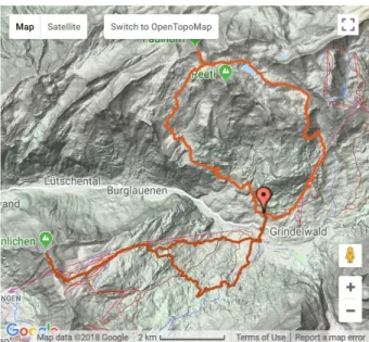
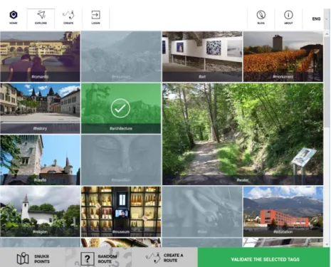
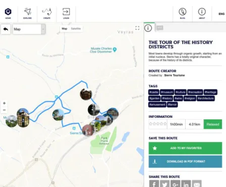
1.3.11. Snukr
Snukr is a service for customized itineraries. They describe the service as “Explore places according your choices, create and share your own routes with the Snukr community” (Snukr, 2018). At the time of the classification, the service was in the beta phase which means that the service was still being developed. Users start by writing the name of the place they want to explore after which they select tags that describe the itinerary of their desire. As a result, the user will get a list of itineraries with the selected tags. Each itinerary contains points of interests that are very well expressed. User can read about points of interests and even call or email them If possible. Finding an itinerary was done in 2 clicks if the user does not select any tags for the location they wish to explore.
Itineraries contain a simple grading of “relaxed” or “intense” with no additional information about the grading standard or the scale of the grading. Itineraries can be visualized with a wide range of maps. By default, itineraries are shown in a google map view with roadmap or satellite view. The user can also choose from a variety of OpenStreetMap views including an outdoor map for hiking or biking, a street map and even a map called “pirates” which makes the map look like an old treasure map. For some reason none of the maps were shown for mobile screen sized browsers. Only additional service that can be found is the ability to download the itinerary as a PDF file. Mobile support via browser was not very well supported but the service did prompt the user to use the Snukr mobile app multiple times when browsing.
Figure 10: Snukr tag selection
Figure 11: Snukr itinerary view
Source: https://www.snukr.com/exploration-details?id=57581190e4b0744d7d1ff3a4&city=Sierre,%20Switzerland&lang=en
Figure 12: Snukr POI view
Figure 13: Snukr alerting user to use the mobile app
Source: https://www.snukr.com/exploration-details?id=57581190e4b0744d7d1ff3a4&city=Sierre,%20Switzerland&lang=en
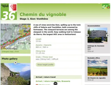
1.3.12. SwitzerlandMobility
SwitzerlandMobility (a.k.a. SuisseMobile or SchweizMobil) is a Swiss outdoor service supported by the Swiss Confederation. SwitzerlandMobility has a wide range of itineraries for activities such as hiking, canoeing, cycling, mountain biking. SwitzerlandMobility offers a very standard hiking service in which you search for a location and select an itinerary on that location. Itineraries can be visualised on a map that has many functionalities, such as a topographic view, satellite view, 3D view, greyscale view, weather information and public transport all on the itinerary map. Points of interest can be viewed on the map with a name and a short description. SwitzerlandMobility offers you with a lot of services around the itinerary. You can look at accommodation, public transport, weather information, printable maps and even guided tours for the itineraries. Web browsing on mobile is supported very well. You can view itineraries in the same map view as on desktop and overall the experience does not differ much between the desktop and mobile browsers. Navigating the web site was fairly easy and finding an itinerary took 3 clicks.
Expression of difficulty is done with a simple grade and a fitness level. An itinerary can be easy as a hike, but it can be graded as a difficult on the fitness level. User can also see other basic information such as itinerary length, ascend, descend and time estimation. Itinerary map can be difficult to read at times as all the itineraries (including the one you selected) are highlighted in green on the map. A nice improvement would have been to see the altitude profile of the itinerary on the map view instead of it being in a separate pdf document.
Figure 14: SwitzerlandMobility itinerary map view
Source:
https://map.schweizmobil.ch/?lang=en&land=wanderland&route=36&bgLayer=pk&season=summer&resolution=50&E=2594138 &N=1119092&layers=Wanderland
Figure 15: SwitzerlandMobility itinerary overview
Figure 16: SwitzerlandMobility point of interest
Source:
https://map.schweizmobil.ch/?lang=en&land=wanderland&route=36&bgLayer=pk&layers=Swisspark%2CAlpguardDog%2CWand erland%2CServices&season=summer&resolution=2.5&E=2599021&N=1122686
Figure 17: SwitzerlandMobility mobile browser view of itinerary
Source:
https://map.schweizmobil.ch/?lang=en&land=wanderland&route=36&bgLayer=pk&layers=Swisspark%2CAlpguardDog%2CWand erland%2CServices&season=summer&resolution=2.5&E=2605850&N=1125774
1.3.13. Conclusion
Overall all the hiking services I classified provided at least an adequate hiking service. Most services were very close to each other in the total scores and they all provided a service that focused slightly on different aspects of hiking. The best score was given to Outdooractive which gave a very good experience with lots of features related to the itinerary and around it. Worst score was given to Snukr, which is understandable as it was at the time of the classification still in development. What was interesting to see was that none of the services classified had any support for points of difficulty. It was also interesting to see how all the services visualized the itinerary data and it gave me a good view on the technical solutions in the hiking itinerary services.
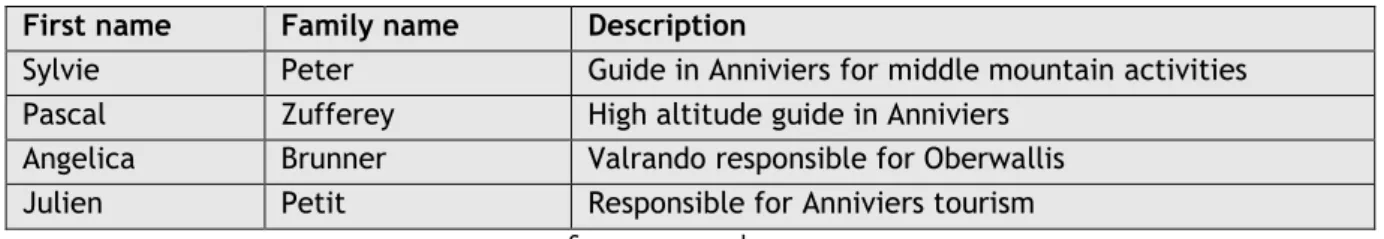
1.4. Interviews
To gain better knowledge and understanding about hiking routes and the dangers and difficulties around them, I did qualitative research by interviewing 4 key people, or “super users” in the field. In the interviews I asked the interviewees about the problems and dangers of a hike, so I can create an accurate questionnaire for the clients of SanTour. I also asked about general information regarding hiking services such as map types, what things to consider when going on a hike and other more specific questions so I can implement important elements and features for the SanTour. To get a formative evaluation from the super users, I also showed the first prototype of SanTour and an early wireframe of the next version I had made. Formative evaluation is primarily diagnostic; it is about collecting qualitative data to identify and fix UX problems and their causes in the design (Hartson & Pyla, 2012, p. 429).
Figure 18: Interviewing Julien Petit
Source: personal sources.
I wanted the interviewee to feel comfortable in the interview process and started out by explaining the interviewing process so that I was completely transparent with the interviewee. In the beginning of the interviews I told the interviewees that there were not trick questions and it was not a test and that I was only gathering their view to the questions. This way I wanted to make sure that I could get
honest answers straight from the interviewees mind. In the interviews I asked the interviewee questions and I let them answer freely without interruption. If the answer was not exactly on the question I was asking, I would specify my question with additional questions. I wanted to stay completely neutral while interviewing. Even if I didn’t agree with the interviewees opinions, I still took their answers seriously. To me the interviewing was more about what makes the interviewee feel the way they do and not if they were right or wrong.
Table 9: List of participants in the interviews
First name Family name Description
Sylvie Peter Guide in Anniviers for middle mountain activities Pascal Zufferey High altitude guide in Anniviers
Angelica Brunner Valrando responsible for Oberwallis
Julien Petit Responsible for Anniviers tourism
Source: personal sources.
1.4.1. Findings
The interviews were very interesting. They offered me insight on to different hiker’s minds. It was interesting to see what things the participants agreed and disagreed on. The results gave me more data and ideas that I can use in my designs and development.
I found out that all the participants used apps on their mobile phone. Some of them used web sites but mostly the participants used mobile apps. Half of the participants said that they use SwitzerlandMobility as their main hiking app. It was inconclusive whether the participants thought the services were easy or difficult to use in general. The ease of use seemed to be a very individual and related to the services the participants used. Half of the participants used a GPS device like a Garmin while hiking and the other half used only their mobile phones. It was also mentioned by some that using these apps was not always necessary as the routes were clearly marked. One participant pointed out thought that sometimes the trails are not marked correctly.
The participants found it difficult at first to describe difficult parts on a hike. I found it best to explain the concept of the points of danger in SanTour to help put their mind in the right place. I used an example of a suspension bridge where a person with the fear of heights may find it very difficult to cross. Most of the participants mentioned that the narrowness or width of the hiking trail is a factor in the difficulty. Rocks were also mentioned by everyone as a point of difficulty. Most said also that snow made hikes more difficult as well because of the slipperiness it can cause. It was also mentioned that ropes and chains in the itinerary can be a point of difficulty.
The most common attributes for a difficult hike were the unclearness of the itinerary path and large height differences in the itinerary. The possibility of climbing was also mentioned to be a factor.
For easy hikes, most of the participants said that the attributes were clear and broad paths where the ground was even.
I asked the participants which grading system they preferred for hikes. Half of the participants said that the Swiss colour system of yellow for easy/normal hikes, red/white for mountain hikes and blue/white for alpine hikes was the best system. The other half did not have a strict preference but one of them did also mention that the colour system was good.
Things that the participants brought on hikes were food and drink, sunglasses, sunscreen, paper map, additional clothing and for safety reasons, most wanted to bring a mobile phone. Some unique things that were mentioned were medicine, small ropes and walkie talkie for emergencies.
Most of the participants had never had to go back from a hike because of a point of difficulty. Some had close call situations, but they always found ways around the points of difficulty. One of the participants had a few instances where he had to turn back because of bad whether or snowy and slippery ground. Some of the participants had also had fearful situations where they lost their way because of weather conditions or difficult terrain.
The most dangerous weather condition for hiking was unanimously a thunderstorm. The Participants explained that it was very dangerous because in the summer, the weather can change very fast into a thunderstorm. They said that if this happens you have to either turn back of find shelter somewhere. Snow and mist were also mentioned by some to be dangerous.
three out of four participants said that the classic topographic map was easily the best for hiking. One of the participants liked the google maps topographic map the best and even the planimetric map was good in the participants opinion. This individual did not like the topographic map.
Figure 19: Classic topographic map
Figure 20: 3D topographic map
Source: https://upload.wikimedia.org/wikipedia/commons/4/4c/Topographic-Relief-perspective-sample.jpg
Figure 21: Google maps topographic map screen shot
Source: https://www.google.com/maps/@46.2933886,7.5076072,15z/data=!5m1!1e4
Figure 22: Planimetric map
I asked the participants also about other services around the hikes that they might use. Everyone mentioned that the weather and public transport information was important. Some other unique services were a mountain peak finding app, flowers app, tripadvisor for good restaurants on the of the hike and also accommodation information.
The participants feedback on the first edition of SanTour was that it was overall good and there were not too many questions on the questionnaire. One participants even said that the questionnaire had all the important questions. Some critical feedback was that the big rocks and small rocks should have separate preferance ratings. I noticed that the participants were fast with the multiple choice questions but once the web site asked for their preferance with sliders, it took the participants more time to choose the option they wanted. Some participants had trouble understanding the terms “cabossé” which translates to “bumps” and “cailloux” which translates to “rocks” or “pebbles”. These terms were used in the sliders on the obstacles section of the questionnaire.
Figure 23: Screen capture from the obstacles section of the first prototype of SanTour
Sources http://www.santour.ch/.
Finally I showed the participants my early wireframe of the vision I had for the next edition of the SanTour web interface. The feedback from everyone was that it was an improvement and simple. One of the participants felt that they would prefer some instructions on the service in the first page for example. The participant also said that a function for a group of hikers would be nice.
Figure 24. Early wireframe of the vision of SanTour
Source: personal sources.
1.4.2. Conclusion
I received some variety in the answers I got but there were also things that the participants were unanimous on. What I found important was that all the participants had mixed experiences with the ease of use of the hiking services they used. It tells me that there are services with good user interfaces, but it also tells me that its very individual how people feel about their experiences. It was
also interesting to hear that participants liked to use traditional GPS devices. To help these participants I could develop a feature which could send GPX files which these GPS devices could use. One thing that I had not considered before was the narrowness of the hiking path. This is something that should be taken into consideration in the questionnaire of SanTour. The swiss colour system was considered by the participants to be the easiest grading system and I think it should be incorporated into SanTour as well. Thunderstorms were unanimously considered dangerous. For this reason, I think it would be important to have a weather functionality on the itinerary page. The classic topographic map was considered the best by most of the participants and I should look into adding one to SanTour as well. Weather and public transport information was also considered useful and adding functionalities for both would be nice. The prototype of SanTour was considered good and most of the questions in the questionnaire were also adequate. Most participants were slower with the questions that had sliders and I feel that I should try to improve them. The instructions for some questions should also be improved. The participants felt that the early wireframe I showed was an improvement and it means that I am on the right track with SanTour. The next step was to turn the wireframes into mock-ups so that I could start developing.
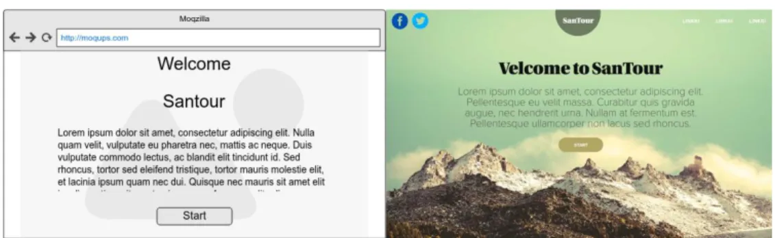
1.5. Wireframing and Mock-ups
Wireframes, a major bread-and-butter tool of interaction designers, are a form of prototype, popular in industry practice (Hartson & Pyla, 2012, p. 340). Wireframes can be used to create “sketches” of websites. They are used to illustrate high-level concepts, approximate visual layout, behaviour, and sometimes even look and feel for an interaction design (Hartson & Pyla, 2012, p. 340). When I started to create the first wireframes for SanTour, I wanted to make the website as simple to use as I could. One of SanTours targeted audiences is elderly people and because of that I felt that it was important to make the service easy and straight forward. The first wireframe could be described as a Horizontal prototype. A horizontal prototype is very broad in the features it incorporates but offers less depth in its coverage of functionality (Hartson & Pyla, 2012, p. 56). The wireframe I created had the main functionality of SanTour. It contained the questionnaire described with a few question types and the result page.
For SanTour it’s very important to receive accurate data from the user. To improve the questionnaire of the page, I decided to divide each question into separate pages. In 2008 a web designer named Adam Silver worked on a website where he turned an ordering form from an accordion model into a single page model. As a result, the website gained extra 2 million orders a year (Silver, 2017). Doing this reduces the cognitive load on the user’s brain. This can be compared to breaking down a mathematical function into smaller steps. It’s the same for users trying to complete a form, or anything else for that matter. If there is less stuff on screen and only one choice to make, then friction is reduced to a minimum. Therefore, users stay on task (Silver, 2017).
After my first wireframes where done, I showed them to the super users I interviewed and asked for their opinions. The feedback I got was positive, every interviewee commented that the wireframe was an improvement on the current layout of SanTour and that it was simple. This was great news because it means that the users found the wireframe easy to use which meant that my design had its target.
After receiving the validation for the first wireframes, the next step was to bring more life into them by creating mock-ups. I don’t have any experience in design or visualization, so I contacted a friend to help me out. My friend Jenni Kiviniemi works as a graphic designer and she was willing to help me out by visualizing my wireframes into mock-ups. I gave her all the pages I had created with wireframes along with descriptions and instructions. My instructions were to bring style and colour into the wireframes while keeping the layout as close to the wireframes as possible. The goal was to create a stylish and simple to user interface that would go along with my vision of SanTour.
After about a week, Jenni provided me with visualized layouts. Some minor adjustments needed to be done because of technological best practices, but in general they were following my vision and guidelines of the layout of SanTour.
Figure 25: Wireframe and mock-up of the front page of SanTour
Source: personal sources.
1.6. Project technologies
As the SanTour project is still at a very early state, nothing concrete is defined yet on the technological side of the project. The final front-end technology will depend on the back-end and the overall architecture of the final service. As the current state of SanTour is a proof of concept, it would be a large task to create the whole architecture of the service and a very comprehensive front-end on top of that. I will instead be focusing my development on the front-end of the application. My goal is to create a good user experience that can be used for the next iteration of the development of SanTour. In the end my vision is that the front-end application will be able to read simulated back-end data from which it can recommback-end itineraries for the client. This back-back-end will be very simple, and it can be improved upon in the future. The back-end will communicate with a database of itineraries from which it will return a set of data whenever the back-end is called.
Figure 26: Schema of the architecture of SanTour
Source: personal sources.
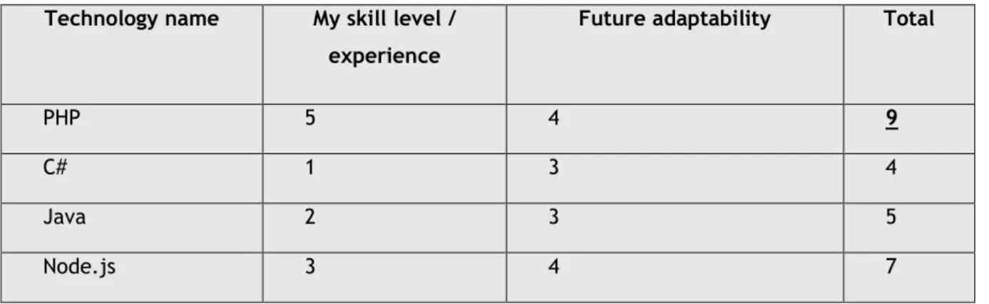
For the development phase of my work on SanTour, it is necessary to choose a technology for the front-end development. There are many older and newer programming languages to choose from and many frameworks on top of that. As the development time of SanTour will be very limited, it is important to choose a language that I am already familiar with. I do not have enough time to learn completely new technologies and it would be beneficial to develop without too many technical issues. I will rate the possible options for the coding languages based on my skill level and experience on the language. I will also rate the adaptability of that language. Adaptability means how well the language can be adapted in the future if the services architecture is changed.
Table 10: Table of scores for front-end technologies
Technology name My skill level /
experience
Future adaptability Total
PHP 5 4 9
C# 1 3 4
Java 2 3 5
Node.js 3 4 7
1.6.1. PHP
PHP (recursive acronym for PHP: Hypertext Preprocessor) is a widely-used open source general-purpose scripting language that is especially suited for web development and can be embedded into HTML (PHP, 2018). PHP is a loosely typed system. It means that for example that a variable can be text, numbers or even a list of items without ever needing to declare the type of the variable. PHP was released in the year 1995 but PHP experienced its biggest surge of popularity after Mark Zuckerberg, still in his Harvard dorm room, chose it to code Facebook in 2004. With a large popular site running it, PHP became an “it” language (Orsini, 2014).
In my developing experience I’ve worked a lot with PHP. I’ve used it in my working life and student projects. It’s a fast language for smaller projects and it has capabilities for larger web developing projects as well. PHP is a fairly old coding language, but it is still used by many websites. In June of 2018 w3techs.com reported that PHP is used by 83.5% of all the websites whose server-side programming language we know (Usage of server-side programming languages for websites, 2018). PHP is written into PHP files which can contain HTML and PHP code mixed together. This makes the possible transition away from PHP fairly easy, because the code structure of the project is heavily linked to the HTML presentation.
Figure 27: Percentage of websites using various server-side programming languages
Source: (Usage of server-side programming languages for websites, 2018).
1.6.2. Java
Java is a programming language and computing platform first released by Sun Microsystems in 1995 (Java, 2018). Java is a strongly typed system which means that for example the type of each variable has to be declared before it can be assigned. This means that if you have a text variable, it will be “String” type and if you have a number variable such as “1”, it will be declared as “int” type. Popular website that have used Java are Amazon, eBay and LinkedIn.
My first programming experience was with basic Java coding. I’ve coded Java at school and I’ve done some personal projects to train my skills in Java. I’ve coded with Java frameworks such as Spring and Spring boot and I’ve done some Java EE coding at school as well. In my experience I found that Java was very slow to develop for me and sometimes it would take me a very long time to develop a simple feature. In java you usually have the presentation layer with your HTML or XML and all of the websites logic and is separated into different parts of the program. Java has many different versions and frameworks and they all contain pros and cons. This makes my decision of Java even more difficult. This can make it difficult to transition, as the relation between back-end and front-end can become very complex. With java you can have very large back-end capabilities which makes it a powerful language but for my needs in front-end, I don’t see it as a very useful one.
1.6.3. C#
C# is a programming language released in the year 2000. C# is developed by Microsoft for the .NET platform. You can use C# to create Windows client applications, XML Web services, distributed components, client-server applications, database applications, and much, much more (Wenzel, et al., 2015). C# has a fairly strongly typed system similar to Java. Some popular websites written in C# include Stack Overflow, and many Microsoft websites such as the XBOX website.
My experience with C# is not very long. I first coded C# in spring of 2017 on a few school projects and I haven’t coded with it since. In my experience it was very similar to Java and I found it somewhat complicated and slow to develop with. Although there are express installs provided by Microsoft that I could use, the structure of the project would take time for me to understand. With the time limits I have, I think that C# is too new and complex for me to start developing on and I would need more experience with it.
1.6.4. Node.js
Node.js is a free opensource JavaScript runtime-environment released in 2009. JavaScript was originally run on client side in the user’s web browser but with Node.js JavaScript is run on the server side. Node.js is based on Googles v8 JavaScript engine. As an asynchronous event driven JavaScript runtime, Node is designed to build scalable network applications (Node.js, 2018). Since Node.js is JavaScript, it’s also a loosely typed programming language similar to PHP. Popular websites using Node.js include Yahoo, Walmart, Netflix and Uber.
My first contact with Node.js was in spring of 2017. I found it to be an easy language to develop, as it is JavaScript running on the server side. I’ve developed with JavaScript before in my working life, so it was familiar to me from the beginning. It is a language that is quite fast to develop, and it has a lot of potential. Node.js would be a good option for SanTour as it combines a good mix of front-end and back-front-end capabilities. If I had more experience with Node.js, I believe it would be a good
choice for SanTour. I’m too afraid to choose Node.js as I don’t really have room for trial and error in my development process.
1.6.5. Back-end technology
Since the back-end of SanTour will not be the focus of my work, I will be keeping it very simple. The back-end will be called from a localhost address and it will always return all the itineraries that are saved in the database. The end will be written Node.js. To save time I will be using a back-end API solution that I’ve worked with in the past. This solution was for a very similar service to SanTour and It can be utilized in the future by native Android apps, iOS apps or it can be scrapped and switched to something better in the future since it’s not a very complicated system.
1.6.6. Database
For the database of SanTour I chose MongoDB. MongoDB is a free and open source NoSQL database. NoSQL systems store and manage data in ways that allow for high operational speed and great flexibility on the part of the developers. Many were developed by companies like Google, Amazon, Yahoo, and Facebook that sought better ways to store content or process data for massive websites. Unlike SQL databases, many NoSQL databases can be scaled horizontally across hundreds or thousands of servers (Yegulalp, 2017). MongoDB saves data into documents which contain data that is in a very similar form to JSON. JSON is a form of data that is commonly used for APIs, which makes MongoDB a good choice when building an API. MongoDB also provides drivers and thorough documentation for Node.js which makes the development faster and easier.
1.6.7. Conclusion
For the overall architecture of SanTour it is difficult to say which language is the best. The final languages will depend on the complexity of the back-end functionalities and the complexity of the database. To keep the project simple and adaptable while considering my skills in each language, PHP is the best option for the front-end. I will also be using scripting languages such as JavaScript and libraries like jQuery which will be mixed into the PHP code. This will make the content of the pages more dynamic and its standard practice for modern day websites. To make the code fast to read for web browsers, I will use SASS for the styling and a tool that will minify the SASS and JavaScript’s into minified files. This will increase the performance of the site and it’s what you would find on any professionally made websites. I believe that a Node.js API with a MongoDB database is a more than adequate solution for SanTour at this stage of development. As far as I can see, the capabilities of both Node.js and MongoDB should support even a fully working back-end and database. To be sure, I won’t be going too deep on the development of the back-end and database. I will try to keep them so that if necessary, they can be completely changed in the future.
1.7. Tools
After choosing the technologies of my development, I must also choose the tools which I will use for my development. These tools will allow me to utilize technologies while making them easier and faster to develop with.
1.7.1. Git, GitHub & Source Tree
To have version control for my project, I will be using Git. Git is a fast, scalable, distributed revision control system with an unusually rich command set that provides both high-level operations and full access to internals (GitHub, 2018). Git allows me to save code online into repositories. If I have any issues with my code or if I lose some code for some reason, I can look at previous versions of files that I committed in the past. Git is a great tool for collaborative coding but since I will be working alone, I won’t be benefitting from those features.
For the hosting of the Git service, I will be using GitHub. I have a student account for GitHub which offers me unlimited private repositories. It makes more sense to use a Git service that I already have an account for, instead of creating a new one as the services that competitors offer are very similar to each other.
The internet offers many tools for controlling Git. Git can be used from the computers command line or from a graphical interface. For my project I chose a Git tool called SourceTree. SourceTree offers a wide range of features such as a GUI, a command line, easy interface and it’s completely free. SourceTree is developed by Atlassian. Atlassian is an Australian IT company behind popular business level IT tools such as Jira, Trello, Bitbucket and many more.
1.7.2. MAMP
For the local development I will be using solution stack called MAMP. MAMP offers a local Apache server with PHP already installed. It’s very easy to use and configure. There are many similar tools such as WAMP and XAMP, but for my needs, I chose MAMP because I have a lot of prior experience using it and it offers all the features that I need for my local development.
Figure 28: MAMP user interface
Source: personal source.
1.7.3. Atom
Every developer has their own preference when it comes to the integrated development environments (IDEs). For most it’s just preference of the user interface and features. For of my project, I will be using Atom for the PHP development. Atom is considered by many to be one of the best development environment tools for PHP. Atom is a modern text editor built by GitHub folks and offered free of cost under MIT license. Atom has an ecosystem of its own with huge community behind it and tons of plugins and packages available to extend its functionality (noeticsunil, 2017).
1.7.4. WebStorm
For the back-end development I will be using WebStorm. WebStorm is an IDE designed for JavaScript development. WebStorm has a great autocompletion system which makes developing JavaScript very fast and easy. It’s also a very useful tool because it contains a command line and basically everything you need integrated right into the interface where you can easily modify and run the code. This is convenient for me because I will be creating a back-end server which is developed from the IDE and run from the command line.
1.7.5. Studio 3T & MongoDB community compass
To manage my MongoDB database, I will be using Studio 3T for large operations such as exporting, importing and clearing collections. 3T studio offers many powerful tools for the management of MongoDB. For smaller scale operations such as updating fields, managing and browsing single documents, I will be using the MongoDB community compass. MongoDB community compass offers a very intuitive user interface for simple operations. The downside is that the suite of features it offers is very small.
1.8. Defining project management
To make sure the developing phase will run smoothly, I will be using a project management framework. In software development projects time is a very important asset. Even more important is how you use your time. To better manage my time, I will be using a modified implementation of Scrum. Scrum is a project management framework made for teams of 3 to 9 developers but as I am developing SanTour alone, some of the features of Scrum won’t be necessary.
There are many online tools for Scrum management, but I feel that for my needs I can use a simple Excel sheet with all the information and tracking related to my project. I will divide the time I have for the development phase into sprints and at the end of each sprint I will have a sprint review. In the sprint reviews I will choose user stories for the upcoming sprints and validate user stories from previous sprints. My thesis supervisor Alexandre Cotting will act as a product owner in the sprint reviews.
2.
Development
2.1. General information regarding development
The development phase of SanTour started on the 18th of June 2018. In scrum, development time
is split into smaller periods called “sprints”. Sprints are used to divide the time you have, and it allows your workload and the speed of your development to be estimated and calculated. I decided to split my time into one-week sprints until the 22nd of July which totalled to 5 sprints of development. I will
choose user stories for each sprint and I will be turning those user stories into smaller tasks inside each sprint. This will make the production of each user story easier.
Table 11: List of all user stories for the development of SanTour
US
Nr. As an/a … I want to … in order to...
1 Developer Setup my environment for developing start the development of the project 8 User Select the Canton I want to travel get recommendations from that specific
area
2 User Navigate to the frontpage of SanTour Find out more information about it 5 User Answer to questions with thumbs up/middle/down answer questions according to my
preference
6 User Answer to questions with radio buttons answer questions according to my preference
7 User Answer to questions with a slider that contains a preview of each step in slider
answer questions according to my preference
3 User See the results of my recommendation choose the best itinerary
20 Developer Have a more intuitive preview for the slider element have a better user experience for mobile devices
21 Developer Have a database setup for the itineraries store the itineraries I have in a database 19 Developer look at the correct form elements for each of the
questions in the questionnaire
create a better experience for the user 22 Developer Database that can receive calls communicate with the database and the
front-end
4 User See a map view of each itinerary get a better view of the itinerary 9 User Have the option to skip a question move forward with the questionnaire 11 User See how compatible each itinerary is to my preferences to help me choose the correct itinerary 14 Developer Have a database that I can use to make calls to and
receive data
get a more functioning system
16 User Get the weather information regarding the itinerary I choose
get more information about the itinerary 18 User Download itinerary as a GPX file have the itinerary in my GPS device 12 User Get more detailed information about compatibility of each
itinerary
give me more knowledge about the itinerary and my skills
13 User Have more details about each itinerary know more about the itinerary
24 User Have a caption for the slider images have a better description for the images 23 User Have a better user interface for the data acquisition
itineraries into SanTour
have a better user experience 10 User Enter my name into a form that will save my preferences
for later
make faster searches for itineraries 15 User Have language support for French and German understand the website in my native
language
17 User Get public transport information to the itinerary help me arrive to the itinerary 25 Developer Optimize the web page have better load times
26 User have a done percentage in the questionnaire get a better overview of the progress 27 Developer Inform the user that our website uses cookies follow European laws