Dynamic Timelines
Visualizing Historical Information in Three Dimensions
by Robin Lee Kullberg
B.S. Environmental Science
Massachusetts Institute of Technology Cambridge, Massachusetts
1991
Submitted to the Program in Media Arts and Sciences, School of Architecture and Planning, in par-tial fulfillment of the requirements for the degree of
Master of Science in Media Arts and Sciences at the Massachusetts Institute of Technology
September 1995
@ 1995 Massachusetts Institute of Technology All rights reserved
Signature of Author
Program in Media Arts and Sciences August 11, 1995
A/
Certified by
William J. Mitchell
Dean of School of Architecture and Planning Massachuetts Institute of Technology Thesis A isor
Accepted by
Stelhen A. Benton
ChairpersonDepartmental Committee on Graduate Students Program in Media Arts and Sciences
Dynamic Timelines
Visualizing Historical Information in Three Dimensions
by Robin L. Kullberg
Submitted to the Program in Media Arts and Sciences, School of Architecture and Planning, on August 11, 1995, in partial fulfillment of the requirements for the degree of
Master of Science in Media Arts and Sciences
Abstract
This thesis considers the form and function of the visual communication of historical information in computer-based media. By applying new visual techniques derived from traditional graphic design and cinema, such as infinite zoom, translucency, and animation, the traditional timeline is trans-formed into a dynamic, three-dimensional framework for the interactive presentation of historical
information.
I argue that current static and non-interactive presentation limit the ability of the designer to visualize
complex historical information. Dynamic, interactive design solutions address the communicative goals of allowing seamless micro and macro readings of information at several levels of detail and from multiple points of view.
Experimental software for visualizing the history of photography was created to examine and com-pare various visualization techniques. Selected examples from the system illustrate advantages and disadvantages of various methods of dynamic visualization and interaction.
Thesis Advisor: William J. Mitchell
Title: Dean, School of Architecture and Planning
Dynamic Timelines
Visualizing Historical Information in Three Dimensions
by Robin L. Kullberg
The following people served as readers for this thesis:
Reader
i
7Glorianna Davenport
Associate Profes
MIT Progr in Medi rts and Sciences
Ken Haase
Assistant ProfessorMIT Program in Media Arts and Sciences
Reader
iion
MacNeil
Principal Research Associate MIT Media Laboratory
Reader
acknowledgme
n t s
Thanks to my colleagues and friends at the Visible
This research has taken place in the Visible Language
Language Workshop and in the MIT Media Lab. Thanks
Workshop of the MIT Media Laboratory. The Visible
especially to Nancy for her patience and sense of humor in
Language Workshop was founded by Professor Muriel
trying times, to Mike and Dave for distraction, to Yin Yin for
Cooper. Her profound vision of the future of design at
teaching me so much, to Dave for always being there, and
the computer interface has guided this research.
to Suguru for cracking the whip.
Thank you Ishantha, Lisa, Earl, Louie, and XY for being such wonderful colleagues. Love and thanks to Darcy, Ryan, Sekhar, Bruce, Mike, Mom, Dad, and my two wonderful sisters, for helping me through and for putting up with me in times of stress.
Special thanks to Bill for advising me on such short notice, and to my readers for their advice and inspiration. I would also like to express my gratitude to Justine Cassell and Leila Kinney for their time and input, and to Andrew Eskind of the George Eastman House for the wonderful database.
this thesis is dedicated to Suguru Ishizaki. Suguru, you have made these past two years invaluable. the words do not exist with which i could adequately thank you for your patience, your insight, your inspiration, and your friendship.
1 Introduction
6
1.1 Problem
1.2 Approach
1.3 Research Methodology
1.4 Software
1.5 Summary of Results
2 Background
16
2.1 Information Visualization
2.2 Cinema
2.3 New Graphical Techniques
2.4 Temporal Cognition
3 Design Experiments
21
3.1 Structure, Stability, and Motion
3.1.1 Providing Structure
3.1.2 Visualizing Dense Information 3.1.3 Providing Stability
3.2 Overview and Detail
3.2.1 Providing Overview 3.2.2 Filtering3.2.3 Showing Detail
3.3 Historical Context
3.3.1 Visualizing Historical Context 3.3.2 Maintaining Historical Context
4 Conclusion
43
4.1 Design Issues and Solutions
4.2 Future Work
4.2.1 More Design Experiments 4.2.2 Expressing Subjectivity 4.2.3 Applications
5 References
48
This thesis considers the form and function of the visual com-munication of historical information in computer-based media.
By applying new visual techniques derived from traditional
graphic design and cinema, such as infinite zoom, translucen-cy, and animation, the traditional timeline is transformed into a dyna-mic, three-dimensional framework for the interactive
pre-sentation of historical information.
Experimental software for prototyping three-dimen-sional visualizations of the history of photography was created to examine and compare various visualization methods. Content for the visualizations consists of photographs from the collection of the George Eastman House in Rochester,
New York. The final software implementation presents a database of 265 annotated images considered to be repre-sentative of an overview of the history of photography from approximately 1830 through 1950. This information is shown in its historical context of concurrent important events from the history of art, the history of technology, and political his-tory.
The image database includes textual annotations which identify each image by title, author (including nationality and activity dates), date of creation, place of creation, photo-graphic process, size, and keywords. At run time, the
visual-ization software reads text annotations of the database of images and uses them to construct a knowledge representa-tion, which will be described in greater detail below.
Supplementary information intended to provide historical con-text is also read and added to the knowledge representation
at run time. This contextual information consists primarily of major events from cultural, technological, and political history gathered from art history textbooks.
Robin L. Kullberg e Dynamic Timelines
1.1 Problem
A timeline is an atlas of history, a map of events in time. We
use timelines for some of the same reasons we use geograph-ical maps: to locate an event in time, as we would locate a city on a geographical map; to see the time elapsed between events, as we would see the distance between two cities; to get an overview while being able to focus on detail in its cor-rect context, as we would view a city in the larger context of its state while being able to discern information particular to the city. When examining events in time, we are not only
con-cerned with finding the what, when, where. We also look for causal relationships. We look at other events and the historical context, and try to understand why and how.
This thesis argues that the current static and/or non-interactive media (e.g. print,film,hypertext) limit the ability of the designer to communicate complex historical information
that often requires multiple points of view and several levels of detail. By re-inventing the static, two-dimensional timeline as a dynamic, three dimensional timespace, the designer can facili-tate the user's ability to access, browse, and understand
his-torical information. This thesis addresses the following three problems in the visual communication of historical information:
1. The difficulty of presenting multi-dimensional
infor-mation as a two-dimensional visual structure. This is especially
problematic in a rigid two-dimensional timeline in which time is one dimension. Typographical elements and images repre-senting events are arranged along the time axis. These graphi-cal elements often invade the time dimension and result in crowding and confusion which obscures the visual structure of the information. Figure 1 shows part of a timeline of the history
of art included in a well-known art history textbook [Janson
1991]. The labeling across the top of the diagram clearly
defines the time dimension, and dark horizontal bars place artistic movements along the time dimension. The problem arises with the typographic presentation of overlapping artistic movements and the added dimensions of artists and their art-work. To retain legibility of the typographic elements, the
Figure 1. (left) Timeline of the history of art illustrating the problem of designing multi-dimensional information as a
two-dimensional visual structure; from Janson's History of Art 1991.
Figure 2. (below) Timeline of the history of art illustrating the problem of present-ing both overview and detail, as well as providing historical context; from Hartt's
Art: A History of Painting, Sculpture, and Architecture, 1989.
tic movements and their related artists and works extend downward along a meaningless vertical axis. The effect is clut-ter and an obscuring of relationships between the time dimen-sion, the movements, and their related artists.
2. The difficulty of providing an overview of historical information while at the same time allowing access to different levels of detail. In static media, this problem is often
addressed by providing the reader with several different time-lines at different granularities, leaving the reader the difficult task of assimilating the events from the different time scales
into a cohesive historical understanding. Another static solu-tion is often to create a timeline with a high level of detail
which would expand to fill several pages, forcing the reader to flip back and forth between views. Figure 2 is a timeline of twentieth century art [Hartt 1989] which demonstrates one
aspect of the problem of overview vs. detail. In this design, all events are expressed in the same manner typographically, making it difficult to form the big picture of twentieth century art. Landmark events which are commonly referenced in art history texts, such as the advent of World War II or the paint-ing of Les Demoiselles D'Avignon, are obscured or misspaint-ing.
3. The difficulty of communicating the context in
which historical events occur. Current trends in the study of
history emphasize contextualization of events within their broader historical context [Tarnas 1991]. Some two-dimen-sional timelines attempt to address this problem by including contextual events in one large timeline, separating them spa-tially into columns or rows according to categories such as "politics" and "arts." This spatial separation makes it difficult to see relationships between events. Figure 2 also demonstrates this problem. Because events are categorized and spatially separated, important causal relationships, such as the rela-tionship between the Bolshevik Revolution and the
Constructivist movement, are not indicated.
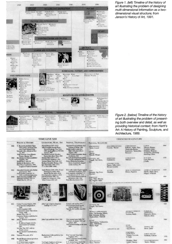
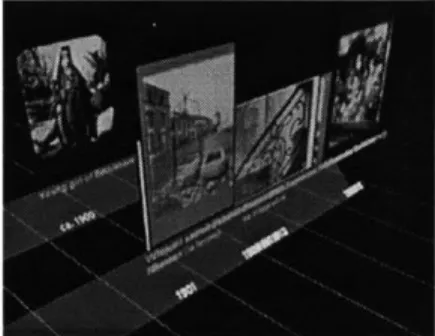
Figure 3. Scenes from photographic
his-1 .2 Approach
tory visualization.By re-inventing the traditional static timeline in a dynamic
computational environment, the communication of complex,
multi-dimensional historical information can be improved.
Consider this scenario:
A user sits down at her computer and connects to a
remote database of information on the history of
pho-tography. This database is extensive, perhaps
linking
to
other databases with more detailed information on
spe-cific topics. Upon first view, the student is presented
with an overview of the information represented in the
database. This overview spreads the available
informa-tion out before her as a three-dimensional landscape of
information through which she can travel to find the
information she needs (Figure 3). The user "flies" over
this overview until she comes to an area of interest. As
she moves closer to the information, more and more
detailed information appears about the
lives
and works
of particular artists. Contextual information from political
and social history hovers in the background, moving as
she moves in order to continuously reflect the dates
that she is examining.
In this scenario, the task of the designer of this
three-dimensional interactive information space surpasses the
lessons learned in traditional graphic design. Now designing in
time as well as space, the problem becomes multidisciplinary,
suggesting an approach which combines the language of
tra-The term "user" is intended to denote a viewer who is an active participant in the dynamic, interactive presentation of the information. The user can browse the database, or conduct a search on a par-ticular topic of interest.
ditional graphic design with the language of a dynamic visual form such as cinema. Additionally, the design of historical information should be informed by knowledge from the field of cognitive psychology about the way we perceive time.
The primary focus of investigation is the use of new interactive and dynamic visualization techniques derived from traditional graphic design and cinema that are unique to com-puters, such as infinite zoom, translucency, and animation.
Real-time computer animation can be used to create smooth visual transitions when moving in a three-dimensional graphical environment. Visually continuous transitions help the
user to maintain her orientation in complex information spaces
by constantly providing a visual context. This research uses a
camera metaphor to describe how the user's view of the three-dimensional space is captured and animated on the
computer screen. Zooming, panning, and tilting of the camera are cinematic techniques which can be applied to a virtual space to structure and inform animated transitions. As in cine-ma, the visual language of camera framing in time is
inextrica-bly linked to the semantic interpretation of the information
being visualized.
The infinite zoom is similar to dollying a camera which has infinite depth of field. As the camera moves closer and closer to an object, it remains in focus. This technique was originated in the film Powers of Ten by The Office of Charles and Ray Eames, in which the viewer is taken on a whirlwind tour of the physical universe from the scale of galaxies to that of quarks [Eames 1978]. Applied to a virtual space, the infinite zoom offers the ability to present increasingly detailed levels of information through animation. Using the technique of zoom-ing into multiscaled hierarchical information, the finite space of the computer screen becomes an infinite space with infinite resolution. In a dynamic timeline with several levels of detail, the infinite zoom offers great possibilities for moving between levels while retaining context. This thesis includes the imple-mentation of the infinite zoom and touches upon questions raised regarding maintaining orientation when zooming into areas of detailed information.
Transparency is a technique that can be used to draw the user's attention to important areas of information by taking advantage of human visual perception. Information can be emphasized by using techniques which simulate depth. This effect is achieved by heightening the contrast between the information being emphasized and "background" information, either by blurring the background or by using transparency to fade the background [Colby 1992].
In a three-dimensional visualization of a timeline which contains perhaps thousands of graphical objects such as text
and images, continuous gradual transitions between trans-parency and opacity and can be used to visually distinguish relevant information while retaining context. For example, a user might want to search a timeline for details of a specific event, such as a particular battle during World War 1l.
Transparency could be used to focus attention on the specific details of the battle of interest, while the general context of World War II, though de-emphasized, would still be visible in
the background. Smooth visual transitions between trans-parency and opacity provide the access to detailed informa-tion while simultaneously placing the battle in the correct his-torical context.
In the process of narrowing down the scope of this research, decisions were made regarding the nature of the information being presented. First of all, this research makes the simplifying assumption that the historical information pre-sented is static. However, historical information is not static. Not only do databases change over time, but history itself is rewritten. The second assumption is that of objectivity. In the historical database used in experimentation, each photograph is treated equally. There is no indication of photographic movements, lines of influence, or exceptional historical signifi-cance. However, it is important to realize that any historical database is subjective by nature, if only by the exclusivity of the information it contains, and any visual presentation is equally biased. This research recognizes the highly subjective nature of the task of visualization of historical events, but attempts to minimize the editorial subjectivity of the designer. No event is presented as being more or less important than
any other event, and no opinions as to issues of influence are expressed graphically.
1.3 Research Methodology
It is important to recognize the distinction between the
research process and the design process. The design process is an important part of the research process; however, their goals are quite different. The result of the design process is a completed design, whereas the result of the research process does not take the form of any one design, but rather a range of guidelines and arguments that can be referred to by
designers tackling similar problems in the future.
The research process begins with the identification of a set of design problems in the visual communication of infor-mation. The design problems being researched are general rather than specific, addressing broad issues in communica-tion design. Next, the design process begins. A range of design approaches are identified, and several experimental design solutions are planned. These experimental design solu-tions are visualized using testbed software which was
imple-mented for this purpose. The resulting prototype solutions are compared and evaluated as to how well they succeed in solv-ing the identified design problems. This stage of evaluation takes the form of qualitative discussion of the areas in which the experimental design solution succeeds in fulfilling commu-nicative goals, and the areas in which it fails. In the process of prototyping and evaluating the experimental design solutions, the designer and her critics often discover new design prob-lems which also must be solved in order to arrive at a suc-cessful design solution. Thus, the design process is a naturally recursive process in which the continuous identification of problems plays a vital role.
In design research, the most important aspect of the design process is discussion of why and how different aspects of a design succeeded or failed, including the identifi-cation of related subproblems. The result of this discussion is a range of arguments and relevant issues which can help guide future designers. In this thesis, design prototypes were evaluated primarily by myself, my advisor and readers, my
leagues in the MIT Media Laboratory and the design commu-nity, and by a professor of the history of art.
1.4 Software
Testbed visualization software is composed of several mod-ules coded in C++ which utilize the Silicon Graphics Performer graphics library. The Performer graphics library is a C library designed to render a three-dimensional virtual world in real-time. My testbed software allows quick prototyping by provid-ing high level C++ code for:
1. creating and managing dynamic, three-dimensional
graphi-cal objects
2. reading and representing a database of historical informa-tion
3. dynamic manipulation of a virtual camera using cinematic
language
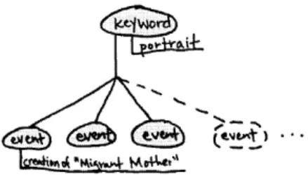
An annotated image database is represented using a relational network data elements. Each data element can be identified as one of the following: an event object, a date object, a place object, a person object, an image object, or a
keyword object. Any data element can be semantically linked to any other data element (Figure 4).
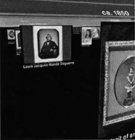
An event, such as the creation of a photograph, has a list of links from it to at least a few of these objects, depending upon the information available in the historical image
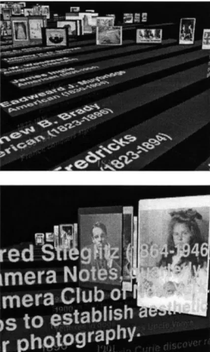
database. For example, the event of the creation by Dorothea Lange of her photograph entitled Migrant Mother (Figure 5) is an event object which contains a list of links to the following: a person object (Dorothea Lange, the photographer), a date object (1936), a place object (Nipomo, California, USA), an
Figure 4. Data elements used in object-oriented knowledge representation of database. Any data lement can be semantically linked to any other data ele-ment.
image object (Migrant Mother, also containing information about the process used and the size of the image), and sever-al keyword objects (portrait, documentary, etc). The various objects to which the event object is linked also contain a list of links, one of which points back to the event object. Thus, if one wanted to find all the portraits, one would follow the list of
links out of the keyword object called "portrait" to the related event objects (Figure 6).
1.5 Summary of Results
In a process of design experimentation using a historical database of images, this research has identified design issues
and solutions which are particularly relevant to the problem of visualizing historical information in three dimensions. Results
include how to provide and maintain a single, stable visual structure whose framework can allow the communication of overview, levels of detail, and historical context in response to user interaction.
Figure 6. To find the events related to portraiture, one follows the list of links coming from the keyword object named
"portrait."
In order to approach the previously identified problems in designing a dynamic timeline, this research borrows experi-mental findings, techniques, and vocabulary from four different fields: information visualization, cinema, new graphical
tech-niques, and temporal cognition.
The purpose of this chapter is twofold. First, it aims to introduce the reader to the background in which this research is rooted. Second, it establishes a common vocabulary upon which later discussion of design experiments and results is based.
Before delving into the four different fields which make up the background of this research, I would like to place this research in the current context of the increased interest in vir-tual museums. One possible application of this research is the visualization of a museum's collection.
The virtual museum has many advantages: you can visit a virtual museum without leaving your home; you can avoid the discomfort of a crowded gallery; you can view the entire collection of the museum rather than being limited to those works which are being currently displayed in the muse-um due to lack of space; you can construct a personalized path through the works that are of interest to you [Mitchell
1995].
In the dynamic environment of the virtual museum, there appear to be few limits on the richness and variety of information which can be presented. There are limits, howev-er, to the user's perception of this information. Regardless how rich with information a space might be, the information is worthless unless it can be communicated.
Robin L. Kullberg * Dynamic Timelines
2.1 Information Visualization
Information visualization helps to communicate information by
displaying the structural relationships that would be difficult to
discern using decontextualized information [Card 1991]. It has
been shown that by visualizing information and by allowing
dynamic user interactivity, complex information spaces can be,
more easily explored and understood [Ahlberg 1994]. Tufte
stresses that in order to navigate through a complex
informa-tion space, the user needs some kind of overview, or
macro-view onto the information, by which he can orient himself
[Tufte 1990].
The Visible Language Workshop of the MIT Media
Laboratory has produced groundbreaking design research
regarding dynamic design and three-dimensional information
visualization. This work draws heavily from the lifelong work of
the late Professor Muriel Cooper, a pioneer of design for
com-putational media [Cooper 1989]; Grace Colby and Laura
Scholl's research into the use of transparency in dynamic
information design (Figure 7)[Colby 1992]; Muriel Cooper and
David Small's Information Landscapes, an interactive
visualiza-tion of an abstract informavisualiza-tion space [Abrams 1994]; Suguru
Ishizaki and David Small's Typographic
Space,
an early
explo-ration into the use of typography in a three-dimensional virtual
space [Small 1994]; Ishantha Lokuge and Suguru Ishizaki's
GeoSpace project, which takes advantage of size and
trans-parency in visualizing personalized geographical information
[Lokuge 1995]; Lisa Strausfeld's Financial Viewpoints, which
explores using point-of-view in visualizing abstract financial
data in three dimensions [Strausfeld 1995]; Earl Rennison's
Galaxy of
News,
a browser which uses animation and scale to
allow the user to access a news database [Rennison 1995];
and unpublished work by my colleagues Yin Yin Wong and
Suguru Ishizaki exploring issues of designing in space and
time [Wong 1995; Ishizaki 1996].
Other related work includes the research by Steven
Drucker regarding intelligent camera control in virtual
three-dimensional environments such as virtual museums [Drucker
1994].
Robin L. Kullberg e Dynamic Timelines
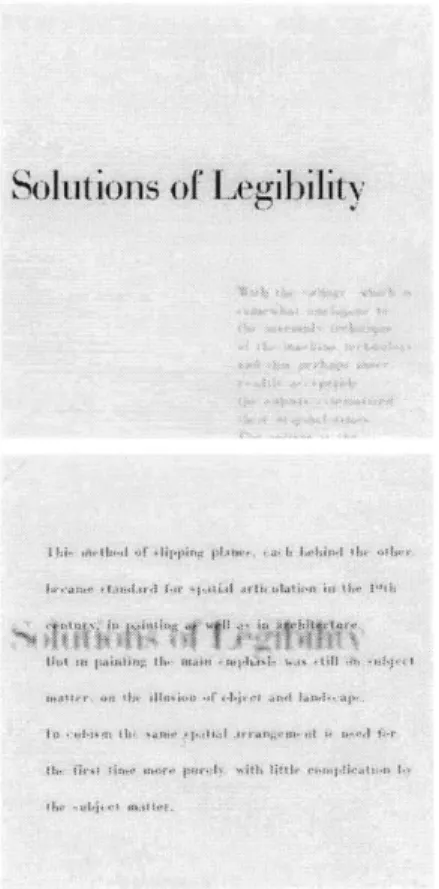
ml
Solition1s of [egibinity
Figure 7. Two frames from Colby's inter-active demonstration of the use of trans-parency in navigating through layers of graphical information
2.2 Cinema
The investigations of this thesis are also informed by the art of cinema. At the most basic level, both cinema and interactive virtual spaces are the dynamic presentation of a three-dimen-sional space on a two-dimenthree-dimen-sional screen.
Design discussion in this thesis uses many terms from the vocabulary of cinema. The metaphor of a virtual camera is used to describe the means by which the three dimensional information space is displayed on the computer screen. Later design discussion freely mixes terms from traditional graphic design with cinematic terms to describe the visual qualities of the images captured by the virtual camera. Framing, distance, angle, depth of field, focus, and point-of-view are a few of the cinematic terms which will be used to describe the quality of the "shot." Cinematic terms are also used to describe camera movement.
The language of cinema includes shot and editing techniques which enable the viewer to construct an under-standing of spatial and temporal relationships by presenting a series of shots of non-abstract images which are often dis-continuous in space and time [Bordwell 1990].
Important questions posed in this design exploration include how and if the language and techniques of cinema can be applied to a virtual environment containing abstract information. Two particular areas of investigation are (1) editing based on the graphic, temporal, and spatial relationships between shots; and (2) cinematographic qualities of the shot
based on framing, distance, and angle.
2.3 New Graphical Techniques
With the advent of the computer and rapidly increasing pro-cessing speeds, many new graphical techniques have become available. This thesis investigates the use of the new techniques of animation, infinite zoom, and transparency in articulating complex historical information. Many of these new techniques have been explored in the research of the Visible
Language Workshop described above.
Infinite zoom in a virtual space has been demonstrat-ed in the Visible Language Workshop by Sabiston and later by Cooper, Small, and Ishizaki. Outside the Visible Language Workshop, Bederson and Hollan demonstrated a mutliscale hierarchical sketchpad in which moving from one area of
infor-mation to another consists of zooming out to get an overview of the information, then zooming in to the new area of interest
[Bederson 1993].
2.4 Temporal Cognition
We all use the conventions of calendars and clocks as exter-nal representations of time. We also draw upon interexter-nal, men-tal representations of time to construct chronologies, under-stand the concepts of past and future, and pick out patterns.
Mental imagery is one theory of temporal representa-tion which has been widely described. It is evident from our
external representations of time that time and space are closely related, and that time is often depicted spatially in both graphical representations and in verbal metaphor [Friedman
1990; Lakoff 1980]. Experimentation has shown that subjects
use processes resembling visual perception to represent and manipulate temporal information. This idea is a core concept of my visualization, in which time is mapped to one dimension of a three-dimensional space.
A second theory which has been very helpful in
describing other kinds of cognitive knowledge is that of the semantic network. Cognitive psychologists now believe that is impossible to explain time cognition without taking into con-sideration the meaning (structure and content) of events as they are related to internalized, prototypical events. The event
is now considered the core concept in mental representations of time [Macar 1992]. Accordingly, my visualization is event-based, concentrating on discrete events rather than a more continuous view of history. This event-based approach is a core concept of my knowledge representation, which was described earlier in Section 1.4 Software. For example, each "photograph" from the database is represented by my soft-ware as the discrete event of the creation of that photograph. Other events from the history of photography, such as the
invention of the color photograph, are also represented as dis-crete events in time. Spans of time are represented as a dura-tion which is associated with each discrete event.
3 Design Experimen t s
This chapter describes the design experiments completed and discussion of their results. It is organized into three sec-tions, each of which addresses one of the three design
prob-lems described in the introduction:
1. the difficulty of presenting multi-dimensional information
2. the difficulty of providing an overview of historical informa-tion while at the same time allowing access to different lev-els of detail
3. the difficulty of communicating the context in which
histori-cal events occur
In the process of approaching these design problems, each problem is broken down into subproblems; each section is organized into subsections, each of which addresses one of the subproblems in achieving the section's main communica-tive goal. It is important to note that although this document separates the three design problems into different sections, the author considered all three problems at once.
Visual techniques used in the experiments described below include three dimensional layout, color, transparency, framing, camera movement, and smooth visual transition through animation and infinite zoom.
3.1 Structure, Stability, and Motion
In this research, design experimentation addressing the prob-lem of how to visually present multi-dimensional historical information in a three dimensional space began with an inves-tigation of how to visually structure the abstract information space. The problem of providing visual structure includes the subproblems of how to visualize dense clusters of information,
and how to maintain a feeling of stability when moving through the graphical information space.
It is important to recognize the difference between the visual structure of a virtual space and the structure of the information being visualized. The information being visualized has its own intrinsic multi-dimensional semantic structure. This structure is inherent in the given information and cannot be altered. The visual structure is determined by the designer. When the information is given graphical form in order to com-municate the information, the graphical forms are often orga-nized into a visual structure based on the information's intrin-sic structure. A well designed visual structure can help the user understand the intrinsic structure of the information and the relationships among different dimensions of the informa-tion.
This research deliberately avoids recreating a physical three-dimensional architectural space, such as a building, gallery, or museum, in a virtual three-dimensional space. When a designer brings an architectural space into a virtual space, she brings with it its rich legacy of cultural and histori-cal connotations. As a result, architectural metaphor often imposes meanings which are not intended by the designer. Rather than apply architectural metaphor, this research uses forms such as typography, two-dimensional images, and rect-angles to visually structure an abstract information space. This abstract information space is sometimes referred to herein as virtual space, or, borrowing terminology from cinema, the scene.
3.1.1
Providing Visual
Structure
This section describes experimentation regarding the problem of how to provide a three dimensional visual structure for a historical database of multi-dimensional information. Four experimental design solutions, which I will call prototypes, will be described in this section. The first two prototypes repre-sent early attempts to provide a visual structure. The third pro-totype, in which information is arranged primarily by time and
by person (photographer), is fairly successful in providing a
visual framework. Small revisions in the third prototype lead to
a fourth prototype, whose visual structure is retained for all later design experiments.
One solution was to design a space in which visual structure was constantly changing in relation to the informa-tion needs of the user. In this opinforma-tion, visualized historical events would dynamically reorganize in response to the user's interaction. This option was rejected from the beginning based upon my previous experiences navigating in abstract three-dimensional information spaces. I have found that it is very easy to become disoriented, especially in areas in which the visual information is less structured. A three-dimensional abstract information space lacks many of the visual cues with which we orient ourselves in the natural world. For example, in a typographic space devoid of recognizable physical objects, size of a typographic element can only be measured in relation to other typographic elements. As a result, it is easy to
become lost when zooming in. Disorientation can also occur as a result of the lack of horizon or bounding walls, or from navigating in a space with no predefined "up" or "down." Because my goal was to optimize the communication of my database of information for educational purposes, I felt
strong-ly in favor of providing a stable structure in which the user
could easily navigate to explore the different dimensions of the historical information.
Early structural experiments included organizing the virtual space into a cartesian coordinate system in which each
of the three dimensions represents a variable (e.g. time). Using this organization structure, the events contained in the
database could then be placed in the three-dimensional space in the form of a graphical object, such as a digital image or a typographic element. Because this research is an investigation into timelines, the variable of time is always assigned to one dimension. The remaining two axes in the cartesian coordinate system can be assigned to other variables which can describe a historical event, such as the the geographic location of the event, the person related to the event, or by any of several categories into which the event falls.
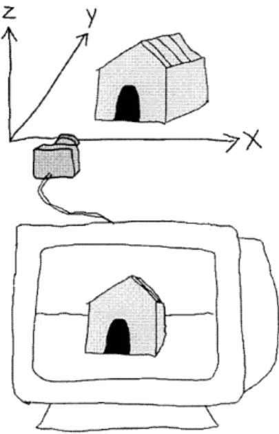
In the three-dimensional virtual space described, the axes are defined as shown in Figure 8. When imagining the
z
y
Figure 8. Definition of the axes and visu-alization of the camera metaphor.
space, it is helpful to think of the X-Y plane as the ground and
the Z-axis as altitude. The X-axis runs across the screen from
left to right, while the Y-axis is pointing away from the user into
the plane of the screen. This definition of axes is common to
flight simulator software.
First and Second Prototypes
Figures 9 and 10 show the first design prototype, in
which time is assigned to the Y-axis. Events are arranged by
their date, from oldest to most recent. In the case of a year
which the database contains more than one event, additional
events are spaced along the X-axis. The presentation of the
events is sequential. As you move the camera forward, you
are moving forward in time. Events which are farther away turn
from transparent to opaque as they come within a certain
range of the camera. I chose this as a beginning point
because our metaphors for time include the spatial metaphor
that "moving ahead" means moving to a later time, while
"looking back" means looking to an earlier time.
In the second prototype, shown in Figure 11, time is
also assigned to the Y-axis; however, in this variation, the
events are arranged from most recent to oldest. Photographs
are arranged along the X-axis alphabetically by the name of
the photograher. The presentation of the the images is
sequential, as you move from left to right. The depth of the
images in the Y direction gives an indication of the relative
dates of the images-images which are farther away from the
camera appear smaller, and thus indicate that they are older.
The visual structures of the first two prototypes are
not completely successful. The first prototype succeeds in
providing a way to quickly and intuitively browse forward and
backward in time by moving the camera forward and
back-ward. Delays resulting from drawing a great number of images
on the screen at one time indicate periods of great activity in
terms of the history of photography. This type of presentation
enables the user to get a feeling for the overall content of the
database in terms of the types of images and the periods of
time it covers. However, because images are viewed
sequen-tially over time, this organization fails to give a visual overview
of the entire database. Furthermore, its visual structure is very
Figure 9. First prototype with definition of axes.
Figure 10. First prototype: these two images represent moving forward in time.
limited-I found that I wanted to be able to see more of the
intrinsic structure of this multi-dimensional information, such
as geographic distribution.
The second prototype has many of the same qualities
as the first prototype. Again, I found that while the sequential
presentation of the images had an intuitive quality and was
entertaining, it lacked a rich visual overview which could help
the user understand the relationships among different
dimen-sions of the information. For example, although images by the
same photographer are juxtaposed sequentially along the
X-axis, there is no other visual indication that these photographs
were created by the same photographer. Furthermore, it is
nearly impossible to see relationships between photographers
based on geographic or temporal proximity.
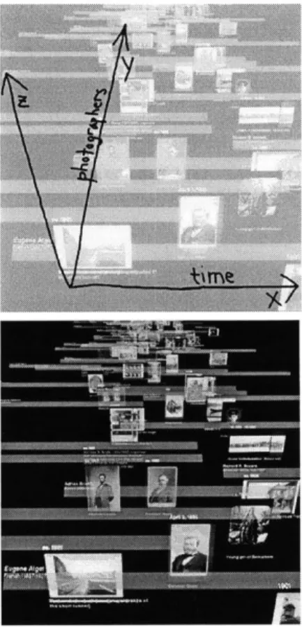
Third Prototype
A third prototype (Figure 12) switches the time axis to
the X-axis and arranges the photographers along the Y-axis
alphabetically. Each photographer has his or her own timeline,
indicated by a colored, partially transparent bar, within the
larger timeline. Each photographer bar spans from left to right
along the time axis, indicating the photographer's dates of
birth and death within the larger timeline, and is placed at an
angle. Events related to each photographer are presented
graphically in the form of text and/or images that "hang" from
that photographer's bar like clothes from a rack.
The word "hang" may seem inappropriate in an
abstract space devoid of gravity; however, the arrangement of
graphical objects in this prototype results in a feeling of "up"
and "down," which is very helpful in orientation. One result of
the first two experimental prototypes is that the way in which
two dimensional images are placed in an abstract
three-dimensional space defined a distinct feeling of "up/down" and
"front/back." Placing images "behind" each other (Figure 13)
gives the feeling that the images are "standing up" and we are
looking at them as if through a camera placed on a tripod.
Placing images side by side gives the feeling that the images
are "laying down" and we are looking at them through a
cam-era which is pointed down at the ground. Physical metaphor
based on the body is pervasive and extremely useful in visually
Figure 11. Second prototype: Y-axis shows time while the X-axis lists photog-raphers.
Figure 12. Third prototype: alphabetical listing of photographers along the Y-axis, with the X-axis as the temporal axis.
structuring and describing a virtual space [Strausfeld and
Rennison 1995].
This prototype is more successful in providing a rich
visual structure which communicates the internal structure of
the information. First, because events related to the same
photographer are suspended from the same bar, it is much
easier to connect events related to the same person. Second,
it is easier to make connections among contemporaries by
scanning the Y-axis. And third, this prototype enables a visual
overview of the information. It is now possible to see a
con-tour of time which is carved out by the lifespans of the
pho-tographer represented in the database. Patterns in the
infor-mation in the form of clusters of images and text are also
made visible. A grid along the X-axis indicates units of ten
years, and is helpful in providing a stable point of reference in
terms of scale when zooming in and out.
This prototype is weak in several areas. It is still
diffi-cult to make distinctions between photographers based on
their geographic location and their particular genre. Also, the
hanging images are often altered in color by the overlap of the
slightly transparent bars of each photographer. The bars use
transparency as a technique to give structure and at the same
time avoid obscuring information; however, because the clarity
of the images is so important to the visualization of this this
subject matter, the overlap becomes a problem (Figure 14). In
approaching this problem, I experimented with limiting the
camera to low angle framing of the images (Figure 15). From
low angles the bars appear behind the images rather than in
front. This solution has two drawbacks. First, the visual
struc-ture is designed such that all overviews are the result of high
angle framing, i.e. camera placement above the bars looking
down (the issue of providing overview will be discussed in
detail in the following section). Moving from high angle to low
angle through the bars was found to be unintuitive and
disori-enting. Second, low angle framing felt unnatural and
con-strained within the context of the overall virtual space. This
result is not inconsistent with techniques of cinema, in which
low angle framing is often reserved to serve a specific
narra-tive function [Bordwell 1990].
]PD
-W7
Figure 13. Camera orientation is often inferred by the spatial arrangement of objects.
Figure 14. Obscuring of photographs by bars indicating the lives of photogra-phers.
Figure 15. Low-angle view of the pho-tographers unobscured by bars.
Figure 16. Fourth prototype: time is shown along the X-axis while the Y-axis shows photographers arranged primarily
by the country in which they lived and
secondarily by their date of birth
Fourth Prototype
A fourth prototype is very similar to the third
proto-type. It is improved by organizing the Y-axis by the nationality
of photographers, with secondary organization within each
nationality group by the photographers' date of birth (Figure
16). The problem of the bars obscuring the photographs has
been remedied by standing the images on the bars rather
than hanging them from the bars.
The design process of constructing a
well-propor-tioned final visual structure included a rapid series of
adjust-ments to the spacing and relative scale of the graphical
ele-ments. The basic unit of spatial measurement was chosen to
be equivalent to one year. All graphical elements are scaled
and placed relative to the images. Rather than place the
images in a predetermined landscape, the landscape is built
around the images.
In order to determine the absolute scale of the
images, the images were experimentally placed in the
three-dimensional space according to the unit of measurement
cho-sen, and qualitatively evaluated.
In order to arrive at the final proportions and spacing
of the photographers bars, many design iterations varied the
width of the bars (1) relative to the size of the photographs
and text placed along the bars, and (2) relative to the other
photographers bars as they fit into the overall virtual space. Another important consideration in deciding the width of the
photographers bars was the aspect ratio of the camera. Early iterations experimented with a 1:1 ratio; the final aspect ratio of 5:4 was chosen so that the resulting image would fit the proportion of the monitor and fill the entire screen.
Scale of typographic elements was determined in part
by the semantic relationships among pieces of information.
For example, detailed information,such as the nationality of a photographer, is smaller than the information it is detailing, i.e. the name of the photographer. Other factors include qualita-tive judgments as to visual balance and proportion in relation to other graphical elements.
The visual structure provides a framework for organiz-ing a large and detailed virtual space. Point-of-view helps to communicate different aspects of the visual structure. Point-of-view (POV) is a term used in cinema to describe a shot which is optically and contextually subjective, i.e. a shot in which cues such as angle and framing impel the viewer to understand the shot as seen through the eyes of a particular character. I will use the term POV to refer to a view onto the scene in which cues such as angle and framing impel the viewer to understand the information according to a particular
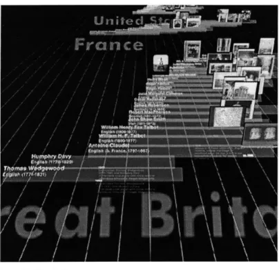
visual organizational structure or level of detail. For example, Figure 25 shows the scene from the point-of-view of nationali-ty. Other POVs include that of a particular decade or that of a particular photographer. POV is a powerful way to convey information in a dynamic virtual space. Using POV, one stable visual structure can afford the user many different ways of understanding the visual information.
Upon first consideration, the assignment of the time dimension to the X-axis in this prototype seems less than opti-mal, since it does not take advantage of the spatial time metaphor for "going ahead" and "looking back." However, using the technique of POV, one can move forward in time similarly to the way one moved forward in time in the first pro-totype. This can be achieved by repositioning the camera so that it is pointed in the X direction, then moving the camera forward along the X-axis.
3.1.2 Visualizing Dense Information
This section addresses the problem of visualizing clusters of
data without obscuring information. The visual structure of the
fourth prototype (described in the previous section) includes
accurate placement of photographs according to their date
and their photographer. This accurate placement has the
problematic side-affect of overlap between images which
were created during the same year or within a few years of
each other by the same photographer. This overlap, illustrated
in Figure 17, is undesirable because (1) it obscures parts of
images and (2) it makes clusters of images in one area appear
as one image. However, the visual effect of showing clusters
of photographs is desirable in that it communicates prolific
periods in the life of the photographer.
One solution to the overlap problem is to place the
images accurately along the time axis, but to space them out
in another dimension. This other dimension could be the
Z-axis, or even the Y-axis in conjunction with the use of parallax.
This solution was rejected because it distracted from the
over-all visual structure already established. An alternative solution
which was observed to be successful was placing the images
at an angle, slightly spaced, so that the edges of the images
are clear at all times, and the visible clusters of images more
accurately convey areas of density (Figure 18).
However, placing images at an angle still hides large
parts of some photographs. A solution to this problem is to
allow the user to interact with photographs in which she is
interested. Clicking on the edge of a particular photograph to
express interest causes the photograph to slide out and
dis-play itself with obstruction to the viewer (Figure 19).
This approach brings out another interaction
ques-tion-how do the images return to their original placement?
Does the photograph simply pause for a few seconds and
then slide back into its slot automatically, or does the user
need to activate its return by clicking on the image? Each
approach has advantages. In the first approach, the viewer is
spared the trouble of active response. However, the viewer is
troubled to go through the process again if the time during
which the photograph is displayed is insufficient. In the
sec-Figure 17. The problem of overlap among photographs by the same pho-tographer.
Figure 18. Solution to the overlap prob-lem in which photographs are displayed at an angle.
Figure 19. A photograph displays itself for the user, complete with detailed infor-mation about its photographer date, process, and size.
ond approach, the user has the chore of putting each
photo-graph away when she is finished viewing it; however, her pace
can be leisurely. Furthermore, the selected photograph can
function as a bookmark for later reference, or a history of her
viewing of the database.
3.1.3 Providing Stability
This section examines the problems related to providing
sta-bility in a dynamic environment.
The visual structure of the fourth prototype is well
defined. However, in the course of interacting with this space
by manipulating the virtual camera, several people who
evalu-ated the work noted that the graphical objects which
com-prised the visual structure often gave the impression that they
were "floating" in the virtual space (Figure 20) The floating
graphical objects were not perceived as anchored or
ground-ed in one particular location.
This lack of visual stability of the graphical objects is a
serious problem in two ways. First, it undermines the carefully
constructed visual structure. Second, it allows motion to take
on meanings which were not intended by the designer,
lead-ing to miscommunication and breakdown of visual structure.
If graphical objects are perceived as being free to
move about a virtual space, then the motion of the camera
over a stable structure of graphical objects can be interpreted
as a stable camera viewing moving objects. I will call this the
Figure 20. The problem of lack of stabili-ty: spatial differences are difficult to understand and graphical objects appear to "float."
problem of relative motion (i.e. motion in which the visual
result is identical whether it is the camera or the object which
is moving).
How can the problem of relative motion be avoided?
In an abstract virtual space, we cannot use cues from the
nat-ural environment to determine whether the camera is moving
or the graphical objects are moving. Instead, we rely on our
expectations. For example, the previous section described the
animated movement of a photograph in response to a mouse
click. When the user clicks on the photograph, there is an
expectation that the click will cause the photograph to
respond to the interaction. When the photograph slides out,
there is not even the slightest doubt that the photograph is
moving while its surroundings are stable, instead of the
inverse. By giving a graphical object the visual quality of
stabil-ity, the designer can lead the user to expect that the object will
remain stable and to interpret relative motion as movement of
the camera.
How can the designer give the visual quality of
stabil-ity? Experimental design solutions included the following
approaches:
1. Defining a stable floor indicated by two-dimensional
grids/lines and/or shadows of graphical elements
(Figure 21)
2. Orienting important structural elements along an invisible
three-dimensional grid
3. Using color to help indicate depth
4. Framing (dependent upon how many graphical objects are
in the frame)
5. Providing a heads-up display with crosshairs and/or text
6. Highlighting the area which is the focus of attention
The first solution, defining a floor, was observed to be
effective when moving the camera at right angles to the lines
indicating demarcations along the time dimension. In this
par-ticular implementation, in which the Y-axis does not represent
any quantifiable dimension, a grid would be inappropriate.
However, as a purely visual solution, it was briefly
implement-ed and found to be successful. I was not able to create a
pro-totype which used shadows to indicate a floor. Unfortunately,
Figure 21. Grounding an object. In the top illustration, the doghouse floats in space. in the bottom illustration, the doghouse is grounded on a floor by adding a two-dimensional grid.
the rendering of shadows is not supported by the Performer
library at this point in time and is extremely costly in terms of
processing.
The second solution of utilizing an invisible
three-dimensional grid was implemented by simply rotating the bars
indicating the lives of the photographers 45 degrees, so that
they lay flat, parallel to the floor, Compare Figure 20 and
Figure 22. In Figure 22, the bars feel much more stable and
thus are far more successful as structuring elements.
The third solution, using color to help indicate depth,
is also demonstrated by comparing Figure 20 and Figure 22.
Both solutions show typographic elements representing
his-torically contextual events which are placed between the
images and the floor. In the Figure 20, the placement of these
typographic elements is unclear. Because of their brightness,
they seem to hover in the foreground. Figure 22 shows that
this effect can be avoided by choosing colors of lower
satura-tion and value.
The fourth solution involves controlling camera
move-ment to reduce the effects of relative motion. It was
discov-ered that the feeling that the graphical objects were moving
was at least partially dependent upon how many graphical
objects (especially structuring elements such as the
photogra-phers' bars) are in the frame at the time. When the camera is
Figure 22. Increased visual stability Color is used to better indicate depth, and bars are laid parallel to the ground.
placed at a closeup range at which very few graphical objects
appear in the frame, the structural elements are less effective
at conveying structure and the graphical objects seem less
stable. When the camera is placed at a medium range at
which many graphical objects appear in the frame, the
struc-tural elements seem more effective. This could be due to an
expectation that the movement of a few graphical elements is
far more likely to happen than the movement of a great
num-ber of visually structured graphical elements.
The fifth solution, providing a heads-up display with
crosshairs and/or text, is borrowed from the realm of video
games and flight simulators. The use of crosshairs (Figure 23)
was not found to be particularly helpful in avoiding relative
motion problems, and was furthermore found to be
distract-ing. The use of text to indicate the year in the center of the
screen was, on the other hand, found to be extremely helpful
in orientation. As the user moves, the text indicating the year
is continuously updated to reflect her current location in time.
The sixth solution, highlighting the center of attention,
was implemented in the form of perpendicular bars which ran
parallel to the floor and which crossed in the center of
atten-tion. This solution, shown in Figure 24, did little to ease the
problem of relative motion.
3.2 Overview and Detail
The problem of providing overview while allowing easy access
to more detailed levels of information is approached by visually
filtering the information. In this solution, all the graphical
objects which represent different levels of detail exist
simulta-neously. By visually filtering the information, the designer can
avoid information overload and support smooth transition
between overview and detail. This section describes a subtle
range of experimental solutions designed to strike a delicate
balance between visually indicating the possibility of accessing
infinite amounts of information, and providing clear overviews
of the visual structure and the different dimensions intrinsic to
the information.
Figure 23. Experimenting with crosshairs.
Figure 24. Experimenting with bars to indicate center of attention.
3.2.1 Providing Overview
In approaching the problem of providing a visual overview, I
began by applying metaphor. Taking the word "overview"
liter-ally, I designed the visual structure in such a way that
position-ing the camera at a high angle, lookposition-ing down over the
infor-mation, would result in an uncluttered (filtered) view of the
visual structure showing the photographers and countries
rep-resented in the database (Figure 25). This approach takes
advantage of the fact that, when viewed from the top, flat
ver-tical elements become invisible. By placing the bars indicating
the lives of the photographers at a 45 degree angle to the X-Y
plane (Figure 26), I intended to allow the user to view the bars
both from the top, to get an overview uncluttered by
pho-tographs and more detailed typographic elements, and from
the front, to see the photographs and more detailed
typo-graphic elements. As the circular movement of the camera
from a top view to a front view is animated on the screen,
there is a smooth transition between two levels of detail as the
photographs gradually become more visible.
This type of overview was observed to be successful
in communicating information about the photographers and
countries represented by the database. Especially successful
is the smooth transitioning from overview to more detail
through animated camera movement.
Other types of overview which it is desirable to
com-municate include overviews of photographers by their genre,
of photographs by their process or subject matter, or of a
par-ticular year or decade. How can the chosen visual structure
support these other types of overviews? One solution is to
alter the visual structure in response to user query. Another
solution is to maintain one visual structure and use visual
filter-ing techniques to highlight the pertinent information. Because
of the strong emphasis this research places on providing and
maintaining visual structure as an aid to orientation and
com-prehension of the information in context, I chose to focus on
exploring the second solution.
3.2.2 Filtering
This section explores the use of different visual techniques for
filtering information in order to avoid visual overload and to
Figure 25. Overview of the photogra-phers active in Great Britain who are
rep-resented in the database.
top 1 top view front / front view side side view
Figure 26. Bars placed at a 45 degree angle can be viewed both from the top and from the front.
provide different types of overviews. Three experimental solu-tions were identified:
1. use of transparency and resolution in drawing a graphical
object as a function of its distance from the camera 2. use of point-of-view/framing to reduce the amount of
infor-mation at a given time
3. use of color and transparency to highlight information
4. use of temporal presentation to form sequences of the information
The first solution uses a technique which I will refer to as level of abstraction. Using this technique, a graphical object is drawn at a level of abstraction that is a function of its dis-tance from the camera. Figure 27 illustrates the implementa-tion of four levels of abstracimplementa-tion. As an object moves farther
away from the camera (or as the camera moves farther away from the object), the object is drawn at a higher level of
abstraction (Figure 28). This increases rendering speed and parallels human vision. To avoid distracting visual artifacts when transitioning from one level of abstraction to the next, there is a transition zone in which the two levels of abstraction
are smoothly blended. One way in which this research uses level of abstraction is in the presentation of the photographic images. When the camera is close to a photograph, it is pre-sented at its highest resolution. As the camera moves away from the photograph, the photograph smoothly transitions to
a lower resolution version of the same image. Not only does this reduce the rendering time, but it reduces the amount of
information presented to the user and helps to focus the user's attention.
Early experiments applying level of abstraction to typographic elements used three zones. The first level pre-sented the typographic element at its highest resolution, as an anti-aliased image. The second level presented filled polygons
Robin L. Kullberg * Dynamic Timelines
Figure 27. Four levels of abstraction, moving from less abstract to more abstract (left to right). Taken from McCloud's Understanding Comics.
most
detaled less more detaitaabstractabstractmost distance
LP from camera
Figure 28. The level of abstraction of a graphical element is determined by its distance from the camera.