AIDE: A Case-Based Approach for Designing
Graphics From Locative and Temporal Data
by Craig Michael KanarickBachelor of Arts, University of Pennsylvania, 1989.
Bachelor of Applied Science/Computer Science, University of Pennsylvania, 1989.
Submitted to the Program in Media Arts and Sciences, School of Architecture and Planning in partial fulfillment of the requirements for the degree of
Master of Science in Visual Studies
at the Massachusetts Institute of Technology, September 1993.
© Copyright 1993 Massachusetts Institute of Technology, all rights reserved.
12
[Sdences
Writif/ed
Muriel R. ooper, B. Professor of yisual $udies
Thesis agvisbr
accepfte
by
Stephen A. Benton
Chairman, Departmental Committee on Graduate Students
Rotch
MASSACHUSETTS INSTITUTE
OF TF N'4' "
'OCT
18 1993
AIDE: A Case-Based Approach for Designing
Graphics From Locative and Temporal Data
by Craig Michael KanarickSubmitted to the Program in Media Arts and Sciences, School of Architecture and Planning on July 1, 1993 in partial fulfillment of the requirements for the degree of
Master of Science in Visual Studies
at the Massachusetts Institute of Technology.
abstract
This thesis describes a research system called aide: automated intelligent design expert that creates graphics from data. It assists users of data who wish to design graphics by combining artificial intelligence techniques with current automated design software paradigms. The work extends previous research in four ways. First, it combines the artificial intelligence technique known as case-based reasoning with traditional rule-based automated layout techniques. Case-based reasoning is used to choose a graphical template from a library of examples and is also used to instantiate the graphical aspects of the image. This approach is investigated because it is
well matched to the process that people take when designing -- adapting old designs to new
situations.
Because of their cognitive importance, the rule-based components of aide have special design knowledge for temporal and locative information, allowing the system to present this type of information in unique ways.
Like other automatic layout systems, aide is capable of producing traditional static graphics. In addition, however, aide can also design and present dynamic graphics.
Finally, aide runs in a one-of-a-kind large high-resolution display environment. This, combined with a unique set of design skills and techniques, allows the system to produce graphical images of a higher quality than found previously.
The research presented here contributes to the fields of artificial intelligence and automated graphic design by effectively combining them in one system. aide, the resulting prototype application, can be used to generate a number of different high-quality graphical representations from application independent data and offers potential benefits for anyone who needs to analyze or present data.
Thesis advisor: Muriel Cooper, Professor of Visual Studies.
This work was sponsored in part by the Defense Agency Research Projects Administration DARPA), International Business Machines Incorporated (IBM), the Department of Transportation (DOT), and Nynex Incorporated.
AIDE: A Case-Based Approach for Designing
Graphics From Locative and Temporal Data
by Craig Michael KanarickThe following people served as readers for this thesis.
ZIZ/"
// / / /N/A : / // / / 'esis
advisor
--Muriel Ruth Cooper, B. F.
Professor of Visual dies, MIT Media Laboratory
Director, Vis Lan age Workshop
Kenneth Haase, Ph. D.
Assistant Professor,MIT Media Laboratory
reader
Joe Marks, Ph. D.
Member of Research Staff, Digital Equipment Corporation Lecturer in Computer Science, Harvard University
acknowledgments
table of contents
acknowledgments ... 4
table of contents ... 5
1 introduction...6
ov erv ie w
...
6
2 the user interaction ... 13
th e sc re e n
...
13
the inp ut d ata
...
15
looking at the library of examples
...
17
"final" g ra p hics ... 18
the
key ... 21kee p in
g track
...
23
3 previous related work...24
the graphical presentation of static information
...
24
perceptual psychology and statistical graphics... 26
automated graphical presentations
...
27
4 case-based reasoning in aide... 29
case based reasoning ... ... 29
the analysis module
...
31
the rating module
e...
33
the adaptation module .eS...e.C...34
5 the designer component ... ... 38
the graphing module
a o ...
38
graphic variables ....
pora...39
displaying the graph
whie. aitanig...
e
...
39
traditional graphical forms...
... 39
chartmaps ... ci...40
automated temporal diagrams
...
42
labeling of data points while maintaining legibility
...
45
editing the encoding
...
48
extending the encoding...
49
6 conclusions... 51
summary1...51
areas for future work... 52
evaluation... 54
references ... 55
appendix a - related readings ... 57
appendix b - biographies of readers ... 59
1
introduction
Number 6: What do you want? Number 2: Information!Number 6: Whose side are you on? Number 2: That would be telling. Number 2: We want information. Number 2: Information.
Number 2: Information! Number 6: You won't get it!
Number 2: By hook or by crook, we will.
-The Prisoner
No statistical package exists that can take raw data and analyze them a priori. The statistician must have ideas about the kinds of structures present in the data before applying even the most general analytical procedure. Possibly the most powerful tool for this initial exploratory data analysis is the graph.
- Colin Ware and John Beatty
overview
The current era has often been dubbed "the information age." As computers become a more integral part of society, they produce more data with each passing minute. Databases can describe a collection of objects, customers, employees, sales figures, the results of scientific experiments, medical histories, events, places, or just about any other phenomena. Not only is the number of such databases increasing, but their size and complexity are growing as well. Databases, as such, are not inherently useful, for they are just collections of data. However, buried within each database is information. We can consider information to be, among other
things, relevant or important aspects of the data. That is to say that each set of data contains trends, patterns, and relationships among the elements and their characteristics (the lack of an easy-to-describe trend or pattern being a pattern in and of itself). These trends and patterns often tell important stories about the data in question and are needed to solve real problems. The ability to quickly and efficiently discover such information buried in a database is valuable and grows more difficult with its size and complexity
Data can be analyzed in many different ways. However, as Ware and Beatty point out, the most powerful way to analyze a database as a whole and to get a good overall view of the information within a database, especially if the user has no a priori knowledge of the database, is through the use of a graphical presentation (e.g., a chart, diagram, or map).
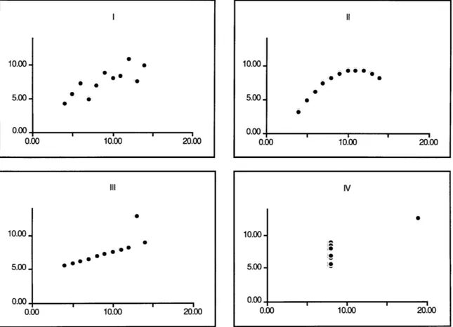
For example, consider the data in Figure 1.1: 1 1| Ill IV N x yx yxyxy 1 10.00 8.04 10.00 9.14 10.00 7.46 8.00 6.58 2 8.00 6.95 8.00 8.14 8.00 6.77 8.00 5.76 3 13.00 7.58 13.00 8.74 13.00 12.74 8.00 7.71 4 9.00 8.81 9.00 8.77 9.00 7.11 8.00 8.84 5 11.00 8.33 11.00 9.26 11.00 7.81 8.00 8.47 6 14.00 9.96 14.00 8.10 14.00 8.84 8.00 7.04 7 6.00 7.24 6.00 6.13 6.00 6.08 8.00 5.25 8 4.00 4.26 4.00 3.10 4.00 5.39 19.00 12.50 9 12.00 10.84 12.00 9.13 12.00 8.15 8.00 5.56 10 7.00 4.82 7.00 7.26 7.00 6.42 8.00 7.91 11 5.00 5.68 5.00 4.74 5.00 5.73 8.00 6.89
Figure 1.1. A tabular arrangement of Anscombe's quartet. For each of thefour sets, N = 11, mean of x's = 9.0, mean of y's = 7.5,
equation of regression line: y = 3 + .5x, standard error of estimate of slope = 0.118, t = 4.24, sum of squares of x = 111.0, regression
sum of squares = 27.5, residual sum of squares of y = 13.75, correlation coefficient = .82, and t2 = .67.
This data, called Anscombe's quartet (Anscombe, 1973; Tufte 1983) contains four sets of data each described by the same linear model. It is difficult to tell by looking at the table above, but even though the four sets are described by the same model, as the visual representations of the data illustrate, each of the four sets is quite different.
10.00-
5.00-0.001
0.00 10.00 20.00 Ill 0 10.00-5.00. e * 0.00. 0.00 10.00 20.00 Il 10.00. 0 5.00. 0 0.00. 0.00 10.00 20.00 IV 10.00-5.00. 0.00 0.00 10.00 20.00This examples illustrates how much easier it can be for a user to understand a set of data by looking at a visual representation than a tabular arrangement. It is easier to recognize patterns, determine trends, or discover other information by using our perceptual skills for recognizing shapes, colors, and positional arrangement of objects than it is to parse a table of textual
information. Graphical images are often more inviting than tables of data and allow the user an opportunity to investigate and examine data in a way just not available with tables. In addition, graphics can often condense data, allowing a view to analyze thousands or millions of data in one visual experience. For hundreds of years people have been making such charts and diagrams from data.
However, the variations on graphical forms are limitless. Choosing the appropriate graphical form for a particular set of data is no easy task. Each aspect of the design, the color of the marks, the width of the lines, the size of the labels, all of these communicate information and play a role in the effectiveness of the graphical presentation.
For example, Figure 1.3 shows the same data in two different formats. The image on the left shows an obvious pattern, while the one on the right does not. One could argue that the left image is more useful (or more effective) than the one on the right.
Figure 1.3. Two different graphical presentations of the same data from Anscombe's quartet. Both graphs are visualizations of Group II, however, the graph on the left is a scatterplot of x vs. y, while the graph on the right is a barchart of N vs. y.
Trained graphic designers are specialists in this area, and are often given the responsibility of turning tables of data into powerful images that illustrate the underlying information in the database. This process of turning data into images involves choosing the format of the graphic, choosing the colors and symbols that comprise the graph, choosing the fonts, and hundreds of
other decisions that on the surface might seem simple, but are in reality extremely complex -- for
each decision has a direct impact on the legibility, expressivity, and effectiveness of the final graphical image.
Since the need to go from data to image is so common, it is hardly cost-effective or time-effective to hire a trained designer every time a user needs a graphic. As a result, the ability to visualize
10.00-0 00Ol 5.00. 0.00. 0.0 10.00 20.00 5 .00 7 2.00 4.00 6.00 14.00 11-00 9.00 13.00 8.*00 10.00 0.00 5.00 10.00
data has been given to the general user through production software, spreadsheets, and statistical tools.
There are two major drawbacks to the current ways of putting this power in the users' hands. First, the graphical intelligence of these systems is severely limited. The user must often make many design choices, including which form to use (scatterplot, pie chart, bar chart, etc.), which characteristics should go on the x axis, which on the y axis, what the tick marks should be like, and so on. The user is often not a trained designer, and hence, is not equipped with the skills needed to produce effective graphics.
The second problem is the graphical power of such programs is limited. This means that even if the user makes reasonable design choices, the graphical quality of the images that can be created is not very high. In most cases, the system just doesn't provide enough control over the
individual design aspects of the image, such as the size of the marks, the colors, and so on.
What are possible solutions to these problems? Providing more control over the various design aspects would solve the second problem, but would make the first even more acute. However, if we could abstract the process of turning data into graphs and generate a set of rules for this process, these rules could be codified in software and a virtual designer could perform the job of a trained graphic designer. Current research in this area has met with limited, although
significant, success. One of the biggest problems is that the design process is too complex and large to be codified in a set of simple rules. It does appear that designers follow general
guidelines and styles when designing. However, these styles and guidelines are so complex, it seems unlikely that they could be delineated in a comprehensive list of strict conditional rules.
An alternative theory about the process of design is that designers borrow ideas from other
designs -- that is to say they create new designs based on old ones. Consider a particular diagram
that communicates information about some specific set of data effectively and is easy to understand. If the data changes slightly (i.e., if the data is about horses, maybe the height of a horse changes), it would not be useful to completely redesign the graphic. Similarly, if afew of the values in the dataset change, it would not make sense to completely redesign the graphic. The alternative is merely to modify the original visualization to reflect the new state of the data. As such, these new images could be considered to be "based" on the original. Design often happens this way -- adapting other graphics to the state of the "new" data. The more different the new data from the old, the more redesign is needed. At some point, when the new data is
This idea is further illustrated in Figure 1.4. In this figure there are four graphs, all graphed in the same form. The values of the data being represented varies greatly from graph to graph,
however. In the two left graphs the images represent time (year) and dollars, whose values range from -640,000,000 to 2,540,000,000. In the third graph, the image also represents time (year) and dollars, yet the dollar values range from -.91 to 3.6. The graph on the furthest right represents time (year) and percentage (values ranging from -3.5 to 10.5). Each of the four graphs displays time against some numerical value, yet the magnitude of the numbers varies drastically from image to image. However, the same graphical style is useful for each of the four datasets.
Revenues IDollars in billions) N1 82 83 84 65 2.14 2.54 1.04 1.83 1.0 Net Income jDollars in billions) 81 82 8 84 85 .225 .240 (.064).071 .06
Earnings Per Share
(Dollars)
81 82 83 84 85
3.2e 3.00 (.91) 1.00 1.25
Return on Revenues
(Percent)
Afte-tax profit nargin
S1 82 83 84 85 10.6 *.a (3.8) 3.0 4.6
Figure 1.4. Four similar barcharts from the 1985 annual report of Baker International. (Graphis Diagram, 1988).
In the example above, each of the four datasets was illustrated using the same basic design. This was possible because the datasets were relatively similar. However, if one of the datasets were extremely different, a new design would have been needed. For example, if the revenues were categorized into "great", "good", "fair", and "bad", instead of being given in billions of dollars, the barchart shown above would not have been able to convey this information appropriately. As stated earlier, the more different the new data from the old, the more redesign is needed.
It is possible to use an artificial intelligence technique called case-based reasoning to model this behavior. This thesis describes a prototype of such a system, called aide: automated intelligent design assistant. aide is a system that uses case-based reasoning to automate part of the process of graphic design. aide takes a set of application-independent data as input and has a library of different data sets and their graphical representations. It compares the new data to the examples in the library, and based on input from the user, attempts to create a new design based on one of the examples. As an assistant, it does not merely take in data and produce graphics, but assists the user in the process of generating statistical graphics from data. This means that the user is an
integral part of the design process. Figure 1.5 shows a very general block diagram of the system.1
The stick-figure ( ) indicates areas where user input is required.
input data case-based reasoner designer graphic output
11 234 45 Blue Fast analysis graphing
11 Blue Slow module module 6 122 18 Red Fast
83 43 GenS
84 103 13 Blue Slow da rai9
25 100 11 Blue Fast r Th
encoding encoding
1 n5 on Sgow avowt Ieditor extender
12 49 17 Yellow Fast
adaptation
43 23 11 Blue Slow module
Figure 1.5. A general block diagram for aide.
How does the system work? The first half of the process utilizes the artificial intelligence
technique called case-based reasoning. The analysis module takes the input database and produces an abstract representation of the data, called the shape, by performing some traditional statistical analyses of the data and their characteristics. This analysis includes sorting the characteristics into nominal, ordinal, and quantitative categories. In addition, aide extends this paradigm by treating two aspects of characteristics as special. These aspects are locative and temporal, and are singled out because of their special cognitive value. People have a natural tendency to organize things with respect to places and time. Hence, any system that tries to design like a human being must have knowledge of these aspects, and appropriate design rules to visually represent this data.
Once the system creates a simple description of the input database, it then compares the input database's shape to a library of example graphs. The rating module compares the shape of the input data to each of the examples' shapes to assess each as a possible basis for the visual
representation of the input database. aide visually displays a subset of the examples along with their ratings and in doing so, provides the user with guidance about how to proceed. At this
point, the user chooses an example and the system passes the input data and the chosen example to the adaptation module that modifies the chosen example to fit the input database.
Once the example is adapted, aide then passes the adapted example and the input data to the
designer component. This component lays out a large, full-color visual representation of the data
based on the adapted encoding and provides the user with an easy and effective way to discover the information buried within the data. The user can then choose another example from the library, modify the graph manually, or in relevant situations, ask the system to try to "extend"
the graphic to convey more information2, through the use of a rule-based design component
similar to those found in other work. Once a user is satisfied with a graphic, he can add the new image to the example library for future use.
aide extends previous research in a number of important ways: 1) It combines the artificial intelligence technique known as case-based reasoning with traditional rule-based automated layout techniques; 2) Because of their special cognitive value, the rule-based designer component of aide treats temporal and locative information as special and contains special design rules to represent these characteristics; 3) Just as other automated layout systems, aide can design and present static images, but the system is also capable of producing dynamic graphics; and 4) aide contains a number of sophisticated new design skills that combined with its unique display environment allow the system to create graphics of a higher quality than in previous work.
This thesis is composed of different sections. Chapter 2 contains a description of the user
interface and how the system looks and feels to a user. Chapter 3 contains an overview of related work. Chapters 4 and 5 delve into the "behind-the-scenes" activities of aide -- Chapter 4 explains the case-based reasoning aspects of aide and Chapter 5 describes the graphing aspects of the system. Chapter 6 concludes the document with a discussion of performance criteria, a summary of the contribution of aide to various fields of research and a discussion of areas for future work.
aide was developed on the Large High Resolution Display (LHRD) Prototype, a 6044x2048, 100 pixel-per-inch display prototype developed in the Visible Language Workshop (VLW) at the MIT Media Lab (Mashiushi, et. al, 1991). The LHRD is composed of hardware including: Sony 2000-line monitors, frame-buffers made by Metheus, and an IBM RS/6000 workstation running
AIX/3.2. The VLW window system, BadWindows version 2.0, and a number of VLW libraries
were used to create the user interface. All other code was written by the author in C.
2 aide has a "goal" to try and represent as much information about the data as possible. To this end, it tries to represent as many of the database's characteristics graphically. If the user chooses an example that visually presents fewer than all of the characteristics, it is possible in some cases to "extend" the image to provide more information.
2
the user interaction
One of the features of aide is a complex feedback loop that makes the user an integral part of the design process. aide is not a completely automated designer. Instead, it is meant to be used as an
assistant in the design process. This section describes the user interface and interaction with the
system.
the screen
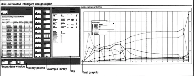
The screen is organized into five primary sections. There is an area where the input data is presented to the user along with some information about its shape, an abstract description of the characteristics of the database. There is an area where the user can view the library of examples and a measure of how "good" the system thinks that example would serve as a basis for a visualization of the input data. There is a large section of the screen used by the designer component to draw the graphic, and a key to the graph. In addition, there is a visual history area of the screen. Figure 2.1 shows an image of the entire display.
Figure 2.1. aide's user interface.
The section on the far left is an area for displaying the input data in tabular format. Directly to the right of this is a visualization of a subset of the example library. To the right of this is a the
key. The large area to the right of this is the area for the fully renderedfinal graphic. In the lower
left corner of the display is the history palette, where rough copies of the final graphics produced are archived. Each of these areas of the screen is described in more detail in this chapter.
aide is a highly interactive system. Once the user provides the system with some input data, he has a lot of control over how the system graphs the data. Figure 2.2 contains a schematic
describing the interaction between the user and the system.
the input data
When aide first starts up, it displays the input data to the user in the input data window. The data is displayed in a spreadsheet-like format in order to give the user an opportunity to see the data as a table. In the current implementation, the user can only look at the data in the tabular format. Future work includes adding the ability for the user to edit the input data, select subsets of the data to be graphed, and other similar tasks.
While the tabular format can be useful, aide's main purpose is to assist in designing more powerful and informative visualizations. aide rests on the theory that the content of the data is not as important to creating a good design as the structure of the data itself. After the system displays the input data as a table, it computes an abstract description of the input data, called its
shape. The shape of the data includes the number of different kinds (nominal, ordinal, or quantitative) of characteristics and the number of the different aspects (temporal, locative, or standard) of characteristics are in the database as well as some other statistical values. Once the shape of the input data is computed, a barchart visualization of it is presented to the user.
Figure 2.3 shows the input data window, including part of an example input database and a visualization of its shape.
input data's shape:
input data:
Name: Time Skill Name Activation Threshold Executable Execute Status Kind: ordinal nominal quantitative quantitative ordinal nominal Aspect: temporal standard standard standard standard standard
0 pickUpSprayer 0.00 45.00 no inactive 0 pickUpSander 0.00 45.00 no inactive 0 pickUpBoard 0.00 45.00 no inactive 0 putDownSprayer 0.00 45.00 no inactive 0 sandBoardlnVise 0.00 45.00 no inactive 1 pickUpSprayer 13.33 40.50 no inactive 1 pickUpSander 13.33 40.50 no inactive 1 pickUpBoard 13.33 40.50 no inactive 1 putDownSprayer 0.00 40.50 no inactive 1 sandBoardlnVise 37.22 40.50 no inactive
2 pickUpSprayer 37.45 36.45 yes activated
2 pickUpSander 37.87 36.45 yes inactive
2 pickUpBoard 23.93 36.45 no inactive
2 putDownSprayer 0.71 36.45 no inactive
2 sandBoardinVise 28.04 36.45 no inactive
Figure 2.3. The input data window. The top half of the window contains a tabular format visualization of the data, while the bottom half contains a barchart representation of the data's shape.
This data is a set of values from sanderWorld, (Johnson, unpublished) a simple virtual environment in which a robot consisting of various autonomous skill agents is given two
potentially conflicting goals: to spray paint itself and to sand a board (Maes, 1990). The difficulty arises because the robot has limited resources and constraints on its actions. The data represents the various parameters of each of the individual agents during a run of the system over a span of time, including the name of the agent, its "activation" level (how badly it "wants" to execute), its threshold for activation, and its execute state.
looking at the library of examples
10 examples from library: U
A barchart vertical barchart
0
Acme rental barchart horizontal barchart
Playfair Debt Linchart linechart
0
1
1111]0~
Abrchart vertical barchart
15[
A bthart vertical barchart
19
aide datashape 24 vertical barchart
I I ...
Synco inc. 1992 scatterplot
Aibachart vertical barchart
I ]
~~30
miIEmety herntal barchart horizontal barchart
35-Empty linechart vertical barchart 35
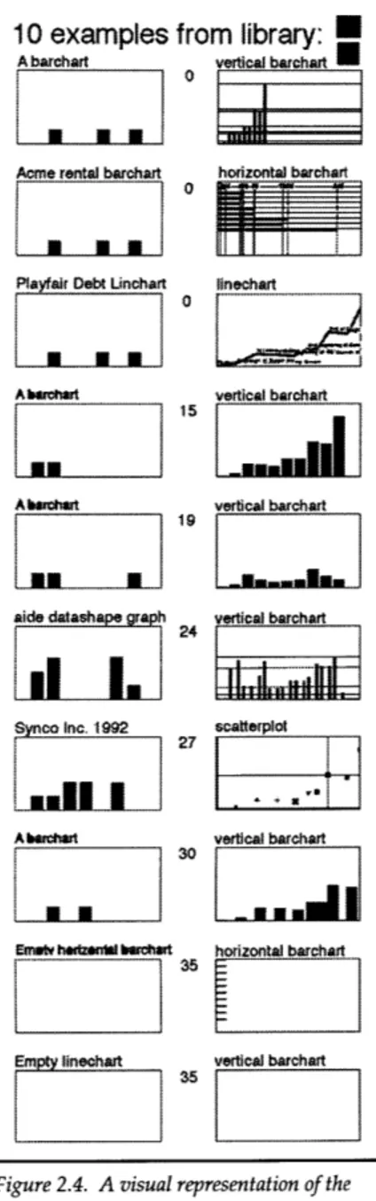
Figure 2.4. A visual representation of the ten best-rated examplesfrom the library of examples.
Once aide computes the shape of the database, it uses this as a basis for suggesting an example on which to base the
graphical visualization of the input data. aide contains a library of examples, each of which includes a graphical image,
the shape of the database visualized in that example, and an
abstract description of the design of the image, called the
encoding. After computing the input data's shape, it is
compared to each of the example's shapes, and each example is rated as a possible basis for the new visualization. This process is described in detail in Chapter 4. Once each example is rated, the ten most similar examples are presented to the user along with their rating, providing guidance about how to continue. Figure 2.4 illustrates how examples are presented.
The column on the left shows a graphical representation of the
shape of the example. It is a rather simple graphic: since there
are three kinds3 and three aspects
4
of characteristics, there arenine kind-aspect combination. The graphical representation of the shape is a simple barchart showing the number of each
type of characteristic in the database. To the right of each of these graphs is a small rough draft of what the graph would look like if the user chose that example. The number between the two images is the rating, or difference, between the shape of the input data and the shape of the data from the example. If the user is unsatisfied with any of the examples shown, he can scroll through the library by using the two scroller buttons in the upper right corner.
By providing the user with rough drafts of the potential
graph, the user can quickly compare the different potential graphics and choose one to his liking. This pre-visualization step can save the user valuable time, as the rendering of the final graphic can often take a significant amount of time, especially in the case of dynamic graphics. To create afinal graphic from one of the examples shown, the user need only click on the rough draft. After the user chooses an example, the system proceeds to draw the larger, fully rendered version of the graphic.
3 Nominal, ordinal, or quantitative. A complete description of these kinds is given in Chapter 3.
"final"
graphics
After the user chooses an example from the database, the system adapts that example to the input data. A detailed description of this adaptation process is given in later chapters.
One of the problems with traditional data analysis packages that allow a user to "graph" data is that the graphical options are fairly limited. Assume that you are a user of a typical spreadsheet package and you have a large set of data (many rows and columns) that you wish to visualize. If you choose to make a scatterplot of the data, for example, you are severely limited in terms of how much control you have over the image. With most programs, you could only choose which characteristics to place on the x and y axes. However, there are many other aspects of the graph that are important parts of the design -- the tick marks, the grid lines, the size, color,
transparency, and texture of the marks, and so on. Design aspects such as the size and color of the marks, however, can carry additional information about the data. Most visualization
packages, however, don't allow the user to assign a characteristic of the data to the color or size of the marks. The most common scenario is that the machine picks a value and assigns all the marks the same size and color. In some advanced systems, the user can set the color and size of the marks individually, but must do so for each mark on the graph. In the first situation, the graph is not as expressive as it could be. In the latter case, the user just has to work to hard to make the graph expressive. For a system to be able to make expressive statistical chart graphic, it must be able to have characteristics of the data assigned to as many graphical aspects of the
image as possible.
In aide, there are a large number of graphical aspects of the images that can convey information about the input data. These graphical aspects are called the set of graphic variables and differ for each graphical form (scatterplot, linechart, barchart, etc.) Each of the graphic variables can be
instantiated in a visualization in different ways -- they can either be a constant value or they can
be a function of one of the characteristics of the input data. For example, in a scatterplot of the
sanderWorld data, the shape of the marks could be determined by the characteristic "executable".
As described earlier, each of the examples in the library contains a graphic image, the shape of the data for that graphic, and an abstract description of the design of the image. This description is called the encoding of the graph. An encoding contains a list of the graphic variables for the specific graphical form, and a list of encoders that describe how each of the graphic variables is instantiated.
An encoder can be assigned a constant value, a description of a characteristic in a database, or be
empty (in which case the system chooses a reasonable default value). In addition, the system can assign the same characteristic to more than one graphic variable. For example, both the color and shape of marks in a scatterplot could be determined by the same characteristic of a database.
Once the user chooses an example from the library, aide adapts its encoding to the input data (this process is described in the section about the adaptation module). Once the encoding has been adapted to the input data, the system renders a large graphical visualization of the input data in a 4000x2000 pixel window. This large image is referred to as a final graphic.
Figure 2.5. This is the graph produced by aide for the data about agents.
Figure 2.5 shows a visualization of the data from the sanderWorld dataset. In the image, the characteristic named "Time" is assigned to the x-axis and "activation" is assigned to the y-axis. Both graphic variables "line number" and "color" are instantiated from the characteristic named "Skill Name". The shapes of the plot marks are determined by the characteristic "execute status", and the transparency of the line and the marks is determined by the characteristic named
"executable". As a result, all of the characteristics of the database are represented visually in different visual aspects of the image.
This is an effective way of displaying information because of the natural ability of humans to perceive the different visual components of the image separately. For example, if two objects have the same color but different shape, a typical person can still tell them apart. Humans have the ability to filter, as it were, based upon one or more visual property. By doing so, the user can quickly analyze the data and discover the information within the image.
aide was used to visualize the data from a few different runs of the sanderWorld system in order
to find a problem with the robot. A situation arose in which the robot refused to activate a particular agent, even though all of its conditions for activation appeared to have been met. After spending a number of hours perusing the code and looking at the data in the tabular format, the bug could not be discovered. However, only a few seconds after aide presented the information visually, the bug was spotted. By being able to see the data from all of the agents from the entire run at the same time, finding the problem took only a few seconds, and provided a solution to a problem that would have been much more difficult to discover with other methods.
the key
As the system renders the final graphic version of the data, a key is displayed to the user, showing
how the system creates the graphic.
aide's key is a simple one: it lists all of the graphic variables and a simple explanation of how they were instantiated. At the top part of the key, the information for each of the graphic variables is listed. On the color display, each row is color coded to reflect whether it is assigned a constant value, derived from a characteristic of the data, or derived from another graphic variable. At the bottom half of this window, other information included in the encoding is displayed, including the information about the grid, axis scales, and tick marks. Figure 2.6 shows a key from the linechart visualization of the sanderWorld database shown earlier.
the key:
encoding for: William Playfair Diagram #946
graph type: linechart
history type: none
graphic variable information:
graphic variable derived from min max flipped
color Skill Name no
transparency Executable 0 180 no
line number color no
label No Encoder M
label size 18 pixels 12 ac 3
abc
noshape Execute status no
shape size 18 pixels 10
0
40Wo
x axis Time no
y axis Activation ro
linewidth
No encoder
10
40
Uo
other information:
vertical scale: 10 ticks adaptive text: ro
horizontal scale: 5 ticks non-overlapping text: yes
vertival grid: yes
horizontal grid: yes
top ticks: no top outline: yes
right ticks: ro right outline: yes
bottom ticks: ro bottom outline: yes
left ticks: no left outline: yes
In this example, the characteristic named "Time" is assigned to the x-axis and "activation" is assigned to the y-axis. Both graphic variables "line number" and "color" are instantiated from the characteristic named "Skill Name". The shapes of the plot marks are determined by the
characteristic "execute status", and the transparency of the line and the marks is determined by the characteristic named "executable".
Even though it appears as a simple list of the graphical aspects of the image, the key is an active
key, as clicking on different areas of the key provide the user with more detailed information. For
example, if the user clicks on any of the names of the graphic variables, a visual presentation of the values used for that graphic variable is shown to the user. In the key shown in Figure 2.6, if a user clicked on the word "color", the following color key could pop up:
Color key:
(derived from characteristic named "Skill Name")
W
pickUpSprayerD
pickUpSanderputDownSander sandBoardInVise pickUpBoard
keeping track
For eachfinal graphic drawn, a rough copy of the graphic image is copied to the "history palette" displayed at the bottom left corner of the screen. This palette provides the user with a visual history of the steps taken to produce the current graphic. The user can click on any of the rough
graphs in the history palette and the system will redraw the "final" version of that graphic. Figure 2.8 shows an example history palette from a session with aide.
graphing history:
K----E---K---Figure 2.8. The history palette.
In the example above, we can see (reading from left to right) that the user first created a linechart, then a vertical barchart, then a horizontal barchart. He then created three similar vertical
barcharts. The graph on the right end is another linechart. In the current implementation, there is space for ten rough drafts (even though the example above only shows seven). The program will soon be extended to allow for more rough drafts to be saved and for the user to be able to scroll through the history palette.
3
previous related work
The use of graphs, bar charts, scatterplots, and other types of diagrams can be traced back to at least the late 1700's and the work of Playfair and De Fourcroy (Playfair, 1786; de Dainville,
1958). An example of one of Playfair's earliest
works is shown in Figure 3.1, to the left. At least three areas of research in the field of statistical graphics design need to be
examined: systematic algorithms for creating static visualizations of information,
perceptual psychology studies of statistical graphics methods, and the implementation of computer generated visualizations of
information.
the graphical presentation of static
information
Over the years there have been many efforts to formalize the process designing statistical charts and maps. One of the most
comprehensive and acclaimed efforts in this area comes from Jacques Bertin and is outlined in his Semiology of Graphics (Bertin
Figure 3. 1. A barchart designed by William Playfair in 1780.
1983). In this work, Bertin describes a series
of general guidelines for creating graphs and charts. Much of his work rests on the theory that while the content of the data is important, characteristics can be grouped into general kinds, and that the distribution of these characteristics within a database is just as important, if not more so.
The first step of Bertin's methodology involves an analysis of the characteristics of the data as a whole. This analysis is a multi-step process beginning with computing the number of
"components" for the elements in the database.5 The next step is sorting each of these characteristics into three categories, nominal, ordinal, and quantitative. This categorization is mostly a description of the granularity of the values for the characteristic in question.
5 Bertin uses the word "component" to mean some sort of characteristic of an element of the database which can vary
from element to element (e.g., sex, width, length, speed, age, name, etc.). I use the word "characteristic" for this same notion.
These three categories are defined as follows:
e nominal: the values of nominal characteristics fall into non-ordered categories. These
characteristics are sometimes referred to as qualitative .
e ordinal: ordered characteristics where the distance between the different possible values is
the same for every possible value
e quantitative: the values of quantitative characteristics are actual values, usually numerical.
For example, let's consider a database consisting of Olympic medalists, their physical
characteristics, and their favorite brands of soft drinks. Characteristics like "height "and "weight" would be quantitative. The kind of medal awarded (i.e., gold, silver, bronze) would be ordinal, as these values aren't real-world quantities, but are sortable categories. Favorite brand of soft drink, however, would be a nominal characteristic, as it is not a quantity, nor are the values ordered (e.g., is Coke more or less than Pepsi?).
For every characteristic, the length of each characteristic (the number of instantiated values for that characteristic) is computed. For example, if one of the characteristics of an element was "sex," the length of this characteristic would be either 1 or 2 (if all of the data elements were only male or female, the length would be 1. If there were some of each, it would be 2). For quantitative characteristics, the range of the values is also computed, which is the ratio between the largest and smallest value for that characteristic.
Bertin then defines a visual system, composed of a small set of fundamental retinal variables6: x_
dimension, y-dimension, size, value, texture, color, orientation, and shape. The rest of his work is devoted to guidelines for diagram construction based solely on the previously described analysis of the data. The main task of this construction is choosing the correct graphic variables for the particular characteristics of the database. As Bertin explains (Bertin, 1983),
...any retinal variable can be used in the representation of any component. But it
is obvious that each variable is not suited to every component. It is the notion of level of organization which provides the key to solving this problem.
Bertin's guidelines outline how to instantiate graphic variables from characteristics of the data to produce effective presentations of the data. One of the strengths of his system is noticing that certain graphic variables are not useful for particular types of characteristics. In order to explain and justify this assertion, he defines "efficiency" as a metric for judging visualizations, which is the application of Zipf's notion of "mental cost" applied to the visual domain (Zipf, 1935). Bertin states that the most efficient visualization is one with which "any question, whatever its type and level, can be answered in a single instant of perception, that is, in a single image."
The basis for Bertin's guidelines is summarized in a simple set of relationships between graphic variables and the notions they can convey. For example, it is easy for people to recognize when two hues are different or similar, but impossible to order hues, as it is meaningless to try to asses whether one hue is "more" or "less" than another (e.g., is red more or less than blue?). He outlined relationships between the graphic variables and the perceptual properties "similar", "different", "ordered", and "proportional". These relationships provide structure for his
Semiology, and is the basis for his design paradigm. For example, since color hue is not ordered, one should not use color to represent ordered values.
Edward Tufte, a statistician, has studied graphic design principles in depth, paying particular attention to the effectiveness of graphical presentations of data. He has produced a number of guidelines, which he calls his "Theory of Data Graphics," regarding the elimination of extraneous information in chart graphics to make diagrams more "effective." Tufte outlines a number of general principles aimed at increasing "the number of dimensions that can be represented on plane surfaces" and increasing the amount of information per unit area of statistical graphics.
(Tufte, 1983, 1990). He summarized his guidelines as follows: - Above all else, show the data.
- Maximize the data-ink ratio. - Erase non-data-ink.
- Erase redundant data-ink. - Revise and edit.
perceptual psychology and statistical graphics
Most of Bertin's work was based on his own feelings about color, texture, sizes and the types of information that they could convey. Cleveland and McGill, however, actually made the
empirical observation that people do perform differently in tasks concerning each of the different graphical variables (Cleveland, 1984). They performed a number of studies concentrating on the perception of quantitative information display in different ways. The result was a set of rankings for different "tasks" of perception of quantitative information. Their ranking, from most easy to most difficult was: position, length, angle or shape, area, volume, and color.
Ware and Beatty (Ware, 1988) have done extensive empirical studies on the perceptual abilities of people to pick out clusters of marks based on color. They have shown that color is an effective way to convey information about data characteristics. They discuss the effectiveness of color and people's ability to discern different colors under different conditions.
automated graphical presentations
One of the earliest approaches to automating the design of diagrams was the BHARAT system (Gnanamgari, 1981). BHARAT is a simple procedural system capable of producing a pie chart, bar chart, or line chart of a single unary function. The system is limited in that design choices, like font and color, are hard-wired into the system. In addition, the user is required to enter large amounts of important information about the data.
Jock Mackinlay (Mackinlay, 1986) developed a system called APT (A Presentation Tool) which analyzes a database and creates a graphical representation of this data using an automated design algorithm similar based in part on Bertin's semiology. APT focuses on generating a variety of two-dimensional static presentations. APT's approach is to encoding graphic design knowledge in a precise graphical language that formalizes the arrangement and properties of graphical elements. The algorithm for creating graphical sentences was based mainly on the work by Cleveland and McGill. Mackinlay used the data from this study to create his own unique rankings of perceptual tasks for quantitative, ordinal, and nominal categories. In doing so, he models the language of chart graphics as a basis set of primitive graphic languages and composition operators. APT then creates visualizations by constructing legal sentences in this language that encode the data. The system uses a depth-first backward chaining version of a deductive algorithm in LISP and has a rule set of around 200 rules.
Graphic design, however, is not strictly procedural. Although Bertin outlines a methodology for creating such visualizations, and Mackinlay's system shows that a procedural approach to visualization can work in certain situations, others have tried using a case-based approach in the domain of design. The problem with rule-based systems is they require a programmer to try to define the design process as a set of rules, which is often impossible. Designers often draw on other work as a basis for new designs. As a result, a case-based approach is better matched to the actual activities of a trained designer.
One of the first case-based systems in the domain of design is TYRO (MacNeil, 1989, 1990). TYRO is a visual programming environment built as a set of design constraint networks and designed to function as a designer's apprentice. The system has mainly been used in the domain of the design of technical diagrams and maps. TYRO's cases contain sequences of design actions for an isolated design decision and an abstract description of the conditions required for that rule to be instantiated.
LIGA (Colby, 1991) is another example of using a case-based approach to design. LIGA, written in LISP, uses case-based reasoning alternative layouts of pictorial and textual information. Figure 3.2 shows two layouts of the same information generated by LIGA.
Figure 3.2. Sample output from LIGA. The sizes and shapes of the two displays are different, so the layouts are different. Both, however, contain the same amount of information and the same general "feel".
In LIGA, a case is a description of a grid and a set of constraints between abstract objects in the display, along with a description of how flexible each constraint is. New "problems" are new display characteristics (e.g., different sized display), and LIGA adapts a set of text and images from one situation to another by adapting both the constraints and the grid, making sure that the final image retains the relevant semantic feeling and content.
Virtual " Frame Buffers and ild Displays
L
Id.
Virtual _____________________________ Pramsi Buffers and TiledDlaplays 7ADWW
EIM L Id
DW"E1*LF
INLI
4
case-based reasoning in aide
input data case-based reasoner designer graphic output
9 0 15 Yleo Slowenoig ncdg
F11
234 45 Blue Fastgraphing
0 5 Ge1en Slow *w m odule
4124 Yelow Fast
25 100 11 Bluee FasteCdigeCin
43 23 11 Blue Slow
This section describes the motivation for case-based reasoning and the particular approach used in aide. The case-based reasoning algorithm can be broken down into three main modules: the
data analysis module, the rating module, and the adaptation module. Each of these modules is now
described in more detail.
case based reasoning
Case-based reasoning originated at Yale University in the late 1970's as an approach to natural-language comprehension (Riesbeck, 1989). As described in Riesbeck, a case-based reasoner solves new problems by adapting solutions that were used to solve old problems. This is opposed to rule-based systems that contain a large set of conditional rules, also called "if-then" rules, that when combined together describe solutions to problems. Rule-based computer programs are effective in situations where the process being automated is a simple one or can be reduced to a simple set of conditional rules. However, it seems unlikely that design happens this way. It is reasonable to assume that designers borrow ideas from other designs and base new visual images on old ones. It seems impractical, if not impossible, to try and delineate a set of rules for design. Instead, it seems that case-based reasoning is better matched to the process that graphic designers often take when creating graphics. As a result, this is the approach used by aide.
aide has a library of "solutions to old problems," called the example library. Each example consists of an image, abstract description of the database being visualized in the example image (the
shape), and an abstract description of how the data was turned into a graphical image (the
encoding). The original data itself is not part of the example because it isn't needed and would
increase te storage requirements unnecessarily. This implies that while the content of a database is important, its characteristicss a database are equally, if not more, important to the design process. aide is capable of adapting each of the examples in the library to the current problem (i.e., the input database) through a series of steps described in this chapter.
Riesbeck explains that the first step a case-based reasoner takes is finding the cases that solved problems similar to the current problem. The analysis module computes the shape of the input data and passes this information to the rating module. This module rates each of the examples in the library to find the similar solutions. According to Riesbeck, the next step is to "adapt the previous solution or solutions to fit the current problem, taking into account any difference between the current and previous situations." In aide, this is performed by the adaptation module. This section contains a detailed description of the of case-based components of aide. For the purposes of explanation, the database shown in Figure 4.1 will be discussed.
Name: Title Location Format Age Length Category Priority
Kind: standard locative standard temporal standard standard standard Aspect: nominal quantitative nominal quantitative quantitative nominal ordinal
Drugs confiscated in SuhAeia Santiago, Chile image international regular
Figure 4.1. A tabular arrangement of a database containing information about news articles.
This data is a collection of news articles generated by different sources over a two week period. The "Age" characteristic is the age of the story in minutes. The stories are from all over the world and have different priorities and formats.
Authorities to protect Taj Mahal from further pollution damage Bombay, India text 912 20 international major Paid killers track down three police informers Rome, Italy text 1000 17 international urgent Cambodians tum out in force to vote Phnom Penh, Cambodia text 1034 71 international major Bosnian deputy prime minister wounded in Sarajevo shelling Sarajevo, Bosnia text 2028 150 international urgent Cairo car bomb death toll rises to seven Cairo, Egypt text 2380 51 international regular Venezuelan president faces congressional curtain call Caracas, Venezuela text 3612 82 international urgent Parliament rejects prime ministers resignation Sarajevo, Bosnia text 3906 23 international major Official vote tally shows Bosnian Serbs rejected peace plan Sarajevo, Bosnia text 6475 178 international regular No. 2 boss in Sicilian Mafia arrested Rome, Italy text 7913 56 international major Authorities dig for remains at 1980 massacre site Buenos Aires, Argentina text 7892 45 international regular Yeltsin: Victory incomplete without new constitution Moscow, Russia text 9357 67 international major New poll says Danes will grudgingly approve Maastricht treaty Maastrict, Netherlands text 9392 81 international regular Fighting in Angola as peace talks remain deadlocked Luanda, Angloa text 9489 37 international major Eastern German metal workers vote on whether to end strike Berlin, Germany text 9496 45 international regular Street fighting flares in shell-ravaged town of Mostar Mostar, Bosnia text 9510 166 international urgent Back to court for August 1991 coup plotters Moscow, Russia text 9593 73 international regular Peace envoy expresses dismay at referendum Jerusalem, Israel text 9779 24 international major India and Pakistan quibble over suspects Islamabad, Pakistan text 11147 86 international regular Rainforest Damage Growing Rapidly Brasilia, Brazil series 8300 5 international regular Racism Still Common Johannesburg, S.A. series 8100 4 international regular Ukraine Votes on New Government Kiev, Ukraine series 6888 5 international urgent Saddam Hussein Speaks Bahgdad, Iraq image 7333 8 international regular Yugoslavian unrest continues Zagreb, Croatia image 11079 9 international major Bill Clinton in Washington Washington, D.C. image 9500 8 washington daily Air Force Marks Planes With Giant Flags Lima, Peru video 8500 18 national major 9 Killed in Stadium Collapse Bastia, Corsica video 7500 17 international regular German Workers Strike Ends Bonn, Germany video 5079 15 international major Russia Unveils Plan for Ruble Moscow, Russia video 6079 17 international regular McDade Indicted for Racketeering New York, New York text 7080 15 usa major Congressman Larry Smith Apologizes for Illegal Spending Miami, Florida text 9080 15 usa major intemnational Imajor Bombs damage homes in Northemn Ireland Belfast, Northemn Ireland Itext
the analysis module
Statistics may be presented graphically in many different ways, but there should always be a sound reason for choosing the particular form of presentation. By and large it is the material itself that will determine which kind is to be used, for it will naturally be visually clearer in that form than in any of the others. The purpose of a chart is to clarify or make visible the facts that otherwise would lie buried in a mass of written material, lists, balance sheets, or reports.
- N. Holmes
The input data is first displayed as a table, allowing the user to
scan the data. In future versions of the program, the user might be case-based reasoner
able to edit the data in the tabular format. Once the data has been presented in a tabular format, aide analyzes this data in order to create an abstract description of the data. This abstract
description, called the shape of the database, is used to compare rating the input data with the example library. As Riesbeck explains, to
find a relevant example, old solutions have to be labeled and adaptation organized so that features of input problems can be used in the module
search. Once the input problem is characterized, it can be
compared to the cases in the example library to choose the most appropriate case. The shape is this characterization upon which
the comparison is based. In the best case, the shape would be the minimum description necessary to compare the input data with the examples. For the input data described earlier, its shape would include:
overall information:
number of elements: 32
number of fields: 7 number of standard quantitative: 1 number of quantitative: 3 number of standard ordinal: 1 number of ordinal: 1 number of standard nominal: 3 number of nominal: 3 number of locative quantitative: 1 number of standard: 5 number of temporal quantitative: 1
number of locative: 1 number of temporal: 1
characteristic information:
name: Title Location Format Age Length Category Priority
dnd: nominal quantitative nominal quantitative quantitative nominal ordinal
aspect- standard locative standard temporal standard standard standard
lengf: 32 24 4 32 25 4 4
average: n/a 1653,1025 n/a 6811 46 n/a n/a
minimum: n/a 816,430 n/a 446 4 n/a regular
maximum: n/a 2564, 1242 n/a 11147 178 n/a urgent
range: n/a 3,2 n/a 24 44 n/a n/a
median: n/a 1752,1120 n/a 7902 23 n/a n/a
standard deviaon: n/a 456,238 n/a 3210 46 n/a n/a
average deviation: n/a 355,186 n/a 2623 35 n/a n/a
skew: n/a 0,-1 n/a 0 1 n/a n/a kurtosis: n/a 0,0 n/a 0 1 n/a n/a
aide computes the shape of a database by first sorting the characteristics of the data into three
kinds, nominal, ordinal, and quantitative. Quantitative fields are quantities, numerical
characteristics, such as height and weight. Ordinal characteristics are those whose values fall into sortable categories, such as "Olympic medal awarded" or "honors status". For a characteristic to
be ordinal, each of the possible values must be considered to be equidistant from the previous (or
latter) possible value. In the case of "Olympic medals", for example, this characteristic would be
ordinal only if the difference between "gold" and "silver" was considered to be the same as the
difference between "silver" and "bronze". Nominal characteristics are values that fall into categories that can not be sorted. For example, "favorite brand of soft drink" or "family name". This classification is based in part on Bertin's work.
However, sorting characteristics into only three kinds is not precise enough for aide's graphing module. While it is true that systems like APT can create useful graphics resting only on this type of categorization, functionality could be improved by increasing the number of possible types of characteristics. The more detailed description of the data provided to the automated designer, the more sophisticated decisions the system can make. As a result, aide does more than just break characteristics down into three kinds.
There are two important aspects of characteristics that aide treats as special. These two aspects are
temporal and locative. Temporal characteristics (or rather, characteristics with a temporal aspect) are
any characteristics dealing with time, locative ones are those which describe locations. Why these two? Because people have a natural tendency to think about things with respect to time and space. As Bertin explains (Bertin, 1983),
Time, like geographic order, can be introduced into any analysis. As a naturally ordered component, it is a universally identifiable concept, on which
innumerable comparisons can be based.
Because temporal and locative aspects have special cognitive value -- people are used to sorting
things by location or time, any automated design system should be able to know when a characteristic is locative or temporal.
In addition to breaking the characteristic down into three kinds (quantitative, ordinal, and nominal) and three aspects (temporal, locative, and standard), various statistical parameters of the
characteristics of the data are computed and included in the shape. These include the maximum, minimum and average values, the mode, median, standard deviation, average deviation, range (ratio of maximum value to minimum value), and the length (number of unique values).