Digital Palettes:
Assessing Cultural and Industry Specific Color Usage in Website Design by
Annie Yue Tang
Submitted to the Department of Architecture in Partial Fulfillment of the Requirements for the Degree of
BACHELOR OF SCIENCE IN ARCHITECTURE at the
MASSACHUSETTS INSTITUTE OF TECHNOLOGY
MAssACHLUSETT S INSTITUTE' OF TECHNOLOGY
AUG
0
7 20
LIBRARIES
June
2014@2014 Annie Yue Tang All rights reserved
The author hereby grants to MIT permission to reproduce and to distribute publicly paper and electronic copies of this thesis document in whole or in part in any medium now known or hereafter created.
Signature redacted
Signature of Author... ... . .r...
Dep rment of Architecture May 23, 2014
Signature redacted,
C ertified By ...
CI
W Terry KnightProfessor of Design and Computation
Signature redacted
A ccep ted B y ... ...
Meejin Yoon Associate Yrofessor of Architecture Director of the Undergraduate Architecture Program
Thesis Committee: Advisor: Terry Knight
Digital Palettes:
Assessing Cultural and Industry Specific Color Usage in Website Design by
Annie Yue Tang
Submitted to the Department of Architecture
on May 23, 2014, in Partial Fulfillment of the Requirements for the Degree of Bachelor of Science in Architecture
ABSTRACT
It is without a doubt that color is one of the most important and distinctive features of any physical or digital product. With the expansion of the world wide web and increasingly new digital media and online technologies, the color choices that web designers make become a forefront of discussion. A well-designed color palette improves a web page's visual aesthetic and facilitates user interaction. In spite of the wealth of information currently available for designing websites, it is not easy for web designers to create cultural and industry appropriate color selections and
determine the best usage for color on a webpage. This thesis project addresses these concerns in two parts. In the first part, a color analysis tool ("Palettes") is created to collect data on how colors are being used in existing websites. The abilities of
Palettes include finding 1) the full spectrum of colors used on a website, 2) the percentage of each color on the page, 3) the CSS properties of each color, and 4) the HTML classes or ID associated with each color. In the second part, a semi-automated empirical study of approximately 2,000 websites across 24 countries and 12 different
industry-related categories was conducted using this tool. From the pilot study, it can be seen that the primary usage of a website's main colors are in highlighting
"action" features, such as buttons and links. Results also show that certain colors can be identified as universally used in website design for all countries and
categories studied, but culture-specific and industry-specific palettes can also be identified. Examples of "preferred" palettes are presented along with suggestions on how designers can work with such palettes.
Thesis Supervisor: Terry Knight
ACKNOWLEDGEMENTS
I would like to thank everyone who contributed to the completion of this thesis project, and who supported me through my education in the past four years:
to Terry Knight, for her insightful advice, continuous enthusiasm, helpful critiques, and motherly support;
to Daniel Jackson, for his enthusiasm for building web applications and helpful advice on the computational side of this thesis;
to the professors in the Computation Group in the Department of Architecture who have taught me invaluable skills: Larry Sass, Takehiko Nagakura, George Stiny and Terry Knight;
to Rachel Wang, for her invaluable help and support during the home stretch of this thesis project
to all my friends, who are always eager to beta test my creations
and finally, to my parents, Jiansheng Tang and Mei Li, and brother, Andrew Tang, for their unconditional love and support, without which I would not be here today.
TABLE OF CONTENTS
1. IN TRO D U CTIO N ... 9
2 . M OTIVATIO N ... 11
2 .1 O bjectiv es... . 12
2.2 Project Contribution...12
3. DEVELOPMENT OF A CUSTOM COLOR ANALYSIS TOOL ("PALETTES")...13
3.1 Data Variables...13
3.2 Creation of "Palettes" ... 15
3.2.1 Method 1: Parsing CSS...15
3.2.2 Method 2: Image Capturing...21
3.2.3 Combining Methods... 26
4 . PI A L ... ... . . 28
4.1 Scope of Study...28
4 .2 R e su lts ... 2 9 5. CONCLUSIONS AND FURTHER RESEARCH...40
1. INTRODUCTION
Color is everywhere. The Human visual and cognitive systems have adapted to perceive and process color information, which is contained in every visual stimulus that can be encountered. Humans generally prefer certain colors over others, and this preference influences a wide range of human behaviors and decision making
[17]. While a number of color studies have disputed the meanings and perception of certain colors and their psychological effects [1], it can be universally accepted that colors do have an effect on the human conscience. Like all other products, colors are crucial to the success of web pages and directly affect the perception of their
aesthetic appeal and usability [11][12].
Despite the history of the web spanning merely two and a half decades, there has been a substantial amount of research on colors in web design in recent years. Precedent studies have been made by focusing on color design rules and qualitatively evaluating select websites of interest. Thorlacius [13] investigated the effects of visual factors - including colors, typography, and pictures - on a user's interaction with that page, and concluded, that small usages of red is most successful in calling the user's attention, whereas a consistent use of blue gives the impression of
organization and quality. Coursaris et al. [4] studied the effects of cool colors vs. warm colors on web aesthetics, and found that pages with a warm primary color, such as red, and a warm secondary color, such as orange, are the least aesthetically pleasing.
McCandless [5] published an info-graphic on colors and cultures, showing that the same colors elicit very different meaning across the world. He concluded, for example, that intelligence and academia was tied to the color black in Asian cultures, but white for Hindu cultures and blue for Western cultures. Surprisingly, a seemingly
universal connection between love and the color red was negated in his findings
-in his color wheel, love is characterized by red -in Western countries and -in Japan, but characterized by green in Hindu cultures and by blue in African cultures. The novelty of these findings sparked a personal motivation to explore more into the connection of colors and cultures, and largely inspired the research of this thesis project.
Figure 1: McCandless Color Wheel [5] ... .... .... . . ... . ...
2. MOTIVATION
Regardless of their individual meanings and effects, colors as a whole have an ubiquitous emotional effect on humans. The world wide web, on the other had, has an ubiquitous informational impact on humans. On a daily basis, there are
approximately two billion global online users, accounting for 30% of the world's population. The global time spent online per month is approximately 35 billion, which is equivalent to nearly 4 million years. In the US alone, the internet usage per
user per month is 32 hours [io].
Therefore, if people are spending a lot of time viewing things online, and it is know that color have an immense psychological impact on humans, then the color choices that web designers make:
1. Are vital to the success of a website
2. Can have an impact on its viewers
3. Has the possibility of shaping what certain colors mean for the future Although color psychology is a highly contested topic where many dispute the meanings of colors and how they affect the human conscience, there could be a correlation found among color usages on the web. The McCandless color wheel[5] argues that colors have certain meanings in certain cultures, and perhaps these claims could be verified or negated through looking at coloration on websites of various countries and cultures. Additionally, the web has now grown to span across not only several cultures, but also across several different industries and disciplines. Perhaps, similar to cultures, industry-specific color preferences can be
2.1 OBJECTIVES
This thesis project aims to uncover some insights about colors on the web. In particular, some questions designers struggle with when designing for specific cultures and industries:
1. What are the most common colors on the web? 2. Do industries prefer certain colors?
3. Do cultures prefer certain colors?
4. Where are colors usually placed on a site?
5. What colors are generally found together?
These five question frame the main goals of this thesis project.
2.2 PROJECT CONTRIBUTION
This thesis project contributes to the study of colors in web design in two ways. First is the website color analysis application, Palettes. There are currently no
tools that can break down and extract out the color palette of a website in a quick, accurate and reliable fashion. The web application created in this study is specifically customized to tailor the needs for such a tool. Palettes will allow future researchers
to input a URL of a website, and it will display and give data about various color properties of that website. Second is a pilot study that begins to explore the cultural and industry related color preferences across the web. Although some research has been conducted on color meaning across cultures [4][5], there has been little work on researching color meanings across cultures in website design in particular. Likewise,
there have been numerous studies on color choices in company branding [32], yet very little is discussed about industry-related website branding. This project aims to
culture-specific and industry-culture-specific color palettes and 3) make suggestions on how designers could use color in future websites.
3. DEVELOPMENT OF A CUSTOM COLOR ANALYSIS TOOL ("PALETTES")
Because there are no tools or services that give desired data about an existing website' s coloration, a new website color analysis tool was created. The development process of this tool can be broken down into two parts. First, data variables were carefully considered and determined. Second, a tool, Palettes, was created to return the appropriate data variables. Palettes is a web application that uses the Ruby on Rails web framework. The following sub-sections detail the development process of creating this custom color analysis tool.
3.1 DATA VARIABLES
The web is a wealth of information, and there is a plethora of data that can be collected about a website. Specific variables must be chosen to define the importance of colors on a website. Through an initial visual study of a random collection of sites,
it was determined that there are three specific areas of interest when it comes to colors - what the colors are, how much of each color is used, and where the colors are on the page. Together they give the location and area of a color, which gives
sufficient information to proceed with any kind of further analysis.
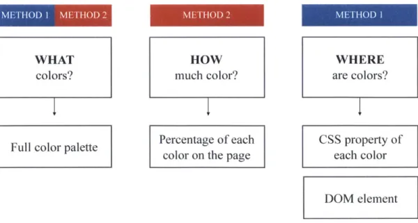
From this, four data types were determined - 1) the website's full color
spectrum, 2) the percentage of each color relative to the page, 3) the CSS properties of each color, and 4) the HTML classes or ID associated with each color.
Full color palette Percentage of each CSS property of color on the page each color
DOM element
Figure 2: Areas of Interest and Corresponding Data Values
The full color palette of a webpage shows breadth. It returns all all existing colors on a website. This would be achieved by parsing through the stylesheets of a website and returning all colors that are specified with a hex color tag or color name
indicator. However, returning just a list of all colors would not be enough to assess the coloration of a web page. Inherently, there is a hierarchy of color importance on websites. Finding the percentage of each color breaks up the colors into a hierarchy of importance, and can be used to find which colors are dominant on the page. This would be achieved by getting the number of pixels that each color occupies on a page
relative to the total number of pixels on the page. Yet, even with knowing what the colors are and how much of it is used on a page, the data would be incomplete without knowing what each color was being used for. The location and use of each
color gives contextual meaning to the colors. This would best be achieved through collecting the css property of each color (i.e. "color", "background-color", "border-color", etc.) and the HTML DOM object that the color falls under (i.e. "button", ".container", "#navigation", etc.). These three variables - what colors, how much
WHAT colors? HOW much color? WHERE are colors?
color, and where are colors - layer together to describe the important concepts of a website coloration in a simple manner.
3.2 CREATION OF "PALETTES"
With the data variables laid out, the next stage of the project called for a tool to collect the data that is needed. After some initial research, a few tools for color analyzation on the web were discovered, such as "ColorZilla"[37] (a color picker extension for Chrome), "The Colour Bookmark"[18] (a website color analysis tool that parses stylesheets), and others. However, none of them produced the results that matched the data variables of interest in an accurate and reliable fashion. Moreover, many of the tools were very buggy and unable to return results from very basic searches, such as "google.com" or "yahoo.com." This necessitated the
creation of a new tool tailored specifically to the interests of this project. Two methods of capturing a website's colors were explored in this stage, both created using the Ruby on Rails framework.
3.2.1 Method 1: Parsing CSS
The first method that was explored was parsing through the stylesheets of a website and collecting all color values. Colors on the web are represented by a 6 digit
hex value ranging from #oooooo (black) to #FFFFFF (white). This method entailed retrieving the url of a specific website of interest, parsing the HTML for a link to the stylesheet(s), retrieving the stylesheet(s) for the website, and parsing through the
CSS for all of the colors. The result was a web application, Palettes, that accepts user
inputs in the form of a url, and displays the full collection of colors that are used on the site.
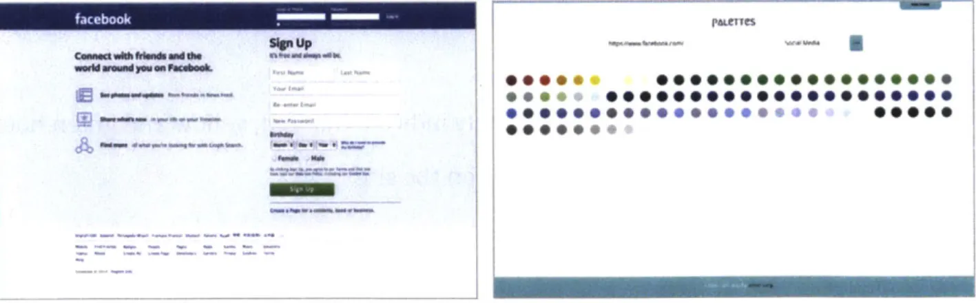
PALeTTeS
on O" 001 mM O MW o
me
e amee Os a# am m 'On '10 m USeeeee'bus e seeeeeis MOM' S am a" ame .00 eeee 0 1%,m M
Figure 3. [top] The web interface displaying the aggregated top colors [middle] The full color palette used in facebook.corn
[bottom] What the original website (facebook.com) looks like [7]
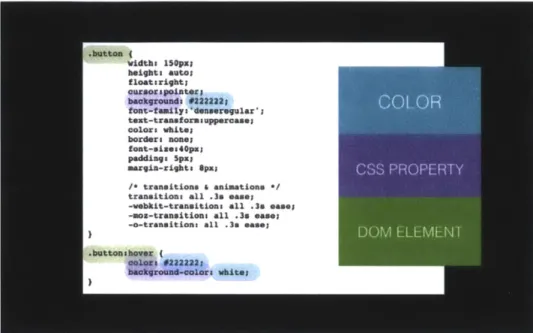
CSS Parsing
As previously stated, this tool's main functionality is CSS parsing to retrieve colors. By parsing the CSS, it also has the ability to retrieve two additional
in~uoruUP EoMUMM~d
--information pertaining to each color - the CSS property and the DOM element associated with each color.
Figure 4. A snippet of a CSS file depicting data that is collected through method 1
The CSS property indicates how the color is being used - as a background color, as a border color, as a text color, etc. The DOM element that the color is assigned to indicates which part of the page the color is located and being used on. Although many times class and ID names for DOM elements are unique and not
consistent across web pages, some elements such as "button", "nav", "input", etc. almost always appear on the stylesheets of a page. To make this work, the rails gems Nokogiri [15], a fast-performing and well documented HTML parser, was used to locate the url of a website's CSS file(s). CSS added into the HTML document itself within style tags (<style = text/css>[CSS here... ]</style>) and inline css (<div
style="color: #ffffff") were both accounted for in this implementation. Additionally, because there are 214 named web colors ("white", "black", "gray", etc.), this tool
parses for those names as well, making sure that it is in fact used as a color rather than a class or ID name by checking that there is no ." or "#" preceding it.
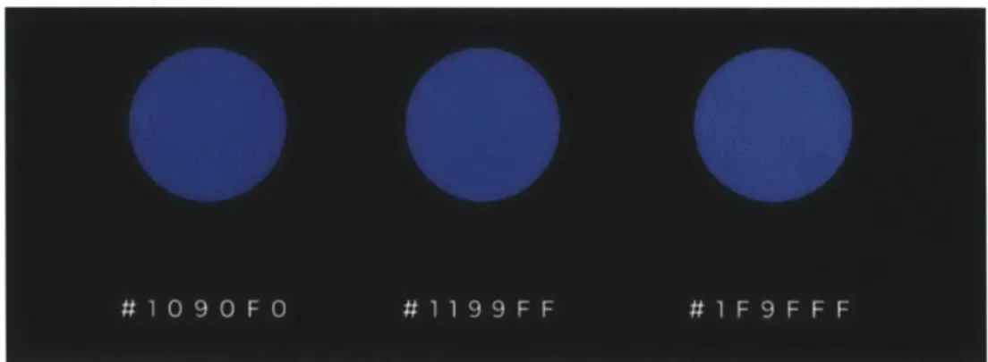
Color Normalization
Because colors on the web are represented by six hex numbers, there are more than 16 million possible colors that can be rendered on the web. To group similar colors together and to make the data more manageable, a system of normalizing the color selection was created. Without normalization, each color is represented by six number, with the first two numbers representing the "Red" value, the second two numbers representing the "Green" value, and the last two representing the "Blue" value. With normalization, each raw color value is represented by the duplication of one number instead of two distinct numbers. For example, "#1497FC" would be normalized to "#1199FF".
Figure 5. All colors between #1o90Fo and #1F9FFF would be normalized to #1199FF
This method of color reduction was chosen because of its simplicity and effectiveness. After running visual tests on some colors, it was determined that the difference between the darkest color and the lightest color within a normalization
range is negligible to the human eye. However, this simple alteration reduces the amount of color data from over 16 million colors to about 4 thousand colors - a much more manageable number.
Data Output
The results from this method of website color collecting displayed a number of interesting results. Because the application was parsing through the CSS file for the entire website, it revealed colors that are being used on the site that are not
immediately seen upon first glance. Such is the case in figure 6. The results for facebook.com indicated that there are some red and yellow hues within the entire
site, but from the image of the input Url, only its iconic blues and greens and grays can be seen. Many other website also had an abundance of unexpected colors (figure
7,8).
Figure 6. Results for facebook.com inaccurately indicate that red and yellow hues are visible on the site
- -. U
I-m-:
--PAseT'es 00000000090*0....000....009 9 000000,... 000000000 0000000000000000.000000.0000 000000000000000000000000000 0000000000 .***.... 9 eeeeee I IFigure 7. Results for yahoo.com inaccurately indicate that red, yellow and green hues are visible on the site
A&C" T Cs 0000000000 000000000 000,000. 00000000*9*99*w , 900000000,, 0000000000000e *000000000000000000000000,0 *S00e OOOOO@00,0,*000s 9 *000000000@e
Figure 8. Results for yahoo.com inaccurately indicate that red, yellow and green hues are visible on the site
Shortcomings
Unfortunately, this method alone did not produce the desired results and the data variables previously determined as vital to assessing the color usage on a webpage. This methodology was successful in returning the full color range of a website and for capturing what the colors were being used for on the page, but without information about how much of each color is used, it is hard to assess the
e
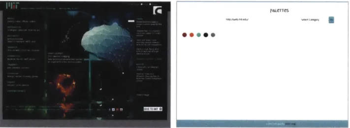
color usage of a site. Looking at the results of figure x, it is impossible to see that the dominant color on twitter's home page is blue, not red, orange/yellow or green. Moreover, unfortunately, the colors that make up a web design is not just the properties found in the CSS. The overall impression of the website includes the images.
Pa~enes
Figure 9. Color results for mit.edu fall short of actual color representation because images are disregarded in CSS color parsing, leading to false representation
3.2.2 Method 2: Image Capturing
To accurately analyze a website's coloration, finding the area that each color occupies on a page is crucial information. The previous approach of parsing the CSS is not capable of finding what percentage of the page is a certain color. Therefore, a new approach must be tested. In this new approach, CSS parsing is replaced by image capturing and image processing.
Image capturing
First, the website of interest is converted into an image using IMGKit [8], a rails gem that can take any valid HTML and generate a JPEG representation of that
page. The image that is captured is always set to have dimensions of 1024 x 1000
pixels - if a website is very long, the image conversion would cut off the bottom half. This is appropriate, because the first impression of any website lies in the top
portion of the page. It also keeps all website snapshots consistent through the image processing and analyzing phases.
Image processing
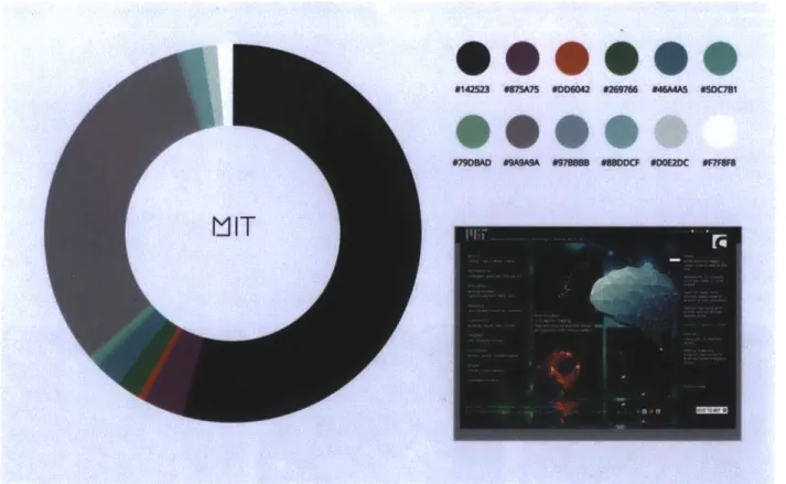
The image following conversion has millions of individual colors, so a process of reducing and normalizing the colors on the page must be put into place. After the website is converted to an image, the image is then reduced to 10 colors, and the percentage of each color is determined by counting each pixel of the specific color. This is performed through using the RMagick [16] rails gem; specifically, the
'quantize' function. The quantize function "analyzes the colors within a reference image and chooses a fixed number of colors to represent the image. The goal of the algorithm is to minimize the difference between the input and output image while minimizing the processing time." The quantize function makes an image less complex by grouping all the colors in an image into a fixed number of groups based on color similarity in RGB values and HSL values. It then takes the average of the pixels colors within a group to produce a fixed number of colors to represent the entire image.
Figure lo. [left] The raw image conversion from mit.edu [14]
[right] The quantized image of mit.edu represented by 10 colors
Initially, reduction down to 5 colors was given a try to compact the dataset even more; however, results from quantizing down to 5 colors proved to be far less satisfactory than 10 colors.
Figure 11. [left] The raw image conversion from mit.edu [middle] The quantized image of mit.edu represented by 10 colors
Calculating Percentage of Colors
Finally, after image capturing the web page and processing the image down to 10 colors, the program can go through pixel by pixel and count how many
occurrences of each color there is on the page. The result is charted in a bar graph that visually displays the color composition of a website. Currently, the colors are displayed in order of which comes first when iterating through pixel by pixel, not by decreasing percentages or by color/hue.
Figure 12. The color breakdown of the top 10 colors of mit.edu
This is a much more accurate and better display of color data on a particular page than the previous method of parsing through the CSS stylesheets. It takes into account the images on a website - an important contributing factor to the overall
---impression of a website, which is something that the previous method lacked. Additionally, visualizing the area of each color relative to each other gives a much better representation of how colors are actually divided on the page.
Shortcomings
Although the second method produced exciting results, it is lacking in a number of areas. First, because the colors on the page are quantized, the top ten colors that are shown are not the true colors of the original website, but rather averages of colors that are similar. The color data then becomes an approximation rather than a depiction of the exact colors used. Additionally, in terms of retrieving information about how a color is being used on a site, method 1 is far superior to method 2. In method 2, because the website is immediately converted into an image, there is no way to extract the CSS parameters and HTML DOM elements associated with each color.
Full color palette Percentage of each CSS property of color on the page each color
DOM element
Figure 13: Depiction of which data values are accessible through each method WHAT colors? HOW much color? WHERE are colors?
3.2.2 Combining Methods
As Figure 13 indicates, the two methods of collecting colors were only capable of returning some of the data variables that we defined earlier. Method 1 (Parsing the CSS files) could return the full range of colors that exist on the page, and CSS
parameters and HTML DOM elements that used the specific color. However, it can not take pictures into consideration because their coloration is not specified within the CSS stylesheets. It also cannot discern which colors take up more space on the webpage, and which colors do not. Method 2 (Image capturing) however, does take images into consideration and can approximate how much of each color is used on a page, but it cannot analyze where exactly the colors are or what significance it has in the HTML.
To take advantage of the best of both worlds, the final color analysis tool combines both methods into one, and runs both methods in parallel. A website is first parsed for all of it's colors and collects data on what each color is being used for. The website is also converted into an image and quantized. The percentage of each quantized color is calculated. The quantized color is then referenced with each color that was extracted from the CSS, and the quantized color is matched with the closest color from the original stylesheet. This way, the analysis can reflect original colors, depict how much color there is, and can the HTML and CSS associations for that particular color.
PALLerTes ~-4 U 00000000000*000*4 ...000000000e-"O 000000000 000000 'VAHOO
0@@@@@0
~4166 MOM=c 77lI fSW bbbbbb b S77 ---YAHOO
#s ~eem ""W6 -*CC edmmf - -futFigure 15: [top left] Results of yahoo.com from Method 1
[top right] Results of yahoo.com from Method 2
[bottom] Results of combining the two methods (colors reflect the true colors from the CSS and CSS/HTML attributes are listed for each color)
Nuh 9"W" 0"" Nom WNW cam U-40. mom 4-ft-w-ft" am am 464Md 0 0 0 0 0 am"" WNW mom
4. PILOT STUDY USING "PALETTES"
With Palettes set up, a study on website coloration can be conducted. The initial objectives for this study was to clear up some questions designers struggle with when designing for specific cultures and industries:
1. What are the most common colors on the web? 2. Do industries prefer certain colors?
3. Do cultures prefer certain colors?
4. Where are colors usually placed on a site? 5. What colors are generally found together?
Using empirical data collected using Palettes, this study aims to answers the
aforementioned questions and be able to make generalized color palette selections for cultures and industries.
4.1 SCOPE OF STUDY
The scope of this pilot study was carefully determined. There are hundreds of millions of active websites in the world, and over sixteen million colors that are capable of being rendered on the web [lo]. Choosing which sites to include in the study required a method for filtering and/or categorizing all the websites in the world. This would reduce the data points to a manageable scope.
Alexa Internet, Inc. [3], a California-based subsidiary company of
Amazon.com, provides comprehensive commercial web traffic data. It collects data on browsing behavior, and publishes rankings and other information on over 30 million websites [2]. Among the public data Alexa.com releases each year are rankings of the top 500 most visited websites broken down by country and by
from Alexa.com were used to analyze colors in websites. Because running all 500 websites for each country/category using Palettes proved to be too time-intensive, only the top 100 websites were used in the pilot study.
Alexa.com provides website rankings for over 120 countries and 17 categories. This pilot study chooses to focus on a subset of that data. 24 countries and 12
categories were chosen. The 24 countries are the countries with the highest number of internet users, listed by the International Telecommunications Union [9]. Internet users are persons using the Internet in the last 12 months from any device, including mobile phones [6]. The 10 categories were chosen by eliminating non-industry related categories, such as "World" and "Regional."
The scope of the pilot study is thus defined by the following data: 1. Top 100 websites (ranked by total visits per year) for 24 countries 2. Top 100 websites (ranked by total visits per year) for 12 industries
The full lists of the websites included in this study can be found in Apendex A.
4.2 RESULTS
The study aims to generalize website colors across a single country and a single industry. This is done by first collecting the top 10 colors of each website in a country/industry. Then, the top 30 colors of a country/industry is graphed and analyzed. Over 2000 websites were analyzed using Palettes, and results ranged from expected to astonishing. The initial questions of interest were:
1. What are the most common colors on the web? 2. Do industries prefer certain colors?
3. Do cultures prefer certain colors?
5. What colors are generally found together?
Using the data collected from the study, answers to these questions can begin to formulate.
First, it can be seen from the results that the most common colors on the web are blues, grays, and oranges/yellows.
.00000 .9.,., 94 eee 9*@@@ .9 0M*Oo@"t*9 .M9 a QUORM
F,
9 DRO'BOX 9 9,00Figure 16: A selection of top websites that exhibit the most common colors on the web
WIKeDIA
INSTgR60
f2ACeBOOK
-... 11111
As can be seen in Figure 16, many of the most popular websites show a similar color palette - blues, grays and sometimes a hint of yellow or orange.
Second, the question "do industries prefer certain colors?" can be answered using the results from the study. Results from analyzing the top 100 websites categorized under "Reference" (Wikipedia, Stackoverflow, Thesaurus.com, etc.) displayed a common palette of earthy-tones - browns, forrest greens, dull oranges and dark blues.
OPM 64 a s lo panp Ou- .o
EPereReNce
n=#om"m _mFigure 17: Reference websites display common colors that are earthy-toned
Heath-related websites (NIH, WebMD, MyFitnessPal, etc.) showed results that were very different. The color palette of these websites have high saturation values and look very "bright." Various blues and large amounts of white give a sense of cleanliness.
41" WO M I m I-' IIIII 1
S
HeALTH
S...0
_- -A# MMS....
0
- M -maSS@0'**
Figure 18: Health websites display various blue tones that are high in saturation
Kids websites (Disney, PBS, Nick, etc.) have a color palette that is very colorful. The range of hues is much larger in this category than any other category, and the
saturation level of each color is very high.
S
- - - -
S.
-S.,.
S
~s - -
0"-Figure 19: Kids websites display a large range of hues and high levels of saturation
Social Media websites (Facebook, Twitter, Tumblr, etc.) also have a colorful palette with a large range of hues and high levels of saturation. Surprisingly, orange and yellow tones appeared most frequently, despite common knowledge that Social Media powerhouse sites like Facebook, Twitter and Tumblr all have a high level of blues. The unexpected results could be attributed to the fact that the social media websites used in the study includes social media sites from all over the world. Social Media sites that are popular in asian countries such as QQ.com and RenRen use more warm toned colors such as reds, oranges and yellows.
SOCIAL MeDIA
0.90
Figure 20: Social Media websites display colorful palettes
University websites (.edu websites), on the other hand, show a preference for color palettes that are very desaturated. The range of hues is also much smaller when compared to the other industry-related results. Dark blue, dark purple, and dark browns allude to a tones of seriousness and academia.
ONIVeRSITy
*0@@
- - - - -_ am ~ms - - -_000@S@
- - - am am am1
0
ow 099 own I@ -" 01"M d~c000:0
0
Figure 21: University websites display desaturated colors and similar hues
Music websites (Pandora, Spotify, Last.fm) have a largely black and white color palette. This category is also the only category where the most frequent color is a dark color. 0 0 00 0@@000
@*@@@
a am -IX= w am - "amaThird, the question "do countries prefer certain colors?" can be answered using the results from the study. Results from analyzing the top 100 websites of China displayed a common palette of blues and reds. Interestingly, red hues do not
appear more than once in the top colors of any other country, but it appears four times for China. In China, red symbolizes luxury, which could be a reason for its popularity on the top websites.
*aow ew= - .onnu
CHINA
-
- --
-1--NO -M" - -M v -A
Figure 23: Top sites in China show a preference for blues and reds
In Russia, however, blue is the color of luxury, and could explain why the top colors in Russian websites are mostly shades of blue.
- mss m
-R~USSIA - -
-0@@@@
0m00 msm ma00000
Figure 23: Top sites in China show a preference for blues and reds
Brazil's coloration showed greens and yellows, which was unique to the country results. Interestingly, green and yellow also appear on Brazil's national flag.
*~ 0@
RAZL-
--
-
Surprisingly, the US and France showed very similar color palettes, with a large amount of blacks and whites intermixed with some blues. This could suggest that the websites that are visited in these two countries are very similar.
M 1"Msao ---- ami pon in
Os*
S...M""
411
A
ODOM. 0111 OO * 4eirn * u 4.I.
Fourth, the question "where are colors usually placed on a site?" can be answered using the results from the study. Because the tool can grab the CSS
properties of the color and the HTML DOM element that uses the color, the use and placement of the color on the page can be analyzed. From analyzing this data, it can be seen that many of the website's main branding colors are seen in "action" items on a page - items that illicit interaction from the user. These items include buttons,
links, forms, etc.
rPe3OOK
W -O -W N
F1
own@@@SO
4"Figure 26: Results show that many top colors of a website are used as background colors for buttons
* 0 9 9 0 * sow
Finally, the question "what colors are generally found together?" can be answered using the results from the study. It can be seen that many websites choose a color palette that includes colors of the same spectrum.
VAHOO
9...
- - -- - -- ~in - m HACKeRNeWS09000
-0 --99@@@*
&me -a -" -M.9
Figure 27: Results show that colors of the same spectrum are often found together on a website
5. CONCLUSIONS AND FURTHER RESEARCH
In spite of the wealth of information currently available for designing
websites, it is not easy for web designers to create cultural and industry appropriate color selections and determine the best usage for color on a webpage. This thesis project addresses these concerns in two parts. In the first part, a color analysis tool ("Palettes") is created to collect data on how colors are being used in existing websites. The abilities of Palettes include finding 1) the full spectrum of colors used on a website, 2) the percentage of each color on the page, 3) the CSS properties of each color, and 4) the HTML classes or ID associated with each color. In the second part, a semi-automated empirical study of approximately 2,000 websites across 24 countries and 12 different industry-related categories was conducted using this tool.
From the pilot study, it can be seen that the primary usage of a website's main colors are in highlighting "action" features, such as buttons and links. Results also
show that certain colors can be identified as universally used in website design for all countries and categories studied, but culture-specific and industry-specific palettes can also be identified. Universally used colors include shades of blues, grays and oranges/yellows. Select industry-specific color palettes include:
- Reference: Low saturation, earthy tones, browns, oranges and forrest green - Heath: High saturation, crisp tones, blues, light grays and white
" Kids: High saturation, high range of hues, blue, purple, yellow
- Social Media: High saturation, high range of hues, oranges, yellows, blues - University: Low saturation, dark blues, dark purples, browns
" Music: Low saturation, blacks and whites Select culture-specific color palettes include:
- Russia: Blues
- Brazil: Grays with pops of greens and yellow - France: Blacks and whites
- US: Blacks and whites and some blue
These are a selection of results from the pilot study. As an initial study, these results open the door to further research into color in website design. Some suggestions for future research in this area are listed below:
For further development of the color analysis tool - Palettes
1. Be able to not only capture the colors on the main page of a URL, but also the
children pages (i.e. not just facebook.com but also the profile pages)
2. Faster runtime (currently takes up to 3 seconds to convert a page into an image)
3. Be able to separate images from DOM elements
4. Be able to collect data of a website's history (i.e. not just the colors on the site currently, but also the colors of the site a year ago, two years ago, etc.)
For further development in researching colors in website design
1. Compare colors of a website over time - how do colors change?
2. Compare colors of a website to color trends in fashion, technology, etc - are
there correlations?
REFERENCES
[1] A.
J.
Ellior, M. A. Maier. Color and Psychological Function. Current Directions in Psychological Science, 16(5):251-254, 2007[2] Alexa - About. http://www.alexa.com/about, 05/16/2014. [3] Alexa. http://www.alexa.com/topsites, 05/16/2014.
[4] C. K. Coursaris, E. Lansing, S.
J.
Swierenga, and E. Watrall. An empiricalinvestigation of color temperature and gender effects on web aesthetics. Journal of Usability Studies, 3(3):103-117, 2008.
[5] D. McCandless. Colors in Culture. http://www.informationisbeautiful.net/ visualizations/colours-in-cultures, 05/16/2014
[6] Definitions of World Telecommunication/ICT Indicators, March 2010, International Telecommunication Union (Geneva), 05/16/2014.
[7] Facebook. http://www.facebook.com, 05/17/2014
[8] IMGKit. https://github.com/csquared/IMGKit, 05/08/2014
[9] International Communications Union. http://www.itu. int/en/ITU-D/Statistics, 05/16/2014.
[10] Internet World Statistics. http://www. internetworldstats.com/stats, 05/16/2014 [11]
J.
Ling and P. Van Schaik. The effect of text and background colour on visual search of web pages. Displays, 23(5):223-230, 2002.[12] K.-E. Schmidta, Y. Liua, and S. Sridharanb. Webpage aesthetics, performance and usability: Design variables and their effects. Ergonomics, 52:631-643, 2009.
[13] L. Thorlacius. The role of aesthetics in web design. Nordicom Review, 28(1):63-76, 2007.
[14] MIT. http://web.mit.edu, 05/08/2014 [15] Nokogiri. http://nokogiri.org, 05/17/2014
[16] RMagick. https://github.com/rmagick/rmagick, 05/08/2014
[17] S.-E. Palmer and K.-B. Schloss. An ecological valence theory of human color preference. PNAS,107(19):8887-8882, 2010.
![Figure 1: McCandless Color Wheel [5]](https://thumb-eu.123doks.com/thumbv2/123doknet/14746669.578426/10.918.107.805.336.822/figure-mccandless-color-wheel.webp)
![Figure 3. [top] The web interface displaying the aggregated top colors [middle] The full color palette used in facebook.corn](https://thumb-eu.123doks.com/thumbv2/123doknet/14746669.578426/16.918.288.667.137.771/figure-interface-displaying-aggregated-colors-middle-palette-facebook.webp)

![Figure 11. [left] The raw image conversion from mit.edu [middle] The quantized image of mit.edu represented by 10 colors](https://thumb-eu.123doks.com/thumbv2/123doknet/14746669.578426/23.918.101.808.714.936/figure-image-conversion-middle-quantized-image-represented-colors.webp)