HAL Id: hal-01246192
https://hal.inria.fr/hal-01246192
Submitted on 18 Dec 2015
HAL is a multi-disciplinary open access
archive for the deposit and dissemination of
sci-entific research documents, whether they are
pub-L’archive ouverte pluridisciplinaire HAL, est
destinée au dépôt et à la diffusion de documents
scientifiques de niveau recherche, publiés ou non,
Interactive Surfaces (DEXIS 2015)
Petra Isenberg, Bongshin Lee, Alark Joshi, Tobias Isenberg
To cite this version:
Petra Isenberg, Bongshin Lee, Alark Joshi, Tobias Isenberg. Proceedings of the Workshop on Data
Exploration for Interactive Surfaces (DEXIS 2015). [Research Report] RR-8819, Inria Saclay. 2015,
pp.27. �hal-01246192�
0249-6399 ISRN INRIA/RR--8819--FR+ENG
RESEARCH
REPORT
N° 8819
December 2015Proceedings of the
Workshop on Data
Exploration for
Interactive Surfaces
DEXIS 2015
RESEARCH CENTRE SACLAY – ÎLE-DE-FRANCE
Parc Orsay Université
for Interactive Surfaces
DEXIS 2015
Petra Isenberg
*, Bongshin Lee
†, Alark Joshi
‡, Tobias Isenberg
§Research Report n° 8819 — December 2015 — 27 pages
Abstract: By design, interactive tabletops and surfaces provide numerous opportunities for data visualiza-tion and analysis. In informavisualiza-tion visualizavisualiza-tion, scientific visualizavisualiza-tion, and visual analytics, useful insights primarily emerge from interactive data exploration. Nevertheless, interaction research in these domains has largely focused on mouse-based interactions in the past, with little research on how interactive data exploration can benefit from interactive surfaces. These proceedings represent the results of the DEXIS 2015 Workshop on Data Exploration for Interactive Surfaces. It was held in conjunction with the ACM International Conference on Tabletops and Interactive Surfaces (ITS) in Funchal on the island of Madeira, Portugal, on November 15, 2015.
Key-words: interactive tabletops and surfaces, visualization, data exploration
ration interactive des donn´ees. N´eanmoins, dans le pass´e, la recherche en interaction dans ces domaines a surtout port´e sur des interactions bas´ees sur la souris, avec peu de recherches sur les avantages des sur-faces interactives. Ce rapport de recherche comprend les r´esultats du DEXIS 2015, un atelier de travail portant sur l’exploration de donn´ees avec des surfaces interactives. Il a ´et´e tenu en conjonction avec la Conf´erence Internationale de l’ACM sur Tabletops and Interactive Surfaces (ITS) `a Funchal sur l’ˆıle de Mad`ere, au Portugal, le 15 Novembre 2015.
Contents
1 Preface by the Organizers 4
2 Cross-Platform InfoVis Frameworks for Multiple Users, Screens and Devices: Require-ments and Challenges (Kerstin Blumenstein, Markus Wagner, and Wolfgang Aigner) 7 3 WallTweet: A Knowledge Ecosystem for Supporting Situation Awareness (Teresa Onorati,
Petra Isenberg, Anastasia Bezerianos, Emmanuel Pietriga, and Paloma Diaz) 12 4 R3S.js – Towards Responsive Visualizations (Juliana Leclaire and Aur´elien Tabard) 16 5 Information Visualizations with Mobile Devices: Three Promising Aspects (Ricardo Langner,
Tom Horak, and Raimund Dachselt) 20 6 Making three Cases for Casual Geovisualizations on Interactive Surfaces (Till Nagel) 24
1 Preface by the Organizers
By design, interactive tabletops and surfaces (ITS) provide numerous opportunities for data visualization and analysis. In information visualization, scientific visualization, and visual analytics, useful insights primarily emerge from an interactive data exploration. Nevertheless, interaction research in these domains has largely focused on mouse-based interactions in the past, with little research on how interactive data exploration can benefit from interactive surfaces. We assert five apparent benefits of interactive surfaces for visualization systems:
1. As interactive surfaces become part of our everyday environments, they provide new ubiquitous data analysis platforms in which data can be accessed and analyzed anywhere and at any time (e. g., on mobile phones and tablets, in meeting rooms, or on public surfaces);
2. Interactive surfaces offer research opportunities on novel interaction paradigms that can improve data exploration experiences or encourage alternative forms of data exploration;
3. Novel visualization designs and interactions promote the use of visualizations by a broad range of people;
4. In particular, large interactive surfaces offer the possibility of depicting and interacting with much larger visualization spaces than possible previously; and
5. As data analysis is increasingly turning into a collaborative process, interactive surfaces offer novel research possibilities on dedicated collaborative visualization platforms.
While the combination of interactive surface technology and visualization research promises rich bene-fits, much remains to be learned about the effects of supporting a visual data exploration experience on interactive surfaces. For instance, we need to learn more about (a) how to re-design desktop- and mouse-based systems for alternative forms of input, (b) what motivates people to explore data using novel vs. traditional interfaces, and (c) how novel input modalities change the ability of people to understand data and draw insights from it. In addition, interactive surfaces often come in the forms of larger or screens, more screens, higher resolutions, sometimes less accurate inputs, and multiple simultaneous inputs, all of which create additional challenges for visualization designers.
At DEXIS 2015, we brought together researchers and practitioners from all sub-fields of visualization in-cluding scientific visualization (SciVis), information visualization (InfoVis), and visual analytics (VAST) as well as the related field of human-computer-interaction (HCI) to discuss and shape the field of visu-alization and analysis on interactive surfaces. We discussed ongoing research, exchanged experiences about challenges and best practices, and identified open research questions. In these proceedings we col-late the knowledge gathered during and after the workshop in order to contribute to the future research in the field.
1.1 Keynote – Sheelagh Carpendale
Sheelagh Carpendale from the University of Calgary, Canada, was the invited keynote speaker for the workshop. Her talk was entitled “InfoVis on Large Displays” and was an experience report of her past research that set the stage for the rest of the workshop. In her talk, Sheelagh discussed three topics that are at the forefront of her thinking when she is considering visualizing information on large displays. One is the importance of the combination of size plus resolution that matters for these displays. To make this point, she discussed one of her initial inspirations: how David Hockney’s great wall (a whole wall in his
studio that he covered with a timeline of reproductions of great art), led re-discovery of the use camera-lucida in renaissance painting, and how he has talked about how immersion in this large display led to his inspiration. In confirmation of this, Sheelagh and her team’s recent study on the use of a high resolution large display led to similar findings. People from a great variety of disciplines were finding inspiration from immersion in their data. The second point she made was about how we use sketched externalizations to help ourselves during problem solving, particularly collaborative problem solving. The important point here is that the fluid combination of gestures, diagrams, and words are not yet supported with software and may hold much promise for effective use of large displays. Sheelagh closed with the third point, which is about the importance of a more holistic approach. Sheelagh argued that we need to consider the individual discoveries in combination. She stated that we, as a research community, are making lots of specific detailed discoveries in regards to large displays; however, we need to think about how they can be integrated, how they can work together. This more holistic approach, Sheelagh closed her talk, might help us formulate a paradigm for large display interaction.
1.2 Workshop Sessions
We organized discussions at DEXIS along five main topics for which representative papers are collected in the main part of this proceedings compilation:
1. InfoVis frameworks for multi-user, multi-screen, and multi-device environments, 2. situational awareness using large displays,
3. responsive visualization for touch-enabled devices, 4. information visualization for mobile devices, and 5. casual geo-visualization on interactive surfaces.
The authors of each paper were asked to set their work in relation to the topics in a brief position statement. After these presentations, we discussed the topic in break-out groups and then summarized the discussion in the plenary.
Blumenstein (see the paper on page 7) brought up various challenges related to the design and implemen-tation of frameworks for InfoVis and SciVis that could support multi-user and multi-device collaboration. In an open brainstorming exercise we collected technical challenges surrounding user and multi-device collaboration as well as various domains that such frameworks could help with. Other breakout group discussions focused on what kind of interactions could be performed between multiple devices for interactive exploration and visualization.
Onorati (see the paper on page 12) provided an overview of an emergency response scenario with chal-lenges for interactive data visualization on large displays. Participants were asked to identify strengths, weaknesses, opportunities, and threats when designing interactive visualizations for emergency response scenarios using a SWOT analysis technique.
Tabard (see the paper on page 16) presented R3S.js, a toolkit that addresses responsive visualization for tactile interfaces such as tablets and large screen displays. For his group activity, the workshop partici-pants were split into three groups to explore the design of surface visualizations: (a) sketching/envisioning surface viz (including with lay people in a participatory way), (b) prototyping surface viz (i. e., rapidly test ideas, scenarios), and (c) developing surface viz applications.
Langner (see the paper on page 20) motivated the need to have a consistent multi-touch interaction frame-work that is useful for multiple domains as well as for multiple visualization techniques. The discussions
were focused on various challenges with such a unifying framework and breakout discussions were fo-cused on InfoVis, SciVis, and interaction challenges.
Nagel (see the paper on page 24) presented his group’s work on interactive geo-visualization in casual settings such as museums and libraries. His session focused on reflection: He provided a handout to each participant and asked them to reflect on a personal project and list the inspirations, other work that emerged from it, and trajectory/impact of the project. Examples of these sketches were then presented and discussed in front of the workshop participants.
In the discussions following these papers we identified a number of challenges for research at the inter-section of ITS and visualization. These include different types of users and their domain-specific tasks, interactions, and visualization requirements as well as different types of collaboration settings. For exam-ple, the use of a touch-enabled mobile surface as a remote interaction tool for visualization was discussed, for several application domains and tasks as well as the resulting implications for how the interaction on the mobile device needs to be realized. These challenges had been specifically mentioned in the presented papers.
1.3 Acknowledgements
We would like to thank all paper authors and participants of DEXIS 2015 for their excellent contributions and lively discussions. The exchange showed that data exploration on interactive surfaces is an exciting area of research that offers great potential.
Petra Isenberg, Bongshin Lee, Alark Joshi, and Tobias Isenberg DEXIS 2015 Organizers
1.4 Copyright Notice
As stated in the individual copyright notices, the copyright for all the following papers including all material presented therein is retained by the respective authors of the workshop papers. This proceedings report is published under a non-exclusive license granted by the respective paper authors.
Cross-Platform InfoVis Frameworks for Multiple Users,
Screens and Devices: Requirements and Challenges
Kerstin Blumenstein, Markus Wagner, Wolfgang Aigner
St. Poelten University of Applied Sciences, Austria
Vienna University of Technology, Austria
[first].[last]@fhstp.ac.at
ABSTRACT
To improve the interactive visualization and exploration of the fast growing amounts of data, collaborative and multi platform systems will get increasingly important. To focus on future challenges of Information Visualization and Visual Analy-tics, we describe three prospective data exploration scenarios: ‘Multi User’, ‘Multi Screen’ and ‘Multi Device’. In relation to
these scenarios, we define a basic set of requirements to design and build such systems in the future. Finally, we elaborate on a set of challenges in this context which have to be solved for such data exploration systems in the future.
ACM Classification Keywords
H.5.3 Group and Organization Interfaces: Collaborative com-puting, Computer-supported cooperative work, Synchronous interaction; H.1.2 User/Machine Systems: Human factors, Human information processing
Author Keywords
Information visualization, cross-platform, framework, future scenarios, multi user, multi screen, multi device
INTRODUCTION
Visual interfaces, especially Information Visualizations (Info-Vis), are high bandwidth gateways for perception of structures, patterns or connections hidden in the data. Interaction is the heart of InfoVis [19] and allows the analytical reasoning pro-cess to be flexible and react to unexpected insights.
In recent years, InfoVis takes essential steps towards the mass market (e.g., through infographic websites like Daily Infographic1or Infographics collected on Pinterest by
mash-able.com2).
However, the main target group in information visualization research has been expert users for a long time. But InfoVis
1http://www.dailyinfographic.com, accessed August 06, 2015. 2https://www.pinterest.com/mashable/infographics/, accessed August 06, 2015.
The copyright is held by the owner/author(s).
A non-exclusive license is granted by the owner/author(s) for the paper to be published as part of the proceedings of the DEXIS 2015 Workshop on Data Exploration for In-teractive Surfaces. The workshop was held in conjunction with ACM ITS, November 15–18, 2015, Funchal, Portugal.
is as much of importance for the informed citizens as it is for expert users. Pousman et al. [13] introduced the term Casual Information Visualization which complements traditional re-search in InfoVis with a focus on less task driven activities and a wider set of audience. As pioneers in the field, Wattenberg and Viégas developed the web portal Many Eyes3. With
this project a broader public receives access to visualization tools [14].
In contrast, especially this broader audience uses a wide range of devices. Screen resolution differs from 320 x 240 pixels to 1920 x 1080 pixels (HDTV resolution) up to 4640 x 1920 pixels (powerwall resolution) [14]. However, target devices for traditional expert visualization research were mainly desktop computers.
To be prepared for the future, cross-platform frameworks be-come increasingly important. With these frameworks it should be possible to build interactive InfoVis for different devices, different screen resolutions (sizes) and different operating sys-tems.
Based on established Beyond Desktop initiatives and work-shop (e.g., [10, 17]) as well as the found challenges for Visual Analytics (VA) by Thomas & Kielman [20] (Collaborative an-alytics, Scale independence, Information sharing, Lightweight software architecture) we describe future scenarios for interac-tive visual data exploration.
RELATED WORK
A lot of frameworks and toolkits are offered for developing In-foVis applications (e.g., D3.js4, Prefuse [4], TimeBench [16].
They provide data import/storage solutions and often a variety of widely used visualization techniques. However, none of them handle touch gestures which are needed for mobile de-vices or cross-platform deployment out of the box.
The Tulip 3 Framework by Auber et al. [2] comes with Tulip Graphics, a complete OpenGL rendering engine which was “tailored for abstract data visualization”. The framework is “efficient for research prototyping as well as the development of end-user applications” [2].
In 2013 Isenberg & Isenberg [7] published a survey article for visualization on interactive surfaces. They have systematically
3http://www.ibm.com/software/analytics/many-eyes/, accessed August 06, 2015.
analyzed 100 interactive systems and tools for small and big displays. The overview shows that most research projects work with Multi Touch Table Top devices. They found “displays ranging from 3.7” in the diagonal up to 283”” [7] which shows the wide range of different screen sizes.
Jokela et al. [8] concentrated on collaborative interaction and the connection between devices for this propose which is a “complex technical procedure”.
Based on the afore mentioned tools and papers we found out that there is a need for frameworks which supports cross-platform compilation and touch gestures, although currently such frameworks are not commonly used in the InfoVis com-munity.
DATA EXPLORATION SCENARIOS
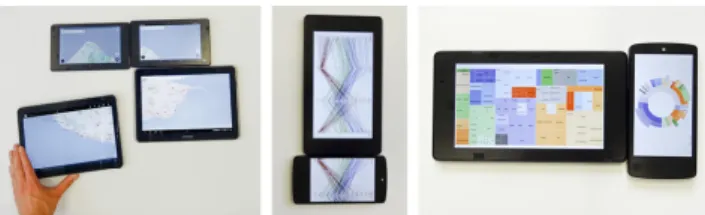
This section presents three different usage scenarios of future interactive visual data exploration. Each scenario gives the user various opportunities to interact with the data on different devices, to collaborate with other users or both. Additionally, these three scenarios can be combined and/or adapted to other working areas.
Multi User
In many business cases or in science, it is very helpful to cooperate during data exploration. This opens the possibilities to share the expert knowledge and to learn from each other. Let’s think about the managing board of a company. Normally, the members receive reports from different departments which show productivity, sales, profit, maybe the cash flow and many more. One major problem is, that users can not dig deeper into the data to gain more insights. In the case of a paper (or simple presentation), interesting and helpful insights for the creation of new business strategies could be lost or overlooked.
User 1
User 2
User 3 User 4
User 5
Figure 1. Shows a ‘Multi User’ scenario for collaborative data explo-ration working on the same dataset with combined expert knowledge.
In this future scenario, we present a new cooperative setting which supports ‘Multi User’ data exploration. Each member of the management board of the company has the same data set on his mobile device or notebook. On the one hand, they
only have to share the interaction commands to each other which lowers the needed bandwidth for a faster immediate feedback. On the other hand, each device which is used in this setting has to have enough power to prepare the data fast enough. Therefore, all the devices should be connected by a server-client or peer-to-peer network architecture for the data transfer, whereby it is not necessary that all users are at the same place (see Figure 1). If a user filters the data on his/her own device, the other users could see this on their own device too, however they have the ability to accept, to ignore or to follow the changes of each other. This way, the users can share and combine their different expert knowledge for the data analysis.
Multi Screen
In the situation of live presentation of results or data in busi-ness or science, it can be very helpful to use more than one screen for the visualization of the exploration results. Let’s think about the (internal or external) presentation of the results of a research group. Each researcher presents his/her results in front of his/her colleagues or an expert group. There-fore, most of the time the presenting researcher uses a simple presentation or shows the data directly on a research prototype.
Device 1 Local Device 3 D evi ce 2 D evi ce 4
Figure 2. Provides an example for the configuration of the active edges for the ‘Multi Screen’ setting.
This future scenario indicates a novel presentation approach for the interaction with the data on more than one screen. Therefore, we introduce the active edges technology. Based on this new idea, it will be possible to connect up to four additional screens (of other devices) to your own presenter device. Each screen will be connected to one edge of the ‘main’ device (see Figure 2), so it will be possible to move visualizations onto a screen by using a swipe gesture into its assigned edge (see Figure 3) nearly similar to the Pick-and-Drop operation which was described by Rekimoto [15] in relation to interactive whiteboards.
Screen 1
Screen 2
Figure 3. Shows an example for the swipe gesture in combination with the active edges for a ‘Multi Screen’ setting.
In the first step, the presenter has to link the screens which have to be connected to his/her device. This connection will be established via a server-client or a peer-to-peer network architecture which is similar to the ‘Multi User’ scenario. In the second step, the presenter has the ability to swipe different explored datasets to the connected screens. This way, it will be easy to show the audience the results and to interact with them if there are questions which need detailed explanation of the presented datasets. Additionally, it will be possible to include linking & brushing between screens, use them like small multiples or focus & context [9, 14].
Multi Devices
Nowadays, most of the people are working on more than one device (e.g., smart watch, mobile phone, tablet, notebook) at a time, to get their work done (see Figure 4). In this case, it could be very helpful to keep the data and the included filtering and zooming settings synchronized between these devices (basically similar to iCloud Tabs5).
Let’s take a closer look on the workflow of a data analyst in this future scenario. If the analyst works in his/her office, he/she has a desktop computer or a notebook to do the analysis. But, if the analyst will go to a meeting, it would be very convenient to use only a tablet which contains (or has access to) the same data exploration state as the other device in the office. This way, it will be possible for the analyst to bring the current results with him/her and to present these results to the colleagues.
Device 1
Device 2
Device 3 Device 4
Figure 4. Gives an overview of the different devices which can be used for interactive data exploration together by a single user.
To get this setting done, it will be necessary to be online with all devices or at least with the current device which will be used at that time. This will be used to synchronize the data and the settings (exploration history) with a server or directly with the other devices depending on the network architecture. Ad-ditionally, in this setting, it will be very easy to work remotely when necessary in order to improve the work-life-balance. So it will be possible to explore and analyze the data during the
5https://support.apple.com/en-us/HT202530, accessed August 06, 2015.
travel per bus or train. If there is a beautiful day, it is also possible to work in the park for some hours and if you go back to your office, all the results are 1:1 transferred to your desktop computer.
REQUIREMENTS
In 2011, Landesberger et al. [21] stated that “the develop-ment of collaborative visual analytics systems has received attention”. Nowadays, there are many different devices (e.g., notebooks, tablets, mobile phones, smart watches) available which have different operating systems, screen sizes or screen resolutions. In our former presented scenarios, all these dif-ferent devices could be used for InfoVis. Therefore, it is important to build a cross-platform environment and to think about two major issues in relation to the framework. First, the framework should be based on the well established InfoVis reference model for a better understanding in the InfoVis com-munity (see Figure 5) [3] including an adaption for the support of cooperative data exploration. Second, the framework has to be based on an cross-platform engine which supports the build-ing for different devices and operatbuild-ing systems. To increase the effectiveness of such a future framework, it might be a good choice to use a render- or game-engine like Unity3D6,
Cry Engine7, Unreal Engine8 or OGRE9. All these engines
supports cross-platform compilation (to several devices) which opens up new possibilities for the future. To grant the ability to use all provided features of the devices, it is important to point out that we do not focus on web based solutions. To increase the user experience the following multi screen pattern should be implemented [6, 12]:
• Screen Sharing addresses the way to combine multiple screens to a larger one.
• Complementary Views for collaboration between different devices whereby every device gets a specific role to fulfill an InfoVis task.
• Device Shifting depends on the collaboration between dif-ferent devices which are close together. Devices can com-municate with each other (e.g., switching the screen). • Coherence contains the finding of suitable use cases for
every device. Therefore, design and usability has to fit to the device and has to be consistent over different screen sizes.
• Synchronization should provide the possibility for chang-ing work from one device to another conveniently.
CHALLENGES
The creation of such mentioned systems for interactive vi-sual data exploration opens up some interesting challenges in relation to interaction and collaboration, new frameworks, system architecture and data synchronization. In relation to
6http://unity3d.com/, accessed August 06, 2015. 7http://cryengine.com/, accessed August 06, 2015.
8https://www.unrealengine.com/what-is-unreal-engine-4, accessed August 06, 2015.
Visual Form Data
Raw Data Data Tables StructuresVisual Views
Data
Transformations MappingsVisual TransformationsView Group InteractionExplorative
Figure 5. InfoVis Reference Model. Adapted from [3] including an extension for group interaction in relation to the interactive data exploration process.
the described three different scenarios, we defined the major challenges which have to be solved for the creation of such cross-platform environments.
• Collaboration: “For solving complex analysis tasks” the “development of collaborative visual analysis systems”
be-comes more and more important [21]. Based on such sys-tems, it will become easy for the users to share their know-ledge and to cooperate during their work to find the best solutions for their problems/tasks [11].
• Different platforms: From the view of different available systems, it is important to create new development frame-works which include the possibility for cross-platform com-pilation (e.g., mobile devices and desktop solutions) and different operating systems (e.g., Mac OS, Linux, Win-dows). This way, it will be possible for the user to choose the preferred device to solve his/her problem [1, 5]. • Synchronization: Most of the time, InfoVis deals with
a huge amount of data whereby a permanent transfer of the analysis data would not be efficient. To overcome this limitation, an initial data synchronization with all the de-vices followed by interaction synchronizations could be used. Therefore, each interaction should have a time-stamp, a user-id and an interaction type. The major benefit of this synchronization would be that devices with bad network connections could be used in spite of the mentioned limita-tion (e.g. [12]).
• History: Based on the previously described synchroniza-tion approach, it will be possible that every device which is connected to the ‘network group’ has the same history in the backlog. Thus, it will be easy for the analyst to change his device during the work. Additionally, it will be possible to support undo and redo actions on each device which is synchronized [18].
CONCLUSION
In this paper we presented three different combinable scenarios for ‘Multi User’, ‘Multi Screen’ and ‘Multi Device’ settings in the future and we roughly outlined the requirements for these systems. These requirements include examples for future cross-platform frameworks and patterns which will be needed for the native deployment of InfoVis systems. According to the requirements, we identified four challenges which have to be solved in combination for such interactive data exploration
systems. Similar challenges were identified by Thomas & Kielman [20] in 2009 which have however not been solved yet.
ACKNOWLEDGEMENT
This work was supported by the Austrian Science Fund (FWF) via the KAVA-Time project no. P25489 and the Austrian Ministry for Transport, Innovation and Technology (BMVIT) under the ICT of the future program via the VALiD project no. 845598.
Many thanks to Iosif Miclaus for his feedback to our manuscript.
REFERENCES
1. Sarah Allen, Vidal Graupera, and Lee Lundrigan. 2010. Pro Smartphone cross-platform development: iPhone, Blackberry, Windows Mobile, and Android development and distribution. Apress.
2. David Auber, Daniel Archambault, Romain Bourqui, Antoine Lambert, Morgan Mathiaut, Patrick Mary, Maylis Delest, Jonathan Dubois, and Guy Melançon. 2012. The Tulip 3 Framework: A Scalable Software Library for Information Visualization Applications Based on Relational Data. (2012).
https://hal.inria.fr/hal-00659880/document
3. Stuart K. Card, Jock D. Mackinlay, and Ben Shneiderman. 1999. Readings in Information
Visualisation. Using Vision to Think. Morgan Kaufman Publ Inc.
4. Jeffrey Heer, Stuart K. Card, and James A. Landay. 2005. Prefuse: A Toolkit for Interactive Information
Visualization. In Proceedings of the SIGCHI Conference on Human Factors in Computing Systems. ACM, New York, 421–430. DOI:
http://dx.doi.org/10.1145/1054972.1055031
5. Henning Heitkötter, Sebastian Hanschke, and Tim A. Majchrzak. 2013. Evaluating Cross-Platform
Development Approaches for Mobile Applications. In Web Information Systems and Technologies. Number 140 in Lecture Notes in Business Information Processing. Springer, 120–138. DOI:
6. Rachel Hinman. 2012. The mobile frontier: a guide for designing mobile experiences. Rosenfeld Media, Brooklyn.
7. Petra Isenberg and Tobias Isenberg. 2013. Visualization on Interactive Surfaces: A Research Overview. I-COM 12, 3 (2013). DOI:
http://dx.doi.org/10.1524/icom.2013.0020
8. Tero Jokela, Ming Ki Chong, Andrés Lucero, and Hans Gellersen. 2015. Connecting devices for collaborative interactions. Interactions 22, 4 (2015), 39–43. DOI:
http://dx.doi.org/10.1145/2776887
9. Daniel A. Keim. 2002. Information visualization and visual data mining. IEEE Trans. Vis. and Comp. Graphics 8, 1 (2002), 1–8. DOI:
http://dx.doi.org/10.1109/2945.981847
10. Bongshin Lee, Petra Isenberg, Nathalie Henry Riche, and Sheelagh Carpendale. 2012. Beyond Mouse and
Keyboard: Expanding Design Considerations for Information Visualization Interactions. IEEE Trans. Vis. and Comp. Graphics 18, 12 (2012), 2689–2698. DOI:
http://dx.doi.org/10.1109/TVCG.2012.204
11. Tamara Munzner. 2014. Visualization Analysis and Design. A K Peters Ltd.
12. Wolfram Nagel. 2013. Multiscreen Experience Design: Prinzipien, Muster und Faktoren für die
Strategieentwicklung und Konzeption digitaler Services für verschiedene Endgeräte. digiparden, Schwäbisch Gmünd.
13. Zachary Pousman, John T. Stasko, and Michael Mateas. 2007. Casual Information Visualization: Depictions of Data in Everyday Life. IEEE Trans. Vis. and Comp. Graphics 13, 6 (2007), 1145–1152. DOI:
http://dx.doi.org/10.1109/TVCG.2007.70541
14. Bernhard Preim and Raimund Dachselt. 2010. Interaktive Systeme. Bd. 1: Grundlagen, Graphical User Interfaces,
Informationsvisualisierung (2. aufl ed.). Springer. DOI:
http://dx.doi.org/10.1007/978-3-642-05402-0
15. Jun Rekimoto. 1998. A Multiple Device Approach for Supporting Whiteboard-based Interactions. In Proceedings of the SIGCHI Conference on Human Factors in Computing Systems. ACM, New York, 344–351. DOI:http://dx.doi.org/10.1145/274644.274692
16. A. Rind, T. Lammarsch, W. Aigner, B. Alsallakh, and S. Miksch. 2013. TimeBench: A Data Model and Software Library for Visual Analytics of Time-Oriented Data. IEEE Trans. Vis. and Comp. Graphics 19 (2013), 2247–2256. DOI:
http://dx.doi.org/10.1109/TVCG.2013.206
17. Jonathan C. Roberts, Panagiotis D. Ritsos,
Sriram Karthik Badam, Dominique Brodbeck, Jessie Kennedy, and Niklas Elmqvist. 2014. Visualization beyond the Desktop - the Next Big Thing. IEEE Comp. Graph. and Applications 34, 6 (2014), 26–34. DOI:
http://dx.doi.org/10.1109/MCG.2014.82
18. Ben Shneiderman. 1996. The eyes have it: a task by data type taxonomy for information visualizations. In IEEE Symposium on Visual Languages, Proceedings. 336–343. DOI:http://dx.doi.org/10.1109/VL.1996.545307
19. Robert Spence. 2006. Information Visualization: Design for Interaction (2nd rev. ed. ed.). Prentice Hall.
20. Jim Thomas and Joe Kielman. 2009. Challenges for Visual Analytics. Information Visualization 8, 4 (2009), 309–314. DOI:http://dx.doi.org/10.1057/ivs.2009.26
21. Tatiana von Landesberger, Arjan Kuijper, Tobias Schreck, Jörn Kohlhammer, Jarke van Wijk, Jean-Daniel Fekete, and Dieter Fellner. 2011. Visual Analysis of Large Graphs: State-of-the-Art and Future Research Challenges. EG Comp. Graph. Forum 30, 6 (2011), 1719–1749. DOI:
WallTweet: A Knowledge Ecosystem for Supporting
Situation Awareness
Teresa Onorati
Universidad Carlos III
Madrid, Spain
[email protected]
Petra Isenberg
INRIA
Paris, France
[email protected]
Anastasia Bezerianos
U.Paris-Sud & CNRS, INRIA
Paris, France
[email protected]
Emmanuel Pietriga
INRIA & INRIA Chile
Paris, France & Santiago, Chile
[email protected]
Paloma Diaz
Universidad Carlos III
Madrid, Spain
[email protected]
ABSTRACT
We present WallTweet, a tweet visualization designed for wall displays and aimed at improving the situation awareness of users monitoring a crisis event utilizing tweets. Tweets are an important source of information during large-scale events, like tornados or terrorist attacks. Citizens in affected areas are often direct witnesses of the situation, and can be aware of certain details useful to, e.g., news channels and emergency response organizations. Yet, tweets are hard to visualize and put in a geographical context: large quantities of tweets get sent in a short period, that vary greatly in content and rele-vance with respect to the crisis at hand. Our visualization tool is currently a work in progress: it addresses these challenges by performing a semantic analysis of the tweets’ content and displaying them on a ultra-high-resolution wall display. The goal of our tool is to create an inclusive experience that en-hances users’ situation awareness during a crisis event, by displaying geo-referenced tweets in detail, embedded into the more global geographic context of the event.
ACM Classification Keywords
H.5.m. Information Interfaces and Presentation (e.g. HCI): Miscellaneous
Author Keywords
Tweet visualization; wall displays; crisis monitoring.
INTRODUCTION
We are currently working on a geographic visualization tool called WallTweet that visualizes a knowledge ecosystem built from the analysis of information collected from Twitter during a large-scale event. WallTweet’s goal is to improve the situa-tion awareness of people involved in crisis monitoring through
The copyright is held by the owner/author(s).
A non-exclusive license is granted by the owner/author(s) for the paper to be published as part of the proceedings of the DEXIS 2015 Workshop on Data Exploration for In-teractive Surfaces. The workshop was held in conjunction with ACM ITS, November 15–18, 2015, Funchal, Portugal.
Figure 1. Clusters of tweets labeled by the most relevant words.
integrated details and overview visualizations for ultra-high-resolution wall displays (see Figure 1).
The datasets underlying WallTweet are tweets (brief textual messages) collected from Twitter during a crisis event and then analyzed. These datasets are becoming more prevalent as the wide availability of modern smartphones with photo, GPS, and video capabilities has led citizens to actively report on crisis events [15]. It is now very common that, when an emergency occurs, citizens start to share information about the situation, not only as witnesses, but also driven by curiosity. For ex-ample, YouTube lists more than 1 million amateur videos for the search terms tsunami and Japan. Another prominent ex-ample is the use of social networks during Hurricane Sandy. As published by the official @twitter account on November 2nd, 2012: “people sent more than 20 million tweets about the storm between Oct 27 and Nov 1.” This in turn means that tweets have become an interesting source of information for various people involved in crisis monitoring, such as journal-ists or crisis operators [6].
As data generated by citizens become more and more useful during emergencies, it is increasingly important to support the active tracking and analysis of these data. With WallTweet, we aim to contribute a tool that is useful and effective during real-time crisis monitoring. The tool relies on a geographic map of the monitored crisis event. Several visualization tech-niques are used to provide local detail in a global geographic
context, in order to support situation awareness. All tweets are analyzed according to their semantic context. Figure 1 shows one of the visualizations we are currently developing: tweets are geographically included into clusters and semantically ana-lyzed to identify the most relevant topic. In its current stage of development, WallTweet works on offline data, and as such is useful for understanding and analyzing – in retrospect – how emergencies have unfolded. Our test dataset contains about 500,000 tweets collected during one of the most critical days of the Hurricane Sandy crisis. Our goal is to first finalize the main visualizations, perform a user study, and then extend the tool to enable live updates during a crisis event.
INFORMATION VISUALIZATION FOR TWITTER
Twitter is a micro-blogging platform created and launched in 2006. Official statics published on June 30, 2015 on
about.twitter.com/company, indicate that this social network
has reached 316 millions active users per month and that 500 million tweets are sent each day. Tweets focus on different topics, including personal feelings, events of general interest, and daily news [5]. Shared information can be seen as an interesting source for discovering what is going on and what the opinions of involved witnesses are.
Considering the amount of generated data on Twitter, a ques-tion arises: is it possible to efficiently access and analyze tweets? Different visual analytic tools have been described in the literature, that take advantage of data collected from streams of information, like social networks or blogs. The Visual Backchannel [3] is an innovative tool for monitor-ing micro-bloggmonitor-ing platforms durmonitor-ing large-scale events usmonitor-ing different visualization techniques. Each technique aims at emphasizing a particular aspect of the data: a streamgraph for visualizing topic evolution over time; a helical graph of the most active users participating in the discussion; a list of tweets; a cloud of all published images.
Steed et al. [12] proposed a system called Matisse for automat-ically extracting emotions from the text messages and relating them with other measures, such as frequency of contained terms, time range and geographical coordinates. All these data are combined through three visualization techniques: a timeline, a streamgraph, and a map. With this system, it is possible to have a general understanding of how people feel about a specific event and from where they are posting. Based on the same idea, Zimmerman and Vatrapu [16] built a prototype that combines information from different social media channels into six different dashboards. Three of them present general offline statistics about most relevant topics, sharing activities, likes from other users, and most active con-tributors in the networks. The other three dashboards are about the real-time evolution of the same information. Following the same direction, Hao et al. have focused on identifying customer opinions and possible useful patterns from tweets as influences on the market [4].
In order to understand the current experience of emergency managers and practitioners with social media, authors in liter-ature have been contributing with the design of several user studies. This is the case of SensePlace2 of MacEachren et al.
in [7] and ScatterBlogs of Thom et al. in [13]. In both contri-butions, participants involved in the evaluation agree on the relevance that social media have in today’s crisis, suggesting also several issues to take into account for designing a tool for analyzing them, as for example the privacy or the adaptability to a specific situation.
All of the above systems are aimed at better supporting the understanding of how information propagates, and peoples’ sentiments, when a large-scale event occurs. We are not aware of any visualization of tweets for high-resolution wall-sized displays. However, researchers have worked on the design of multi-surface interactive environments for crisis manage-ment centers, involving multiple devices such as tablets, smart-phones, and both horizontal and vertical large displays [2]. In particular, the wall display’s purpose is to give an overview of collected data from Twitter about the incident. The visual-ization relies on the Folding View technique, that distorts the information space depending on where the user’s attention is directed. If users need more detailed information, a tablet or a smaller device is required.
THE KNOWLEDGE ECOSYSTEM
A Knowledge Ecosystem is defined by Thomson as a “complex and many-faceted system of people, institutions, organizations, technologies and processes by which knowledge is created, interpreted, distributed, absorbed and utilized” [14]. The Knowledge Ecosystem used within WallTweet is the result of a semantic similarity-based approach for analyzing text, already presented by Onorati and Diaz [10]. It consists of four different steps: (i) query Twitter for one or more keywords; (ii) perform a syntactic analysis of collected tweets for extracting nouns, where nouns are considered the most meaningful elements in a speech; (iii) filter extracted nouns, identifying the relevant ones by comparing their frequencies with a domain ontology about emergency; (iv) perform a semantic analysis of filtered terms, associating each one with a fixed category. Categories have a semantic value; they help in organizing the tweets depending on their correlation with Emergency, Evacuation, Media, Hashtag, Place, Time and General. All these data, including tweets, extracted terms, frequencies and categories, are visualized in WallTweet using different techniques, as described in the next section.
In this work, we have applied this mechanism for collecting information from the Hurricane Sandy dataset. While at the end of the hurricane crisis more than 20 million tweets were published, we currently work with a subset consisting of al-most 500,000 tweets. These tweets are the result of querying keywords hurricane and Sandy, as well as hashtags #hurricane and #sandy during the first 24 hours of the hurricane hitting New York bay on October 29. During the semantic analysis, almost 24,000 nouns were extracted, successively filtered and reduced to 5,500.
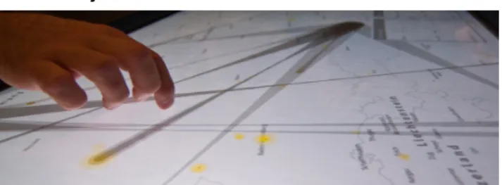
WALLTWEET
Emergency operation centers usually work with a large display showing a map visualizing the current position of officers on duty, temperature, traffic information, etc. Inspired by this setup, we use a wall displays that shows a geographic map
Figure 2. The three proposed views: (a) Global View, (b) Semantic View, (c) Time Sequence.
of the hurricane twitter data. Our goal is to explore different options for helping operators in finding an answer to questions about the most affected areas, the number of people involved, the range of damages, or the effects of the rescue activities. The Knowledge Ecosystem described above runs on the WILDER ultra-high-resolution wall, that consists of 75 narrow-bezel LED tiles (960x960 pixels each, 60ppi) laid out in a 15x5 matrix, 6 meters wide and 2 meters high for a total resolution of 14,400 × 4,800 pixels. WILDER is driven by a cluster of 10 computers, each equipped with high-end graphics cards, and a master workstation. The platform also features multiple input capabilities, including a multi-touch frame, real-time motion tracking, and handheld devices. WallTweet is built upon jBricks [11], a Java toolkit for rapidly prototyping multi-scale interfaces on cluster-driven wall displays. Ultra-walls (short for ultra-high-resolution wall displays [9]) make it possible to visualize much larger volumes of data com-pared to earlier projector-based wall displays, whose pixel den-sity is lower. Ultra-walls support the display of large datasets with a high level of detail while retaining context. They afford multi-scale interaction through physical navigation [1]: users can move from an overview of the data, to the fine details of a specific area simply by walking in front of the wall.
WallTweet offers three main views: Global View, Semantic View and Time Sequence. In the Global View, geo-located tweets are represented by geographical points over a map. Each point gets assigned a background color depending on the semantic category of the terms contained in the tweet (Figure 2-a). This view also includes a bubble chart representing the most relevant terms extracted from the dataset. Analyzing this view, we can see that the most discussed topics are related to the emergency description, and the majority of the tweets are distributed around big cities, like New York City, Baltimore, Washington and Boston. This can indicate densely populated areas, and areas that have been impacted most by the hurricane. Knowing where these areas are located is a crucial information for emergency operators in charge of making decisions about where to allocate resources.
The Semantic View combines two different visualizations (Fig-ure 2-b): a geographical clustering and a tag cloud. The clustering consists of groups of tweets that are geographically close. To identify these clusters, we apply the concave hull algorithm [8], that associates each point with its neighbors
at a distance that has been determined empirically. For each cluster, tweets are semantically analyzed based on the Knowl-edge Ecosystem described earlier, in order to identify the most relevant terms and use them as labels. As in tag clouds, the labels’ font size depends on their relevance with respect to the defined Knowledge Ecosystem. This view thus gives an idea of the semantic distribution of terms with respect to their geographical position.
The last view, Time Sequence, is an animated visualization in which each tweet falls from the top of the display and is added to the map at the time of its posting on the social network. Clusters are updated once the tweet reaches its geographical position. Figure 2-c illustrates the visualization after new tweets have fallen on the map, showing that both the labels’ font size and the clusters have changed. Each cluster has its own label (indicating the topic) and is painted with a specific color to make it easier to distinguish. If used in real-time, this dynamic visualization of how published content evolves over time can help emergency operators or media centers to get an idea of how people are reacting to the emergency, and taking these reactions into account to inform future decisions.
DEVELOPING VISUALIZATIONS FOR WALL DISPLAYS
The benefit of using a large surface with a ultra-high resolution is twofold. First, its large size enables multiple users to work together in a shared workspace, thus making the monitoring exercise and the collaboration among them easier. Second, as mentioned earlier, the very-high pixel density enables users to look at the data at different levels of detail simply by physically moving in front of the display. Developing multi-scale collab-orative visualizations that take advantage of these properties is not trivial, but we have started to make progress. For example, in our Semantic View, clusters can be seen at a distance from the wall, indicating pockets of activity, while when stepping closer users can also read details about the most discussed topics of each cluster. The map can also be smoothly zoomed in and out, in which case clusters get recomputed as the dis-tance used by the concave hull algorithm to compute point neighborhoods is adapted to the new zoom factor. Interacting with the display, it is also possible to read tweets and compare them with the performed semantic analysis.
Walltweet can be seen as part of a more complex ecology of devices aiming at surrounding users – who have to handle crisis situations – with data, helping them explore those data
and extract meaningful information from them in an efficient and timely manner. We believe that using wall displays in such an ecology can significantly improve users’ situation awareness, and we are very interested in further discussing the associated challenges in this workshop.
CONCLUSIONS AND FUTURE WORKS
Social networks and other messaging services have drawn the attention of researchers and practitioners in media and crisis management. In social networks like Twitter, people share their opinions and experiences, generating vast quantities of data about a wide range of topics, including real-time informa-tion on crises that impact them. Visualizing this data in order to better understand and use it for decision making is a chal-lenging topic in visual analytics and information visualization. In this paper, we introduced a prototype system for analyzing and visualizing tweets generated during a large-scale critical situation, in order to support the monitoring activities of emer-gency operation and media centers. The main contributions of our approach so far are the combination of the semantic analysis of tweets and the use of a ultra-high-resolution wall display for visualizing its results. We are still at an early stage of this on-going project, called WallTweet. So far it consists of three different views: a generic view showing the semantic categorization of tweets on the map; a semantic view with geographical clusters of tweets, tagged with the most relevant terms associated with them; a time sequence that simulates the real-time posting of tweets on the map, the definition and evolution of clusters, and the varying relevance of terms. Future work will focus on two different directions. First, we are going to evaluate WallTweet and its visualizations from both a domain and a usability point of view. We are currently planning a usability test as well as an expert evaluation with emergency practitioners. Second, we are going to make the system run in real-time, integrating it in an ecology of devices for achieving better collaborative sense making and higher situation awareness: including additional data sources such as digital sensors for tracking information about, e.g., pressure, temperature or traffic, and providing users with more elaborate capabilities for interacting with the wall display using devices such as smartphones and tablets.
ACKNOWLEDGMENTS
This work is supported by the project emerCien grant funded by the Spanish Ministry of Economy and Competitiveness (TIN2012-09687). Teresa Onorati was partially supported by a grant from Universidad Carlos III de Madrid.
REFERENCES
1. R. Ball, C. North, and D. Bowman. 2007. Move to improve: promoting physical navigation to increase user performance with large displays. In Proc. CHI. ACM, 191–200.
2. S. Butscher, J. M¨uller, A. Weiler, R. R¨adle, H. Reiterer, and M. H Scholl. 2013. Multi-user Twitter Analysis for Crisis Room Environments. In 3rd Crisis Management Technology Workshop on Collaborative Human Computer Interaction with Big Wall Displays. 28–34.
3. M. Dork, D. Gruen, C. Williamson, and S. Carpendale. 2010. A Visual Backchannel for Large-Scale Events. IEEE Trans. on Vis. and Comp. Graphics (TVCG) 16, 6 (2010), 1129–1138.
4. M. Hao, C. Rohrdantz, H. Janetzko, U. Dayal, D. A. Keim, L. E. Haug, and M. C. Hsu. 2011. Visual sentiment analysis on twitter data streams. In Proc. VAST. 277–278. 5. A. Java, X. Song, T. Finin, and B. Tseng. 2007. Why we
twitter: understanding microblogging usage and communities. In 9th WebKDD workshop on Web mining and social network analysis. ACM, 56–65.
6. B. R. Lindsay. 2010. Social Media and Disasters: Current Uses, Future Options and Policy Considerations. Journal of Current Issues in Media & Telecommunications 2 (2010), 287–297.
7. A. M. MacEachren, A. Jaiswal, A. C. Robinson, S. Pezanowski, A. Savelyev, P. Mitra, X. Zhang, and J. Blanford. 2011. SensePlace2: GeoTwitter analytics support for situational awareness. Proc. VAST (2011), 181–190.
8. A. Moreira and M. Y. Santos. 2006. Concave Hull: A k-Nearest Neighbours Approach for The Computation of The Region Occupied By A Set of Points. In Conference on Computer Graphics Theory and Applications. 61–68. 9. M. Nancel, E. Pietriga, O. Chapuis, and M.
Beaudouin-Lafon. 2015. Mid-Air Pointing on Ultra-Walls. ACM ToCHI 22, 5 (2015), 1–62.
10. T. Onorati and P. Diaz. 2015. Semantic Visualization of Twitter Usage in Emergency and Crisis Situations. Proc. ISCRAM (to appear) (2015).
11. E. Pietriga, S. Huot, M. Nancel, and R. Primet. 2011. Rapid development of user interfaces on cluster-driven wall displays with jBricks. In Proc. EICS. ACM, 185–190.
12. C. A. Steed, J. Beaver, P. L. Bogen II, M. Drouhard, and J. Pyle. 2015. Text Stream Trend Analysis using Multiscale Visual Analytics with Applications to Social Media Systems. In ACM IUI Workshop on Visual Text Analytics. 13. D. Thom, R. Krger, U. Bechstedt, A. Platz, J. Zisgen, B.
Volland, and T. Ertl. 2015. Can twitter really save your life? A case study of visual social media analytics for situation awareness. In IEEE Pacific Visualization Symposium (PacificVis). IEEE, 183–190.
14. A. J. Thomson, B. E. Callan, and J. J. Dennis. 2007. A knowledge ecosystem perspective on development of web-based technologies in support of sustainable forestry. Computers and Electronics in Agriculture 59, 1–2 (2007), 21–30.
15. O. Westlund. 2013. Mobile News. Digital Journalism 1, 1 (Feb. 2013), 6–26.
16. C. Zimmerman and R. Vatrapu. 2015. The Social Newsroom: Visual Analytics for Social Business Intelligence Tool Prototype Demo. New Horizons in Design Science. LNCS 9073 (2015), 386–390.
R3S.js – Towards Responsive Visualizations
Juliana Leclaire
Aurélien Tabard
Université de Lyon, CNRS
Université Lyon 1, LIRIS, UMR5205,
F-69622, France
[email protected]
ABSTRACT
We present our preliminary work on R3S.js, a Javascript library supporting the development of Responsive Visualizations, i.e., Web visualizations adapted to the device they are displayed on. R3S.js is based on D3.js and brings the following contributions: 1. Handling of tooltips and especially their triggering on tactile devices; 2. Abstraction of input events to avoid dealing with mouse, touch or styluses separately; 3. Pre-defined media-queries to automatically control the size of graphical elements depending on the device size and resolution. And 4. Automated resizing of specific visualizations. We show how basic D3 line-chart and treemap could benefit from more responsiveness. And we conclude with a discussion on automated adaption of visualizations to devices’ properties, and whether Responsive Web Design principles provide good adaptation strategies.
Author Keywords
Visualisation; adaptation; plasticity; Responsive Web Design; mobile; d3js.
ACM Classification Keywords
D.2.2. Design Tools and Techniques; H.5.2 User Interfaces.
INTRODUCTION
Since the beginning of the 1990’s, digital devices of varied form factors and supporting various interaction modalities have emerged. User Interface (UI) adaptation mechanisms are an interesting strategy to avoid device-specific development [6]. Besides the devices themselves, adaption efforts started to also consider the environment and the users, i.e. the context of use, for instance with plastic UI [13].
More recently, with the commercial success of smartphones and tablets, Responsive Web Design (RWD) emerged as a simple approach to adaptation. Unlike richer adaptive approaches, RWD does not take into account the specificities of users or the environment but only devices’ properties. RWD principles center mostly around fluid
layout of Web pages on mobile devices, tablets, and computers screens. We can summarize the responsive approach to the following points1:
• Adapt the spatial layout to the screen size.
• Adapt images to the screen resolution (especially with ultra high fidelity displays).
• Simplify pages for mobile devices with low bandwidth.
• Make links and buttons clickable and touchable. These principles are widely used for Web pages today and are starting to be adopted for images2 and videos. Although
they have been taken into account in Web-based information visualization, it is often in an ad-hoc manner. For example, the New York Times visualizations are often designed to handle touch. The approach consisting in designing first for devices with a small screen size and then extending to larger and more capable devices has been described in practioner conferences, for example by Gabriel Florit from the Boston Globe at OpenVizConf 20133 or Dominikus Baur at JSConfEU 20144.
Building on this previous work, we present our preliminary work on R3S.js, a library based on D3.js that facilitates the development of responsive visualizations. R3S.js helps developers to incorporate adaptation mechanisms in their visualizations. More specifically we bring four contributions:
1. Abstraction of input events to avoid dealing separately with mice, touch or styluses.
2. Management of tooltips, especially by providing means to have them pop-up on touch devices. 3. Predefined media-queries to automatically adjust
the size of the main graphical elements (font, tooltips, and label size) to the size and resolution of the device.
4. Automated resizing of the visualization itself.
1 Responsive Web Design Demystified, 2011, Matt Doyle,
http://www.elated.com/articles/responsive-web-design-demystified
2
https://www.w3.org/community/respimg/
3 Gabriel Florit, 2013, On Responsive Design and Data
Visualization, OpenVis Conf, https://youtu.be/BrmwjVdaxMM
4 Dominikus Baur, 2014, Web-based data visualization on mobile
devices, JSConfEU, https://youtu.be/X2ZlDrx6dAw The copyright is held by the owner/author(s).
A non-exclusive license is granted by the owner/author(s) for the paper to be published as part of the proceedings of the DEXIS 2015 Workshop on Data Exploration for Interactive Surfaces. The workshop was held in conjunction with ACM ITS, November 15--18, 2015, Funchal, Portugal.
We discuss the challenges of making responsive visualizations, based on the case of a simple Treemap and a line-chart, and show how R3S.js could help. We conclude on whether Responsive Web Design mechanisms are suited for visualization.
RELATED WORK
While Responsive Web Design gained a lot of popularity, research on adaptation also proposed to leverage Web standards and emerging HTML standards, for instance using columns to let content flow on screens of various sizes [8], or to handle touch in a generic manner [9].
Mobile visualizations
Several examples of visualizations for phones [2] or large interactive displays [7] have demonstrated the relevance of touch devices to visualize and explore data. Regarding interaction, recent work such as TouchWave [1] or Kinetica [10], demonstrated that touch input could support understanding and create engaging experiences of data exploration. However, most visualization toolkits are still geared towards interaction with a mouse and keyboard. Zoomable visualizations lend themselves particularly well to adaption [5], but they nonetheless require specific adjustments.
In their survey of mobile visualizations, Sadowski and Heidmann [11] note that “Tablets and smartphones are not
only varying in size but are also providing new interaction methods or sensors which enable new design possibilities”,
which suggests that adaptation could be about retargeting input and output modalities to other ones depending of their availability on different devices.
D3.js
D3.js5 is a Javascript library sometimes referred to as a visualization kernel [4], in the sense that it provides the core functionalities to create novel Web based visualizations. D3 is based on the browser’s Document Object Model (DOM), which enables developers to apply transformations to data Since D3 is based on Scalable Vector Graphics (SVG) and the DOM, scaling to different screen size is relatively straightforward. And the use of Web standards such as CSS makes it possible to modify graphical properties of visualizations. Nonetheless adaptation mechanisms are not offered by D3.js. This can be explained by D3 focus on offering rich control on the basic elements of interactive visualizations, rather than offering a library of ready to use visualizations. This motivates our work to offer alongside D3.js a library supporting the development of adaptive visualizations.
5http://d3js.org/
CHALLENGES IN DESIGNING RESPONSIVE VISUALIZATIONS
Based on the related work and our experience adapting a line-graph and a Treemap to various devices, we have identified the following challenges.
Variations in input modalities across devices
Touch devices have different input modalities than laptop or desktop computers. For instance, while a mouse scroll often controls zoom levels on computers, a pinch gesture is generally preferred on touch devices. Although the correspondence is well accepted for zooming, there is rarely a generic correspondence between a touch-based and a mouse-based interaction technique. For example, hovering with a mouse, is difficult to translate to touch devices. Different applications and operating systems handle this differently, either through a long touch, or quick tap or a gesture.
Besides interaction modalities, the form of the devices has an impact on possible interactions. Finger size is rarely a problem on large screens, but can become one on small mobile devices [3], where the hand or even a single finger can easily hide the points of interests.
Variations in displays
The main motivation behind RWD is to manage screens of various sizes and resolutions, i.e., the available display space. We separate display sizes into five broad categories: Large screens with a diagonal size larger than 27”, desktop computers with a size of 19” to 27”, laptops with screens ranging from 11” to 17”, tablets between 8” and 11”, and smartphone between 5” and 8”.
Screen resolution can vary a lot and smartphones may have more pixels than a 55” touch screens. So relying on either screen resolution or screen size, or even a mix of the two such as pixels per inch (ppi), may not be satisfying. Text at a small size on a large screen with low resolution may become sharp but unreadable of a small screen with high resolution if proportions are preserved. For a given resolution, the smaller the screen, the smaller graphical elements will become. Some high-resolution devices (e.g. Retina devices) already offer a lower “virtual” resolution to simplify display management.
Finally, besides screen size and resolution, the width-height ratio of a smartphone, a tablet and a computer screen are often different.
Use cases
We studied two simple visualizations offered alongside the D3.js library to better understand the challenges of developing responsive visualizations. First, a line chart, presented the following challenges (see figure 1):
• The size of the line and the axes are not updated when the window is resized.
• The quantity of information displayed does not depend of the available screen space and its resolution. A line with lots of variations can
become unreadable as they become squeezed horizontally.
• It is difficult to explore specific zones or points on the line.
• When adding interaction capabilities to the visualization, the “fat finger” problems appears. Second, a Treemap visualization revealed several problems when displayed on different devices :
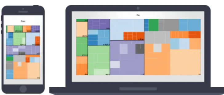
• Labels were displayed as the visualization loaded, and when no space was available they were not displayed. This is not a problem on large displays but quickly becomes one when most labels are not displayed.
• The layout of the rectangles is not adapted to the screen size.
R3S.JS
Based on the challenges and issues identified above, we have started to develop R3S.js6 (figure 2), a library to ease the development of responsive visualizations. We present here our preliminary work on the library.
Event management
R3S.js offers a ResponsiveEvent class to bind callback functions to objects when an event is triggered. By default,
ResponsiveEvent establishes a correspondence between mouse events and touch events. Since the default correspondence may not always be the most appropriate, it can be changed by extending the object. Depending on the use case, it can be better to use specific events rather than others, e.g. mouseover event can be associated to a touchenter in some cases, a touchmove in other cases or even a simple tap depending on the action triggered by the event.
Tooltip Management
Tooltips are a classical method to display extra information about points of interests while keeping the context visible. Mouse hovering often triggers Tooltips. But very few touch devices have the ability to detect finger moving over the surface. The Tooltip object makes tooltip use more
6http://juliana23.github.io/responsiveVisualisations/
straightforward by removing the need to handle different input event listeners. At the moment, developers still have to handle callbacks and dynamically assign the content of the tooltip related to the hovered object. This could probably be improved in future versions of R3S.js, so that the content of tooltips is defined with the object.
Media queries
Media queries enable developers to specify rules that change the CSS style of a page based on some conditions. Although media queries were originally designed to link a specific style to a specific medium (e.g. printouts or screens), media queries now support the activation of styles when some criteria are met, for example a device or window having a given width, this is called a breakpoint.
Breakpoints
We have defined a series of breakpoints adapted to visualizations, especially on small devices, while taking into account portrait and landscape orientation (see Table 1). Besides size and orientation R3S media queries also consider the type of devices. Further work would involve dealing with “real” displayed sizes using ppi instead of pixels.
Table 1. Media queries. Media queries configuration with Less
Less7 is a CSS pre-processor. It enables developers to
generate style sheets using variables, functions or inheritance. Default values for media queries breakpoints
7 http://lesscss.org/
Min-width
Max-width Orientation Device
X 320 X Phone 321 768 X Phone-landscape 1024 X X Desktop 1824 X X Large screen 768 1024 X Tablet 321 768 landscape Phone-landscape-strict 321 768 portrait Phone-portrait-strict 768 1024 landscape Tablet-landscape-strict 768 1024 portrait Tablet-portrait-strict Figure 2. Adaptation of a Treemap visualization with R3S.js Figure 1. Timeline visualization offered with d3.js


![Figure 5. InfoVis Reference Model. Adapted from [3] including an extension for group interaction in relation to the interactive data exploration process.](https://thumb-eu.123doks.com/thumbv2/123doknet/12757481.359274/13.892.88.822.144.319/infovis-reference-adapted-including-extension-interaction-interactive-exploration.webp)