Using stagger charts
to improve the accuracy
of demand forecasts
A. Ramosaj & M. Widmer
Internal working paper no 20-01
January 2020
WORKING PAPER
DEPARTEMENT D’INFORMATIQUE DEPARTEMENT FÜR INFORMATIK Bd de Pérolles 90 CH-1700 Fribourg www.unifr.ch/infUsing stagger charts to improve the accuracy of demand forecasts
Agneta Ramosaj* and Marino Widmer
University of Fribourg – DIUF
Boulevard de Pérolles 90
1700 Fribourg (Switzerland)
(* corresponding author: [email protected])Abstract
Nowadays, no business organization can avoid the need for accurate demand forecasting. It helps make the right decisions at every level, strategic or operational, and it is the center of financial simulation or procurement decisions in terms of production. A way to depict company forecasts could be provided by a stagger chart, a visual tool that is easy to implement and is understandable at each level of the company. In this case study, the sales predictions of an SME are analyzed; the results of quantitative and qualitative forecasting methods are compared and visualized, thanks to a stagger chart. On one hand, quantitative methods provide better forecasts than qualitative methods and, on the other hand, the combination of these techniques with a stagger chart helps the SME drastically improve the accuracy of its demand forecasting.
Keywords
Demand forecasts, qualitative forecasting techniques, quantitative forecasting techniques, stagger charts, rolling-horizon planning, accuracy, SME (small- and medium-sized enterprise), SKU (stock-keeping unit).
1. Introduction
Many companies struggle with forecasting. Sales forecasting is important for a company to plan its production. The quality of its forecasts could have high impacts on product availability or on the financial side, either leading to a high stock level, which means an immobilization of cash flows, or to out-of-stock impacts.
Sales forecasts also form the bases of budget simulation and project launches. If these forecasts are not reliable, that may have negative consequences on the company’s future.
Therefore, we are studying how to enhance the accuracy of these forecasts, investigating the existing methods and analyzing which tools could be provided to a small- and medium-sized enterprise (SME) to improve its forecasts.
2. State of the art
Forecasting is important for every business organization to make the right strategic decisions, even if perfect forecasting does not exist. Each company must regularly and continuously review its forecasts and learn how to decrease the impact of inaccurate forecasts.
Demand forecasting integrates mainly six components:
average demand represents the total demand of a certain period t divided by the number of weeks or months during this period t;
trend is the projection of the direction something is changing (growing, decreasing, stable); seasonality refers to fluctuations that occur every year at the same period;
cycling elements usually follow a ripple shape, passing from one low value to a high value [Lan05]; random variation is the variability of forecasts caused by many irregular factors;
correlation is an indicator that represents the degree of dependence between successive observations.
Usually, forecasting methods are classified into four basic categories: qualitative, time series analysis, causal relationships, and simulation [Mak77].
2.1. Qualitative techniques
These methods are based on experts’ judgments and knowledge to give the best inputs to determine a future demand. They are mostly useful for new product launches, where no historical data exists. To determine the future demand, qualitative techniques rely on provided information such as the number of future points of sales (POS), the tendency of similar products’ sales, the customer behavior, or even the amount of marketing support provided for the launch.
Some tools used in qualitative techniques are the following: market researches, panel consensus, historical analogy, the Delphi method, etc.
The main limitation of qualitative methods is the fact that they are subjective: indeed, they are not based on any calculation and, consequently, the interpretation is highly dependent on the person who provides it. However, Batyrshin and Sheremetov [Bat07] tried to model the importance of human perceptions in terms of forecasting.
2.2. Time series analysis
Time series analysis is based on historical sales [Goo06]. The idea is that future sales could be based on previous sales. Past data may include seasonal or promotional trends. Characteristic to this type of forecasting is the use of short-, medium-, and long-term periods. Short term usually refers to fewer than three months of forecasts and is commonly used for tactical decisions such as replenishing inventory or planning production capacity. Short-term forecasts are also a good measure of the current variability and accuracy and can be used as an indicator to define the safety stock. The medium term is used to build a strategy from 6 to 18 months of forecasts. Medium-term forecasts are useful in capturing seasonal effects. Long-term forecasts are over two years of forecasts and are useful in detecting trends.
Time series analyses are mainly composed of the weighted moving average, simple moving average, exponential smoothing with or without trend, linear regression analysis or trend, and seasonal models. Limitations for this kind of method occur when a change happens in the company or for external reasons, such as an economic crisis, an inventory management change to customers, etc.
2.3
Causal relationship forecasts
Causal forecasts use a linear regression technique and assume that the demand is related to some underlying factors in the environment (other than the time factor). For example, it could be expected that sales of umbrellas increase if a long period of rain occurs.
2.4
Simulation models
Simulation models allow forecasters to vary a range of assumptions and conditions to estimate the forecast. Compared by Caniato and Kalchschmidt [Can11], the methods of these four different categories help improve forecasting, but they are difficult to implement in a company, especially in SMEs because they do not have the same financial flexibility as multinationals. Furthermore, time is required to develop a forecasting tool, which will use one or many of the models presented above. Companies mostly have a lack of time and employees that have the competences to implement such a tool. For this reason, it is important to first propose an easier tool that could help employees follow up their sales and forecasts, and then in a second step, propose improvements to this tool.
3. Stagger charts
As traditional methods seem to be complicated to implement in an SME, the idea of the stagger chart was developed. This tool is visual and could be shared by different departments; it is also easy to implement and to update each week or month, depending on the company’s needs.
The notion of the stagger chart appeared for the first time in 1983 in the book High Output Management by Andrew Grove [Gro15]. At that time, the author was the CEO of Intel, which was known as the best company in the technology industry. In the book, Grove explained some specific management tools such as the stagger chart and the environmental complexity, uncertainty, and ambiguity factor (CUA) as well as more general concepts such as management by objectives (MBO) and task-relevant maturity (TRM).
To our knowledge, the stagger chart is not commonly used in operations management, even if it appears in some papers, such as “Forecasting with Stagger Charts” by Jay Heizer [Hei02]. Weedon et al. [Wee15] also introduced the stagger chart and tried to improve it for aviation fleet planning by using an evolutionary algorithm based on a genetic algorithm. However, they did not consider real sales or the evolution of forecasts through time.
The stagger chart is a tool to better forecast future demand. For each product or category of products, it contains all the information of when the forecasts are made and the real sales by month. It must be updated weekly, monthly, or yearly (depending on the type of products or market) with additional and the latest information. Usually what appears in a stagger chart is commonly an input of qualitative forecasts.
A stagger chart is often used in finance to predict and anticipate cash flows, but it can also be used to predict future sales and, consequently, future production needs.
Its goals are to give a visual view of the forecasts’ evolution from one month to another. For example, it can show the sales trend of one product or one category of products. If a product meets more success than actually planned, the forecasts could be directly and accordingly adjusted.
The stagger chart originally introduced by Grove is the one shown in Figure 1. The first column shows when the forecasts were made and to which month these forecasts are related.
For example, the forecasts for September were evaluated as follows: at the beginning of July, they forecasted 34 real sales for September; at the beginning of August, they reduced the forecasts to 33 and then to 30 at
the beginning of September. However, at the beginning of October, the real sales for September were closed at 29. The black line in Figure 1 separates the forecasts and the real sales indicated by an “*” before the number.
Grove shows a basic case of how stagger chart could be used.
Figure 1: Stagger Chart inspired by Grove [Gro15]
The stagger chart has several similarities with the rolling-horizon planning concept described in Stadtler and Kilger’s book [Har02]. It explains how the planning is divided into periods (such as months), and how the new planning horizon overlaps the previous one (Figure 2). Brown et al. [Bro01] also used the notion of a rolling horizon and explained how the period, which was period t+1, becomes period t one month later.
Figure 2: Planning on a rolling horizon basis inspired by [Har02]
In all the seen cases, the use of a stagger chart remains the same as the one by Grove, even if it concerns cash flows predictions, sales, or production forecasts. However, Heizer used it in an interesting way; he compared the forecasts with the average sales, the budget plan, or the actuals (recent sales) of a product family [Hei02]. Heizer used the stagger chart’s visual facility to validate the forecast accuracy. For example, he compared the accuracy of a forecast made 3 months ahead (in January for April), 2 months ahead (in February for April), and 1 month ahead (in March for April) and proved that the forecast done 1 month ahead had a better accuracy than the one made 3 or 2 months ahead. He used the stagger chart more to validate the forecast accuracy than to bring a real tool to the company to better forecast the future demand.
The advantage and limitation of Grove’s stagger chart is the tool’s simplicity. A stagger is provided globally, but what happens if few markets and products are considered? This is not explained in Grove’s stagger chart introduction.
planning horizon Period t
Jan. Feb. Mar. Dec. Period t + 1
Feb. Mar. Dec. Jan. Period t + 2
Mar. Dec. Jan. Feb. frozen period
4. Stagger chart in SME context
For several decades, forecasting has been a huge topic, especially in multinational companies. Lately, it has become an important topic even in SMEs, where they try to find useful tools that are relevant, efficient, and relatively inexpensive. Most of the time, using traditional models requires investing in new tools or hiring specialized employees. As SMEs cannot afford extra costs, they must find inexpensive tools to help them improve their vision on forecasts, thus the idea of stagger charts.
According to our knowledge, a stagger chart is mainly related to one product while, in our case study, the SME must foresee the sales for more than forty countries around the world, all having different products, ways of ordering, etc. For that, a consolidation of all the forecasts for all the markets has been done through a pivot table, enabling the selection of the market, the product, or the family product.
At this point, two questions appear:
- Could it be possible to implement a simple stagger chart in this company?
- Could it be possible to integrate all the products and markets in this simple stagger chart? The answer to both questions is the subject of the next section.
5. Case study
The first idea was to develop the stagger chart based on Grove’s inputs. In our case study, the SME uses qualitative methods of forecasting. A comparison of the qualitative forecasts and the real sales could give a visual view through a stagger chart.
Figure 3 illustrates the compilation of all the companies‘ data in a pivot table. This SME could compare the
forecasts for each month provided by qualitative methods (in gray in Figure 3) and the real sales (what was sent to the customers) in blue in Figure 3. This representation is already a useful tool for the company, which can “visualize” the forecasting errors and sales trends. All these modifications are visible in the first tool proposed to the company to follow up their forecasts (illustrated by Figure 3).
Figure 3: Stagger chart comparison Qualitative methods and real sales
The configuration of this stagger chart changes from the one proposed by [Gro15], because this SME is working on 2 months of rolling orders (for example, in November 2017, they received the final orders for January 2018 and a four-month rolling forecasts horizon). Every sales or operations manager could go farther to see from where the variations originate. They can select the interested market, the type of products, or even the stock-keeping unit (SKU) to see the forecasting trend and to readjust the forecasts for the future if they see higher or lower sales in one or many products.
Qualitative methods Real sales
Row Labels 01.01.2018 01.02.2018 01.03.2018 01.04.2018 01.05.2018 01.06.2018 01.07.2018 01.08.2018 01.09.2018 01.10.2018 01.11.2018 01.12.2018 01.01.2019 01.02.2019 01.03.2019 01.04.2019 01.05.2019 01.11.2017 200 200 400 350 350 01.12.2017 200 400 350 400 400 01.01.2018 245 400 350 300 200 200 01.02.2018 20 200 44 400 200 200 01.03.2018 49 88 200 200 88 176 01.04.2018 35 200 200 88 176 400 01.05.2018 109 400 200 200 400 200 01.06.2018 121 300 200 400 200 200 01.07.2018 391 200 400 200 200 200 01.08.2018 266 400 200 200 200 200 01.09.2018 89 200 200 200 200 88 01.10.2018 329 200 200 200 88 200 01.11.2018 115 200 200 88 200 88 01.12.2018 228 200 400 200 200 01.01.2019 257 400 200 200 01.02.2019 220 200 200 01.03.2019 57 264 01.04.2019 522 01.05.2019 166
In a second step, the goal was to define whether the qualitative techniques used by the company to forecast were those suitable. In other words, could this SME use quantitative techniques to improve its forecasts’ accuracy? To answer this question, different quantitative methods were tested [Jac18].
The first method was the simple moving average, which calculates the average of the demand over the most recent periods using the formula below:
𝐹𝑡 =
𝐴𝑡−1 + 𝐴𝑡−2 + 𝐴𝑡−3 … + 𝐴𝑡−𝑛
n
where At is the demand of period t, Ft is the forecast of period t, and n represents the number of periods.
The second method was the weighted moving average. This method associates a weight for each past demand, and the sum of the weights should be equal to 1. In general, the idea is to give more importance to the recent periods. The following formula was applied:
𝐹𝑡 = 𝑤1𝐴𝑡−1+ 𝑤2𝐴𝑡−2 + ⋯ + 𝑤𝑛𝐴𝑡−𝑛
Third, the exponential smoothing technique was considered. This method is the most used for forecasting [Har02]. To apply this method, it is required to have the following data: the most recent period’s forecast and demand and a smoothing constant alpha (α), which determines the level of smoothing and the speed of the reaction between the forecast and the real sale. The following formula was applied:
𝐹𝑡 = 𝐹𝑡−1+ 𝛼 (𝐴𝑡−1− 𝐹𝑡−1)
These three methods are classical methods in forecasting. As in the data, several high variations were detected, so a fourth method was developed to account for seasonality.
The first step for this seasonal method was to compare the sales of month t during the last four years (2015 to 2018). The below formula gives a first estimation of the forecasts for year 2019 and month t.
F’t = (At-12 + At-24 + At-36 + At-48) * 1
4 t є {1,..,12}
Then, it was important to find a seasonal factor for each month to readjust the forecasts F’.
Factor: 𝑓𝑡 = 𝐹′𝑡
∑12𝑖=1 (𝐹′𝑖)
Once the seasonal factor was defined, the forecast could be readjusted for month t.
Ft = ft * 1
12 ∑ (𝐴𝑡−𝑖) 12
𝑖=1
These four methods were the basis to estimate and improve the accuracy of this SME’s forecasts, but to better readjust them, further elements could be considered.
Further factors such as promotional factors were also defined. The first step was to analyze whether in the past data it was possible to determine which months were impacted by promotional sales. The promotional factor was identified by tracking the promotional sales per item and by making an average of the promotional quantities sold per item. After, the past sales were cleaned up by removing the promotional quantities. The impact of these promotional quantities was compared to the total quantities, and a factor was determined as the promotional factor.
Another estimated element was the trend factor (δ). Based on past data, the information provided by this factor is the sales tendency (increase, decrease, or stability). The comparison of past similar data permits quantifying this factor.
All these factors were applied to refine the method, which gives the best result for each product.
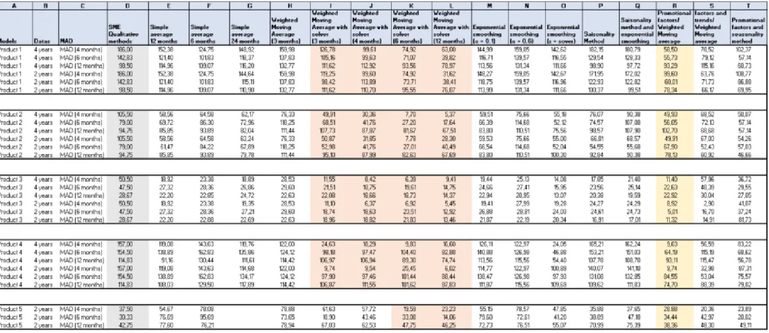
As the company’s data are considered confidential, it is not possible to publish them in this paper. Therefore, to show the efficiency of the different proposed quantitative techniques, the mean absolute deviation (MAD) was chosen as the indicator to compare the results of all these methods. The MAD was calculated for each method and each data set [Jac18].
𝑀𝐴𝐷 = ⅀ |𝐴𝑡− 𝐹𝑡| 𝑛
The MAD (column C in Figure 4) was compared over time for all the methods and SKUs (from 4 to 12 months). The data available for this comparison were the following: 5 products were chosen (column A); for 4 of them, data were available over 4 years, and for the last one, only for 2 years, as it was launched later on the market (column B).
Figure 4 summarizes the results. First, the MAD was calculated for the qualitative method used by the
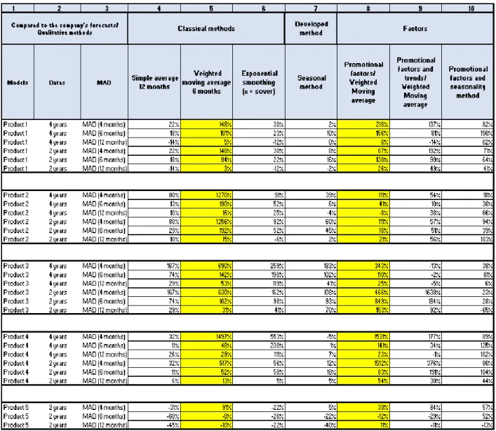
company (column D). Then, this result was compared to the MAD of the first quantitative technique tested (simple average technique). This comparison was done for 6, 12, and 24 months (columns E to G). Figure 5 shows that the simple average technique improves the MAD compared to the qualitative method (column
4). The higher improvement is seen for product 3, for which, depending on the period, it could increase up
to 167%. Nevertheless, as it does not raise the results for product 5, this is most probably due to the fact that product 5 was launched later, and the sales history for this item is smaller compared to those of the other four items.
Then, the weighted moving average with the defined factors of 0.1 for t-3, 0.3 for t-2, and 0.6 for t-1 (column
H) was applied. The results were better (Figure 4) than using the qualitative method (column D), but to further
improve the MAD, these factors were readapted using a solver. As a result, factors were determined for 3, 4, 6, and 12 months (columns I to L) to observe whether the MAD could decrease. It was observed that the best forecast was obtained when it was calculated for the last 6 months. Further, in Figure 5 (column 5), the improvements compared to the qualitative method used by the company are up to 1497% for product 4 and up to 91% for product 5 if the MAD is calculated for 4 months. This proves that the short-term forecasts provide better results than the long term (6 or 12 months).
Then, the exponential smoothing technique was used for α = 0.1, α= 0.6, and α defined by a solver (columns
M to O in Figure 4). The objective for the solver was to minimize the MAD by changing the value of the α
factor using the GRG nonlinear solving method. The results provided by the solver were the best. Figure 5 shows the improvements compared to the qualitative method in column 6. Generally, improvements occurred for all products except product 5. However, the improvements are less significant than those for the weighted moving average technique.
Another approach was to analyze whether it was possible to consider seasonal factors: for example, January 2015, January 2016, January 2017, and January 2018 were compared, and a factor was determined and applied to January 2019 to forecast the sales of that month (column P, in Figure 4). Except for product 3, for which the results were better than that provided by the qualitative method used by the company, the other results were not significantly improved (Figure 5, column 7). It seems that the behavior of these products is irregular.
All these methods were evaluated separately, but then the question became: could the MAD be improved if different methods were combined?
As the results were not satisfying, column Q (Figure 4) was a mix of seasonal factors and exponential smoothing methods seen before in columns M to O. The MAD was sometimes even worse than that obtained by the qualitative method (for products 2 and 4).
The last approach tested was the determination of promotional factors (Figure 4, column R). These promotional factors were applied to the method, which gave the best results (weighted moving average).
Figure 5 shows the improvements compared to the qualitative method used by the company (column 8). If a
quick comparison is done between columns 5 and 8, it can be observed that for products 1 and 4, the improvements are even higher if promotional factors are taken into account. It seems that these two products are promotionally driven products. The improvement is significant for products 2, 3, and 5, but the weighted moving average without considering the promotional factors gives better results.
As the promotional factors seem to give good results, it was decided to add further parameters to observe their positive or negative influence on these factors. For column S (Figure 4), the basis is the same as the that of the previous column (column R), but in this case, a trend factor (δ) was added. Column 9 in Figure 5 shows that these results are not as good as the ones obtained in column 8 or 5.
Figure 4 (column T) shows that if the promotional factors and the seasonality trend were used
simultaneously, the MAD improves significantly for most of the products compared to the qualitative method, but the observed improvements (Figure 5 column 10) are lower than those appearing in column 5
or 8. This confirms that the results are better if seasonal factors are not considered.
In the case study, for all types of products, quantitative methods give better results than the qualitative method used by the SME.
The quantitative methods, which gave the lower MAD, were also dependent on the product’s volatility. Highly volatile products tend to have better results when promotional and seasonality factors are taken into account (Figure 5).
The tests of all these quantitative techniques give inputs to the company, indicating that it should use the stagger chart in a different way by replacing their forecasting method with quantitative techniques that give better results.
After having defined the most suitable quantitative method (weighted moving average) to forecast this company’s future demand, the results of this method were added in the stagger chart and visually compared to the forecasts made by the company (through qualitative methods) and the real sales made for each product.
The stagger chart in Figure 6 helps visualize that quantitative methods (in yellow) give better results than qualitative ones (in gray) when these 2 methods were compared with the real sales (in blue).
Furthermore, this easy tool could become very important for sales managers in challenging distributors or subsidiaries on their forecasts. It can be used at monthly meetings and could become a base for the company to better follow the sales accuracy for each subsidiary and important export market. It helps to picture the sales trend per product and to quickly adjust the forecasts if needed.
Figure 6: Comparison of Qualitative and Quantitative forecasting methods through a stagger chart
However, perfect forecasting does not exist. Even if this decision support tool helps improve forecasts, sales managers are the only ones who can see the customers and market behavior. Therefore, this stagger chart is a good forecasting base, but it could be readapted to the company’s future needs if additional information is provided. Furthermore, as seen in Figure 6, sometimes forecasts are lower than real sales: for this reason, safety stock must also be considered for each item.
6. Further Improvements
The quantitative results were calculated using an Excel file and were added in the pivot table data. The next step would be to automatize them into an easy forecasting tool that this SME could use in its daily business to improve its accuracy. It will be more convenient for the company to have an automatized link between the forecasting tool and the stagger chart and, with time, this SME could use quantitative methods to forecast and include some qualitative inputs when needed.
The advantages of developing this tool are gaining a better view of the company’s sales forecasting and a visual and quick understanding of trends and variations, which could expedite the company’s reactions to improve the tendency.
This tool was focused on sales forecasting for this SME, but they could also use it in the production side to better plan the spare parts needed for the future demand and also to see the variation per spare parts planning.
7. References
[Bat07] Ildar Batyrshin and Leonid Sheremetov (2007), Perception-Based Functions in Qualitative Forecasting. In: Batyrshin I., Kacprzyk J., Sheremetov L., Zadeh L.A. (Eds.), Perception-based Data Mining and Decision Making in Economics and Finance. Studies in Computational Intelligence, vol. 36, pp. 119–134, Springer.
[Bro01] Gerald Brown, Joseph Keegan, Brian Vigus and Kevin Wood (2001), The Kellogg Company Optimizes Production, Inventory, and Distribution, INTERFACES, vol. 31, no. 6, pp. 1–15.
Qualitative methods Real sales Quantitative methods
Row Labels 01.01.2018 01.02.2018 01.03.2018 01.04.2018 01.05.2018 01.06.2018 01.07.2018 01.08.2018 01.09.2018 01.10.2018 01.11.2018 01.12.2018 01.01.2019 01.02.2019 01.03.2019 01.04.2019 01.05.2019 01.11.2017 200 200 400 350 350 01.12.2017 200 400 350 400 400 01.01.2018 245 400 350 300 200 200 01.02.2018 221 20 200 44 400 200 200 01.03.2018 85 49 88 200 200 88 176 01.04.2018 57 35 200 200 88 176 400 01.05.2018 107 109 400 200 200 400 200 01.06.2018 150 121 300 200 400 200 200 01.07.2018 116 391 200 400 200 200 200 01.08.2018 352 266 400 200 200 200 200 01.09.2018 266 89 200 200 200 200 88 01.10.2018 114 329 200 200 200 88 200 01.11.2018 328 115 200 200 88 200 88 01.12.2018 153 228 200 400 200 200 01.01.2019 228 257 400 200 200 01.02.2019 257 220 200 200 01.03.2019 220 57 264 01.04.2019 129 522 01.05.2019 414 166 01.06.2019 230
[Can11] Federico Caniato and Matteo Kalchschmidt (2011), Integrating quantitative and qualitative forecasting approaches: organizational learning in an action research case, Journal of the Operational Research Society, vol. 62, no. 3, pp. 413–424.
[Goo06] Jan G. De Gooijer and Rob J. Hyndman (2006), 25 years of time series forecasting, International Journal of Forecasting, vol. 22, no. 3, pp. 443–473.
[Gro15] Andrew S. Grove (2005), High Output Management, Vintage Books Editions.
[Har02] Hartmut Stadtler and Christoph Kilger (Eds.) (2002), Supply Chain Management and Advanced Planning, pp. 71–96, Springer.
[Hei02] Jay Heizer (2002), Forecasting with Stagger charts, pp. 46–49, IIE Solutions.
[Jac18] F. Robert Jacobs and Richard B. Chase (2018), Operations and Supply Chain Management, Fifteenth Edition, McGraw-Hill.
[Lan05] Robert Landry (2005), Méthode classique de prévision par décomposition de séries chronologiques, Teaching session, HEC Montréal.
[Mak77] Spyros Makridakis and Steven C. Wheelwright (1977), Forecasting: issues & challenges for marketing management, Journal of Marketing, vol. 41, no. 4, pp. 24–38.
[Wee15] Richard Weedon, Samad Ahmadi and Mike Critchley (2015), Optimisation of a Stagger Chart for Aviation Fleet Planning, in Proceedings of the 7th Multidisciplinary International Conference on Scheduling: Theory and Applications (MISTA 2015), Aug 25–28, 2015, Prague, Czech Republic, pp. 952–962
![Figure 1: Stagger Chart inspired by Grove [Gro15]](https://thumb-eu.123doks.com/thumbv2/123doknet/14507506.529065/5.892.90.695.224.427/figure-stagger-chart-inspired-grove-gro.webp)