Computational Support for Media Ecosystems
Research
by
Rebekah L. Bell
Submitted to the Department of Electrical Engineering and Computer
Science
in partial fulfillment of the requirements for the degree of
Master of Engineering in Electrical Engineering and Computer Science
at the
MASSACHUSETTS INSTITUTE OF TECHNOLOGY
June 2018
© Massachusetts Institute of Technology 2018. All rights reserved.
Author . . . .
Department of Electrical Engineering and Computer Science
May 25, 2018
Certified by. . . .
Ethan Zuckerman
Director of the MIT Center for Civic Media
Thesis Supervisor
Accepted by . . . .
Katrina LaCurts
Chair, Master of Engineering Thesis Committee
Computational Support for Media Ecosystems Research
by
Rebekah L. Bell
Submitted to the Department of Electrical Engineering and Computer Science on May 25, 2018, in partial fulfillment of the
requirements for the degree of
Master of Engineering in Electrical Engineering and Computer Science
Abstract
This thesis summarizes the design, implementation, and evaluation of two end-user web tools for automated content analysis of online news data. The first tool is a visualization that displays neural word embeddings data, allowing a user to explore words used in similar contexts within a text corpus. The second tool is an interface that guides users through a supervised machine learning pipeline, enabling novices to train their own binary classification models to detect the presence of a specific frame within the text of a news story. The visualization and interface were evaluated in a user study and think-aloud test respectively. These tools were developed for integration into Media Cloud, an open-source platform for media analysis, which is part of a larger effort to facilitate and advance media ecosystems research.
Thesis Supervisor: Ethan Zuckerman
Acknowledgments
As with any significant undertaking, there is always a group of people working behind the scenes to help make a project like this possible.
I would first like to thank Ethan Zuckerman and the rest of the team at the Center for Civic Media for the opportunity to work on Media Cloud.
Thanks to the Media Cloud team for all of their support and feedback throughout the development of these new features. I’d specifically like to thank Anushka Shah and Natalie Gyenes for their feedback on the word space visualizations and for their willingness to be our go-to guinea pigs for early user testing in general.
Thanks to Katy Ma for her help with the design for the subtopic classifier interface. And special thanks to Rebekah Larsen, whose feedback and insights were crucial to its development.
And last, but definitely not least, a huge thank you to my direct supervisor Rahul Bhargava. Thank you for all of the time and energy you invested in this thesis and for helping me wrangle and squash bugs as well as pivot in the face of research obstacles.
Contents
1 Introduction 13
1.1 Digital Media Ecosystems . . . 14
1.2 Challenges of Computational Analysis . . . 17
1.3 Thesis Goals and Research Questions . . . 18
2 Existing Tools for Media Ecosystems Research 19 2.1 The Media Cloud Platform . . . 19
2.1.1 Explorer . . . 19
2.1.2 Source Manager . . . 20
2.1.3 Topic Mapper . . . 21
2.2 Other Platforms and Services . . . 23
2.2.1 Europe Media Monitor: NewsBrief . . . 23
2.2.2 GDELT . . . 24
2.2.3 Crimson Hexagon . . . 24
2.2.4 Alto Analytics . . . 25
3 Visualizing Word Embeddings 27 3.1 Background . . . 27
3.1.1 Language Visualizations for Content Analysis . . . 27
3.1.2 Word Embeddings . . . 29
3.2 Related Work . . . 30
3.3 Implementation . . . 31
3.3.2 Model Validation . . . 32
3.3.3 Model Visualization . . . 34
3.4 Evaluation . . . 35
3.4.1 User Study Design . . . 35
3.4.2 Results . . . 37
3.4.3 Discussion . . . 38
3.5 Limitations . . . 40
3.6 Extensions and Future Work . . . 41
3.7 Summary . . . 42
4 Helping Users Build Subtopic Classifiers 43 4.1 Background . . . 43
4.1.1 Manual and Automated Framing Analysis . . . 43
4.1.2 Supervised Text Classification . . . 45
4.2 Related Work . . . 45
4.3 Implementation . . . 47
4.3.1 Model Selection . . . 47
4.3.2 Additional Validation Tests . . . 49
4.3.3 Interface Design . . . 50
4.4 Evaluation . . . 53
4.4.1 Results and Discussion . . . 53
4.4.2 Planned Improvements . . . 55
4.5 Limitations . . . 56
4.6 Extensions and Future Work . . . 57
4.7 Summary . . . 57
5 Conclusion 59
List of Figures
1-1 The number of sentences containing the phrase “standing rock” within
a collection of news sources from the Media Cloud database . . . 15
1-2 An example of a link network constructed from news stories mentioning at least one term from a set of words related to teen pregnancy. The colors correspond to communities determined by the Louvain algorithm. 16 2-1 The Explorer interface . . . 20
2-2 The Source Manager interface . . . 21
2-3 The Topic Mapper interface . . . 22
3-1 Ordered Word Cloud for the Climate Change 2016 topic . . . 28
3-2 Word-In-Context for the Climate Change 2016 topic . . . 29
3-3 The process of generating word2vec embeddings for a Media Cloud topic corpus . . . 33
3-4 An early iteration of the word space visualization for the Climate Change 2016 topic . . . 34
3-5 The word space for the Climate Change 2016 topic . . . 35
3-6 A standard word cloud (left) and an augmented word cloud (right) . 36 3-7 Proposed mapping of the conversations identified by our domain expert onto the word space visualization for the Ebola 2016 Media Cloud topic corpus. . . 40
4-1 Supervised learning pipeline for text classification . . . 46
4-3 Probable words lists for each classification type shown in Step 2 . . . 51 4-4 Example of a randomly selected story from Step 3 . . . 51 4-5 Examples of correct and incorrect model guesses based on user feedback 52 4-6 Comparison of attention between the entire RTBF corpus and the
au-tomatically generated Press Impact and Economic Impact sub-topic corpora . . . 53 4-7 Most probable words for each classification for a model trained on the
List of Tables
3.1 Settings for some of the key hyperparameters used in the word2vec model training. Values denoted in parentheses are the default set by the Gensim library. . . 32 3.2 Mean match scores . . . 37 3.3 Mean difficulty scores . . . 38
4.1 Mean precision and recall scores for 3-fold cross-validation on a set of 100 news stories . . . 48 4.2 Mean test precision and recall scores with 3-fold stratified cross-validation 49
A.1 Visualization and analysis methods available in Topic Mapper. Tools that are also available in Explorer are followed by an asterisk. . . 62 A.2 Visualization and analysis methods available in Topic Mapper
(contin-ued) . . . 63 A.3 Comparison of common platforms used in media ecosystems research 64 A.4 Conversations for the Ebola 2016 Media Cloud topic corpus . . . 65
Chapter 1
Introduction
For decades, researchers have been working to understand how media shape the pub-lic agenda and influence civic engagement. The media effects theory of agenda setting suggests that the salience of topics in the media significantly contributes to the pub-lic’s perception of their importance [1]. This phenomenon has been studied in many different contexts, from presidential elections to coverage of the women’s movement [2]. As Cohen so succinctly put it, “The press might not be successful much of the time in telling people what to think, but stunningly successful in telling its readers what to think about” [3].
Although the underlying theories and motivations are still relevant, today’s media landscape is rapidly changing. As the volume of content grows through digital plat-forms of dissemination and as interactions between content generators become more complex, traditional communications research methods alone are no longer adequate to fully understand contemporary media ecosystems.
In the age of big data, media researchers need access to computational methods of analysis in order to understand the large-scale patterns of these networks. Media Cloud, an open-source platform for media analysis, provides such tools in an online setting [4]. This thesis summarizes the development and evaluation of research tools for further expansion of the Media Cloud platform. In addition to providing robust insights into news data, these tools must also cater to researchers with potentially little-to-no background in computer science or machine learning. We begin by
re-viewing some of the literature that has already been produced using Media Cloud as well as the existing challenges faced by researchers. We then go into deeper detail surrounding the current features of Media Cloud and other similar services. Finally, we present two case studies that outline the development, evaluation, and integration of a new feature that helps novices take advantage of machine learning for large scale content analysis.
1.1
Digital Media Ecosystems
When studying media ecosystems, researchers are interested in identifying narratives that develop within a controversy as well as measuring and comparing the overall attention given to these narratives. Researchers are also interested in identifying the sources that advance particular narratives and measuring their relative influence within the ecosystem. Developing quantitative and computational methodologies to help answer these questions is key to the growth of this emerging research field.
Researchers have already begun to explore and evaluate quantitative metrics of influence and attention. For example, attention can be measured by the number of articles that discuss a specific topic. Social media metrics, such as the number of Tweets with a specific hashtag or the number of Facebook shares of an article, are another way to measure attention. When viewing this data in a time series visual-ization, local maxima typically correspond to significant events in the development of a media controversy. Figure 1-1 shows an example of such a visualization from an analysis of media coverage on the Dakota Access Pipeline (DAPL) [5].
There are several ways to measure influence. Benkler, et al. used link analysis in their case study of the SOPA-PIPA debate between 2010 and 2012 [6]. In a link economy, a news story that links to another source is assumed to attribute some measure of importance to that source. The number of references, or ‘in-links’, provides a way to rank articles by influence within the greater conversation. The number of likes, clicks, and shares on social media platforms can provide another metric of influence. By using a social media metric, Graeff, et al. identified influential sources
Figure 1-1: The number of sentences containing the phrase “standing rock” within a collection of news sources from the Media Cloud database
in an analysis of the Trayvon Martin media controversy that link analysis methods did not [7].
Links between articles and sources naturally lend themselves to the use of network models. One such model, used in several studies produced by the Media Cloud research team, is called a link network. In a link network, nodes represent sources within a topic. An undirected edge with a weight of 1 exists between source A and source B if a story from source A links to a story from source B or vice versa. The weight of the edge is doubled if both sources link to each other. The value of a node is determined by the number of incoming edges and is used to convey its importance within the network.
This representation easily allows the application of existing network analysis algo-rithms. For example, using Louvain community detection [8], researchers can pinpoint different framings of a topic based on these linking relationships. Figure 1-2 shows the results of community detection in a link network generated from a collection of news stories about teen pregnancy [9].
More advanced computational techniques can be applied to the text of an article itself. Methods such as topic modeling, sentiment analysis, and entity detection can provide useful insights into a large corpus of online news content.
It is worth noting that these computational analysis methods are not meant to replace human content analysis, but to supplement it. In fact, more established qual-itative analysis methods are useful in testing the validity of these newer quantqual-itative measures [6]. The mixed methodology used in this kind of research takes advantage
Figure 1-2: An example of a link network constructed from news stories mentioning at least one term from a set of words related to teen pregnancy. The colors correspond to communities determined by the Louvain algorithm.
of large scale automated data analysis while still leaving room for the human insight and interpretation that algorithms have yet to be able to mimic.
1.2
Challenges of Computational Analysis
There are several challenges that prevent the proliferation of research in the field of computational social science and contribute to what Manovich calls the “data analysis divide” [10]. Here we discuss a few of these challenges and how Media Cloud helps alleviate the computational burden for media researchers.
The first of these challenges pertains to data access. Fortunately, there is a growing number of freely available data repositories, such as data.gov [11], that allow CSV downloads, although the quality of this data can vary. Social network and news sites also provide APIs to access a subset of their data [12, 13, 14]. These APIs are targeted towards developers and their use requires at least some background in programming. Media Cloud provides access to content data from more than 60,000 actively crawled sources including mainstream news sites as well as independent news platforms and blogs [15]. Data collection is handled on the backend of the platform by scraping the RSS feeds of these sources. Media Cloud data can be accessed through an API [16] as well as through a friendly user interface.
Even if researchers are able to access data, they might not necessarily have the technical or human resources for storage and processing. Advances in cloud computing have made this less of a problem, but using such services usually requires collaboration with computer or data scientists, which is not always possible. Media Cloud not only provides its own database of articles from thousands of monitored sources, but also expands its collection using links found in Media Cloud stories that reference other online articles (Section 2.1.3). Media Cloud also handles the processing and cleaning of data. Important metadata such as dates, headlines, and links are extracted and NLP metrics such as word counts and word stems are calculated. The storage and processing capacity of the Media Cloud platform provides a ready-to-use dataset that can be further refined with query and filter tools.
The ability to model and analyze data is the final challenge and one of the more difficult problems to address. Media researchers need training in machine learning and data science, or need to collaborate with those who have had such training, in order to gain useful insights from big social data. Section 2.1.3 provides a summary of the data visualization and analysis tools available in Media Cloud. We address in the next section how this thesis aims to enhance Media Cloud’s existing data analysis toolkit.
1.3
Thesis Goals and Research Questions
While the current Media Cloud platform has valuable features that have helped pro-duce insightful research, there are currently few tools that help researchers make use of powerful machine learning methods without downloading the data and performing those methods offline. In order to better equip media researchers who are not as well-versed in computational methodology, Media Cloud needs end-user tools that enable the sophisticated content analysis these machine learning techniques can pro-vide. The goal of this thesis is to begin efforts to address that need. The result is the design, development, and evaluation of two new end-user tools for content analy-sis. We present two case studies as justification of the utility of these tools in media ecology research and of their consequent adoption into the existing platform.
The development of these tools brings up additional questions and challenges or-thogonal to UI/UX design, data visualization, and machine learning. Which machine learning and visualization techniques will provide insight into online news data? How can UI/UX and co-design methods help these advanced tools remain powerful yet accessible? How do we adapt these analysis methods to a real-time, web-based user experience? The case studies presented in this thesis provide further insight into these questions and serve as practical examples of the importance of user-centered design. Our main measure of success, however, is that these tools help media researchers produce cutting-edge research from the mountains of data available on the web that would otherwise not be possible due to a lack of technical training or resources.
Chapter 2
Existing Tools for Media Ecosystems
Research
This chapter provides an in-depth summary of the Media Cloud platform as well as overviews of other tools used in media ecosystems research. Table A.3 in the appendix provides a high-level comparison of the different platforms.
2.1
The Media Cloud Platform
The Media Cloud platform collects news stories from sources all over the web through RSS feeds. In addition to news stories, Media Cloud also collects data such as hyper-links, Facebook shares, and Twitter shares. The interfaces that allow users to explore this data are the Explorer, the Source Manager, and the Topic Mapper.
2.1.1
Explorer
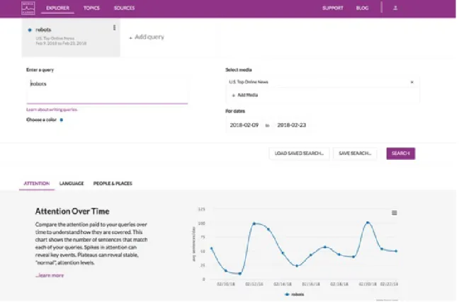
The Explorer interface provides users with a high-level analysis of stories in the Media Cloud database that match a simple boolean query [17]. When creating a query, the user specifies the collection of sources to search within as well as a date range. If a user specifies more than one query, the interface will display a comparison of the results or a tab for each query where appropriate. The analysis tools in this interface
Figure 2-1: The Explorer interface
focus on attention, language, and representation.
The main purpose of the Explorer interface is for preliminary investigation. Un-like Explorer, Topic Mapper expands its search to stories outside the Media Cloud database through a time-intensive web ‘spidering’ process. Explorer provides a more efficient search tool, sacrificing corpus size for time. Because the analysis and visu-alization tools available in Explorer are a subset of those available in Topic Mapper, we postpone the discussion of those tools to Section 2.1.3.
2.1.2
Source Manager
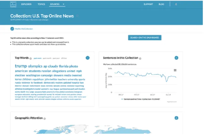
The Source Manager interface allows users to explore an individual source or collection of sources within the Media Cloud database [15]. Users can view summary data such as which sources, languages, and countries make up a collection. For a given source or collection, they can also see how many sentences per day have been collected over time, the top words used in stories, and a map of geographic coverage.
Figure 2-2: The Source Manager interface
2.1.3
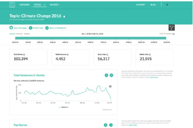
Topic Mapper
The Topic Mapper interface allows users to dig even deeper into a collection of news stories about a specific topic by providing more content and influence metrics as well as subtopic analysis tools [18].
Users create topics starting with a boolean query and a date range. The stories in the Media Cloud database that match this query are used as seeds in a subsequent ‘spidering’ process. The spidering process follows links found in the seed stories that point to other news stories. If those linked stories match the user’s boolean query, they will be included in the topic collection. This process iterates 15 times by default. This allows the inclusion of relevant news stories that are not already in the Media Cloud database.
Once a topic has been created, the user can begin exploring the data with a variety of analysis and visualization tools. Tables A.1 and A.2 in the appendix provide a high-level summary of the current tools available in Topic Mapper.
Figure 2-3: The Topic Mapper interface
Topic Mapper allows additional dimensions of analysis by enabling the user to filter topic stories using the following methods:
• Subtopic. There are currently six different ways for users to create subtopics in the platform. The first method uses a user-specific boolean query and will generate a sub-corpus of news stories within the topic that match the query. Users can also create sub-corpora based on the top countries mentioned in news stories, the media type of the stories (online, radio, etc.), as well as the top themes as determined by a theme classifier from the New York Times [19]. Users can also split their topic into political left and right groups.1
• Sentence Search. Users can enter a simple query to only look at stories within the topic that contain sentences which match the query.
• Snapshot. When users creates or edits a topic query, they generate and save
1This analysis is based on the ratio of Trump and Clinton Twitter followers who retweeted a story and is only applicable to the top 1000 sources within the 2016 U.S. Election topic [20].
a ‘snapshot’ or version of the topic associated with the query. Media Cloud allows users to view the data for different topic snapshots.
• Timespan. Each topic has a start and end date associated with it. Users can adjust the start and end date within the overall timespan of the topic and explore the data for a specific month, week, or day. There are also several visualizations that allow you to compare data from two timespans side-by-side.
2.2
Other Platforms and Services
In this section we provide brief summaries of other platforms and services similar to Media Cloud. These platforms span both the private and public sector and provide data aggregation and analysis tools for studying online news content as well as other text data from the web.
2.2.1
Europe Media Monitor: NewsBrief
The Europe Media Monitor (EMM) tracks thousands of news sources and uses NLP and information extraction methods to produce a summary including the contents of new reports, the location of events, and the entities involved [21]. Unlike Media Cloud, the information displayed in NewsBrief is determined by a purely automatic process without human interaction. Instead of users creating topics, the topics are determined by an algorithm and displayed to the user.
The website has five main features. The first is the ‘Top Stories Overview’, where users can examine which news stories have gained significant attention at the imme-diate moment or within the past 24 hours. Attention is measured by the number of news articles about the event or story. This underlying grouping of news articles by event can be further examined with the ‘Events Detection’ feature. Users can scroll through lists of events and see the lists of individual articles associated with each event. The NewsBrief can also classify articles based on higher-level themes, such as ‘Security’ or ‘Natural Disasters’. Users can scroll through these themes and see
the lists of articles associated with each theme. The NewsBrief provides even more specific classification categories, such as EU-specific themes, people, policy, world regions, and offices and agencies such as the United Nations.
In addition to providing automatic classification of news articles from around the world, the EMM also has an advanced search feature that allows users to explore the EMM database based on keywords, source, category, language, and timespan. Users can also search through the list of sources monitored by the EMM with the ‘Source List’ feature on the website.
2.2.2
GDELT
The Global Data on Events, Location, and Tone (GDELT) Project is a multi-lingual, codified dataset of broadcast, print, and web news from all over the world [22]. The project employs NLP and deep learning methods in order to create datasets coded by events, people, places, themes, and sentiment. The project’s archives date from 1979 through the present day and are updated every fifteen minutes.
The GDELT project includes an analysis service [23] that provides online tools for users to explore a subset of their datasets, specifically the GDELT Event Database and the GDELT Global Knowledge Graph [24]. The purpose of the analysis service is to provide a lower technical entry barrier to begin exploring the GDELT datasets. GDELT provides fourteen different visualization tools, including maps of events, net-works, intensity timelines, and word clouds. The user selects the visualization and enters a query. Once the query has been processed, the results are sent to the user’s email.
2.2.3
Crimson Hexagon
Crimson Hexagon is a private company that helps its customers analyze and under-stand online consumer conversations [25]. It draws from online data sources including social media, customer reviews, online news, and blogs. In addition to its data library, to which customers have full access, it also provides an online platform for data
anal-ysis. This platform includes visualizations and machine learning tools to help users classify data as well as image analysis tools to identify logos, scenes, actions, and objects.
2.2.4
Alto Analytics
Alto Analytics is another private company that also helps its clients analyze large datasets [26]. They provide access to proprietary software for data analysis as well as the ability to collaborate with an in-house team of data scientists for more advanced analysis needs. They provide access to a wide variety of data, including emails, social media, news articles, and web forms and have produced reports in a variety of domains such as consumer insights, crisis response, and public opinion mapping.
Chapter 3
Visualizing Word Embeddings
In this case study we investigate the use of neural word embeddings to help media researchers identify themes within a topic corpus. We first provide a brief overview of existing language visualizations in the Media Cloud platform. We then discuss how neural word embeddings can be used to create semantic word clouds as well as review previous work on the generation of semantic word clouds. Finally, we present the implementation and evaluation of a new language visualization called the word space.
3.1
Background
3.1.1
Language Visualizations for Content Analysis
A key motivation for the content analysis of news articles is the need to identify the dominant themes within a specific topic corpus. Understanding the makeup of the greater conversation surrounding a topic in the media allows researchers to investigate which aspects of a story, debate, or controversy are receiving attention and which are not.
The ability to effectively visualize the language used in a topic corpus can prove to be a powerful tool to help researchers discover and understand these themes. Vi-sualizations allow a user to develop a broad understanding of the data that pure
Figure 3-1: Ordered Word Cloud for the Climate Change 2016 topic
quantitative metrics would otherwise not reveal [27]. To effectively visualize the lan-guage used in a corpus however, we need a robust lanlan-guage data model.
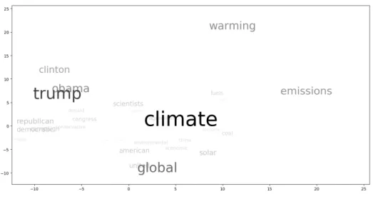
Computational methods of language modeling are abundant. One of the more simplistic approaches is to represent the entire text corpus as a bag of words and examine individual word frequencies. Traditional word clouds can be used to display this kind of model and researchers have access to this visualization in the current platform (Figure 3-1). A user can quickly identify the most frequently used words within a text corpus and perhaps gain a general understanding of the contents of a topic, a task that is sometimes called impression formation or gisting.
Some have pointed out the limitations of word clouds and are skeptical of its uses in data analysis [28]. One of the main shortcomings is that word frequency data alone produces a limited picture of a text corpus. Although word frequencies can help identify more relevant words, any information about the intended purpose behind the specific occurrence of a word is lost without understanding the context in which it was used.
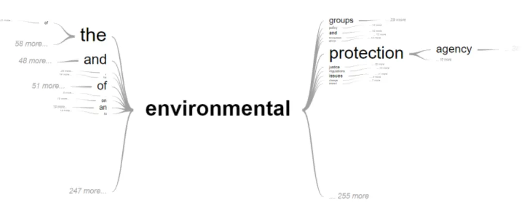
An example of a visualization in the current platform that incorporates contextual information is the Word-In-Context tool (Figure 3-2) which generates the word tree visualization described in [29]. The visualization shows the words most often used before and after a given word in a topic. Although this helps the researcher
under-Figure 3-2: Word-In-Context for the Climate Change 2016 topic
stand the different contexts in which a word appears, it is more suitable for detailed investigation of individual words rather than impression formation.
In order to better support the identification of subtopics, there is a need for a tool that combines the bird’s-eye view of word clouds with the contextual detail of the Word-In-Context tool. With the hope of achieving this balance, we explored and evaluated the use of neural word embeddings to create a useful, glanceable visualiza-tion for the purpose of theme discovery in online news topics on the Media Cloud platform.
3.1.2
Word Embeddings
Word embeddings refer to condensed vector representations of words in a vocabu-lary for a given text corpus. Although there are several different ways of creating word embeddings, the visualization presented in this case study uses word2vec [30]. The theoretical basis for word2vec is the distributional hypothesis which states that words that occur in similar contexts tend to have similar meanings [31]. Word2vec embeddings are generated by training a single-layer neural network to predict a word given its surrounding context. The embedding vector for a word is the corresponding weight vector in the hidden layer of the trained network.
embeddings reflect the semantic relationships between the words they represent. For example, given vectors for the words king, man, woman, and queen, a trained model can learn embeddings such that < 𝑘𝑖𝑛𝑔 > − < 𝑚𝑎𝑛 > + < 𝑤𝑜𝑚𝑎𝑛 > is very close to the vector for the word queen [32]. As is common for most word vector repre-sentations, cosine distance proves to be a useful similarity metric. In the case of word2vec, the cosine similarity between vectors reflects the semantic similarity be-tween the words they represent. The length of a word vector is also considered to encode useful information. Schakel et al. provide evidence that words with larger vector lengths tend to appear not only more frequently, but also more consistently within the same context in a corpus [33].
Because of these meaningful mathematical relationships between vectors, word embeddings can provide useful quantitative metrics for understanding the contextual relationships between words in a text corpus. These metrics can be used to produce a semantic word cloud, that is, a visualization where the spatial distance between words indicates the semantic relationship between words. In order to create this kind of visualization with word embeddings, one can use dimensionality reduction techniques such as PCA so that high-dimensional word embeddings can be mapped to a two-dimensional space. Using a scatterplot of the two-dimensional embeddings, a user can explore the vector space of the corpus where the semantic relationship between words is reflected by their positions in the plot. This method, also outlined in [34], is a common technique for visualizing word embeddings and is the basis for the visualization presented in this chapter.
3.2
Related Work
The problem of generating semantic word clouds is not new. Most methods use some measurement of similarity between words and create an initial layout based on those metrics. These preliminary layouts tend to be sparse or have overlap between words. To account for this, an algorithm such as Force-Directed is usually applied to create a more readable visualization.
A common measurement for similarity is the cosine distance between vectors in a co-occurrence matrix. Examples of visualization techniques that use this method can be found in [35] and [36]. In both examples, an additional algorithm is applied to adjust the layout of the cloud while preserving the semantic information encoded in the spatial distance between words. Xu et al. used a similar approach of layout adjustment, but with neural word embeddings instead of a co-occurrence matrix as the underlying data model [37]. As noted by [37], vectors in a co-occurrence matrix do not encode semantic information as effectively as word embeddings produced by deep learning methods. Furthermore, the size of these vectors is directly dependent on the size of the corpus vocabulary, which can result in rather large and sparse vector representations.
A more unique approach to semantic cloud generation can be found in the work done by Gambette, who used the structure of trees rather than spatial distance to encode the semantic relationship between words [38]. In this ‘tree cloud’ visualization, a word’s placement in the tree is based on its co-occurrence with other words in the text.
In the realm of topic modeling, previous work has been done within the Media Cloud research team in investigating the use of Latent Dirichlet Allocation (LDA) on a Media Cloud topic corpus [39]. Although LDA can be a useful tool, the number of topics must be specified for the training process, putting the burden on the end-user to guess how many topics might be in a corpus.
3.3
Implementation
3.3.1
Model Training
To generate word embeddings for Media Cloud topic corpora, we used the Gensim Python library’s word2vec implementation [40] to train a continuous-bag-of-words (CBOW) model with negative sampling as described in [41] and [42].
Parameter Description value size Number of nodes in the hidden layer (100) window Max distance between current and predicted word (5) iter Number of epochs over corpus (5) min_count Minimum word frequency count allowed 1 max_vocab Maximum number of words allowed in vocabulary 5000
Table 3.1: Settings for some of the key hyperparameters used in the word2vec model training. Values denoted in parentheses are the default set by the Gensim library.
the hyperparameters were set to the library defaults, except for the minimum word frequency count and the maximum vocabulary size, whose settings we discuss below. In general, a hidden layer size of tens to hundreds is suggested by the author of Gen-sim [43]. Given the smaller size of Media Cloud topic corpora (a typical topic corpus in Media Cloud can range from about 100,000 to 600,000 sentences for smaller topics and from 2 to 3 million sentences for larger ones), we chose the library default setting of 100. In order to keep the size of the models manageable and to reduce noise found in corpora such as web links and metadata, we set the maximum vocabulary size to 5000. We found this to be a reasonable number by examining the distribution of word frequencies over several different topics and noting that the majority of the text corpus is accounted for when only considering the top 5000 most frequent words for both smaller and larger topics.
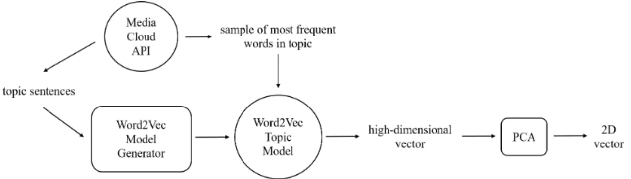
Once the model was trained, the implementation of PCA provided by the Scikit-learn library [44] was used for dimensionality reduction, resulting in the final data point used in the visualization. Figure 3-3 provides a summary of the entire embed-dings generation process.
3.3.2
Model Validation
In general, unsupervised machine learning models cannot be validated with traditional metrics such as precision and recall. Word2vec models are typically evaluated by
Figure 3-3: The process of generating word2vec embeddings for a Media Cloud topic corpus
their performance on word similarity or analogy tasks for standardized datasets [45]. Faruqui, et. al. discuss the limitations to this approach, emphasizing that until more robust validation methods can be developed, “models should be compared on how well they can perform on a downstream NLP task” [46].
It is important to note that the purpose of our word2vec models is to generate embeddings that capture the relatedness of words within the context of a Media Cloud topic, not within the context of the English language. This goal changes what we consider ‘relatedness’ to mean. For example, in English we would not consider the words Paris and agreement to be related to each other semantically. Instead, we would group words like London or Tokyo with Paris and words like consensus or accord with agreement. Indeed, these are the results you would see in large word2vec models such as the GoogleNews model, which has been trained on approximately 100 billion words [30]. Within a corpus focused on climate change however, the words Paris and agreement would often appear in similar contexts, and we would expect their vector representations to indicate a close relationship.
Because of this difference in how we define relatedness, the standard datasets available for evaluating a model’s opinion of word similarity cannot be used. We therefore measured model performance based on the downstream NLP task of finding themes within a topic. In the initial validation of our models, we had domain experts from the Media Cloud team examine the scatter plot of word embeddings for several different topic models. Figure 3-4 shows an example of the scatter plot visualization
Figure 3-4: An early iteration of the word space visualization for the Climate Change 2016 topic
for the Climate Change 2016 topic.
The feedback we received from our researchers suggested potential promise in using word2vec embeddings for a subtopic identification task; however, we also found that it was difficult for researchers to make sense of the scatter plot visualization. For our second iteration, we added additional features to more effectively visualize word relatedness which we discuss in the next section.
3.3.3
Model Visualization
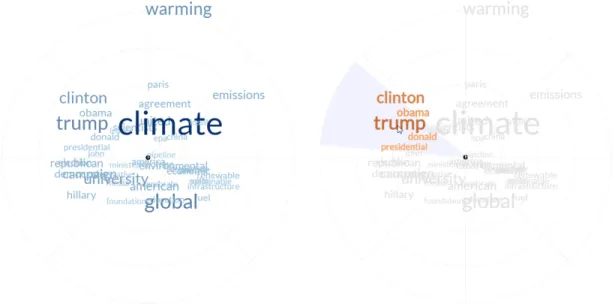
Based on the initial feedback from our researchers, we developed an extended version of the scatterplot visualization that we call the word space as shown in Figure 3-5. The left image in the figure shows the initial view when the user first loads the visualization. The right image shows the view when a user hovers over a word.
As shown in Figure 3-5, when a user hovers over a word, related words are also highlighted. The metric for relatedness is the cosine distance between the two-dimensional word embeddings. A threshold of 0.95, which roughly corresponds to 𝑐𝑜𝑠(18°), was used keep the user’s focus on only the most relevant words. Because cosine distance is used as the similarity metric, the visualization makes use of polar
Figure 3-5: The word space for the Climate Change 2016 topic
coordinate axes to help users group words based on angle differences rather than Eu-clidean distance. A light gray background also appears to mark the boundary where the cosine distance from the selected word is below the threshold.
One limitation of this visualization is that word overlap cannot be controlled since the position is based on the two-dimensional word embedding; however, because the visualization is intended to be dynamic and interactive, using libraries like d3.js [47] allows us to take advantage of features such as zooming and panning.
3.4
Evaluation
To evaluate the effectiveness of the visualization, we conducted a small user study comparing the utility of a standard word cloud, an augmented word cloud, and the word space in helping users complete a short theme-detection task.
3.4.1
User Study Design
We evaluated three different types of visualizations using the Ebola 2016 topic from the Media Cloud database. The first was a standard word cloud with a randomized layout and limited user interaction. When a user hovers over a word with their mouse,
Figure 3-6: A standard word cloud (left) and an augmented word cloud (right)
the word turns blue to improve readability. The augmented word cloud had the same exact layout as the first, but incorporated information from our trained word2vec model. In this visualization, when a user hovers over a word, related words (with respect to the cosine distance threshold) are also highlighted. The word cloud layouts for these two visualizations were both generated using Jason Davies d3 word cloud library [48] and are shown in Figure 3-6. The third visualization was the word space as described in Section 3.3.3.
Participants were randomly assigned a word cloud type and asked to read through a short tutorial on how they could use the visualization to detect a potential conver-sation within a news topic. Each participant had the opportunity to directly interact with the visualization for a sample topic before beginning the actual task. Once a participant was familiar with the visualization and the task, they were shown the visualization for the Ebola topic and asked to find and label two conversations. They were also asked to list three keywords within the visualization that they thought best represented each conversation they identified. Once this task was completed, users had the opportunity to provide feedback in a free-response form. Participants were taken from a convenience sample of students, journalists, researchers, and Media Cloud affiliates. Their answers were compared against an expert analysis of the topic by a researcher on the Media Cloud team, the results of which can be found in Table A.4. We note that the researcher was only given the list of words in the visualization ordered by frequency and that no visual aid was used in the analysis.
Visualization Group Score Std. Dev. Standard Word Cloud 1.6471 0.4779 Augmented Word Cloud 1.1875 0.5266
Word Space 1.5882 0.5999
Table 3.2: Mean match scores
3.4.2
Results
Conversation Matches
We evaluated user responses based on the number of distinct conversations listed by the user that were also listed in the expert analysis. A user conversation was deemed to match an expert conversation if at least two of the three words listed in a user conversation were found within one of the expert conversation lists. Based on this metric, each participant was assigned a score of either 0, 1, or 2. We note that a participant only received a score of 2 if they identified two separate conversations. For example, if both of the conversations identified by the participant matched a single expert conversation, the participant would still receive a score of 1. The results of this analysis are shown in Table 3.2.
An ANOVA test shows no significant difference between the means for the stan-dard word cloud group and the word space group. It did show that there is a significant difference between the average score for the augmented word cloud group and both the standard word cloud and word space groups at a significance level of 0.05 and 0.1 respectively.
Conversation Difficulty
The second metric we used for response evaluation was based on the difficulty of identifying an expert conversation. Here we made the assumption that the more prevalent a theme is within a topic, the easier it is to detect in the visualizations. This prevalence is based on the number of words in each conversation list provided by our domain expert. We assigned a difficulty rating to each expert conversation
Visualization Group Score Std. Dev. Standard Word Cloud 0.971 0.0155 Augmented Word Cloud 0.966 0.042
Word Space 0.989 0.0291
Table 3.3: Mean difficulty scores
and calculated the mean difficulty score for each visualization group. The difficulty rating for each expert conversation was calculated as follows: Let 𝛼 be the likelihood that two words randomly chosen from the topic word list (without replacement) are a member of the expert conversation list. The difficulty rating for that conversation is then (1 − 𝛼). Because participants were asked to identify two conversations, ratings were also assigned to conversation pairs if two conversations were correctly identified by a participant. The difficulty rating for a conversation pair was calculated as 𝛼𝛽 where 𝛼 and 𝛽 are the difficulty ratings for the two expert conversations in the pair. A difficulty rating was assigned to each participant that correctly identified at least one expert conversation. The results of this analysis are shown in Table 3.3.
An ANOVA test shows a significant difference between the means for the standard word cloud group and the word space group at a significance level of 0.1 (𝑝 = 0.051). It also shows a significant difference between the average score for the augmented word cloud and the word space groups at a significance level of 0.05 (𝑝 = 0.046).
3.4.3
Discussion
In our evaluation of the match scores, we were surprised to see the performance of the standard word cloud group as comparable to, if not better than, the augmented word cloud and word space groups. Our original hypothesis was that participants would be able to detect more conversations with the word space visualization followed by the augmented word cloud. However, considering the small set of words to choose from as well as a participant’s potential familiarity with the topic, it is understandable that many would most likely identify at least one expert conversation no matter the
visualization type. Interestingly, most of the negative free-response feedback we re-ceived from participants was directed towards the standard word cloud visualization, with one user stating that relative term frequency data did not seem “relevant to the task” and another user expressing that they felt as if they were “just guessing” (in fact, the same user suggested that a co-occurrence network of the words would have been helpful). Although the standard word cloud group found about as many expert conversations as the other two groups, we suspect that this feedback is consistent with what we see in the difference in difficulty scores between the groups, that is, the stan-dard word cloud conversation matches were skewed towards the expert conversations that were more likely to be chosen at random.
Looking at participant answers and free-response feedback for the word space group, we saw confusion among some of the participants regarding the meaning of the underlying data and how to use the visualization for the specified task. This confusion was either expressed directly in the free-response feedback or indirectly in the word lists. When looking at the word lists that did not match any expert conversation, several responses included words that were not near each other in the visualization at all. We suspect that the higher cognitive load on the user may have contributed to a lower match score for the word space group. These results also suggest a need to revisit the language and examples in our tutorial.
Although there was little difference in the number of expert conversations found, our analysis of the variation in prominence for the correctly identified conversations favored the word space visualization. This suggests that the word space visualiza-tion can help users with limited knowledge of a topic find conversavisualiza-tions that would otherwise be difficult to identify without deeper study of the text corpus.
As a final exercise, we came up with a proposed mapping of our domain expert’s conversations onto the word space visualization for the Ebola 2016 topic (Figure 3-7). Although not all the words in the conversation lists are contained within each labeled sector (for example, ‘obama’ is in the ‘Epidemic in Africa’ theme when according to our domain expert it should be in the ‘Infections in the U.S.’ theme), a large portion of the word lists are clustered together in the visualization. The overlap between the
Figure 3-7: Proposed mapping of the conversations identified by our domain expert onto the word space visualization for the Ebola 2016 Media Cloud topic corpus.
‘Quarantines’ theme and the ‘Infections in the U.S.’ theme suggests that subtopics are not necessarily independent of each other, and the visualization is able to show this relationship. We believe this mapping to be a promising proof-of-concept for the use of word2vec embeddings in finding meaningful subtopics within a focused text corpus.
3.5
Limitations
Here we discuss a few of the limitations to our approach. The first is the lack of a generalized, automated validation method for our trained word2vec topic models due to the difference in each model’s definition of ‘relatedness’ (Section 3.3.2). As of
now, we assume that the same hyperparameters for model training will be sufficient across all Media Cloud topics, which may not be completely accurate. For example, depending on the size of the topic corpus, a larger or smaller hidden layer size might improve the quality of a model. A lack of a generalized, automated validation method means that the quality of the resulting models must be assessed by the end-user.
Secondly, the word space visualization as described here does not provide a full picture of language use within a corpus given that we only display the fifty most frequently used words. Although it provides a possible partition of these words, less prevalent conversations may not be visible. Additionally, our current word2vec models do not support bigrams or phrases.
Due to the limitations listed here, we see the word space visualization as a high-level, exploratory tool for initial analysis that can serve as a springboard into a deeper, more detailed investigation of the patterns seen in the visualization. The confirmation of these patterns with more established qualitative analysis methods can provide validation for the results of these models.
3.6
Extensions and Future Work
We have already begun implementing an extension to this visualization by adding an additional dimension of time. By generating a word space visualization for different timespans, users can explore how word use changes over time within a topic corpus.
Word embeddings themselves have other applications worth exploring. In other work, word embeddings have been adapted for use with LDA as well as sentiment analysis techniques [49, 50]. They can also be used as feature vectors in supervised learning. Integrating word2vec models into the current platform architecture facili-tates the future development of additional automated content analysis methods such as these.
3.7
Summary
In this case study, we presented a new visualization to help Media Cloud end-users explore groups of related words in order to identify themes within different topic corpora. This relatedness is based on word2vec embeddings generated by a single-layer neural network trained to predict a word given its context. In the evaluation of this visualization, there was little difference in the effectiveness of standard and augmented word clouds and the word space in helping users detect subtopics; however, we did find that the word space helped users identify less prominent themes within a topic. Based on these initial findings, we believe that although standard word clouds can provide a very general understanding of the contents of a topic, the word space visualization can provide users with subtle insights into the text corpus that cannot be revealed by word frequency data alone.
Chapter 4
Helping Users Build Subtopic
Classifiers
In this case study we summarize the development of an interface to guide end-users through the process of training and validating their own classifiers to automatically detect different subtopics within a Media Cloud topic corpus. We first discuss tra-ditional content analysis methods as well as current subtopic generation tools in the Media Cloud platform. We then review existing machine learning tools available out-side the platform. Finally, we describe the design and implementation of the interface, initial end-user feedback, and planned improvements.
4.1
Background
4.1.1
Manual and Automated Framing Analysis
In manual content analysis, media researchers will typically read through hundreds of articles, coding for a specific frame or focus [51, 52]. This assignment is usually based on the presence and context of certain keywords in a news article, although specific coding guidelines depend on the purposes of the research. The resulting set of coded articles can then be used for further analysis such as the comparison of attention across different frames. Although manual content analysis is vulnerable
to the potential bias of the human coder, intercoder reliability techniques can be used to mitigate such effects. Overall, the process can be extremely time-consuming, requiring hours of labor and involving multiple researchers.
Automated content analysis techniques can supplement, although not fully re-place, such methodology. The Media Cloud platform includes a “Subtopic Builder”, which allows users to automatically tag and filter stories within a topic using a variety of methods. Currently, in order to filter stories based on article content, a user can use either keyword search or a pre-trained theme detector.
The first method allows users to tag content for inclusion in a subtopic using keyword boolean queries. Any news stories included in a generated subtopic collection must strictly match the query. With this model, the burden is on the user to determine which word or set of words will define the frame. This can result in many false negatives if a crucial keyword is left out of the query. Boolean queries are also very rigid in that they do not take into account the rest of the words used in the article. This can result in a number of false positives if the context of the keyword is not applicable to a theme in a given story. The Media Cloud research team will regularly write long and complex queries in an attempt to avoid these issues.
The second method uses the New York Times theme analyzer. This is a model trained on the New York Times annotated corpus that will output various themes given the text of a news story [19]. This model can help users understand general themes within a topic, but does not allow a user to tag articles for a custom frame. Its vocabulary is also limited to what only appears in the New York Times corpus and cannot scale to new topics that might emerge in the future.
The limitations of both the manual and automated content analysis methods men-tioned above suggest a need for a more sophisticated approach to framing analysis, for which we turn to supervised machine learning. Although there exist many use-ful libraries that provide implementations for supervised learning algorithms, Media Cloud end-users do not necessarily know enough programming to make use of them. In order to still make such methods available to our user base, this case study explores the creation of an interface designed to help end-users train and validate their own
machine learning models to detect custom frames within a topic corpus.
4.1.2
Supervised Text Classification
Supervised machine learning for text classification is a thoroughly studied method for which there exist many tools and resources. Well-known algorithms such as Support Vector Machines and Naive Bayes have been used for this task in many different contexts, the classic example being spam filtering [53].
In this case study, we focus on binary classification models where a document is given only one of two possible labels. Each document is transformed into a tf-idf vector as input into the training algorithm and model. The algorithm takes in a subset of the documents called the training set and performs parameter updates in order to maximize its accuracy in guessing the pre-defined label of each document. These trained parameters make up the resulting model. Additional validation and test sets are used to detect overfitting during the training procedure. High training, validation, and test precision and recall scores suggest the model has successfully learned the distinctions between the two classes and can therefore be used on unseen documents. Figure 4-1 provides a summary of a typical supervised learning pipeline. Our goal in this case study is to develop and evaluate an interface to help an end-user with little machine learning experience follow this pipeline and create their own high-quality classification models. While many of these steps can be automated for the user, algorithm and hyperparameter selection as well as model evaluation are higher level steps in the process that cannot be automated. This case study will outline how we assist end-users in completing these tasks.
4.2
Related Work
A growing area of research in the field of human computer interaction is the de-velopment of interactive machine learning interfaces. These interfaces remove the machine learning expert as the middleman in the training process and allow the end-user (typically a domain expert) to update the model in an iterative fashion within
Figure 4-1: Supervised learning pipeline for text classification
more frequent “train-feedback-correct” cycles [54]. According to [55], an important component of human interaction with supervised learning systems is the user’s do-main expertise. For example, given feedback specifying the areas of a model’s poor performance, a user with domain expertise will know the appropriate examples to add to a training set to address those issues whether or not they fully understand the underlying algorithm. The ability to incrementally modify training data and hyperpa-rameters based on intuitive model feedback can help end-users with little background in machine learning create higher quality models.
There are several existing platforms that allow end-users to train their own ma-chine learning models. Cloud platforms like Amazon Web Services and Microsoft Azure are two such examples [56, 57]. In both of these services, users can select from a wide variety of training algorithms and compare the performance of different mod-els. Pienso and DataRobot are companies that provide machine learning tools on a platform with a lower technical barrier with Pienso’s platform specifically targeting non-programmers [58, 59].
algorithms, the learning curve can still be high for non-technical users and the services are not freely available. Furthermore, we want to allow users to easily integrate their model results into Media Cloud. Consequently, the interface and underlying learn-ing system presented in this case study provide a gentler introduction to supervised machine learning for end-users than those listed above, is specifically focused on text classification, and is tailored to the Media Cloud platform.
4.3
Implementation
4.3.1
Model Selection
The three main goals that drove our design decisions throughout the implementation process were simplicity, efficiency, and accuracy. Working with the assumption that most of our users are machine learning novices, we recognized the need to keep the interface and model creation process as simple and as clear as possible in order to reduce cognitive load. This led us to remove algorithm selection from the learning pipeline and instead use a single training algorithm on the backend of the interface. Because the same algorithm was to be used across users, we needed an algorithm whose accuracy would not be too dependent on small changes in its hyperparameters. Additionally, for the sake of user experience, we needed a reasonably efficient training algorithm so that the pipeline would not be bottlenecked, allowing the user to receive real-time feedback on the model’s results.
We ran initial model validation experiments on several different common classi-fication algorithms using implementations provided by the SciKit-Learn library [44]. We had a domain expert develop a training set consisting of stories from the Media Cloud Right to be Forgotten topic. This topic consists of news stories surrounding the ‘Right to Be Forgotten’ (RTBF), a concept whose practice would allow a citizen to petition for a technology company to remove links to damaging stories about them online [60]. One hundred stories were manually coded by the expert as either con-taining a press impact frame or not. We used this training set to perform three-fold
Classifier Mean Recall Std. Dev. Mean Precision Std. Dev. Top Features Linear SVM (𝐶 = 1) 90.000% 2.154% 94.773% 1.332% 3550 (𝜒 2) Multinomial
Naive Bayes 90.480% 1.942% 83.266% 2.454% 450 (ANOVA) K-Nearest
Neighbors
(𝑘 = 3) 92.280% 2.498% 96.112% 1.999% 9 (ANOVA)
Table 4.1: Mean precision and recall scores for 3-fold cross-validation on a set of 100 news stories
stratified cross-validation for each model with the results shown in Table 4.1.
The preliminary results in Table 4.1 show that all the models performed reasonably well. We discuss each algorithm in detail below:
The linear SVM model performed well but has an additional parameter that would either have been 1) selected through a cross-validation analysis over a set of possible parameters, or 2) included in the interface as a dial for the user to tweak. Our concern with the first option was that an expensive grid search to select the optimal parameter would have violated our design goal of efficiency. The second option would have added additional complexity to the interface which we decided to forgo, at least for the first version of this feature.
Although the K-Nearest Neighbors algorithm had the highest mean precision and recall, in general it is known to not perform well with large feature vectors given that the Euclidean distance metric becomes meaningless in higher dimensions. Fur-thermore, it must scan through all the training data in order to make a prediction, negatively impacting efficiency for large training sets. These shortcomings, as well as its additional hyperparameter, did not coincide with our design goals.
Consequently, we chose Naive Bayes due to its reasonable performance and lack of additional hyperparameters, although we do note the tradeoff of simplicity for some loss of model performance. The Naive Bayes algorithm also outputs a probability distribution of the vocabulary for each label which we hypothesized would be useful
Frame n Mean Recall Std. Dev. Mean Precision Std. Dev. Economic Impact 100 89.394% 14.999% 82.108% 8.151% Abuse 40 61.111% 10.393% 73.016% 28.660%
Table 4.2: Mean test precision and recall scores with 3-fold stratified cross-validation
information to share with users in the training step of the interface (Section 4.3.3).
4.3.2
Additional Validation Tests
We performed additional validation experiments for Naive Bayes on two more training sets curated by our domain expert. The first set contained 50 labeled stories consid-ered to contain an Economic Impact frame within the RTBF topic and 50 labeled counterexamples. The second set contained 20 labeled examples of an Abuse frame within the RTBF topic and 20 labeled counterexamples. The results are shown in Table 4.2.
The model performed roughly the same for the Economic Impact frame as it did for the Press Impact frame. We asked our domain expert to only include 40 stories in the Abuse frame dataset in order to test the model’s resiliency against a smaller dataset size. Unfortunately, there was a significant drop in both the precision and recall scores for this frame suggesting that 40 stories may be insufficient to train a useful model.
We ran the models on the rest of the stories in the Media Cloud RTBF topic and had our domain expert verify a randomly chosen sample of stories from the set. According to the domain expert, 25 of the 30 stories (83%) were correctly classified for the Impact on the Press dataset. For the Abuse dataset, 15 out of 20 randomly selected stories (75%) matched the domain expert’s qualitative review (although two of the five stories could not be reviewed due to a paywall).
Based on the above results, we found a simple Naive Bayes model to perform rea-sonably well for several different frames within the RTBF topic. Given its simplicity
Figure 4-2: Interface workflow
and efficiency, we considered it suitable as a generalizable model for the backend of the interface.
4.3.3
Interface Design
Figure 4-2 shows the breakdown of the individual steps of the interface.
As part of the training step in the interface workflow, we included additional information to help the user evaluate the results of the model. The first was the inclusion of a probable words list as shown in Figure 4-3. Under the assumption that the end-user is also the domain expert, we expected language to be an intuitive source of feedback for users. This led us to include lists of the model’s opinion of the most probable words for each classification.
As is typical in recommender systems, we show a random sample of articles within the topic corpus that the model tagged as part of the subtopic (Figures 4-4 and 4-5). In the third step of the interface, the user can browse through this set of sample articles and indicate whether or not the model’s opinion was correct. We also display common performance metrics such as precision and recall. All of this information is provided to help the user judge the quality of the model and make updates to the training set as necessary.
In order to integrate the interface into the existing platform, all the stories in the topic corpus are tagged with a label based on the model’s opinion. Users can then filter a topic based on these tags and use existing analysis tools to dive deeper into the subset of stories. By integrating these tagged stories as different subtopics, existing
Figure 4-3: Probable words lists for each classification type shown in Step 2
true positive
true negative
false positive
false negative
Figure 4-6: Comparison of attention between the entire RTBF corpus and the auto-matically generated Press Impact and Economic Impact sub-topic corpora
comparison tools can be employed to explore and compare different metrics across the subtopics, such as attention. Figure 4-6 shows an example of the different levels of attention for the Press Impact and Economic Impact subtopics compared to the overall RTBF topic.
4.4
Evaluation
To evaluate the interface design and workflow, we held a think-aloud session with the RTBF domain expert who developed the training sets for our initial algorithm selection and validation. The user developed a new set of stories to train a model to detect a gender frame within the RTBF topic corpus. The user was asked to step through the interface while verbalizing any thoughts, confusion, or questions during the process. At the end, the user was asked additional questions about her experience.
4.4.1
Results and Discussion
Probable Words List
The user expressed some confusion regarding the list of probable words displayed for each label in the second step of the interface. This confusion was rooted in the fact that the same word can appear in both lists. Figure 4-7 shows the two lists displayed to the user during the think-aloud session.
Figure 4-7: Most probable words for each classification for a model trained on the gender frame dataset
The user noted that the word ‘search’ appeared in both lists and asked whether or not the lists should be exclusionary. She suggested that including a more detailed explanation of what the word lists meant would help demystify the overlap between lists for researchers who “want to know more of how the process works”. Despite this confusion, the user found some of the words in the first list to be indicative of a gender frame (e.g. ‘porn’, ‘women’, ‘revenge’). The user also noted it was strange that the word ‘woman’ would appear in the list of words not likely to contain the frame, but followed up with the suggestion that the results “could be an issue of [her] sample.”
Story Samples
The user found the third step of the interface to be both useful and intuitive to understand. She expressed excitement in being able to click on links to each story and verify for herself whether or not it contained the frame. She also found the model confidence percentages to be useful indicators of whether or not a story was likely to be a match (“It guessed it was at 64% and it was correct!”, “Let’s try 50%....yep, not a match”).
about the quality of the model, she stated that the story sample list seemed to be a good method to decide how trustworthy the model was, adding that she would have to review the entire sample of stories to have a fully-formed opinion of the model’s accuracy. We only showed a random sample of 30 stories, but the user stated a preference for an even larger sample.
When the user clicked the ‘Next’ button at the end of the third step, she expected her input to be used in someway to update the model. The interface is currently designed to simply display the information for the user to roughly gauge the model’s performance against her opinion, with the model remaining unchanged. We discuss a potential modification to this design in the Section 4.4.2.
Modifying the Training Set
The user had originally developed a training set containing 33 positive and 40 negative examples of stories containing a gender frame within the RTBF Media Cloud topic. The user was asked to go through the interface one more time after updating the training set so there were an even number of positive and negative examples. Due to the bias that can result from Naive Bayes given an unbalanced training set, we expected to see more accurate results [61].
The user noticed that the probable words lists changed with the new training set, explaining that the word ‘woman’ no longer appeared in the negative classification list, but that ‘women’ was still in the positive classification list. This difference made her more confident in the word list results than in the previous walkthrough.
4.4.2
Planned Improvements
Based on the think-aloud session, there is a clear need for more detailed explanations and hints throughout the interface, especially for the probable words lists. In general, the user in the think-aloud session noted a need for more explanation of how the model works overall. We also note the need to provide tips to users when editing their training data (e.g. add more examples, keep the number of each label balanced,