26
If a Way to the Better There Be:
Excellence, Mere Competence, and The
Worst Comics Ever Made
Joseph Witek
Abstract
The conventional interpretive protocols of current Anglophone critical discourse create a historical disjunction between a déclassé “comics” tradition and an emerging culturally legitimated form of “graphic narrative.” These protocols, which assume a unified, fully intentional author possessing a functionally unlimited degree of technical competence, serve to align the aesthetic criteria for evaluating the consecrated graphic novel with previously legitimated cultural forms, resulting in a narrowly conceived set of approved thematic concerns and a truncated and ahistorical understanding of contemporary artistic practice. I begin a project of histori-cizing the aesthetic evaluation of comics by considering the critical challenges posed by the anomalous work of three creators working in the lowest circles of the commercial comics industry in the United States: Lee Sherman, whose almost boundless ineptitude reveals previously unsuspected criteria for artistic competence; Don Sherwood, who explores the boundaries of professional task avoidance in commercial illustration; and Enrique Nieto, whose visually extravagant and narratively unmotivated character and page designs violate both the implicit critical requirement that “pictures must serve the story” and any reasonable cost/benefit analysis of artistic labor to financial reward. Examining such creators is, I hope, a useful step in developing a critical discourse that conceives of contemporary and future artistic practice as continuous with, rather than a transcendence of, the entirety of comics history.
Keywords
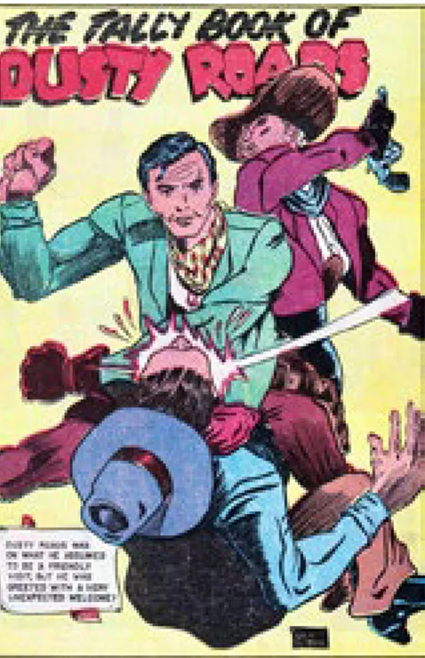
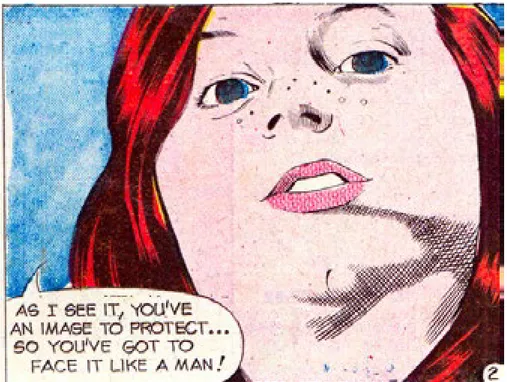
27 This essay begins an attempt to historicize the development of evaluative criteria in the critical discourse on comics, a project that is intended to intervene in a fundamental but only intermittently articulated dispute over the place of comics history in Anglophone comics studies. The project began some years ago with the unexpected intersection of two disparate areas of interest. The first was a project on critical terminology which involved reading nearly every book and substantive article published on Art Spiegelman’s Maus: A Survivor’s Tale up to around 2010; the second was an attempt to come to terms with the apparently endlessly ramifying interpretive complexities involved in reading “The Tally Book of Dusty Roads,” a 7-page story from a 1948 Western comic which has a plausible claim to being the worst story ever published in the commercial comic book industry. In considering the critical literature on Maus, I was struck by the parallels and inversions between what have become the standard interpretive protocols of Anglophone critical discourse on comics, and the interpretive assumptions that were required to postulate how “The Tally Book of Dusty Roads” could have gone so thoroughly wrong in so many baffling ways (fig. 1).
Many aspects of these by-now standard interpretive protocols have developed in response to a problem which has always been endemic to critical discourse on comics, but which became especially salient in the mid-1980s when at first general-audience critics, and somewhat later, academic critics, found themselves attempting to reconcile their own positive and often highly sophisticated aesthetic responses to comics with the fact that the works they wanted to analyze (and often to celebrate) had been created in a culturally de-legitimated art form. The first, longest-lasting and, I would argue, ultimately most pernicious solution to what is at root an ideological dilemma has been to position the newly valorized works of the emerging graphic novel tradition as a revolutionary break with the comics of the past. One of the earliest major reviews of Spiegelman’s Maus: A Survivor’s Tale simply declared, “Art Spiegelman doesn’t draw comics” (Langer 1), and, although few critics today would state the case as flatly as that, much contemporary critical discourse proceeds from the premise that works such as those by Spiegelman, Joe Sacco, Marjane Satrapi, Chris Ware, and Alison Bechdel are best understood as being discontinuous with, indeed a transcendence of, the long tradition of
commercially-Fig. 1: Lee Sherman, “The Tally Book of Dusty Roads,” Cowboy Western #18, September 1948.
28 oriented, industrially-produced comic books and strips (ibid.). In one of the most overt articulations of this position, Johanna Drucker asserts that, “Maus was a radical departure from the ‘comics’ mode whose formal devices it appropriated” (40), thereby rendering the entirety of prior comics history as a scrap heap to be ransacked for a few useful formal techniques in developing that new and unprecedented art form, the graphic novel (ibid.).
Whatever their disciplinary focus, readings of Maus have tended to share some fundamental (although generally unspoken) assumptions about how to engage the work. In any given essay, or set of assertions within an essay, the rhetorical active agent might be:
• the audience (often not specific readers but a generalized hypothetical “we”) • the text itself enacting its own formal gestures and artistic techniques
• the characters posited as human beings moving in a mimetic world • the summarized thematic content of the story
Unifying them all, however, is the author-function: readings almost invariably position the graphic novel as the product of a single creative consciousness whose intentions remain constant, or at least unified, throughout the creation of the work. That creating consciousness actualizes itself in a text created with a functionally limitless degree of technical skill, where even the minutest textual gestures or possibly accidental physical qualities can generate profound and multilayered implications for interpretation. The attributes of the text are grounded in the artist’s choices, and those available options are shaped primarily by conceptual concerns rather than by logistical or commercial considerations.
Academic readings of legitimated graphic novels, then, generally assume a kind of authorial hyper-competence premised on one or more of what may be called interpretive ideologies.1 Those include:
1) the ideology of intentionality: the formal elements displayed by a text are intended to be the way they are or, if accidental, they are allowed to stand as if intended.
2) the ideology of artistic competence: a given text represents the highest level of technical skill available to its creator at the time of its creation.
3) the ideology of professional validation via publication: the publishing of a text certifies that it meets the minimum requirements of the context of its publication.
The wholesale adoption of these familiar operating assumptions of much academic discourse in the humanities has served to align Anglophone comics criticism with existing discourses on visual art, film, and most especially literature, resulting, as in those other discourses, in an interpretive model in which aesthetic evaluation is rarely to be seen (the academic critic’s job, after all, is to analyze the text rather than to celebrate or to deplore it) and yet is felt everywhere: the choice of topic itself is a profound act of evaluation, and contemporary critical discourse is shot through with a familiar array of thinly masked evaluative terms— valorized works are seen as “complex,” and “complicated;” their emotional effects are “powerful,” and “compelling.” The work may be “confrontational,” as it “challenges our very notions;” yet shows “restraint,” displaying “honesty,” “originality,” or “authenticity.” Most centrally of all, the emerging canon of graphic 1 This use of the term “ideology” is derived from Donald Ault, 1997.
29 narrative is “serious,” with the gravity of its typical subject matter (genocide, geopolitical struggle, gender and ethnic identity, and most especially all forms of physical and psychic trauma) serving to validate its solemn explication.
The practical advantages of aligning critical discourse on comics with existing taste hierarchies in terms of professional legitimation and institutional acceptance are obvious, but the consecration of a small body of contemporary work comes at the price of severing those texts from the art form of comics as a whole. Readings of even those consecrated texts can become seriously truncated, resulting, for example, in a body of critical literature which implicitly suggests that Spiegelman’s artistic career prior to Maus consisted almost entirely of halting attempts to discover Maus, a work which itself did not really exist until it was published as a book, or where significant thematic and narrative elements in Maus can be illuminated by invoking Jewish myth and folklore, Nazi propaganda, and Disney animation, but the influence of, for example, Spiegelman’s cartoonist colleagues or his extensive labor as an editor, publisher, and teacher can contribute little to understanding his work.
As a preliminary step toward developing a set of evaluative criteria specific to comics form and cognizant of its history, then, I have been attempting to come to terms with a selection of texts that can charitably be described as “anomalous,” including several cases which are arguably among the worst comics ever published. The basic rationale for this apparently perverse approach is simple: to distinguish degrees of excellence in the arts is a notoriously subjective and ambiguous task, but an analysis of the failure to achieve what are the usually implicit minimal requirements of simple competence can identify some of the most fundamental aspects of comics production more precisely than might a consideration of superior artistic achievement or even of generically adequate work. And in the Anglophone comics tradition the mother lode of errors so profound that they challenge the protocols of textual interpretation, of missteps so egregious that they reveal aspects of comics-making that were previously invisible because no one could ever imagine anyone getting them wrong, is to be found in the output of the Charlton Publishing Company, the alpha and omega of whose corporate ethos was to minimize production costs by any means possible.2 It is no surprise,
then, that Charlton was the publisher of the comics work of arguably the most untalented creator ever to find employment in any aspect of the commercial illustration industry and whose professional output may well constitute the worst comics ever published in the United States: the enigmatic figure known as Lee Sherman.
Sherman exists in the historical record of the comics industry only as a name signed to or associated with over 75 stories and features published between 1947 and 1949 in children’s humor and Western comic books by the company which became known as Charlton Comics.3 Nothing is known of Sherman except the
2 The history of Charlton Publications prior to 1950 is complex and exceedingly poorly documented. Charlton began publishing comic books in 1944, but in contrast to the company’s later practice, until around 1950 much of the material in its comic books was supplied by outside comic book packagers, primarily the Lloyd Jacquet Studio (formerly known as Funnies, Inc.). Sherman may have been employed by Jacquet, by some other comic supplier, or by Charlton itself. For the early history of Charlton and its corporate practices, see Irving, 2000, and Cooke and Irving, 2000.
3 Sherman’s work, to the best of current knowledge, appeared in the following titles: Zoo Funnies #11-15 (July 1947-January 1948); Jack-in-the-Box Comics #14-16 (June 1947-December 1947); Cowboy Western #17-20, 24-26, 28 (July 1948-June 1950);
Tim McCoy 16-21 (October 1948-August 1949), all published by Charlton, and Catholic Comics vol. 1, #11-13, vol. 2, #1-10, vol.
3, #1-10 (May 1947-July 1948), published by Catholic Publications, Inc. (Catholic Publications was apparently an unacknowledged subsidiary of Charlton Publications). Internal evidence suggests that Sherman, like many of the cartoonists whose work appeared in the same publications, rarely worked from complete scripts, and at times was most likely responsible for scripting and lettering as
30 little that can be inferred from the comics themselves and from the circumstances of their production. While biographical obscurity is typical of the often-anonymous comics artists of this period, one notable aspect of Sherman’s canon is the relatively high percentage of his work that bears his signature or initials. Most notable of all, and the characteristic that distinguishes even his unsigned work as his own, however, is the profoundly poor quality of Sherman’s efforts in every conceivable aspect of comics creation, including, but not limited to: basic draftsmanship; spelling, grammar, and lettering; the construction of coherent plots; the appropriate use of standard visual conventions indicating movement and emotion; the rational organization of diegetic space on the page and within panels, and, most fundamentally, the simple depiction of recognizably similar figures from one panel to the next.
Sherman’s corpus, consisting of some 250 pages of published comic art, including five covers and scores of multi-page stories and one-page filler pieces, encompassing the genres of children’s humor and funny animal stories, true-fact educational pieces, retellings of classic fables, and a number of comics adaptations of B-movie Westerns, poses a fundamental question for the comics historian: How could this possibly happen? What combination of misguided artistic ambition and abrogation of editorial responsibility could have allowed this cornucopia of inexplicable artistic choices and errors of execution to see print?
The long list of unusual artistic gestures in Sherman’s work here can only be asserted rather than fully explicated: one can spend many hours on end pondering the questions raised by the seven pages of “Dusty
Roads” alone, analyzing the myriad failures of draftsmanship, the strange lapses in story construction and narrative logic, and the baffling artistic choices on display concerning everything from inking technique to the selection of names for characters, as when in a Western story depicting or referring to a total of seven people, two of them are, for no apparent reason, given the rather un-cowboy-like name of “Ralph.”
I will here briefly focus on only a few of the many baffling attributes and idiosyncratic gestures to be found in the Sherman canon. First, no matter what genre or stylistic approach Sherman attempts, the most consistent quality of his draftsmanship is its radical inconsistency. Perhaps the most basic skill required for cartooning, indeed for any kind of drafting activity at all, is the ability to make repeatable drawings, but in Sherman’s work characters often are drawn so erratically as to be unrecognizable from panel to panel, most well as for penciling and inking.
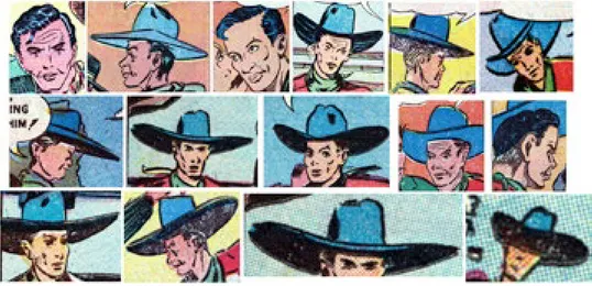
31 notoriously in “The Tally Book of Dusty Roads,” where Dusty Roads himself appears to gain and shed weight, shrink and grow taller, and to change the shape of his head and face throughout the story. Dusty’s cowboy hat undergoes a similar series of radical transformations as its crown rises and falls and its brim expands and recedes (fig. 2).
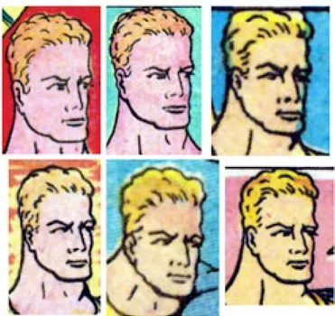
While in comics some variation in a character’s appearance is to be expected, depending on the visual angle, the lighting of a scene, and varying postures and facial expressions, by transgressing a conventional boundary Sherman’s work reveals that it exists at all. While in the fledgling comic book industry of the late 1930s the quality of the artwork could be remarkably crude, by Sherman’s era of the late 1940s most comics displayed a much more consistent level of draftsmanship, and even in those earlier comics a given artist’s rudimentary drawing skills generally resulted in figures which were if anything excessively consistent, as in the work of the cult artist Fletcher Hanks, whose characters often displayed almost identical postures and expressions in panel after panel on page after page (fig. 3).
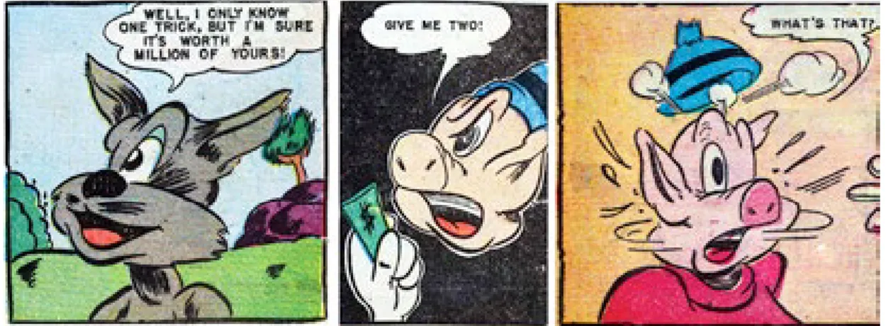
Although the Western adventure story “The Tally Book of Dusty Roads” is for Sherman whatever the term is for the opposite of “masterpiece,” the bulk of his work was actually done in the cartoon humor mode, and the specific demands of that genre elicited an array of distinctive errors not found in his work in the naturalistic mode of the Westerns. For example, one of the conventions of traditional humor cartooning is that as the action unfolds the characters are generally depicted at full length in long shots, in mid shots, or in medium close-up, and much of the narrative typically consists of exchanges of dialogue. As a result, characters are often depicted either in profile or angled facing the reader in a three-quarter view as they speak to or react to an off-panel character. The choice between these two basic angles presents the artist with a compositional decision—in profile, only one of the character’s eyes will be visible; in the three-quarter view, one eye will be entirely visible along with at least a portion of the other one. It turns out, however, that arranging two eyes proportionately on a three-quarter-view funny-animal face is a far more complex task than it might at first appear. Sherman characteristically declines to undertake the challenge posed by that second eye, and by
32 splitting an un-splittable difference introduces into the comics lexicon what may be called the Cyclops shot, where the character appears to possess a single, centrally located eye (fig. 4).
Where in the interpretive protocols attached to the graphic novel unusual or anomalous artistic gestures are assumed to be intentional and significant, Sherman’s comics ultimately call into being an interpretive paradigm that neatly inverts the hermeneutic assumptions presently being deployed in academic discussions of the developing canon of comics art. In contrast to the hyper-competent author-figure found in readings of the canonical graphic novel, “Lee Sherman” of necessity becomes an authorial construct whose artistic intentions can only be inferred from a hypothesized professional context, the specific facts of which have been almost entirely lost to history—we can only assume that Sherman aspired to do what his fellow comic book artists were doing, an assumption reinforced not only by Sherman’s obvious compositional swipes from other Charlton comics, but also by the fact that in the Charlton comics of the 1940s Sherman’s somewhat more accomplished colleagues were themselves attempting to imitate to any degree just short of legal liability the characters and features from publishers farther up the industry food chain, making Sherman the failed imitator of near-plagiarists. To interpret the unusual attributes and puzzling technical gestures in Sherman’s work as unintended failures of draftsmanship, of narrative logic and coherency, of spelling and grammar is to invoke an interpretive ideology of hyper-incompetence grounded in the possibility of infinitely unachieved intentions in a text where potentially anything can be wrong to a functionally limitless degree. Such a reading ultimately becomes an act of complete colonization as the reader replaces the existing text with the hypothetical one Sherman would have created had it been within his power as an artist to do so.
If the “Lee Sherman” authorial construct can be seen as a sincere but profoundly limited craftsman attempting to emulate his professional peers, the cartoonist Don Sherwood epitomizes the sin of task avoidance; in his work the everyday cheats, swipes, and shortcuts of the professional artist are taken to their ultimate conclusion. Sherwood is best known in the history of comics as the target of a vengeful parody in the first issue of Warren’s horror magazine Creepy in 1964. “Success Story,” written by Archie Goodwin and drawn by Al Williamson, tells the story of cartoonist Baldo Smudge, who murders his collaborators to hide his professional misdeeds, only to have his scripter, penciller, and inker return as zombies and tear him to pieces. “Success Story” is based on an anecdote which rightly has become legendary in the comics industry. Sherwood always aspired to a regularly paying job as a syndicated cartoonist, and his newspaper strip Dan Flagg, an obvious
Fig. 4: Lee Sherman, Left: “The Cat and the Fox,” Catholic Comics vol. 2, #2, November 1947; Center: “Pudgy Pig,” Catholic Comics vol. 2, #4, January 1948; Right: “Piggly Pete,” Zoo Funnies #15, January 1948.
33 knockoff of Alex Raymond’s Rip Kirby, ran in a number of newspapers from 1963-1967. Comics artist George Evans told an interviewer in The Comics Journal, no. 177:
That [story] was based on the guy who “drew” Dan Flagg, Don Sherwood. The first parts were art swipes from Alex Raymond’s Rip Kirby, and as the schedule hit him, producing strips seven days a week plus the story, he began to hire other people to do it. These included Al Williamson, myself and Wally Wood. He hired a whole slew of people and it turned out, as we talked to each other, that that’s what was happening. He was buying the story, buying the art and everything else, but his name was signed large and clear on all these strips. The guy was a real pain in the ass. (73) (fig. 5)
Although Sherwood was forced back into the role of actually writing and drawing the comics for which he was paid, his tendency to minimize the labor involved in making comics proved recrudescent in his stint from 1971 to 1973 writing and drawing the 21 issues of Charlton’s licensed adaptation of the popular TV sitcom The Partridge Family. Created as a television vehicle for teen idol David Cassidy, the series featured a widowed mother, played by Shirley Jones, and her five children as a pop music group who toured the country in their Mondrian-inspired multi-colored school bus.
Sherwood’s comic book stories rarely had any connection to the plots of the TV episodes, and as the series went on he developed a peculiar mode of image-text interaction featuring full-page, pin-up-style renditions of the characters, a technique which mutated away from comics as commonly understood and toward a merging of sequential art with the specular conventions of the teen magazine. The final issue of The Partridge Family is a tour de force of pictorial efficiency and economy of effort, albeit at the cost of narrative continuity and coherence. The lead story, “The Kid Who Knew Too Much,” was described by Spiegelman in a telephone conversation as, “it’s like it’s not even a comic.” This 12-page story of a jewel heist at a Partridge Family concert in Monte Carlo contains a total of 16 panels; the thieves themselves are only pictured twice,
34 one of these only in outline, and the climax of the story and its dénouement are described in the text rather than depicted. The bulk of the story, as with a large percentage of the entire series, particularly in its last 12 months, consists of full-page close-up portraits of the members of the Partridge Family against plain backgrounds, all obviously derived from publicity stills and other photo references, and all with the gaze of the characters oriented entirely outside the panels, directly at the reader rather than into the diegetic space. This labor-saving approach comes to its fullest flowering in the backup story “Keith’s Sea Adventure,” a four-page story consisting of a total of eight panels, and the only multi-panel page is obviously taken from the preexisting inventory of a naval war comic with Keith’s pleasure boat drawn in. The identification number on the rescue ship tells us that this image is a swipe from a stock photograph, and that what is supposed to be a rendition of a Coast Guard cutter is actually a drawing of DD-706, the USS Gainard, an Allen M. Sumner-class destroyer whose formidable complement of six 5-inch guns and several dozen anti-aircraft batteries are of little use in everyday search-and-rescue missions off sunny California beaches (fig. 6).
In an apparent attempt to add visual variety to the comics while minimizing the number of lines required to be drawn, Sherwood emphasizes extreme close-ups of the faces of the Partridge Family, often up to and past the point of grotesquerie. The extensive deployment of photo reference also emphasizes the problems inherent in depicting the faces of real-life persons in comic art. In comics the faces of such characters are
35 generally delineated with much more specificity than are those of the fictional characters around them, and the facial orientation of a portrait’s subject outward toward the original camera creates a series of subtle disjunctions and displacements that suggest that the characters exist for readers but not for each other in the storyworld (fig. 7).
Sherwood’s hybrid of licensed-property comic adaptation and teen-idol magazine transgresses not only formal but professional norms. As various interviews with editorial staff such as Dick Giordano and George Wildman suggest, Charlton editors apparently did attempt to produce the best comics they could within the bounds of the profoundly miserly and slipshod corporate ethos, so we can assume that editors sometimes requested some changes or corrections to the work of various artists and writers. As it happens, however, the historical record contains exactly one account of work that almost failed to meet Charlton’s standard of quality. Jon B. Cooke, an interviewer from the magazine Comic Book Artist, asked George Wildman:
CBA: You had a good personality for working with freelancers, right?
George: Yes, because I had been one. I knew what it was to lose an account. I had one guy one time, I’ll never forget—his name is not important, we were doing The Partridge Family and the artist would get behind. He would come in with a book, you know, once a month he’d come in. His wife would be there, his kids would be there with him. He and I would sit down, and he does a nice intro page. Then the next page is a head, a full page of a head. Six pages, a head, six pages, a head. I said, “You do this one more time . . .” and he said, “No, I just thought that had a nice effect.” [laughter] I said, “Aw, don’t give me that. Tell you what: You claim you wrote it this way? Next time I’ll give you [get] half the book.” [laughter] “No, no, don’t do that to me. George, you can’t.” He had a copy machine. He had all kinds of sh*t who could help him crank it out, you know. But he came right around as soon as I said to him, ‘You’re going to get half the book next time.” Oh, Christ, I thought he was going to cry. It turned him right around.
Fig. 7: Don Sherwood, “The Lone Partridge Rides Again,” The Partridge Family #20, September 1973.
36 I knew what was going on.
(24) (fig. 8)
Just as in its struggle to achieve mediocrity Sherman’s work can highlight the existence of a previously unremarked-upon convention for drawing funny-animal faces by remaining oblivious to it, Sherwood’s Partridge Family comics reveal a previously unsuspected boundary between the visual simplification that is endemic to cartooning on the one hand and professional malpractice at the other. Those comics ultimately challenge our very notion of what a comic is and can be by embodying the artist’s valiant but ultimately doomed attempt to not do any work and still get paid for it.
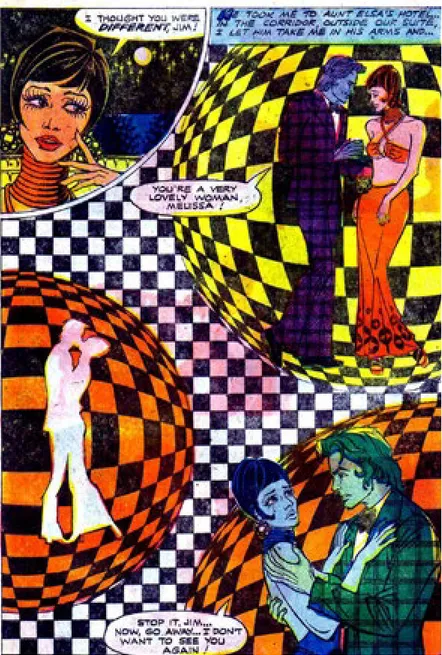
A third Charlton artist, in contrast, is remarkable for transforming our very notions of what a comic can be by working exponentially harder than necessary. In the 1970s Charlton began looking abroad, including in Europe, South America, and Australia and New Zealand, for artists who would work even more cheaply than the cheapest North American artists. One scouting expedition to Spain discovered Enrique Nieto Nadal, who published at Charlton in the mid-1970s under the names Frank Nieto, Joe Nieto, and most commonly, Enrique Nieto (Nieto). Nieto published some work in Charlton’s war and horror comics, but the most notable aspect of Nieto’s comics are the narratively unmotivated graphic excesses of his copious romance work. While romance comics have always had an interest in fashion and style, and artists often took the opportunity to showcase the lifestyles of the lovelorn rich and famous, Nieto’s pages push graphic design into a methodical violation of what Andrei Molotiu has called “the logic of illustration,” the critical ideology that insists on the primacy of narrative in comic, as embodied in the injunction that everything in a comic should function in support of the story (fig. 9).
Fig. 8: Don Sherwood, “The Kid Who Knew Too Much,” The Partridge Family #21, November 1973.
37 Nieto’s explanation for the complex designs and florid graphic gestures in his romance comics is simply that he wanted to use the opportunity of North American publication to display his skills to potential future employers. Those technical skills are indeed formidable. Although his published pages can sometimes appear to consist almost entirely of collages of texture screens and tonal appliqués, in fact a close examination of some original art reveals that most of the lines and textures on the pages have been drawn by hand. Throughout Nieto’s romance comics, men’s suits are typically plaid or their bell-bottom pants are striped, both their shirts and women’s dresses tend to sport floral designs, and, most spectacularly of all, Nieto’s panels often deploy extravagantly decorative visual motifs, both diegetic (Op Art posters on the walls of an otherwise ordinary business office, for example) and non-diegetic (a vast range of design-heavy panels including high-contrast reversal effects, checkerboards and other geometric patterns, and Art Nouveau filigree backgrounds) (fig. 10).
Given that Charlton’s page rates had to be low enough to make international artists cheaper to use than North American creators even after factoring in the cost of international postage for scripts and finished art, clearly any direct professional cost-benefit analysis in regard to these pages is almost completely beside the point.
38 This ideology of visual excess apparently infected the production staff back at Charlton, because Nieto’s works habitually are given a remarkable color design sometimes seen in European comics of the late 1960s and 1970s but almost unknown in North American commercial comics. The chiseled features and torsos of the characters in Nieto’s work obviously are extremely stylized and idealized, as if in a more angular parallel to the homoerotic art of Tom of Finland. But Nieto himself had nothing to do with the fact that the skin tones of his characters can vary from panel to panel in shades of blue, green, hot pink, purple, and yellow. While interpretive hypotheses can be constructed to associate the graphic exuberance of Nieto’s comics with the emotional themes of some of the stories, and the changing skin tones might notionally be ascribed to the emotional volatility of the characters themselves, I would argue that the attempt to reconcile Nieto’s work with the logic of illustration, to see “the pictures in service to the story,” is primarily a function of critical habit (fig. 11).
Ultimately Charlton was a place where few people cared about comics, and those who did care were, by all available evidence, left to care about them in their own individual, often partial, ways. Nieto had no particular fondness for romance comics, but he obviously liked to draw shapes and play with textures.
39 Someone in the Charlton production department apparently liked to experiment with colors, even though the printing side of the house had no particular interest in effectively printing those complex color schemes. The result is a series of striking and unusual comics that give some readers, me among them, enormous pleasure in looking at them and thinking about them.
Those specific pleasures of Nieto’s Charlton comics are at this point largely incommensurate with the standard interpretive protocols of contemporary comics criticism. The artist controlled neither the pedestrian writing nor the extravagant (and usually shoddily reproduced) coloring of the comics he drew, and, by his own account, their flamboyant visual gestures were primarily addressed not to comic book readers in the United States but to potential European employers. While analogues to the sort of graphic exuberance and focus on visual design exhibited by Nieto’s pages can be found in various ways in the work of cartoonists such as Gary Panter, David B., and Chris Ware, critics are only just beginning to explore how such qualities as Nieto’s obsessive page and panel designs might be valued in works created under the regimes of industrial production.4 For most of the history of Anglophone comics publishing, the criteria in play at any given time
4 The most important work in English in this regard is being done by the critic and art historian Andrei Molotiu, whose
40 for distinguishing a good comic from a bad one have been largely unarticulated. But the peculiar set of values under which Charlton’s comics were produced can help to illuminate the historical development of those criteria in ways that more critically acknowledged comics works do not. Even the most fundamental metric of commercial mainstream success, sales of comic books on the newsstand, was only marginally relevant at Charlton, where comic books functioned primarily as a means for the publisher to avoid paying for idle printing presses and production crews; the minimal interventions by Charlton’s comic book editors and the obvious indifference to quality control on the production line can perhaps be explained by comics-industry anecdotes suggesting that magazine newsstand operators, contractually required to accept Charlton comics in order to handle the publisher’s more lucrative newsstand magazines, routinely pulped bundles of comics unopened. The leading comics publishers such as DC and, later in their history, Marvel Comics required a degree of editorial oversight and basic quality control in order to protect their established corporate brands and to maintain the value of assets such as characters and series titles. That is, where Marvel and DC made money by creating stories and characters that readers wanted to buy, Charlton, as an integrated publisher, printer, and distributor, made money by convincing retailers to buy bundles of paper and ink. Moreover, Charlton’s attempts at maintaining comic book sales, such as they were, primarily took the form of filling obsolete or under-served genre niches as trends in comics sales fluctuated, producing, for example, lines of Charlton romance, Western adventure, and war titles whenever the focus of other comic book publishers turned elsewhere.
Given that the actual content of Charlton comics not only was relatively unaffected by feedback from readers, and given that the books could fulfill their primary commercial purpose without ever being put on sale at all, the question arises: Why regard Sherman, who has hundreds of published pages and several comic book covers to his credit, as an inept anomaly in the history of the comics industry rather than as an artist setting the minimum standard of competence for a commercial artist? But after Sherman did not come the flood of inept drawing, not immediately, at any rate. Certainly Sherman’s draftsmanship is, taken out of historical context, considerably more polished, his panel-to-panel character rendering no more erratic, his spelling and grammar no more error-prone than those of any number of comics creators in the underground comix and today’s alternative cartooning. The history of aesthetic evaluation in comics is only beginning to be written, and when it is, the rejection, reversal, and transformations of traditional canons of skill and taste in commercial illustration by the underground comix movement will surely be among its most important epochs. But Charlton’s elevation of commercial values to the exclusion of all others paradoxically created a space for a kind of artistic freedom, or at least license, that was available nowhere else in the comics industry, making it, for example, the congenial professional home to the idiosyncratic comics great Steve Ditko for decades after his acrimonious split from Marvel. Not until the emergence of the aggressive primitivism of underground cartoonists such as Rory Hayes would comics in the U.S. again find space for drawing as crude as Sherman’s, and not until the graphic innovations of the alternative and independent comix could the minimalist gestures of cartoonists such as Shane Simmons and Matt Feazell be positioned as manifestations of a innovative artistic ethos rather than as a form of Sherwood’s inveterate task avoidance. Charlton likewise had room for a number of artists who matched the rote and repetitive scripts of its romance comics with page after page of close-tions of comics by Steve Ditko and Jack Kirby on his Abstract Comics blog have influenced my own thinking on how contemporary critical discourse might connect to rather than bracket off the bulk of comics history.
41 ups of pensive young women and their angst-ridden suitors against blank panel backgrounds, as well as for allowing Nieto to lavish outlandish amounts of visual attention on the decorative details of clothing, furniture, and non-diegetic backgrounds.
From the Olympian heights upon which contemporary critical discourse has situated the consecrated graphic novel, the work of Sherman, Sherwood, and Nieto becomes almost completely invisible. The sum total of these artists’ work almost perfectly epitomizes all that must be rejected in order to transform the déclassé “comics” into the culturally legitimated “graphic narrative”—kiddie humor, TV tie-ins, and low-end romances, with at best the thematic gravitas of cheap melodrama and with any psychosexual tensions rendered deeply subtextual. An attempt to read a specific example of their work as if it were the product of a unified creating consciousness, even if such a project were not completely ahistorical, would be crippled by incomplete and to a large extent unrecoverable information about the creators themselves and the context in which they created. But as culturally tempting and professionally convenient as it may be to conceive of a valorized “graphic novel” as transcending its embarrassing “comics” past (with perhaps a select group of high art avant la lettre comics “greats” rehabilitated in order to assist with canon-building), the loser in such a trade-off really is the work of current and future creators. At its simplest, that loss takes the form of critics praising the “originality” of artists for doing what, unbeknownst to the critic, comics have routinely done. At other levels it can take the form of excessive and critically counterproductive apologia for the comics medium, or of overselling the parallels between important work in comics and work in art forms whose cultural legitimation is of longer standing. Sherman’s missteps can show us how comics work when they step more adroitly, Sherwood can illuminate how we define the necessary work of a comic creator when he avoids doing it, and Nieto’s work demonstrates that comics of remarkable energy and strange visual delight can emerge from even the most commercialized and least rewarded of artistic situations. If indeed those comics, and the history which preceded and followed them, cannot be encompassed by the ruling criteria of value now current, it is high time to reexamine those criteria.
I am deeply grateful to Donald Ault, Art Spiegelman, and Jim Vadeboncoueur, Jr., whose extraordinary generosity in sharing their ideas and their comic books has made this project possible.
Works Cited
Ault, Donald. “Design and Ideology in Mickey Mouse Comics: Gottfredson, Murry
Wright, and Others.” The South Atlantic Modern Language Association Conference, Popular Culture Session, November 1997, Atlanta, GA. Paper presentation.
Cooke, Jon B. “Wildman Times at Charlton: Talking With Charlton’s Managing Editor
(and Popeye Artist).” Interview with George Wildman, transcribed by Brian K. Morris. Comic Book Artist, no. 12, 2001, pp. 18-25.
Cooke, John B., and Christopher Irving, “The Charlton Empire: A Brief History of the Derby, Connecticut Publisher.” Comic Book Artist, no. 9, 2000, pp. 14-21.
42
vol. 46, no. 2, 2008, pp. 39-55.
Irving, Christopher. “The Half-Dollar Man: Charlton Founder’s Son Reveals the
Company’s Roots.” Interview with Charles Santangelo. Comic Book Artist, no. 9, 2000, pp. 12-13.
Langer, Lawrence L. “A Fable of the Holocaust.” New York Times Book Review, 3 Nov. 1991, p. 1.
Molotiu, Andrei. “More on Ditko and Abstraction.” Abstract Comics: The
Blog, 21 Jan. 2010.
Nieto, Enrique. “Re: Charlton Comics.” Personal email message. 30 June 2011. Sherman, Lee. “The Tally Book of Dusty Roads,” Cowboy Western #18, Sept. 1948.
Spiegelman, Art. Personal telephone conversation. 12 Feb. 2010.
Wardle, Paul. “George Evans Interview.” Comics Journal, no. 177, 1995, pp. 57-75.
Joseph Witek’s Comic Books as History: The Narrative Art of Jack Jackson, Art Spiegelman and Harvey Pekar was the first book published in the University Press of Mississippi’s “Studies in Popular Culture” series in 1989. He has been teaching courses and publishing articles on comics for over thirty years, and has served on the editorial boards of many journals and as an editorial consultant to a number of publishers in the field of comics studies. He is the editor of Art Spiegelman: Conversations, and the Kathleen A. Johnson Professor of Humanities at Stetson University in DeLand, Florida, where he teaches in the Department of Creative Arts. Email: jwitek@stetson.edu