Data Analytics and Visualizations for StarLogo Nova
Block Programming Platform
by
Phoebe Hiuchin Tse
Submitted to the Department of Electrical Engineering and Computer
Science
in partial fulfillment of the requirements for the degree of
Master of Engineering in Electrical Engineering and Computer Science
at the
MASSACHUSETTS INSTITUTE OF TECHNOLOGY
September 2017
c
○ Massachusetts Institute of Technology 2017. All rights reserved.
Author . . . .
Department of Electrical Engineering and Computer Science
July 24, 2017
Certified by . . . .
Eric Klopfer
Director of MIT Scheller Teacher Education Program
Thesis Supervisor
Accepted by . . . .
Christopher J. Terman
Chairman, Masters of Engineering Thesis Committee
Data Analytics and Visualizations for StarLogo Nova Block
Programming Platform
by
Phoebe Hiuchin Tse
Submitted to the Department of Electrical Engineering and Computer Science on July 24, 2017, in partial fulfillment of the
requirements for the degree of
Master of Engineering in Electrical Engineering and Computer Science
Abstract
In this thesis, I designed and implemented an analytics tool for StarLogo Nova, a block-based programming platform for creating 3D simulations and games. This tool collects block data from the platform and visualizes the data into 15 different charts, showcasing both high-level and the more detailed aspects about the data. As a way to investigate how to improve StarLogo such that it is more accessible to beginner users and more extensible to experienced users, the tool includes charts that focus on the following four elements: tutorials, breed tabs, scrolling, and block size and placement. Suggestions for how to improve StarLogo’s user interface, driven by a few runs of this tool on the data, are documented in this thesis as well.
Thesis Supervisor: Eric Klopfer
Acknowledgments
I thank the members of the Scheller Teacher Education Program (STEP) lab for their support, encouragement, and insightful feedback on my work. I specifically thank my direct supervisor Daniel Wendel, who was always available to discuss everything from the vision to project pivots to specific technical issues throughout the entire process to thesis revisions. Also, I would like to thank Eric Klopfer for being willing to revise and revise, as well as Paul Medlock-Walton for encouraging me to think beyond StarLogo toward the vision of improving the block-based programming space as a whole. I hope that the tool developed and insights discovered in this thesis project contributes to the future of StarLogo as well as the broader space of block-based programming.
Contents
1 Introduction 13
1.1 StarLogo Nova Platform Overview . . . 13
1.1.1 Introductory Programs . . . 14
1.1.2 Users . . . 16
1.1.3 Interface . . . 17
1.2 Main Elements for Investigation . . . 17
1.2.1 Tutorials . . . 20
1.2.2 Breeds . . . 20
1.2.3 Scrolling . . . 22
1.2.4 Block Size and Placement . . . 24
1.3 Thesis Overview . . . 25
2 Evaluation of Current Block-Programming Analysis Tools 27 2.1 ScratchStats . . . 27
2.2 App Inventor . . . 29
2.3 StarLogo Approach . . . 30
3 Analytics Tool Overview 33 3.1 Goals . . . 33
3.2 Constraints and Challenges . . . 33
3.2.1 Public Projects Only . . . 34
3.2.2 Browser Limitations . . . 34
3.3.1 Extracting Data . . . 35
3.3.2 Visualize Data . . . 36
3.4 Recap . . . 36
4 Implementation 39 4.1 Extracting Data . . . 39
4.2 Transforming Data: Finding Duplicates . . . 40
4.2.1 Active Blocks and Functional Duplicates . . . 41
4.3 Mining Data . . . 45
4.4 Visualizations . . . 46
4.4.1 Top 200 and Random 10,000 . . . 47
4.5 From Extraction to Visualization . . . 48
5 Results 51 5.1 How do the projects look as a whole? . . . 53
5.1.1 Empty Projects . . . 54
5.1.2 Overview: Duplicated, Potentially Similar, or Empty . . . 54
5.2 How similar/different are they to tutorials? . . . 55
5.2.1 Top 200 Project Signatures are Tutorials or Tutorial-Inspired . 56 5.2.2 Breed Behavior Trends Similar to Tutorials . . . 57
5.2.3 Project Sizes Slightly Different From Tutorials . . . 59
5.2.4 Overview: Fairly Similar, Sometimes Larger . . . 62
5.3 Are breed tabs organizing users’ code effectively? . . . 63
5.3.1 Everyone breed is rarely used . . . 63
5.3.2 The World breed can get overwhelmingly complex . . . 66
5.3.3 Sometimes Too Many Breeds . . . 67
5.3.4 Overview: Breeds Understood, but Visual Overload . . . 70
5.4 What is the extent of required scrolling on the development page? . . 71
5.4.1 Vertical Scrolling . . . 71
5.4.2 Horizontal Scrolling . . . 75
5.5 Summary . . . 80
6 Conclusions 81 6.1 How Do the Results Address Our Questions? . . . 81
6.2 User Interface Suggestions . . . 83
6.3 Analytics Tool Impacts . . . 85
6.3.1 Verification of Currently Implemented Updates . . . 86
6.3.2 Inspiring New Questions . . . 87
6.3.3 Limitations . . . 88
6.4 Future Work . . . 88
6.4.1 Block Usage Tree Map . . . 89
6.4.2 Group Projects by Type . . . 89
6.4.3 User Analysis . . . 90
6.5 Contributions . . . 90
A Visualizations Generated By Tool 93 A.0.1 Num Stacks by Num Blocks . . . 93
A.0.2 Max Stack Height by Num Blocks . . . 94
A.0.3 Frequency of Num Blocks . . . 94
A.0.4 Frequency of Num Breeds . . . 95
A.0.5 Frequency of Num Widgets . . . 96
A.0.6 Stack Positions Filtered By Breed . . . 96
A.0.7 Stack Positions Filtered By Stack Height . . . 97
A.0.8 Num Blocks by Num Widgets . . . 98
A.0.9 Num Blocks by Num Breeds . . . 98
A.0.10 Max Stack Size: Largest Number of Vertically Stacked Blocks 99 A.0.11 Width Pixels by Width Blocks . . . 100
A.0.12 Height Pixels by Height Blocks . . . 101
A.0.13 Height Blocks by Width Blocks . . . 101
A.0.14 Max Height Pixels . . . 102
List of Figures
1-1 Teachers With GUTS User Map . . . 14
1-2 Example of Tall and Wide Stacks . . . 18
1-3 StarLogo Development Page . . . 19
1-4 Scratch and Code.Org Development Pages . . . 23
1-5 App Inventor Development Pages . . . 24
2-1 ScratchStats TreeMap of Block Usage . . . 29
4-1 Overall System Architecture . . . 39
4-2 Top Level Blocks: No ‘Before’ and no ‘After’ connector . . . 42
4-3 Examples of Different Stacks . . . 42
4-4 Partial Screenshot of Another Wide Stack . . . 43
4-5 Tree Structure Example . . . 44
4-6 Duplication rate of top 200 project signatures . . . 47
5-1 Entire Database Categorized by Signature . . . 53
5-2 Top 200 Project Signatures Classified By Type . . . 56
5-3 Number of Stacks vs Number of Blocks in Project in ‘Everyone’ Breed 58 5-4 Frequency of Number of Breeds . . . 60
5-5 Frequency of Number of Blocks . . . 61
5-6 Max Stack Size Across Different Breeds . . . 64
5-7 Stacks Filtered By Breed . . . 65
5-8 Max Stacks vs Number of Blocks in Project in World . . . 68
5-10 Project with Many Breeds . . . 70
5-11 Max Height Pixels Across Different Breeds . . . 72
5-12 Stack Positions Filtered By Stack Height . . . 74
5-13 Height Pixels by Height Blocks . . . 75
5-14 Max Width Pixels Across Different Breeds . . . 77
5-15 Width Pixels by Width Blocks . . . 78
6-1 Proposed Mock-Up of Development Page Redesign . . . 84
6-2 Frequency of Number of Widgets . . . 87
Chapter 1
Introduction
StarLogo Nova is an online agent-based block programming environment that allows users of a wide age range to build 3D simulations and games, in order to visualize and better understand complex systems. By the end of Summer 2016, the engine running the entirety of StarLogo Nova was completely rewritten from ActionScript (Flash) to JavaScript [21]. Because the system underwent a huge overhaul, we decided to take a step back and focus on how to make the StarLogo Nova platform better: easier for beginners and more extensible for advanced users. In this chapter, we give a brief description of StarLogo Nova and its users. We also discuss the specific areas of focus in our investigation and give an overview of the rest of this thesis.
1.1
StarLogo Nova Platform Overview
StarLogo Nova is a web-based platform that allows users to create 3D models, games, and simulations using programming blocks instead of textual code. The platform teaches users how to code with blocks, so anyone, not just those who already know how to write textual code, can build with the platform. StarLogo is agent-based, which is useful in modeling how individuals or organizations interact with and are affected by their environment and the system as a whole. Thus, one can use StarLogo to create educational applications in many fields, including everything from ecosystems to epidemiology.
Figure 1-1: Teachers With GUTS User Map
1.1.1
Introductory Programs
Project GUTS
Project Growing Up Thinking Scientifically (GUTS) is a major source of users for StarLogo. Beginning in 2007 and initially held for middle and high school students in New Mexico, this program introduces computational thinking within math and science concepts, specifically abstraction, automation, and analysis [18] [8]. With the Use-Modify-Create model, teachers use MIT’s StarLogo to teach students how to create 3D models and simulations of ecosystems and other complex systems [17]. This typically means that students are given pre-built StarLogo projects to use, then given tasks that require modifying the projects, and then encouraged to make their own models on the platform [19].
Since its beginnings, GUTS has grown, partnering with code.org to offer GUTS’ curricula, and therefore StarLogo, to schools across the nation [3]. 43,654 individuals across the globe have visited the GUTS site or registered for a Project GUTS online course, as seen in Figure 1-1 [14]. Within recent years, Teachers with GUTS (TWIG), an online and in-person professional development network of teachers in the Project
GUTS community, has grown across the globe as well [14]. Within TWIG professional development courses, teachers are taught different ways of incorporating StarLogo models into their classroom curricula and how to use StarLogo themselves.
Examples of introductory projects found in Project GUTS include Flower Turtles, which is a basic project in which turtles draw flowers on the terrain, and the Epidemic Model, which simulates a disease’s rate of infection in a population. Many students and teachers who have participated in any part of Project GUTS and/or TWIG have probably been exposed to projects like Flower Turtle and the Epidemic Model before.
Imagination Toolbox
Another source of users is Imagination Toolbox, a program held by the MIT Scheller Teacher Education Program (STEP) Lab every year [7]. During this annual week-long workshop, 20-30 teachers come together to learn how to build 3D games and simulations in StarLogo, and how to incorporate the platform into their classrooms [7]. Both formal and informal educators of any field are welcome to attend. StarLogo users are directly attained through these annual workshops, and indirectly through these teachers’ students outside the workshop.
Introduction to Programming with Imagination Toolbox (IPWIT) is a series of tutorial projects that Imagination Toolbox workshop attendees are guided through. This series of projects includes Orientation, which is essentially the Flower Turtles project mentioned in the previous section, as well as other projects like a Paintball shooting game or a Treasure Hunt game [6]. There is overlap between the projects introduced in Project GUTS and those introduced in IPWIT. Additionally, these IPWIT tutorial projects are available publicly on StarLogo’s resources page, so any user using StarLogo can use these starter projects to learn how to use the platform.
1.1.2
Users
How Beginner Users Learn StarLogo Nova
As discussed in the previous section, a majority of end users are introduced to Star-Logo Nova through some structured program with beginner tutorials. From our understanding of how most users are introduced to the platform, we know that users range from elementary school students to teachers and researchers. They often learn from these tutorials, which include a series of guided instructions on how to make 4-7 types of 3D models and game projects. These guides contain screenshots and detailed instructions on how to create 3D simulations by connecting the block pieces together [6]. The tutorials in IPWIT also include detailed screenshots on how to use the website itself, such as how to create a project and how to navigate between different pages [6]. They also define the various terminology commonly used in the system, such as ‘Agent’ and ‘Breed of Agents’.
It is therefore expected that most beginner users, no matter the age, have projects that look similar to those provided in the tutorials. Their projects might not be very large and could look like direct copies of existing tutorial projects. We do not know exactly how users’ projects differ from the starter projects introduced to them in programs like GUTS or IPWIT, though.
How Advanced Users Use StarLogo Nova
Once a user grows more familiar with the StarLogo platform, they may begin to include more advanced, complex logic into their programs, straying further from tu-torial projects. Just as complex text-based coding programs can get disorganized and more difficult to read, StarLogo Nova’s complex projects can explode in size. For example, in Figure 1-2a, we see a partial screenshot of a very tall stack of StarLogo blocks. The user is interested in creating many agents and modeling relatively com-plex behavior. As such, the stack of blocks is very tall. Additionally, because of the nature of StarLogo blocks, the blocks’ widths can grow very wide very quickly. This is seen in Figure 1-2b, which is a partial screenshot of multiple levels of nested blocks
[11].
1.1.3
Interface
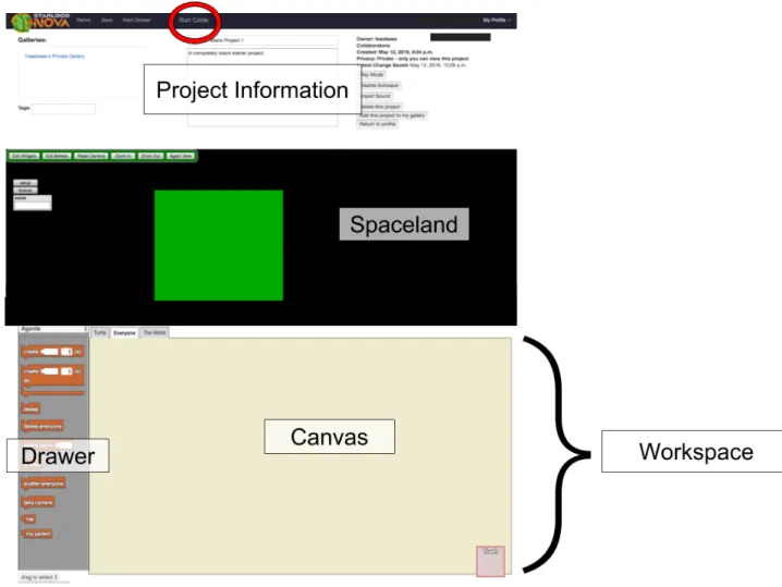
The development space on the website is, for our purposes, the page of greatest interest. On this page, end users create their projects with drag-and-drop block code, run their code, and see their 3D models and games come to life. Figure 1-3 displays what the development page looks like in edit mode [11]. In this mode, the page is divided into 3 sections: the Project Information section at the top, Spaceland in the middle, and the Workspace (Canvas and Drawer) at the bottom. The Canvas is where blocks are placed, and the Drawer is where users can find and select the different types of blocks that they want to use. Draggable and droppable, these blocks can be connected together like puzzle pieces to create 3D games and simulations. In play mode, the page hides the Workspace section such that blocks are not visible to the end user. To navigate between any of these three sections, the end user is required to scroll up and down the development page.
Currently, there are a total of 108 different types of blocks that end users can use in their programs. The block code can be run by pressing the 𝑅𝑢𝑛𝐶𝑜𝑑𝑒 button at the top of the page. The resulting program is then visible in Spaceland, where end users can see their 3D program’s button interfaces as well as their agents interacting with one another.
1.2
Main Elements for Investigation
From my own interactions with the StarLogo Nova interface and from discussions with StarLogo researchers, we established four initial areas of investigation that may be useful for improving the platform’s accessibility to both new and expert users. We used these four factors as the first step in thinking about what we wanted to learn about how users use the platform, and ultimately how to make the platform easier for beginners and more extensible for experts. The following sections describe these four elements and pose questions of interest regarding each.
(a) Tall Stack
(b) Wide Stack
1.2.1
Tutorials
In order to fully and thoroughly learn StarLogo Nova, one must be able to read (and have the patience to read) the large set of instructions in the IPWIT tutorial guide, which was discussed in Section 1.1.1, Introductory Programs. Aside from written instructions, some additional in-person guidance is generally needed to explain the guide and explain how to use the website. While this may reveal a need for an improved orientation process to StarLogo Nova, this could potentially reveal a lack of intuitiveness in the interface as well.
According to StarLogo Nova developers, over 90% of the projects on the platform are expected to be from the last three years, mostly because of Project GUTS [8]. However, we do not have documentation on how the platform was introduced to those who have not directly participated in these programs. It is unclear whether teachers participating in GUTS or Imagination Toolbox had ever incorporated what they learned about StarLogo in their curricula. If they did, it is still unclear exactly how they introduced the platform to students.
Thinking about tutorials and their effect on users raises important questions for evaluating the platforms’ accessibility to new users. How many of the projects are duplicates of, or very similar to, tutorials? Exactly how different from the tutorials are the more complex projects? Do users take the platform and expand upon it? Answering these questions would bring interesting insight into how users use the platform and how effective StarLogo Nova is in facilitating creative innovation.
1.2.2
Breeds
Agent-based programming allows for more decentralized thinking and thus allows for modeling of emergent phenomena [20]. An agent has its own pre-defined set of traits and behavior, and cannot change other agents. Instead, agents can interact with other agents and react from said interactions. This type of programming is particularly useful for modeling complex systems such as ecosystems in nature.
StarLogo [4]. This means that all agents of the same breed have the behavior defined by the block code given to that breed. This ‘breed’ concept is a way to help end users better understand how to code different types of agents and how to better organize their StarLogo projects. On the platform, there are two special breeds called ‘The World’ and ‘Everyone’. ‘The World’ is a special breed that is the only one in which other agents can change its traits. Also, ‘The World’ is the only breed that exists when a StarLogo game or simulation is loaded, so it is naturally the breed where most agent creation occurs.
The ‘Everyone’ breed contains the blocks that define any shared behavior between agents. If the ‘Everyone’ breed tab did not exist, any project in which agents possessed shared behavior would have the shared behavior blocks repeated for each breed tab. Having ‘Everyone’ was a way to help cut down on repetitive code. When breeds do share behavior, they generally do so using Procedure blocks. For example, in a simplified ecosystem model, both a Lion agent and an Antelope agent may grow in size after eating. The Lion would grow larger after eating an Antelope, and the Antelope would grow larger after eating grass. The shared behavior here is ‘growing in size’, but they occur in different situations. Wrapping the blocks that define ‘growing in size’ in a Procedure block in ‘Everyone’ allows for both Lion and Antelope breed blocks to call the Procedure when defining individual ‘eating’ scenarios, without repeating code.
When users first begin creating a project, they are shown three default tabs that represent three breeds: ‘The World’, ‘Everyone’, and ‘Turtle’ (a basic breed). These tabs are similar to web browser tabs. When a tab is selected, the canvas that repre-sents that particular breeds’ blocks is displayed. The ‘Everyone’ and ‘The World’ tabs look the same as any other breed in the project, despite being conceptually special.
Similar to how one can view one tab at a time in a standard web browser, StarLogo users can only view one breed at a time and therefore do not have the ability to visually compare blocks between breeds at the same time. In addition, blocks can be copied and pasted across breeds, but it is accomplished by a series of mouse clicks, and not the usual drag and drop motion usually associated with these blocks.
Is the breed tabs layout getting in the way of users’ interaction with the plat-form? Are users using the ‘Everyone’ and ‘The World’ breeds the way researchers had anticipated? Are users’ blocks actually organized because of these different tabs of breeds? Researchers are wondering about these questions and about how breed tabs affect both new and expert users’ experiences with the platform.
1.2.3
Scrolling
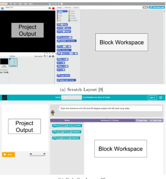
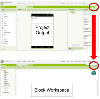
As seen on Figure 1-2, the Workspace section, which contains the Drawer and the Canvas, is below Spaceland. While working on their blocks, end users are not able to see the running environment next to the block environment. Users cannot concur-rently view Spaceland and their blocks. Being forced to only view one environment at a time can make it difficult for end users to debug their projects. The platform’s required scrolling could interfere with a new user’s ability to explore the StarLogo Nova system to its greatest capacity, depending on the amount of scrolling. Requiring users to scroll up and down between their blocks and their program generated by the blocks is different from many of the popular block-based programming platforms that currently exist- such as Scratch, code.org studios, and App Inventor [9] [3] [2] . For Scratch and code.org, the canvas of blocks is on the right and the output window is on the left. Scratch (Figure 1-4a) and code.org (Figure 1-4b) have similar layouts. For App Inventor, the project output and the block workspace are on separate pages. To navigate between them, users must click on buttons located in the top right corner. This is pictured in Figure 1-5.
Overall, these other platforms’ layouts do not require as much vertical scrolling for the user as StarLogo does. Also, StarLogo researchers have noted that users are oftentimes required to scroll horizontally because when complexity increases, the blocks tend to grow wider. The visual effect of such expansion is pictured in Figure 1-2b.
How often do users need to scroll up and down when developing? How often do they need to scroll left and right? Does this amount of scrolling impact usability? Would changing the layout of the development page improve usability and learnability
(a) Scratch Layout [9]
(b) Code.Org Layout [3]
Figure 1-5: App Inventor Development Pages
of the system? These are questions that StarLogo researchers have not looked into yet, but are interested in answering. Gathering data on how screen real estate is used could inform researchers how to redesign the development page such that scrolling is minimized, and thus, hopefully improving the platform for new and advanced users.
1.2.4
Block Size and Placement
Blocks can explode in width incredibly quickly. This is especially common if the user wants to use math blocks to compute certain values, since math expressions can have many nested arguments, which could mean potentially many nested blocks. Stacks of blocks can also grow very tall as projects grow in complexity. As users explore the StarLogo platform, and as they gain more expertise with the system, the blocks may become more and more difficult to organize and understand.
Aside from the actual size of each block, the placement of blocks and stacks of blocks can also make one’s project visually confusing. For example, unused blocks and unused stacks of blocks can be scattered all along the canvas without affecting
the program. With this potential visual overload of both active and inactive blocks, users may find it difficult to understand how their own programs and blocks work.
Where are users’ blocks usually placed on the canvas? How large or small are these blocks usually? How many projects in the database have abnormally huge block stacks? Answering these questions would give insight into how visually complex projects are, and better inform any future user interface design decisions.
1.3
Thesis Overview
What does a project’s similarity to or difference from a tutorial starter project say about StarLogo’s ability to encourage creativity? Does the current layout help or hinder users’ experiences with the site? Does the platform’s enforced need to scroll frustrate users? Do the blocks’ sizes and positions make the platform visually over-whelming? Without analyzing data on how users use the platform, these questions will remain unanswered. With a greater understanding of the data, though, we can begin to address these questions.
With data, we can ask more specific questions that would bring us closer to understanding StarLogo’s specific impacts on users. How do StarLogo projects look in the database? How similar to and how different from tutorials are projects? Are breed tabs organizing users’ code effectively? What is the extent of required scrolling on the development page?
This second set of questions, which can be answered with data analysis, motivates this M.Eng project. Answers to these questions would equip us with the necessary tools to begin evaluating StarLogo’s ability to encourage creativity and to determine what design changes would improve user experience. This would thus give insight on how to improve the platform for both beginner and advanced users.
The overall goal of this thesis is to create an analytics tool that collects data about the projects on the StarLogo Nova platform and visualizes said data in an informative matter. The tool is aimed to be effective in displaying relevant data that answers our questions and is easy to build upon in the future. The analysis that is presented in
this thesis is an overall look at how users interact with the StarLogo Nova platform. At the end of this thesis, I provide several recommendations for the redesign of the StarLogo development page, informed by the data visualization results gathered from our data analytics tool.
This chapter described the background and initial directions for StarLogo’s new data analytics and visualizations. Chapter two is an evaluation of other block-programming analytics research that has been done in recent years. Chapter three discusses an overview of StarLogo Nova’s new data analytics tool. Chapter four de-tails implementation steps and challenges encountered during the development of the tool. Chapter five describes the results from the visualizations generated from our analytics tool. Chapter six then lists the takeaways from our analysis, discusses the tool’s impact, describes its limitations, and suggests a number of user interface mod-ifications backed by the tool’s analysis. Possible future extensions to this project are also discussed.
Chapter 2
Evaluation of Current
Block-Programming Analysis Tools
In this chapter, we describe the data analysis and statistics work accomplished within the past few years in the block programming space. Specifically, Rita Chen’s M.Eng thesis on ScratchStats, Benjamin Xie’s SuperUROP paper on App Inventor, and Xie’s M.Eng thesis on App Inventor users are discussed [24] [15] [25]. We then detail how their work can and cannot be applied to our StarLogo Nova analytics tool task given our current constraints.
2.1
ScratchStats
Scratch is an online block programming community that users can use to create stories, games, animations, and other applications. ScratchStats, an extension of the Scratch website, displays aggregated user and project data. According to Rita Chen’s M.Eng thesis, projects also contain remix trees to visualize how users have built upon each others’ projects [24]. The data visualized on the ScratchStats page dates back from 2007 to the present [10]. User data on ScratchStats include visualizations of the following information about Scratch:
∙ Monthly activity trends, like new comments, projects, and users ∙ Monthly active users
∙ Age distribution of users
∙ Which countries Scratch users are located
These visualizations give interesting insight into the breadth of users who use Scratch. Counting monthly active users is one way that Scratch measures success and engage-ment on their platform.
In addition to visualizing user data, Scratch offers more project-specific data vi-sualizations:
∙ Projects shared, users registered, comments posted, and studios created ∙ Remix trees [24]
∙ Monthly project shares, monthly comment activity ∙ Tree map of Scratch block usage from a random sample
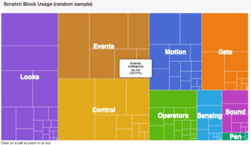
As briefly mentioned earlier, Scratch, like StarLogo Nova, has a feature called ‘Remix’, which is how users share projects, make copies of other projects, and build on top of them [24]. The purpose of this is to encourage collaboration between and creativity among users of the platform. These visualizations give insight into how users use the Scratch platform. Additionally, the tree map pictured in Figure 2-1 displays how often the different Scratch blocks are used across a random sample of projects. Hovering over the rectangles on the chart gives users more detail about the appropriate block type, and clicking through yields a zoomed-in perspective of the tree map.
A major piece of ScratchStats that inspired the way we designed StarLogo’s visu-alizations is the interactivity of the visuvisu-alizations. In ScratchStats, hovering over any point on any area of the charts reveals a tooltip with more information about that particular point in the chart [10]. Some charts in ScratchStats also have togglable legends and clickable parts of the graph to give users the ability to ‘tinker’ with the
Figure 2-1: ScratchStats TreeMap of Block Usage
data [10][24]. Our analytics tool for StarLogo aims to incorporate similar interactivity in our visualizations. The hope was to ensure that the visualizations were informative and easy to understand.
2.2
App Inventor
App Inventor is a block-programming platform that is specifically used to develop mobile Android applications. On the App Inventor homepage, basic statistics on active monthly users, the number of registered users, weekly active users, number of countries reached, and the number of applications built are available [2]. From Xie’s M.Eng thesis and SuperUROP paper, we see that the App Inventor team has also done some research into user progress data and grouping projects by type [25][15].
One of Xie’s goals was to investigate how users grew in their computational think-ing skills as they continued to use App Inventor over time. To do this, Xie used K-Means clustering algorithms to find similarities between representative users [25]. Using feature extraction and grouping, he also classified projects into different cate-gories based on App Inventor’s palette, which organizes blocks by functionality. He was thus able to gain insight on how users’ projects correlate with App Inventor tutorials [15].
inspiration from his thesis. His work on analyzing the relationship between tutorials and users’ projects inspired us to investigate tutorials’ impact on StarLogo users [15]. Additionally, Xie’s analysis makes sure to only focus on active blocks [25]. This means that any blocks that did not contribute to project functionality were considered noise and removed. StarLogo blocks are similar to App Inventor blocks in that blocks can be placed on the canvas without actually contributing to the functionality of the resulting programs. Because of this, we decided to similarly filter out this noise when generating visualizations for our StarLogo tool. Further details on this process is described in Chapter 4, Implementation.
2.3
StarLogo Approach
We chose to make the visualizations interactive, similar to how ScratchStats charts are, in order to give users the option to view the data with a variety of perspectives [24]. For example, we decide to make breeds togglable for some charts so that users of our tool can compare the data between different breeds. Also, similar to Xie’s work, we decide to filter out inactive blocks, which do not contribute to StarLogo program functionality [25]. This includes blocks that are disconnected or stacks that are not connected to a valid top level block. By doing this, we are able to effectively remove noise in our data source.
There is no existing data analytics tool or infrastructure to support data analysis of how users use the StarLogo Nova platform. On the site, though, any StarLogo user can open a public project and view its block code in the browser. This block data is used as our initial data source for our analytics tool. Structured in a large JSON format, this data includes the block names, positions, and how the blocks are linked to each other for every breed of a given project. The tool aims to programmatically extract this data from the server and to make it more understandable.
Unlike both ScratchStats and Xie’s work with App Inventor, though, StarLogo’s tool currently only works with decontextualized block data. Thus, questions of monthly activity, remix trees, and user growth over time will not be addressed in
our visualizations and analysis. We decided to choose visualizations that would con-vey an informative overlook of data that would give insight into the pervasiveness of tutorials, the effectiveness of breed tabs, the extent of scrolling, and block size and placement. A list of the visualizations generated by our tool is found in Appendix A. Potential ways to build upon Chen’s and Xie’s theses in StarLogo are discussed in greater detail in Section 6.3, Future Work.
Our goal was to create a tool that would collect and visualize StarLogo data to shed light on how to best lower the floors and raise the ceilings for users. Specifically, we wanted to address questions about the relationship between projects in the database and tutorials, about how breed tabs affect usability, about how the need for scrolling impacts usability, and about how StarLogo blocks’ sizes and positions influences user experience. With the inspiration garnered from ScratchStats and App Inventor, we have designed a tool that aims to achieve this goal.
Chapter 3
Analytics Tool Overview
The following chapter describes our goals as well as the high-level constraints and challenges we encountered. A discussion on the StarLogo Nova Data Analytics tool interface follows.
3.1
Goals
We want to gather information on how to improve the StarLogo Nova platform, particularly in raising the ceilings and lowering the floors for users of many levels of expertise. In order to accomplish this, we need to understand how the platform is used. We aim to investigate the factors mentioned in Chapter 1, Introduction (Tutorials, Scrolling, Breed Tabs, and Block Size and Placement) and to understand these factors’ impacts on usability. Thus, we decided to build a data analytics tool that collects, transforms, and visualizes StarLogo block data so that we can better achieve these goals.
3.2
Constraints and Challenges
There are two substantial factors that affected how we went about achieving all of the aforementioned goals. The following sections discuss what constraints and challenges we encountered that led us to follow more creative methods of collecting data and
drawing meaningful information from said data.
3.2.1
Public Projects Only
Projects on the StarLogo Nova platform can be either private or public, a setting configured by end-users themselves. For this thesis, we only have access to public data, and thus, our conclusions are drawn from public project data alone. This public project data is accessible through an HTTP GET request, which the platform uses every time it renders a StarLogo project. The data gathered and reported in this thesis is equivalent to the data one would find from opening the public projects available on the website and looking at their blocks.
Only having access to public projects introduces some constraints. Public project block data does not possess any information about the users who created the projects, so we will be making analyses from a decontextualized perspective rather than from the context of users. There is also a chance that public projects are different from private projects in some significant way. For example, public projects may look more complete, organized, or interesting if users decide to only publish their ‘better’ projects publicly1. If this is the case, our conclusions will be constrained to analyzing ‘good’ projects only.
Our analysis may not be an accurate representation of all projects due to selection bias. Despite all of this, we can still find useful data from these public projects nonetheless. We can still gain much insight into StarLogo by analyzing and comparing public projects’ blocks and breeds.
3.2.2
Browser Limitations
As mentioned previously, the data source for our analytics tool is the data received as an HTTP response to a GET request, which is the same way that blocks are loaded onto the StarLogo platform in the browser. The current StarLogo code that loads block data runs in the browser, which means our tool must also run in the browser
1On the contrary, we see in Chapter 5 that the public projects in our data source are often
in order to collect this block data. Given our dependence on HTTP requests and the browser, the tool needed to use the web browser for extracting and transforming the data. Our tool’s performance can be impacted when it is given a larger amount of data. For example, it takes around 7 hours to query the server for all the projects in the database. Also, it takes about 1 minute to render the SVG visualizations for over 8,000 projects. In practice, the tool is intended to be used for full database querying relatively infrequently, so the amortized time cost of using our tool is about 1 minute. Our initial plan was to create a simple script to query for and process the StarLogo block data. However, because of Cross-Origin Resource Sharing (CORS) rules, we needed to build a separate server that acted as a proxy between our querying code and the StarLogo server. We had also wanted this tool to specifically be for StarLogo researchers, not the general user body. Therefore, this analytics tool is an external web-based tool. It is not an extension of any part of the StarLogo Nova website at this time. Working with these browser limitations makes this task less straightforward, and hence, more technically intriguing.
3.3
Interfacing with the Data Analytics Tool
StarLogo’s new data analytics tool is a web-based tool that extracts data from the StarLogo server and then visualizes it. Using our tool involves a few manual steps that will be outlined in the following subsections.
3.3.1
Extracting Data
The first step is to adjust the configurations such that the tool knows how many samples to query from the database. As mentioned previously, it takes around 7 hours for our tool to query for around 400,000 project samples, which is approximately the size of the current database that is loaded into the Beta server. More details about what the Beta server is follows in Chapter 4, Implementation.
After the tool finishes running, the data is manually extracted by removing the string out from either the browser’s LocalStorage or IndexedDB, depending on where
the data was stored, which depends on the size of the stored data. This data is then saved locally and the researcher using the tool can then run the 𝑝𝑎𝑟𝑠𝑒𝐷𝑎𝑡𝑎.𝑝𝑦 script. This script creates .𝑡𝑥𝑡 and .𝑐𝑠𝑣 files needed for the visualization step and takes less than a second to run on about 69,240 project samples. This is the number of public projects found after querying for 400,000 projects.
3.3.2
Visualize Data
After the 𝑝𝑎𝑟𝑠𝑒𝐷𝑎𝑡𝑎.𝑝𝑦 script is finished running, change the configurations for the tool such that the tool knows that it is tasked to visualize the data. Charts are then rendered on the browser, visualizing the data source specified by the configurations. At this time, the configurations allow the tool to visualize a representative project for each of the top 200 most popular project signatures. The tool can also visualize a representative project for each of 10,000 random signatures not in the top 200. Project signatures are discussed in greater detail in Section 4.2: Transforming Data: Finding Duplicates. In Section 4.4.1 Top 200 and Random 10,000, we explain why we chose to visualize the top 200 most popular project signatures and a random sample of 10,000 project signatures not in the top 200.
3.4
Recap
Without much data analysis infrastructure available with StarLogo now, it is unclear to researchers how users’ projects relate to tutorials, how effective breed tabs are, how users feel about the need for scrolling on the development page, and how visually overwhelming the blocks are to users. These are four key aspects we suspect to have substantial impact on both beginner and advanced users. With our dependency on the browser, collecting and visualizing project data becomes a more technically interesting challenge.
Creating data analysis tools have had lower priority in previous years when com-pared to other feature requests and bug fixes. However, given that StarLogo Nova had just underwent such a huge overhaul from Flash to JavaScript, this thesis takes on the
opportunity to provide greater visibility of the StarLogo platform to researchers than they have had before. Building a tool that collects and visualizes project block data can provide an incredible amount of information that would bring insight into how users use StarLogo as a whole, setting the foundation for more data-driven platform design decisions in the future.
Chapter 4
Implementation
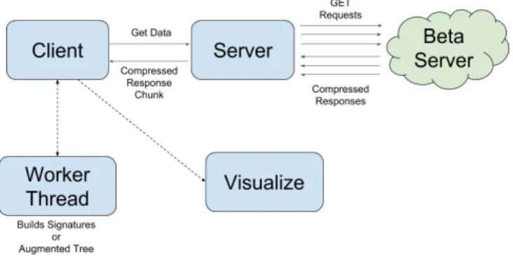
This chapter discusses implementation details and technical challenges encountered during development. Limitations of our implementation are also discussed. Figure 4-1 illustrates the general architecture of the system, both when it is extracting data and when it is visualizing the data. Our tool accesses data from the Beta server, which holds a clone of the live database from October 2016. The Beta version of the site is the new version of StarLogo that is currently being developed.
4.1
Extracting Data
To request data from the Beta server, our analytics tool’s client sends a request to its server for a predetermined amount of data. Then, the tool’s server sends GET requests to the Beta server. The Beta server responds with string responses that hold
the project data. Our tool’s server then sends this to our client, which reads and transforms the data. This process repeats until the client has received the desired number of data samples (the desired number of projects). In Figure 4-1, the multiple arrows between our server and Beta server represent how the server sends chunks of GET requests to the Beta Server at a time.
Avoiding DDOS
StarLogo uses Amazon Web Services (AWS) cloud computing services [1]. Because our method of getting data is similar to a DDOS attack on the StarLogo Nova Beta server, AWS automatically shuts down my connection if I try to send a couple hundred of GET requests immediately after another. To fix this, I chunk the number of GET requests by chunks of 100, restarting the connection after every 100 GET requests to the Beta server. The size of the chunks are parameters that can be changed as a configuration setting.
Asynchronous Manipulation: Using Promises
Because sending HTTP requests are asynchronous, chunking the GET requests was a bit trickier than writing a simple for-loop. Because of ECMAScript 6 Promises, the functionality was achieved through a series of Promise functions. These functions involve pre-processing the responses received from the Beta server too, making this data collection step a little more complex.
4.2
Transforming Data: Finding Duplicates
Duplicates of IPWIT, Project GUTS, and other tutorial projects could appear in our visualizations many times because many users are introduced to the platform through a standardized program. Tutorials are generally how users are introduced to this platform, so we would expect a fairly significant percentage of the projects in our samples to be similar, or even exact duplicates. This is especially since tutorials provide very specific directions, so users are oftentimes following these step-by-step.
These duplicated projects would only reveal how tutorial-developers (i.e. StarLogo researchers) use StarLogo, not how the general body of StarLogo users use it. Star-Logo Nova’s ‘remix’ feature allows users to copy another project and build on top of it, which is another possible reason that many of our data samples may be exact duplicates of other projects. Duplicates can be seen as a source of noise in our data. With this in mind, we implemented a way to detect when different projects are so similar that they should be considered duplicates.
4.2.1
Active Blocks and Functional Duplicates
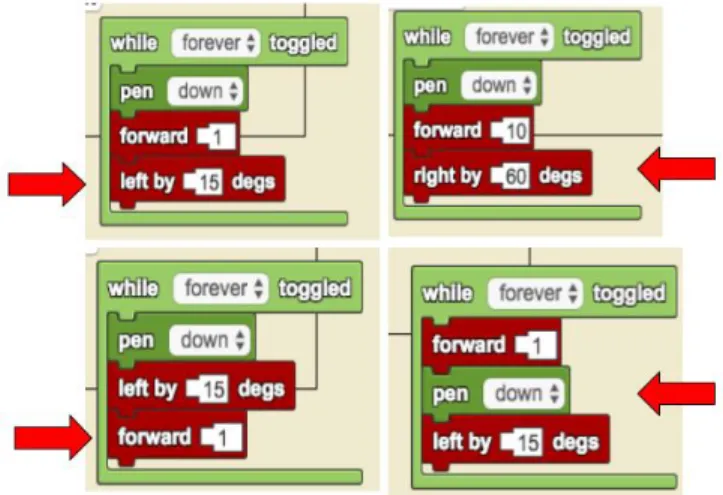
Our analysis is done on projects’ active blocks only, similar to Xie’s work in App Inventor [25]. Active blocks are top level blocks that are connected to other blocks, and other blocks that are connected to a top level block. Inactive, disconnected blocks are not compiled into the program and thus do not contribute to the program’s functionality. Figure 4-2 pictures the types of blocks that are considered top level blocks, but none of those blocks alone are active because they are not connected to other blocks. On the other hand, Figure 4-3 shows examples of active blocks.
We define ‘Functional Duplicates’ to be projects whose active blocks are in the same order, have the same structure, and have the same frequency. Because of this, our analysis will consider two projects different even if they look fairly similar. In Figure 4-3, we see that the stacks have similar block types, but they do not have the same order. Our tool recognizes each of the stacks in Figure 4-3 as different. One may argue that these stacks are similar enough to be considered duplicates, but measuring similarity between our data samples requires something like a tree edit-distance algorithm. However, because implementing such an algorithm is beyond the scope of this M.Eng project, we chose to preserve the differences between stacks even if they do not seem very significant.
Our tool’s data processing functionality can be built upon for any future work in measuring similarity. If our tool had combined projects that ‘looked similar’, we would have lost some information about the original data. Our more conservative approach of preserving these seemingly minute differences builds the foundation for
Figure 4-2: Top Level Blocks: No ‘Before’ and no ‘After’ connector
Figure 4-3: Examples of Different Stacks
future investigation into measuring similarity between projects.
For the rest of this thesis, references to blocks in regard to our data analysis refer to active, connected blocks as described in this section.
Building a Tree Structure
A data sample received from the Beta server is a very large, complex tree of both active and inactive blocks representing one project. Ignoring inactive blocks, we create tree structures for each project, where each breed and its blocks is a subtree of the larger project tree structure.
de-Figure 4-4: Partial Screenshot of Another Wide Stack
coded project data to build a tree structure that consists of only active blocks. More concretely, project A would be a functional duplicate of project B if they both have the same number of breeds and between their corresponding breeds, they use the same stacks of blocks with the same structure. Functionally duplicate projects do not need to have breeds with the same names.
We define a ‘child’ block to be a block that is connected to the current block’s nested socket, or a block that is connected to its ‘after’ socket. For example, the ‘forward’ blocks in Figure 4-3 have a ‘before’ connector and an ‘after’ connector. In the top left stack of Figure 4-3, the ‘forward’ block’s child is the ‘left by _ degs’ block while in the bottom left stack, the ‘forward’ block does not have a child. Blocks can also have arguments, which we distinguish from children because arguments tend to contribute to width calculations more than children do. Figure 4-4’s wide stack shows an example of a block with many nested arguments. Argument and children blocks are represented visually differently on the StarLogo platform, and so too in the tree structures we create.
Our tool peruses through the block data, filters out the unused blocks, and builds up a tree consisting of active root, children, and argument blocks. The final tree structure looks like the following:
𝐵𝑙𝑜𝑐𝑘𝑁 𝑎𝑚𝑒 : [[𝑐ℎ𝑖𝑙𝑑1, 𝑐ℎ𝑖𝑙𝑑2, ...],
[𝑎𝑟𝑔1, 𝑎𝑟𝑔2, ...]]
where the first element of the array is an array of the block’s immediate children, and the second element in the array is an array of immediate arguments. The array data type was chosen in this case because we want to ensure the ordering of block names are standardized across the different trees built for all the different projects.
Figure 4-5: Tree Structure Example
Figure 4-5 shows a side-by-side comparison of an example stack of blocks and its corresponding tree structure. Note that we also ignore literal values, like the ‘5’s in Figure 4-5, in our tree structure.
Signatures
After constructing the tree structure of all the active blocks in a project, the tool keeps a stringified copy of the project’s tree object as a ‘signature’. When the tool is in ‘Extract’ mode, it builds projects’ tree signatures from the data and then updates the tool’s internal hashmap of project signatures. Every key in the hashmap is a tree signature, and every value is a list of project IDs that have that particular signature. When the tool is in visualization mode, we input the IDs of different project signatures into the tool via 𝑝𝑎𝑟𝑠𝑒𝐷𝑎𝑡𝑎.𝑝𝑦. Instead of building a signature, the tool builds an ‘Augmented Tree’ that contains the tree structure signature as the backbone. The additional information added to this backbone includes the project’s stacks’ positions, block heights and widths in pixels, breed names, and other pieces of data. The ‘Augmented Tree’ contains data that are useful for visualizations, but are not used to distinguish similarity between projects and thus are not included in ‘Extract’ mode’s signature creation. Because this process gives us access to project IDs, we were able to also manually opened some projects on the StarLogo site when testing our tool’s accuracy and when observing outlier projects.
4.3
Mining Data
As mentioned in the introduction of this thesis, we initially went about investigating how to raise the ceilings and lower the floors for StarLogo users by thinking about tutorials, scrolling, breed tabs, and block sizes and placement. This played a large role in our decisions on which statistics were useful to gather and which were not.
Project wide information, such as the number of breeds and the number of blocks in a project, contributed to building an overview of how projects looked regarding tutorials and breeds tabs. Finding information about the position of block stacks and their widths and heights in pixels were useful in determining how users used screen real estate. Additional information, such as the number of widgets in a project, was included in our analysis as a way to see how far projects have deviated from the default blank projects, thus aiding in measuring how ‘creative’ users are with the platform, and how accessible it is for new users to grow to be expert users.
Complexity of block-based programming projects are multidimensional- there are many aspects that contribute to the complexity of a given project. This could include the number of blocks in the project, frequency of certain block types, number of nested blocks in the stacks, number of breeds, and other factors. For this project, we use the total number of blocks in a given project as a general measure of overall complexity. For example, we wanted to see how stack heights and widths change based on the increasing number of project blocks.
Throughout iteration, we learned that averages were not as informative as focusing on the extreme cases. Averages, like average block widths or average project block lengths, were not as effective in characterizing projects as expected. For instance, visualizing the maximum width of a stack of blocks gives more information about the complexity of a particular stack than would visualizing an average width for all stacks. So, in our final implementation, we opted for visualizations that highlight outliers-minima and maxima- as well as charts that display trends. We could have averaged the x-coordinate positions of all stacks in a given project and plotted those averages. Instead, we plot every stack’s top level x- and y-positions so that we could preserve
information about each stack’s position and top level block name. This alternative approach provides richer information than averaging out all of the stacks’ x-positions.
Manual Work
The block data itself does not store any information about blocks’ pixel details. So, to collect data on block pixel widths and heights, we needed to manually measure the blocks and manually test how blocks dynamically resize when connected to others. Alternatively, we could have used ScriptBlocks, StarLogo Nova’s block library, to load the blocks visually and then get the pixel measurements after the blocks have been loaded. However, loading and rendering each project and then measuring each block with ScriptBlocks is a very time-consuming task, much more time-consuming than using pre-measured values. Also, pixel measurements for each block do not need to be calculated every time the tool was run since they would only change if ScriptBlocks changed, which does not happen often. We therefore used the Page Ruler Google Chrome Extension to manually measure each of StarLogo’s blocks’ heights and widths [16]. This method is sufficient for our needs, because our goal is to gain an improved, bigger picture understanding of how users use the platform as a whole. We do not require much precision in our pixel measurements.
4.4
Visualizations
We used an open source data visualization library called D3, version 4, to output graphs for this analytics tool [5]. This is a JavaScript library we used to generate scatter plots, box and whisker plots, circle graphs, and other types of charts specifi-cally for the StarLogo Nova data. These charts include togglable legends and hovering tooltips, in an effort to make the visualizations interactive and informative. Alterna-tive software, such as a popular desktop data visualization application called Tableau, could also be used for visualization once data is extracted [13]. For our purposes, we decided to continue forward with D3 since it is not a desktop app, but instead a li-brary that programmers can use to write customizable graph-generating code. Using
Figure 4-6: Duplication rate of top 200 project signatures
D3 ensures that future users of this analytics tool can make changes and updates easily.
4.4.1
Top 200 and Random 10,000
Ideally, we would visualize a representative project from each project signature in the entire database. However, we ran into RAM and performance issues when attempting to visualize every single data point. In this thesis, we visualize the top 200 most popular project signatures and a random sample of 10,000 signatures that are not part of the top 200 most popular signatures.
We wanted to see how the most popular projects in the database looked, so we stepped through a list of signatures sorted by decreasing number of occurrences until any new signatures stopped enhancing our understanding of the most popular be-havior in the database. This was determined to be at the 200th project signature, since after that point, the signatures had very few occurrences and hence stopped representing ‘popular’ behavior of the database. Figure 4-6 shows what we found for the top 200, where the X-Axis represents the 𝑛𝑡ℎ most popular project signature and the Y-Axis is the number of occurrences in the database. The number of duplicates per signature is inferred to decrease in a predictable manner for signatures after the 200𝑡ℎ. We determined that the 200𝑡ℎ most popular project would be the threshold
between signatures that represented ‘popular’ and ‘not popular’ behavior.
be-havior of the signatures not part of the top 200 project signatures. We chose a sample size of 10,000 because it was the largest sample size we were able to take before reach-ing performance limits, which are discussed in the next section. Additionally, we saw that, after repeatedly visualizing random 10,000 samples of our project signatures, we would consistently receive qualitatively similar results.
Visualizing both the top 200 project signatures and a random sample of 10,000 project signatures not in the top 200 therefore gives us a close approximation of the behavior of all of the projects in the database. That being said, the number of popular projects to visualize and the random sample size can both be re-configured in the tool.
4.5
From Extraction to Visualization
As briefly mentioned in Section 3.3 Interfacing with the Data Analytics Tool, running our tool involves a few steps. These are discussed in more technical detail here.
1. Set Extract Mode In this step, the tool requests data from the Beta server and builds tree object signatures from this project data. The 𝑀 𝑂𝐷𝐸 configuration in 𝑐𝑜𝑚𝑚𝑜𝑛.𝑗𝑠 is set to 𝐸𝑥𝑡𝑟𝑎𝑐𝑡. In this mode, the tool stores a hashmap with {𝑡𝑟𝑒𝑒𝑆𝑖𝑔𝑛𝑎𝑡𝑢𝑟𝑒 : [𝐼𝐷1, 𝐼𝐷2, ...]} key-value pairs. This hashmap is stored in
either LocalStorage or IndexedDB, depending on the size of the data, and is updated until the tool has finished querying and processing all the data from the Beta server.
2. Manually Load Extracted Data The data is stored in the browser either in LocalStorage or IndexedDB as a string and must be loaded locally as a .𝑡𝑥𝑡 file. This can be done with manual copy-and-pasting from the browser’s Local-Storage interface, or by running a few commands on Chrome console to copy the string from IndexedDB. In our tests with public project data, LocalStorage suffices.
3. Run Python Script 𝑃 𝑎𝑟𝑠𝑒𝐷𝑎𝑡𝑎.𝑝𝑦 is a Python script that parses the .𝑡𝑥𝑡 file that was created manually in Step 2. This script iterates over the tree
signatures, counts the frequency of each signature, and chooses a representative project ID for each signature. This information is generated into a .𝑐𝑠𝑣 file. Also, a list of representative IDs for the top 200 project signatures and a list of representative IDs from 10,000 random signatures not in the top 200 are generated into .𝑡𝑥𝑡 files. These files are needed for visualization. Each ID that is added to the .𝑡𝑥𝑡 files represents a different signature in the database, so there are no duplicates in our visualizations.
4. Visualization Mode After the necessary .𝑡𝑥𝑡 files are generated, the tool’s 𝑀 𝑂𝐷𝐸 configuration in 𝑐𝑜𝑚𝑚𝑜𝑛.𝑗𝑠 needs to be set to either ‘VIZ_200’ or ‘VIZ_10K’, which visualizes the top 200 project signatures or the random sam-ple of 10,000, respectively.
5. D3 Graphs Rendered All graphs are loaded onto one page, one after the other. Scrolling down the page reveals the different charts. This was done so that all the visualizations are available at once for the user. This format is borrowed from ScratchStats, which also shows all of its visualizations on one page [10].
Limitations
As a brief benchmark, running the tool to visualize 10,000 random project samples takes around 15-20 minutes. During the development of this thesis, this running time was the longest we could work with. D3 uses SVG for graphs, so as the data set size increases, the laggier rendering becomes. Tooltips that appear when hovering over certain data points are also slow to render at large sample sizes. Ways to improve this can be addressed in future iterations of this tool, especially if it becomes an extension to StarLogo Nova for the general body of StarLogo users.
Also, because this tool involves a multiple step process of extracting and then visualizing the data, and because the data transformation depends on the browser, the tool requires a researcher to take a few manual steps to get meaningful data. In future iterations, data extraction from the browser and automating .𝑐𝑠𝑣 and .𝑡𝑥𝑡 file
Chapter 5
Results
In this chapter, we showcase examples of the data visualizations our tool generates, representing data from the top 200 most popular project signatures. We also include visualizations generated from a random sample of 10,000 project signatures not in the top 200. The most popular signature occurs 1712 times and represents an empty project with three breeds. The 200𝑡ℎ most popular project signature occurs 18 times
and is an IPWIT tutorial project remix.
As mentioned in Section 4.4.1 Top 200 and Random 10,000, we visualize the top 200 most popular signatures and 10,000 other random signatures to give us a sense of what the entire database looks like, without actually visualizing the entire database and without crossing our performance limits. We include visualizations of the top 200 and the random 10,000 side-by-side as a way to compare the behavior of the most popular projects with that of the less popular projects. In doing so, we aim to achieve an accurate overview of the entire database’s project behaviors.
We have reached the conclusions in this section by analyzing the tool’s generated data visualizations, manually opening the representative projects from each of the top 200 popular projects, and manually opening large project outliers. Manually opening a project involves using the project ID to view the project on the StarLogo Nova platform. The pie charts included in the following chapter were also generated manually after running our analytics tool. Given our tool’s capability, we ask the follow questions about our data:
∙ How do the StarLogo projects look as a whole?
Our analysis involved filtering out inactive blocks from our project data because they were a source of noise. We wanted to know how the database looked after filtering these out. We were especially curious since the StarLogo team did not previously have an answer to this question before.
∙ How similar are projects to tutorials? How different?
As mentioned in Chapter 1, Introduction, most users learn StarLogo with tuto-rials from standard programs like IPWIT or Project GUTS. We wanted to know how similar projects were to tutorials, or how different the projects were from tutorials. We wondered how users expanded their projects away from tutorials, if they did. These insights could shed light on how well StarLogo has been able to encourage creativity for both new and expert users.
∙ Are breed tabs organizing users’ code effectively?
Visually similar to web browser tabs, breed tabs can only be viewed one at a time and aim to keep different agents’ blocks separated, in order to make the blocks more manageable. Although different from typical breeds, the two special breeds ‘Everyone’ and ‘The World’ are visually represented as tabs, just like any other breed. Our analytics tool can reveal how ‘Everyone’ and ‘The World’ are used by users of all levels of expertise, and reveal if the tab layout actually organizes blocks effectively.
∙ What is the extent of required scrolling on the development page? Earlier, we expressed interest in learning how scrolling on the development page (i.e. scrolling between Spaceland and the canvas) may impact usability. We also discussed how StarLogo block stacks’ sizes and positions can potentially be overwhelming. With our visualizations, we observe how much the page’s layout, block stack sizes, and block positions contribute to the development page’s required amount of scrolling. Then, we infer from our data if both beginner and advanced users are possibly limited by this amount of scrolling.
Figure 5-1: Entire Database Categorized by Signature
5.1
How do the projects look as a whole?
We queried approximately 400,000 projects from the Beta server and received data on 69,240 public projects. After processing this data, we found that these 69,240 projects yield 34,618 different tree object signatures, not including the Completely Empty project signature. This means that 50% of the project data we received are copies of some other project in the database. The 69,240 projects represent only 34,618 functionally different projects.
In Figure 5-1, we see a pie chart that represents the percentage of projects in the database that have the indicated signature types. 24.6% of the database, that is 17,085 projects out of the 69,240 projects, share the top 200 most popular project signatures. For this pie chart, we manually opened a representative project from each of the top 200 signatures on the StarLogo site, describing each of the signatures by inspecting projects’ blocks and titles. Detailed results from this are found in Section 5.2.1, Top 200 Project Signatures are Tutorials or Tutorial-Inspired.
41.9% of the database, which is 29,006 projects, have unique signatures. This means that each of these projects’ arrangement of blocks only occur once in the database. 24.4% of the database, that is 16,880 projects, share signatures that are
not unique, but are not duplicated enough to make the top 200 threshold. Specifically, this 24.4% represents signatures that have less than 18 occurrences but more than 1 occurrence.
5.1.1
Empty Projects
As we see in Figure 5-1, 9.1% of the database, that is 6,269 projects, are Completely Empty. Completely Empty is defined as a project without any blocks at all. The number of Completely Empty projects is gathered from a direct filter of projects without any blocks at all. Thus, the tool does not currently have the granularity of determining how many breeds are in these Completely Empty projects. We can also see in the figure that the most popular project signature is Functionally Empty with 3 breeds- which represents 2.5% of the database. Functionally Empty refers to projects that only contain inactive blocks.
After manually opening a representative project from each of the top 200 project signatures, we found that the project signature that represents a Functionally Empty project with 4 breeds appears in the top 200 and represents 0.04% of the entire database. Taking these three types of empty projects together, we see that at least 12% of the projects in the entire database is empty in some way. There may even be more empty projects (i.e. functionally empty with a different number of breeds) among the unique signatures and the other 5,412 signatures. A significant portion of the projects in the database are empty, which may indicate something about how accessible the platform is to new users.
Note that the visualizations generated by our new analytics tool do not include Functionally Empty or Completely Empty projects.
5.1.2
Overview: Duplicated, Potentially Similar, or Empty
We have discussed a high-level view of the StarLogo projects database. An overview of what was discussed and how it addresses our question ‘How do the projects look as a whole?’ follows.
∙ Empty At least 12% of the database is empty or functionally empty, including Completely Empty projects, projects with three breeds but no active blocks, and projects with four breeds but no active blocks. This percentage does not include the empty projects that may not have been explicitly captured. For example, there could be a project in the database with a signature that represents a project with 2 breeds with no functional blocks. So, at least 12% of the database is empty.
∙ Duplicated Half of the database of public projects are duplicates of some other project. We found 69,240 public projects, but they represent only 34,618 func-tionally different projects.
∙ Many Unique, but Potentially Similar Over 40% of the database’s projects have unique signatures- these projects do not look like any other project in the database. Also, the top 200 project signatures only represent 24.6% of the entire database. As stated previously, projects that are considered ‘different’ in our analysis might still look similar. This shows that there is diversity in the database, but ‘how diverse?’ is still an open question.
5.2
How similar/different are they to tutorials?
We are aware that most users are introduced to StarLogo through some tutorial or standardized program like GUTS. As stated in Chapter 1, Introduction, over 90% of the projects on the platform are expected to be from Project GUTS [8]. How similar are projects to tutorials? If users do explore the platform beyond tutorials, how different are the projects? We use our analytics tool to visualize projects’ similarities to and differences from tutorials. In the following sections, we discuss how the projects represented by the top 200 most popular signatures look and then detail how project samples look from breed and block-level perspectives.
Figure 5-2: Top 200 Project Signatures Classified By Type
5.2.1
Top 200 Project Signatures are Tutorials or
Tutorial-Inspired
Using the StarLogo Nova platform, we manually opened a representative project from each of the top 200 duplicated signatures and determined that they were mostly remixes of either IPWIT tutorials or Project GUTS projects. Figure 5-2 is another pie chart that shows the classification of each of the signatures in the top 200. We qualitatively characterized the signatures in the top 200 by seeing if projects shared similar titles, similar blocks, and similar behavior when the code was run.
Figure 5-2 shows that over 40% of the projects that share one of the Top 200 project signatures share a signature that is some remix of Flower Turtle, an IPWIT and GUTS tutorial project. The Flower Turtle project is a project that involves creating an agent that leaves a trail as it moves around the terrain in a flower path. Remixes of Bumper Turtles, a tutorial project from Project GUTS, is the second most shared type of project signature. A brief glance over the rest of the top 200 project signatures’ representative projects indicate that most of these signatures are remixes of some other tutorial-related projects.