Copyright © 200x Inderscience Enterprises Ltd.
Representations of sensory experiences in the early phases
of architectural design: there is more than meets the eye
Abstract - In response to questions about designers’ visual way of knowing and working, this
article explores how sensory experience is conveyed during the early phases of architectural design. By processing 985 graphic components issued from a three-month ethnographic observation inside an architecture firm, and proposing an original methodology for their analysis, we identify and analyse graphic expressions of sensory-related design intentions. Multi-sensory dimensions of experiencing an architectural artefact, and the way architects deal with users experiencing space differently, are topics also considered in this article. The resulting observations remind us not to mistake apparent lack of graphical clues with lack of sensibility when it comes to addressing sensory experience during architectural design.
Keywords - architectural design; early phases of conceptual design; perception; sensory experiences
Introduction
A major goal of design research is to understand the nature of design expertise, and to try and establish its particular strengths and weaknesses (Cross, 2006). One characteristic of design expertise is designers’ visual way of knowing and working. In architecture and other design disciplines, designers rely heavily on the use of external representations (sketches, CAD representations, 3D models, …) as aids to communicating ideas both to themselves and to others. In design research, this visual way of knowing and communicating as it relates to design is highly valued as paramount to design expertise (see for instance Cross 1982, 2006; Schön and Wiggins 1992; Goldschmidt 1999). It is said to distinguish design from the cultures of the sciences and the humanities, and as such serves as justification for introducing design in general education: the traditional emphasis on numeracy and literacy, so it is argued, should be complemented with a third way of thinking, i.e., ‘graphicacy’ (Cross 1982, 2006).
While this visual way of knowing and working tends to be valued as a unique quality of design expertise, in architecture it is said to show serious limitations as well. According to some authors, the intrinsic characteristics of the commonly used design tools and their linked representations, especially free-hand drawings, do not offer designers an adequate way to express the full complexity of human experiences. For instance, Rob Imrie (2003) points out:
when you’re looking at drawings, unless you actually have a pretty sophisticated ability to translate what you see on the drawings into reality and evaluate the problems around that, there’s not much point in having a body image to mind. (p.63)
Imrie suggests that architects do not express (or even consider) the complete range and various dimensions of users’ bodies and their sensory experiences: architectural representations would act as an extra layer between them and their project, pushing them to unintentionally screen-out, or even intentionally filter, those dimensions.
Other authors observe that instead of completely screening-out (or filtering) sensory experiences, architects seem to develop a systematic bias towards vision. Architects’ visual way of knowing and working would translate into their traditional representations and increase the distance between their spaces and the future users’ spaces, consequently making other sensory qualities disappear (Dischinger, 2006; Franck and Lepori, 2007). For others, like David Harvey, representations themselves nurture this bias towards
Copyright © 200x Inderscience Enterprises Ltd.
vision, a historical consequence of how “men conceive and represent space in the occidental culture” (quoted by Dischinger, 2006).
To our knowledge, however, few studies have considered how design tools in architecture articulate users’ experiences in general, and sensory experiences in particular. Lora Oelhberg et al. (2011) formalized a list of tools helping designers to capture, reflect and share information about users, but do not provide a clear explanation about how and why those tools are used, nor what type of content is effectively generated in the specific situation of addressing sensory experiences during design. In front of these sometimes-conflicting viewpoints, the question of sensory qualities and their expression in architects’ design process seems to remain open.
Sensory dimensions of users’ experience(s)
In traditional societies, where human-made objects were conceived, made, and used by the same person (Jones, 1970), the experience of using the object could be fed back directly in its design and making. The industrial revolution, however, introduced a separation between the designer (the person who conceives an object), the maker (the person who produces it), and the user (the person who experiences it). As a result, the direct feedback loop between experience, design and making is interrupted. Today, designers typically conceive objects with an eye to offering the user a certain experience. How this experience anchors in the design process and through which design tools, however, is not always clear.
In the field of “User eXperience” (or UX), Effie Law et al. (2009) conducted a survey amongst 275 participants (mostly researchers and designers from 25 different countries). Their findings suggest that the community significantly agrees on one statement only: UX is a dynamic, context-dependent and subjective topic.
Users (inhabitants, customers, clients, operators, ... direct or indirect) are thus proactively and differently stimulated by a complex range of intrinsic and extrinsic characteristics. In this regard Nathan Crilly, Anja Maier and John Clarkson (2008) write:
“consumers approach artefacts with their own motivations, experiences and expectations, and therefore artefacts will be interpreted in different ways by different people in different contexts” (p.18)
The experience is shaped by particularities, inherent to each individual: personality, moods and background; cultural values and beliefs; skills and capabilities; motivation and expectations (linked to previous experiences and memory) as well as the physical, social and economic context (Desmet and Hekkert, 2007). These characteristics, if they indeed deeply impact the way we experience something, are themselves submitted to another - more basic - layer of the experience: the direct perception of the surrounding phenomenon. This perception, informed by the context and inferences, is eventually rooted in our most primary senses.
In the case of architecture, Juhani Pallasmaa (2005) underlines that multiple senses are contributing to our experience of space, matter and scale: the way a space looks is obviously important, but also the way it feels, the smell and sound of a place plays a role in how we experience it. Peter-Willem Vermeersch(2013), building upon the work of Tim Ingold (2000), goes a step further by adding that rather than juxtaposed, our senses are in fact overlapping and interacting in the way they contribute to our experience. Sight,
Copyright © 200x Inderscience Enterprises Ltd.
smell, touch, taste and sound thus compose an intricate and complex perception of the experienced space, and a different one for each of us. To those five traditional senses, Julian Hochberg (1972) added the notion of movement. Because the body and its dynamic and static postures actively take part in the exploratory perceptive process (Loomis and Lederman, 1986; Vermeersch, 2013), Hochberg completed the “distance” and “skin” senses with “deep senses”, and defined kinaesthesia (or the sensation of both position and motion) as another important dimension of perception.
The study reported in this article targets the sensory dimensions of users’ experience(s). Their implication in every design process may seem obvious; yet studies suggest that during architectural design processes senses were not evoked systematically (at least not explicitly). Having studied the human body in architectural design, Imrie (2003) argues: “[…] most architects rarely think about the human body as an explicit, or even implicit, point of reference in their work”. The body, when at all referred to, is generally conceived of in terms of “precise Cartesian coordinates” (p. 53), a “partial and reductive” view of the human body (p. 63). Rachael Luck and Janet McDonnell (2006) make identical observations during briefing sessions and underline how, even in direct collaboration with future users, architects rarely address their perception of the space. Bodies and embodied experiences of people with different abilities seem to be addressed even less frequently, except by particularly sensitive designers or designers disabled themselves (Authors 2012).
Expression of (sensory) experiences in architectural design
Among the large toolbox architects can explore, free-hand drawings, CAD tools and physical models certainly are the three main media used during preliminary phases of architectural design. They have been extensively studied for their respective specificities, but we will only refer here to studies that tackled more specifically their articulation with users’ experiences and sensory experiences.
Among the literature we found, free-hand drawings (and their graphic components) have been the most researched in architectural design and are still often considered as the favourite, most efficient and intuitive tool to express, share and convey an intention during preliminary design phases (e.g., Do, Gross, Neiman and Zimring, 2000; Dogan and Nersessian, 2010).
When addressing intentions related to users’ experience in architectural design, representations such as perspective drawings and axonometric drawings (from a bird’s-eye or worm’s-bird’s-eye view) have been shown to play a fundamental role. For architects like James Stirling, for instance, they were used as “conceptual drawings” to represent “the essentials (and only the essentials) of the relationship between form, space and movement” (Goldschmidt and Klevitsky, 2004, quoted by Dogan and Nersessian, 2010). These worm’s-eye perspectives more specifically are either considered as depicting a “scenery”, without necessarily taking into account the user (Imrie, 2003) or, on the contrary, as rooting the user in the space and its projected boundaries: “the subjectivity of the worm’s eye view […]” is pulling the viewer “ […] into the space of the building” (Bryon, 2011). Beside those “flat” 3D representations, Karen Franck and Bianca Lepori (2007) explain why plans, sections and elevations, largely adopted during the modern period in order to design space in a highly abstract way, are consequently less referred to nowadays in their relation to materiality and embodiment.
Copyright © 200x Inderscience Enterprises Ltd.
Computer-aided design tools, and 3D modelling software more specifically, moreover slowly demonstrate as potentially powerful and complementary during the intermingled phases of problem definition and ideation (see Authors 2010). Although not initially developed to integrate any UX considerations, CAD tools are now quickly evolving and, sometimes, support early-stage sensory design. At first only used in architecture to draw lines, define envelopes and refine structural and technical details (Leclercq, 2005), CAD renderings nowadays tend to support architects in the design of inhabited spaces. They do not only introduce a new type of visual experience, but also offer the possibility to quickly simulate and test a variety of situations. Author2 et al., for instance, evaluated the potentialities offered by an acoustic simulation tool, enabling architects to assess acoustic qualities from the point of view of several users sitting in various areas of an auditorium (2010). Other specific tools to specify scenarios of use and perform controlled simulations of human-product interaction are also being developed, augmenting potentialities of more conventional ergonomic manikins (van der Vegte and Horvath, 2012).
One can certainly understand how early visualization and simulation of architectural ambiances (in terms of sound, temperature, colour, natural or artificial lighting) can support architects in refining projected users’ experiences. We should nevertheless remember that getting to these simulations requires a lot of preliminary modelling work as well as a detailed vision of the space being designed, which is more often than not in contradiction with iterative, blurry stages of preliminary design. As Youn-Kyung Lim, Erik Stolterman and Josh Tenenberg (2008) underline:
“Working with the design of a digital artifact means that the material qualities determine form and function to a lesser degree” (p. 10)
In their research, these authors observed how physical models could help, in their various forms and dimensions, to better understand users’ experiences for instance during participatory design (Lim, Stolterman and Tenenberg, 2008). Each prototype is defined through “interactivity dimensions”, translating the way people interact with each of their parts (input behaviours, operation behaviours, output behaviours).
Similarly, Marion Buchenau and Jane Fulton Suri (2000) asked subjects to wear a beeper - whose noise would simulate heart attacks - and to record specificities of the situations surrounding them during these simulated accidents. Here again, “quick and rough” prototypes were useful to directly gain feedback from end-users.
In architecture though, physical prototypes are more rarely reported to address anything else than users’ visual experiences, except in rare cases such as the one discussed by Peter-Willem Vermeersch and Ann Heylighen (2011), where a blind architect referred to prototypes as his “haptic tools”. In this case, clay models would enable him to physically test various handrails and doorknobs’ shapes, while he would put large pieces of different flooring materials on the ground to test them by moving his cane over them.
Towards an understanding of sensory clues in architectural design
There seems to be some distance between sensory experiences as they unfold in reality and the way they are conveyed by architectural representations. Intricate multi-sensory perception shapes the way we experience architecture, and even if this experience is different for each of us, architects are expected to design for it.Copyright © 200x Inderscience Enterprises Ltd.
Free-hand drawings, CAD representations and physical models play a fundamental role in the progression of intentions throughout the design process. However a clear understanding is lacking of how these tools may facilitate or hinder involvement of (multiple) users and their multi-sensory perception of a space or building. We consequently formulated three research questions that structured the study reported in this article:
1. To what extent is sensory experience conveyed by architectural representations during early phases of architectural design?
2. To what extent do architects deal with the multi-sensory nature and user diversity of experience, or rather demonstrate a bias towards vision as it has been argued?
3. What are the main graphic clues used by architects to address sensory experiences during design?
Methodology
A three-month ethnographic observation in an architecture firm
The material analysed for this article was collected through a team ethnography of the design process of an architecture firm participating in a design competition, combined with video and document analysis (Jordan and Henderson, 1995).
Studying design processes in the context of design competitions has multiple advantages (Lindekens 2006). The fixed deadline clearly limits the design process in time. Moreover, in order to be clear to the jury, the proposed concepts should be unmistakably represented when defended and are therefore better documented than when designing for a client.
In the context of the competition studied here, the architecture firm was selected based on its portfolio and the quality of its architecture (evidenced by the fact that, despite its young age, this firm had won several design competitions), following the information-oriented selection for case studies as summarized by Bent Flyvbjerg (2006). The young team was at the time of the study composed of four architects: two principles/head architects (both in their thirties at the time of the study) and two junior architects.
Two researchers were also involved in the project: one researcher observed the practice “from outside” while the second one, with a background in architecture, acted as member of the design team and experienced the process first-hand through participant observation, a technique in which the authority of the knowledge comes from “having been there”. The study took place over a period of three months, and employed a variety of data collection methods, including direct observation, video recording, semi-structured interviews, and analysis of documents/artefacts, such as the design brief, drawings, etc.
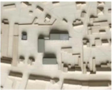
The competition at stake involved the design for the extension of a town hall into an Administrative Centre and Social House, gathering all local services. The project submitted by the architecture firm aims at maximally preserving the green space on site by inserting multiple smaller volumes and arranging them in a U-shape (Figure 1). In order to safeguard the open space and perspectives as much as possible, the volumes are lifted from the ground, allowing the green space to run on underneath. The centre’s main
Copyright © 200x Inderscience Enterprises Ltd.
functions are situated on the first floor, resulting in a ‘bel-étage‘ town hall with a view on the park. On the first floor, the different volumes are linked through covered footbridges forming one public circulation connecting all welcoming desks.
This real-time observation of the firm’s design process yielded a very rich set of material including 284 design documents, video- and audio-recordings of site visits and meetings, and follow-up interviews. In order to find out how architects represent sensory experience in the early stages of the design process, we performed a microanalysis on the artefacts used and produced by the architects during teamwork. We used the findings from the long-term ethnography to provide warrants for our analytic judgments in conducting the microanalysis.These two sides of the research, the microanalysis and the larger ethnography, are therefore interdependent and co-construct our understanding of how sensory experience is addressed inside the observed practice.
This methodology fits in with a series of observations and case studies that usually focus on one particular real-world design project or firm at a time (e.g., by Bucciarelli, 1988; Schön, 1983; Cross, 1996 and more recently Dogan and Nersessian, 2010). By doing this, Bent Flyvbjerg argues, the multiple wealth of details of case studies (in regard to their closeness to real-life situations) enables the development of a more nuanced view of reality and constitutes an important support to falsification by “testing views directly in relation to phenomena as they unfold in practice” (2006)1.
Fig. 1 – Scale model of the final project (© architecture firm). Microanalysis of collaborative graphic components
Considering the research questions outlined above, we made the informed choice to track dimensions of sensory experiences inside the representations used during the collaborative phases of the project only. A quick scan of the available data indeed revealed that both head architects frequently gathered around a table to discuss possible solutions and make the project evolve faster. They also often required inputs from the researcher involved in participant observation (who had been in charge of analysing the design brief and pinpointing its most important aspects), which ensures from a research point of view that most of the collaborative design situations have been indeed recorded.
1 Flyvbjerg’s paper discusses the five most common misunderstandings about case
studies, including that “one cannot generalize on the basis of a single case and that the case study cannot contribute to scientific development” (2006).
Copyright © 200x Inderscience Enterprises Ltd.
We also quickly realized that, given this highly collaborative context, all stakeholders were inclined to favour paper and printouts versions of their shared representations in order to ease essay-and-error sketching and iterative design. Our microanalysis therefore mainly had to deal with free-hand drawings as well as printed and redrawn 2D CAD representations (all systematically scanned and inventoried), while scale models and manipulation of 3D models happened to be used less frequently during this stage of the design process in the firm under study.
Making this choice of focusing only on collaborative design sessions, we are aware that we miss complementary information generated during individual design sessions. While we acknowledge the value of this information for other analyses, focusing on collaborative sessions (where architects anyway had to share individual representations and synchronize again on any advancement made on a more personal level) enables us to extract essential graphic information for the evolution of the project, and this way to better understand how architects, in this specific setting, did deal with end-users’ sensory experiences.
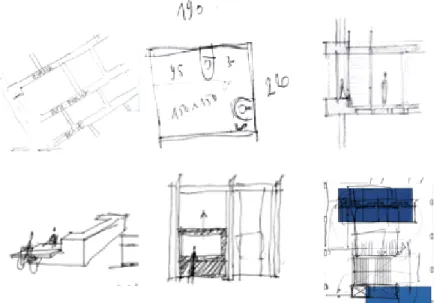
The documents created inside such collaborative contexts were registered in their chronological appearance and were analysed that way too. As several of them had been reused at different occasions during the design process, we did not consider time as a variable of analysis though. At first we made an inventory of graphic components present in each document, several documents containing more than one. A component is here understood as a group of strokes presenting internal coherence in view of the architectural project (ranging from a couple of lines over doodles, annotations, or calculus to fully detailed perspective drawings). Depending on what the components referred to (a specific part of the building; a singled-out piece of furniture; a front elevation…), we sometimes clustered them with other(s) (referring to the same “topic”) to form “individuated sketches” or separate “sketching episodes” (Rodgers, Green and McGown, 2000). A document could thus contain either several components referring to the same design episode, or components that each generated their own distinct episode. Working with this notion of “episode” helped us better track sensory clues that emerged from a set of representations rather than from a single component (e.g., Figure 2).
Fig. 2 – Within the whole document (left), one can observe that the three sketches down-left of the page (three “components”) refer to the same sketching episode (the spacing between different buildings, their rhythm, and the circulation in between them). Considering those three components jointly helps better understand the architect’s intention and evaluate whether any sensory experience can be detected.
Copyright © 200x Inderscience Enterprises Ltd.
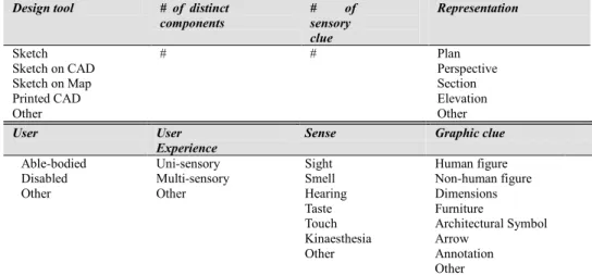
Table 1presents the variables used for the quantitative analysis, each with their set of possible values.
User User
Experience
Sense Graphic clue
Able-bodied Disabled Other Uni-sensory Multi-sensory Other Sight Smell Hearing Taste Touch Kinaesthesia Other Human figure Non-human figure Dimensions Furniture Architectural Symbol Arrow Annotation Other
Table 1 – Variables used for analysis and their values.
First we coded for each representation the design tool used for its creation: free-hand sketches (sometimes on top of a printed CAD representations or printed Google® maps), CAD representations (i.e., without any re-drawing on it), and printed pictures of inspirational buildings and scale models (gathered under “Other”, because of the very limited used architects made of them). After a basic inventory of the total number of components per representation, we focused on a qualitative understanding of those components (their contents and intentions). The type of representation was first categorized (plan, perspective, section etc.), attention specifically turned to the point of view chosen to build the perspectives and what it could convey, be it drawn from a bird’s-eye viewpoint or from a worm’s-bird’s-eye, or more frequently from a “standing-figure” viewpoint. When the architects used the latter to root the projected user into the scenery, we coded it as a sensory clue by itself (e.g., Figure 3), consequently hypothesizing that bird’s-eye views were intrinsically less inclusive of human perception of space (extending the argumentation of authors like Bryon, 2011, as referred to above).
Fig. 3 – The left representation, using a bird’s-eye view, suggests less consideration for the future user’s perception of the space than the right one.
Design tool # of distinct
components # of sensory clue Representation Sketch Sketch on CAD Sketch on Map Printed CAD Other # # Plan Perspective Section Elevation Other
Copyright © 200x Inderscience Enterprises Ltd.
Other graphic clues possibly conveying reference to sensory experiences were assessed. For each detected “sensory clue”, we coded the type of projected user (able-bodied, disabled, “other” when unsure); the nature of the projected experience (uni-sensory by default, multi-(uni-sensory if enough clues could be identified) and the sense referred to (adding kinaesthesia to the five basic senses). Eventually, we took a step back from the coding and considered the graphic traces that helped us decipher each sensory clue. Iteratively building this last variable of analysis, we found eight categories of graphic clues that, on top of worm’s-eye or standing-figure’s perspective, referred to some sensory experiences (Figure 4).
Fig. 4 – Top-left: an explicit annotation (“publiek – privé”, or public/private) defines how the building and its future users will relate to their surroundings. Top-middle: specific mention of dimensions suggests a more conscious move towards users’ experiences (the reflective dimension of this move being yet not clear). Top-right and below: human figures, furniture and an arrow express how people will relate to each other and will manipulate the equipment. Below right, redrawn arrows on a 2D CAD plan express physical circulation through the building.
A qualitative analysis of more complex graphic contents (such as the one by Rodgers, Green and McGown, 2000 or Dogan and Nersessian, 2010) was made possible by the participant observation done by one of the researchers. This member-checking step insured robustness to the qualitative findings (Creswell, 2003): when unsure about a coding decision, we submitted the concerned component or episode and its analysis to the participant-researcher to gain his feedback and feeling towards the analysis’ accuracy. In the rare cases where no consensus could be found, the value “Other” was chosen.
Given the nature of the collected data and the considered research questions, no statistical tests were run. Instead we opted for a cross-analysis of concurrent occurrences (using pivot tables), a simple tool that proved helpful for the quantitative analysis of the data, conjointly made with a cautious qualitative understanding of the traces.
Copyright © 200x Inderscience Enterprises Ltd.
Results
Among the 985 components we extracted from 209 representations, only 183 conveyed graphic clue(s) of sensory experiences. For 802 components (more than 80% of the total), there was consequently no possibility to infer any design intention related to sensory experiences. Interestingly, and as next section will show, free-hand drawings remained the main tool – and external representation – used to refer to end-users’ sensory experiences during teamwork sessions.
Sensory experiences and architectural representations
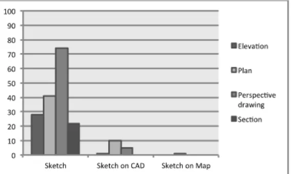
Figure 5 summarizes how the 183 sensory clues identified distribute across the main design tools and their various types of representations. We observed that printed CAD (without any re-draw) and pictures of various design elements (inspirational buildings, scale models, …) do not convey (at least not explicitly enough) any sensory experiences inside this specific design setting. Traditional free-hand sketches feature more sensory clues, mainly allocated amongst perspective drawings and plans. CAD re-prints are used in their 2D form (plans) and redrawn while one map-view supports the design of paths of circulation on the site. Free hand sketching on plain paper supports 165 out of the 183 detected clues, which underlines its importance during design for sensory experiences, at least in the context of this design process.
Fig. 5 – Type of design tool crossed with type of representation for the 183 components conveying sensory clues (in number of occurrences).
Considering how sensory clues are supported by each of the three main media used by the architects inside this collaborative setting (i.e., plain sketches, sketches on CAD printouts and on maps), Figure 6 illustrates that most of the sensory experiences are expressed by one graphic component at a time. For regular free hand sketching we found 19 pairs of components each supporting one experience, and for one occurrence even up to five components (clustered in one large sketching episode) nurtured one single experience.
Looking at the variety of representations (Figure 7) makes clear that perspective drawings and plans (in this context) actively support the expression of sensory experiences. If most of the perspective drawings with a worm’s-eye or standing-figure viewpoint were per se considered as bearing some sensory experience, one could still wonder whether there is any other justification that could explain this dominance.
Copyright © 200x Inderscience Enterprises Ltd.
Fig. 6 (left) and 7 (right) – Distribution (in number of occurrences) of sensory clues per main design tool (left) and per type of representation (right).
Senses and users inside architectural representations
Given the fact that the observed design team mainly used drawn representations as support of their collaborative processes, and building on the observation that free-hand drawings obviously do not allow to be read in another way than visual and therefore provide mainly visual “backtalk” (Schön, 1983), this sections investigates whether this particular language of expression imperatively means an architecture designed solely based on and for vision.
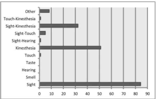
In this regard, Figure 8 shows which senses are referred to by each of the 183 sensory clues. Interestingly, and beside the expected (and documented) dominance of sight, kinaesthesia stands out as another important sense graphically conveyed by drawings during preliminary architectural design (51 occurrences). If taste, hearing and smell could not be detected per se, we underline here one occurrence where touch could be identified
,
as well as several others convoking an association of multiple senses (“sight-kinaesthesia” in 32 occurrences, as well as 5 “sight-touch” pairs and one for each pair “touch-kinaesthesia” and “sight-hearing”).Fig. 8 – Repartition (in number of occurrences) of sensory clues amongst the various senses (and associations of senses).
We illustrate here some of these associations of senses. A section for instance (Figure 9) depicts a human figure on top of a roof, protected by banisters, experiencing a view on the council meeting room (through a roof window), allowed to hear everything from what happens in the meeting since that window has no pane. Figure 10 presents sliding archives-shelves and their manipulation and informs us about both how the user’s body
0 20 40 60 80 100
Sketch Sketch on CAD Sketch on Map 1 2 3 4 5 0 10 20 30 40 50 60 70 80 90 Sight Smell Hearing Taste Touch Kinesthesia Sight-Hearing Sight-Touch Sight-Kinesthesia Touch-Kinesthesia Other
Copyright © 200x Inderscience Enterprises Ltd.
and the shelves move (kinaesthesia). When designing the details of a banister (Figure 11), the architects pay particular attention to the shape and roundness of its profile, its angle, thus designing with attention for the sense of touch.
Fig. 9 (left), 10 (middle) and 11 (right) – Council meeting room and its public alleyway; manipulation of sliding archives-shelves; rough sketch of a banister and its profile.
When we look at how the various senses (and their associations) unfold inside each representation (Figure 12), it is interesting to notice that sight seems mainly supported by perspective drawings (48 occurrences, most of them linked to the worm’s-eye/standing-figure postulate), while kinaesthesia is expressed inside both plans and drawings (respectively 28 and 20 occurrences).
Fig. 12 – Repartition (in number of occurrences) of the senses amongst the four types of representation. Taste, hearing and smell do not reappear here, as they were not identified as independently supporting any sensory experiences.
Questioning now which users are evoked by the architects of this design firm, Figure 13 teaches us how, during the early phases of architectural design, they rarely consider disabled people and, if they do, these are moreover exclusively people with limited mobility. Interestingly, a user in a wheelchair alone appears just once through the 985 components, and twice conjointly with an able-bodied user. The latter is dominantly referred to throughout the process, but almost exclusively making use of one of the senses (108 occurrences versus 23 multi-sensory situations). Worth underlining is the fact that
Copyright © 200x Inderscience Enterprises Ltd.
multi-sensory clues overtake the uni-sensory only when both users (able-bodied and disabled) are considered jointly.
Fig. 13 – Repartition (in number of occurrences) between considered user and user experience.
Graphic clues of sensory experience(s) in architectural design
Geometrical components inside an architectural representation inevitably - and obviously - convey the expression of a certain experience: architects project their vision of a future building, hosting future activities. As Heylighen and Bianchin underlined (2012, p.9): “it makes no sense to design something without a user in mind”. The previous sections showed how graphical components, even if they do not efficiently convey the complete and complex range of experiences, still constitute clues for an external observer to understand design intentions concerned with sensory experiences.
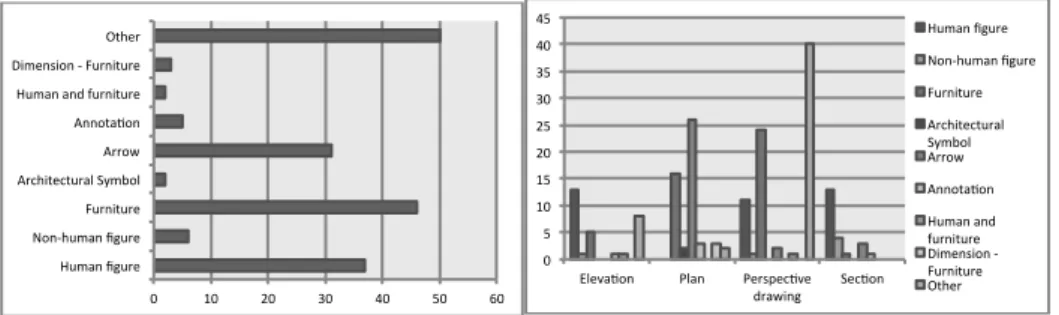
Inside those components we found a limited set of elements that quite systematically referred to sensory experiences. Figure 14 presents their repartition in number of occurrences (some pairs of elements being sometimes inseparable, for instance a human figure using a desk). We see how human figures, pieces of furniture and arrows frequently refer to sensory experiences. Among the information presented in Figure 15, worth mentioning is the equally frequent occurrence of human figures on all representations but plans. The specific design of pieces of furniture is made principally on plans and perspective drawings, whereas numerous arrows on plans are used as indicators of paths and physical circulations (the three arrows detected on sections being the common graphical expression of natural light penetration).
Fig. 14 (left) and 15 (right) – Repartition (in number of occurrences) between all graphic clues (the large proportion of “Other” referring to worm’s-eye/standing-figure perspectives) and between graphic clues and the four main types of representations.
Copyright © 200x Inderscience Enterprises Ltd.
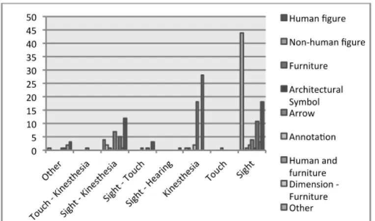
Finally, Figure 16 shows how those graphic clues refer to specific senses or associations thereof. Interestingly, kinaesthesia is distinctly expressed through arrows and (manipulated) furniture, while human referents are particular clues for considerations around sight (and the “sight-kinaesthesia” pair).
Fig. 16 – Repartition (in number of occurrences) between senses and graphic clues.
Discussion
Since the results presented here are extracted from the ethnographic observation of a design process in a single architecture firm, any observation has to be considered, with regard to this local situation, as demonstrative of one way to graphically express sensory experiences. Potentialities offered by 3D CAD modelling and/or physical models in terms of designing for sensory experiences were for instance less explicit in the context of this design process, but should certainly be researched further through other case studies.
Results are discussed here in terms of the contribution they make to improving our understanding of how sensory experiences are conveyed by representation during architectural design.
To what extent is sensory experience conveyed by architectural representations during preliminary design?
Results showed how free-hand sketches and particularly perspective drawings, plans and (to a lesser extent) elevations are the most common representations used to express sensory experiences in architecture. With up to five components nurturing a single experience (Figure 6), episodes of free-hand sketches, detached of any geometrical pre-existing structure (CAD or map), seem in this case the most effective support for an abundant and interlocked expression of sensory experiences. CAD tools and scale models, despite their documented potentialities for gaining insights about end-users’ (sensory) experiences, are rarely exploited in that sense inside the observed setting, at least during collaborative design episodes.
Copyright © 200x Inderscience Enterprises Ltd.
With only 183 clues extracted from the 985 analysed components, the graphical expression of sensory experiences nevertheless remains rather frugal. Only perspective drawings, with their worm’s-eye or standing-figure points of view, appear (both in the literature and through our results) to be particularly useful to root projected users in the future scenery. If perspective drawings are generally considered as more efficient for the expression of materiality and embodiment compared to plans, sections and elevations (Franck and Lepori, 2007), we recognize in them a synthetic quality that could possibly also explain this dominance.
In view of our results, we indeed consider perspective drawings as more than demonstration, evaluation or communication tools. Unlike Pierre Leclercq’s suggestion about perspective drawings being nothing else than communication tools (1994), we would on the contrary argue that they are more than simple re-representations tools.
Daniel Estevez (2001) considers plans, sections and elevations as fragmented and geometrically paradoxical and, therefore, capable of ensuring an overall blurry, ambiguous and polymorphic exploration process. Following this author, these fragmented views are partial, linked but autonomous; they do not counter the notion of integration (which could be present in the architect’s mind) but do not impose it either. They enable the designer to work on fragmented and incomplete views that all, in their own way, take part to the global evolution of the project.
When it comes to addressing sensory experiences during design, our results suggest that perspective drawings go beyond these fragmented views. They do not simply translate decisions already taken (in plans, elevations or sections) into a three-dimensional world, but rather constitute an augmented proposition, merging those decisions with more intangible dimensions of the architectural space such as sensory experiences. In perspective drawings the whole thus seems more than the sum of its parts. To what extent do architects deal with the multi-sensory nature and user diversity of experience?
Quantitative and qualitative results confirmed sight as a dominant sense in architectural design. Yet our results also demonstrated that sight is not the only sense to be found inside architectural representations: graphic clues of both kinaesthesia and the association of sight and kinaesthesia are detected, mainly in plans and perspective drawings.
This finding locally challenges some authors’ position about the human body in architecture (as outlined above). When it is argued that “the absence of non-visual features in traditional architectural spatial representations indicates how these are disregarded as important elements in conceiving space” (Dischinger, 2006), it seems that the (obvious) visual nature of representations is confused with the multi-sensory intentions that architects may unfold, but not necessarily express graphically. If designers indeed develop a bias towards a certain visual language when designing a space or building, we would nevertheless not automatically assume that they have no intent at all to design for other sensory experiences. Graphical clues of bodies in movement and in interaction have been found and seem to indicate that movement is considered as another possible “catalyst for architectural experience” (Cain, 2005).
Considering which users are referred to throughout the design process, we underline how rarely disabled people are considered, and how limited the definition of their situation is (in this case: only people using wheelchairs). Interestingly, even if uni-sensory
Copyright © 200x Inderscience Enterprises Ltd.
situations are dominating, multi-sensory experiences are expressed here and there, especially when both able-bodied and disabled people are represented together.
One could wonder whether a conscious design sensibility towards disabled users triggers a more multi-sensory attention. We would at least suggest that architects juggle with an assemblage of fragmented views of users. Wilkie (2010) argues that in the designers’ minds, models of users are multiple and fluid, much more like a progressive concept evolving from “distal” to “proximal” situations. Several codes and successive transcriptions shape this model (the competition brief and the putative vision of a client; the designer sensibility and his colleague perception of this shared “cloud” of concepts; the representations’ capabilities etc.) and make it evolve between different levels of abstraction and idealization. From our point of view this assemblage of fragmented and evolving views is valid for both able-bodied and disabled users: the architect’s sensibility will rather depend on his/her personal involvement inside each design moment, and on which user fragment he/she will require during this specific moment.
What are the main graphic clues used by architects to address sensory experiences during design?
The results showed that the observed architects preferably convoke specific graphic clues to refer to specific sensory experiences. Human figures (present everywhere but on plans), pieces of furniture (on both plans and perspective drawings) and arrows (used as indicators of paths and circulations) are the three most common clues to be found in this context. Figure 14 moreover suggests that sight, or the association of sight and kinaesthesia, is preferably expressed through the use of human referents.
The latter observation confirms the results of Eriksson and Florin’s (2011), who explain how human referents are useful to evaluate dimensions, proportions, background versus foreground etc. Imrie (2003, p.63), on the other hand, writes: “more often than not the use of a human figure in drawings is primarily to represent building scale rather than to convey an understanding of the interactions between architecture and the human body.” One could thus question the level of reflection that we, as architects, put behind those little graphic creatures (human referent or others): do they illustrate the user’s future interaction with the projected space, or do they simply nurture our sight - our reflective conversation with the drawn project?
Conclusions
In the study reported in this article, we investigated how sensory experiences are conveyed in an architecture firm’s design process, and more particularly through representations used collaboratively all along preliminary design. Our results suggest that, even if graphic expressions remain quite frugal (in this particular design process) and do not contain the complete range of users nor the multiplicity of their possible sensory experiences, there is more in architects’ representations than meets the eye.
Plans, and more particularly perspective drawings (with their synthetic quality), indeed seem to help the observed architects to graphically unfold architectural concepts including more than visual experiences only, despite what some authors suggest.
We consider this apparent frugality of architectural drawings as a “necessary evil”: on the one hand, it indeed makes designers’ intentions more difficult to catch (especially for something as complex as sensory experiences), but on the other hand it ensures that
Copyright © 200x Inderscience Enterprises Ltd.
fragmented, highly implicit and flexible representations keep the exploratory process going on. If architectural representations indeed still filter more intangible and enacted dimensions of architectural design than expected, we should not mistake this lack of sensory vocabulary for a lack of sensibility.
Acknowledgements
Omitted for blind review.References
1. Authors (2010) Omitted for blind review 2. Author2 et al (2010) Omitted for blind review 3. Authors (2012). Omitted for blind review.
4. Bryon, H. (2011). The worm’s eye as a measure of man. In G. Adler, T. Brittain-Catlin, & G. Fontana-Giusti (Eds.), SCALE – Imagination, Perception and Practice in Architecture, 54-64. Oxon: Routledge.
5. Bucciarelli, L.L. (1988). An ethnographic perspective on engineering design. Design Studies, 9 (3), 159-168.
6. Buchenau, M. & Suri, J. F. (2000). Experience prototyping. In Proceedings of the Conference on Designing Interactive Systems: Processes, Practices, Methods, and Techniques. New York, ACM Press, 424–433.
7. Cain, R.E. (2005). Involving users in the design process. Loughborough: Loughborough University.
8. Creswell, J. (2003). Research design : qualitative, quantitative, and mixed method approaches, 2nd ed., Thousand Oaks Calif.: Sage Publications.
9. Cross, N. (1982). Designerly ways of knowing. Design Studies 3(4): 221–227. 10. Cross, N. (2006). Designerly Ways of Knowning. London: Springer.
11. Cross, N. & Cross, A. C. (1996). Winning by design: the methods of Gordon Murray, racing car designer. Design Studies, 17 (1), 91-107.
12. Crilly, N., Maier, A., & Clarkson, P.J. (2008). Representing Artefacts as Media. International Journal of Design, 2(3), 15-27.
13. Desmet, P. M. A., & Hekkert, P. (2007). Framework of product experience. International Journal of Design, 1(1), 57-66.
14. Dischinger, M. (2006). The Non-Careful Sight. In P. Devlieger, F. Renders, H. Froyen, & K. Wildiers (Eds.), Blindness and the Multi-Sensorial City, 143-176. Antwerp: Garant.
15. Do, E. Y-L., Gross, M.D., Neiman, B., & Zimring, C. (2000). Intentions in and relations among design drawings. Design Studies, 2, 483-503.
16. Dogan, F., & Nersessian, N.J. (2010). Generic abstraction in design creativity: the case of Staatsgalerie by James Stirling. Design Studies, 31, 207-236.
17. Eriksson, Y., & Florin, U. (2011). The relationship between a model and a full-size object or building. In Proceedings of the International Conference on
Copyright © 200x Inderscience Enterprises Ltd.
Engineering Design, ICED11, Technical University of Denmark, 10 p.
18. Estevez, D. (2001). Dessin d’architecture et infographie, l’évolution contemporaine des pratiques graphiques. Paris : Edition du CNRS.
19. Flyvbjerg, B. (2006). Five misunderstandings about case-study research. Qualitative Inquiry, vol. 12 n°2, 219-245, Sage Publications.
20. Franck, K. A. & Lepori, B. (2007). Architecture from the Inside Out. Chichester: Wiley.
21. Goldschmidt, G. (1999). The Backtalk of Self-generated Sketches. In Visual and Spatial Reasoning in Design, Eds John S Gero and Barbara Tverstky, 163-184. Sydney: Key Centre of Design Computing and Cognition, University of Sydney.
22. Heylighen, A., & Bianchin, M. (2012). How does inclusive design relate to good design ? Designing as a deliberative enterprise. Design Studies, 34, 93-110. 23. Hochberg, J. (1972). The representation of things and people. In E.H. Gombrich,
J. Hochberg, & M. Black, Art, perception and reality, 47-94. Baltimore, Maryland: Johns Hopkins University Press.
24. Imrie, R. (2003). Architects’ conceptions of the human body. Environment and Planning D: Society and Space, 21, 47-65.
25. Ingold, T. (2000). The perception of the environment. New York: Routledge. 26. Jones, J. C. (1970). Design methods: Seeds of human futures. Chichester: John
Wiley.
27. Jordan, B., & Henderson, A. (1995). Interaction analysis: foundations and practice. The Journal of the Learning Sciences, 4(1), 39-103.
28. Law, E. L-C., Roto, V., Hassenzahl, M., Vermeeren, A.P.O.S., & Kort, J. (2009). Understanding, Scoping and Defining User eXperience: A Survey Approach. CHI 2009, Boston, 719 – 728.
29. Leclercq, P. (1994). Environnement de conception architecturale préintégrée. PhD dissertation. Liège : University of Liège.
30. Leclercq, P. (2005). Le concept d’esquisse augmentée. SCAN’05, Séminaire de conception architecturale numérique. 16 p.
31. Lim, Y.-K., Stolterman, E., & Tenenberg, J. (2008). The anatomy of prototypes: Prototypes as filters, prototypes as manifestations of design ideas. ACM Trans. Comput.-Hum. Interact. 15, 2, Article 7, 27 pages.
32. Lindekens, J. (2006). Re-design strategies unmasked, PhD, Vrije Universiteit Brussel, Brussel, Belgium.
33. Loomis, J.M., Lederman, S.J. (1986). Tactual perception. In K.R. Boff, J. Kaufmann, & J.P. Thomas (Eds.) Handbook of perception and human performance, vol.2 (pp.1-41). New York: John Wiley.
34. Luck, R., & McDonnell, J. (2006). Architect and user interaction. Design Studies 27, 141-166.
35. Oehlberg, L., Roschuni, C., & Agogino, A. (2011). A descriptive study of designers’ tools for capturing, reflecting on, and sharing user needs and conceptual designs. Proceedings of the ASME IDETC/CIE 2011 conference,
Copyright © 200x Inderscience Enterprises Ltd. Washington DC: ASME, 10p.
36. Pallasmaa, J. (2005). The Eyes of the Skin. Chichester: John Wiley.
37. Rodgers, P. A., Green, G., & McGown, A. (2000). Using concept sketches to track design progress. Design Studies, 21(5), 451-464.
38. Schön, D. (1983). The Reflective Practitioner: How Professionals Think in Action. New York: Basic Books.
39. Schön, Donald, & Glenn Wiggins. (1992). Kinds of seeing and their functions in designing. Design Studies 13(2):135-156.
40. van der Vegte WF & Horvath I. (2012). Theoretical underpinning and prototype implementation of scenario bundle-based logical control for simulation of human-artifact interaction. Computer-Aided Design (2012), Volume 44, Issue 8, August 2012, 791–809 41. Vermeersch P.W. (2013). Less vision, more senses. Towards a more multisensory
design approach in architecture. PhD dissertation. Leuven: KU Leuven.
42. Vermeersch, P.W. & Heylighen, A. (2011). Scaling Haptics - Haptic Scaling. Studying scale and scaling in the haptic design process of two architects who lost their sight. In: Adler G., Brittain-Catlin T., Fontana-Giusti G. (Eds.), Scale: Imagination, Perception and Practice in Architecture. Oxon: Routledge, 127-135.
43. Wilkie, A. (2010). User Assemblages in Design: an ethnographic study. PhD dissertation. Goldsmiths, Univ. of London.