T
HÈSE DE DOCTORAT DE
L’UNIVERSITE DE NANTES
Ecole Doctorale N° 601
Mathématiques et Sciences et Technologies de l’Information et de la Communication Spécialité : INFO – Informatique
Par
«
Vincent RAVENEAU »
«Interaction in Progressive Visual Analytics »
« An application to progressive sequential pattern mining »
Thèse présentée et soutenue à NANTES , le 4 Novembre 2020
Unité de recherche : LS2N – Laboratoire des Sciences du Numérique de Nantes
Rapporteurs avant soutenance :
Nicolas LABROCHE Maître de conférences HDR, LIFAT, Université de Tours
Adam PERER Assistant Research Professor, Human-Computer Interaction Institute, Carnegie Mellon University
Composition du jury :
Présidente : Béatrice DAILLE Professeure des universités, LS2N, Université de Nantes Examinateur : Jean-Daniel FEKETE Directeur de Recherche, INRIA Saclay, INRIA
Dir. de thèse : Yannick PRIÉ Professeur des universités, LS2N, Université de Nantes Co-enc. de thèse : Julien BLANCHARD Maître de conférences, LS2N, Université de Nantes
A
CKNOWLEDGMENTS
First, I would like to thank the members of my PhD committee: Nicolas Labroche and Adam Perer, for agreeing to review my work and provide valuable feedback; Béatrice Daille, for agree-ing to preside this committee; Jean-Daniel Fekete, for his role in the committee as well as for all the great discussions and support throughout the thesis.
Second, I would like to express my gratitude to my advisors, Yannick Prié and Julien Blan-chard, for their guidance, support and help during this work.
I would also like to thank the members of the LS2N laboratory that I have been pleased to meet during these years. This includes members of the DUKe team, as well as my fellow PhD students – Adeline, David, Erwan, Ziwei, Jiajun and Adrien.
Finally, my sincere thanks goes to my friends and family for their continuous support, even though I spent too little time with them during these years. I am very much thankful to my girlfriend, Maëva, for her love and encouragements.
T
ABLE OF
C
ONTENTS
1 Introduction 9
I State of the art 13
2 From Visual Analytics to Progressive Visual Analytics 17
1 Visual Analytics . . . 17
1.1 Origins and early definitions . . . 17
1.2 Current definition . . . 19
1.3 The importance of insights . . . 20
1.4 Generating knowledge with Visual Analytics . . . 21
1.5 Modeling the tasks performed with Visual Analytics. . . 23
1.6 Examples of existing Visual Analytics tools . . . 27
1.7 Degree of automation in Visual Analytics systems . . . 30
1.8 Towards Progressive Visual Analytics . . . 33
2 Progressive Visual Analytics. . . 33
2.1 Definition and origin of the progressive paradigm . . . 33
2.2 Progressive algorithms compared to related algorithm types. . . 35
2.3 Existing implementations of Progressive Visual Analytics systems . . . . 37
2.4 Designing Progressive Visual Analytics systems . . . 44
2.5 Interaction-related user studies in Progressive Visual Analytics . . . 49
3 Conclusion – Challenges for Progressive Visual Analytics . . . 50
3 Sequential Pattern Mining 53 1 Mining patterns in sequences . . . 54
1.1 General definitions . . . 54
1.2 Sequential patterns . . . 57
1.3 Episodes . . . 57
1.4 Constraints on the mining process . . . 59
1.5 Counting pattern occurrences. . . 60
2 Sequential Pattern mining algorithms . . . 64
2.1 Apriori-like algorithms . . . 64
2.3 Implementations . . . 69
3 Conclusion – Towards Progressive Pattern Mining . . . 70
3.1 Sequential Pattern mining within Progressive Visual Analytics . . . 71
3.2 Progressiveness in Sequential Pattern mining . . . 71
II Propositions 73 4 Interactions in Progressive Visual Analytics 79 1 A framework of possible interactions with an algorithm in Progressive Visual An-alytics . . . 80
1.1 Interactions between an analyst and an algorithm. . . 81
1.2 Progressive Visual Analytics systems seen through our framework . . . . 82
2 An updated definition of Progressive Visual Analytics . . . 84
3 Indicators to guide the analysis . . . 87
3.1 Indicators for the analyst. . . 87
3.2 Indicators in existing systems . . . 89
4 Conclusion . . . 89
5 Towards Progressive Pattern Mining 91 1 Analysis tasks performed with patterns . . . 92
1.1 Choosing a task model . . . 92
1.2 Andrienko and Andrienko (2006): data model . . . 92
1.3 Andrienko and Andrienko (2006): task model . . . 93
1.4 Data model for sequential patterns . . . 98
1.5 Task model for patterns . . . 99
1.6 Leveraging our task model . . . 100
2 Guidelines for Progressive Pattern Mining algorithms . . . 101
3 Conclusion . . . 103
6 PPMT: a Progressive Pattern Mining Tool to explore activity data 105 1 Design process . . . 106
1.1 Organization of the process . . . 106
1.2 Main design choices . . . 107
1.3 The coconotes dataset . . . 109
2 Features . . . 111
2.1 Technical features . . . 112
2.2 Supported analysis tasks . . . 112
TABLE OF CONTENTS
3.1 Dataset-related panels. . . 114
3.2 Algorithm and pattern-oriented panels . . . 119
3.3 Visualization-oriented panels . . . 124
3.4 Dataset selection. . . 129
4 Architecture . . . 129
4.1 Logical architecture . . . 129
4.2 Implemented architecture . . . 130
5 Progressive pattern mining in PPMT . . . 132
5.1 Design and implementation of the algorithm . . . 133
5.2 Steering the algorithm . . . 135
5.3 The algorithm . . . 137
5.4 Comparison with existing Progressive Pattern Mining algorithms . . . 138
6 Evaluations . . . 139
6.1 Compliance with existing recommendations . . . 139
6.2 Performances of a progressive pattern mining algorithm derived from an existing algorithm. . . 144
7 Conclusion . . . 147
7 Comparing the effect of various progressive interactions on data analysis tasks 149 1 Material and protocol . . . 150
1.1 Experiment material . . . 150
1.2 Experiment protocol . . . 150
1.3 Collected data . . . 153
2 Results . . . 153
2.1 Time to answer questions . . . 153
2.2 Correctness of answers . . . 154
2.3 Interaction with the algorithm . . . 154
2.4 Affirmation ratings . . . 155
3 Discussion . . . 155
3.1 Impact of interactions on answer time . . . 155
3.2 Impact of interactions on correctness. . . 157
3.3 Use of available actions by the participants . . . 157
4 Conclusion . . . 157
8 General conclusion 159 1 Contributions . . . 160
1.1 Major contributions . . . 160
2 Perspectives and future work . . . 161
References 165
Appendices 174
A Existing pattern mining algorithms 174
1 Apriori-like algorithms . . . 174 2 Pattern growth algorithms . . . 176
B First user experiment 177
CHAPTER1
I
NTRODUCTION
This manuscript presents the work conducted during my PhD thesis at the University of Nantes under the supervision of Yannick Prié and Julien Blanchard, as a member of the DUKe team (Data User Knowledge) of the LS2N laboratory (Laboratoire des Sciences du Numérique de Nantes). The funding came from the French Ministère de l’Éducation Supérieure et de la
Recherche. A timeline with the milestones of this work is available in figure1.1.
Sep Jan 2016 May Sep Jan 2017 May Sep Jan 2018 May Sep Jan 2019
Development of PPMT User experiment
VIS 2016 VIS 2018
Figure 1.1: Timeline representing the different steps in our work. Publications are indicated above
the axis.
Scientific context
While data analysis predates the invention of computers, the processing power they offer has led to many new possibilities besides raw number crunching, such as data transformation and visualization. The paradigm of Visual Analytics proposes that data analysis should benefit from both human and computer respective strengths (Bertini & Lalanne, 2010; D. Keim, Kohlham-mer, Ellis, & Mansmann,2010), by combining humans’ ease to derive insights from data visu-alizations and make decisions, with computers’ ability to process very large amounts of data. However, these processes suffer from one major pain point: when using time-expensive algo-rithms or working with large datasets, the analyst has to wait for the computation to complete. This speed bump (Pezzotti et al., 2017; Stolper, Perer, & Gotz, 2014) is detrimental to their focus and ability to explore the data at hand (Liu & Heer,2014).
From this observation, new research domains have emerged that offer alternatives to these imposed idle times for the analyst. The paradigm of Progressive Visual Analytics is one of these, and its solution is articulated around two core ideas that define the characteristics of progressive algorithms. The first one is to output intermediate results of increasing quality during the computation, instead of waiting for a unique result at the end. This allows the analyst
to start working on a broad picture of what can be expected, that will be improved as the algorithm’s computation continues. The second idea is that the analyst is able to interact with the running algorithm, by steering its remaining computation without restarting it. Combined with the intermediate results, this allows the analyst to leverage his interpretations and findings from the early results to guide the analysis towards targets of interest.
Our work takes place within the Progressive Visual Analytics paradigm, and focuses on the exploratory analysis of activity traces. This kind of temporal data consists of events recorded during specific human activities, and can be collected for a wide range of contexts, at various granularity levels (from broad actions to very precise events). As such, exploring activity data can be used to gain insights into the behavior of people, either in isolation or with regards to others’ recordings. One can then infer useful knowledge, depending on the kind of data that was recorded. For example, records of medical events can be used to investigate bad combinations of treatments, or long-time side effects. Another application could be learning how software is really used from the recordings of its users, in order to improve it. Activity data usually consists of large amount of data (especially when recorded at a fine granularity), which means they can benefit from the Progressive Visual Analytics approach. This kind of data can be explored using various algorithmic techniques. In this work, we decided to use pattern mining.
Challenges and research goals
Our work is focused on the interaction between a human analyst and a progressive algorithm. Based on our review of the literature, we identified four challenges that drove our work on this matter. The first two are directly related to interaction in Progressive Visual Analytics (PVA), while the last two target Progressive Pattern Mining (PPM).
Clarify what “interaction” means in the context of Progressive Visual Analytics, as well as investigate the role of the al-gorithm in the process.
Challenge PVA1
Investigate the consequences of interac-tions between the human and the algo-rithm on the analysis process.
Challenge PVA2
Investigate progressive pattern mining as a tool for data exploration and not only for pattern exploration.
Challenge PPM1
Investigate the ways to make a pattern mining algorithm progressive, the rele-vant interactions when using such algo-rithm and how they should be imple-mented.
Introduction
Contributions
We strived to provide theoretical, practical and experimental contributions to our research do-main. We identified the following six contributions, of which we consider four to be major.
Major contributions
C1. A study on interaction within a progressive analysis process. This contribution
tar-gets our PVA1 and PVA2 challenges, and encompasses the following elements:
C1.1. A framework describing the actions an analyst can perform when interacting with a
progressive algorithm;
C1.2. A model of how these actions impact a generic data analysis system;
C1.3. An evaluation of the impact of “progressiveness” on an algorithm’s performances. C2. A clarification of the process of Progressive Visual Analytics, with regards to the
role of the algorithm in the process. This contribution targets our PVA1 challenge, and
encompasses the following elements:
C2.1. A clear definition for the notion of steering;
C2.2. An updated definition of Progressive Visual Analytics, that offers a more precise
vision of the interactions that can take place within Progressive Visual Analytics;
C2.3. A model of the Progressive Visual Analytics process, based on a classical Visual
Analytics model (Sacha et al.,2014).
C3. PPMT, a progressive pattern mining system. This contribution targets our PPM1 and
PPM2 challenges, and encompasses the following elements:
C3.1. The PPMT system itself, that supports the analysis tasks we identified (C5),
imple-ments all the actions from our framework (C1.1), and follows our guidelines (C6);
C3.2. A review of PPMT’s compliance with existing recommendations for the design of
Progressive Visual Analytics systems.
C4. A user experiment focused on the impact of the interactions between the analyst and the algorithm on a progressive analysis process. This contribution targets our
PVA2 challenge.
Secondary contributions
C5. A data and task model for an analyst exploring temporal data with patterns, special-ized from the general model of Andrienko and Andrienko (2006). This contribution
targets our PPM2 challenge.
C6. A set of five guidelines for the design of a progressive algorithm for pattern mining in sequences. This contribution targets our PPM1 challenge.
Structure of the manuscript
The first part of the manuscript is entitled “State of the art”. It contains two chapters presenting our review of the state of the art, and identifying several challenges. Inchapter 2, entitled “From
Visual Analytics to Progressive Visual Analytics ”, we focus on Progressive Visual Analytics-related works, starting with an overview of Visual Analytics that leads to Progressive Visual Analytics. We then review existing Progressive Visual Analytics work, focusing on its defining characteristics, the existing systems and their design, as well as on existing interaction-related studies of Progressive Visual Analytics. We then switch in chapter 3, “Sequential Pattern
mining”, to sequential pattern mining, presenting the different kinds of sequential patterns that can be found in the literature, as well as the different families of pattern mining algorithms.
The second part of the manuscript, “Propositions”, is dedicated to the presentation of our contributions. Inchapter 4, entitled “Interactions in Progressive Visual Analytics ”, we address
the question of interactions in Progressive Visual Analytics (C1) and propose an updated def-inition of the Progressive Visual Analytics paradigm (C2). Chapter 5, “Towards Progressive
Pattern Mining ”, focuses on the notion of Progressive Pattern Mining, on the tasks an analyst exploring temporal data with patterns can perform (C5), and on the design of dedicated algo-rithms (C6). Inchapter 6, “PPMT: a Progressive Pattern Mining Tool to explore activity data”,
we present PPMT, our Progressive Pattern Mining system (C3), and its evaluation (C1). In
chapter 7, “Comparing the effect of various progressive interactions on data analysis tasks”,
we relate a user experiment we conducted that focused on the impact interactions between the analyst and the algorithm have on a progressive analysis process (C4).
Inchapter 8, “General conclusion”, we finally reflect on various aspects of the presented
PART I
In this first part, we present our review of exiting works in Progressive Visual Analytics and sequential pattern mining, the two research domains we were interested in. For the sake of clarity, each domain is presented in its own chapter.
Chapter 2 is about Progressive Visual Analytics, the data analysis paradigm at the core of our work. While some earlier works comply with its definition, its inception is fairly recent, and came as an answer to some limitations of the Visual Analytics paradigm. As such, in order to offer a comprehensive perspective on Progressive Visual Analytics, we open with a presentation of Visual Analytics in section2.1. Throughout this section, we review the evolution of the definition of Visual Analytics, present the central concept of insights, and present the knowledge generation process and task models that have been proposed for this paradigm. We also present some of the existing Visual Analytics systems, and discuss their various degrees of automation. The section concludes with the limitations that Visual Analytics systems face when dealing with large datasets or time-consuming algorithms. Having presented the context that led to its inception, we focus on Progressive Visual Analytics in section2.2. We present its fundamental concepts and definition, highlight the differences between progressive algorithms and other closely related algorithm types, and review existing implementations of the paradigm. We also present existing works on the design of Progressive Visual Analytics systems, as well as user studies that focus on interaction within this paradigm. In section2.3, we conclude the chapter by identifying two main challenges for Progressive Visual Analytics.
Chapter 3is focused on Sequential Pattern mining. While not exhaustive, this review aims at providing by itself a good understanding of the domain and what it offers in terms of data anal-ysis techniques. In section 3.1, we present the general task of mining patterns in sequences. We first provide necessary definitions, before introducing the two types of Sequential Patterns that are found in the literature. The section closes with a presentation of the various constraints one can apply to the mining process, and of the different ways to count a pattern’s occurrences. Section3.2is dedicated to pattern mining algorithms, in which we present the two families that can be found in the literature, Apriori-like and pattern growth, and discuss their available imple-mentations. Section3.3concludes both this chapter and our review of the state of the art. In it, we consider the notion of Progressive Pattern Mining, and identify two additional challenges.
CHAPTER2
F
ROM
V
ISUAL
A
NALYTICS TO
P
ROGRESSIVE
V
ISUAL
A
NALYTICS
Associating humans and computers to benefit from the strengths of both has been suggested since the early days of computer science. Some research domains have emerged from this need, such as Visual Analytics, a data analysis paradigm built upon the idea of having a human analyst explore data visualizations. However, when datasets grow too large or when algorithms become too time-consuming, the promises of Visual Analytics are diminished by imposed wait-ing times for the analyst. To provide an alternative to these problematic cases, the paradigm of Progressive Visual Analytics has emerged, and offers to solve this problem by increasing the interactivity of the analysis process.
This chapter aims at providing an extensive review of the current state of research on Pro-gressive Visual Analytics. Section2.1is dedicated to Visual Analytics, and presents the domain and its aspects that lead to the aforementioned limitations. Section2.2is then dedicated to the presentation and review of the current research on Progressive Visual Analytics.
1
Visual Analytics
1.1 Origins and early definitions
The first use of the term “Visual Analytics ” is by Wong and Thomas (2004), who define it as follows:
A contemporary and proven approach to combine the art of human intuition and the science of mathematical deduction to directly perceive patterns and derive knowl-edge and insight from them.
They do so in an introduction to a series of six articles by Elizabeth G. Hetzler and Turner (2004), Teoh, Ma, Wu, and Jankun-Kelly (2004), D. A. Keim, Panse, Sips, and North (2004), Nesbitt and Barrass (2004), Schmidt et al. (2004) and Lee, Girgensohn, and Zhang (2004). Even though these articles do not use the term (except a brief mention by Teoh et al.), Wong and Thomas deem them representative of Visual Analytics as they conceive it. They view Visual
Analytics as a solution to deal with the size, variety and complexity of data that may need to be processed, expecting it to “[enable] detection of the expected and discovery of the unexpected within massive, dynamically changing information spaces”.
The following year, Cook and Thomas (2005) published what they call a “research and development agenda for Visual Analytics ”, in which they provide a shorter definition of Visual Analytics:
The science of analytical reasoning facilitated by interactive visual interfaces. (Cook and Thomas (2005), page 4)
In this book, they provide a vision for the potential of Visual Analytics, almost exclusively stemming from the September 11, 2001 terrorist attacks and the need for better analysis tools to react during and before a crisis. They summarize the challenge they face as “the analysis of overwhelming amounts of disparate, conflicting, and dynamic information to identify and prevent emerging threats, protect our borders, and respond in the event of an attack or other disaster”. In order to help tackle this problem, they present a vision of Visual Analytics that combines the following elements:
• Analytical reasoning techniques that enable users to obtain deep insights that directly support assessment, planning, and decision making
• Visual representations and interaction techniques that take advantage of the human eye’s broad bandwidth pathway into the mind to allow users to see, explore, and understand large amounts of information at once
• Data representations and transformations that convert all types of conflicting and dynamic data in ways that support visualization and analysis
• Techniques to support production, presentation, and dissemination of the re-sults of an analysis to communicate information in the appropriate context to a variety of audiences.
(Cook and Thomas (2005), page 4)
Throughout the book, Cook and Thomas review the state of the art relevant for their vision of Visual Analytics to provide a set of recommendations to guide its development. In particular, they stress the importance of creating tools that will support a collaborative analytic reasoning about complex problems by building upon “existing theoretical foundations of reasoning, sense-making, cognition and perception”. They suggest that this should be done through research, by developing “a science of visual representations” and “a science of interactions” to support the analytical reasoning process. In parallel with these scientific recommendations, they also stress the importance of building practical tools to implement these new paradigms and incentivize their insertion into operational environments.
2.1. Visual Analytics
1.2 Current definition
Cook and Thomas (2005) conclude their presentation of Visual Analytics by stressing the fact that the vision they give will most probably evolve in the following years, as Visual Analytics will mature. Indeed, a few years later, D. Keim et al. (2008) provide a more specific definition for Visual Analytics:
[A combination of] automated analysis techniques with interactive visualisation for an effective understanding, reasoning and decision making on the basis of very large and complex data sets. (D. Keim et al. (2010), page 7)
Since the research community has responded to Cook and Thomas (2005)’s “call to action” on Visual Analytics, D. Keim et al. (2008) present a vision of Visual Analytics where the ques-tions of adoption and integration into existing environments are absent. Instead, they are more focused on dealing with what they call the “information overload problem”, which can lead to an analyst getting lost in data that may be either irrelevant to her current task, processed in an inappropriate way or presented in an inappropriate way. D. Keim et al. (2008) also keep the idea of Visual Analytics being applicable to a wide array of people (having varied skills, goals and priorities) in completely different circumstances.
Two years later, D. Keim et al. (2010) propose a review of the state of Visual Analytics and its application in various research communities (data management, data mining, spatio-temporal data analysis, system infrastructure, perception, cognition and evaluation). They keep D. Keim et al. (2008)’s definition of Visual Analytics, and identify a set of challenges for Visual Analytics organized into four categories:
Data challenges. Handling large datasets poses challenges with regards to storage,
re-trieval, transmission, processing time and visualization scalability. The heterogeneous nature of the data increases the complexity of its processing, as does the variation in quality and for-malism. Specific cases are also adding to the complexity, such as handling streaming data or semantic information (metadata) and their integration in the analysis process.
User challenges. Minimizing cognitive and perceptual biases requires users to have
infor-mation about the data provenance, the transforinfor-mations that were performed during the analysis pipeline, and uncertainties within the data. It is also important that the users are able to under-stand the simplifications that are done when extracting a model of information from the data. This need for guidance is especially noticeable when said users are not familiar with data anal-ysis. Challenges also arise regarding user collaboration and the degree of interactivity offered by Visual Analytics tools.
Design challenges. Designing Visual Analytics tools should take advantage of the
exist-ing knowledge from the domains of visual perception and cognition. Guidance to choose the most suitable existing tools for a given task could also be helpful, as well as having available
test datasets, tools and results of evaluation studies. Although they note the difficulty of the challenge, they also advocate the use of a unified architectural model for Visual Analytics ap-plications.
Technological challenges. The duration of the analysis phase in a data exploration is
identified as a challenge, since it tends to be longer than traditional transactions due to the added cost of processing and presenting the data to the analyst. To that end, D. Keim et al. (2010) argue for the need for a “progressive availability” of the results that would give an analyst a rapid overview of what can be expected, allowing her to steer the analysis in particular directions. Another technological challenge is in the capacity to provide multi-scale analysis, along with a methodology for providing basic interactions with data visualizations, such as linking and brushing.
The disparities between Cook and Thomas (2005) and D. Keim et al. (2008)’s presentations of Visual Analytics illustrate the different visions of Europe and the USA with regards to data analysis. Regardless, the broad goals of Visual Analytics remained constant over the years, as evidenced by the similarity between Cook and Thomas (2005)’s recommendations and D. Keim et al. (2010)’s challenges. Visual Analytics aims at allowing one to explore data to extract knowledge from it by offering tools allowing to, in the words of both Cook and Thomas (2005) and D. Keim et al. (2010):
• Synthesize information and derive insight from massive, dynamic, ambiguous, and often conflicting data
• Detect the expected and discover the unexpected
• Provide timely, defensible, and understandable assessments • Communicate these assessments effectively for action. (D. Keim et al. (2010), page 7)
1.3 The importance of insights
Visual Analytics as a paradigm is supposed to allow an analyst to gain insights from the data, as stated in several ways over different works. Card, Mackinlay, and Shneiderman (1999) state that “the purpose of visualization is insight”, and Cook and Thomas (2005) describe Visual Analytics’s purpose as enabling and discovering insights. The term is widely used, even though none of its existing definitions has been commonly accepted by the information visualization community as a whole (Sacha et al.,2014; Yi, Stasko, & Jacko,2008). Depending on the focus of the work at hand, an insight can designate a particular moment when one makes sense out of a piece of information, or the newly obtained knowledge from this moment (Chang, Ziemkiewicz, Green, & Ribarsky, 2009). As such, an insight can be new information about
2.1. Visual Analytics
the content of the data, or an hypothesis based on the exploration, that will require further investigation of its veracity.
1.4 Generating knowledge with Visual Analytics
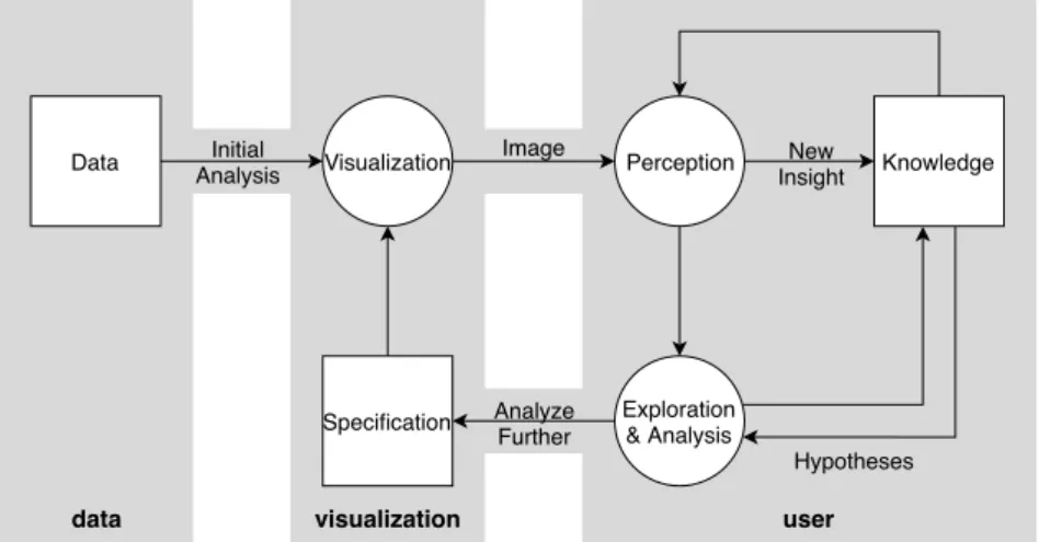
The question of how analysts interact with a system to generate knowledge has been the focus of several research works. A first step has been proposed by van Wijk (2005), in an attempt to assess the value of visualization and how analysts use it to generate knowledge. In his article, he proposes a general model for visualization that considers a visualization process that will create a image from the combination of data and a specification. This image will then be subject to the analyst’s perception, which will generate knowledge that can either feed the perception process or lead to new hypotheses. These hypotheses can then lead to further exploration by changing the specification before going back into this cycle with a new image. The initial model was later augmented to denote the fact that perception is an important part of the exploration process, and that exploration in itself feeds knowledge reasoning (T. M. Green, Ribarsky, & Fisher,2008; Tera Marie Green, Ribarsky, & Fisher,2009). This whole process has later been referred to by D. Keim et al. (2008) as the sense-making loop, illustrated in figure2.1.
data visualization user
Hypotheses Initial Analysis Data Specification Knowledge Image Visualization New Insight Perception Analyze Further Exploration & Analysis
Figure 2.1: Sense-making loop (D. Keim et al.,2008). Boxes denote containers, while circles are
processes that produce an output from an input. The model originates from the works of van Wijk (2005), T. M. Green, Ribarsky, and Fisher (2008) and Tera Marie Green, Ribarsky, and Fisher (2009).
Visual Analytics differ from the domain of data visualization in that an algorithmic process takes place both before and after the visual exploration process. From this observation, D. A. Keim, Mansmann, Schneidewind, and Ziegler (2006) extended the information seeking mantra from Shneiderman (1996), “overview first, zoom and filter, details on demand”, to propose the following Visual Analytics mantra:
Analyse first – Show the important – Zoom, Filter and Analyse Further –
Details on demand
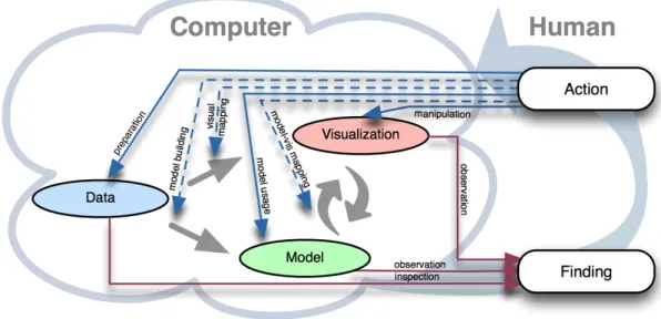
This mantra is similar to the one by Shneiderman, with the addition of the two “analyse” steps that represent the addition of an algorithmic process. In accordance with this mantra, D. A. Keim, Mansmann, Schneidewind, Thomas, and Ziegler (2008) proposed a model for the Visual Analytics process, illustrated in figure 2.2. Their model include data transformations that are performed during the pre-processing stage of the analysis, leading to data that can be either visualized or fed to an algorithm to build a model from it. Following this first step, the model created from the data can be visualized, and the insights gained from visual exploration can be used to build a new model. By repeating these interactions, the analyst is then able to generate knowledge, going back to the data transformations if needed.
Data
Visualisation
Models
Knowledge
Visual Data Exploration
Automated Data Analysis
User interaction Mapping Transformation Model building Model visualisation Parameter refinement Data mining Feedback loop
Figure 2.2: Visual Analytics workflow (D. A. Keim, Mansmann, Schneidewind, Thomas, & Ziegler,2008). Representation from D. Keim, Kohlhammer, Ellis, and Mansmann (2010).
Building from D. Keim et al. (2008)’s model, Sacha et al. (2014) proposed a model of knowl-edge generation in Visual Analytics, illustrated in figure 2.3. In their model, the focus is on the actions a human analyst can make and which stage of D. Keim et al.’s model they impact, rather than the connections between the stages. The preparation action refers to data gath-ering and pre-processing. Model building and visual mapping actions respectively lead to the creation of a model and visualization from the data, that the analyst can then explore (model usage and manipulation actions). The model-vis mapping action represents actions that map models into visualizations, as well as the opposite one (creating a model from a visualization).
2.1. Visual Analytics
Observations lead to findings, which represent any interesting information the analyst obtains while working with the Visual Analytics system. They can lead to the generation of insights or to the continuation of the exploration process.
Figure 2.3: Knowledge generation process in Visual Analytics (Sacha et al.,2014). Human
ac-tions are the blue arrows, which can lead to Visual Analytics components (filled arrows) or to the mappings between them (dotted arrows). Red arrows represent the human cognition paths, when generating findings by observing the system.
When describing their model, Sacha et al. draw a parallel with two other processes de-scribed in the literature. The upper part (Data and Visualization) corresponds to the InfoVis pipeline by Card et al. (1999), while the bottom part (Data and Model) corresponds to the Knowledge Discovery in Databases process (KDD process, Fayyad, Piatetsky-Shapiro, and Smyth (1996)).
1.5 Modeling the tasks performed with Visual Analytics
Conducting a data analysis is a lengthy process, composed of several steps that an analyst repeats depending on her goals and on the task at hand. To obtain a better understanding of what this process encompasses, several research works have tackled the problem of offering a proper model for data analysis tasks. Here, we present a review of the literature on these models, structured around their focus, be it what the analyst wants to achieve, what actions the analyst performs to achieve their goal, or what data the analyst is working with. The following categories present the models in chronological order. Since they can be quite different in scope and design, the latter models do not necessarily build upon the earlier ones. A final important thing to note is that the following models have not necessarily been proposed with
Visual Analytics in mind. They are however general enough to be applied to this particular context.
1.5.1 Visual Analytics task models focused on analysis goals
Amar and Stasko (2004) propose a high level categorization of analysis tasks composed of two categories, the rationale-based and the worldview-based tasks. The former contains tasks that aim at supporting complex decision-making, in particular when dealing with uncertainty, and encompasses exposing uncertainty, concretizing relations and formulating cause and ef-fect. The latter contains tasks that aim at supporting learning a domain, and encompasses determining domain parameters, providing multi-level analysis of complex data and confirming hypothesis.
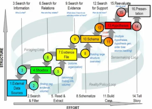
Pirolli and Card (2005) propose a model of analyst’s sense making built around six states that a dataset can be in, as illustrated in figure2.4. In order of increasing structure, the first state is called “external data sources”, and refers to the raw data. The “shoebox” is a subset of this raw data, from which one can extract parts of the items to create an “evidence file”. “Schema” is a re-structuration of this information that is more suited to obtain conclusions, which are then supported with arguments to form the “hypotheses”. The final state is the “presentation” of the knowledge gained from this process.
2.1. Visual Analytics
Their task model consists of the ten actions one can perform to transition between two of the aforementioned states. They propose a bottom-up process (from “external data sources” to “presentation”) consisting of “search and filter”, “read and extract”, “schematize”, “build case” then “tell story”, as well as a top-down process (from “presentation” to “external data sources”) consisting of “reevaluate”, “search for support”, “search for evidence”, “search for relations” then “search for information”. Although these two processes are distinguished, the authors note that in practice, analysts use both in an opportunistic mix.
For Ward, Grinstein, and Keim (2010), analysis tasks form three high level categories. When performing exploration tasks, analysts aim at formulating hypotheses, while confirmation tasks consist of verifying these hypotheses. The third category, called presentation tasks, encom-passes the work on data realized with the aim of communicating what has been found through the other two types of tasks.
1.5.2 Task models focused on actions on data
MacEachren (1995) proposed a model composed of low-level tasks designed for temporal data, in order to cover all the possible questions an analyst can ask herself during her work. He provides the following list of questions, while noting that it is by no means exhaustive:
• Does a given element exist in the data? • When does an element appear in the data? • What time does an element span?
• Does an element present a given temporal pattern? • What is the change frequency of an element?
• What is the sequence or order of appearance of some elements? • Is there a synchronicity between elements?
Based on his mantra of “Overview first, zoom and filter, then details on demand”, Shneiderman (1996) proposes to group visual information seeking tasks into the following seven categories:
• Overview tasks, that provide a global view of the data at hand • Zoom tasks, to zoom on elements of interest
• Filter tasks, to reduce data to elements of interest
• Details on demand tasks, to obtain details on one or more elements • Relating tasks, to visualize relations between elements
• History tasks, to navigate the history of actions performed during the analysis • Extraction tasks, to obtain subparts of the data or parameters used
Rather than using Shneiderman’s visualization mantra, Yi, ah Kang, Stasko, and Jacko (2007) propose a classification of analysis tasks built from the intents of an analyst during her work. Doing so, they identify seven categories of tasks:
• Selection tasks, where the analyst marks some element as interesting
• Exploration tasks, where the analyst changes her focus from some elements onto others • Reconfiguration tasks, where the analyst changes the spatial arrangement of the data to
observe it under a different angle
• Encoding tasks, where the analyst changes the representations used
• Abstract/Elaborate tasks, where the analyst looks at the data with respectively less or more details
• Filtering tasks, where the analyst observe data elements under certain conditions • Connection tasks, where the analyst looks at the relations between elements
The authors note that their classification is not exhaustive, citing actions such as “undo/redo” or “changing a system’s configuration”.
1.5.3 Task models focused on data
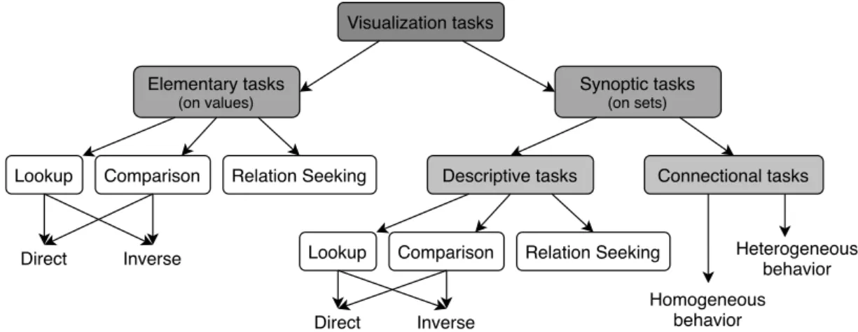
Andrienko and Andrienko (2006) propose a general high-level model designed to express the tasks an analyst may perform on temporal data. Their model relies on a formal description of the data to be explored, composed of two sets of elements: the referrers, which can be seen as the dimensions of the data, and the attributes which contain the values found either directly from the data or derived from it. By specifying the values of the referrers, one can obtain the associated attributes’ values through what can be seen as a function from the domain of the referrers to the domain of the attributes. Similarly, one can perform the inverse operation by specifying the values of some attributes to retrieve the associated referrers’ values.
Based on this data model, Andrienko and Andrienko identify 11 task categories, as illus-trated in figure2.5. Elementary tasks refer to tasks targeting a single data element, or a set of element where each one is considered individually. They oppose these tasks to the synoptic tasks, which target sets of data elements that are considered as a whole. In both categories, the lookup and comparison tasks can be either direct or inverse, the difference between these notions being in the subject of the task. Direct tasks specify the referrers’ values to look for the associated attribute values, while inverse tasks specify the attribute values in order to find the associated referrers’ values. While this is only an overview of their model, more details are provided in section5.1.
2.1. Visual Analytics Visualization tasks Elementary tasks (on values) Synoptic tasks (on sets)
Lookup Comparison Relation Seeking Descriptive tasks Connectional tasks
Lookup Comparison Relation Seeking Direct Inverse Inverse Direct Homogeneous behavior Heterogeneous behavior
Figure 2.5: The task model from Andrienko and Andrienko (2006). Illustration inspired by Aigner,
Miksch, Schumann, and Tominski (2011).
1.6 Examples of existing Visual Analytics tools
Visual Analytics has been applied to a number of domains, data and use cases. Offering a de-tailed review of existing Visual Analytics systems would be too long, and is not part of the scope of our works. As such, while far from exhaustive, the following list aims at offering an overview of the variety in existing Visual Analytics systems, in terms of algorithmic techniques used and of visualizations offered. No other criterion has been taken into account when choosing which systems would be included.
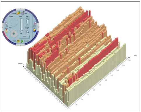
1.6.1 Interactive Parallel Bar Charts (Chittaro, Combi, & Trapasso,2003)
Interactive Parallel Bar Charts (IPBC) allows the exploration and comparison of a collection of time-series, initially designed to explore medical data. It is illustrated in figure2.6.
Visualization – A bar chart representation of the time-series is provided. It can be switched
between 2D and 3D, and supports the flattening of subparts of the chart to avoid occlusion prob-lems in 3D mode. Color is used to highlight query results, and water is displayed to represent a user-specified threshold, highlighting the emerged bars.
Interactions – The analyst can switch between different modes to explore, transform and
manipulate the bar chart. She can also aggregate the data by specifying the duration repre-sented in a bar. The analyst can specify range of values of interest, to formulate a query in the chart, or specify a threshold to highlight the data points above it. A pattern matching can also be requested with an SQL-like syntax.
Algorithms – Algorithms in IPBC support the construction of the bar chart from the initial
data, as well as providing results for the user queries. Additional interactivity is provided by the ability to manipulate the display, by rotating and translating the visualization.
Figure 2.6:Interactive Parallel Bar Charts (Chittaro, Combi, & Trapasso,2003).
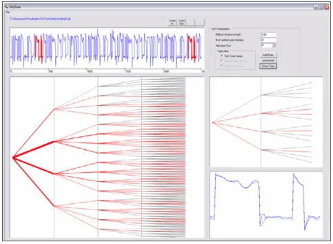
1.6.2 VizTree (Lin, Keogh, Lonardi, Lankford, & Nystrom,2004)
With VizTree, Lin et al. provide a system to visually explore time series in order to discover underlying patterns. The system was designed to address some challenges faced by the US Department of Defense when launching space vehicles, by allowing to simultaneously visualize the global and local structures of the data. VizTree allows one to discover frequent patterns, perform anomaly detection and query specific content within the explored data. It is illustrated in figure2.7.
Visualization – The time series are equally divided in a number of sub-sequences, as
is the range of the values present in the series. A letter refers to each value-range, and sub-sequences are then mapped to the letter representative of their mean value, thus form-ing a strform-ing representation of the time-series. A tree representation aggregates all the strform-ing- string-sequences, with the width of a branch representing the frequency of the corresponding pattern in the data. Each level of the tree is a segment of the original sequence. All possible combina-tions are displayed, even if they are not found in the data. Color is used to distinguished found patterns (red branches) from possible ones (grey branches). When a node is selected by the analyst, its sub-tree is displayed on the right, along with the corresponding sub-series, that are also highlighted in the top view of the whole time-series. When selecting two nodes, a diff-tree is displayed, showing the differences between them. These differences are also highlighted in the top view.
2.1. Visual Analytics
Figure 2.7:VizTree (Lin, Keogh, Lonardi, Lankford, & Nystrom,2004).
Interactions – The analyst can select a node in the tree to zoom-in on sub-trees of interest
and highlight them in the visualization. Two nodes can be selected to compare their differences. A few parameters are available, to select the number of sub-sequences and the number of value categories to create the string representations.
Algorithms – Besides converting the initial time-series to a string, algorithmic tools
al-low the retrieval of sequences in the original time-series, and the comparison of two sub-sequences.
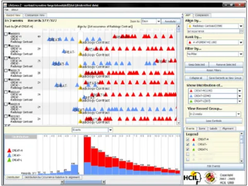
1.6.3 Lifelines2 (Wang et al.,2009)
LifeLines2 allows one to explore temporal categorical data, namely medical records of patients. The focus is on exploring and comparing multiple patient records at the same time, as opposed to its predecessor LifeLines (Plaisant et al.,1998) that was targeting a single record at a time. It is illustrated in figure2.8.
Visualization – The visualization provided is a timeline-based representation of the medical
records occupying most of the interface. It allows the analyst to visually compare side-by-side records to look for patterns or singularities in the data. A temporal summary of the data is also provided, where the analyst can decide which criterion is used for the summary (events, records, events per record). A comparison view is available, to display bar charts highlighting the differences between different records.
Figure 2.8: LifeLines2 (Wang et al.,2009).
in varying ways (nthoccurrence from the start or the end, or on occurrences of the same event). The system support searching for a target event type, and the records can be split into sub-records if needed. A time-interval can be selected by dragging over a visualization, which will automatically focus the other ones on the selected period. Additionally, the event types can be ranked and filtered, and various options are provided to tweak the records’ display.
Algorithms – The algorithms provided deal with the presentation of the data, to filter it,
compare selected records, build temporal distributions and adapt the visualization to the ana-lyst’s needs.
As noted at the start of this subsection, these few examples of existing Visual Analytics sys-tems are far from exhaustive. They however illustrate how Visual Analytics as a data analysis paradigm has been applied to a wide range of tasks, using a variety of visualization and al-gorithmic techniques. As a result, the role of the algorithms involved varies from one system to another, which raises the question of how much of the analysis process should still be per-formed by the human analyst.
1.7 Degree of automation in Visual Analytics systems
By definition, Visual Analytics systems provide both data visualization and algorithmic pro-cesses to assist an analyst. However, the balance between these two components is not
spec-2.1. Visual Analytics
ified, and varies greatly from system to system. This subsection presents existing works that have studied the importance of both visualization and algorithms in existing Visual Analytics applications.
While Visual Analytics is at the intersection of Automatic Analysis and Visualization, D. A. Keim, Mansmann, and Thomas (2010) argue that Visual Analytics is not always a good solution for all problems from these domains. In the absence of a clear way to tell if a given problem should be handled with Visual Analytics tools, they propose a theoretical representation of the potential of Visual Analytics, as illustrated in figure 2.9. They conclude by stressing the interest of “[developing] methods for determining the optimal combination of visualization and automated analysis methods to solve different classes of problems by taking into consideration the user, the task and the characteristics of the data sets”.
Figure 2.9: Potential of Visual Analytics (D. A. Keim, Mansmann, & Thomas,2010).
The same year, Bertini and Lalanne (2010) proposed a review of 48 Visual Analytics sys-tems, in which they identify three groups of systems:
• The Computationally enhanced Visualizations (V++), relying mostly of visualizations but supported by algorithmic processes
• The Visually enhanced Mining systems (M++), relying mostly on algorithmic processing but offering some visualization capabilities to deal with the results of the algorithm • The Integrated Visualization and Mining systems (VM), where the balance of visualization
and algorithmic processes does not allow one to evidence a clear dominance of one or the other.
Bertini and Lalanne conclude from their review that “the most interesting and promising direction for future research is to achieve a full mixed-initiative KDD process where the human and the machine cooperate at the same level”. This paints VM systems as the most desirable category, even though it is the least populated (8 systems among 48). When studying the other
two categories, they observe that both use algorithms at the early stage of the analysis, while visualization is present in the final stages.
From their review of existing systems, they suggest several ways in which V++ and M++ systems could be improved, to bridge the gap towards the VM category. With regards to V++ systems, they first suggest the idea of Visual Model Building, in that visualizations (and the ways in which the user interacts with it) can be used as input for a model-building algorithm. Their second suggestion is to use algorithmic techniques to verify and refine patterns found in the data visualizations, in order to replicate the practice of communicating a level of trust-worthiness of the extracted knowledge, common in automatic data mining. Finally, their last suggestion for V++ systems is to provide tools to deal with tasks of predictive modeling, that are usually not addressed by information visualization tools. With regards to M++ systems, their first suggestion is that they should leverage visualization to offer better representations of the parameter space of the algorithmic processes, and of the alternatives that different param-eter values can offer. Their second suggestion is that visualization should be used as a way to bridge the semantic gap that can exist between the original data and the models that are built from them.
While they deliberately leave systems fully dedicated to either data visualization or algorithmic processing out of their study, one could easily extend their work to such systems. This would provide a categorization of existing systems as done in figure 2.10, with an axis having at one end Data visualization, with no algorithm besides the one responsible for building the visualiza-tion. An illustration could be the Perspective Wall visualization, by Mackinlay, Robertson, and Card (1991). At the other end is Algorithmic processing, with no visualization to support the exploration of the algorithm’s result. An illustration could be the R language and environment, which provides text outputs after an analysis. In the middle, we can find Visual Analytics sys-tems from Bertini and Lalanne’s VM category, while the other categories are on the left and right side of the axis. A system’s distance from the center will depend on its balance between visualization and algorithmic capabilities.
Data visualization Algorithmic processing VM systems M++ systems V++ systems
Figure 2.10: Visual representation of the categories from Bertini and Lalanne (2010). We added
two categories fully dedicated to either visualization or algorithmic processing. The systems pre-sented in the previous subsection have been placed on this axis. The position of a system on the axis provides a broad estimate of its features.
2.2. Progressive Visual Analytics
1.8 Towards Progressive Visual Analytics
Despite the advantages it offers, Visual Analytics is limited in that the analyst needs to have the visualization ready before he can explore the underlying data. As explained in the technological challenges for Visual Analytics by D. Keim et al. (2010), when dealing with large dataset or using time-consuming algorithms, the visualization might not be immediately available, which forces the analyst to wait before starting her work. This is obviously problematic in the case of long waiting time (hours or more), but even small delays of a few seconds can harm the analysis process if encountered repeatedly. In some cases, this can be solved by providing more memory or processing power to run the Visual Analytics system, but other paradigms have been suggested to tackle this challenge, such as Progressive Visual Analytics.
2
Progressive Visual Analytics
This section presents the paradigm of Progressive Visual Analytics, which brings an alterna-tive to the aforementioned limitations of Visual Analytics. After a chronological presentation of the evolution of Progressive Visual Analytics’ definition and its difference with closely related domains, we present some examples of existing Progressive Visual Analytics systems. A pre-sentation of the works that have studied the design of such systems follows, before concluding the chapter.
2.1 Definition and origin of the progressive paradigm
Stolper et al. (2014) first defined Progressive Visual Analytics as follows:
Methods to avoid [...] speed bumps, where analysts can begin making decisions immediately [by] visualizing partial results [that] provide early, meaningful clues [...] without waiting for long-running analytics to terminate.
This definition stems from existing work, notably in the domains of incremental visualization (Angelini & Santucci, 2013; Fisher, Popov, Drucker, & schraefel m.c., 2012) and dynamic vi-sualization (E. G. Hetzler, Crow, Payne, & Turner, 2005). Stolper et al. aimed at unifying and extending these domains to offer an alternative to what they call batch Visual Analytics, where analysts need to wait for the end of a computation before visualizing the results (figure 2.11, top). They argue that having intermediate results allows an analyst to detect and cancel an analysis that is unlikely to generate interesting results, thus limiting wasting analysis and com-putation time. In addition, having partial results allows the analyst to start exploring the data right from the start, thus reducing or even eliminating any waiting time (figure2.11, bottom).
Select Dataset
Select Analytic Parameters
Run Analytic Visualize
Results Interpret Results Visualize Partial Results Interpret Partial Results Wait for Analytic to Complete Select Dataset Select Analytic Parameters Run Analytic Visualize Complete Results Interpret Complete Results
Figure 2.11: Batch Visual Analytics (top) vs Progressive Visual Analytics (bottom) (Stolper, Perer, & Gotz,2014).
Along with the previous definition, Stolper et al. provide a list of 7 design goals for Progres-sive Visual Analytics systems:
• Design analytics component to:
1. Provide increasingly meaningful partial results as the algorithm executes 2. Allow users to focus the algorithm to subspaces of interest
3. Allow users to ignore irrelevant subspaces • Design visualizations to:
4. Minimize distractions by not changing views excessively
5. Provide cues to indicate where new results have been found by analytics
6. Support an on-demand refresh when analysts are ready to explore the latest results 7. Provide an interface for users to specify where analytics should focus, as well as the
portions of the problem space that should be ignored
Though Stolper et al.’s definition was the first to provide a precise definition and a name for the principles behind Progressive Visual Analytics, some work predates this definition while complying with it. Most importantly, in their technological challenges for Visual Analytics, D. Keim et al. (2010) write the following:
One [challenge] is in relation to the duration of the analysis phase, which tends to be much longer than traditional transactions dealt with by a standard database management system. Therefore, methods are required not only to support long commit phases, but also to furnish partial results from the analysis. Providing this
2.2. Progressive Visual Analytics
“progressive analysis” would give the analyst a rapid overview and hence, a basis for steering the analysis in a particular direction, from which details could be sought. (D. Keim et al. (2010), page 147)
Implementations complying with Stolper et al.’s design goals can also be found predating their definition of Progressive Visual Analytics, such as Williams and Munzner (2004)’s Pro-gressive MDS. This will be presented in more detail in subsection2.2.3.
With regards to the notion of “progressive algorithms”, none of the previously mentioned publications on Progressive Visual Analytics provide a clear and explicit definition. As such, the implicit definition of a progressive algorithm seems to be “an algorithm that complies with the concepts of Progressive Visual Analytics ”; i.e. that provides intermediate results of increasing quality, while allowing the analyst to interact with its execution.
While these articles focus on the benefits of Progressive Visual Analytics, some work have been focused on highlighting the risks that the progressive paradigm might carry. Angelini and Santucci (2017) in particular stress that the important role played by partial results needs to be taken into account to prevent analysts to misinterpret an Progressive Visual Analytics system’s output.
On October 2018, Progressive Visual Analytics was the focus of the Dagstuhl Seminar 18411, entitled “Progressive Data Analysis and Visualization”. Its focus was on bringing together re-searchers from the database, visualization and machine learning communities, in order to dis-cuss the challenges associated with the notion of progressiveness, that each of these commu-nities had started to address in their own terms. The seminar’s report (Fekete, Fisher, Nandi, & Sedlmair,2019) as well as the articles that stem from it (Micallef et al.,2019; Turkay et al., 2018) are discussed in our conclusion (chapter8) rather than here.
2.2 Progressive algorithms compared to related algorithm types
Due to their goal of offering an answer to waiting times imposed to the analyst by an algorithmic computation, it might seem relevant to assimilate progressive algorithms to other types of algo-rithms having a similar aim, such as anytime, online or incremental algoalgo-rithms. This subsection is focused on how progressive algorithms are in fact different from these, and should not be confused with them (Fekete et al.,2019; Fekete & Primet,2016).
2.2.1 Progressive versus anytime algorithms
Anytime algorithms (Dean & Boddy, 1988) can be described as algorithms that enable the trading of result precision for computation time. This is achieved through four aspects:
• Allow the output of a result upon interruption of the execution at any time; • Provide results whose quality can be measured;
• The more processing time, the better the results;
• Predictability of the results quality, given then data and the allowed computation time. From this, we can see that anytime algorithms differ from progressive ones in that they need to be interrupted to provide their result. Later, Zilberstein (1996) proposed that anytime algorithms could regularly output results during their execution, by regularly pausing the com-putation process. Based on the current output, the analyst could then choose between three options: 1/ resume until the next pause, 2/ resume until completion of the computation, and 3/ terminate the computation. However, the effectiveness of this proposition relies on the ability to pause and resume the computation with reduced overhead.
2.2.2 Progressive versus online algorithms
Online algorithms are algorithms that need to produce an output to answer requests using input data that is not entirely available at the time of their execution (Albers (2003), Borodin and El-Yaniv (2005) (Preface)). Since future input may be relevant to the current computation, this means that online algorithms must work with incomplete knowledge.
Should an online algorithm be ran several times to perform the same request, one could consider the earlier output to be intermediate results for the subsequent ones. From this, we can see that online and progressive algorithms both output intermediate results. However, online algorithms do not provide any interaction with their process, while providing a different result from what a non-online algorithm performing the same task would provide. Another difference between the two is that rerunning an online algorithm brings additional data to be processed, while progressive algorithms are supposed to work on the entirety of a dataset right from the start.
2.2.3 Progressive versus incremental algorithms
Incremental algorithms are a family of algorithms designed to process large datasets by chunks of increasing size. While each chunk includes the previous one, the algorithm only processes the new data. The output is then combined with the information extracted from the previous
2.2. Progressive Visual Analytics
chunk, and the next increment can occur. Even though these algorithms inspired Stolper et al. (2014) for their definition of Progressive Visual Analytics, and can be a basis for a progressive algorithm, they are not inherently progressive in nature. The main reason for this distinction is that processing the data in chunk does not imply that feedback is provided before the end of the process, or that interacting with the process is possible.
2.3 Existing implementations of Progressive Visual Analytics systems
Even though the paradigm of Progressive Visual Analytics is still young, a few implementations have been proposed in the literature. They vary in the way they approach Progressive Visual Analytics and in the use case they address, but offer a basis future systems will be able to build upon. As we will see in this subsection, these Progressive Visual Analytics systems all propose visualizations that present the analyst with what is essentially incremental visualization of results as they are being built. Interactions in this case are classical, such as zooming, filtering, ordering, highlighting, etc. Additional control may be available, such as tuning density map’s rendering parameters (Pezzotti et al., 2017; Schulz, Angelini, Santucci, & Schumann, 2016) or altering the visualization’s evolution speed (Badam, Elmqvist, & Fekete,2017; Schulz et al., 2016). Some systems go further by proposing interactions between the analyst and the running algorithm. In addition to the following systems, one can also mention Fekete (2015)’s ProgressiVis, a python toolkit that can be used to implement progressive algorithms.
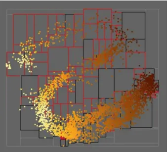
2.3.1 MDSteer (Williams & Munzner,2004)
Williams and Munzner propose MDSteer, a steerable system that allows the user to progres-sively guide the MDS layout process. Multidimensional Scaling (MDS) is a general term that refers to any approach that attempts to represent multi-dimensional data in a lower dimension space while preserving inter-point distance as best as possible. A common application of such technique is to project N -dimensional data (N > 2) into a 2-dimensional space, which enables a scatterplot representation of the data. MDSteer is illustrated in figure2.12.
Visualization – The visualization in MDSteer consists of the scatterplot representation of
the data points’ projection in the low-dimensional space. During the computation, the 2D space is divided in several regions (boxes in figure 2.12). The color of a region’s outline indicates whether all of the data points that are likely to be projected into it are displayed (black) or not (red).
Algorithmic processes – The only algorithm involved is Progressive MDS, which
alter-nates between two phases. The binning phase involves dividing the low-dimensional space into regions and associating them to the data points they contain. The layout phase adds a number of points to the low-dimension space and updates the representation. The binning phase is triggered after a number of layouts have been performed.
Figure 2.12:Progressive MDS (Williams & Munzner,2004).
Interaction with the algorithm – The analyst is able to interact with Progressive MDS by
selecting regions of the low-dimension space. This impacts the selection of random points that will be added to the representation during the next layout phase, ensuring that it selects points that are likely to be projected into the selected regions (based on their high-dimensional similarity with already placed points).
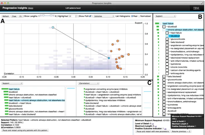
2.3.2 Progressive Insights (Stolper et al.,2014)
Stolper et al. implemented a system for the exploration of medical data using sequential pattern mining, built around a progressive version of an existing algorithm. Their system displays the patterns both in a hierarchical list and in graphical representations that the analyst can interact with. Progressive Insights is illustrated in figure2.13.
Visualization – Progressive Insights’ interface offers three main data visualization views.
First, a list view of the top patterns, according to several ranking measures. Two instances of this view are present, allowing the analyst to compare different ranking measures (C in figure
2.13). On the left side, each pattern in the list is paired with a bar of the selected measure’s histogram. A mini-map of the complete pattern list is provided on the right. In order to reduce visual noise, newly discovered patterns are not added to the list, but are instead represented as purple horizontal marks within the list. These can be clicked to update the list, and are reflected on the mini-map.
The second view is a scatterplot (A in figure2.13) whose axes are the two metrics selected in the previously described list views. The top-n patterns according to a third user-selected metric are represented using orange dots. When a pattern is selected by a click (either in the
2.2. Progressive Visual Analytics
Figure 2.13: Progressive Insights (Stolper, Perer, & Gotz,2014).
lists or in the scatter plot), its prefixes and the pattern itself are highlighted in blue. The analyst can then observe the pattern-to-prefix relationship within the current metric space by displaying a black line that connects the selected pattern to its ancestors. Rather than abruptly removing the points associated to pattern that fall out of the top-n, these are progressively transitioned to smaller, white-filled dots. A “Clear” button is available in the top-left, should the analyst want to get rid of these. In addition to the scatterplot for the top patterns, the entirety of the mining output is displayed in the background using a heat map of the pattern density within the metric space. Cells of the heat map can be hovered over to see detailed information about their content, and double-clicking a cell adds its content to the scatterplot, in addition to the top-n patterns.
The last view is a tree view (B in figure2.13), which provides a collapsible hierarchical view of the patterns. It allows analysts to direct the ongoing computation, by steering towards specific pattern prefixes or by marking some patterns as undesirable, thus preventing the search for patterns that extend them. Similarly to the list view, a bar chart is displayed on the left of the list, representing the ordering according to a user-selected metric.
in all of them.
Algorithmic processes – The progressive algorithm in Progressive Insights is adapted
from the SPAM algorithm (Ayres, Flannick, Gehrke, & Yiu,2002), and outputs frequent patterns as soon as they are discovered. Their modifications to SPAM include making the algorithm use a breadth-first search strategy (see subsection 3.2.1), effectively prioritizing the shorter patterns in the first steps of the computation.
Interaction with the algorithm – During the algorithm computation, the analyst is able to
specify (by clicking in the pattern list on the right) that a given pattern should be prioritized. This forces the algorithm to look for new frequent patterns having the selected pattern as prefix. In the same way, a pattern can be forbidden, preventing the search of new patterns having it as a prefix. Either during or after the computation, the analyst can restart the algorithm over a subset of the data, or with different parameter values, the system keeping a record of the previously selected sets of parameters.
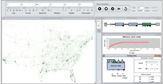
2.3.3 Similarity search (Schulz et al.,2016)
Schulz et al. propose a system for similarity search in large datasets, illustrated in their article with a dataset containing all car crashes in the USA between 2001 and 2009. They use an algorithm that incrementally finds the data points similar to a target point defined by the analyst. Their system is illustrated in figure2.14.
Figure 2.14: Similarity search (Schulz, Angelini, Santucci, & Schumann,2016).
Visualization – The main visualization is a geospatial representation of the data points
output by the algorithm. This visualization is incrementally updated as the algorithm discovers results. Representations of the process from data to visual representation are displayed on the side to provide insights about the data processing pipeline. The top part of the interface offers