HAL Id: hal-01144312
https://hal.archives-ouvertes.fr/hal-01144312
Submitted on 21 Apr 2015
HAL is a multi-disciplinary open access
archive for the deposit and dissemination of
sci-entific research documents, whether they are
pub-lished or not. The documents may come from
teaching and research institutions in France or
abroad, or from public or private research centers.
L’archive ouverte pluridisciplinaire HAL, est
destinée au dépôt et à la diffusion de documents
scientifiques de niveau recherche, publiés ou non,
émanant des établissements d’enseignement et de
recherche français ou étrangers, des laboratoires
publics ou privés.
SketchSliders: Sketching Widgets for Visual Exploration
on Wall Displays
Theophanis Tsandilas, Anastasia Bezerianos, Thibaut Jacob
To cite this version:
Theophanis Tsandilas, Anastasia Bezerianos, Thibaut Jacob.
SketchSliders: Sketching Widgets
for Visual Exploration on Wall Displays.
Proceedings of the 33rd Annual ACM Conference on
Human Factors in Computing Systems, ACM, Apr 2015, Seoul, South Korea.
pp.3255-3264,
SketchSliders: Sketching Widgets for
Visual Exploration on Wall Displays
Theophanis Tsandilas
1,2Anastasia Bezerianos
2,1Thibaut Jacob
1,2,3 [email protected] [email protected] [email protected]1INRIA 2Univ Paris-Sud &CNRS(LRI) 3Telecom ParisTech &CNRS(LTCI) F-91405 Orsay, France F-91405 Orsay, France F-75013 Paris, France
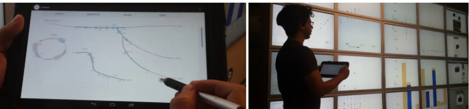
Figure 1. SketchSliders (left) allow users to directly sketch visualization controllers to explore multi-dimensional datasets. We explore a range of slider shapes, including branched and circular, as well as shapes that express transformations. SketchSliders control visualizations on a wall display (right).
ABSTRACT
We introduce a mobile sketching interface for exploring multi-dimensional datasets on wall displays. We demonstrate the idea of SketchSliders, range sliders that users can freely sketch on a mobile surface to customize their exploration. A small combination of sketches and gestures allows the cre-ation of complex interactive sliders, such as circular sliders for periodic data, slider branches for detailed interaction, and fisheye transformation sliders. We augment sliders with a suite of tools, such as markers, slider cursors, and approxi-mate views of data distributions. Our designs are inspired by a design study with three visualization experts and validated through a user study with six experts using our system. Our findings indicate that our sketching interface accommodates a wide range of exploration strategies, helping users customize as well as focus their visual explorations.
Author Keywords
Data visualization; sketching interfaces; wall displays
ACM Classification Keywords
H.5.m. Information Interfaces and Presentation (e.g. HCI): Miscellaneous
INTRODUCTION
High-resolution wall-sized displays [3, 6, 24] allow users to view a large amount of visual information, and thus have ap-plications in a wide range of domains related to visual data
Theophanis Tsandilas, Anastasia Bezerianos, and Thibaut Jacob. SketchSliders: Sketching Widgets for Visual Exploration on Wall Displays. In CHI’15: Proceedings of the 33rd Annual ACM Conference on Human Factors in Computing Systems, 3255-3264, ACM, April 2015.
c
ACM 2015. This is the author’s version of the work. It is posted here by permission of ACM for your personal use. Not for redistribution. The definitive version will be published in CHI ’15, April 18-23 2015, Seoul, South Korea.
http://dx.doi.org/10.1145/2702123.2702129.
analysis and exploration. Nevertheless, choosing appropriate techniques to explore data in such environments is not a sim-ple matter. Viewers are often mobile, moving away to get an overview of complex visuals, and coming up-close to see de-tails [3]. Exploring complex datasets also requires access to a large number of interactive controls in order to manipulate multiple dimensions and adjust their visual parameters. We introduce a mobile sketching interface (Figure 1) that decouples control and visualization in a wall environment. Instead of having users interact with a large set of prede-fined exploration widgets, we let them customize their explo-ration by sketching the controllers that best suit their needs. To demonstrate the approach, we focus on range slider con-trollers, SketchSliders. We show how with a small gesture vo-cabulary users can: creatively use sketching to adjust explo-ration properties, such as precision, by drawing controllers of various sizes and shapes; focus on parts of the data by changing the control resolution in dense areas of data; ex-plore variations of controllers by grafting alternative paths; and bookmark important results and points. Due to the nature of sketching, users can naturally customize the controller’s appearance and its effect on the exploration. For example, they can draw larger sliders and branches for a finer control, circular sliders for periodic data, or shapes that describe trans-formation functions to focus on a smaller range of the data. Our designs were inspired by design sessions with three vi-sualization experts, whose feedback reinforced our choice of sketch-based range sliders as a versatile controller. Our sketching interface was then evaluated by six visualization experts. Our findings verify the flexibility of sketching con-trollers. They also demonstrate how the approach can accom-modate different visual exploration strategies, and effectively support data exploration in interaction with wall displays.
Our main contributions are:
• We allow users to sketch directly the interactive controllers they require to conduct data exploration. We illustrate the potential of the approach with range sliders.
• We design mechanisms for sketching interactive sliders of arbitrary forms, including circular, branched and transfor-mation sliders, that support complex queries over multiple data dimensions and multiple levels of control granularity. • We introduce an environment that combines visualization plots on a wall display with mobile devices for sketching controllers. We study how experts use such a setup.
RELATED WORK
The search for appropriate interactions for wall displays has been largely investigated in HCI, focusing on questions mostly related to specific tasks, such as pointing [24] and maintaining awareness [6]. Recent work has looked at the use of mobile devices as an interaction medium that supports mobility. For example Smarties [10] customizes programmat-ically mobile interfaces to control a wall, while Jansen et al. [18] combine mobile devices with tangible controllers to ex-plore visualizations. Our approach differs, as we allow users to customize their exploration interface using sketching. Sketch-based input has been used among others for 3D mod-eling [17], note taking [14], and for domain specific applica-tions such as MathPad2 [21] and Musink [28]. We focus here on two relevant research directions: using sketching to create interfaces, and sketching specifically for visual exploration.
Sketching to Create Interfaces
Wong [33] explains that sketching by hand to prototype inter-faces allows users to ignore graphic details, focusing instead on the main goal and nature of the interaction. This is of special interest in data exploration, as often there is no clear goal (and thus an ideal interface), and hypotheses are formed progressively as users generate insight into their data [26]. SILK [20] was the first to allow users to sketch several in-terface controllers (buttons, sliders), and make them active by automatically detecting them and generating code. It re-lates to our work, as interface components are sketched, but are then ”beautified” by the system, losing their informal and custom look. Given Wong’s suggestions [33] and comments from our participants, this custom drawing and appearance is important in visual exploration.
Monet [23], allows users to sketch items and their states to create continuous widgets, keeping their informal look. They explore how to define new widgets and their states by ex-ample, while we examine how to customize existing widgets through sketching to aid visual exploration.
Sketching in Information Visualization
Sketching has been used in visualization as a visual render-ing style (e.g. [34]), but less work has been done on usrender-ing sketching as input for data exploration.
QuerySketch [30] and QueryLines [25] allow users to search and query data by sketching the desired result of their queries
in the form of a graph. Relaxed selection techniques [16] go further by providing ways to implicitly define the level of similarity between sketches and real data. These approaches target mainly time-series data, focusing on searching for pre-defined patterns, rather than open exploration as we do. In Transmogrification [7] selected regions from a 2D visual-ization can be transformed into a destination shape defined by sketching. This technique does not focus on interactive controllers. It rather acts directly on the visualization. Nev-ertheless, it relates to our work, as we also explore how an arbitrary slider shape can deform a visualization.
SketchStory [22] uses a small set of sketched gestures and touch interactions to construct a story for presentation and communication purposes. This tool does not support data ex-ploration per se, it is rather a tool for helping play back the results of data exploration to others.
NapkinVis [9] uses sketching gestures to rapidly generate dif-ferent types of charts, focusing mainly on data visualization authoring, not exploration. More relevant to our approach is SketchVis [8] that allows users both to load and to create vi-sualizations using sketching, but it also provides simple ways of conducting data exploration. Users can switch between different data views, select specific data categories, or apply simple functions such as averages or maximum. SketchVis was later used in a Wizard of Oz study [29] to better under-stand the interplay between touch and pen interactions. Our work delves into using sketching for more complex query types during exploration, focusing in detail on one type of interactive controller, range sliders.
GOALS, CONCEPT AND DESIGN SESSIONS
Visual exploration and analysis tasks [2], such as filtering and range-selection, consist of selections and dynamic queries [1]. These are predominantly performed using slider widgets, each representing one data dimension. Our goal was to com-bine the simplicity of such widgets with the expressive power of sketch-based data exploration. We were particularly inter-ested in identifying meaningful roles that shaped controllers can take, and explore how users could make use of sketching to augment controllers with new functions.
To explore this direction, we recruited three information visu-alization experts outside the research team, and ran an hour-long semi-structured design session with each of them. Their experience in visualization design and exploration ranged from 5 to 10 years. We first explained the main goal of the session, and then gave them three examples of sketch inter-action, namely how to draw a straight slider and define new ranges to filter a data set, and how to sketch a data trans-formation function to acquire overview or details. These are fundamental tasks in visual exploration [27].
The experts then explored a multi-dimensional dataset. Their task was left intentionally open to encourage exploration, and was run in a Wizard of Oz setting. Participants had to think aloud, explaining what they were sketching on paper and what the expected behavior on the visualization was. One experimenter simulated this behavior on a real visualization
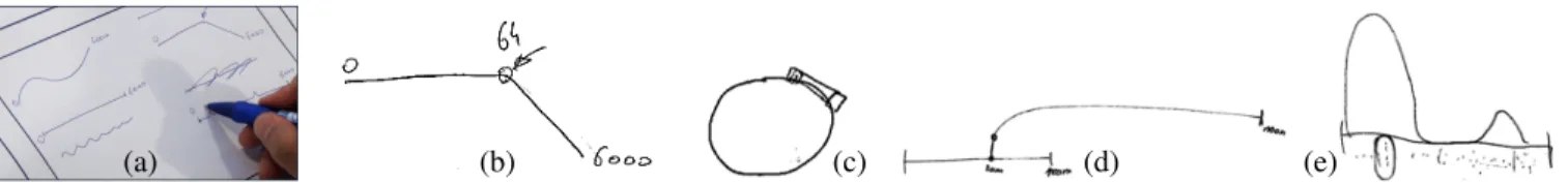
“Wizard of Oz” experiment (Kelley, 1980) User-centered Study User requirements analysis phase 20 (a) (b) (c) (d) (e)
Figure 2. Designs from our three experts: (a) customized sliders, (b) bended slider with a mark, (c) circular slider, (d) grafting a slider, and (e) a slider combining different granularity ranges.
using controllers on her machine. A small brainstorming ses-sion followed, to discuss sketch interactions that could benefit data exploration in the context of our experts’ own work. Participants gravitated naturally to variations of sliders as their main interaction tool to narrow down their exploration, further validating our choice to focus on this controller. They all felt that sketching sliders for filtering data provided several benefits for visual exploration:
Customization (B1). Each stroke is unique. This aspect of sketching can be used to visually differentiate one slider from another (Figure 2a). Moreover, as the shape of a stroke can be arbitrary, one can encode information inside it, for example bending the slider in a given point of interest (Figure 2b). Granularity (B2). The length of sketched slider affects the level of its control on the data. Long sliders allow fine-grained control and more precise filtering of data, while smaller ones are only appropriate for coarse-grained control. Two experts commented on how they often need both fine and coarse-grained control, e.g., for timelines that contain periods with both heavy and low activity. Each expert sketched a dif-ferent solution to this problem. One created a coarse-grained slider and then grafted on top of it a second fine-grained slider (Figure 2d). The other expert drew a bulge at the location he required finer control (Figure 2e).
Parametrization (B3). Sketched sliders can support multiple ranges, giving users the possibility to filter the visualization in a discontinuous manner. This is occasionally a constraint in existing predefined range sliders. Another way of parametriz-ing a slider is to write by hand possible slider extremums or link specific data values to specific locations of the slider, which controls completely the mapping between the slider and the data. All our experts suggested a variation of this. Special Shapes (B4). Our experts took advantage of the fact that they can sketch sliders in any shape they wanted. One expert sketched a circular slider to be used in the exploration of periodic dimensions such as hours of the day or angle val-ues (Figure 2c). In this way, the slider represents a complete period with no start or end.
Reusability (B5).All participants requested the ability to de-activate controllers while still have them accessible for later use, either ”faded-out” on the canvas or in a separate side panel. These solutions ensure that users keep copies of their sketched components, allowing them to explore alternative aspects of their data without losing their past work.
Annotation (B6).All our experts appreciated how a sketching environment naturally supports annotating and bookmarking
of important information that is crucial for long term visual analysis tasks. Such an environment can combine notes on the analysis process taken by users, as well as traces of the interaction exploration, e.g., sketched controllers and values, that led to specific insights and findings.
One motivation behind our work is the need for an interface that is mobile, to accommodate users working in front of high-resolution wall displays. Nevertheless, all experts com-mented that a tool for sketching controllers would be valuable even in desktop environments, where visualization systems are often overloaded with numerous controllers.
SYSTEM OVERVIEW
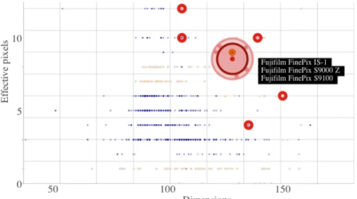
We designed a sketch-based interface for data exploration that implements many ideas from our design sessions. The inter-face runs on mobile devices and communicates with a visual-ization dashboard on a high-resolution wall display (see Fig-ure 1). The dashboard displays plots such as scatterplots and bar charts that present different views of a dataset. Plots are completely synchronized (coordinated views). If data points are selected or filtered, these effects are applied to all plots. Users can sketch sliders on the mobile interface to explore different data dimensions, and create queries to filter data. Queries are communicated through the network to a server, which propagates the appropriate data filters to a wall cluster for rendering. Figure 3 shows the effect of filters on the two dimensions of a scatterplot. Blue points are data points inside all active filter ranges, while pale orange ones are outside. Our setup supports personal exploration (tablet) over a shared viewing space (wall). This decoupling serves two main goals. First, users can move freely around the wall display and in-teract with sliders at the desired viewing distance and level of data overview. Second, large datasets can be comfortably visualized on a visualization cluster without overloading the limited capacities of personal devices. To a lesser extent, the setup accommodates wall displays that lack touch support.
Interacting with Gestures
Our sketch-based interface runs on Android devices, tablets and smartphones. Its design combines free writing, sketching of interactive controllers, and interaction with gestures. Since our interaction model only requires the use of a passive stylus or a finger, we combine stroke delimiters [13], crossing-based selection [4], and simple gesture recognition [32] to correctly infer the type and function of pen strokes.
Delimiters. We use dwells as delimiters to identify special command-strokes. As seen in Figure 4, a dwell invokes a contextual menu with a list of possible actions, e.g., create a
Figure 3. A scatterplot displays filtered points that represent camera models. Blue points are inside the active filter ranges, pale orange points are outside. A red area cursor can point to, and select, blue data points. Circled points correspond to previous selections. The dots in the ring around the cursor communicate the relative position of selected points.
new slider. We found that short dwells of 250 to 350 ms do not disrupt the flow of regular writing. Hinckley et al. [13] report that dwells result in fewer errors but are slower than pigtails. But since pigtails interfere with symbols of regular handwriting, we only use them in conjunction with crossing. Crossing-Based Selection. Users can cross existing interac-tive components and then dwell to choose a function from a context menu, e.g., deactivate or activate a slider, remove a filter or a marker, and change a filtering dimension.
Gesture Recognition. We facilitate interaction by recogniz-ing three special forms of gestures: zig-zag scribbles, circu-lar strokes, and pigtails. Zig-zag gestures serve as erasers of individual or groups of strokes as well as erasers of interac-tive slider components, e.g., whole sliders and filters. Circu-lar strokes are generally considered as candidates for periodic sliders unless their trace crosses a slider, in which case they create slider cursors. Finally, pigtails create filters. We give more details about these features in the next section.
Pointing on the Wall Display and Data Selection
Users can activate additional functionality through bezel and contextual menus to reconfigure the plots on the wall display. They can also interact directly with their filtered content by turning the mobile device into a touch pad. As shown in Fig-ure 3, we support pointing and selection through a circular area cursor with excentric labeling [12], for previewing and selecting data points directly on the plots. Users can pinch with two fingers to resize the area cursor and reduce or in-crease the active area of selection. We use the GlideCursor [5] and the acceleration function of Nancel et al. [24] to control the cursor position on the wall display.
Implementation
Our application has been built on Java for Android 4.3. The visualization software on the wall runs on Processing 1.5 - 2.0 and uses the Most Pixels Ever library1for spanning the charts on multiple machines and screens on the wall display, and a modified giCenter Utilites library for the charts2. Our wall
1
http://github.com/shiffman/Most-Pixels-Ever-Processing
2http://www.gicentre.net/software/#/utils/
(a) (b) (c)
Figure 4. Combining crossing, dwelling, and gesture recognition. (a) Dwelling after drawing a curve activates a contextual menu that lets the user create a new slider. In this example, the system has recognized a circular form and therefore suggests a ”Circular Slider” in addition to other types. (b) Dwelling after crossing a SketchSlider shows a contex-tual menu with a set of possible actions. (c) Scribbling out a filter.
consists of 32 30-inch LCDs arranged in a 8 × 4 matrix (size 5.5 x 1.8m and effective resolution 20480 x 6400 pixels) and is driven by a cluster of 16 computers. A Java server takes care of the communication between the Android and the wall application through the Open Sound Control protocol3. SKETCHSLIDERS
As regular sliders, SketchSliders control specific dimensions of a dataset, but can take arbitrary shapes. We have explored a number of designs that take advantage of their free form, including periodic sliders, grafted sliders, and transformation sliders whose path describes a fisheye function. SketchSliders can serve as classic controllers, but also as alternative mech-anisms for direct data exploration. As we support embedded data distributions, slider cursors, and markers, users can focus on the tablet to complete part of their tasks without having to frequently move their attention to the wall display.
BasicSketchSliders and Filters
After drawing the path of a SketchSlider, a popup dialog asks the user to assign a data dimension. We support both ratio and ordinal dimension variables (numerical, or textual sorted in alphabetical order). For ratio variables, we differentiate between decimals and integers. We also differentiate between periodic, e.g., months, and non-periodic variables (Figure 5). When first created, a slider extends between the two extrema values of the dimension’s active range. Users can interac-tively change the active range (B3) by long-pressing the label of the starting or ending extremum value, and then dragging it leftwards or rightwards. This decreases or increases the asso-ciated value, but also updates the range of the data dimension on the plots of the wall display. This way, users can control the charts by zooming in within a subrange of a dimension. Figure 5 shows examples of SketchSliders and explains how users interact with their widgets. Sliders can host one or more interactive filters (B3), that define the union of ranges or in-dividual values. Filter ranges are shown in blue. We support delta filtersand range filters, created with pigtailed strokes that cross either once or twice the path of a slider. A delta
1
2
4
3
add cursor add range filter
resize filter add delta filter
change extremum
Figure 5. Left: Four SketchSliders on the screen of a 5-inch Samsung Galaxy S4: (1) a slider over an ordinal variable (Country), (2) a circular slider over a periodic variable (Month), (3) a slider that is currently inactive, and (4) a slider over a ratio variable (Temperature). The query of the three active sliders selects winter mean temperatures for Finland and Germany. Slider 4 shows how the distribution of active temperatures (blue) leans towards lower values. Right: Gestures and interactions to create and manipulate basic slider widgets: add a cursor (crossing circle), add a range or a delta filter (crossing pigtail), change a slider extremum, and resize a filter. Observe how active (blue) density distributions change in response to these actions.
filter has a single control point and represents either a unique value (ordinal variables), or a small delta range around a value (ratio variables), whose precision depends on the slider size and range of values. Range filters have two control points, and determine an active range between two values. Users can manipulate the control points to change the start and end val-ues, or pick and move the entire range along the slider. For complex queries involving multiple data dimensions, users can create multiple SketchSliders. Their result is the intersection of the results of the individual sliders’ queries. During data exploration, users may draw several sliders and switch between them by deactivating ones or activating others (B5). Our implementation allows for a single active slider for each dimension. Sliders become automatically inactive when a new slider for the same dimension is drawn.
Guided by the results of our design study (B4), we support cir-cular sliders dedicated to periodic variables (Figure 5: Left). Circular sliders have no ends, and thus do not constrain the translation of their filters. For example, a single range filter can specify the winter months, from December to February.
Embedded Density Distributions
We augment SketchSliders with density distributions that ap-pear as shadows along the path of each slider, and commu-nicate data overviews. We get inspiration from scented wid-gets[31], but opt for a different visualization approach that derives from violin plots [15]. Violin plots show a density trace that extends symmetrically along the length of a box plot. The density trace provides rich information about the underlying distribution, and when compared to histogram-based visualizations [31] it results in less visual clutter. It can also better generalize to curved paths of arbitrary shapes. As with histograms, this approach requires the selection of an interval (bin) width h. We try to optimize h by considering the type of the slider’s variable (ordinal, integer, decimal) and its range. For a given range, longer SketchSliders contain a larger number of intervals, and thus show more detailed den-sity distributions. Denden-sity distributions are normalized
be-change marker value
corner marker
cursor
Figure 6. Corners can serve as markers of values of interest. As with extrema, the user can adjust the value of a corner by long-pressing and dragging its label along the horizontal axis. A slider cursor reveals both the value of its center and the number of active data points it covers.
tween zero and the highest available density. We visualize two distributions: (1) a static distribution of the entire dataset within the slider’s range (in light orange), and (2) a dynamic one of the active data subset, defined by the filters of the cur-rently active sliders (in blue). A dynamic distribution is up-dated every time the user adds, removes or changes a filter on an active SketchSlider. This allows users to directly observe the effects of their filters on multiple dimensions.
Density distributions are approximate but can support data exploration directly on the mobile surface. For instance, users can draw multiple sliders to get quick information about how data points are distributed along different dimensions, and identify areas of interest within the sliders’ ranges, common tasks in data analysis [2]. Thus, users can focus on their actual filters without having to continuously shift their attention to the wall display. Or, the distributions can help users identify functional dependencies between dimensions as they manip-ulate filters of different sliders. For example, the Temperature slider in Figure 5 (Left) shows that registered winter temper-atures for Finland and Germany lean towards the low range of values and include a high proportion of negative values.
2
3 1
4
(a) (b)
Figure 7. (a) Branched SketchSliders. Branches (1, 2, 3, 4) serve as proxies, providing a more detailed view of a range. A branch can start from (1, 3) or end at (2, 4) the main slider or another branch. (b) A Transformation SketchSlider applies a fisheye deformation to a scatterplot. The slider contains grid lines that correspond to the transformed grid of the scatterplot. In this example, the transformation allows for zooming into the range of temperatures between 20 and 25◦C. For this range, the user can make more precise selections on the scatterplot and the slider itself.
Slider Cursors and Markers
A SketchSlider can host one or more slider cursors that serve as one-dimensional navigation widgets. Slider cursors can move along the length of a slider and display the data value that corresponds to its centre, aiding value retrieval tasks [2]. Similarly to the 2D area cursor on the wall charts, they also serve as data-point selectors. As seen in Figure 6, a slider cursor covers a delta area over the slider’s range, and counts the active data points queried by the filters. Users can tap on the + symbol to display the list of the covered data points, and optionally, add a subset of these points to their selections. The granularity of the cursor depends on the length of the SketchSlider and its range of values.
Since SketchSliders can take any shape, distinctive features can act as markers of values of interest, as suggested in our design study (B1). We enhance this property by running a corner detection algorithm that automatically identifies cor-ners on the slider’s path and displays their value. As with ex-trema values, users can long press on a marker label to further adjust its value. Figure 6 shows that changing the value of a marker shifts the extreme values (one or both) of the slider and adjusts its scale, ensuring that the slider remains linear.
Grafting: Branched Sliders
We apply the concept of grafting from our study (B2), in a new slider type, branched sliders. Branched sliders support infinite nesting of branches to allow multiple levels of granu-larity within a slider’s range. Grafting a branch is similar to creating a new SketchSlider, but the stroke for the new branch has to cross an existing slider or branch. The joint point can be either the starting or the ending extreme of the branch, de-pending on the direction of the stroke that creates it. Thus, branches can form arbitrary tree and polytree structures. We also allow for closed branches between any two points of the root slider or a branch. Note that the extrema values of a branch cannot exceed the extrema values of its parent. As seen in Figure 7a, branches act as slider proxies, and filters have copies in all the branches of a slider. The user can ma-nipulate any of these copies according to the level of intended precision. By grafting branches and adjusting their extrema,
users can zoom in partial ranges of the slider. The density dis-tribution of a branch reflects its individual range rather than the range of the root slider, offering a different view of the data. As users zoom in a subrange, distributions get more fine grained, while filters and cursors become more precise. This can reveal distribution anomalies or clusters, that are impor-tant components of data analysis [2]. For example, branches 1, 3, and 4 in Figure 7a reveal small clusters of data points not visible on the root slider. Notice how the filter on branch 4 has increased in length and granularity compared to its orig-inal copy on the root slider. Branched sliders let users dig incrementally into ranges of a dimension, without removing the trace of previous explorations.
Transformation Sliders
Sketching is commonly used for drawing curves to communi-cate trends or mathematical functions. Inspired by our study (B2), the path of transformation sliders similarly describes an 1D transformation function. To define transformations over slider paths, we use a curvilinear l-y coordinate system, where l is the arc length of the partial curve at point p(x, y). This approach overcomes the problem of curves that do not describe valid functions in Cartesian coordinates.
We examine focus+context transformation functions that af-fect the dimensions of plots on the wall display. More specif-ically, peaks of a slider curve represent areas of focus while valleys represent areas of context. To model this behavior, we define a fisheye function F (y, g) = (1 − g)f (1) + gf (y), where y ∈ [0, 1] is the vertical curve position normalized between the higher and lower extreme of the curve, while g ∈ [0, 1] is a gain function. In our implementation, the gain is g = h/hmax, where h is the height of the curve and hmax is a maximum height value. Finally, f is a monotonically increasing function. We produce a more aggressive fisheye deformation by taking an exponential function f (y) = ay. Figure 7b shows a SketchSlider that applies a fisheye trans-formation to the x−axis of a scatterplot. We can see that the transformation applies to the scatterplot but also to the slider itself. This means that values are not uniformly distributed along the path of the slider, i.e., they are sparser around peaks and denser around valleys. Similarly, the granularity of slider
1 2
Figure 8. A document can consist of multiple sections, where each sec-tion (1, 2) forms a unique query. A movable bar (separator) denotes the bottom of a section and includes functionality for managing the section.
widgets varies along the slider. As a result, delta filters and cursors become more precise closer to higher peaks.
To apply a fisheye transformation over the slider’s path, we divide it into small arcs and estimate the transformed value v(l) ∈ [0, 1] at position l as the sum of its partial delta values:
v(l) = i−1 X k=1
∆v(lk, lk+1) + ∆v(li, l) (1)
We then approximate the fisheye transformation value for a position s within each arc i as a linear function F (s) = Fi+ λis, where Fi is its value at the start point of the arc and λi= (Fi+1− Fi)/(li+1− li). Based on this approximation, we can calculate the delta values in Equation 1 as follows:
∆v(lk, l) = β l Z lk F (s)ds = β(Fkδl + λkδl2 2 ) (2)
where δl = l − lk. The parameter β is a normalization factor derived from Equations 1 and 2 by setting v(L) = 1, where L is the total slider length.
Exploration Sections
A user can divide an exploration session into sections, where each section can contain any number of sliders that form a query. Sections let users start a new exploration without los-ing the history of their previous queries (B5). New sections are created by drawing a long horizontal line with a pigtail. This creates a separator (Figure 8) that serves as the lower boundary of a section. The widget can be dragged up or down to adjust the size of two adjacent sections.
CURVE MODELING AND DRAGGING
We model the path of SketchSliders and range filters as cu-bic B´ezier curves. We uniformly decrease the number of path points, which results in smoother curves and better perfor-mance. We also use cubic B´ezier curves to model the trace of distributions, by connecting density points between bins at the normals of the SketchSliders. If the lines of two neigh-boring density points intersect, we consider a single density point at their intersection, avoiding the creation of path loops. Figure 9 explains how we derive the position of a handler, e.g., a slider cursor, on the B´ezier curve from the position
stylus pointer
segment between points handler position: B(t) where t = d/D
d
Dbisector lines
Figure 9. Deriving the position of a handle (blue circle) on the cubic B´ezier curve of a slider from the position of the pen (red circle).
of the finger or stylus pointer when dragging the handler. We find the line that crosses the pointer and is parallel to the clos-est segment between two consecutive path points. We then take the vector ~D defined by its intersection with the previ-ous and the next bisector of the between-segment angles. We also take the position ~d of the pointer on this vector. From this, we derive the t parameter of the corresponding B´ezier curve B(t) as the normalized pointer position t = d/D. To deal with slider curves that contain closed loops, we can set a threshold distance that avoids accidental jumps between non-neighboring segments.
In contrast to our approach, DimpVis [19] simply takes the minimum-distance point to project the position of the finger to a path. Dragicevic et al. [11] have proposed a more generic solution by modeling curvilinear dragging as an optimization problem that minimizes a 3D instead of a 2D distance. Our solution is less generic, yet fast and simpler, while it still re-sults in very smooth behavior for meaningful slider shapes.
USER STUDY
To validate our prototype we conducted a user study with six visualization researchers (2 female), who used regularly vi-sual analytics tools, recruited through chain-sampling. Their experience in visualization research and analysis ranged from 2 to 15 years (median 10), and their age from 24 to 41 (median 34.5). All reported being highly familiar with the visualiza-tion plots used in our study and the novisualiza-tion of range sliders. Three had taken part in our early design study.
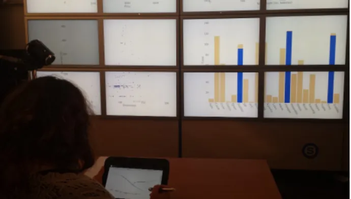
Goals: The goal of the study was threefold: (G1) verify the findings from the design study regarding the value of sketch-ing controllers for visual exploration; (G2) observe how ex-perts can appropriate SketchSliders; and (G3) examine the benefits and shortcomings of divided attention. We wanted to observe how the sketching interface supports visual explo-ration in combination, but also in sepaexplo-ration, from the wall. Setup: Participants were seated in front of the wall display, which displayed three scatterplots and one bar chart. Partic-ipants interacted with the plots using a Nexus 10-inch tablet running our prototype (Figure 10). We also provided a capac-itive pen. We chose a seated setup, as opposed to free walk-ing, to ensure user comfort for the duration of the study, and to avoid any confounds due to uncomfortable hold positions of the tablet without proper hand support.
Figure 10. Study setup with wall display and SketchSliders on a tablet.
T1 Tell us your observations about the distribution of Prices (e.g. extremes, clusters, similarities or gaps inside clusters at low detail).
T2 Which camera Models are in the Price range 3000-6000? Approximate as much as you can the most frequent Max resolution values for them.
Table 1. The two open tasks. T1 was conducted by using both the wall and the tablet. For T2, participants were asked to not look at the wall.
Procedure and Tasks: Each session lasted approximately one hour and was videotaped. Participants were given a de-tailed training session of 20-30 minutes, using a dataset on the history of temperatures in different countries. They then performed alone, using a think-aloud protocol, two open ex-ploration tasks on another dataset. The two open tasks (Ta-ble 1) were related to a multidimensional camera dataset with a total of 1038 digital cameras and 13 dimensions. For the second task, participants were asked to not look at the wall. We expected that this would encourage them to explore the capabilities of SketchSliders in more depth, and assess their strengths and limitations both with and without the wall. The session was followed by a semi-structured interview.
Results
We report here on observations gathered during the study and participants’ responses during the interview.
G1: Value of Sketching in Visual Exploration
All participants were very enthusiastic about sketching their own controllers as needed. They each commented on differ-ent aspects, which we briefly summarize here:
Customization. Participants reinforced findings from our de-sign study, stating that sketched sliders can be ”customized to what I need”, ”easy to tell apart”, and ”feel personal”. As one participant mentioned ”there is something very com-pelling about sketching your own tools”.
Personal space. All participants could envision sharing the wall plot result but would be reluctant to share the sliders themselves. As one participant mentioned, ”it is similar to sharing my notes, I would be reluctant, it is too personal”. Flexibility. All participants appreciated the flexibility of sketching different shapes and sizes to: (i) better fit their view of the data, ”this is vertical [indicating a dimension on a plot] so I drew a vertical slider”; (ii) focus on parts of the data as needed, ”I can focus either with branches or transformation, you don’t have that in other interfaces”; and (iii) generally allow users to feel that the interface can accommodate their needs. As one participant stated ”existing interfaces are not flexible enough, they only show you predefined controllers”.
Annotation. All participants mentioned they liked the ability to be able to sketch controllers and also take personal notes related to their analysis and findings (see Figure 11a,b). How-ever, three participants stated that they would have preferred a different mode for analysis and a different one for annotation, as in some cases they wanted to use gestural marks, such as circling a slider, as a free-form note to indicate emphasis.
G2: Use ofSketchSliders functionality by Experts
Participants were able to effectively use the interface without aid, adopting different strategies to perform their tasks and us-ing different combinations of SketchSliders’ functionalities. Branches. Five participants used extension branches to in-crease the granularity of their exploration. As P1 mentioned ”I draw a branch when I couldn’t interact precisely [with the slider], and adjusted its end to be more precise”. Branches were also used to compare different parts of the data. P2 ex-plained that ”I made a second branch to see if I have the same detailed pattern as in the other [branch]”. P4 com-bined branches with other strategies to explore different as-pects of the data. She drew multiple sliders for the same di-mension and adjusted their ranges. She then compared their effect on the wall plots by switching between them. As the activation and deactivation of sliders happens through a con-textual menu, she asked for a faster way to do so.
Transformation sliders. Four participants used transforma-tion sliders to focus on part of their data. As P6 mentransforma-tioned, this gave ”a better view of the densely packed data points in this range”. Figure 11a shows how P6 used a transformation slider to focus on the lowest range of camera prices, while he filtered release dates with a regular slider. This partici-pant did not use any branches, as he could complete the tasks with transformation sliders by adjusting their extremes. Oth-ers used transformation slidOth-ers early on to get a quick view of clusters in their data, or to focus on some interesting areas of certain dimensions, while using branched sliders for others. Slider cursors.Participants made a frequent use of the slider cursor and found it very useful. Some created a large number of these cursors (Figure 11) to locate items within an area of the slider and then display them as selected on the wall. Two participants commented that they would have liked to change the cursor’s size, as they could do with the wall cursor. Density distributions. All participants mentioned that slider distributions were helpful to ”identify possible high level pat-ters”, ”get a quick overview of data”, or to ”quickly see how much data are filtered”. P1 stated that the distribution was enough on its own for a high level and approximate data ex-ploration. On the other hand, P4 and P5 suggested show-ing individual points rather than distributions at fine gran-ularity, as they ”expected clusters not points, and was not sure if I should focus more”. P4 observed that the render-ing can be misleadrender-ing, expectrender-ing that data are normally dis-tributed within the range covered by bins. A possible solution to this problem is to use beeswarm-like visualizations4when the number of data points around a bin becomes very low.
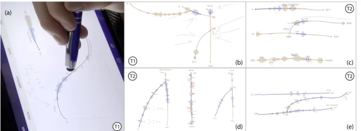
(a) (d) (c) (e) (b) T1 T1 T2 T2 T2
Figure 11. Complex queries sketched by different participants of our study. P6 applies a filter to lower prices by using a transformation slider (a). Use of a mix of simple and branched SketchSliders by P2 (b, d), P3 (c), and P4 (e). We indicate the task (T1, T2) for which the query was created.
G3: Exploration usingSketchSliders and Wall Display
All participants mentioned that the combination of sketch-ing controllers and decoupled wall plots worked really well for visual exploration and were ”very well integrated”. Ac-cording to P5, ”the setup really works well for me, they are complementary, as you cannot show all the information on the tablet, and I don’t really want to directly interact with the wall all the time”. Observing how participants worked on task T1, we were able to identify the following strategies. Participants found that sketching one controller at a time helped their analysis process. P1 used almost exclusively the tablet, as plots on the wall ”are at first overwhelming, too much data”. She explained that sketching sliders as needed let her ”focus on one dimension, and see the result on other dimensions [using the slider distributions], which reduced my cognitive load”. She explained that the interface ”helped me filter not just my data, but also my controllers”.
A similar sentiment was expressed by P3, who explained that ”existing interfaces are too cluttered and it is hard to decide where to focus on, here I can focus on one thing, and draw-ing a slider is a way for myself to decide what will be most likely of interest next”. It is interesting to note that P3 and P6 completed the task by focusing mainly on the wall, manip-ulating their sliders eyes-free. According to P6, this helped him ”avoid splitting attention” between the two displays. P2, P4, and P5 divided their analysis between tablet and wall. They used slider distributions for approximate answers, and the wall for detailed ones. P4 mentioned she always ”checked to see the result [of a slider] on the plots”, while P2 explained that ”when I wanted detail I would go here [plots]”.
Overall, participants were very enthusiastic, and were able to retain and use the interface successfully. Their choices on what controllers to create, and how to explore data using the tablet and wall varied greatly. Clearly experts have their own analysis approaches, and one interface does not fit all. Given the varied ways our setup was used, we feel SketchSliders are flexible enough to support different working styles.
CONCLUSION AND PERSPECTIVES
We presented SketchSliders, range sliders that users can freely sketch directly on a mobile, in order to parametrize and cus-tomize their exploration of data on a wall display. With a small combination of sketches and gestures users can cre-ate complex interactive components, such as slider branches and data transformation sliders, to investigate detailed aspects and subsets of their datasets. Apart from their natural custom shape, our sketched sliders are enhanced by interaction aids such as slider cursors, markers and distribution visualizations. Results from a user study with visualization experts indicate that SketchSliders are flexible, support different exploration strategies, while the fact that they are sketched as needed can focus and aid the visual analysis. Our system currently does not support collaboration. Nevertheless, participants in-dicated that the sketched sliders are very personal, and al-though they would be willing to share their results on the wall visualization, they are less open to sharing the controllers themselves. This opens interesting questions regarding shar-ing mechanisms and privacy that need further study.
We were motivated by a scenario where users view large datasets on wall displays, and require mobile interaction sup-port. Nevertheless, our experts commented that sketching customized controllers can be useful even in desktop settings, where visualizations are usually laden with numerous inflex-ible controls. We plan to investigate further how users can sketch and use sliders directly on their visualizations. One benefit of SketchSliders is the combination of regular note taking that is crucial in data exploration, and the trace of the interactive controllers and their values that were used to reach insights. This coupling of analysis process and record-ing could be further enhanced. We could envision users tak-ing snapshots of their data to add to their sketched environ-ment, and detailed history mechanisms for reverting to previ-ous steps in their exploration. These ”traces” of the interac-tion explorainterac-tion could then be used as a logging mechanism for analysts, or shared with others without sharing the data themselves that could be too large or sensitive.
REFERENCES
1. Ahlberg, C., Williamson, C., and Shneiderman, B. Dynamic queries for information exploration: an implementation and evaluation. CHI ’92, ACM (1992), 619–626.
2. Amar, R., and Stasko, J. A knowledge task-based framework for design and evaluation of information visualizations. Symposium on Information Visualization, INFOVIS ’04, IEEE (2004), 143–150.
3. Andrews, C., Endert, A., Yost, B., and North, C. Information Visualization on Large, High-resolution Displays: Issues, Challenges, and Opportunities. Information Visualization 10, 4 (2011), 341–355. 4. Apitz, G., and Guimbreti`ere, F. Crossy: A
crossing-based drawing application. UIST ’04, ACM (2004), 3–12.
5. Beaudouin-Lafon, M., Huot, S., Olafsdottir, H., and Dragicevic, P. Glidecursor: Pointing with an inertial cursor. AVI ’14, ACM (2014), 49–56.
6. Bezerianos, A., Dragicevic, P., and Balakrishnan, R. Mnemonic rendering: an image-based approach for exposing hidden changes in dynamic displays. UIST ’06, ACM (2006), 159–168.
7. Brosz, J., Nacenta, M. A., Pusch, R., Carpendale, S., and Hurter, C. Transmogrification: Causal manipulation of visualizations. UIST ’13, ACM (2013), 97–106. 8. Browne, J., Lee, B., Carpendale, S., Riche, N., and
Sherwood, T. Data analysis on interactive whiteboards through sketch-based interaction. ITS ’11, ACM ( 2011), 154–157.
9. Chao, W. O. NapkinVis: Rapid Pen-Centric Authoring of Improvisational Visualizations. IEEE InfoVis Poster (2009), 1–9.
10. Chapuis, O., Bezerianos, A., and Frantzeskakis, S. Smarties: An input system for wall display development. CHI ’14, ACM (2014), 2763–2772. 11. Dragicevic, P., Ramos, G., Bibliowitcz, J.,
Nowrouzezahrai, D., Balakrishnan, R., and Singh, K. Video browsing by direct manipulation. CHI ’08, ACM (2008), 237–246.
12. Fekete, J.-D., and Plaisant, C. Excentric labeling: Dynamic neighborhood labeling for data visualization. CHI ’99, ACM (1999), 512–519.
13. Hinckley, K., Baudisch, P., Ramos, G., and
Guimbretiere, F. Design and analysis of delimiters for selection-action pen gesture phrases in scriboli. CHI ’05, ACM (2005), 451–460.
14. Hinckley, K., Zhao, S., Sarin, R., Baudisch, P., Cutrell, E., Shilman, M., and Tan, D. Inkseine: In situ search for active note taking. CHI ’07, ACM (2007), 251–260. 15. Hintze, J. L., and Nelson, R. D. Violin plots: A box
plot-density trace synergism. The American Statistician 52, 2 (May 1998), 181–184.
16. Holz, C., and Feiner, S. Relaxed selection techniques for querying time-series graphs. UIST ’09, ACM (2009), 213–222.
17. Igarashi, T., Matsuoka, S., and Tanaka, H. Teddy: A sketching interface for 3d freeform design. SIGGRAPH 2007 Courses, SIGGRAPH ’07, ACM (2007).
18. Jansen, Y., Dragicevic, P., and Fekete, J.-D. Tangible remote controllers for wall-size displays. CHI ’12, ACM (2012), 2865–2874.
19. Kondo, B., and Collins, C. Dimpvis: Exploring time-varying information visualizations by direct manipulation. Trans. Vis. Comput. Graph. PrePrints, IEEE (2014), 2003–2012.
20. Landay, J. A. Silk: Sketching interfaces like krazy. CHI ’96, ACM (1996), 398–399.
21. LaViola, Jr., J. J., and Zeleznik, R. C. Mathpad2: A system for the creation and exploration of mathematical sketches. SIGGRAPH ’04, ACM (2004), 432–440. 22. Lee, B., Kazi, R. H., and Smith, G. Sketchstory: Telling
more engaging stories with data through freeform sketching. Trans. Vis. Comput. Graph. 19, 12 IEEE (2013), 2416–2425.
23. Li, Y., and Landay, J. A. Informal prototyping of continuous graphical interactions by demonstration. UIST ’05, ACM (2005), 221–230.
24. Nancel, M., Chapuis, O., Pietriga, E., Yang, X.-D., Irani, P., and Beaudouin-Lafon, M. High-precision pointing on large wall displays using small handheld devices. CHI ’13, ACM (2013), 831–840.
25. Ryall, K., Lesh, N., Lanning, T., Leigh, D., Miyashita, H., and Makino, S. Querylines: Approximate query for visual browsing. CHI EA ’05, ACM (2005), 1765–1768. 26. Saraiya, P., North, C., and Duca, K. An insight-based
methodology for evaluating bioinformatics
visualizations. Trans. Vis. Comp. Graph. 11, 4 IEEE (2005), 443–456.
27. Shneiderman, B. The eyes have it: A task by data type taxonomy for information visualizations. Symposium on Visual Languages, IEEE (1996), 336–.
28. Tsandilas, T., Letondal, C., and Mackay, W. E. Musink: Composing music through augmented drawing. CHI ’09, ACM (2009), 819–828.
29. Walny, J., Lee, B., Johns, P., Riche, N. H., and
Carpendale, S. Understanding pen and touch interaction for data exploration on interactive whiteboards. Trans. Vis. Comput. Graph. 18, 12 IEEE (2012), 2779–2788. 30. Wattenberg, M. Sketching a graph to query a time-series
database. CHI EA ’01, ACM (2001), 381–382.
31. Willett, W., Heer, J., and Agrawala, M. Scented widgets: Improving navigation cues with embedded
visualizations. Trans. Vis. Comp. Graph. 13, 6 IEEE (2007), 1129–1136.
32. Wobbrock, J. O., Wilson, A. D., and Li, Y. Gestures without libraries, toolkits or training: A $1 recognizer for user interface prototypes. UIST ’07, ACM (2007), 159–168.
33. Wong, Y. Y. Rough and ready prototypes: Lessons from graphic design. CHI ’92, ACM (1992), 83–84.
34. Wood, J., Isenberg, P., Isenberg, T., Dykes, J.,
Boukhelifa, N., and Slingsby, A. Sketchy rendering for information visualization. Trans. Vis. Comput. Graph. 18, 12 IEEE (2012), 2749–2758.