O
pen
A
rchive
T
OULOUSE
A
rchive
O
uverte (
OATAO
)
OATAO is an open access repository that collects the work of Toulouse researchers and makes it freely available over the web where possible.
This is an author-deposited version published in : http://oatao.univ-toulouse.fr/ Eprints ID : 16886
The contribution was presented at UAHCI 2016 : http://2016.hci.international/uahci
To cite this version : Roussille, Philippe and Raynal, Mathieu and Jouffrais, Christophe LOVIE: a word prediction list optimized for visually impaired users on smartphones. (2016) In: 10th International Conference on Universal Access in Human-Computer Interaction (UAHCI 2016), 17 July 2016 - 22 July 2016 (Toronto, Canada).
Any correspondence concerning this service should be sent to the repository administrator: [email protected]
LOVIE: A Word List Optimized for Visually
Impaired UsErs on Smartphones
Philippe Roussille(B) and Mathieu Raynal
CNRS, IRIT, F31 062 Toulouse, France [email protected]
Abstract. On mobile devices, most text entry systems offer assistance through the means of prediction or correction word lists. These lists can hardly be used by visually impaired users in a short time. In this paper, we present three studies to find an interaction which minimizes the time required to select a word from a list without knowing its elements a priori. First, we explored the various possible item layouts, to conclude that a linear spatial arrangement is preferable. Then we studied the audio feedback, and we have determined that providing on-demand audio feedback is enough. Finally, we proposed four validation interactions to retain a validation based on the principle of a press-release gesture.
1
Introduction
Smartphones are difficult to use for visually impaired people due to their big touchscreen presenting no physical buttons, hence presenting no tactile cues. Consequently, their daily uses are difficult, especially for text input. However, there exist techniques allowing the visually impaired to use a traditional soft keyboard (VoiceOver for Apple, TalkBack for Android, DUCK). Since the visu-ally impaired know the character layout, they can type fast relying on that knowledge.
Yet, soft keyboards are often enhanced by a completion, prediction or cor-rection system. Such a system usually offers a word list to the user. That list is made of the most probable words given the input context. As a consequence, every proposed word differs on each time the list is being displayed. The users can neither learn nor anticipate the word list that appears. Such lists are thus problematic for the visually impaired as they lack a global vision of the list when it appears. They have to browse it entirely to see the proposed words. Selecting a word in such a list is usually a time loss for the user.
This article aims to facilitate access towards different words within a list as well as selecting the wanted word. As such, we carried out three studies on three problems linked to list interaction. The first study focuses on how to present the different words of a list to a visually impaired user. The second study aims to find the best vocal feedback to the user whilst he uses the list. Finally, the third study was made to find the best interaction allowing to select the word chosen by the user.
2
Items Presentation
The first problem at hand is to correctly present the items to the user. Indeed, since visually impaired users have no access to visual information, they should have little to no time lost finding all the elements they need to select.
When it comes to lists and layouts, the usual design is made through a balance between depth and breadth, turning most of the selective operations into a hierarchical browsing. Hierarchy is very common on small devices, as it allows a logical organization and presentation of a large number of items through a tree-like structure [10].
Usually, when browsing a list, selecting an item determines what will be presented next, since browsing is made in a linear fashion. As such, hierarchical browsing is sometimes a challenge, even more when it grows deeper and wider. Different strategies and trade-offs have been studied and modeled [4]. It appears that broader and wider presentations are more efficient [8,12]. However, since the efficiency depends on screen size and the complexity of the task [3], Users actually prefer a deeper hierarchy on a mobile phone, which has a small screen size [5]. However, due to the serial quality of audio-enhanced lists, a broad list might result in information overload for the user.
The items or options in a visual menu are often ordered in some logical fashion. Alphabetical, numerical, and chronological ordering are all examples of ordering techniques that can reduce menu selection times if used appropri-ately [10]. Ordering menus by frequency of use is another technique that has been found to significantly reduce performance times [11], although it results in dynamic menus that also lead to poorer performance due to the lack of con-sistency [9]. Even it’s preferable to offer a display that order elements under a hierarchy to increase learning. it is however impossible for us to use that app-roach due to the extreme changing nature of our content: we cannot establish a stable hierarchy that the user could remember or use easily without increasing his cognitive load more than necessary.
For modern screen readers, there exist different strategies to avoid these problems. According to Borodin [1], modern screen readers often read the num-ber of available items, then open an auxiliary window for the user to navigate within the list (like JAWS). Again, the main approach is a vocalization of the list content to the user, which takes time and is not really usable on a mobile environment.
As it is not possible to build a solution effective to quickly run through the elements in a preferred order, giving the smallness of our screen, we chose to focus on a simple set of layouts that an user could easily browse efficiently. 2.1 Proposed Presentations
During our first experimental study, we wanted to know what item presenta-tion would best meet the needs of users. Therefore, we proposed three different presentations.
The first presentation displays the whole word list on the screen. The screen is used entirely and divided so that every item has an identical size. This pre-sentation is called “absolute” prepre-sentation. Using this as a principle, we studied three different layouts:
– line: the elements are placed on a horizontal line,
– column: the elements are arranged in a vertical column,
– grid: the elements are arranged in several columns comprising an even number of elements.
The second presentation describes a more dynamic arrangement. Unlike the “absolute” presentation, the elements are dynamically linked to the position of the user’s finger. The first element is positioned at the location where the user places his finger, and the following items are achieved when the user moves away from that point. The user can confirm the item he is looking for releas-ing his freleas-inger from the screen. This presentation will be called the “relative” presentation.
In these two presentations, the main interaction is to press finger onto the screen to select an item, move finger on the screen to navigate among the different items and then release the finger to validate the last selected item. On the other hand, the user can cancel by pressing with two fingers onto the screen.
In this last presentation, the items are not all visible on the screen at the same time. Only one word is available. The user can browse the list by sliding his finger left or right, validate by sliding down and cancel by sliding up. This presentation will be called the “list” presentation.
2.2 Method
Participants. 12 participants (3 women and 9 men, mean age = 25) with normal or corrected-to-normal vision participated in our study. They were all blindfolded to ensure they couldn’t see the screen at all.
Apparatus. Participants used a Samsung Galaxy SIII smartphone. The device has a resolution of 306 ppp for a 136.6 mm × 70.6 mm screen, a ARM Cortex-A9 MPCore Quad core set at 1.4 GHz and uses Android 4.3. They used their finger to navigate through the items. The items were synthesized from text using the Google Translate service. The audio was trimmed to provide feedback as fast as possible, reducing any possible delay. Nothing was displayed onto the screen during the experiment, making the grids and items invisible to the users.
Procedure. The task was to find a word in the available items as fast as possible. The task went as follow: first, the participant was read the instruction, he was then given the word to search, then he had to browse the items to find the correct one, and ultimately validate it. If he answered a different item, we considered his answer to be wrong. Once a session was completed, the participant was asked to answer a SUS test for each technique, and state his preference among the layouts he went through.
Design. Each participant had to go through two sessions. One session comprised only four elements per list, while the other comprised only six elements per list. Both sessions were run one after the other. The twelve participants were then split at random into two even groups. The first group started with four items lists, while the second started with six items lists. For every session, the participant had to go through five blocks of tasks, one for each presentation. The blocks were balanced through a Latin square. Each block was made of three series of tasks, each run one after the other. Each series comprised as many tasks as there were positions in the list (4 or 6). For each task, the position of the word to select was picked at random. However, in each series, every possible position in the list is tested through a selection task. This leads us to a total of 1,800 trials.
Collected Data. In order to study the different presentations, we collected various data during the experiment: we collected the number of items seen by the user, the time taken for the participant to make his selection, the distance (in pixels) he traveled, the errors he made and the answers he gave to the SUS questionnaire.
2.3 Results and Discussion
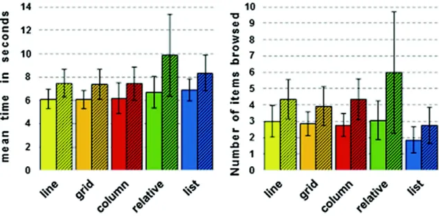
Figures1 and 2 show the main results of the first study. The vertical bars depict the items arranged in a line (yellow), a grid (orange), a column (red), using a rel-ative arrangement (green), and using a list (blue). The hatched bars correspond to the 6 items results, while the clear bars are used for the 4 items lists.
Fig. 1. Mean time in seconds (left), and error rate (right) to select an item with each presentation. (Color figure online)
Number of Items. In the first place, we can see that the number of items browsed depends on the number of items within that list. Indeed, when the user has six items in the list, he goes through more items to find the one he wants. On average, the user browses 1.5 additional items when there are six items rather than four. This is also visible on the time measured, which takes 1.7 s (about 120 %) longer to find the desired word. This increase is not due by the two items that are additionally present at the end of the list : indeed, no matter what the desired item’s position is, there is always a significant increase in the time spent for a six items list.
Items Browsed. Items browsed (Fig.1- Right) is the number of items covered participants browsed before he validated his selection. The validated word itself is included. The “list” presentation is the one needing the least browsed items to reach the desired word : for a list of 4 items, the “list” presentation only needs 1.85 items, while the “relative” presentation needs 3. For the “absolute” presentations, this number is of 2.9 items on average, no matter the layout used. The differences between relative and absolute are not significant (p > 0.05), but the differences between the list and the absolute and relative layout are (p < 0.04) significant. This notable difference can be explained by the fact that all the items are shown at the same time on screen for the absolute and relative presentations. The user, while browsing the list, can pass through the desired item and not stop on it. As a consequence, he has to go through more items to select the correct one. On the “list” presentation, the items are shown one at a time. Thus, the user can pass through less easily, and therefore selects the needed item in a shorter time.
Time Selection. Time selection (Fig.1 - Left) is the time required to select the desired item. It is computed between the moment the user presses his finger on the screen to point the first item and the moment when he validates his choice by releasing his finger.
There is not a significant difference between the absolute and relative pre-sentation.
There is no significant difference between the absolute and the list presenta-tion. However, there is a visible difference on the item level. This is due to the time spent interacting: swiping on the screen is an easy gestures, but it takes more time than absolute selection.
The relative layout is longer than the two others, especially in the context of a list with six items. This is due to the smallness of the items in the list, requir-ing slow gestures to compensate the needed high precision. Thus, the relative presentation takes longer.
Similarly, there is no significant difference within the absolute layout (line, grid and column are similar time-wise speaking).
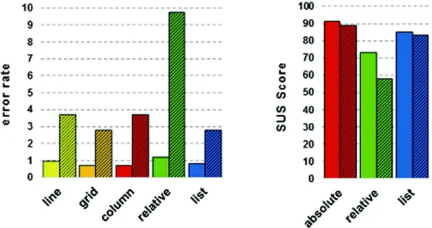
Accuracy. The precision is given by the error rate in the selection task for each presentation type (Fig.2 - Left). It is computed through the ratio of incorrectly selected items divided by the total number of selected items.
There is no significant difference in terms of error rate between the absolute layouts and the list layout. When it comes to lists of six items, the relative layout becomes significantly more error-prone compared to the others (9.7 % compared to 3 % on average, p < 0.05 given by a Friedmann analysis). This can be explained to the required precision to interact with the relative layout: the more elements there are on the screen, the smaller they become. Shall the user selects a starting point in a corner, the elements are going to be harder to select. These cumulative problems cause a higher error rate.
Fig. 2. Error rate to select an item with each presentation (left), and SUS Score for the three presentations (right) (Color figure online)
User Satisfaction. User satisfaction was evaluated through the obtained results collected in the SUS questionnaire (Fig.2 - Right). Subjects gave the “usable” rating for all presentations when there were only four elements: in fact, every presentation has obtained a score of at least 70. The absolute presenta-tion was the one preferred. For presentapresenta-tions involving six elements, scores were lower, showing that the dynamic one was unusable in this case (score 58). This reflects the user’s preference : users prefer to use our presentation for small lists than large lists, and if possible absolute presentations interactions.
In summary, the absolute layout appears to be the most appropriate. Indeed, it is the one necessitating the least time while yielding a small error rate. The list layout shows less browsed items, but takes more time. Finally, the relative layout is inappropriate. Indeed, it’s longer to use than the other two, and yields more errors. Besides, depending on the initial position, items can be of smaller sizes, leading to precision problems. Therefore, for the two following studies, we have retained the “line” layout of the “absolute” presentation. On the other hand,
we saw that the time spent selecting and browsing an item is directly linked to the size of the list. Since it is faster with four elements and better rated by the participants. So we kept only four items for our list in the two last studies.
3
Audio Feedback
Beyond the way the items are arranged for an easy navigation, the offered audio feedback must also be efficient for the visually impaired users : it should allow them to have a fast and efficient knowledge about the possible words along with their position in the list; and as a consequence, on the screen as well.
Concerning parsimony, Brewster [2] indicates that for small devices such as connected phones or watch, interactions should reduce the number of modalities. Indeed, for them, it’s more efficient to use different and distinguishable gestures than to rely on provided tactile or audio feedback to guide the user to validating an option. As such, if there is no need for audio feedback beforehand, it would be better to limit it to just during the selection. Being cautious to the quantity of the feedback is thus important : we must not overload the user with information. When the word list is known beforehand, sound-based techniques can be used. This allows to shorten the necessary time for audio feedback. Zhao presents an approach of continuous audio feedback through the Earpod [16]. The earPod provides users with audio feedback that is synchronously linked to touch input. It is intended to allow users to discover menus and lists at their own pace. Each interaction made by the user is sonified, making audio feedback more precise than visual feedback. This system, according to them, gets less efficient when imbrication appears or menus and list grew bigger. Finally, when the elements are different in meaning but small in numbers, one of the most common choices is the use of earcons (according to Helle [6]) : an earcon, similarly to an icon, uses a distinctive sound to allow a quick finding of the information (e.g. an alarm beep for an error, a noise of torn paper to notify a deletion. A study made by Walker [13] compares the earcons alongside a text-to-speech approach : given the results, text-to-speech is more efficient when it is coupled with earcons and spearcons. Spearcons, like their earcons counterparts, are sounds that are made to distinguish between different items. Unlike earcons, though, they are made up of synthesized speech that is speeded up to the point of being too fast to be fully recognizable. However, the designers must be cautious: sonification methods and earcons are often regarded as being distracting, and are not always appreciated by the majority of the users. However, in a context of text-input, this solution is quite impracticable : indeed, the proposed lists of words offered by a prediction system depends on the user’s own input. As such, we chose not to use a sound-based solution. Ordering menus by frequency of use could potentially be very beneficial, especially since auditory menus are usually conveyed serially. In most cases the user would probably be able to make a selection after listening to just a few menu items [15]. In our case, since words are sorted by their usage frequency, the desired word is highly likely too be in one of the first positions in the list. Given this observation, this second study was made to assess whether it would
be beneficial for the user to be given the whole set of words before he starts making his selection within the list.
3.1 Considered Feedback
In this experiment, we assess and compare two types of feedback :
– item: as in feedback produced when the user selects an element, and only there;
– context: feedback played before the user makes any selection, in which the entire list is being read to the user, in addition to the “item” feedback provided to the user as he selects.
3.2 Method
Hypothesis. With the absolute layout, the user can easily learn and know the on-screen position of each item. As such, if the list of words is announced beforehand, the user may point directly to where he expects to find the desired word. Therefore, he won’t have to go through all the items to find the one he wants. Our first hypothesis (H1) is that the user browse through fewer items if the items in the list are announced beforehand, and during their selection. Our second hypothesis (H2) is thus that if the user browses fewer items, he will select the desired word faster.
Participants. 12 participants (3 women and 9 men, mean age = 25) with normal or corrected-to-normal vision participated in our study. They were all blindfolded to ensure they couldn’t see the screen at all.
Apparatus. Participants use the same smartphone that in the first study. They used their finger to navigate through the items. The items were made from random fruit names that were synthetized from text using the Google Translate service. The audio was trimmed to provide feedback as fast as possible, reducing any possible delay. Nothing was displayed onto the screen during the experiment, making the grids and items invisble to the participants.
Procedure. The task was to find a word in the available items as fast as pos-sible. The task went as follow: first, the participant was read the instruction, he was then given the word to search, then he had to browse the items to find the correct one, and ultimately validate it. If he answered a different item, we con-sidered his answer to be wrong. The participants had then to state his preference through a SUS questionnaire. These tests were done after each combination was played.
Design. The experiment was made into one single session. Each participant had to go through two blocks. The twelve participants were then split at random into two even groups. The first group started with “context” feedback while the other group started with “item” feedback. Each block was made of six series of tasks, each run one after the other. Each series comprised five tasks, one for each position in the list, including its absence. Each item position (including its absence) was made to be selected three times in the list. Similarly to our first experiment, the positions were randomized. The users gave us a total of 660 trials.
Collected Data. In order to study the different feedbacks, we collected various data during the experiment: we collected the number of items seen by the user, the time taken for the user to make his selection, the errors he made and the answers he gave to the SUS questionnaire.
3.3 Results
The main result of our second experiment concern the number of items browsed to reach the desired word. When the user is given “context” feedback, he browses 1.9 items on average, versus 3.6 items on average with “item” feedback when he has no help for the selection (p < 0.05). This result hence confirms our first hypothesis H1.
For the item feedback, the position of the desired word in the list has an influence. Indeed, the more the word is located far away in the list, the more items the user browses: when the word is located in the first position of the list, the average number of items browsed is 2.3, while it is respectively of 2.8, 3.3 and 3.6 for the following three positions. For the context feedback, there is no such effect : no matter the position of the desired item is, the number of items browsed is between 1.6 and 1.8. This means that the user has a knowledge of the layout when he knows the words in advance, and can thus point the words faster on screen.
However, the participants averaged a higher time when the list was announced before (5.56 s) compared to when the list was not given at the begin-ning (5.26 s). Yet this difference is not significant. Our hypothesis H2 is not verified. This result is verified no matter what the position of the word in the list is. In all the cases, the user takes a bit less time with item feedback than context feedback. This can be explained by the time taken to pronounce the list initially, in the case of context feedback, which is not compensated by the time saved by the user to select the desired word.
In both cases, the error rate is low (1.8 % for “context” feedback and 1.2 % for “item” feedback) and therefore has no impact. Finally, the scores for SUS questionnaire are almost similar for both conditions (79 for “context” feedback and 77.6 for “item” feedback).
4
Validation Technique
Once the user has selected one word, he must validate it. Here, in this third study, we focus on what gesture would be best suited to validate a word, as opposed as its simple selection.
When it comes to validation, for Kane et al. [7], the solution must rely on ges-tures which use multiple fingers. In their study, they designed such interactions to be used within list driven environment (for example, checking a contact within the list, browsing through a musical playlist, etc.) by focusing on a “swiping” approach, like a “one-finger-scan”, coupled with a “second-finger-tap”. In this context, the lists are browsed as the finger draws onto the list with the first fin-ger, and validated using a second finger without releasing the first finger. Such an approach simplifies the exploration while offering the user an easier selec-tion. For Kane, it is vital to use multi-finger exploration to enhance accessibility towards visually impaired users.
For Wilson et al. [14], selection is made through a pressure-detection solution. They studied two main validation strategies : holding the finger temporally on an item to validate it, or release the finger from the screen. According to their studies, error-wise, it’s more efficient to hold temporally than to release the finger, but at the expense of a longer interaction time.
4.1 Considered Feedback
We studied four different validation interactions which can be used to select an item from a list:
– release: the user slides his finger on the screen to select a word, and release it to confirm his choice.
– dual tap: the user presses finger onto the screen to select an item, moves finger on the screen to navigate among the different items and then types the screen with two fingers simultaneously to validate the item placed at this location.
– double tap: the user select an item in the same way that the “dual tap”, and validate its choice by performing a double tap with one finger (similar to a double-click).
– broken line: the user slides his finger on the screen to select a word. To validate his selection, the user must perform a 90 angle on his route.
We retain, according to our observations of the two previous studies, a line layout containing four elements, with the “item” feedback.
4.2 Method
Participants. 12 participants (3 women and 9 men, mean age = 32.5 years) participated in our study. They all had normal or corrected-to-normal vision. They were all blindfolded to ensure they couldn’t see the screen at all.
Apparatus. Participants use the same smartphone that in the first two studies. They used their finger to navigate through the items. The items were made from random fruit names that were synthetized from text using the Google Translate service. The audio was trimmed to provide feedback as fast as possible, reducing any possible delay. Nothing was displayed onto the screen during the experiment, making the grids and items invisible to the participants.
Procedure. The task was to find a word in the available items as fast as possible. The task went as follow: first, the participant was read the instruction, he was then given the word to search, then he had to browse the items to find the correct one, and ultimately validate it. If he answered a different item, we considered his answer to be wrong. Once a session was completed, the participant was asked to answer a SUS test for each technique, and state his preference among the layouts he went through.
Design. The whole experiment was conducted in one single session for all the participants. Every session constituted of four blocks, run one after the other. Each block was made to test one validation interaction. The block order was balanced through a Latin square. Each block was made of two series of tasks, each run one after the other. Each series comprised four selection tasks. For each task, the position of the word to select was picked at random. However, in each series, every possible position in the list is tested through a selection task. At the end of each block, the participants had to fill in a SUS questionnaire. The users gave us a total of 384 trials.
Collected Data. In order to study the different interactions, we collected var-ious data during the experiment : we collected the number of items seen by the user, the time taken for the user to make his selection, the errors he made and the answers he gave to the SUS questionnaires.
4.3 Results
Quantitative Results. We first computed the time taken to validate an item using a specific gestures, this is to say the time spent between the moment the instructions finish and the moment the users validate his input.
The users took 5.6 s on average for release, 6.16 s for double tap, 5.66 s for dual tap and 6.75 s for broken line.
There is no significant difference between the dual tap and the release gestures (p > 0.1), nor between the broken line and the double tap gestures (p > 0.1). There is however a significant difference between the two groups dual tap/release and double tap/broken line (p < 0.01).
Finally, we computed the error rate for each validation technique. They are 4,2 % for drag and release, 6 % for double tap, 6 % for dual tap, and 9 % for broken line.
Here, there is no significant difference between the dual tap/drag and release/double tap gestures (p = 0.34), but they are about one half compared to the broken line gesture (p = 0.03). In any case, release seems to be the better suited in terms of efficiency.
Qualitative Results. According to the users’ answers, they found broken line and dual tap to be unsatisfactory (both ranked under 70), whereas they ranked double tap and release to be their favourite interactions (they scored 81 and 85 respectively). The overall ranking gave release the first position (selected 1st by nine users on the twelve), followed by dual tap, broken line, while dual tap was ranked last by our users.
4.4 Discussion
As we saw in this study, the validation gesture is something that should be thought carefully. Indeed, offering an easy approach to items must go in par with a clearly well defined method to distinguish selection from validation. Timed validation (via double tap) or pattern validation (via drawing lines) can be used effectively to split the interaction between selection and validation, but it’s slower and might take more time to be accurate. Given our users’ feedback, it also helps to have an unmistakable way which is resistant to mistypings: as such, a drag-and-release approach is better suited for validation.
5
Conclusion
In this article, we showed the importance of adopting a practical approach to design interactions for selection and validation in a dynamic context accessible by the visually impaired. Since there is little learning or memorization available, information must be directly accessible, preferably arranged linearly (possibly a grid with many elements). The audio feedback is only required when selecting elements (no significant gain in terms of time). Finally, the validation must be fast and accurate, if possible in one simple gesture, such as a drag-and-release approach.
In this study, we restricted ourselves to a list of words. However, in the case of text input, a possible improvement can use some context analysis solutions to sort the list of suggestions or corrections to be as fast and accurate as possible. We see this technique as a result of our ongoing work to improve the efficiency of our system.
References
1. Borodin, Y., Bigham, J.P., Dausch, G., Ramakrishnan, I.V.: More than meets the eye: a survey of screen-reader browsingstrategies. In: Proceedings of the 2010 International Cross Disciplinary Conference on Web Accessibility (W4A), W4A 2010, pp. 13:1–13:10. ACM, New York (2010)
2. Brewster, S., Lumsden, J., Bell, M., Hall, M., Tasker, S.: Multimodal ‘eyes-free’ interaction techniques for wearable devices. In: Proceedings of the SIGCHI Con-ference on Human Factors in Computing Systems, CHI 2003, pp. 473–480. ACM, New York (2003)
3. Chae, M., Kim, J.: Do size and structure matter to mobile users? an empirical study of the effects of screen size, information structure, and task complexity on user activities with standard web phones. Behav. Inf. Technol. 23(3), 165–181 (2004)
4. Eberts, R.: Cognitive modeling. In: Handbook of Human Factors and Ergonomics, pp. 1328–1374 (1997)
5. Geven, A., Sefelin, R., Tscheligi, M.: Depth and breadth away from the desktop: the optimal information hierarchy for mobile use. In: Proceedings of the 8th Conference on Human-Computer Interaction with Mobile Devices and Services, MobileHCI 2006, pp. 157–164. ACM, New York (2006)
6. Helle, S., LePlˆatre, G., Marila, J., Laine, P.: Menu sonification in a mobile phone a prototype study. In: ICAD 2001, pp. 255–260 (2001)
7. Kane, S.K., Bigham, J.P., Wobbrock, J.O.: Slide rule: making mobile touch screens accessible to blind people using multi-touch interaction techniques. In: Proceed-ings of the 10th International ACM SIGACCESS Conference on Computers and Accessibility, Assets 2008, pp. 73–80. ACM, NewYork (2008)
8. Kiger, J.I.: The depth/breadth trade-off in the design of menu-driven user inter-faces. Int. J. Man Mach. Stud. 20(2), 201–213 (1984)
9. Mitchell, J., Shneiderman, B.: Dynamic versus static menus: an exploratory com-parison. ACM SigCHI Bull. 20(4), 33–37 (1989)
10. Norman, K.L.: The Psychology of Menu Selection: Designing Cognitive Control at the Human/Computer Interface. Intellect Books, Oxford (1991)
11. Sears, A., Shneiderman, B.: Split menus: effectively using selection frequency to organize menus. ACM Trans. Comput. Hum. Interact. (TOCHI) 1(1), 27–51 (1994) 12. Shneiderman, B.: Designing menu selection systems. J. Am. Soc. Inf. Sci. 37(2),
57 (1986). (1986–1998)
13. Walker, B.N., Kogan, A.: Spearcon performance and preference for auditory menus on a mobile phone. In: Stephanidis, C. (ed.) UAHCI 2009, Part II. LNCS, vol. 5615, pp. 445–454. Springer, Heidelberg (2009)
14. Wilson, G., Brewster, S.A.: Pressure-based menu selection for mobile devices. In: Proceedings of the 12th International Conference on Human Computer Interaction with Mobile Devices and Services, pp. 181–190 (2010)
15. Yalla, P., Walker, B.N.: Advanced auditory menus. Georgia Institute of Technology Technical report, Atlanta, October 2007
16. Zhao, S., Dragicevic, P., Chignell, M., Balakrishnan, R., Baudisch, P.: Earpod: eyes-free menu selection using touch input and reactive audiofeedback. In: Proceedings of the SIGCHI Conference on Human Factors in Computing Systems, CHI 2007, pp. 1395–1404. ACM, New York (2007)