Tweet Data Mining: the Cultural Microblog Contextualization Data Set
15
0
0
Texte intégral
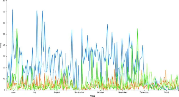
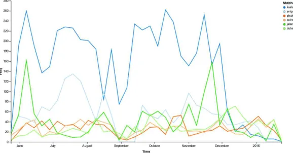
Figure

+6


Documents relatifs