Université de Montréal
Using Goal-driven Assistants for Software Visualization
par
Alassane Ndiaye
Département d’informatique et de recherche opérationnelle Faculté des arts et des sciences
Mémoire présenté à la Faculté des études supérieures en vue de l’obtention du grade de Maître ès sciences (M.Sc.)
en computer science
Novembre, 2016
c
RÉSUMÉ
Utiliser la visualization de logiciels pour accomplir certaines tâches comme la détection de défauts de design peut être fastidieux. Les utilisateurs doivent d’abord trouver et confi-gurer un outil de visualization qui est adéquat pour représenter les données à examiner. Souvent, ils sont forcés de naviguer à travers le logiciel manuellement pour accomplir leur tâche. Nous proposons une approche plus simple et efficace. Celle ci s’éloigne de la configuration d’un outil et la navigation manuelle d’un système et se concentre sur la définition écrite de la tâche à accomplir. Suite à cela, notre assistant génère le meilleur outil de visualization et guide les utilisateurs à travers la tâche.
Notre approche est constituée de trois éléments principaux, un langage dédié à la description de la tâche d’analyse. Un langage pour définir les visualizations comme des mises en oeuvre du patron modèle-vue-contrôleur. Et un processus de génération pour passer d’une tâche d’analyse à une visualization.
En enlevant le besoin de configurer un outil de visualization et en guidant la naviga-tion du système, nous pensons que nous avons fait un outil qui plus simple et rapide à utiliser que ses homologues.
ABSTRACT
Using software visualization to accomplish certain tasks such as design defect de-tection can prove tedious. Users first need to find and configure a visualization tool that is adequate for representing the data they want to examine. Then all too often, they are forced to manually navigate the software system in order to complete their task. What we propose is a simpler and more efficient approach that moves the emphasis from con-figuring a tool and manually navigating the system to writing a definition of the work we want to accomplish. Our goal-driven assistant then generates the best visualization tool and guide us through the navigation of the task.
Our approach consists of three main components. The first component is a domain-specific language (DSL) to describe analysis tasks. The second component is a language to define the visualizations as customized implementations of the model-view-controller (MVC) pattern. The last component is a generation process used to go from the analysis task to the visualization.
By removing the need to configure a visualization tool and guiding the navigation of the system, we believe we made a tool that is simpler and faster to use than its conven-tional counterparts.
CONTENTS
RÉSUMÉ . . . iv
ABSTRACT . . . v
CONTENTS . . . vi
LIST OF TABLES . . . viii
LIST OF FIGURES . . . ix LIST OF ABBREVIATIONS . . . x DEDICATION . . . xi ACKNOWLEDGMENTS . . . xii CHAPTER 1: INTRODUCTION . . . 1 1.1 Context . . . 1 1.2 Problem . . . 1
1.3 Objectives & Contributions . . . 2
1.4 Methodologies . . . 2
1.5 Thesis Structure . . . 3
CHAPTER 2: RELATED WORK . . . 4
2.1 State of the art . . . 4
2.1.1 Visualization tools without awareness of analysis tasks . . . 5
2.1.2 Visualization tools with awareness of analysis tasks . . . 7
2.1.3 Evaluating visualization tools . . . 9
2.1.4 Summary . . . 10
2.2 Terminology . . . 11
2.2.2 Bayesian network . . . 13
2.2.3 Software metrics . . . 14
2.2.4 Roassal and Mondrian . . . 15
CHAPTER 3: APPROACH . . . 18
3.1 Overview . . . 18
3.1.1 First approach: generating visualizations from a feature model using low level features . . . 18
3.1.2 Second approach: generating visualizations from a feature model using high level features . . . 20
3.1.3 Third approach: generation of a model, a view, and a controller 22 3.2 Analysis task . . . 22
3.2.1 Domain specific language . . . 22
3.2.2 Making an analysis task . . . 26
3.3 Visualization tool . . . 28
3.4 Generation process . . . 30
3.4.1 Processing the analysis task . . . 30
3.4.2 Cost function . . . 30
3.4.3 Visualization generation . . . 33
CHAPTER 4: CASE STUDY . . . 35
4.1 Setup . . . 35
4.2 Tooling . . . 36
4.3 Result . . . 40
CHAPTER 5: CONCLUSION AND FUTURE WORK . . . 44
5.1 Conclusion . . . 44
5.2 Future work . . . 45
LIST OF TABLES
LIST OF FIGURES
2.1 Feature Model Example (Source: Wikipedia) . . . 12
2.2 Bayes Network Example (Source: Wikipedia) . . . 12
2.3 Example of a probability function for the Grass wet random vari-able (Source: Wikipedia) . . . 13
2.4 Creating a shape using Roassal . . . 15
2.5 Visualization using Mondrian . . . 16
3.1 Roassal’s System Browser . . . 19
3.2 Feature Model: first iteration . . . 19
3.3 Feature Model: second iteration . . . 21
3.4 Overview . . . 23
3.5 Blob detection scenario by Karim Dhambri . . . 24
3.6 Domain specific language: Abstract syntax tree . . . 25
3.7 Blob detection task using our DSL . . . 26
3.8 Cost Function: Bayesian Network . . . 31
4.1 Analysis Task: Misplaced Classes Detection . . . 35
4.2 Analysis Task: Blob Detection . . . 36
4.3 Circle packing example . . . 37
4.4 CodeCity example . . . 38
4.5 Interaction elements . . . 38
4.6 Visualization using the distribution filter . . . 39
4.7 Visualization using the suggestion filter . . . 39
4.8 Analysis Task Result: Blob Detection . . . 41
LIST OF ABBREVIATIONS
MVC Model-View-Controller DSL Domain Specific Language
To my family To my friends To my colleagues
ACKNOWLEDGMENTS
I would like to thank the jury for taking the time to evaluate my research. I would also like to thank my research director, my co-director and all my colleagues at GEODES who helped me during my labor.
CHAPTER 1
INTRODUCTION
1.1 Context
Software visualization refers to displaying information about a system, its structure, execution, behavior and evolution, through 2D or 3D visual representations [8]. Infor-mation can be static, interactive or animated [8]. The displayed artifacts often involve various metrics related to the system, the source code [17], traces of code execution [11], software repositories which keep information about the system’s history [18], and testing data made available from testing suites [9].
Software visualization is used to better understand software systems, and help in their analysis and exploration. For example, software visualization can be used to visu-alize a software system’s complexity [5] and see how it has evolved through time [18]. Coupled with bug data, this can be used to understand the relation between the soft-ware’s complexity, and the number of bugs. Software visualization can also be used to display coupling between various software artifacts [8]. Exploration and analysis of that data can facilitate the search for software anomalies [7], thereby helping in software maintenance [7].
1.2 Problem
Software visualization is traditionally carried out by feeding a general purpose visu-alization with software-related data. For example, providing metrics to a visuvisu-alization tool, so that it may display them. To use the most elaborated features such as the ability to switch what metric is mapped to each attribute, additional fiddling with the tool is usually required. Adapting a visualization so that it represents a software system is not trivial because of the existing gap between the primitive elements (e.g. layout, graphical element properties) and the complex structure of software systems (e.g. classes, pack-ages, relations, metrics). Filling this gap is an operation manually carried out, which is
both error-prone and difficult to perform.
1.3 Objectives & Contributions
Our objective is to help software programmers solve software analysis tasks. To achieve that objective, we made a goal-driven assistant. In this context, "goal-driven" means that our assistant helps programmers by processing a series of goals (the analysis task) given as input. Our goal-driven assistant:
— shifts the focus from using a general purpose visualization and manual navigation of the system to writing a series of instructions representing a software engineer-ing task to perform.
— automatically generates the visualization tool.
— assists the software programmer in completing the task by generating different interaction elements.
As a consequence, we expect our visualizations to be simpler and faster to use.
1.4 Methodologies
Our approach consists of three main components: — a DSL to represent the different analysis tasks.
— a language to define the visualizations as customized implementations of the model-view-controller (MVC) pattern
— a generation process to translate the analysis task into a visualization.
This makes the generation of the visualization easier, gives us the possibility to solve a wide range of analysis tasks, and makes our approach extensible, giving us the pos-sibility to broaden the type of analysis tasks and visualizations that are available in the future.
1.5 Thesis Structure
The rest of the thesis is structured as follows. In section 2, we define all the notions needed to understand our work and discuss the related work. In section 3, we give an in-depth description of the approach we propose and the methodologies we used. In section 4, we show a case study of our approach. In the last section, we conclude this thesis by summarizing our work and by presenting the future work that could improve our visualization assistant.
CHAPTER 2
RELATED WORK
2.1 State of the art
Software visualization focuses on the graphical representation of software. Infor-mation is displayed in order to leverage the optical proficiencies of humans, and in the process, make understanding certain aspects of software easier. It is often the case that displaying a picture can summarily and effectively convey information that would oth-erwise take a lot of text to describe.
The need for software visualization arises from the demand for code maintainers to be able to quickly and clearly get information on the code they are working on. Software visualization facilitates finding certain patterns inside data, which can help data analysts do more informed decisions regarding the data. Software visualization also helps to understand the software behavior, to do maintenance tasks, to do debugging, and more.
This does not mean that any kind of visualization will do, however. Good visualiza-tions make it easier for users to analyze and reason about data by presenting complex data in a simple to digest manner. Depending on the type of task the engineer is taking and the information that is available, some visualization methods work better than oth-ers. For instance, in a situation where software developers need to gather information about a software run-time behavior, it makes more sense to use visualizations that show run-time information such as call graphs, as opposed to visualizations that only display static information. Because of those varying needs, visualization tools differ deeply, and tend to focus on completing specific type of tasks. Examples include tools that focus on visualizing different aspects of software such as its behaviour, its structure and evo-lution [8]. Other tools focus on analysing running programs [16]. Other tools focus on efficiently displaying information on a large amount of data, such as the web [22]. What we set to accomplish is create an all-encompassing tool that, when given any task, is able to make the right visualization in order to best relay the information required for the
task.
To achieve that goal, we first studied a few visualization tools, so that we could better understand some of the use cases that an all encompassing tool must tackle. Gaining that knowledge can help us better identify what sort of analysis tasks users want and show us how they expect the data to be presented in order to perform a good analysis.
2.1.1 Visualization tools without awareness of analysis tasks 2.1.1.1 Lowly configurable tools
The first category of tools we studied are the tools that do not offer many customiza-tion opcustomiza-tions. Those tools usually offer a simple interface and are meant to solve very specific type of tasks.
The first tools we studied was made by Voinea et al. [19]. They propose a method to parse software configuration managements systems in order to extract data on soft-ware evolution and visualize that data through a file-based visualization. The latter is a visualization where projects are represented as stripes on a time axis. A single stripe represents a file, and the segments inside the stripes are the different versions of the file, ordered chronologically. Segments are drawn in different colors in order to show vari-ous information. The goal of this visualization is to allow the users of the tool to see the evolution of the software and help understand it.
Another tool we studied is the tool created by Michele Lanza et al. [12]. This tool also tackles the question of understanding software evolution, however the method used is different. The visualization used is an evolution matrix; each column represents a dif-ferent version of the software and each row represents a class and its difdif-ferent versions. Columns are sorted by the version the class was created, and then by the class name, in order to help see the continuous development of existing classes and to put an emphasize whenever classes are added in newer versions. Each class is represented by a rectangle, with metrics being assigned to its width and height.
The tool by M. Termeer et al. [21] presents a method to do software visualization using a UML diagram. The program takes as input a UML diagram and a set of metrics
and outputs another UML diagram combining the information included in the input. This allows the tool to display different metrics based on the input.
The tool by Munzner et al. [14] presents a view of the web in a 3D Hyperbolic space. Visualization in a 3D hyperbolic space was chosen because of its suitability in representing the web. Visualizations can contain directed graphs with cycles, moreover, visualizations have mathematical properties that make representing exponentially grow-ing trees easier. This helps to display more information while reducgrow-ing visual clutter.
2.1.1.2 Highly configurable tools
The second category of tools we studied are tools that offer a lot of customization options. While those tools offer more degrees of freedom than tools with low configura-bility, and can potentially cover more type of tasks than them, the amount of tasks that they can accomplish are still limited.
One of those tools [1] is used to visualize software repositories in 3D using a service called White Coats. This tool is able to display elements using different views such as the Evolution Matrix [12], the authors views, which is used to see authors activity, and the file activity view, which as the name suggests, is used to visualize file activity. Other features include visualizing specific entities like folders or files, displaying other elements related to that entity based on a relation specified by the user, specifying what metrics are mapped to each visual attribute, history navigation, making search queries, and more.
Another of those tools [15] is used to visualize software structure. The tool models packages, classes and the dependencies between them. The arrangement of those ob-jects is governed by what they call visualization metaphors. Visualization metaphors are analogous to having different views. For instance, they offer an universal visualization metaphor where planets represent classes and solar systems represent packages. They also offer a terrestrial visualization metaphor where buildings represent classes and glass bubbles represent packages. It is the user’s responsibility to select which metaphor he wants to use. On top of visualization metaphors, the tool also provides a UI with input fields for navigation and search. It also provides a heads-up display that shows
able information about the selected objects. Finally, the tool also provides a method to generate 2D UML diagrams inside the 3D environment if 2D views are desired.
2.1.1.3 Synthesis
While useful, these tools have a few weaknesses.
For one, those tools are limited in the type of analysis tasks they can complete. Our wish is to make a tool that can help us accomplish any type of analysis.
Moreover, these tools make no effort to understand what type of task the user is trying to do. If the user wants the visualization to better answer the task he wants to accomplish, it is his responsibility to manually go through the options and find the one that best fits his needs. Instead of having to go through menus and such, we want to make a tool that understands what tasks are and is able to customize the visualization in accordance.
An option would be to take the idea of highly configurable tools to the extreme, and add enough customization to solve any type of task. We do not think that it is the right solution however. For one, we still have the problem of having to do the customization manually. Moreover, because of the various amount of tasks that are possible, the tool would get overloaded with options and would likely lose its simplicity and ease of use. Thus we come to the conclusion that making a tool that can understand analysis tasks is the right answer.
2.1.2 Visualization tools with awareness of analysis tasks
Closer to our work, research that incorporates the idea of expressing analysis tasks as a series of instructions the tool can understand also exists. Following are some of the inspirations we used in order to make a DSL that can represents software analysis tasks. In the paper by Alikacem et al. [2], a rule-based approach for defining and detecting design flaws in software is proposed. This approach is composed of 3 main compo-nents. The first component represents the source code that needs to be analyzed. The second component is used for extracting metrics from the first component. The last
component is the flaw detection tool. It is written as a set of rules, similar to instructions in a programming language with primitives likes "if", "else", and more. Once written, those rules are converted into Jess, a rule engine for the java platform in order to make inference on whether the artifacts contain flaws or not.
Another approach by Naouel [13] presents a tool for detecting code and design smells. The tools uses DECOR, a method that defines what code and design smells are, and also defines the required steps in order to detect them. After specifying code and design smells at a high-level using the DECOR DSL, the analysis task is instanti-ated. Elements are automatically classified as smells or not using hints like the metrics (number of methods, number of parameters, etc...), lexical properties (method names, class names, etc...), and structural properties (global variables, polymorphism, etc...).
2.1.2.1 Synthesis
While these tools are able to understand analysis tasks, they are fully automated except for the composition of that task. Even though the users’ expertise is leveraged by making them write the task, we think these tools could further interact with the user in order to improve the quality of the analysis. Once the visualization is generated, the tool could provide further assistance. For instance, if the task requires the user to find patterns, the tool could assist the user by listing all objects that respect the pattern. Then, it could help the user iterate through them so he can decide for himself whether those objects follow the pattern or are false positives.
Moreover, these tools do not use the information gathered from the analysis task in order to generate the visualizations. Instead of switching between different view by selecting different options provided by the tool UI, like for the highly configurable tools mentioned above, we want to make a tool that understands the task and directly generates an adequate visualization for it.
2.1.3 Evaluating visualization tools
In order to generate a good visualization though, we need a method to evaluate the quality of a visualization. Following is research that studies taxonomies for visualiza-tions.
In the work by Amar et al. [3], we find the definition of 10 low level analysis op-erations that can be combined to form analysis tasks. The opop-erations were gathered by observing what activities users did when using visualization tools. Operations include retrieving values, sorting, determining ranges, and more. Visualization tools are evalu-ated based on whether they implement those operations or not.
In the work by Shneiderman [20], we find an approach to evaluate visualizations using data types and tasks. Data types represent the search domain on which the task is being run. For instance, if the analysis task requires the user to search through a 2D map, the data type is classified to be two-dimensional. If the analysis task requires the user to traverse a graph, the data type is classified to be a network. Shneiderman defines many such data types, including one-dimensional, multi-dimentional, trees and more. Tasks are similar to the operations defined in the work by Amar [3] mentioned above. However, tasks represent higher level actions than those operations. Tasks include seeing an overview of the system, displaying details about an object, zooming in, filtering, and more. Shneiderman proposes a taxonomy that assigns a cost to each task depending on the data type of the analysis task.
2.1.3.1 Synthesis
We saw two different approaches for evaluating visualization tools. The approach by Amar focuses on the implementation of visualization operations while the approach by Shneiderman assigns costs to tasks depending on the search domain of the analysis task. Our approach borrows the idea of assigning costs depending on the search domain and it does not assign costs to primitive operations. Our reason is that the presence of those operations is an implementation decision, and our philosophy is that visualization operations should all be implemented during the generation of the visualization, thus we
do not need to assign costs to them.
2.1.4 Summary
All in all, we studied different types of visualization tools. The first series of tools we looked at are those without awareness of analysis tasks. In that category, we fur-ther looked at lowly configurable tools and highly configurable tools. We came to the conclusion that the pool of tasks these tools were capable of completing were limited. While highly configurable tools had an edge over the lowly configurable ones in that as-pect, they still did not satisfy our goal of making an assistant that could help us with any kind of analysis task. Moreover, since these tools had no mechanisms for understanding analysis tasks, the option of customizing the visualization tool based on the analysis task was not available.
Following that, we looked at visualization tools that had awareness of analysis tasks. Although these tools understand analysis tasks, none of the tools tries to customize the visualization by using information collected from the analysis task. Moreover, interac-tion with the user is kept to a minimum. By interacting with the user more actively, we could improve the quality of the analysis by using the user’s expertise.
Finally, we looked at taxonomies for visualization tools. We saw one approach that focused on assigning costs to primitive operations and another approach that focuses on assigning costs to tasks depending on the search domain of the analysis task. Primitive operations should not have costs since our visualization tools are generated, therefore, we should make sure operations are implemented. On the other hand, the search domain determines how hard it will be for the user to find information, therefore that information should be included in the cost function.
Synthesising all that data, what we propose is a tool that processes analysis tasks, similarly to the visualization tools with awareness of analysis tasks [2, 13]. We then generate visualizations from the processed information, using the search domain as one of the evaluation criterion.
2.2 Terminology
As mentioned previously, we want to make a tool that generates visualizations from analysis tasks. What follows are the definitions of some concepts we needed in order to achieve that goal.
2.2.1 Feature model
In order to generate visualizations from analysis tasks, we need a method to reliably generate visualization tools. To achieve that end, we explored the idea of expressing visualization tools as instances of feature models.
Feature models [10] are compact representations of all the products in a family of related programs in term of features and constraints related to those features. Features are singular units of the program functionality. Feature models can be used to generate programs. Those programs are a combination of the features available which follow all the constraints imposed by the feature model. A feature configuration is a set of features defining a program, in other words, a program has a feature if it is written in its configuration. A feature configuration is valid if all the constraints imposed by the feature model are respected.
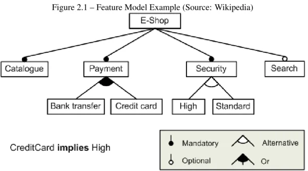
Feature models visual representations are called feature diagrams. Feature diagrams are hierarchical trees where each node represents one available feature in the family of products. Those nodes are linked by edges which represent the different constraints im-posed on the product. The possible relation between a parent and its child are mandatory, which means that if we want to use the parent feature, the child feature is required. The second relation is optional, which means the child is not necessary in order to use the parent feature. The third relation is or, which means that at least one of the children must be available in order for the configuration to be valid. The fourth relation is alternative which means that exactly one of the children must be available in order for the configu-ration to be valid. Besides the parent-children constraints, there also exist cross-diagram constraints which are A requires B, which means that in order for the feature A to be available, the feature B must also be available; and A excludes B, which means that in
Figure 2.1 – Feature Model Example (Source: Wikipedia)
order for the feature A to be available, we cannot have the feature B. Other features and relations exist, but our research is limited to this subset.
A feature diagram is displayed in Figure 2.1. The diagram represents an online E-Shop and the different features available for it. As one can see, the E-E-Shop must include a catalog, include at least one payment method, implement one of the two available security measures, and optionally can include a search feature.
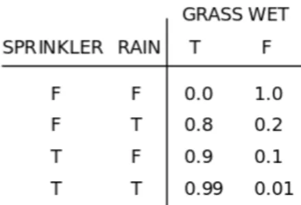
Figure 2.2 – Bayes Network Example (Source: Wikipedia)
2.2.2 Bayesian network
In order to find which visualization to generate, we need a way to compare different visualization candidates. The visual cost of each candidate is theorized to be composed of intermediate costs such as a cost related to the mapping of the visual attributes, and a cost related to the complexity to switch between different views of the visualization. One of the approach we tried to model these costs was Bayesian networks, which allow modeling functions composed of smaller, interconnected components.
Bayesian networks (Figure 2.2) are probabilistic graphical models that represent random variables and their conditional dependencies through a directed acyclic graph (edges are ordered and there are no cycles). Each node represents a random variable, and each edge is a conditional dependency. Nodes that are not connected are condition-ally independent. Each node has a probability function (Figure 2.3) which takes as input the value of its parents and outputs the probability of each of its values.
Two events X ≤ x and Y ≤ y are conditionally independent given Z ≤ z if, given Z ≤ z, knowing whether or not X ≤ x occurs does not affect the probability of Y ≤ y and knowing whether or not Y ≤ y occurs does not affect the probability of X ≤ x. Mathematically speaking, this means that Pr( X ≤ x | Z ≤ z ) = Pr( X ≤ x | Z ≤ z, Y ≤ y ) and Pr( Y ≤ y | Z ≤ z ) = Pr( Y ≤ y | Z ≤ z, X ≤ x ) where Pr(X ≤ x) is the probability of the event X ≤ x.
Figure 2.3 – Example of a probability function for the Grass wet random variable (Source: Wikipedia)
2.2.3 Software metrics
Our tool is used to solve analysis tasks on source code. This naturally led us to use different software metrics. Software metrics are quantities, representing software properties that are computed using a standard method.
We chose software metrics [6] that would help us gauge the objects’ complexity, their cohesion, and give information about their inheritance. This allowed us to extract a lot of information such as the quality of the implementation of these objects, the likelihood software maintainers will be able to understand them, the likelihood that those objects need refactoring, and more.
What follows are the definitions of the software metrics we used as example in our tasks. These metrics assume that the source code we are working on is object-oriented.
2.2.3.1 Depth of Inheritance
The Depth of Inheritance (DIT) of a class is the maximum length from a node rep-resenting the class to the root class on an inheritance tree. Higher DIT usually mean a higher number of inherited classes, methods and more complex design, which means the class behavior will be harder to predict and errors are more likely. On the other hand, higher DIT can mean more code reuse, due to the higher number of inherited methods and classes.
2.2.3.2 Weighted Methods per Class
The Weighted Methods per Class (WMC) is the sum of the complexities of each method for a class. Many methods exist for computing a method’s complexity such as McCabe’s Cyclomatic Complexity, the number of lines in the methods, or using the value 1 for the complexity of each method (the WMC is the number of methods in a class in this case). WMC is good at representing the complexity of a class and how hard its upkeep will be. A high WMC means the class is complex, therefore it will be hard to maintain. Refactoring into smaller classes should be considered in such cases.
2.2.3.3 Lack of Cohesion in Methods
Lack of Cohesion in Methods (LCOM) metric is used to measure how well the meth-ods inside a class relate to each other. Methmeth-ods are said to relate to each other when they work on the same class level variables. Methods are unrelated if they work on different sets of variables or work on variables defined outside their owner class.
LCOM computes the number of connected components inside a method. A low LCOM means the methods are related (cohesive), which means the methods inside a class are used to fulfill a common function. A high LCOM means the methods are not related (non-cohesive), which makes it likely a class performs many functions. Classes with high LCOM are more complex, thus more likely to contain bugs. Moreover, they can potentially be refactored into smallers classes.
2.2.4 Roassal and Mondrian
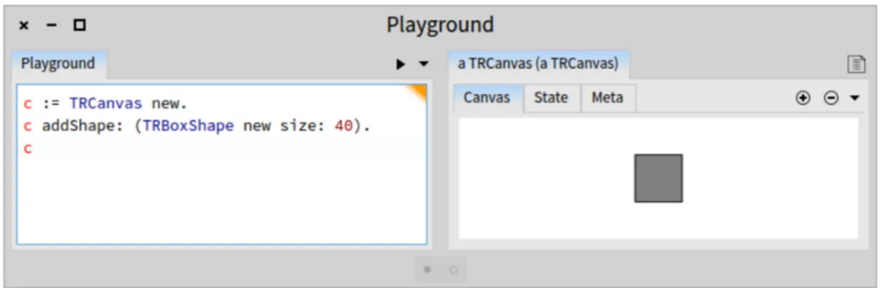
Roassal [4] is a visualization engine written in the Pharo programming language. Roassal is used to interact with arbitrary data defined in terms of objects and their re-lationships, like software. Roassal’s APIs allows us to build visualizations like graphs, timelines, geographical maps, and more. One of those APIs is Mondrian, a domain-specific language that enables scripting visualizations, and is tailored for visualizing source code. The software artifacts are represented with a graph. Visualizations can
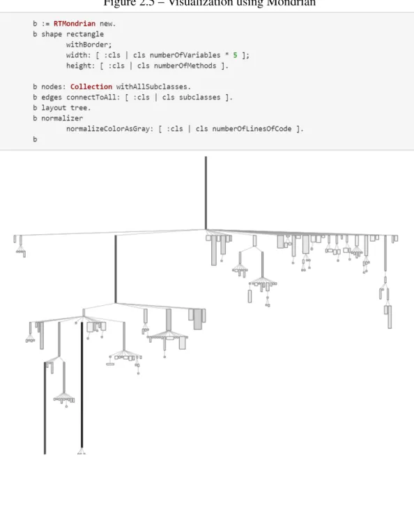
Figure 2.5 – Visualization using Mondrian
be customized to display nodes using different shapes and colors, display graphs using different layouts like a tree or a grid, nest views insides nodes, and handle several input events in order to allow further interactions with the visualizations.
Figure 2.4 shows an example of Roassal being used in order to make a basic shape and specify its size. The user first instantiates the canvas that contains the basic shape. The user then adds the shape to the canvas using the basic shape constructor and gives the size of the shape as a parameter. The user then calls the canvas in order to display the result.
Figure 2.5 shows an example of Mondrian being used to make a graph representing a class hierarchy. The user first instantiates a new Mondrian object. The user then specifies all parameters of the graph such as the shape of the nodes, what metrics are used for the width and length of the nodes, how the edges are connected, etc. The user then calls the Mondrian object, which prompts it to call upon Roassal primitive operations and display the result.
CHAPTER 3
APPROACH
3.1 Overview
Our research consists of the definition of a DSL representing a software analysis task, and the generation of a visualization tool that helps us accomplish that task. In order to accomplish this goal, we tried three different approaches, revisiting the concepts during each iteration so that we better fulfill our objectives. In the first two approaches, we tried modeling a visualization engine into a feature model that would be used to generate visualization tools. The distinction between the two approaches is that the second one makes it easier to extract the visualization cost from the model and is more interesting from a generation perspective. In the end, the solution we went with is our last approach. In this approach, we made our own tool that takes an analysis task as input and generates a visualization based on it. Following are the details for each approach, the lessons we learned from each of them, and how we moved from there.
3.1.1 First approach: generating visualizations from a feature model using low level features
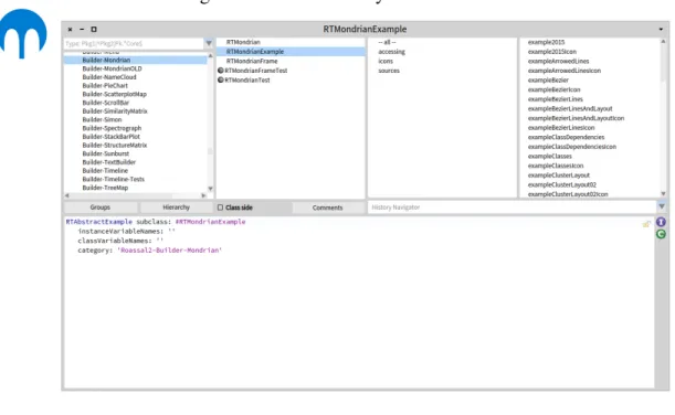
In order to model Mondrian into a feature model, we first had to inspect it and find its features. In order to do that, we used the Roassal system browser (Figure 3.1), read the documentation, and used the examples Mondrian provided.
During the first iteration of the feature model, the features we used were directly ex-tracted from the operations Mondrian provided. For instance, the shape, and the layout are parameters that are directly controllable from Mondrian, thus we used them as fea-tures. The feature model is displayed on Figure 3.2. The features are changing the shape, changing the layout, and nesting visualizations. However, the way the model was repre-sented made it hard for us to do useful generations and extract the information we needed in order to determine the cognitive cost of a visualization. For instance, while we could
Figure 3.1 – Roassal’s System Browser
choose between many layouts and shapes, those did not tell us much regarding cogni-tive cost for someone using the visualization. Information like the domain on which the objects are defined or the presence of nested elements is more important. Moreover, by using such low level features, it was hard to determine whether high level features like a sorting feature or a filtering feature were present except by using many constraints. For instance, some layouts may or may not support the sorting feature, which means that for each layout that does not support sorting elements, we would have to add a constraint.
Our mistake was trying to model Mondrian using the parameters it provided as the features. Those parameters are meant to help users have easy access to the visualization primitives. From a generation standpoint, those are not interesting things to microman-age. In a model that is used to provide generations and from which we wish to extract visualization costs, it is more interesting to have control over higher level features like access to sorting tools or filtering tools, and controlling the domain on which objects are defined, than to have control over things like shapes or layouts.
Thus, for the second iteration of our feature model, the goal is to look for higher level features that are interesting to control from a generation perspective and that make it easier to derive cognitive costs.
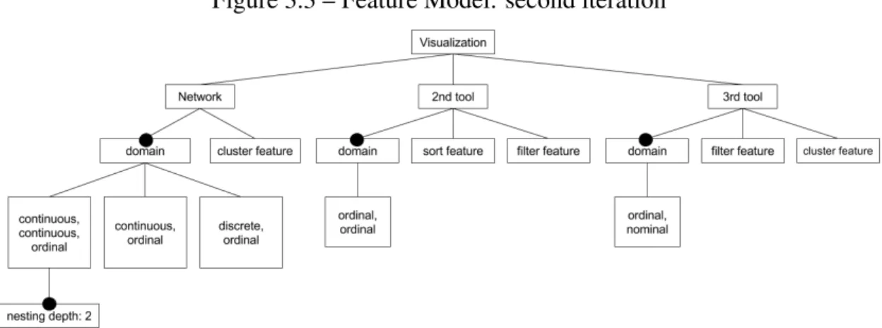
3.1.2 Second approach: generating visualizations from a feature model using high level features
Our second feature model is visible on Figure 3.3. Starting from the root, we specify the Roassal libraries that are available. Those are a network that represents Mondrian, and a hypothetical second and third tool. For each of those libraries, we specify the features that are accessible. For instance, the network library (Mondrian) has a cluster-ing feature, and the 2nd library has a sortcluster-ing and filtercluster-ing feature. We also specify the domain of each shape that the library provides. For instance, the network provides three different shapes to represent objects. One of those shapes is a rectangular shape that al-lows mapping to the width, length, and color of the object. This translates to the domain [continuous, continuous, ordinal] on the feature model. This means that two metrics can be mapped on a continuous domain, and another one can be mapped on an ordinal
Figure 3.3 – Feature Model: second iteration
domain. Furthermore, it is possible to nest elements inside those rectangles, which is translated in the feature model by the node with the label "nesting depth: 2".
The idea was to take an analysis task as input, and use it as a guideline to generate the right tool from the feature model. We would first extract what features we want from our analysis task such as the domain on which the metrics are mapped, and what features are required. Using those, we would randomly generate each possible instance of the feature model, and compute the cognitive cost associated with each instance. Once done, we would output the instance that has the lowest cost. The first step was making sure that this processs worked when the only Roassal library we used was Mondrian. Following that, we would expand the idea to other Roassal libraries, giving us the ability to generate visualizations besides networks.
Unfortunately, a problem came up. Implementations of some of the libraries came in conflict with what we wanted to do in our visualization. For example, when using Mondrian, it is possible to represent objects as circles, rectangles, and labels. While it is possible to assign a metric to the size of rectangles and circles, it is not possible to do the same with labels. Moreover, when using nested views, it is not possible to add labels to elements that are nested and it is not possible to have more than one metric being used to determine the size of elements. This means we can use circles and squares as shapes for nested elements. However, we cannot use rectangles (assigning different values to the
width and the height is not permitted by the tool). We initially thought we could translate those rules as constraints, however, those constraints became related to implementation decisions instead of conceptual constraints.
The problem was our attempt to make a tool flexible enough to accommodate any type of analysis task while using libraries that did not have that sort of objective in mind. This naturally led to setbacks and inconsistencies related to implementation decisions.
In order to avoid the pitfalls related to code implementation, we tried another ap-proach where we developed the tool ourselves. Our goal is to make a tool that is able to generate different types of visualizations, while consistently providing the same features for each of the visualization possible.
3.1.3 Third approach: generation of a model, a view, and a controller
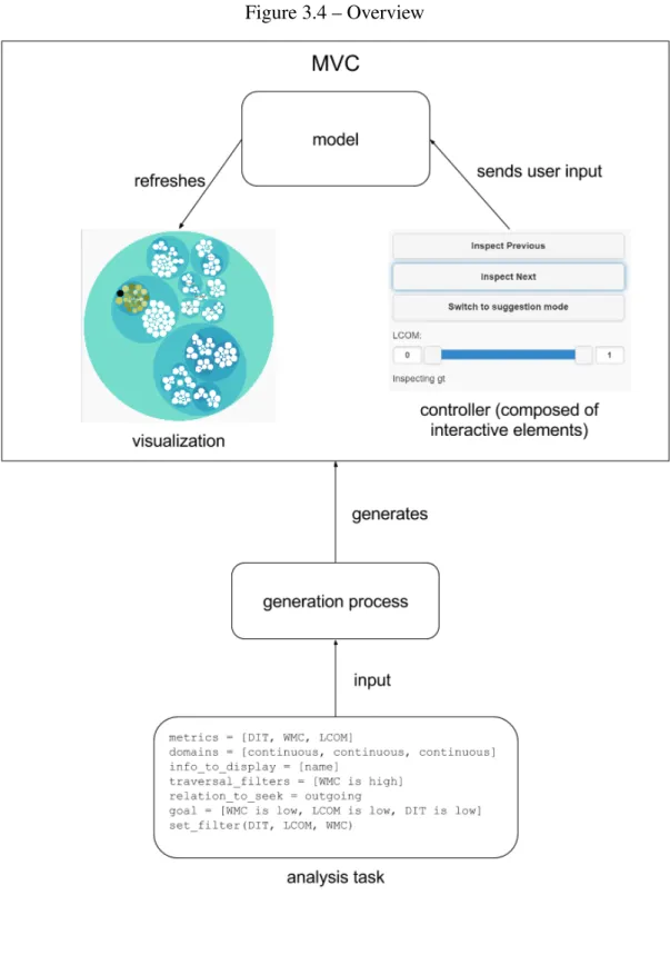
Our last solution is visible on Figure 3.4. Our approach consists of 3 main compo-nents, the analysis task which describes the task we want to accomplish, the generation process which is the method used to get a visualization from a code analysis task, and the generated visualization tool. The first thing we do is write the analysis task describing the task we want to accomplish. Once completed, we generate the right visualization tool using our generation process. The visualization is made using the MVC design pat-tern. This means that we populate the model with the right variables, generate the best controller and select the view that fits the best for the task at hand. Each of these topics is explained in greater details in the rest of this section.
3.2 Analysis task
3.2.1 Domain specific language
Our DSL is inspired by the work of Dhambri [7]. His research presents a semi-automatic method of detecting software anomalies such as the blob, the misplaced class, and the shotgun surgery. In order to reduce the search space for the detection, the ap-proach he uses consists in modelling design anomaly detection strategies as scenarios of interactive visualizations as seen on Figure 3.5. Then, he assigns to each class in
Figure 3.5 – Blob detection scenario by Karim Dhambri
an anomaly description the status of a primary or a secondary role. Finally, the proper detection consists first in identifying, in a given program, the classes that fit the primary role, and then going from there, he tries to identify the classes that fit the secondary roles. Effectively, this is a pattern recognition strategy, which is useful in many domains such as data mining, deep learning, clustering, and of course anomaly detection. Although, we also focus on detecting software anomalies, and do not explore other domains like data mining, we believe anomaly detection is broad and interesting enough for the first iteration of our assistant. In the future, it would be interesting to see how well we can use our tool for other types of pattern recognition tasks.
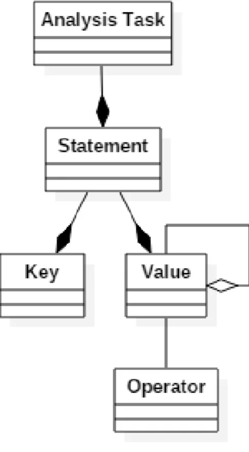
3.2.1.1 Abstract syntax
The abstract syntax of our DSL is shown on Figure 3.6. Analysis tasks are composed of statements. Those statements are themselves composed of a key and a value. Values range from things like metrics, metadata, description of domains and more. Moreover, values can be aggregated into lists. Operations can be applied on values. Examples of operations are low, and high. Further details are given in the concrete syntax section.
3.2.1.2 Concrete syntax
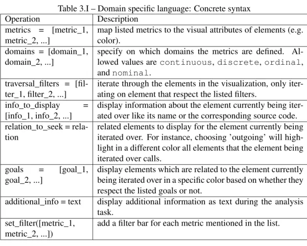
Our DSL’s concrete syntax is displayed on Table 3.I.
Our DSL can express the full range of analysis tasks presented in Dhambri’s work. As explained earlier, his work presents a method of detecting software anomalies using scenarios where classes can play one of two roles. The primary role is translated in our DSL with the traversal_filters operation which emulates iterating over all the primary el-ements. The secondary role is translated with the relation_to_seek and goals operations which allow us to respectively display all classes that are candidates for the secondary role, and identify which of the candidates actually fulfill the secondary role. This will allow us to leverage all the scenarios Karim Dhambri created for finding software anoma-lies, translate them and use them for our own analysis tasks. Moreover, our DSL is more compact, which is beneficial for processing the analysis task since removing verbose and ambiguous elements makes the task easier.
3.2.2 Making an analysis task
An example of an analysis task implementing the blob detection strategy using our DSL is displayed on Figure 3.7. The blob is a design anomaly where one class handles most of the logic of the program, and the other classes are mainly used to store data. In practice, what it entails is the presence of a huge and complex class called the controller interacting with many smaller classes called the data classes. To solve that task, we first
Figure 3.7 – Blob detection task using our DSL metrics = [WMC, LCOM]
domains = [continuous, discrete] info_to_display = [name]
traversal_filters = [WMC is high] relation_to_seek = outgoing goal = [LCOM is high] set_filter(LCOM)
Table 3.I – Domain specific language: Concrete syntax
Operation Description
metrics = [metric_1, metric_2, ...]
map listed metrics to the visual attributes of elements (e.g. color).
domains = [domain_1, domain_2, ...]
specify on which domains the metrics are defined. Al-lowed values are continuous, discrete, ordinal, and nominal.
traversal_filters = [fil-ter_1, filter_2, ...]
iterate through the elements in the visualization, only iter-ating on element that respect the listed filters.
info_to_display = [info_1, info_2, ...]
display information about the element currently being iter-ated over like its name or the corresponding source code. relation_to_seek =
rela-tion
related elements to display for the element currently being iterated over. For instance, choosing ’outgoing’ will high-light in a different color all elements that the element being iterated over calls.
goals = [goal_1, goal_2, ...]
display elements which are related to the element currently being iterated over in a specific color based on whether they respect the listed goals or not.
additional_info = text display additional information as text during the analysis task.
set_filter([metric_1, metric_2, ...])
add a filter bar for each metric mentioned in the list.
define what would be good metrics that can characterize the classes playing the roles of controller or data classes. In order to determine whether a class is a controller candidate, we look at the value of the WMC. As explained previously, the WMC is the sum of the complexities of each method inside a class. Therefore, a high WMC means that a class is complex. The controller class handles most of the logic inside a program, on top of interacting with many other data classes. Therefore, it is safe to assume that those classes are complex, which means they have a high value for their WMC. In order to determine if a class is a data class, we look at the value of the WMC, the LCOM, and the DIT. LCOM is used to compute how un-cohesive a class is, which means that classes with high cohesion have a low LCOM. DIT is used to determine how deep in the inheritance tree a class is. This means that classes with low DIT are not part of long chains of inheritance. Data classes are used for the sole purpose of storing data for the controller
class, which means they have high cohesion, which translates to a low LCOM. It also means they are quite simple classes, which suggests they have simple inheritance trees, which translates to a low DIT.
Now, that we know what info we want to extract, what remains is to translate those instructions into operations using our DSL. We first search for all classes we suspect to be controller classes. In the code analysis task, this translates to the command traversal_filters = [WMC is high], which means traversing all classes which have a high WMC (complex classes). Then, for each controller class candidate, we look at the classes they interact with and confirm whether those are data classes or not. In our analysis task, this translates to relation_to_seek = outgoing; goal = [WMC is low, LCOM is low, DIT is low]. This means, that for each controller class we iterate over, we highlight all other classes they call. For each of those classes, we put a special mark on those that respect the conditions listed in the goal which are having a low WMC, LCOM, and DIT. We also added the operation set_filter(DIT, LCOM, WMC)(add a filter for each one that is listed); in case the user wanted to fine tune his research further.
3.3 Visualization tool
The generated visualization tool is based on the Model–view–controller (MVC). The MVC is a pattern that is used for implementing user interfaces. There are three compo-nents that define the MVC. Those are the model, the view and the controller. The con-troller communicates user input to the model. The model stores and manages the data, controls the flow and logic of the operations, and refreshes the view. The view displays the information sent by the model.
In our implementation, the controller is an aggregation of interaction elements (but-tons, filters and panels to display information) that are generated based on the analysis task.
The data is stored inside the model. In order to display that data, the model transfers its information to the view. The view then refreshes the user interface. We made 2
plementations of the view, called visualization plugins. One of the plugins is a 3D view called the CodeCity [23] and the other plugin is a 2D hierarchical view implementing a circle packing algorithm. The visualization plugin is chosen based on which one is the most suitable for the analysis task. Plugins are written with HTML and Javascript, granting them portability. Further details about them are given in the tooling section.
There are several advantages to using the MVC.
— The internal representation of the data and the way the data is presented to the user are separated. This allows us to have several views representing the same underlying data.
— We can modify the controller, and its interaction elements without having to mod-ify how the data is structured inside the model. This means the selection of the interactive elements (menus, buttons, etc) is solely dependent on the code anal-ysis task. This makes it possible to implement a dynamic controller where the interaction elements are chosen based on how well they fit with the code analysis task.
— By separating the controller, the model and the view, we make it easier to add new interaction items to the controller that will be supported by all the views. That is possible because interaction elements only interact with the model, which in turn interacts with the different views. Similarly, this makes it easier to add new views without having to worry about the different interaction elements since views only interact with the model, which in turn communicates with all the interactive elements.
All in all, this approach is modular; plugins focus on rendering the data given to them by the model, the model handles the data based on the user input and the controller focuses on sending user input. This makes implementing additional navigation methods and views easier, greatly improving our program’s extensibility. Moreover, the separa-tion of the components makes it easier for specialized developers to contribute to this project. For instance, UI developers could focus on extending the visualization plugins while software analyzers could provide better analysis tasks. With additional work, our assistant could generate solutions encompassing an even larger variety of scenarios.
3.4 Generation process
As mentioned earlier, our view is selected from a pool of visualization plugins, and the controller is composed of interactive elements that are generated based on the anal-ysis task. Moreover, the model needs to be populated with task data in order to do the task properly. The generation process is the component that does the generation of the artifacts in all three cases.
3.4.1 Processing the analysis task
To start the generation process, we must first write a code analysis task. Plain text editors and such can be used. The text file is then processed, making an analysis task object usable by our generating tool.
The first thing the generation process does is fetch the data that will be analysed. It then transforms that data into objects so they can be readily handed to the model once it is generated. The process then parses the analysis task to get the traversal_filters, relation_to_seek, the goal and such in order to respectively find all the nodes that need to be traversed, make a map for each node to its related elements, and compute a list of the nodes which satisfy the goals. That information is then stored, to be handed later to the model.
3.4.2 Cost function
In order to generate a visualization, we first need to define a cost function that will allow us to compare different visualization options and select the best one. Two different approaches were used for computing the cost.
3.4.2.1 Bayesian Network
The first approach used Bayesian networks. In order to use it to compute cost func-tions, we first need to learn the parameters of the network. More precisely, we need to learn the joint distribution of the random variables.
Figure 3.8 – Cost Function: Bayesian Network
When learning Bayesian networks, there are four main cases that can occur, and each of those requires a different method for learning. The graph can either be known or not and the learning data is either complete or not, where complete means that for each data input, all the random variables are observed. In the case one or more of the random variables are missing, which happens if collecting the data is complex for instance, then the data is incomplete. For our approach, we made a graph representing the network, and we assume the data is complete. In this case, parameter estimation is the widely used method for learning the network. There are two main variants for estimating the parameters of the network when using parameter estimation. The first approach is using the maximum likelihood estimation, a method that tries to maximize the likelihood of the data. In other words, we try to find the parameters P that, when given as evidence, maximize the probability for our data to occur. The second method is the maximum a posteriori estimation, a method that tries to maximize the posterior definition, which is similar to maximizing the likelihood, part of its computation even requires knowing the likelihood. However, unlike maximizing the likelihood, we try to find the parameters P that maximize the probability for P to occur given the data as evidence.
As seen on Figure 3.8, our graph is defined with five random variables. The first one is the data mapping cost, which represents the likelihood that the mapping cost will be high. As you can guess, the more the mapping between visual attributes and metrics is bad, the higher the probability that the cost is high. The second random variable is
the nesting cost, which represents the likelihood that the nesting cost will be high. This variable becomes relevant when we have visualizations where elements can be contained inside other elements. The more cluttered the container is, the higher the probability that the nesting cost is high. The third random variable is the switching cost, which represents the likelihood that the switching cost will be high. The more the visualization task requires us to switch between different views, the higher the probability that the switching cost is high. The fourth random variable is the multiview cost. This variable tries to capture how hard it is for the user to work with elements of different magnitudes, like elements belonging to different views or elements contained within one another. This variable depends on the nesting cost and switching cost random variables, the higher the probability of the nesting and switching cost, the higher the probability that the multiview cost is high. The final random variable is the cognitive cost. This variable tries to capture how hard it is for the user to extract information from the visualization. This variable is dependent on the multiview cost and the data mapping cost random variables. The higher the probability of the multiview and data mapping costs, the higher the probability that the cognitive cost is high.
The goal of making that network was to train it using parameter estimation and com-pute the cognitive cost given the data mapping cost, the nesting cost, and the switching cost . While this value is a probability, it can also be interpreted as a cost in the interval [0, 1] representing how likely it is that the cognitive cost is high given the other vari-ables. Some problems arose however. For one, we had few plugins available, moreover, the lack of data meant we had to generate it ourselves. This was not ideal since it made it possible for us to manually learn the parameters for the network and still get satisfactory results, suggesting the complex structure was not needed to solve the problem. There-fore we tried working with a cost function which used a more intuitive algorithm and was more explicit about what it was computing.
3.4.2.2 Simple variable cost function
What we tried was re-purposing the mapping cost as the actual cost function. Let num_metrics be the number of metrics we need to map, and num_vis_attributes be the
number of available visual attributes. Our algorithm first tries to map each metric to a visual attribute which has the same domain. Let X be the set that contains every metric that does not have such a mapping and size(X) be the size of that set. If there are visual attributes remaining, we then try to map the metrics to attributes whose domain is a su-perset. For instance, if a metric is defined on the ordinal domain, it can either be mapped to a visual attribute defined on a continuous or discrete domain, but not to a visual at-tribute defined on a nominal domain. Let Y be the set containing all metrics which still do not have a mapping, and size(Y) is the size of that set. Let vis_attributes_left be the number of visual attributes that still do not have a mapping. The cost is then
a×size(X)+b×size(Y )+c×vis_attributes_le f t
a×num_metrics+b×num_metrics+c×num_vis_attributes, however, we have to make sure that b>a
since the cost of an unmapped metric should be higher than the cost of a metric that is mapped to a visual attribute that is not ideal for it. a × size(X ) + b × size(Y ) represents how good our mapping is. The more metrics are left unmapped, the higher this number. c× vis_attributes_le f t is added to give a penalty if some of the visual attributes are not used after the mapping. The denominator a × size(W ) + b × size(W ) is the value we get in the worst case, which means that no metrics were mapped at all. The value is used to normalize the cost between [0, 1].
3.4.3 Visualization generation
With knowledge of the cost function, we can now do the generation of the visual-ization. To achieve that objective, the generation process iterates over each plugin and computes its cost in order to find the best one. For instance, given an analysis task that requires the mapping of two metrics with continuous domains, the generation process first extracts the metric and domain information from the analysis task. This information is directly available by looking at the metrics and domains operations respectively. Once extracted, the generation process calls the cost function in order to find which of the visualization plugins has the lowest cost. The cost function scores plugins based on how fitting the mapping between visual attributes and metrics is, with the lower cost being the better option. For instance, because our analysis task requires the mapping of two metrics with continuous domains, our cost function would give a lower cost to
a plugin that allows mapping to the size and color of an element than to a plugin that maps elements to the size and shape of elements since the size and color of an element can effectively translate disparities between continuous values, unlike the shape of an element which has a finite number of distinct values.
The next step consists in the generation of the selected visualization tool. Firstly, the generating process populates the model with all the data that was collected previously. It then generates artifacts for the visualization tool and the controller. More precisely, it generates the info to display for the info_to_display and additional_info operations. It also generates all filters specified in the set_filter operation. It also generates all the buttons to properly traverse the elements specified by the operation traversal_filters. Finally, the generation process generates the visualization tool selected by our cost function. If required by the extension, the generation process also populates the model with environment variables required by the extension in order to work correctly.
This concludes what the generating process does. All that remains is to load the visualization in order to start the analysis task.
CHAPTER 4
CASE STUDY
4.1 Setup
To show our results, we will run 2 different analysis tasks. The first one (Figure 4.1) is an example analysis task for detecting misplaced classes, the second one (Figure 4.2) is an example for detecting blobs. In both cases, we study the code source of Flare, an ActionScript library for making visualizations in Adobe Flash Player.
Misplaced classes are classes that were put in packages in which they do not fit. This causes a lack of interactions with the classes that belong to the same package and an overabundance of interactions with the classes that belong to other packages. If a class is moderately complex, but shows a lack of interactions with its siblings, then it is possible that this class is misplaced. On our analysis task (Figure 4.1), we fo-cus on the WMC and LCOM. As mentioned before, WMC is good for measuring a class’s complexity. Moreover, LCOM is good for measuring how well classes inside the same package relate to each other. The fact we are looking for complex classes translates to iterating over the classes with a high WMC. The fact we are looking for classes that do not interact with their siblings is translated in the analysis task with the operations relation_to_seek = outgoing and goal = [LCOM is high]
Figure 4.1 – Analysis Task: Misplaced Classes Detection metrics = [WMC, LCOM]
domains = [continuous, discrete] info_to_display = [name]
traversal_filters = [WMC is high] relation_to_seek = outgoing goal = [LCOM is high] set_filter(LCOM)
Figure 4.2 – Analysis Task: Blob Detection metrics = [DIT, WMC, LCOM]
domains = [discrete, continuous, discrete]
info_to_display = [name]
traversal_filters = [WMC is high] relation_to_seek = outgoing
goal = [WMC is low, LCOM is low, DIT is low]
set_filter(DIT, LCOM, WMC)
which means that for each class we iterate over, we look at all the classes they call and check whether those have a high LCOM. If a class has a lot of siblings with a high LCOM, and has a high LCOM itself, it is likely that class is misplaced.
Blobs are a design mistake where one class handles most of the logic of the program, the controller class, while the other classes are used to store data, the data classes. To find those blobs, we first look for the controller classes, which have a high complexity, meaning they have a high WMC. Once found, we check whether those classes call data classes, which are simple classes with high cohesion, which translates to a low DIT, low WMC, and a low LCOM. If a class is both complex and interacts with many data classes, it is likely that the class is a blob.
4.2 Tooling
In order to use our tool, we must first write an analysis task. We can write analysis tasks using any regular text editor. Once written, we run our tool with the path to the analysis task as argument. This generates HTML and Javascript files containing the visualization. Visualizations use one of two plugins, those are the 2D circle packing algorithm (Figure 4.3) and the 3D implementation of the CodeCity (Figure 4.4).
The CodeCity is an environment specifically made for software analysis. In that en-vironment, classes are represented as tall rectangular boxes, packages are flat rectangular
Figure 4.4 – CodeCity example
Figure 4.5 – Interaction elements
Figure 4.6 – Visualization using the distribution filter
boxes on top of which the classes that belong to the package are fixed. That environment is made in a layout that is reminiscent of cities with the classes looking like buildings, and the packages looking like the neighbourhoods of those classes. It is also navigable, with a feeling similar to flying over a city. Software metrics are mapped to the width, length, height, and color of the rectangular boxes.
The second visualization plugin is a 2D hierarchical view implementing a circle packing algorithm. Classes are represented as circles. Packages, just like classes, are also represented as circles that contain all the classes that belong to it. The whole thing is setup using a circle packing algorithm, an algorithm made in order to pack circles inside boundaries such that none of the circles overlap, and all the circles are at least tangent to another of the circles. Metrics can be mapped to both the circles sizes and colors.
On top of being able to map metrics to attributes, our assistant is able to generate interaction elements (Figure 4.5). When traversal_filters is set, our assistant generates buttons that allow software programmers to iterate over the objects speci-fied by the operation traversal_filters. When set_filter is set, a slider is generated in order to filter the range of the values for the metric given as a parameter. info_to_display can be set to display additional info about elements such as the source code and name of elements. By setting goal, a button that allows us to switch between two different views of the data is generated. Toggling that button switches a visual attribute between mapping to a metric (Figure 4.6) to showing all the objects that satisfy the goal specified in the analysis task (Figure 4.7).
4.3 Result
As a reminder, our cost function is a×num_metrics+b×num_metrics+c×num_vis_attributesa×size(X)+b×size(Y )+c×vis_attributes_le f t . After running the tasks through our assistant, the 3D tool was used to render the data for the blob detection task (Figure 4.8). The WMC is mapped to the box’s color, the DIT is mapped to the box’s length and the LCOM is mapped to the box’s width. That was to be expected since this task requires three metrics to be mapped, which is too much for
Figure 4.9 – Analysis Task Result: Misplaced Classes Detection
the 2D tool to display at once. Looking at our cost function, in both cases, we first map WMC to any of the visual attributes since the WMC is a continuous value, just like the available visual attributes. This means that X, which is the set that contains every metric that was not mapped to a visual attribute with the same domain, has the same size of two for both of the visual plugins. However, while we can map the remaining two metrics to visual attributes whose domain is a superset of the metric when we use the CodeCity plugin, one of the metric is not mapped in the case of the 2D plugin, which means that Y is not empty in that case, directly causing the higher cost of the 2d plugin compared to the CodeCity.
For the misplaced classes detection task (Figure 4.9), the 2D visualization tool was used instead. The circle size is mapped to the class’s WMC while the circle color is mapped to the class’s LCOM. While less obvious, that is also to be expected since both tools had enough attributes to map all metrics. However, as explained before, our cost function gives a penalty if some of the visual attributes are not used after the mapping. This is expressed through the term c × vis_attributes_le f t. This translates into favoring the 2D visualization tool over the 3D tool, easing navigation through the tool since lower dimension visualizations are easier to operate.
In summing, these case studies show that our tool has potential. This belief sparks from the successful selection of a visualization that is optimized for the chosen metrics, the automatic mapping of the metrics to visual attributes, and the generation of the var-ious input controls which make executing the analysis task easier and faster. A formal validation of our method is needed in order to make further conclusions.
CHAPTER 5
CONCLUSION AND FUTURE WORK
5.1 Conclusion
This paper presented a different method of executing analysis tasks. Our approach is formed of three main components, the analysis task, the generation process, and the generated visualization. The analysis task describes a task that the software programmer wants to accomplish. The generation process has the role of generating our visualiza-tion. The visualization is an implementation of the MVC pattern. Its components are the model, the controller and the view. In our implementation, the controller is an aggrega-tion of interacaggrega-tion elements such as buttons, filters, and panels, that are generated based on the content of the code analysis task. The view is a plugin that is selected based on a cost function evaluating how appropriate a plugin is for the code analysis task.
To evaluate our approach, we ran our tool on two different analysis tasks. In both cases, the results were encouraging. Indeed, a plugin with enough visual attributes was picked and the proper interactive elements were generated. Moreover, if several plugins were suitable, the plugin with the lower amount of dimensions was given priority.
Our tool allows us to define and execute analysis tasks using a semi-automated as-sistant. Thus we successfully moved the emphasis from configuring a tool and manually navigating the system to writing a definition of the work we want to accomplish and generating the best tool from that definition. By removing the need to search and con-figure a visualization tool, and allowing a guided navigation of the system through our assistant, we believe we made a tool that is simpler and faster to use than its conventional counterparts.
However, there are some areas we wish we had allocated more time to, like the definition of the DSL. Exploring the possibility of defining different types of analysis tasks is an idea that has crossed our minds several times. Moreover, we could have spent more time evaluating the cost function. While the function we ended up with gave
us satisfying results in our case study, we need to test it with a larger pool of data in order to better evaluate it. On the other hand, we may have spent too much time making the visualization plugins. While it was mandatory to have plugins that supported the interface used by our MVC, we could have tried reverse engineering existing tools to make them compatible with our framework. This would have both saved us the time of making the visualization plugins and likely given us the opportunity of experimenting with tools that were more feature rich. Finally, our case study only displays our tool’s behavior with the object-oriented paradigm. It would have been interesting to show that our tool also works with other programming paradigms. The required effort would have been to compute other software metrics because those we currently use only apply with object-oriented design.
5.2 Future work
While our results are encouraging, there are several ways in which we can improve our research.
For one, our results need to be verified. We need to perform some sort of empirical test where we ask users to detect anomalies using both our tool and a third party tool. We then check which of the tool is the most efficient.
Moreover, our approach is limited to finding anomalies. Expanding our DSL to support a more diverse set of analysis tasks would improve the quality of our work and give us the possibility to do even more complex analysis tasks. A possible upgrade would be to add general pattern recognition, which is used in many fields like speech and image recognition.
Furthermore, we only support two visualizations currently. Adding more options will allow us to generate tools which are even more adequate for the tasks they execute on.
With all that said, our tool was built to be extensible. Our tool was made using the MVC pattern. Advantages include the fact that the internal representation of the data and the way the data is presented to the programmer are separated, which gives us the