COMME EXIGENCE PARTIELLE DE LA MAÎTRISE EN INFORMATIQUE
PAR
FRANCIS GUÉRIN
TESTING WEB APPLICATIONS THROUGH LAYOUT CONSTRAINTS: TOOLS AND APPLICATIONS
Contents i
List of Figures iii
List of Tables v
List of Source Code vi
Résumé 1
Abstract 2
Introduction 3
1 Bugs in Web Applications 7
1.1 Layout Bugs . . . 10
1.2 Non-Layout Bugs . . . 17
1.3 Responsive Web Design Bugs . . . 19
1.4 Behavioural Bugs . . . 23
2 Related Work 30 2.1 Testing Tools . . . 30
2.2 Visual Techniques . . . 34
2.3 Declarative GUI Specifications . . . 35
2.4 Crawlers . . . 37
2.5 Manually Testing Responsive Web Design . . . 39
3 Cornipickle: A Web Application Testing Tool 42 3.1 A Declarative Layout Language . . . 43
3.2 A Tool for Verifying Layout-Based Specifications . . . 55
4 Tools and Applications Using Cornipickle 62 4.1 Using Cornipickle With a Crawler to Verify Behavioural Bugs . . . 62
1.1 Main flow of Webkit (Garsiel and Irish, 2011) . . . 8 1.2 A simple DOM document. (a) HTML structure (b) Representation as a DOM
tree; only element names are displayed: the remaining attributes and values are omitted for clarity. . . 9 1.3 Examples of misaligned elements: a white box with an incorrect horizontal
alignment (LiveShout); the “Interests” menu is one pixel lower than the others (LinkedIn). . . 12 1.4 Examples of overlapping portions of a page (a) Layout problem caused by
insufficient document width; (b) caused by longer text in a French version of the site (RailEurope) . . . 14 1.5 Page contents being concealed from view, due to their extending beyond their
parent container’s dimensions. . . 15 1.6 The “Facebook Bug”. The textbox allowing a user to type an instant message
(left) suddenly disappears (right). . . 16 1.7 An element incorrectly placed under another. . . 16 1.8 An example of Mojibake: (a) UTF-8 data displayed as Cp1252 (SpringerOpen);
(b) Cp1252 data displayed as UTF-8. . . 18 1.9 Data fetched from a database is incorrectly escaped in IEEE PDF eXpress:
note the presence of multiple apostrophes. . . 18 1.10 JavaScript code is being displayed, rather than interpreted, on YouTube. . . . 19 1.11 Moving elements: the position and border of the textboxes changes when
writing text (NSERC). . . 24 1.12 Login/logout confusion in a web page: contents for a logged in user (top-right
of the page) coexist with a login form reserved to users that are not already logged in. . . 26 1.13 Inconsistent search results: the user types a postal code in a search box (top
left); the results that appear in the next page all have a different postal code (right). . . 26 1.14 The multiple login bug. A user that is already logged in is presented the option
to login again. Taken on the Beep Store website (Hallé and Villemaire, 2012) 28 1.15 The multiple carts bug. Buttons for creating a cart and adding items to the
cart coexist on the same page. Taken on the Beep Store website (Hallé and Villemaire, 2012) . . . 28
(Hallé and Villemaire, 2012) . . . 29
3.1 The schematics of Cornipickle . . . 58
3.2 A screenshot of Cornipickle in action. . . 59
4.1 Interaction and serialization workflow (Crawljax-Cornipickle) . . . 64
4.2 The Element Protrusion bug on the website https://www.thelily.com/. . 75
4.3 The Viewport Protrusion bug on the website https://www.slaveryfootprint. org/. . . 76 4.4 The Wrapping Element bug on the website https://www.anthedesign.fr/. 78
1.1 Web sites and applications for which at least one layout-based bug has been
found. . . 10
2.1 Market share for browsers as of February 2014, taken from http://gs. statcounter.com . . . 33
2.2 Market share for browsers supported by various web testing tools . . . 34
3.1 The BNF grammar for Cornipickle (Part I) . . . 45
3.2 The BNF grammar for Cornipickle (Part II) . . . 47
3.3 BNF grammar extensions for Cornipickle . . . 48
3.4 The formal semantics of Cornipickle; a, a′∈ A are DOM attribute names, v∈ V is an attribute value, c ∈ C is a CSS selector, ξ and ξ′ are variable names, ν, ν′∈ N are DOM nodes, and ϕ and ψ are Cornipickle expressions. . 53
2.1 Code in Java that checks if all elements of a list are left-aligned . . . 31 3.1 Javascript code with JQuery detecting that at least one list item has the value
of some other list item the previous time the user clicked on a button called “Go” 51 4.1 The code needed in Crawljax to catch the multiple logins bug without Cornipickle 66
Puisque les entreprises tentent de minimiser leurs coûts, les applications web deviennent de plus en plus utiles en fournissant des applications multiplateformes qui peuvent être facilement portées aux appareils mobiles et environnements de bureau. Par contre, tester ces applications est beaucoup plus ardu que de tester des applications de bureau en raison du manque d’outils.
Dans ce mémoire, nous décrivons un outil de test d’applications web, Cornipickle, qui utilise une spécification expressive sur la mise en page. Le langage de spécification de Cornipickle fait des affirmations sur la mise en page des applications mais nous montrons qu’il permet aussi de tester des comportements. Grâce à lui, nous réussissons à détecter efficacement les bogues identifiés dans une étude de 35 applications webs. Nous montrons aussi la polyvalence de Cornipickle en l’utilisant dans une multitude d’applications et outils, notamment en l’associant à un robot d’indexation.
With businesses trying to minimize cost, web applications are becoming increasingly useful by providing cross-platform applications that can be easily ported to desktop and mobile. However, testing these applications is much more arduous than testing desktop applications due to the lack of tools.
In this thesis, we aim to describe a web application testing tool called Cornipickle which uses an expressive layout specification. The specification language for Cornipickle makes statements on applications’ layouts but we show that it can also test behaviours. With it, we effectively achieve to detect the bugs found with our survey of 35 real-world web applications. We also show Cornipickle’s versatility by using it in multiple applications and tools, notably pairing it with a crawler.
The use of the web has seen significant changes since the inception of HTML in the early 1990s. Thanks to the use of databases, client- and server-side code, web sites have moved from being mere repositories of simple and static pages to become complex, interactive and stateful applications in their own right. Sites like Facebook or LinkedIn have become common fixtures of web users, and vendors like Microsoft now maintain a fully featured web-based version of their popular Office suite. Recent years have even seen the advent of full-fledged operating systems relying solely on the web stack of HTML/CSS/JavaScript, such as FirefoxOS1, Chromium OS2 and eyeOS3. The web is now a large and mature software ecosystem on a par with the complexity found in traditional desktop applications.
Due to the somewhat complex relationship between HTML, CSS and JavaScript, the layout of web applications tends to be harder to properly specify in contrast with traditional desktop applications. The same document can be shown in a variety of sizes, resolutions, browsers and even devices, making the presence of so-called layout “bugs” all the more prevalent. Such problems can range from relatively mundane quirks like overlapping or incorrectly aligned
1https://www.mozilla.org/en/firefox/os/ 2https://www.chromium.org/chromium-os 3http://www.eyeos.com
their layout, and in particular the short supply of formally defined languages for expressing the desirable properties of a web application’s content and display.
For example, currently, Selenium WebDriver lets the user write scripts in Java that test rendered web pages by accessing each element and its properties. However, the assertions, being in Java, do not provide clear and readable descriptions of their purpose. There are also visual techniques like WebSee (Mahajan and Halfond, 2015) that visually compare an input web page with the correct web page in order to identify layout problems like overlapping elements. This technique forces the generation of an oracle to be the “correct” rendering of the page and suffers from a lot of false negatives caused by different test contents or browser dimensions.
These problems are tackled in this thesis with the implementation of Cornipickle, a language and a tool to test web pages layouts at runtime. The language borrows from first-order logic, linear temporal logic and existing testing tools like Cucumber (Wynne and Hellesoy, 2012) to be used as an oracle for the tests. Using runtime monitoring ideas, the tool serializes web pages and tests whether it respects the properties defined prior. We achieved to set up a tool that is easy to use with its very expressive language, versatile (in the sense that it works in every browser and can express most bugs), and fast enough to execute at runtime on moderately big websites.
In order to cement Cornipickle as a general tool for testing web applications, it was used in other applications to test some types of bugs more specifically and in one other tool to ease its use through Selenium. First, a plugin for the very popular crawler Crawljax was developped to test behavioural bugs. In the same vein, bugs related to Responsive Web Design
(RWD) were detected with an application that uses Crawljax and a browser resizer. Finally, to facilitate the developpement of the latter, we wrapped Selenium’s Driver class to allow testing with Cornipickle while using Selenium without additional work. This thesis is structured as follows:
Chapter 1 provides information on web applications, web browsers and bugs in websites. The last part of the chapter covers all the different types of bugs: layout bugs, non-layout bugs, RWD bugs and behavioural bugs.
The next chapter, Chapter 2, presents an overview of the work that has been done in the field of web application testing. We take a look at some testing tools, visual techniques, declarative specifications for Graphical User Interfaces (GUI), crawlers and RWD testing tools.
Chapter 3 describes our core testing tool, Cornipickle, that tests web application layouts using declarative constraints. We start by defining the language’s grammar. Then, the tool’s design goals and implementation will be described.
Next, Chapter 4 describes more specific tools and applications which use Cornipickle as the back end testing solution. We introduce a plugin for Crawljax, a stateful crawler, that allows the crawling of a website in a user-like way while testing Cornipickle assertions on every state. We also describe an application that tests RWD specifically. RWD is a design principle that focuses on displaying web pages correctly in any viewport dimension and without any loss of information. Since displaying a page correctly is harder with smaller space, the application horizontally shrinks the browser incrementally and tests the page on every resize. This is done on every page of a website with the help of Crawljax. Also, during developpement, a Selenium wrapper for Cornipickle was built due to some Crawljax limitations.
Most of the work in this thesis has already been published in the following research papers: Sylvain Hallé, Nicolas Bergeron, Francis Guérin, Gabriel Le Breton, Oussama Beroual, “Declarative Layout Constraints for Testing Web Applications,” In Journal of Logical and
Algebraic Methods in Programming, Volume 85, Issue 5, Part 1, 2016, Pages 737-758, ISSN 2352-2208, https://doi.org/10.1016/j.jlamp.2016.04.001.
S. Halle, N. Bergeron, F. Guerin and G. Le Breton, “Testing Web Applications Through Layout Constraints,” 2015 IEEE 8th International Conference on Software Testing, Verification and Validation (ICST), Graz, 2015, pp. 1-8. doi: 10.1109/ICST.2015.7102635.
O. Beroual, F. Guérin and S. Hallé, “Searching for Behavioural Bugs with Stateful Test Oracles in Web Crawlers,” 2017 IEEE/ACM 10th International Workshop on Search-Based Software Testing (SBST), Buenos Aires, 2017, pp. 7-13. doi: 10.1109/SBST.2017.8.
BUGS IN WEB APPLICATIONS
The term “web application” was first introduced by the Java Servlet Specification 2.2 (Hunter, 1999). It refers to a single file containing every pages and resources that could be deployed
accross web servers.
Today, web applications are websites that have functionalities similar to desktop applications, providing messaging or store services for example, in contrast to only displaying information from a file on a server. Technologies like Javascript, Ajax and jQuery are typically used in order to have fluid interactions with the server and a dynamic user interface.
We refer to web applications in this thesis because it is the most recent and complex product available in browsers. However, we include static and dynamic websites in this term.
Browsers are the means with which users display web pages. There are multiple different browsers on the market but some of the most widely used are Chrome, Firefox, Opera and Safari.
The component that is the most relevant to our subject is the rendering engine. The main flow of a typical rendering is described in Figure 1.1. The engine parses the HTML file into a DOM tree containing DOM nodes. DOM is an acronym for Document Object Model.
Figure 1.1: Main flow of Webkit (Garsiel and Irish, 2011)
Essentially, it is a tree representing the HTML structure of the elements. Figure 1.2 shows the result of the transition from an HTML document to a DOM tree. To create the render tree with visual information (color, dimensions), the CSS files and the HTML file are parsed to obtain the CSS rules to be applied on the DOM tree. Then, a layout process goes through the render tree to position every node in the page with exact coordinates. Finally, the page is painted on the screen.
The complexity and coupling of HTML and CSS makes it also hard for the developer; building a bug-free web application is difficult today. As an experiment, we performed a survey of more than 35 web applications over a ten-month period in 2014–2015, and collected any bugs having an impact over the layout or contents of their user interface. The sites were surveyed in an informal way, by simply collecting data on bugs through the authors’ daily use of the web. Table 1.1 gives the list of web sites and applications for which at least one layout bug has been found.
<html>
<head>
<title>My title</title>
</head>
<body>
<h1>The first page</h1>
<p style="color:red;width:400px"> Hello world</p> <p style="font-size:14pt;width:200px;"> Another <b>paragraph</b></p> <p style="width:400px;"></p> </body> </html> (a) html head body title #CDATA h1 p p p
#CDATA #CDATA #CDATA b
#CDATA
(b)
Figure 1.2: A simple DOM document. (a) HTML structure (b) Representation as a DOM tree; only element names are displayed: the remaining attributes and values are omitted for clarity.
• Adagio Hotels • Air Canada • Air France • AllMusic • American Airlines • Boingo • Canadian Mathematical Society • Customize.org • Digital Ocean • Elsevier • Evous France • Facebook • IEEE
• Just for Laughs • LinkedIn • Liveshout • Microsoft TechNet • Monoprix • Moodle • OngerNeige • ProQuest • Rail Europe • ResearchGate • St-Hubert • SpringerOpen • TD Canada Trust • Time Magazine • Uniform Server • YouTube
Table 1.1: Web sites and applications for which at least one layout-based bug has been found.
description of the bug (or the expected content of the page), a screenshot of the offending part of the page, as well as a snapshot of the page’s contents.
In the following, we briefly present some of the bugs we discovered; many are manifestations of more than one type of layout problem, so that the classification given below is not a partition of all the encountered bugs. We shall highlight the fact that, unless stated otherwise, none of the bugs described here is a cross-browser problem —that is, the bug is present no matter what browser is being used to view the page, and is not caused by a divergent interpretation of the standards by two different browsers. Due to space limitations, we cannot provide screenshots or detailed information on all these bugs; however the complete bug database is publicly available online.1
1.1 LAYOUT BUGS
A layout-based bug is a defect in a web system that has visible effects on the content of the pages served to the user. This content can be anything observable by the client, including
the structure of the page’s DOM and the dimensions and style attributes of elements. Hence, unless it has observable effects on the client, we exclude from this definition anything that relates to the inner workings of the application: obviously any server-side state information (session variables, back-end database contents), but also any reference to client-side code, such as values of variables in local JavaScript code. In a nutshell, layout-based bugs are those that can be detected by client-side black-box testing.
This section shall first show that, although seemingly mundane, layout-based bugs are widely present in a large number of real-world applications and web sites. It will then demonstrate how, although based on page layout, bugs of this kind are not limited to simple, static presentation problems, and can in many cases reveal defects in the behaviour of the application.
A first category of bugs consists of disruptions in the layout or presentation of the page itself. By disruption, we mean any property of the page (position, size, number of elements) that contradicts the appearance or content expected by the designer for that page.
1.1.1 MISALIGNED ELEMENTS
A mundane but frequent layout problem is the presence of elements which should be visibly aligned but are not. Figure 1.3 shows an example of this bug from the web platforms LinkedIn and Liveshout. Sometimes, the misalignment is obvious, as in the case of Figure 1.3a, but sometimes, the misalignment is subtle, as an element may be off by a single pixel (Figure 1.3b).
(a) Liveshout
(b) LinkedIn
Figure 1.3: Examples of misaligned elements: a white box with an incorrect horizontal align-ment (LiveShout); the “Interests” menu is one pixel lower than the others (LinkedIn).
1.1.2 OVERLAPPING ELEMENTS
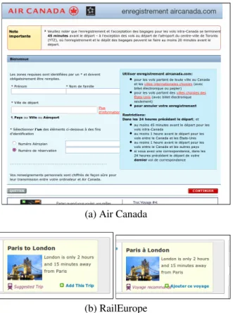
A common layout problem is the overlapping of elements that should be disjoint in the layout of a page. In our empirical study, this bug was one of the most prevalent; problems of this nature have been found in sites as varied as Time Magazine, Air Canada, Moodle, and Rail Europe. Figure 1.4 shows examples of this problem. In some cases, the overlapping occurs through a disruption of the layout caused by the main document being resized below some minimum dimensions. Containers that were normally side by side are being forced on top of each other by the browser’s layout engine. However, we also found that in many instances, this overlapping is caused by the fact that elements are absolutely positioned in a page with respect to their dimensions when the text they contain is in English. When displaying the web site in another language (such as French), it may occur that the corresponding text is longer than the English version, causing two elements that were disjoint to suddenly overlap. This has been observed, for example, in Figure 1.4 for the RailEurope web site.
1.1.3 ELEMENTS EXTENDING OUTSIDE THEIR CONTAINER
Another prevalent bug is the presence of elements that cause their parent container to extend beyond the dimensions it was designed for. In such a case, elements can be displayed past the boundaries of their parent container, causing unwanted overlapping with surrounding elements. This bug is the converse of the previous one: rather than extending their container outside its nominal dimensions, this time the elements that expand outside their container are simply clipped (i.e. trimmed off) from the display. Figure 1.5 shows an example of the latter type in the Moodle online teaching platform: elements from the table are clipped at the right; when analyzing the page’s source code, it turns out that four more columns should actually be visible and are simply inaccessible, no matter how wide the parent window is resized. This
(a) Air Canada
(b) RailEurope
Figure 1.4: Examples of overlapping portions of a page (a) Layout problem caused by insuffi-cient document width; (b) caused by longer text in a French version of the site (RailEurope)
(a) Moodle
(b) LinkedIn
Figure 1.5: Page contents being concealed from view, due to their extending beyond their parent container’s dimensions.
makes the page more or less unusable.
A particular case is when the container is the whole browser’s window. We have witnessed examples of web applications where, when the window is resized below a certain threshold, elements become inaccessible. This can be shown (or rather not) in Figure 1.5b: the top menu content disappears when the window is resized. The browser does provide a horizontal scroll-bar, but this only scrolls the bottom part of the page —not the top menu. As a consequence, some buttons from the site’s main menu can no longer be clicked.
We place in that category a bug we witnessed using Facebook’s instant messaging window. When the parent window is resized below a specific width, the textbox allowing a user to enter a new message suddenly disappears from the interface, as is shown in Figure 1.6. All other elements of the window remain identical, yet it becomes impossible to type a message.
Figure 1.6: The “Facebook Bug”. The textbox allowing a user to type an instant message (left) suddenly disappears (right).
Figure 1.7: An element incorrectly placed under another.
1.1.4 INCORRECTLY STACKED ELEMENTS
This problem happens when an element that should be rendered on top of another is actually placed under it, as is shown in Figure 1.7. In this example, clicking on the orange button at the top of the picture is supposed to bring up a drop-down menu; however, the content of this menu appears under the rest of the page’s content, rather than on top of it, making some of its elements unusable.
As it turns out, it is hard to predict how the CSS standard decides on the stacking of elements in a page; this is a common source of errors. Most problems of this nature can be corrected by properly assigning the z-index property of the faulty element.
1.2 NON-LAYOUT BUGS
While not being layout problems per se, several other bugs can be detected by analyzing the contents and layout of a page. We shall see in the following pages that some of them even relate to the expected behaviour or functionality of the application, yet can still be detected through rules expressed on a single static snapshot of the application’s viewport.
1.2.1 MOJIBAKE AND ENCODING PROBLEMS
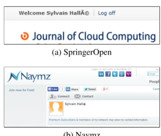
Several sites and applications incorrectly handle string data outside 7-bit ASCII. Various character encodings, such as Cp1252 or UTF-8, can be used to represent so-called “accented” or “foreign” characters. However, the same character may be represented by a different binary value according to the encoding scheme being used; worse, some encodings, such as UTF-8, may use multiple bytes to represent a single character.
Problems arise when a system does not properly interpret the contents of a character string, believing it to be in some encoding while it actually uses antoher. This often results in the display of an incorrect, superfluous, or missing character; this phenomenon is called mojibake.2 For example, the UTF-8 encoding of the character “é”, when interpreted as a Cp1252 string, produces “Ã c⃝”, as shown in Figure 1.8. Conversely, the Cp1252 character “é” yields “ ” when interpreted as UTF-8 (Figure 1.8b). While these characters may be legitimate data in their own right, their presence in an element’s content most likely indicates an incorrect handling of string encoding by the application under test.
(a) SpringerOpen
(b) Naymz
Figure 1.8: An example of Mojibake: (a) UTF-8 data displayed as Cp1252 (SpringerOpen); (b) Cp1252 data displayed as UTF-8.
Figure 1.9: Data fetched from a database is incorrectly escaped in IEEE PDF eXpress: note the presence of multiple apostrophes.
1.2.2 ESCAPING PROBLEMS
Escaping problems occur when strings with special characters fail to be properly encoded or decoded between two applications. The most frequent manifestation of this problem is when reading and writing character strings to a database. Some characters, such as the apostrophe, require to be doubled so as not to be confused with a string delimiter. Problems occur when a system fails to replace double apostrophes by single ones when displaying that data in a form. When saving the form contents back to the database, each apostrophe will again be doubled, resulting in quadruple apostrophes when reloading the page next time, and so on; this is shown in Figure 1.9. Hence looking for multiple apostrophes in a form can be used to detect incorrect escaping inside the source code.
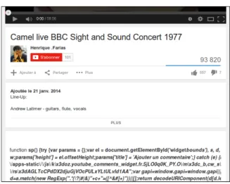
Figure 1.10: JavaScript code is being displayed, rather than interpreted, on YouTube.
(such as HTML or JavaScript) are wrongly escaped. For example, a sequence like <p> may be transformed into <p>, resulting in the literal string <p> being displayed as text, rather than being interpreted as a paragraph delimiter. We have witnessed examples of this problem on EasyChair (which shows raw HTML code) and YouTube (which displays raw JavaScript code, as Figure 1.10 shows). Looking for escaping problems of this kind can prove especially important, as it can reveal a vulnerability that a malicious user could exploit.
1.3 RESPONSIVE WEB DESIGN BUGS
A few years ago, access to websites was conditioned by assumptions about the size of the device’s screen. Desktop computers were designed to access websites with minimal window sizes, so if the size of the viewport was smaller than the supported size, the site would appear broken. Nowadays, an alternative approach is needed for proper site operation in a range of different viewport appliances and sizes.
StatCounter statistics dating from October 2017 show that the percentage (56.7%) of Internet users in the world via mobile devices and tablets is higher than the percentage (43.3%) of
However, the rapid change of device properties could not be followed by web developers. They continued making assumptions from the client’s request. The request for a resource through a browser was followed by a user agent string to identify the type of browser used. Reading the user agent string on the server side causes the release of two versions: a mobile version designed for a maximum width and a desktop version designed for minimum width.
Although the approach has many shortcomings, there was unfortunately no better technique. Among its defects, the fact that it does not fit with new devices entering the market, such as tablets that are somewhere in the middle of mobiles and laptops in size, brings the need for another special version for the site. In addition, other versions of the site must be developed in order to satisfy all user devices.
On the other hand, the desktop site assumes that users have large screens (which is usually true) and therefore a large browser navigation window (browser viewport) for the simple reason that the screen is large, something that is not always true. Users may want to have more than one browser window displayed at the same time on the screen, which may invalidate assumptions about the available layout size for the site. Clearly, a better approach was needed. Developers have been following the emergence of CSS media queries that allow conditional style statements by media properties such as window size, see Listing 1.1 for an example. Adapting a site for a specific window size at runtime has become possible. The approach of having a single site respond to different multimedia properties (mainly the size of the window) at run time to enhance the user experience is referred as Responsive Web Design (RWD). The maintenance of several versions of a site is then no longer necessary.
@media (max-width : 420px) { body { background-color : white ; } } @media (min-width : 421px) { body { background-color : blue ; } }
Listing 1.1: CSS code with conditions on the device’s width
multiplication of the devices in the market nowadays, the layout of web applications tends to be harder to properly specify in contrast with traditional desktop applications. The same document can be shown in a variety of sizes, resolutions, browsers and even devices, making the presence of so-called layout “bugs” all the more prevalent. Such problems can range from relatively mundane quirks from elements overlapping to viewport protrusions.
Walsh et al. (2017) describe five types of bugs in RWD websites, which we shall now describe. Visual examples of these bugs are in Section 4.2.2.
1.3.1 ELEMENT COLLISION
When the viewport of a responsively designed page becomes narrower, one design strategy to account for the loss of width is to move horizontally-aligned page elements closer together. As the viewport contracts, however, elements may collide into one another, causing their contents to overlap. This can result in unintended effects such as overlaid text or images, or hidden content or functional elements, thus harming page usability.
When implementing a responsive design, one concern is ensuring that, as the viewport becomes narrower, HTML elements also adapt in size so that they are still large enough to contain their contents. When elements do not resize correctly, their contents may no longer “fit” and consequently protrude into surrounding parts of the page.
1.3.3 VIEWPORT PROTRUSION
As viewport space is squeezed, elements may not only start to overflow their containers, but also start to protrude out of the page’s root presentational HTML element (i.e., the body tag), thus appearing outside of the horizontally viewable portion of the page.
1.3.4 SMALL-RANGE LAYOUTS
Responsively designed web sites tend to use many CSS rules, which are activated and deacti-vated by different media queries. More than one media query in the CSS rules may evaluate to true at the same time for a given viewport width. For instance, two rules, one activated when the viewport is over 768 pixels wide, and another activated when the viewport is below 1024 pixels, will both be activated in the range 769–1023 pixels.
The logic that governs when a series of rules are “on” or “off” for a given sets of elements and viewport sizes can quickly become complex, to the point at which developers can frequently make mistakes that result in CSS rules being applied unintentionally at some viewport widths. A common fault of this type occurs when developers mix the use of the min-width and max-width qualifiers to define changes in layout. For instance, a developer may encode a media query “@media (max-width: 768px) for example”, and another as “@media (min-width:
768px)”. Since the viewport ranges defined by both of these expressions are inclusive, both will be activated at the 768 pixel viewport width. This clash of media queries can lead to strange layout effects, as two sets of rules will be activated when only one set was intended. These types of failures are difficult for developers to spot, since they occur only in small subranges of the entire range of viewport widths in which the page may be viewed.
1.3.5 WRAPPING ELEMENTS
If a containing element on a web page is not wide enough to contain its children, but is still “tall” enough, or has a flexible height, horizontally-aligned elements contained within it will “wrap” to form an additional, yet undesirable, row of elements and an unwanted presentational
effect.
1.4 BEHAVIOURAL BUGS
Contrarily to a traditional web application, a Rich Internet Application (RIA) makes use of emerging modern web technologies such as AJAX (Garrett, 2005), Flash, and Silverlight. Therefore, novel testing problems are added to the existing problems in web testing field. An important characteristic of these applications is that they are inherently stateful: their code can store persistent data on the client (using WebStorage, CSS properties, JavaScript variables and objects) and on the server (using cookies, session storage and databases). Moreover, the state of the application is dispersed across a number of elements, and cannot simply be assimilated to the current page’s URL (shown in the browser’s address bar). Features such as asynchronous communication, delta updates, client side DOM manipulation, event handlers and timing (Arora and Sinha, 2012) make it possible to change the state of the application, without either requiring a full reload of a page, or changing the page’s URL.
Figure 1.11: Moving elements: the position and border of the textboxes changes when writing text (NSERC).
A positive consequence of these features is that such an application can provide a richer (hence its name) user experience; without cookies and JavaScript, mundane operations such as shopping cart manipulations, user sessions (login/logout) and the like would not be pos-sible. However, the presence of a state in the application also introduces the possibility for inconsistencies in the state displayed from one page to the next. These problems are called behavioural bugs, as they are the consequence of multiple pages interacting with each other and coming in a certain order.
1.4.1 MOVING ELEMENTS
Some elements have their position unintentionally changed upon interaction with a user. Figure 1.11 shows an example of such an issue on the web site for Canada’s NSERC. Writing text in a previously empty textbox reduces its width by 4 pixels and shifts the remaining textboxes slightly to the left. This problem turned out to be more prevalent than we expected; variations include some elements’ style (border or size) changing for no apparent reason in multiple other websites.
1.4.2 MALFUNCTIONING BUTTONS
Many applications show the user overlaid elements that behave as in-window “pop-ups”. However, in a number of cases, buttons in these windows are inoperative: clicking on them any number of times produces no effect whatsoever. This problem has been witnessed in sites as varied as American Airlines, Dropbox and BitBucket. In some cases the user is effectively stuck in the pop-up or the page that contains the button, and cannot move on without forcing a complete reloading of the document.
1.4.3 LOGIN STATUS CONFUSION
A couple of web sites in our survey exhibit inconsistencies in the status of a page, showing in the same window elements of a page normally reserved to logged in users (such as personalized menus) along with elements reserved to users that are logged out (such as a login form). We have witnessed such behaviour in IEEE’s web site for the Senior Member application form. After some timeout expires, the user is normally required to login again; however, the page presented to the user is the one shown in Figure 1.12. Notice how the user’s name is still present at the top-right of the page, even though it is supposedly logged out (as login credentials are required). Clicking on that name brings the same drop-down menu that is normally accessible only when the user is logged in. The same problem has been witnessed on Air Canada’s reservation site.
It shall be noted how an inherently stateful behaviour of the application (namely, the fact of being logged in or not) in this case reduces to the verification of a stateless property on the page’s contents.
Figure 1.12: Login/logout confusion in a web page: contents for a logged in user (top-right of the page) coexist with a login form reserved to users that are not already logged in.
Figure 1.13: Inconsistent search results: the user types a postal code in a search box (top left); the results that appear in the next page all have a different postal code (right).
1.4.4 INCONSISTENT SEARCH RESULTS
Another behavioural problem we witnessed is the inconsistency between a query made by a user, and the results of that query displayed by the application. Figure 1.13 shows an example of this problem on the web site for the Monoprix grocery stores. When searching for nearby stores, a user can type a postal code in a form field and then click on “Validate”. However, the search results displayed in the next page almost never show stores with the desired postal code. As with all bugs in the present category, this can only be observed by correlating multiple elements in two different states of the page: the text in the textbox, a click on a specific button, followed by the text in the list items that appear in the resulting page.
Our survey revealed a number of other oddities we do not describe here for lack of space: double vertical scrollbars, textboxes where text can by typed in but not deleted, buttons outside a window that is not scrollable, flickering tooltips, etc.
In addition to the bugs described above, we shall also include bugs taken from the Beep Store(Hallé and Villemaire, 2012), a demo RIA application developped for a research paper where it is possible to toggle behavioural bugs directly in the application. It is a stand-alone, client-server web application, implemented in PHP and JavaScript, that allows registered users to browse a fictional collection of books and music, and to manage a virtual shopping cart made of these elements. This application, whose features were extracted from an exhaustive study of real-world web applications, is an RIA in the pure sense of the term: user interactions are completely asynchronous, never require the reloading of the page, depend on past user actions, and consist of a single document whose various parts are shown or hidden depending on the current state of the application.
We detail here some of the bugs that will be used to test our application in Section 4.1.
1.4.5 MULTIPLE LOGIN
One of the bugs that can be toggled in the Beep Store lets the user land in the login page while being already logged in. This is detected by the fact that the “Sign in” link appears in the top action bar even after the user has successfully logged in, as is shown in Figure 1.14. Obviously, a well-built application would not provide a login button after a user is already logged in; note how this property is stateful, in the sense that the valid state of a page depends on the sequence of past actions made by the user (in this case, the fact that a successful login has occurred).
Figure 1.14: The multiple login bug. A user that is already logged in is presented the option to login again. Taken on the Beep Store website (Hallé and Villemaire, 2012)
Figure 1.15: The multiple carts bug. Buttons for creating a cart and adding items to the cart coexist on the same page. Taken on the Beep Store website (Hallé and Villemaire, 2012)
1.4.6 MULTIPLE CARTS
Another bug lets the user create multiple shopping carts even after creating a first one. Figure 1.15 shows an example of this bug: a cart has already been created, since the interface shows buttons allowing the user to add items to the cart; yet, buttons to create a new cart are also shown.
Figure 1.16: The remove from nonexistent cart bug. Buttons for removing from the cart and creating a cart coexist on the same page. Taken on the Beep Store website (Hallé and Villemaire, 2012)
1.4.7 REMOVE FROM NONEXISTENT CART
This bug is the converse of the previous one: sometimes, the Beep Store lets the user remove an item from his cart before he even creates it. We can see in Figure 1.16 that the buttons for creating a cart are present along with the buttons to remove the items from it.
These bugs are clearly behavioural because they are caused by prior actions by the user or actions that never happened. It should also be noted that, depending on the server’s implementation, these bugs do not necessarily trigger error messages in the logs. We can easily imagine a case where an action is dismissed and does not create further problems but the client should have never been presented with the option.
In this chapter, we will discuss other works that have been done in the field of web application testing. We will see some traditional testing tools with similar mechanisms as ours, as well as tools that use visual techniques and GUI specifications.
2.1 TESTING TOOLS
Analytics software (Google Analytics,1Piwik,2etc.) achieve some of the goals of a testing tool. They track HTTP requests and provide a dashboard to analyze basic data: country of origin, duration of a session, etc. However, as a rule, these tools do not handle Ajax, cannot be used as testing tools (i.e. do not evaluate conditions on the contents of the page) and do not report anything about the page’s contents, the user’s actions or the Ajax requests.
Closer to our goals are web testing software such as Capybara, Selenium WebDriver, Watij or Sahi. These tools provide various languages for describing the tests and writing assertions about the application. WebDriver scripts are written in Java; Capybara is an API3 over the
1http://www.google.com/analytics 2http://www.piwik.org
WebDriver driver = new FirefoxDriver(); driver.get("http://...");
List<WebElement> items = driver.findElements(By.cssSelector("li"));
int left = -1;
for (WebElement item : items) { if (left == -1) { left = item.getLocation().getX(); continue; } assert(left != item.getLocation().getX()); }
Listing 2.1: Code in Java that checks if all elements of a list are left-aligned
Ruby language; Watij uses WebSpec,4an API over Java; and Sahi uses SahiScript, an extension of JavaScript.5 All these languages are imperative (i.e. procedural), and aimed at driving an application by performing actions. The testing part reduces to the insertion of assert-like statements throughout the script code.
As an example, Listing 2.1 is a snippet of Java code for Selenium WebDriver to check that all elements satisfying a CSS selector are left-aligned:
We can see how this code (which does not provide any explanation or counter-example when the assertion fails —this would require additional code) has a relatively low readability especially to those not familiar with the language. Barring syntactical differences, the other testing tools mentioned above produce expressions of a similar nature.
There is currently no tool that provides a declarative language, observes the contents of each page while an external agent (user, external driver) manipulates the application, and detects when the conditions for a given scenario are present and checks whether the conclusion occurs. This also means these tools do not work well with other software, such as automated crawlers (Crawljax (Mesbah et al., 2012), WebMate (Dallmeier et al., 2013) or WebMole (Hallé et al.,
4http://watij.com/webspec-api/ 5http://sahi.co.in
Moreover, all of the aforementioned tools (with the exception of Sahi) require some browser-specific plugin to operate, and as a consequence only support a handful of browsers —typically the “Big Five” (Firefox, Safari, IE, Opera and Chrome). Tools based on such solutions claim to work on “most browsers”. However, Table 2.1 reveals that the market share of browsers other than these five amounts to 20%, and rises to 63% when considering non-desktop devices (tablets, consoles and mobiles). Table 2.2 shows the market share of existing web testing tools, based on the market share of the browsers they support. Apart from Sahi, these testing tools do not reach more than three quarters of the market, and for some as few as 25% for non-desktop devices. Therefore the claim that “most users” are supported by them is relatively unsubstantiated.
On the other hand, ReDeCheck (Walsh et al., 2015) is an RWD testing tool. It is inspired from the alignment graph used in X-PERT, a concept that was proposed and developed by Choudhary et al. (2013b). ReDeCheck focuses specifically on layout bugs caused by responsive designs; it uses a Responsive Layout Graph (RLG), which takes into consideration of the alignment of the elements of the web page, visibility changes and other aspects of the page when the viewport width varies. As such, ReDeCheck can only verify a fixed set of predefined layout problems, and does not provide a general-purpose language for expressing assertions as Cornipickle does.
Browser Share (all) Share (non-desktop) Chrome 36.44% 11.46% IE 17.34% 0.14% Firefox 14.86% 0.43% Safari 7.44% 13.38% Android 7.07% 24.3% Opera 4.21% 11.11% iPhone 4.85% 16.66% UC Browser 2.65% 9.1% Nokia 1.31% 4.5% BlackBerry 0.54% 1.84% NetFront 0.48% 1.63% iPod Touch 0.27% 0.94% IEMobile 0.51% 1.76% 360 Safe Browser 0.28% 0% Yandex Browser 0.26% 0% Maxthon 0.19% 0% Silk 0.18% 0.62% Sogou Explorer 0.18% 0% Sony PS3 0.07% 0.23% Unknown 0.13% 0.43% Dolfin 0.08% 0.28% Chromium 0.06% 0% QQ Browser 0.1% 0.1% Samsung 0.03% 0.09% Puffin 0.06% 0.2% Openwave 0.05% 0.17% Pale Moon 0.02% 0% Phantom 0.03% 0.07% Netscape 0% 0% Jasmine 0.02% 0.06% RockMelt 0.01% 0% TheWorld 0.02% 0% Obigo 0.02% 0.07% Tencent Traveler 0.02% 0% SeaMonkey 0.01% 0% Iron 0.02% 0% CoRom+ 0.04% 0% SonyEricsson 0.02% 0.07% Nintendo 3DS 0% 0.02% Iceweasel 0.01% 0% Mozilla 0.02% 0% Other 0.13% 0.14%
Table 2.1: Market share for browsers as of February 2014, taken from http://gs.
Crawljax Yes Yes No Yes Yes 76% 25%
HP QTP6 Yes Yes No No No 32% 1%
iMacros No Yes No No No 15% 0%
QF-Test Yes Yes No No No 32% 1%
Ranorex Studio Yes Yes No Yes Yes 76% 25%
Sahi Yes Yes Yes Yes Yes 80% 37%
TestComplete Yes Yes No No Yes 69% 12% Tosca Testsuite Yes Yes No No No 32% 1% Test Studio Yes Yes No Yes No 40% 14%
Watij Yes Yes No Yes No 40% 14%
WatIN Yes No No No No 17% 0%
Watir Yes Yes Yes No Yes 73% 23%
WebDriver Yes Yes No Yes Yes 76% 25%
Table 2.2: Market share for browsers supported by various web testing tools
2.2 VISUAL TECHNIQUES
Some work has also been done on the use of image analysis techniques to identify layout prob-lems (Tamm, 2009); in particular, WebSee (Mahajan and Halfond, 2015) is a tool implemented in Java that leverages several third party libraries to implement some specialized algorithms. It applies techniques from the field of computer vision to analyze the visual representation of web pages to automatically detect and localize presentation failures. WebSee identifies presentation failures, and then determines the elements in the HTML source of the page that could be responsible for the observed failures by comparing the visual representation of the rendered web page under test and its appearance oracle.
To this end, WebSee takes as input the HTML/CSS code of the page to analyze and an oracle (i.e. picture) of the expected rendering of the page. A set of differences between the rendered page and the reference picture is computed, and these differences are then clustered into groups that are likely to represent different underlying faults in the page. A second processing phase attempts to identify the HTML elements corresponding to the difference pixels, which
are then ordered by some priority metric and output to the user. Applitools Eyes (Applitools, 2016) is a commercial tool following a similar principle; it uses pure image segmentation of web pages and a pixel-by-pixel visual comparison.
However, this approach is geared towards the detection of static, overlapping- or overflow-type bugs in a document, and currently does not support the checking of temporal patterns across multiple snapshots of the same page. Moreover, the approach generates lots of false positives if the rendered page contains text that is slightly different from the reference picture. This is the case when, for example, the browser’s window has different dimensions, and causes some text to flow differently (but not necessarily incorrectly) with respect to the picture. To address this problem, the user has to manually define, for each oracle, so-called dynamic regionsthat should basically be ignored by the system when analyzing the page.
2.3 DECLARATIVE GUI SPECIFICATIONS
Declarative specifications of user interfaces has been the subject of research in the past. Early attempts include the MASTERMINDsystem, which uses a modelling language based on CORBA (Szekely et al., 1995); other approaches include the Auckland Layout Model (Lutteroth and Weber, 2008), Adobe’s “Adam and Eve” (Parent et al., 2007) and property models (Järvi et al., 2008). We shall however discard these, and a lot of other GUI markup languages (QML, XAML), which are aimed at generating interfaces based on constraints, not to be used as assertions to be tested; moreover, they focus principally on solving linear constraints relative to the size and placement of elements inside a form.
To show why GUI-generating languages are not appropriate, let us consider the simple example of CSS. As was discussed earlier, CSS expresses what elements should look like, but not what they should not look like. Consider the following styling declarations, in the case
#div1 { ... width: 200px; } #div2 { ... width: 300px; }
It is not possible to state that the contents of div1 should never be wider than its own declared width. If this is the case, the browser can either expand the element’s box (disregarding its declaration), display elements outside its container (a problem we discussed extensively in Section 1.1), or cropping from that content anything that is too wide. The only solution is for the designer of the CSS document to make sure that the declared width of all elements that will be contained in div1 is smaller than 200 pixels. We will see later that, with our solution, a property expressed in our language could easily enforce at runtime that the width of div1 is always of 200 pixels.
One could argue that this can also be checked by statically analyzing the HTML document along with the CSS file (although no related work seems to address this question). There are cases, however, where this is not possible. If we delete the declaration for div2 in the example above, but that div2 contains an image that is 300 pixels wide, then there is no way to discover that the desired property is not fulfilled by simply looking at the CSS.
As a final example, consider the following code, which states that some menu’s elements should be placed vertically and fixes their size:
#menu li { float: left; width: 200px; height: 50px; }
Nothing allows the designer to specify that all elements should always be on the same line (i.e. have the same top position even if the value of top is defined). This will not be the case if the
containing window is resized small enough for elements to float under. In such a case, one has to actually render the page inside a browser, with its actual dimensions, to discover the presence of the problem.
2.4 CRAWLERS
Crawlers are an integral part of web search engines and are dedicated to the collection and indexing of Web documents. They were originally developed for the purpose of archiving, retrieving information (find e-mail addresses or product pages for example). However, it was soon discovered that crawlers could be used for other purposes: in particular, a crawler can be seen as a state-space exploration tool, and as such, be used to perform automated testing.
A traditional crawl process starts from seed URLs. Web pages corresponding to these URLs are downloaded and the hyperlinks present on them are extracted and added to a set of URLs to visit, also called the crawl frontier. Since the number of URLs that populate the crawl frontier increases very rapidly, a criterion for prioritizing the downloading of certain pages is generally applied. In turn, the best ranked URLs within the crawl frontier are downloaded and new links are extracted. This operation is repeated until all accessible links are visited (Mirtaheri et al., 2013a; Olston and Najork, 2010).
Some basic features of traditional web applications are different in RIAs (Rich Internet Applications), which makes crawling RIAs more difficult than crawling traditional web applications. In RIA crawling, the crawl order respects the sequence of possible pages as if a user were using it. As we have seen, unlike in traditional web applications, a URL does not uniquely identify the state of the application, and hence cannot simply be requested from the server at any moment.
For instance, in a scenario where the user can create a cart, delete a cart, add an item to a cart and edit a cart to change the quantity of an item, a bug that lets the user edit an item in his cart while not having a cart could be discovered. After creating a cart, adding an item to it and then deleting the cart, the traditional crawler’s set of URLs to visit contains the URL to edit the item. Then, when trying to reach this URL, a bug occurs because the cart has been deleted. However, it can be a false positive because this sequence of actions is most likely not possible by a user. A traditional crawler is therefore not adequate to search for behavioural bugs.
In a typical RIA web crawler, the page associated with a seed URL is extracted and loaded into a virtual browser. A module is required to check if this is the first time the page constructed is encountered. An event extractor retrieves the JavaScript events from the page; one of these events is selected and executed on the page. The resulting page is then collected, and the process continues until all discovered actions have been exhausted (Choudhary et al., 2012). On the basis of this model, different exploration strategies (such as depth-first search, Greedy, Model-Based, and Component-Based) have been suggested (Mirtaheri et al., 2013b; Benjamin et al., 2011; Dincturk et al., 2012; Choudhary et al., 2013a; Dincturk, 2013).
Some tools have already been designed to test RIAs. For example, WebMate (Dallmeier et al., 2013) can extract the state tree of a web application. This tree is then compared with other browsers’ state trees to find layout differences. However, it focuses on cross-browser compatibility and does not seem to support external user-defined tests.
WebMole is another automated crawler that generalizes existing approaches. It eliminates arbitrary backtracking by intercepting HTTP requests and make page jumps (Hallé et al., 2014). However, WebMole’s goal is simply to extract the navigation graph of an application;
it does not allow a user to write test oracles to be evaluated while the application is being explored.
On the other hand, Crawljax (Mesbah et al., 2012) uses a depth-first strategy to crawling and produces a finite state machine of the application’s behaviour. It is possible through its plugin architecture to test every state while they are being visited. However, the tests in question are left to be written by the user as pure Java code; this makes it hard, for reasons mentioned earlier, to easily write stateful test oracles.
2.5 MANUALLY TESTING RESPONSIVE WEB DESIGN
It is always a smart decision to test the design of a website on a variety of devices. But this classic method takes a lot of time, and because of the variety of devices available today, the developer may not have access to all of these devices. Apart from ReDeCheck seen in Section 2.1, the only tools that exist to ease this process display a page in a custom window of variable size using a web browser. However, most of these tools do not provide any information other than the rendering of the pages on different sizes which forces the task of evaluating the responsiveness on the developer. Not only identifying layout failures with a human eye is hard and time-consuming, but it is also subject to the developer’s biases. We present here some of these tools:
With smart search and quick review features, Websiteresponsivetest (CSSChopper, 2017) supports all major browsers to provide the exact preview of the website on any specific device. It requires entering the URL of a web page to quickly assess its responsiveness. By providing accurate results in a matter of a few seconds, the tool saves a lot of time to the tester. User-friendliness and browser-compatibility are other added features which make it better than the other tools available.
chosen from a list. Once the selection is done, a simple click on “G” is needed to receive a full analysis of website/web page for that specific device. The page can be easily previewed at an appropriate width.
Screenfly (Screenfly, 2017) is a multi-device compatibility testing tool which allows preview-ing web pages as they appear on different devices. The most popular ones include tablet and other smartphone devices like the Galaxy tab, Apple iPad, and Motorola Xoom. Additionally, it supports different screen sizes and resolutions. The site automatically detects if the entered URL has a mobile site and redirects the user to it. To switch between screen resolutions, all that is needed is to click on the icon of the device type or choose the device that is closest in screen resolution.
ViewPort Resizer (Wassermann, 2012) comes as a browser bookmarklet which can be used with any modern web browser. Dragging the bookmarklet on the Bookmarks bar is needed to get a toolbar at the top with buttons for different screen resolutions. As a user-friendly browser tool, ViewPort Resizer is completely configurable. It permits the selection of an initial range of screen resolution sizes and building a custom bookmarklet.
Responsinator (Pugsley and Hovey, 2013) helps site owners get an idea of how their site will work on the most popular devices. Just by typing the website URL, the site will quickly show on screens of various sizes.
ResponsivePX’s (Sharp, 2011) process involves entering the URL of the site and uses buttons to adjust the width and height of the viewport to find the exact breakpoint width in pixels. Extremely simple to use and enhanced functionality, this web design tool helps designers create usable and responsive sites.
Finally, FROONT (FROONT, 2012) makes responsive web design testing accessible to all kinds of designers without requiring any coding skills. Designs can be created in the browser with this intuitive drag and drop tool. By testing each URL specifically, it tests the designs on real devices right away.
One might be inclined to think that a static analysis of a page’s HTML content and CSS declarations should be sufficient to detect all of the aforementioned problems. Yet, one must realize that CSS is not a language that can express prescriptive properties about the layout of a document. CSS declarations are a set of instructions processed by a layout engine, which can (and most often do) contradict or override each other. As we discussed in Section 2.3, giving CSS a prescriptive expressiveness would imply the possibility to specify how an element should not look, or that a particular style declaration may not be overridden by some other constructs that CSS does not provide. Aside from an absolute positioning of all elements in a page (thereby completely bypassing the layout engine), there is no formal guarantee that two elements with the same left property will always be vertically aligned. Moreover, one cannot use CSS to express constraints about the structure or content of a document (such as: the #menu element should not contain mojibake). Finally, some of the bugs described earlier involve the comparison of the content of a document at multiple moments in time, a thing that CSS obviously is not designed for.
3.1 A DECLARATIVE LAYOUT LANGUAGE
Therefore, in order to express prescriptive properties about the layout and contents of a page, a language on top of CSS is required. This language shall allow a user to elicit declarative properties on the computed styles of elements, and deal with events, regardless of whatever CSS declarations or client-side code that may have been declared. In this section, we shall now describe Cornipickle, a declarative language for expressing properties about a document’s Document Object Model and CSS properties.
The language borrows features from a variety of other formalisms and tools. Its name is a nod to Cucumber (Wynne and Hellesoy, 2012), a general-purpose testing tool that uses regular expression matching to interpret structured-English constructs from an input file and convert them into executable test steps, yielding very human-readable test documents. Although Cornipickle is not a regex-based converter between text files and script commands, its grammar strives for the same kind of readability. Similarly, constructs from first-order and linear temporal logic, such as quantifiers and temporal operators, allow a user to specify complex relationships on various document elements at multiple moments in time, a feature that, as we saw in Section 2.1, is absent from many scripting languages.
The reader may wonder about our insistence on human readability. A similar behaviour could have easily been achieved using more formal (e.g. first-order logic) syntax or script-like constructs. This design choice stems from our past experience at using formal specification languages in a real-world testing context. It is fair to say that any solution involving some amount of formalism elicits from many practitioners a reaction ranging from pure disgust to sheer fright —and limits as much their will to use a tool for real. Moreover, a human-readable specification can also be understood and interacted upon by non-technical people, such as graphic designers, much more easily than logic or code.
3.1.1 GRAMMAR
In Cornipickle, properties are expressed as assertions on the content and attributes of some snapshotof a page taken at a given moment. The precise way such snapshots are taken from a given web application will be detailed in the next section. In the following, we first describe the language’s grammar, summarized in Table 3.1, by illustrating its various constructs.
Selecting Elements
The main unit in Cornipickle are page elements, which are selected in order to express properties about them. These properties may apply to all selected elements, or at least one. Therefore, element selection is done through classical first-order quantification, using the English-like syntax For each $x in S or There exists $x in S. In these expressions, S denotes either a CSS selector,1or another set previously defined by the user. CSS selectors are expressed using jQuery’s syntax $(. . . ). A special selector called CDATA can be used to refer to the text content of leaf nodes in a DOM tree (i.e. the actual clear-text snippets that compose the page).
If $x is a variable quantified using the mechanism described above, one may access to the DOM or CSS attributes of this element using the syntax $x’s property. For exam-ple, the width of the element would be written as $x’s width. Element attributes (which are either character strings or numbers) can then be compared using connectives such as
1A CSS selector is a path expression that defines what elements of a document are the subject of a given set
⟨S⟩ ::= ⟨predicate⟩ | ⟨def-set⟩ | ⟨statement⟩ | ⟨context⟩ Cornipickle statements
⟨statement⟩ ::= ⟨foreach⟩ | ⟨exists⟩ | ⟨binary-stmt⟩ | ⟨negation⟩
| ⟨temporal-stmt⟩ | ⟨userdef-stmt⟩ | ⟨let⟩ | ⟨when⟩
⟨binary-stmt⟩ ::= ⟨equality⟩ | ⟨gt⟩ | ⟨lt⟩ | ⟨regex-match⟩ | ⟨and⟩ | ⟨or⟩ | ⟨implies⟩ ⟨temporal-stmt⟩ ::= ⟨globally⟩ | ⟨eventually⟩ | ⟨never⟩ | ⟨next⟩ | ⟨next-time⟩ ⟨context⟩ := The following rules apply when ( ⟨statement⟩ ) ;
First-order logic
⟨foreach⟩ ::= For each ⟨var-name⟩ in ⟨set-name⟩ ( ⟨statement⟩ )
⟨exists⟩ ::= There exists ⟨var-name⟩ in ⟨set-name⟩ such that ( ⟨statement⟩ ) ⟨when⟩ ::= When ⟨var-name⟩ is now ⟨var-name⟩ ( ⟨statement⟩ )
⟨let⟩ ::= Let ⟨var-name⟩ be ⟨property-or-const⟩ ( ⟨statement⟩ ) ⟨and⟩ ::= ( ⟨statement⟩ ) And ( ⟨statement⟩ )
⟨or⟩ ::= ( ⟨statement⟩ ) Or ( ⟨statement⟩ )
⟨implies⟩ ::= If ( ⟨statement⟩ ) Then ( ⟨statement⟩ ) ⟨negation⟩ ::= Not ( ⟨statement⟩ )
Temporal statements
⟨globally⟩ ::= Always ( ⟨statement⟩ ) ⟨never⟩ ::= Never ( ⟨statement⟩ ) ⟨next⟩ ::= Next ( ⟨statement⟩ )
⟨eventually⟩ ::= Eventually ( ⟨statement⟩ )
⟨next-time⟩ ::= The next time ( ⟨statement⟩ ) Then ( ⟨statement⟩ )
also be combined using the classical Boolean connectives and, or, if. . . then, not.
Events and Temporal Operators
In Cornipickle, user-triggered events such as key presses and mouse clicks are represented as attributes on the element that is the event’s target. For example, an element that has been clicked by the user will momentarily possess an event attribute with value click. Hence asserting that some element $x has been clicked can be written as $x’s event is "click".
The inclusion of events in the language naturally leads to the notion of sequences of document snapshots. Consequently, Cornipickle provides operators borrowed from Linear Temporal Logic (LTL) to express assertions about the evolution of a document’s content over time. The Always ϕ construct allows one to assert that whatever ϕ expresses must be true in every snapshot of the document. Similarly, Eventually ϕ says that ϕ will be true in some future document snapshot, and Next ϕ asserts it is true in the next snapshot.
A special construct called The next time ϕ then ψ asserts that whatever ψ expresses must hold, but only once ϕ evaluates to true. For example, one can use this construct to express that something must be observed after an element has been clicked. This is but a slight rewriting of LTL’s “until” operator.
One particular purpose of temporal operators is to compare the state of the same element across multiple snapshots. This can be done in Cornipickle with the construct When $x is now $y ϕ. If $x refers to the state of an element captured in some previous snapshot, then $y will contain the state of the same element in the current snapshot.
Operators
⟨equality⟩ ::= ⟨property-or-const⟩ equals ⟨property-or-const⟩
| ⟨property-or-const⟩ is ⟨property-or-const⟩
⟨gt⟩ ::= ⟨property-or-const⟩ is greater than ⟨property-or-const⟩ ⟨lt⟩ ::= ⟨property-or-const⟩ is less than ⟨property-or-const⟩
⟨regex-match⟩ ::= ⟨property-or-const⟩ matches ⟨property-or-const⟩ ⟨constant⟩ ::= ⟨number⟩ | ⟨string⟩
⟨property-or-const⟩ ::= ⟨elem-property⟩ | ⟨constant⟩ ⟨number⟩ ::= ˆ\d+
⟨string⟩ ::= ˆ"[ˆ"]*"
Auxiliary constructs in statements ⟨el-or-not⟩ ::= element | ε
⟨set-name⟩ ::= ⟨css-selector⟩ | ⟨userdef-set⟩ | ⟨regex-capture⟩ ⟨userdef-set⟩ ::= ⟨string⟩
⟨var-name⟩ ::= ˆ\$[\w\d]+ CSS selector
⟨css-selector⟩ ::= $( ⟨multi-css-sel⟩ )
⟨multi-css-sel⟩ ::= ⟨css-sel-contents⟩ , ⟨multi-css-sel⟩ | ⟨css-sel-contents⟩
⟨css-sel-contents⟩ ::= ⟨css-sel-part⟩ > ⟨css-sel-contents⟩ | ⟨css-sel-part⟩ ⟨css_sel-contents⟩ | ⟨css_sel-part⟩
⟨css-sel-part⟩ ::= ^[\w\u0023\.\*\-\$]+ CSS attributes
⟨css-attribute⟩ ::= nodeValue | value | height | width | top | left | right | bottom | color | id | text | background | border | event | cornipickleid | display | size | accesskey | checked | disabled | min
⟨def-set-name⟩ ::= ˆ.*?(?=is)
⟨def-set-elements⟩ ::= ⟨def-set-element⟩ , ⟨def-set-elements⟩ | ⟨def-set-element⟩ ⟨def-set-element⟩ ::= ⟨constant⟩
User-defined predicate
⟨predicate⟩ ::= We say that ⟨pred-pattern⟩ when ( ⟨statement⟩ ) ⟨pred-pattern⟩ ::= ˆ.*?(?=when)
User-defined statements ⟨userdef-stmt⟩ ::= empty
Table 3.3: BNF grammar extensions for Cornipickle
All these constructs can be freely mixed. For example, the following property asserts that every list item eventually moves down the page at some moment:
For each $x in $(li) ( Eventually (
When $x is now $y (
$y’s top is greater than $x’s top ))).
Extending the Grammar
An important feature of Cornipickle, which contributes to the readability of its specifications, is the possibility for users to extend the basic vocabulary with their own definitions. These new definitions are read by the interpreter, and can then be used freely like any basic language element.
and when is interpreted as a literal string that can contain variables. The text after when describes how that expression should be evaluated in terms of the existing vocabulary. For example, one can define the expression “left-aligned” as follows:
We say that $x and $y are left-aligned when ( $x’s left equals $y’s left ).
The phrase $x and $y are left-aligned can then be reused (possibly with different variable names) in later assertions. Users can also define sets —either sets of character strings, numbers, or sets of elements from a page, by enumerating them using the A. . . is any of construct:
A Mojibake is any of "à c⃝", "Ã’", "è".
Note that the name of the set need not be a single word; the parser interprets as a name anything between A and is any of.
3.1.2 LAYOUT BUGS REVISITED
Equipped with such a grammar, it is possible to give examples of properties corresponding to some of the bugs we discovered in our survey. For example, with Mojibake the set defined as above, the presence of character encoding issues in a page can be detected with:
We say that $x doesn’t contain $y when ( Not ($x’s text matches $y’s value )).
For each $text in $(CDATA) (
For each $mojibake in "Mojibake" ( $text doesn’t contain $mojibake )).
should never move can be written as:
We say that $x is immobile when ( Always (
When $x is now $y (
($x’s left equals $y’s left) And
($x’s top equals $y’s top ) ))).
For each $item in $(li) ( $item is immobile ).
The intuitiveness of specifications can be further highlighted in this (slightly contrived) last example, which states that at least one list item has the value of some other list item the previous time the user clicked on a button called “Go”:
We say that I click on Go when (
There exists $b in $(button) such that ( ($b’s text is "Go")
And
($b’s event is "mouseup") )).
Always (
If (I click on Go) Then (
There exists $x in $(.value) such that ( The next time (I click on Go)
Then (
There exists $y in $(.value) such that ( $x’s text equals $y’s text
))))).
As with the Java example shown in Section 2.1, the readability of this specification should be contrasted with the procedural code one would need to write to detect the same issue, which is objectively longer, and arguably much less clear in its intent. For example, Listing 3.1 shows how to detect that bug in jQuery.