What do strokes teach us about collaborative design ?
Texte intégral
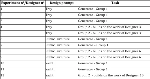
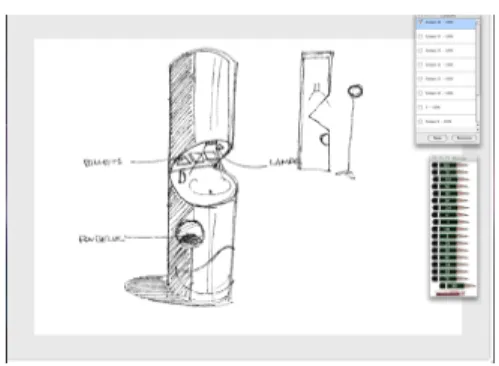
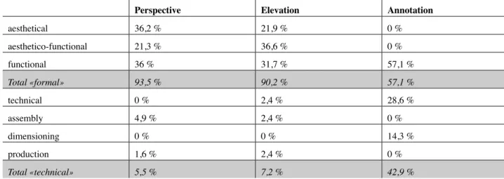
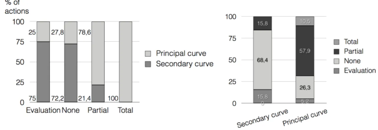
Figure

Documents relatifs
This paper employs a design science research method which aims at laying the foundation for the development of non-intrusive voice-based interfaces, with the main goal of
Keywords: Exchange rate, US dollar, euro, yuan, volatility, trade, trade in agriculture, short-run effects, long-run effects, GARCH volatility, trade deficit,
a) Research on sign bilingualism, targeting the study of bilinguals who use in parallel a sign language A and a spoken language B in its written form. c) Research on
Biologically inspired design uses inspiration of natural systems to develop solutions for design and engineering problems. We experienced teaching bioinspired method
Here, our objective is twofold: (1) we investigate how query length (ie., # query terms) varies across the search stages within sessions and tasks of different sizes (ie., #
played, among other things, by they are made aware of the importance, for them, to have had a significant part in the managing of an innovating project as a two-year long team
relationships of a public service determine actual policy orientations and practices (see for instance Woolford and Curran 2013). Here, the concept of field provides a sociologically
Harold Garfinkel pointed out the problems of theories that rely on inter- nalization of society’s norms and found ethnomethodology (EM) to study how people themselves in
